This week we’ll be documenting the full process of our kids’ shared bath (with a full, styled-out reveal and another YouTube video coming within DAYS – watch the first video if you haven’t yet HERE). BTW this is one of those rooms that looks straightforward, not moving any plumbing or changing the layout from the original room – easy peasy, right? But y’all NOTHING IN LIFE IS STRAIGHTFORWARD, especially when remodeling, creativity, and the internet are involved. There is just so much to break down and I have a lot to say (surprise, surprise), with a compulsion to share everything I learned. You really shouldn’t pay to go design school (once you learn renderings), future designers should just follow me around all day during a renovation year – you’ll learn so much!! It’s truly endless what you can learn (and if any designers say it’s not, don’t trust them). The creative process is a beast – so let’s hope it turns into a beauty this time, shall we??
Where Is This Bathroom In The House?
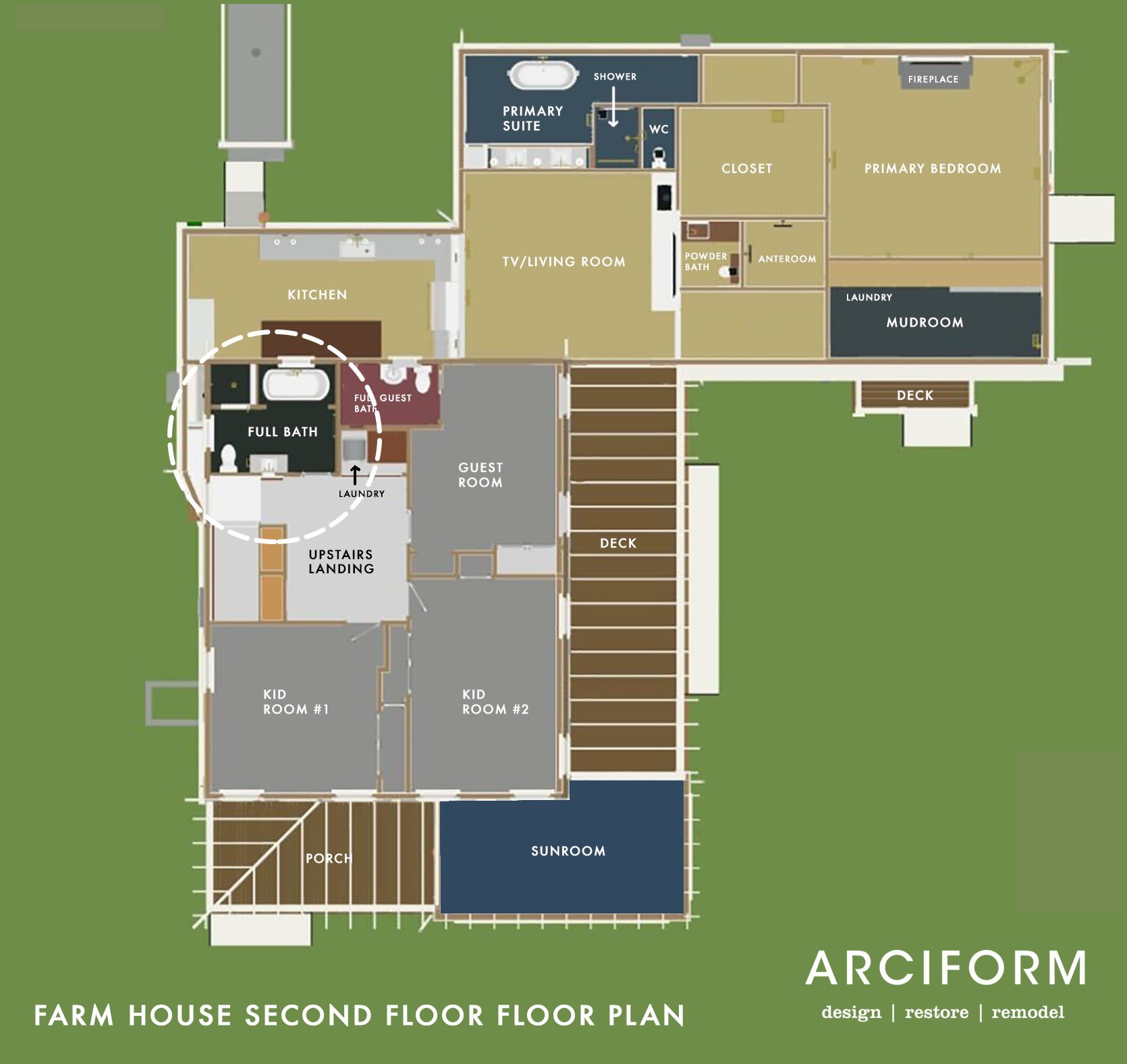
Today we are upstairs, off the landing where the two kids’ bedrooms and our guest bedroom are located. It’s a decent-sized bathroom and was the only room in the entire house that we seriously considered for months not doing much to (just paint, really). See for yourself…
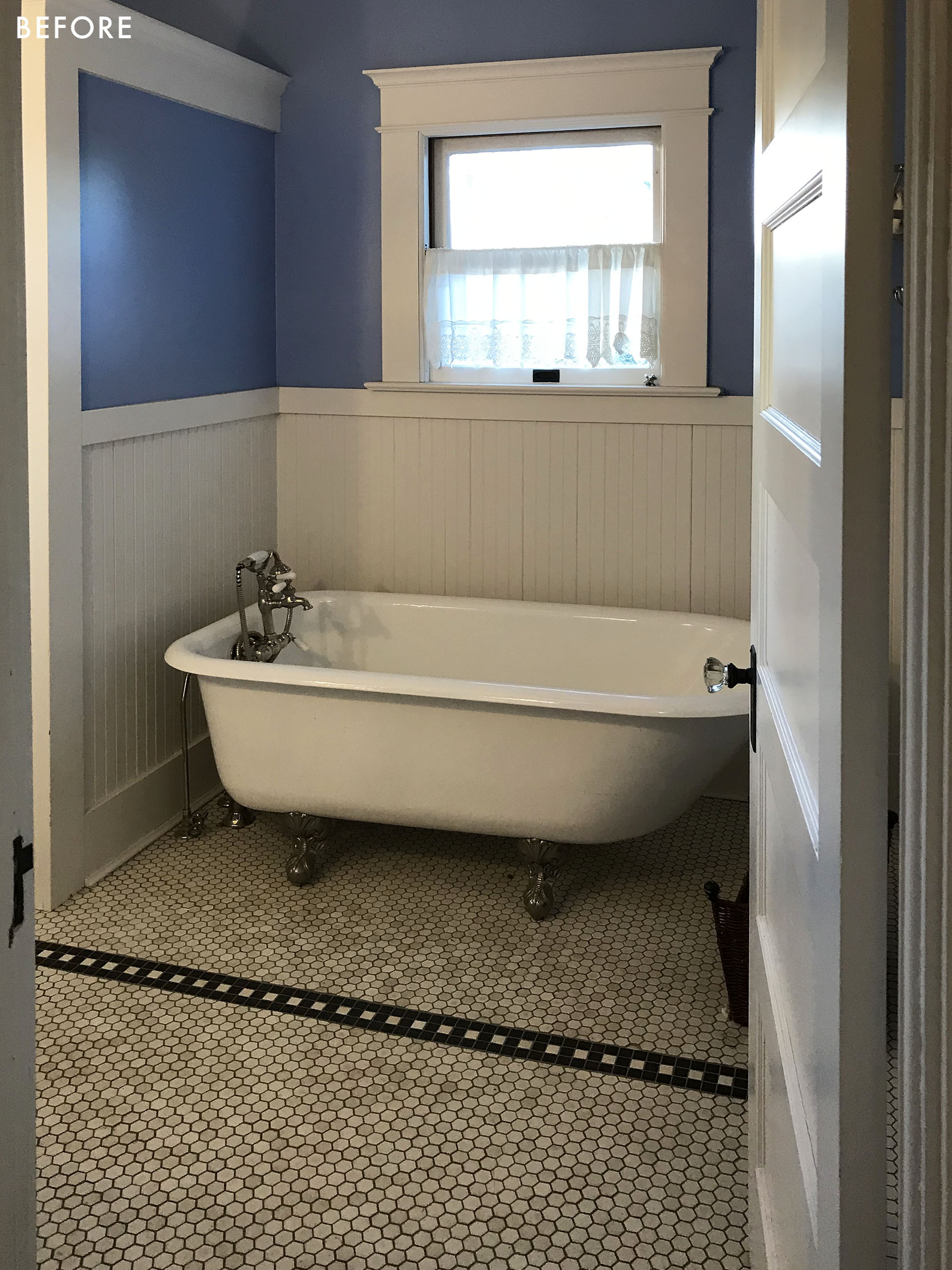
See? Pretty cute! So how dare I tear this all out? Good question. Well, first off for you purists, it wasn’t original (done in the ’90s), but done with classic finishes in a totally tasteful way. Had we not been redoing the electrical and plumbing of the entire house (which we had to do, she was OLD and it wasn’t pretty) we likely would have not opened up these walls. But we still considered leaving it be until ARCIFORM did a bit of fortune-telling and reminded us that the whole house is going to be freshly, and perfectly renovated – do we really want one room to feel like it’s in a different house? Would we end up upgrading it to match the vibe of the rest later on? And if so, we should just do it now. You might have opinions about that, which I fully get. But I did picture the whole house done and leaving only this room mostly untouched started to not make sense.
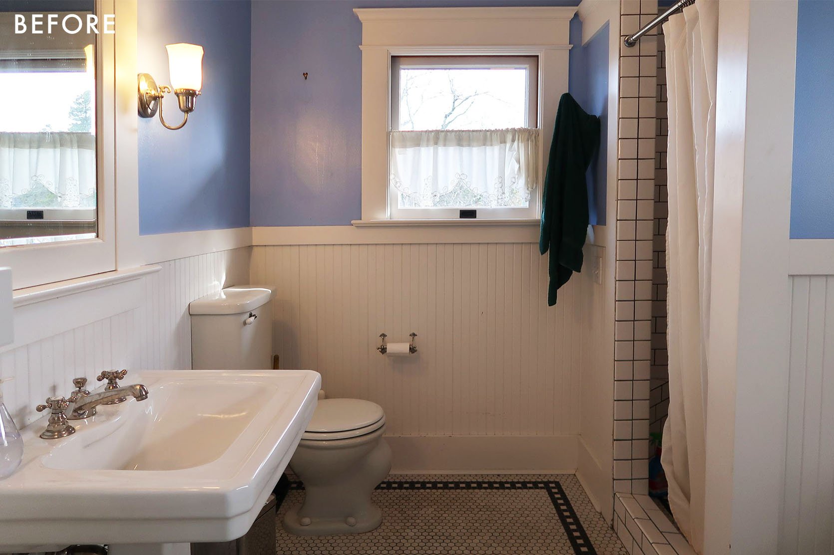
But the location of everything was great (and how adorable is that vintage toilet that broke upon us trying to salvage??). ARCIFORM also pointed out a lot of tile imperfections – not the tile itself but the install, which I didn’t notice but once they pointed them out I sure did.
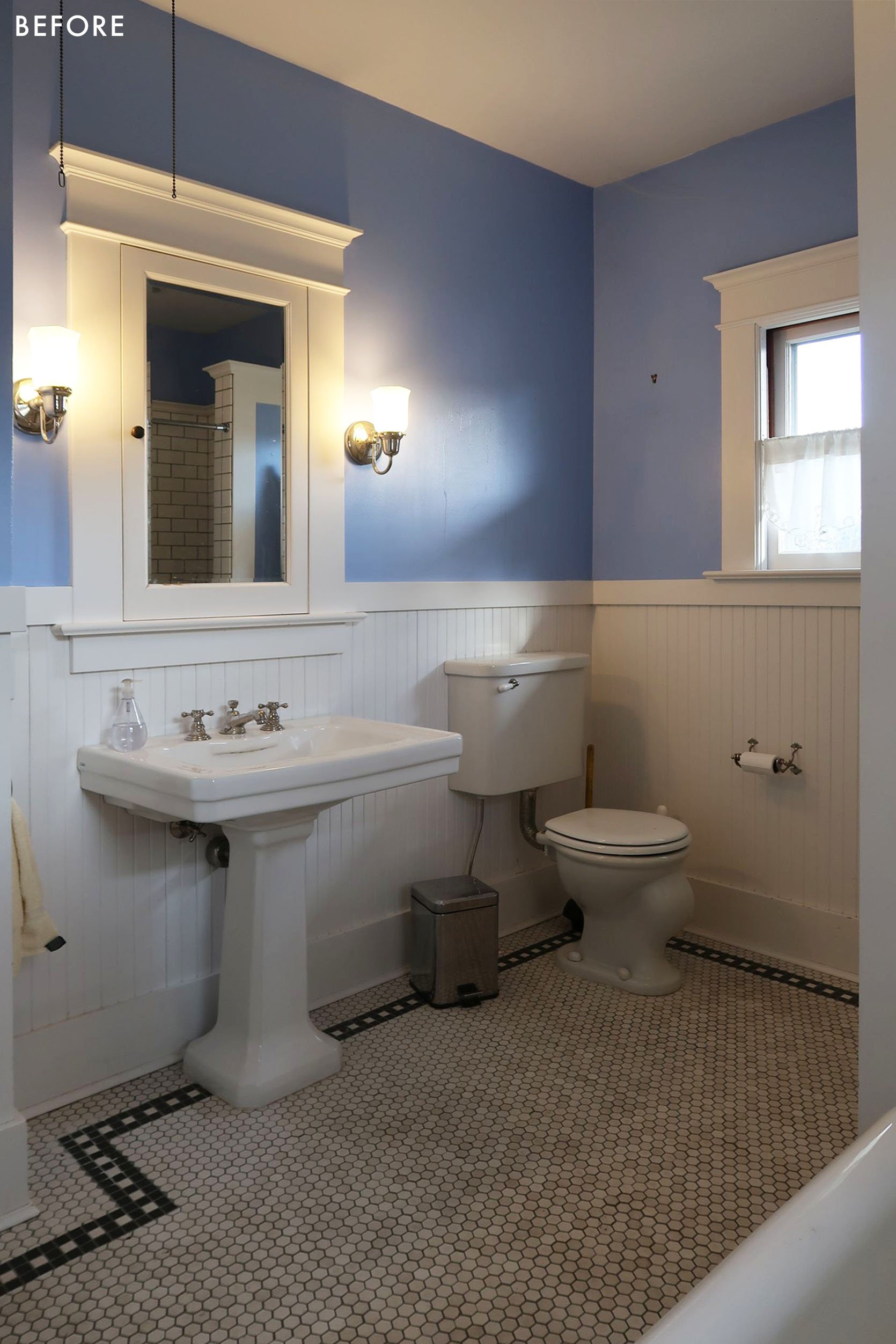
I want to say kudos to the former homeowners who remodeled this in the 90s – besides the paint color and maybe the light fixtures, this bathroom is totally timeless and classic.
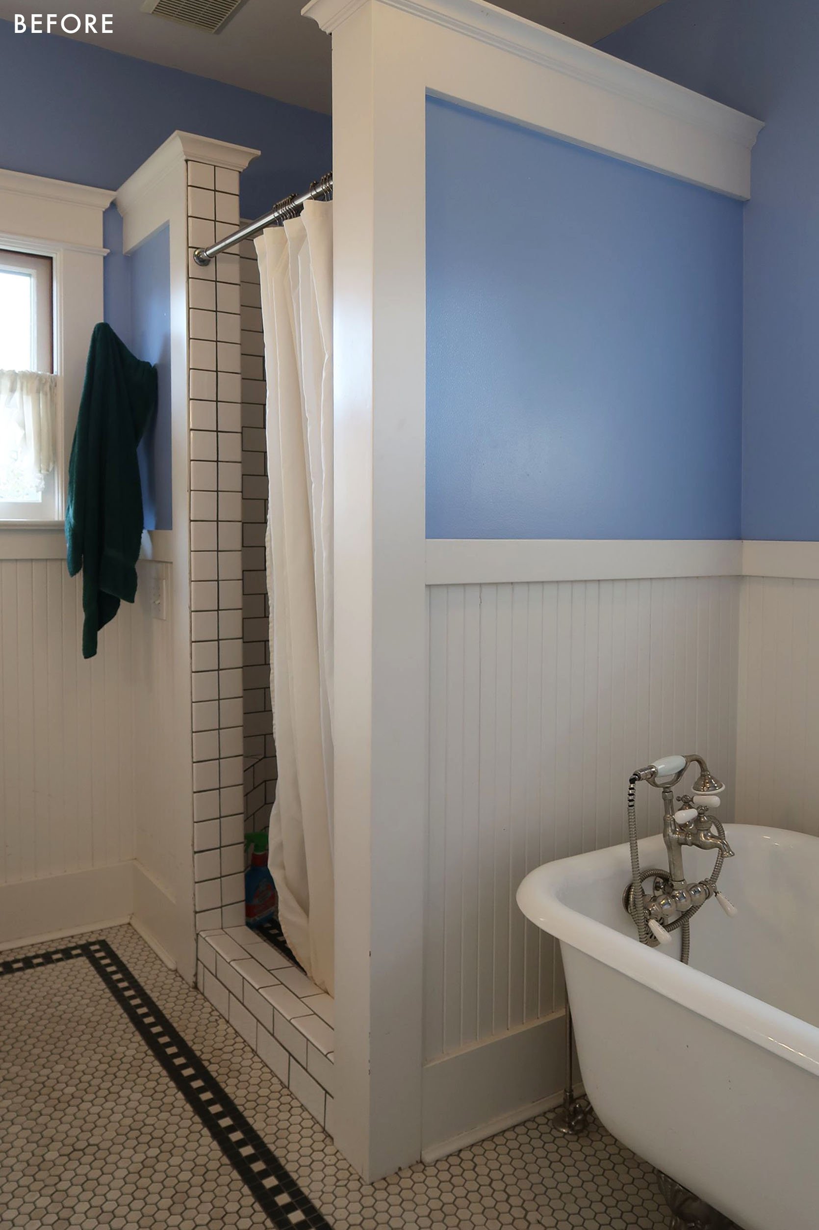
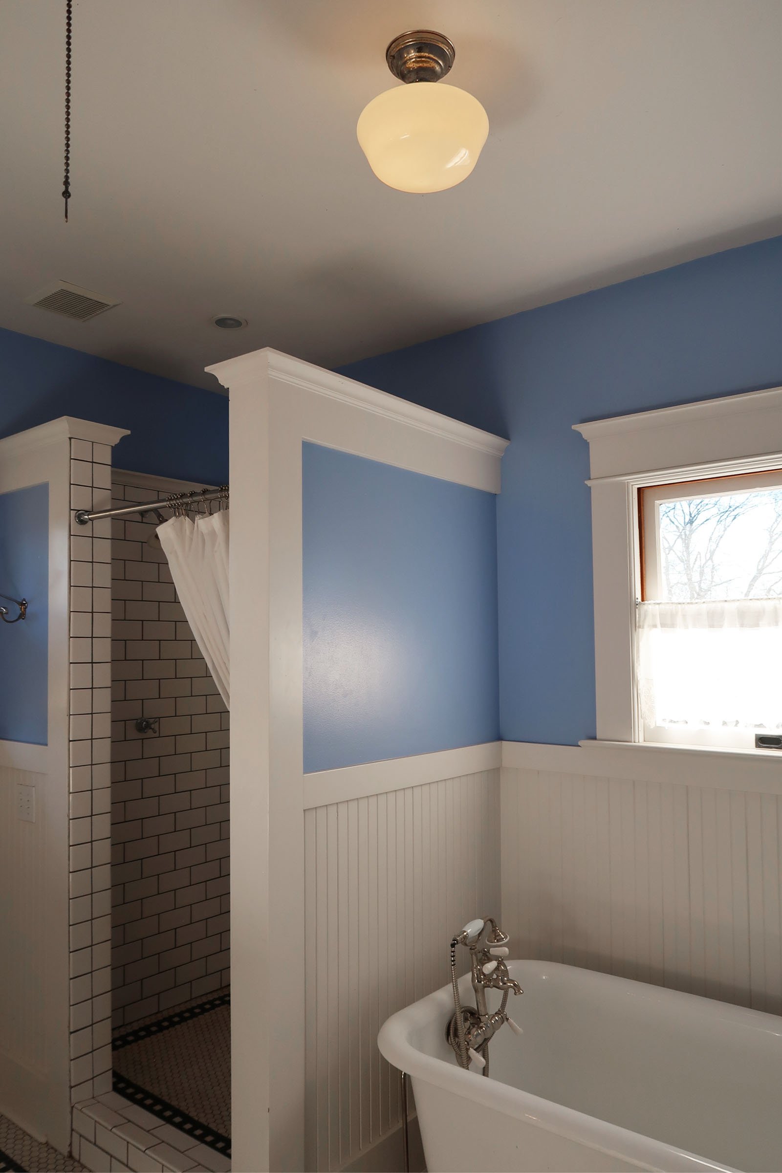
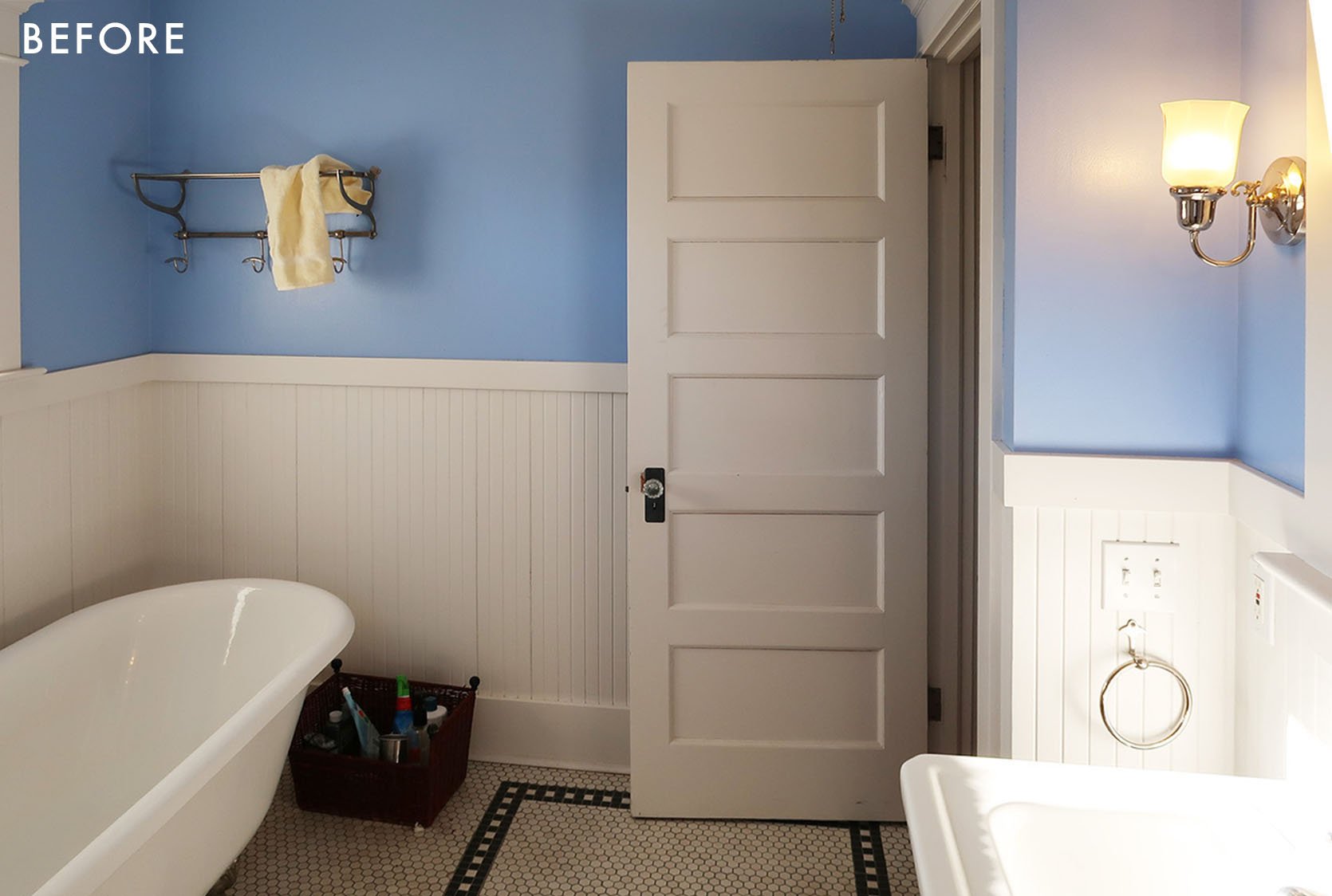
We kept that train rack which I JUST found in the garage and have the perfect place for it. Everything else was donated to the Rebuilding Center and sold quickly.
So we set out to redesign it in an updated way that felt more “me” with a Scandi-farmhouse bent. Here were the renders that ARCIFORM did based on my design. Stephyn and Anne were so incredible at helping us see the vision with these renders (they use Chief Architect which is so much faster and more intuitive than others and can do 3D, plan view, and elevations at the same time – when you make a change it changes it across the board).
Tomorrow I’m going deep into the tile choice and why we did what we did, how we chose this design and any lessons learned for all of you design enthusiasts (hi! me!).
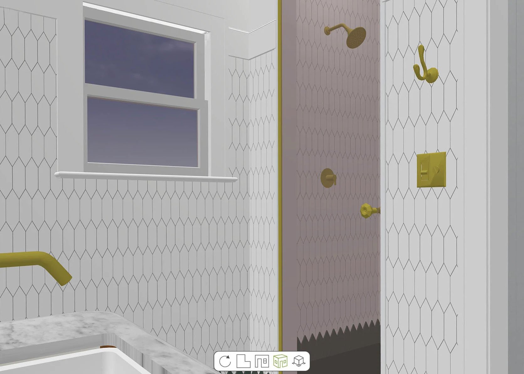
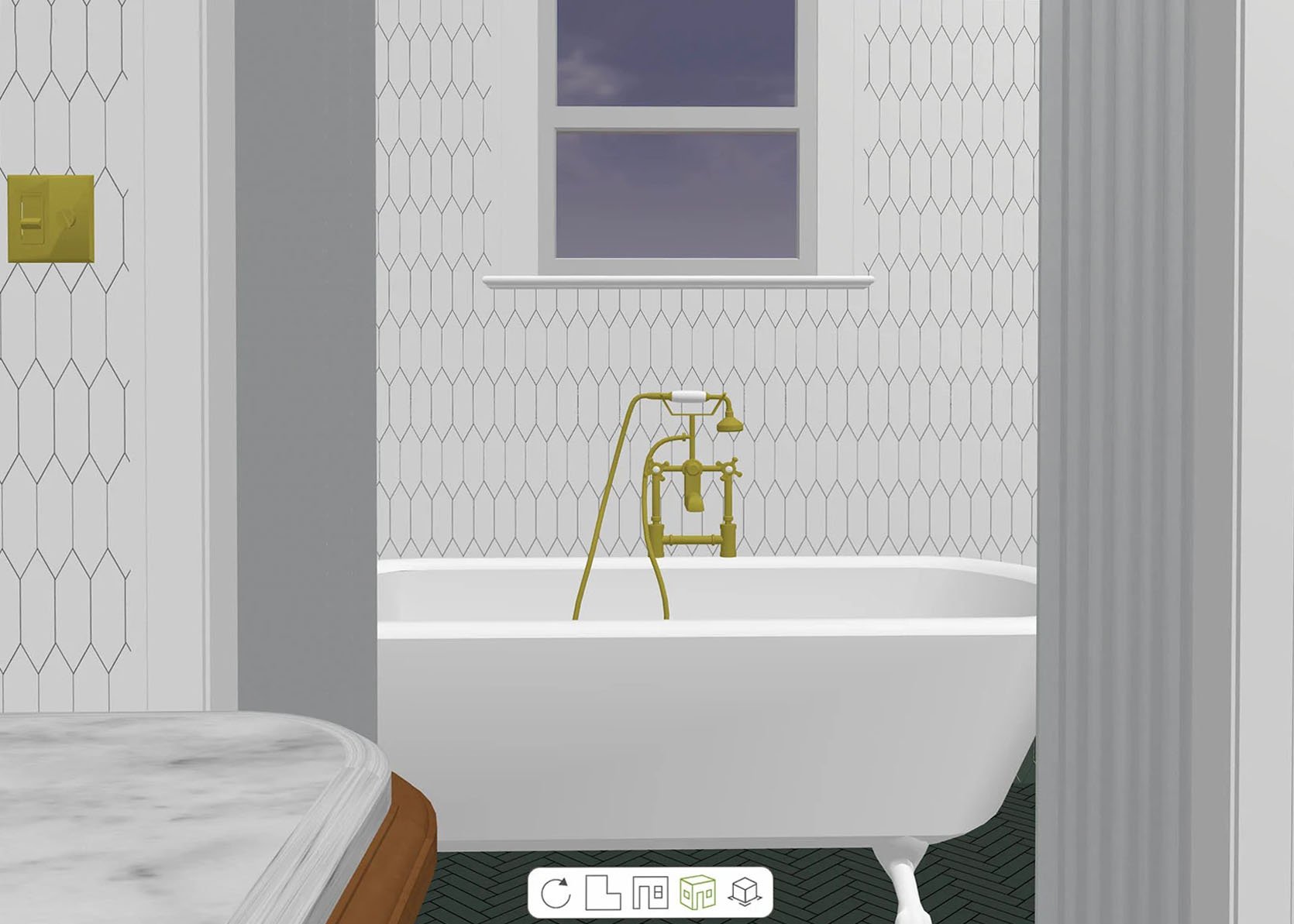
But you don’t go from renderings to all done without some hard work. When you have to redo the plumbing and electrical it’s really your chance to fix all the things inside the walls and make it a solid new house again (spoiler – this is also where your budget will explode, so if you don’t need to open up the walls, simply DON’T).
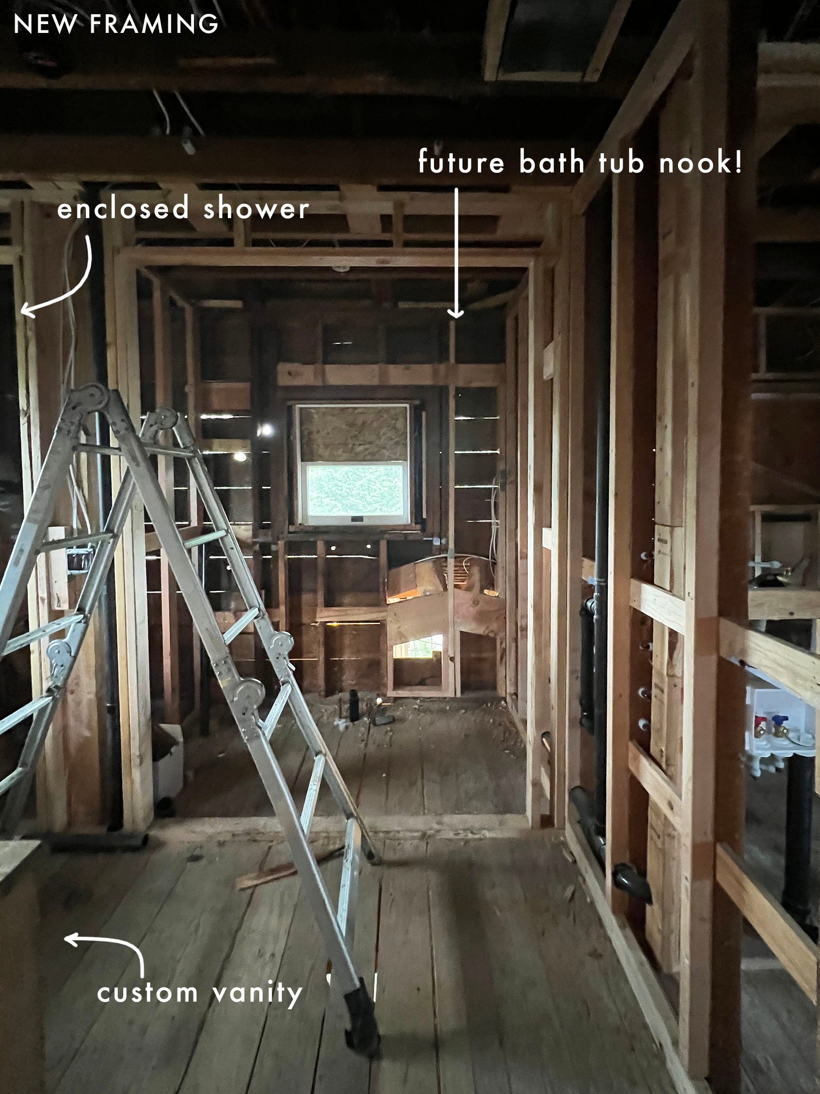
ARCIFORM did all the stuff that I honestly don’t even know about – Jamie (our project manager) becomes more of a national treasure every time I see old photos like this. SO MUCH HAPPENS without you even knowing it. Reinforcing stuff, adding insulation, a billion things to problem solve (our new pantry is right below so a lot of engineering need to happen). Everything. Is. A. Thing. (that might need to be a new EHD drinking game phrase along with “simple but special”). The point is, you can (almost) never make a big decision without it creating a domino effect (and sometimes those dominos are BIG!). I feel incredibly grateful that our house is basically brand new from the inside out now because ARCIFORM did such a high-quality job – no shortcuts – renovation.
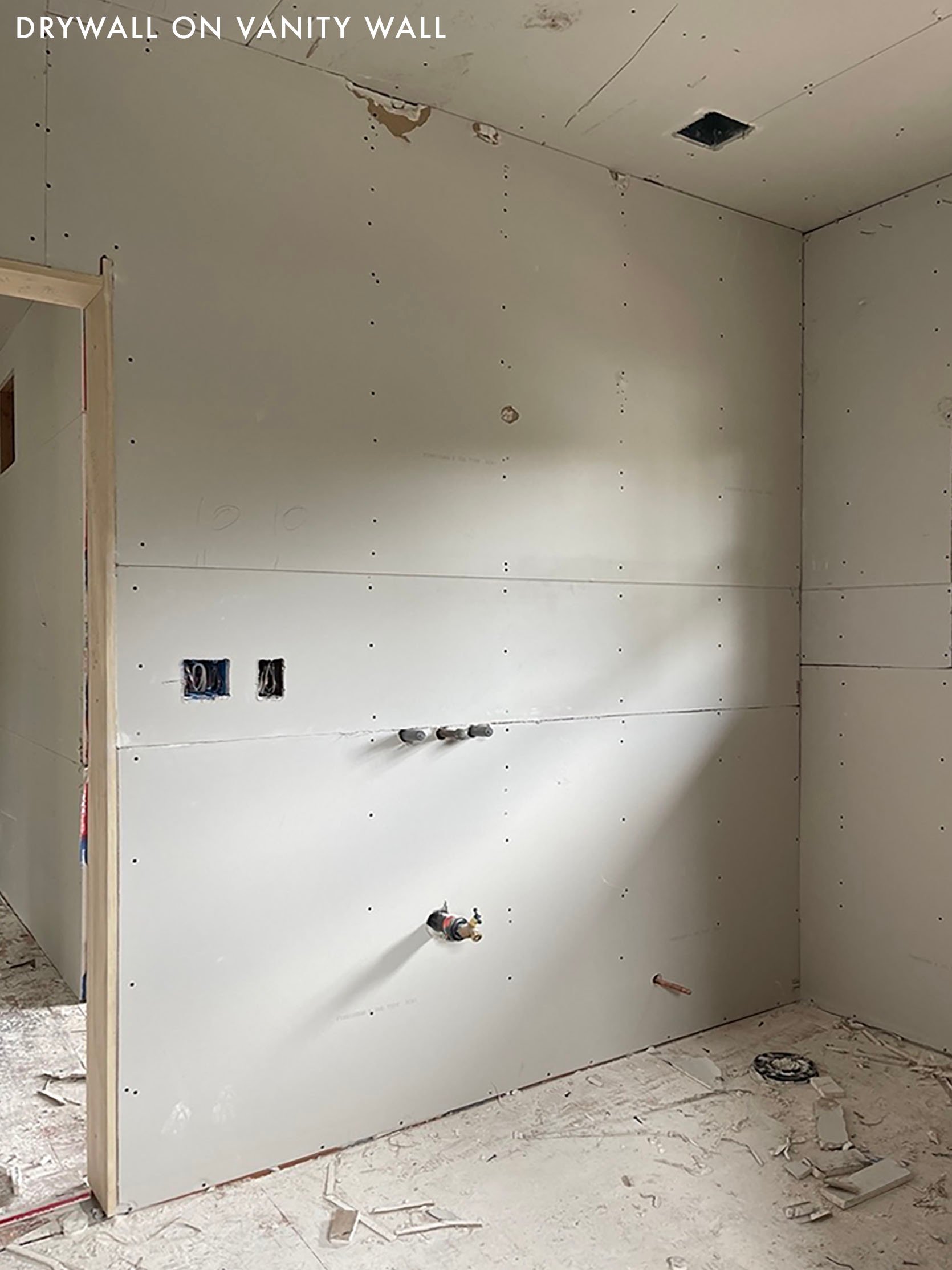
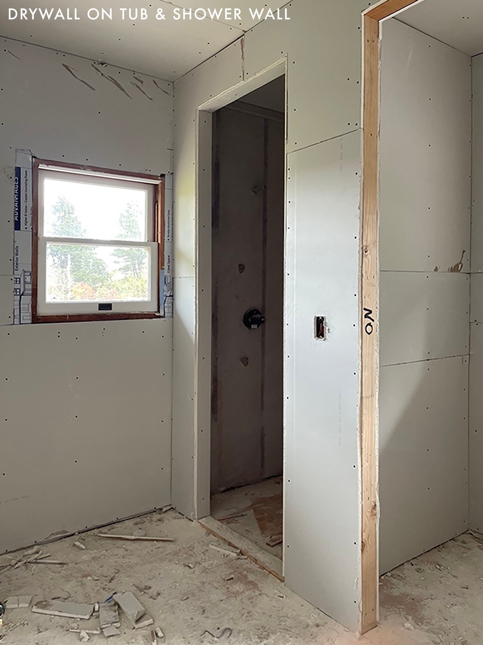
When you aren’t making major changes it seems so funny to go from walls to no walls back to walls as if seven subcontractors weren’t involved. But it’s freshly done and going to last FOREVER.
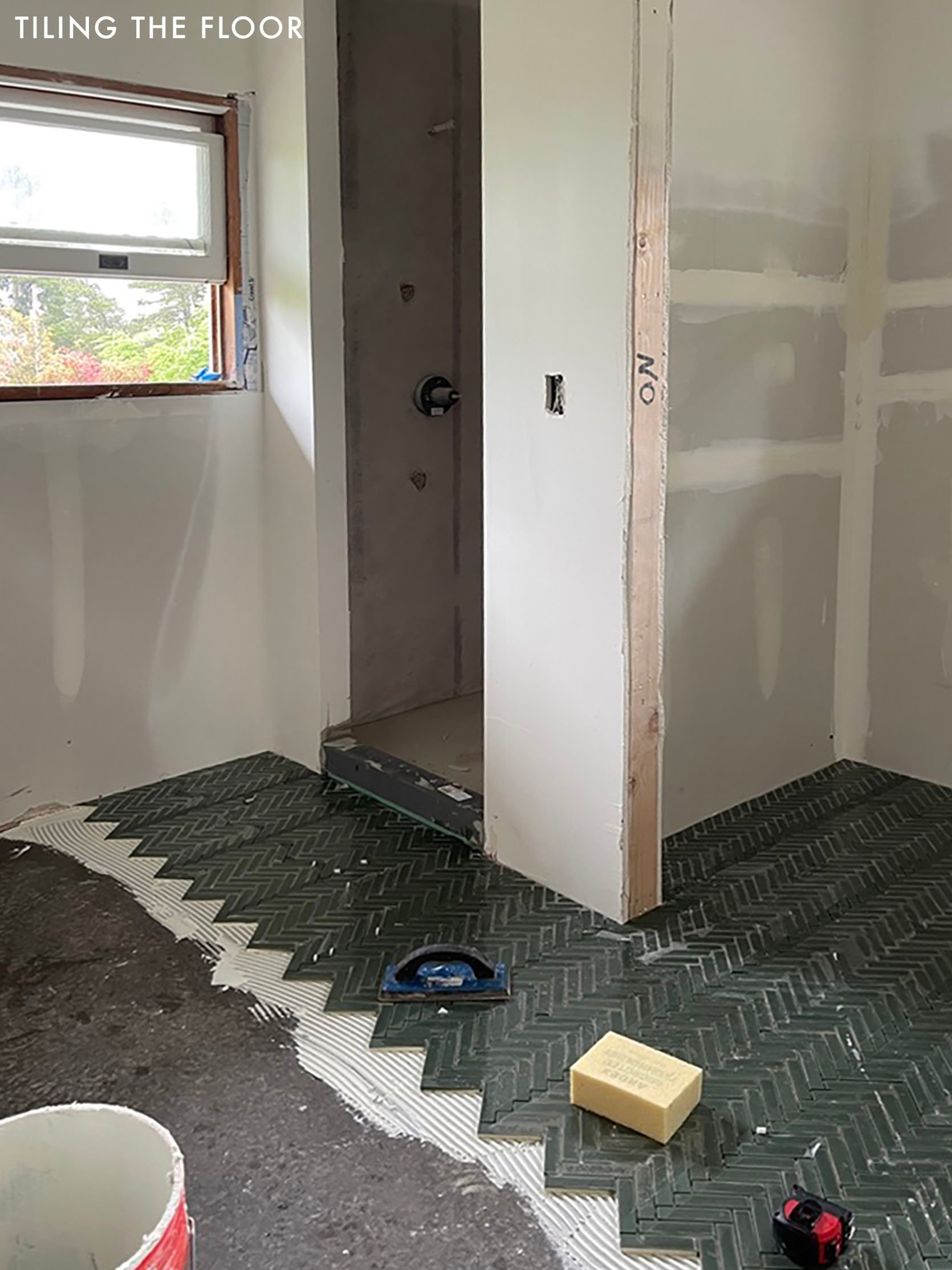
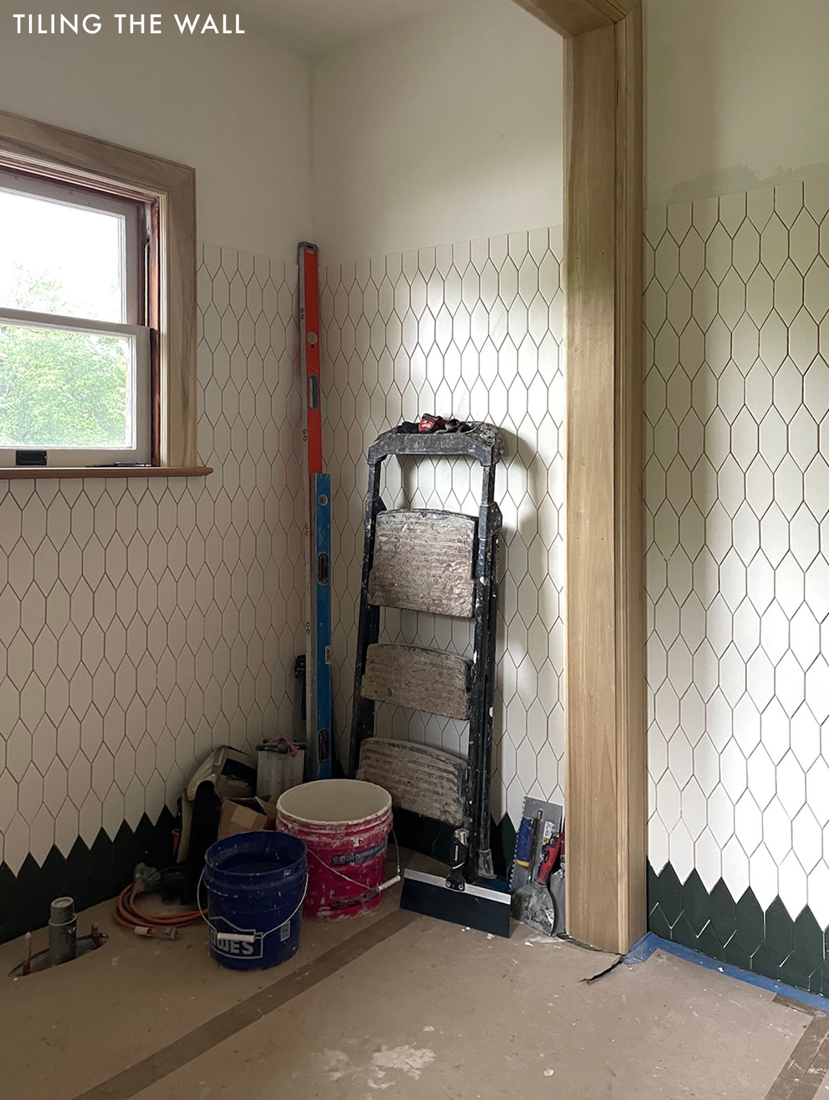
Plumbing (rough-in), electrical (J-boxes), then drywall went up (you can say “hang rock” if you want to speak contractor language, although I doubt they’d appreciate it if you are a lady which is just so cool…). Then tile, trim, and paint. SO EASY. 🙂
Tile Install Progress
Then… My Paint Fail
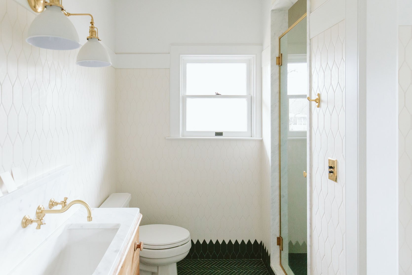
So last August we moved in, and the bathroom looked like this. It’s pretty incredible EXCEPT for my dumb paint color choice. I wrote about it more here, but essentially, while the tile was covered with plastic I made a blanket paint color choice for the whole house, which has worked well in some rooms, but not so much in others. The white I chose was too white and once the plastic was off the tile, I was super bummed/nauseous to see that the once white tile now looked very, very beige and it was all my fault. And y’all, I can handle ivory, cream, and taupe but this new beige-looking tile was a real problem for me (it was even worse in person, trust me).
I was SO MAD at myself and of course, had to tell anyone who stepped foot into this bathroom how much I had effed it up. It felt like such a rookie mistake. Fixable, sure, but again (sorry for being a broken record but there are always new faces here), we had JUST paid tens of thousands of dollars and it took three weeks to paint the entire house. So to have to pay to repaint and disrupt my family again because I didn’t obsess enough about the white color just felt so dumb. Plus my confidence was in question and so much self-doubt had seeped in that I didn’t even feel like I could make the right white choice on my own. Turns out decision and renovation exhaustion can affect your judgment, PLEASE BEWARE.
But we kept moving along even while I was awaiting the right paint color to magically reveal itself in my brain.
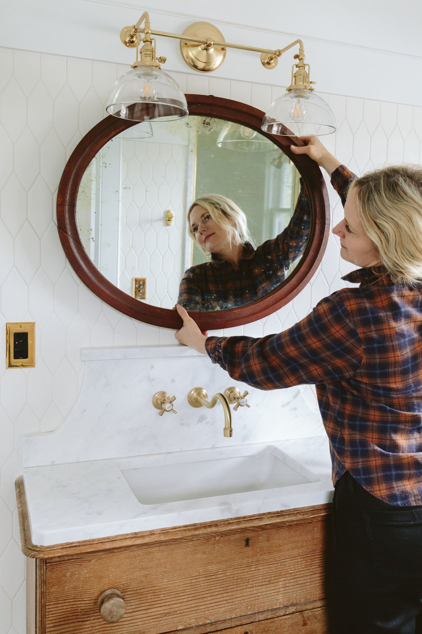
We went round and round (ha) about mirrors. Playing with a lot of vintage ones (none of which were chosen) because drilling into tile isn’t for the faint of heart.
Ultimately everything came together and y’all, this bathroom is FUN. What you’ll see this week is all things tile choice/design, how we retrofitted this dresser into a vanity, designed a new antique vintage light over the bath, and styled it out with a bold patterned fabric bathtub niche curtain. Adding color and pattern on a quiet foundation is my favorite game to play. I hope you think we won 🙂
And good news! The bathroom got repainted with a white that matched the tile, and…THE TILE LOOKS WHITE AGAIN. You might think you know what this bathroom looks like but styling goes a long way so please come back and watch it come ALIVE.
*The Pretty Photos by Kaitlin Green
THIS POST WAS ORIGINALLY PUBLISHED HERE.


