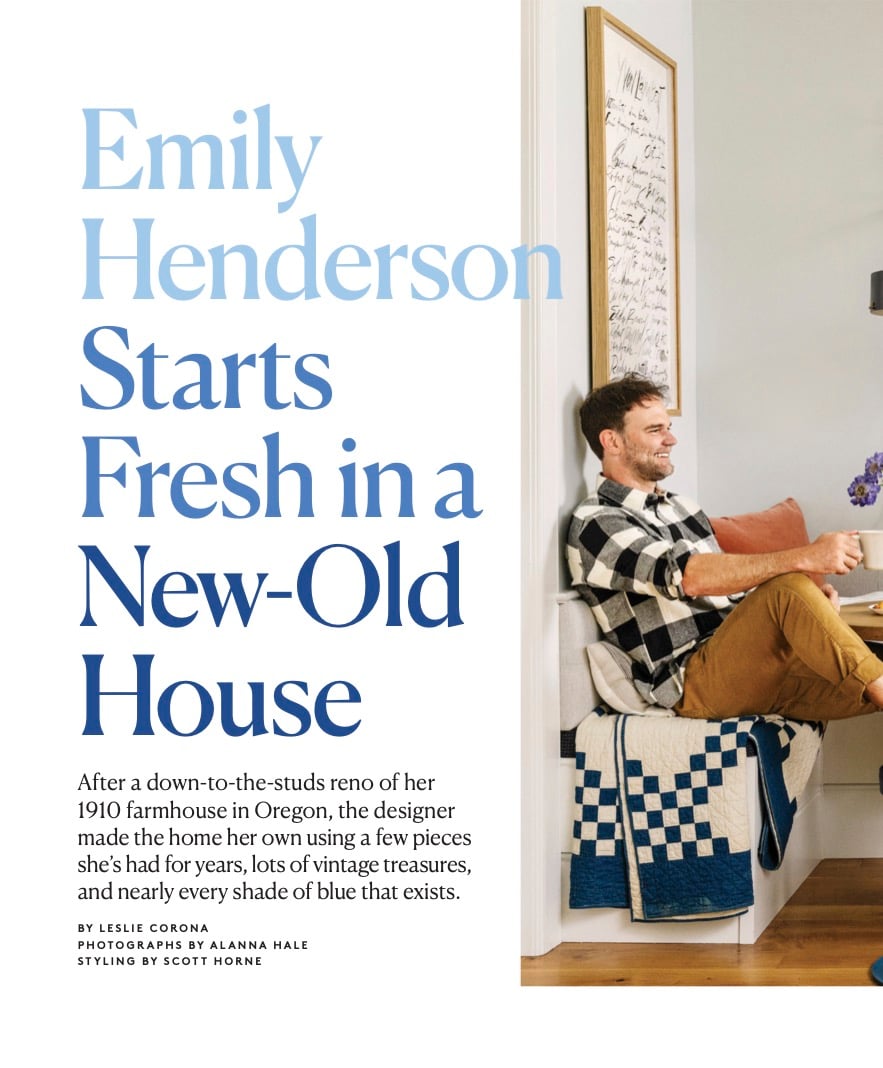
Three years ago I pitched the farmhouse to Real Simple, which frankly isn’t normal. I had nothing to show them – just a promise that I’d make it really pretty and a good past relationship. They shot and featured our house in LA and this house. Both were (and are) so family oriented yet still elevated so it felt like a good fit. As you all know, we moved home to Oregon to raise our kids in a slower environment (which might have been doable in LA, too, but this felt more natural to us) and to indeed simplify our lives. While there is nothing simple about a renovation of any size, let alone on this scale (gut, additions, three years of work), the intent of the move has in fact lined up with the result – life has gotten simpler. Maybe it’s leaving a huge city, maybe it’s not having toddlers anymore, maybe it’s being middle-aged, but it just feels really good up here. While the house was done and livable months before this feature, I tried to take my time designing the interiors and enjoy as much of the process as possible, and they were SO gracious to allow me that time. Originally, I pitched it for a September 2022 publication date, LOL, but I think we all know that we didn’t make that self-imposed deadline. So three years after first falling in love with this property and the potential of this life, we are featured in one of my favorite magazines – Real Simple.


A huge thanks to Leslie Corona, the editor who I worked with on this story who was so wonderful, patient, and lovely. This feature was shot by Alana Hale, who I’ve worked with before and just LOVE her photos. She did an incredible job of shooting and lighting our home (it’s very fun to see how different people capture the same space). I asked that my friend Scott Horne to style it, which means he’s the one bringing the flowers and food, and behind the laptop screen making sure that there isn’t a branch coming out of the back of my head or a tag showing. I had the house almost 100% styled but someone has to style it for the shoot and I’ve found over the years that if I try to be on camera, host everyone at my house, AND do the hard schlepping that stylists do…it’s a recipe for a mental breakdown. My team up here – Gretchen and Emily M. helped me have every room dialed in, but there are still changes and certain angles you don’t know what how they will ready on camera. Things always need to get moved:)

There was so much to shoot and I knew that I wasn’t going to have every room ready (nor would we be able to shoot every room). So about four months out they picked the rooms (based on our photos) that they wanted to feature, on what I thought was for sure was going to be done as well as what they thought would resonate with their audience. You can’t possibly shoot a whole house for a feature as it’s usually only eight pages. For this one, since we had really good scouting shots of every angle of every room, we were able to send them a deck two weeks in advance and they told us what their favorites were (with some flexibility, of course).

Then myself and my team made sure I had a lot of options for those rooms – pillows, vases, soap dispensers, trays, etc – all the usual suspects. I definitely had some new pieces that I wanted to show off so I made sure they got into the shots and could have their moment!
We wanted to keep a few rooms exclusive to this feature so y’all would go pick it up:) So in this issue you’ll find a shot of our family room, bedroom, and bathroom – all of which will be fully shot and revealed on the blog soon. Until then, please go snag it and support print magazines if you are into them (I am, very). And thank you so much to Real Simple for featuring our home and being so wonderful.
Photos by Kaitlin Green unless otherwise noted
THIS POST WAS ORIGINALLY PUBLISHED HERE.


