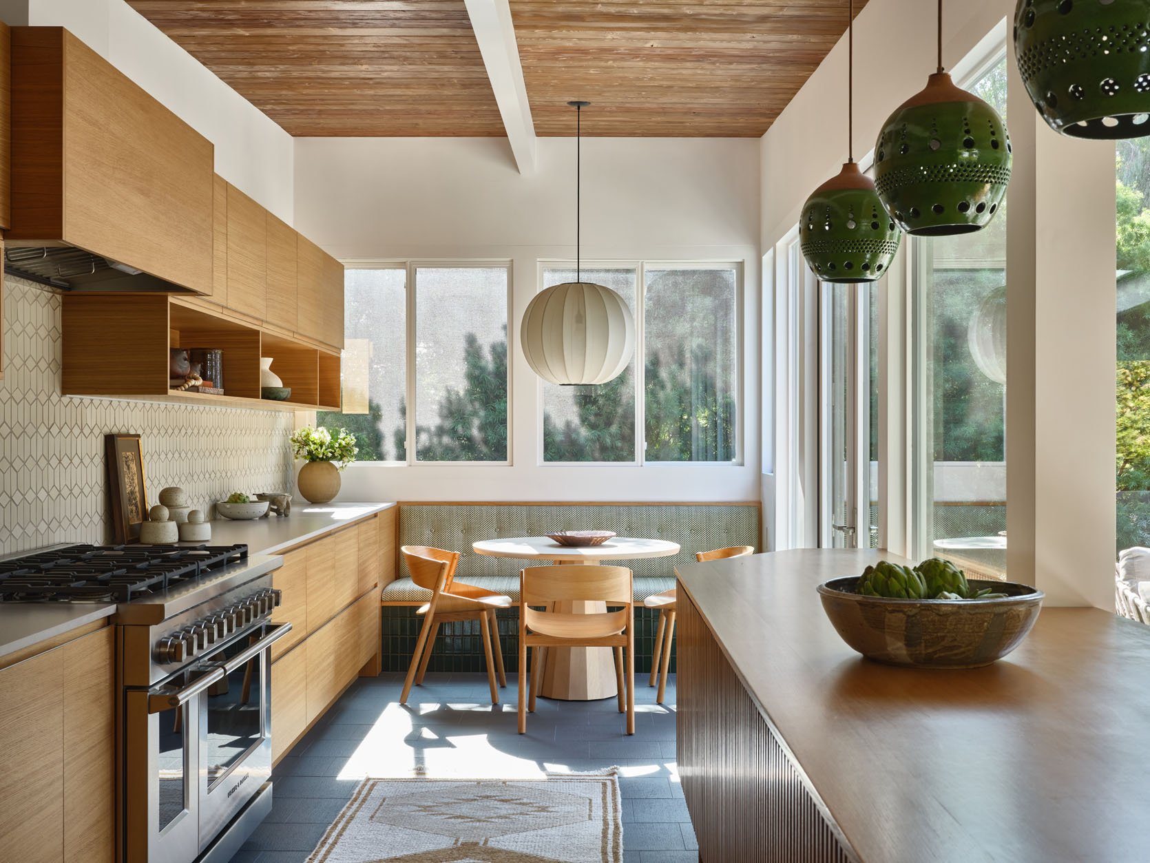
It’s pretty exciting to get not only one but TWO incredible reveals from EHD favorite, Kirsten Blazek. The woman just can’t miss in our eyes. So in case you missed this moody office/bathroom trust me and go look at it now. If you’ve already had the pleasure of pouring over those photos then you know this kitchen both lives in the same style world (MCM, organic, modern) but is the lighter brighter version. Ready to get into the details? Let’s start with maybe our favorite:

Do you see those green tiles under the custom banquette?? What a simple yet impactful detail that I feel could be relatively DIYable if you or someone you know is a little handy.
Also what a stunning shot. Kirsten created a truly airy yet richly textured space. But then again that’s kinda what she does best.


Those tiles add dimension so that your eye has a little break from all of the wood in the space and they also bounce the light around. I love that she chose a green patterned fabric (peep those mini buttons!). Cohesive but not even a little boring:)

Now let’s talk about the lighting choices. Typically we recommend switching up light fixture shapes if you have more than one area that requires lighting in one space. But since there are only these two spots, I LOVE how she chose different pendants in the same shape but in two different materials and sizes – both in an MCM style. So beautiful and a great contrast to all of the straight lines.

Speaking of straight lines, we need to talk about this island immediately.


First off, modern slat detailing is something I have loved for a long time…when it’s done right, and this is absolutely done right. And the way that this island wraps around that corner post creating more counter space makes it look so intentional and like it’s always been there.

But what really feels special is that it’s footed like a piece of moveable furniture. Now this isn’t a new idea and is very popular with the more traditional modern style, farmhouse vibe (like Emily’s vintage island), and especially the eclectic English style. But when it comes to more modern spaces, like this one, it’s less common and that should clearly change! Look at how amazing this looks and makes the whole space feel lighter.
And in a very “tell me you’re in you’re in your 30s without telling me you’re in your 30s “…the ease at which you could vacuum under that island does things to me. Unprompted, my cousin had the same reaction:)

Oh, another stunning view! This side really highlights not only the really pretty mix of old and new wood between the ceiling and the cabinetry/island but also the mix of wood grain orientation. The grain on the cabinets is going horizontal while the slats on the island are vertical. That’s what I call “secret visual interest”. It’s also why you hire a designer:)
Oh, and notice the dark floor tiles. I love how the ceiling wood and the floors are darker and anchor the space, letting the rest of the lighter elements really shine.

Let’s now talk about this backsplash tile. Kirsten has used this style of tile before in this incredible renovation and I can see why she wanted to use it again. It’s a stunning ceramic tile with a lot of visual dimension in an MCM pattern. But since it’s in a more neutral color, it doesn’t feel overwhelming. Also, the thinner countertop is so sleek and that midtone color goes beautifully with the backsplash tile.


Lastly, let’s chat about those display boxes. First of all, I love them. The homeowner might use them for actual dishware or glassware but there seems to be a good amount of storage between the lowers and island (I assume the wall of cabinets is the fridge/freezer and pantry storage). I think having at least half of them be used for pretty decor creates some visual versatility. Also, I love that the decor is on those lower boxes versus on top of the cabinets. While the “above the cabinet” space, and how to address it is controversial, I love that it’s left unstyled intentionally. There is so much light with all of those windows that leaving negative space helps make everything feel light and airy.
Thank you, Kirsten, for sharing another space with us, GO BUY her wonderful new book, A 1000 X Better: A Rebel by Design, and if any of you decide to tile the base for your banquette, let us know!
Love you, mean it.
*Design by A 1000x Better
**Photos by Michael P.H. Clifford
THIS POST WAS ORIGINALLY PUBLISHED HERE.


