This blog post has a very happy ending – which is a very good thing as I was the one who kinda forced my best friend to invest in painting (which wasn’t cheap) and I got a lot of pushback from readers (which I don’t mind, but at times doesn’t help with the self-doubt). Well, I have news for the doubters – I’ve never felt so good about a paint color decision in my life, which could be an exaggeration or untrue as I’ve had a lot of great paint decisions, but I’m telling you when we walked in after it was painted, both Gretchen and I sucked in our breath and said: “it’s perfect, just perfect”. I think the pressure to get it perfect felt higher than usual because it wasn’t my house – this was my best friend’s living room and they had just moved in and the white was fine! It just felt boring to me, but painting it needed to be professionally done and cost $3k – aka they weren’t going to “just repaint” if we got it wrong. Also, choosing a darker color is harder and riskier, often with undertones you don’t pick up til it’s a larger portion of a room (not just a little swatch). So PHEW, here we go.
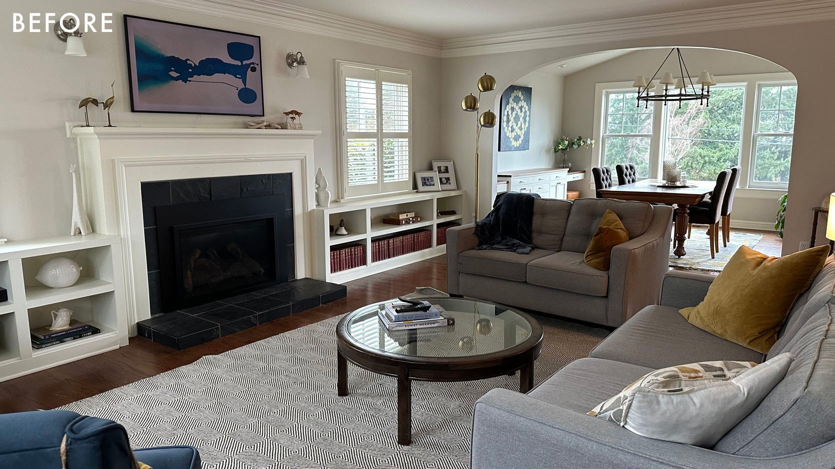

They had just moved in in these photos and brought their furniture from their old house in here – mostly starter pieces which didn’t help the blandness of the neutral color palette. This room needed a design direction (which we came up with – PNW Library Lodge), but with that came the need for color and pattern. While we debated painting the walls instead of the shelves and fireplace, I pushed hard for these as I knew that they would anchor the wall, pull you into the room as well as minimize the black firebox. Additionally, the rest of that floor, including the kitchen, has this neutral airy feeling and we didn’t want all of a sudden these two rooms to be dark and make the whole house feel off balance. I didn’t mind the dining room being dark and cozy, but the living room (also their TV room) needed to walk that line – cozy, but not dark.

The built-ins continued through the dining room with this sideboard and flanking desks. We decided not to paint any of the window moldings or trim work, hoping to make them work. For now, we’d start with the built-ins and once we started to get quotes, the sticker shock helped solidify that decision. The first quote for painting just the shelves, fireplace, and dining built-in was $4,500. The second was $3,200 – which is who they went with and still felt high, TBH. But they had to tape off the whole room, sand, prime, spray, sand, spray, sand, spray, fill hardware holes, touch up, etc. My advice was that it was still high, but honestly, we didn’t want to hire someone who didn’t know what they were doing so they bit the bullet.
How We Chose The Color
We knew that we wanted really dark but we didn’t know if it would be in the blue or green realm. We also didn’t want it to be so dark that it would read as black, nor so saturated that if the sun hit it it would look teal. It needed to have undertones that worked with the rugs, the wallpaper, and the overall color story.


We debated a lot, per usual, but felt about as confident as you can choosing Mount Etna from Sherwin-Williams. It was dark, but when the light hit it it had so much blue and green in it. It was powerful, but still a color, and not a super bright saturated color – just a moody tone. Again, I can’t say that it will look good anywhere and everywhere you put it – this room is a medium light, no direct light room that can handle this darker tone so well (but if your room gets a ton of direct natural light it could read like a really saturated dark teal). But I was so afraid that you’d walk in and it would just read as almost black, which felt too intense for them and just not what we were going for.


We looked at it with both the rug and the wallpaper, even reading as different tones in those different lights. It was a bit of a gamble, but like I said I felt about as confident about it as you possibly can. You truly don’t know what a bold paint color is going to do for a larger area when you are choosing it from a sticker or a paint deck. A good rule of thumb is that whatever it is, it’s just “more” the bigger it gets. ie. you see more of the color, it has more of an impact and this is the mistake I HAVE made a few times (my bedroom is a good example – I love the color, but with the direct sunlight it’s just a lot and the saturated colors come out and play in a really bold way – which was not my intent).
Painted Before Styling!!

There she is!!! We chose a satin finish, BTW, which is typical for durability without a ton of shine. Oh, it’s so happy but not bold. A color, for sure, but not crazy saturated – still subtle enough to work in our color palette.

The dining room is RIDICULOUS. I’m so excited to show you the reveal but for now, you can see how Mount Etna reads far bluer than black, which we are so glad about (but not so blue that it looks “BRIGHT”). It’s absolutely perfect.
Color Palette

Ok, here is our color palette to give you a better idea of the direction (which honestly I’m jealous of). So many warm tones, mixed with the ever-popular blues and greens. Again, I’m so excited to show you the reveal! Stay tuned. xx
*Photos by Kaitlin Green
THIS POST WAS ORIGINALLY PUBLISHED HERE.