There’s been a little secret trend that’s been popping up more and more on my feeds and I am so in love with it. It’s not a brand-new concept (little is these days) but designers are really running with it in some extremely cool applications. What am I talking about? Well, I’m talking about tall vertical wall niches. This is a really simple but beautiful way to add storage that doesn’t take up square footage as well as adds an intentional design moment into your space. The only downside is that you likely need to own your home because a little demo is usually required. But, if you are already renovating, I hope this post can give you a decent dose of inspiration. Let’s start with a personal favorite…
This dreamy Massachutes home was designed by Mother Studio and Maryann Thompson Architects. The warm natural wood and hits of pattern are pretty perfect (oh, wouldn’t a Noguchi pendant look incredible in here?? :)) But what captures my eye the most is the marble niche. It’s such a cool contrast to the other materials in the space but isn’t so visually overpowering that it distracts from everything else. It also visually balances the darker tones of the bedding. However, practically, it’s perfect for a little storage. The designers said that these bedrooms were made intentionally on the smaller side to create a coziness. Plus, since most everyone spends their time in the communal main spaces, there was no need to use extra square footage for the bedrooms. So a cute little niche is a great use of space for books, objects, and any other little display items.
I am such a Sophie Rowell fan and this room is another testament as to why. Go check out the whole room here, but for today’s purposes, we will be talking about this incredibly sweet niche! Now in terms of style, I love the choice of painting it yellow (and the perfect one at that). It’s not too bright, not too mustard, just a happy but medium-toned yellow that can work really well with other colors. That way if they decide to change the bedding, it’s still going to look awesome. What I also love about this one, in particular, is the cork chequerboard shelf that can fold in as well as the enclosed cupboard under it. A perfect way to have a little closed storage while having other spaces to show off decor. It’s a design statement with purpose.
Ok, this is the only example where “the niche” isn’t carved into the wall, but it almost feels like it and it’s so cool. I really love that the homeowner and founder of Vinterior, Sandrine Zhang Ferron, went basically floor-to-ceiling and narrow. And while I’m going to show a handful of wider niche examples, I think the narrow vertical is what we can expect more of. Also, this is a great example for handy renters! No stress if you can’t cut into a wall, just DIY a whole wall unit:) It could be this awesome if you are up for it.
See how cool yet elegant this looks?? As something who has yet to renovate a home (SOMEDAY!!) I don’t know how much something like this would cost to add to a space but I really think it’s worth looking into. And what’s even more practical about this style is that unlike the niche with the marble, you don’t need to purchase any other expensive materials (at least that’s what it looks like). And think, if you don’t want to take up space with a credenza or even shelves, this is the perfect solution to still be able to show off your beautiful things!
The HommeBoys are always leading the design charge, so seeing them apply a very similar feature in their space makes me feel very confident about this call.
Here’s where things get wider but also are making a bigger statement. This wood-framed niche is so beautiful. It’s not only a perfect place to display their vessels and objects but clearly OSKLO, the design firm, knew it would add an important amount of warmth and texture. Imagine that wall was simply white. Would the home be beautiful? Of course. But is it so much more inviting with that light warm wood feature? Absolutely.
Now while wood is beautiful it’s also not cheap. But you know what is much more affordable and can be just as impactful? Paint. I love love this bold pop of blue in this wall niche. It looks so fresh, adds balance to the neighboring room with its lack of intentional clutter, and is just cool. For those of you living in homes with niches already there, maybe a little weekend paint job could transform the room it’s in…just saying:)
I think kitchens and bathrooms are where we are used to seeing a tall vertical niche so I wanted to show some examples I really love. Take this one above. It perfectly pops off the white walls visually, is a perfect contrast to all the closed storage, and gives the homeowner a place to show off some decor.
Shapeless Studio to me can do no wrong. The color of this bathroom is so warm and beautiful, the marble is UNREAL (I really love a marble trim), and that little wall niche is placed in a slightly unconventional spot and I couldn’t love it more! I think bathrooms especially are improved by having a feature like this since they tend to be small spaces with a lot of little things you need on hand. What I would give to call this bathroom mine:)
So what are your thoughts? If you were remodeling would you want to add something like this into your home? Did you and do you love it? Let’s chat!
Love you, mean it.
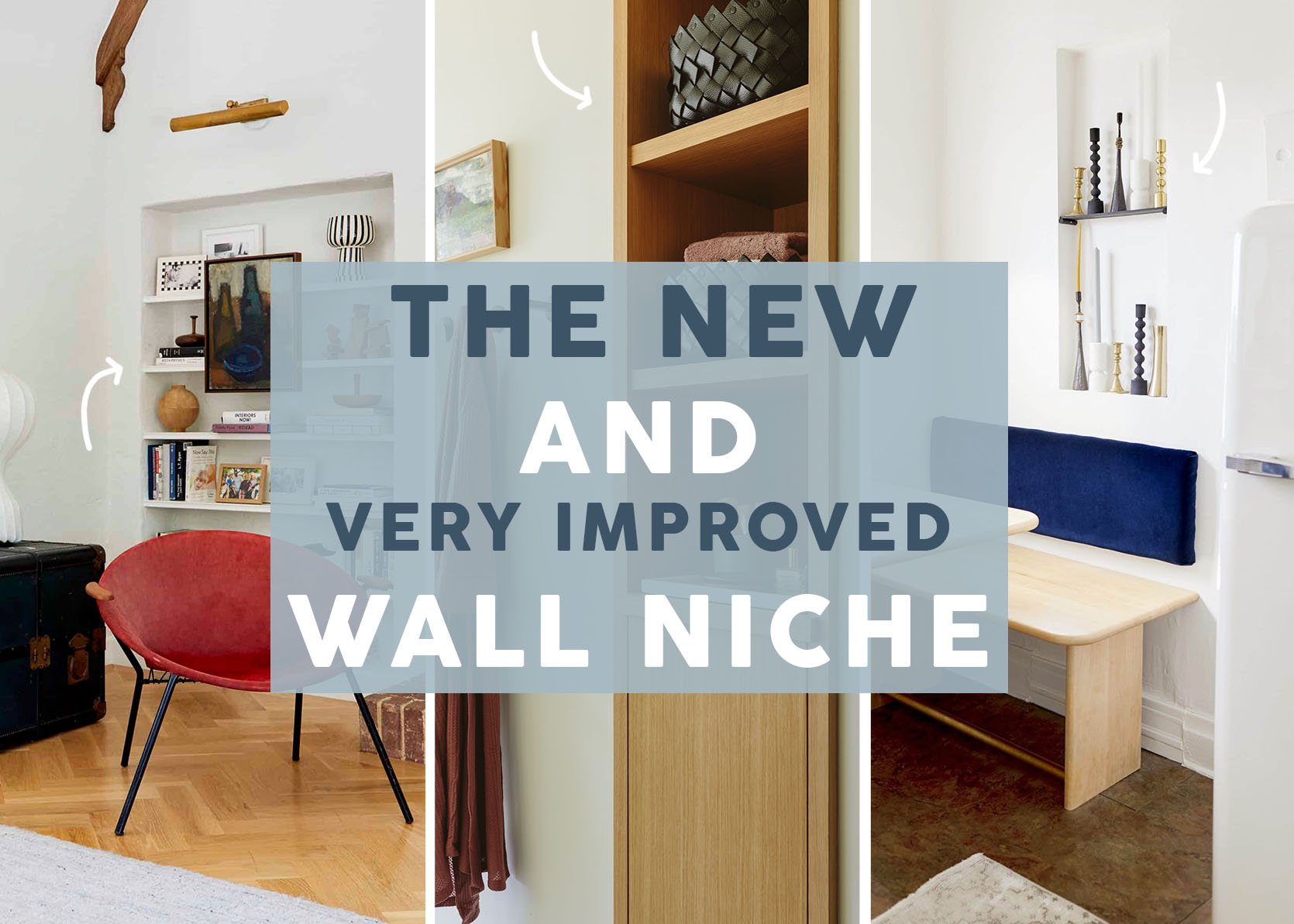
Opening Image Credits: Left – Photo by Sara Ligorria-Tramp, From: Final LA Living Room Reveal | Middle – Photo by Kaitlin Green, From: River House Primary Bathroom | Right – Photo by Sara Ligorria-Tramp, From: Jess’ Kitchen MOTO Reveal
THIS POST WAS ORIGINALLY PUBLISHED HERE.