Over a year ago I threatened to put up cafe curtains in the kitchen. We have a lot of glass windows and in “the great long dark” (i.e. November to March) it just looks like black reflection and doesn’t feel very cozy. But then other priorities got in the way, spring came and I forgot again until this November. So January seemed like the perfect time to tackle it and this time I’d DIY it to save some dough (felt simple enough).
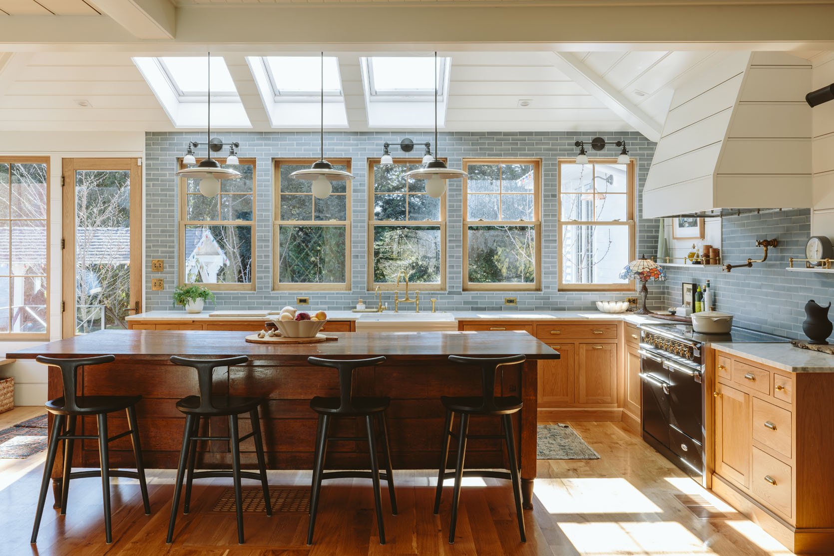
This is how our kitchen looks on days when it’s clean, without a lot of styling, so you can get a sense of how it feels. It’s always bright and sunny and during the day you don’t really think about cafe curtains until about 4:30 and then you want them badly. Also, ignore our dirty windows – we didn’t hire someone this winter, but will in the spring – they are FILTHY.
As a reminder, this is the rest of the living room (with some slight changes).


The Block Print

This is how it went down – I chose this block print linen, in a bright white with a green and gray pattern on it. I really liked how it looked and spent hours and hours making the panels. I have a tutorial coming soon (they are no-sew). They look pretty great in this shot.

But here’s the deal, when I started putting them up that night, they looked so bright and high contrast and just BUSY. Now this could be because the kitchen was also messy post-dinner, but I did NOT like the vibe (and Brian and the kids agreed). Just too much.

Nothing is wrong with these and again in the bright sun I think they are so happy! But it’s like all I could see after the sun went down, against the darkness outside. Sure, if it were a softer cream that might have helped, but during the day the bright white works so well with the bright kitchen.


So 7 panels in, I had an epiphany and decided to move the Boro fabric (the vintage indigo plaid) from the other windows in the living room and hang them here instead.

I LOVED THEM. Now the issue with these is that there is no way to get 10 panels that match so I had to make sure that the tones worked well together and that they were balanced. Additionally, the panels that we had weren’t exactly the right size so I turned them horizontally and they were a bit short (while others are a bit long TBH), but I think I can still make them work.

Pulled back I like them so much more in person (and in the photos, TBH but I’m not sure that opinion will reign supreme). In context to the whole room, shared with the living room, it looks so good. It pulls you over there, but it’s not busy (just blends in with the blue during the day and the “black” of the windows at night).

And when they are closed you see the pretty patchwork quilting of the Boro fabric, which I know is not everyone’s cup of tea (one commenter told me to stop “trying to make my ripped rags work” which honestly made me LOL that someone would DM me such a thing – hurt people hurt people!).

We used the Rejuvenation unlacquered brass tension rods so that we didn’t have to drill into the tile, and then they sell these pinch clip rings that were tricky to figure out, but once we did were so easy and I love how simple they look. Now don’t look too closely or you’ll see that some of the rods are at different heights and that’s because some of the Boro was just shorter than others, but it’s really hard to detect. Since I generally live in the “interesting is better than perfect” philosophy I don’t care. I’m into this. And before you say that you aren’t sure about this I’d love to style out the kitchen and shoot it with the context of the living room (soon!)

We did take one shot with more context and me in it 🙂 I actually love the solid neutral curtains in the living room being simpler now, and it’s inspired me to finally paint the fireplace. The blue cafe curtains just draw you over to the kitchen in such a “me” way and create so much coziness. And you’ll have to trust me that the white was actually busier than the darker blue, which seems nuts! Stay tuned for more photos in the spring of our updated living room (with some surprise products in it :))
*Photos by Kaitlin Green
THIS POST WAS ORIGINALLY PUBLISHED HERE.