The tile at the farmhouse is being installed and it looks INSANE. It’s going to take about a month because this lady likes things that are complicated, but it looks incredible and I get so excited every single time I am there. When we originally designed this house, 12 years ago, we wanted the bathrooms (the whole house really) to be quiet and more monotone, so when there is color there isn’t also a TON of contrast. At times I’ve questioned and doubted this vision, but I hope that we were right – that there will be enough contrast and interest in the rest of the elements to still look interesting. And now that the bathrooms are coming along, and the tile is almost done, I feel SO confident in that decision (quite a f*cking relief, TBH). It’s not what a lot of designers would do – they would add more color, pattern, etc, but the vibe that we want is a more calm, restrained, simplistic (ha. that sunroom). So for most of our bathrooms, we chose 1 color and used it in different patterns and scales in the same room (mixed with white), with hopes that the grout would not create more contrast. But there is a hole in the grout market and while you can customize grout colors, it cost $200 and takes 2-3 weeks. So today I’m walking you through our grout thought process, how we chose what we did with some sneak peeks at what it looks like now:
Our Desire: Monochrome
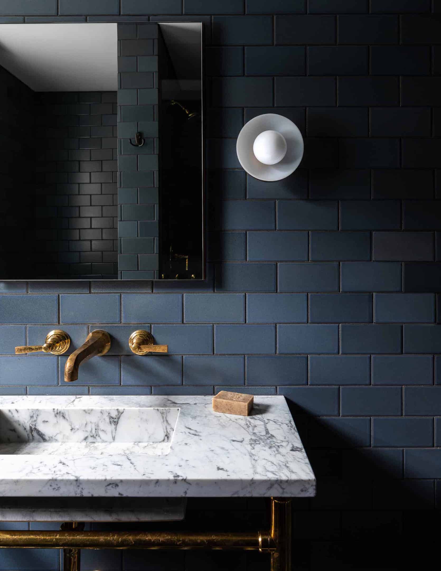
This might be boring to you but it’s not to me. It feels simple but special (drink! drink! – anyone else playing the drinking game for how often I use those two words?). There is some contrast of course, but not within the tile and grout itself (note that Heidi’s bathroom has dark tile with a white detail – not totally monochrome).
I know that a lot of people might want MORE, but y’all I’ll style it out, I promise. I just love how the floor just reads as a texture and not too busy – but there is so much movement. So now that you know the “tile vibe” we are going for let’s go grout by grout:
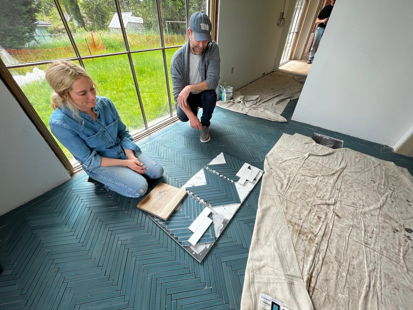
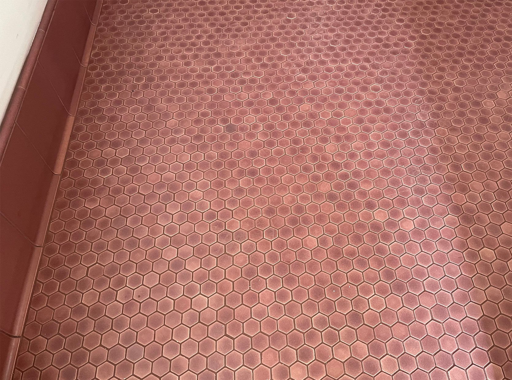
Primary Bath Floor – Our Bathroom
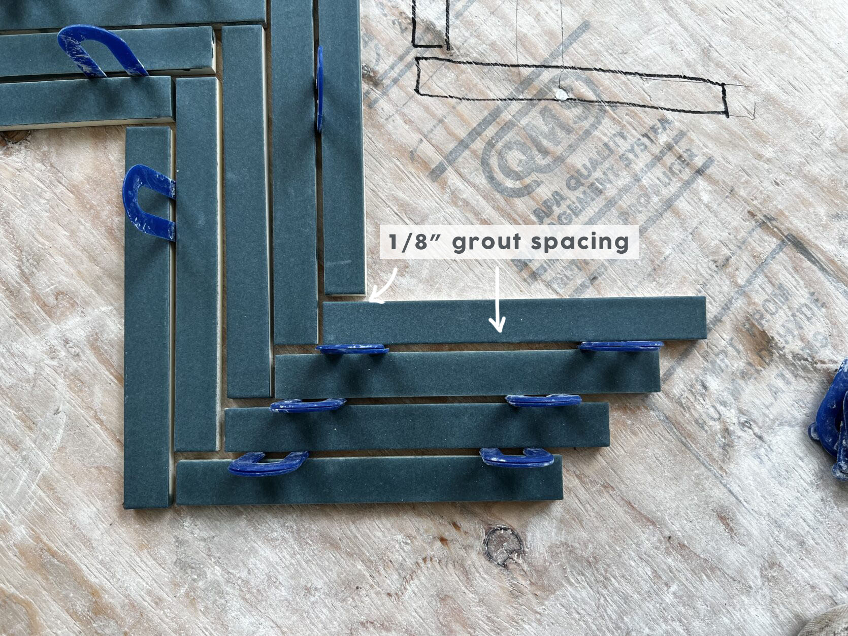
As you can see we chose a 1×8 herringbone, otherwise known as “the gray hair maker”. Our tile team, which was FANTASTIC, loved installing this purely for the sake of the challenge – or so they said. This is from Pratt + Larson, made in Portland and it was an idea I came up, using a custom color just for us – but you can call them and order it, too (if you want to let me know I’ll try to wrangle a discount code for you) Remember: the smaller the pattern = more cuts = make more expensive to install and this mosaic was not netted so it was installed individually. This is not a cheap install (not sure how much as it is all tied in with the overall house tile budget which everyone is shielding me from, but likely a few thousand for just this floor as it took 3 days of labor with two guys, not including prep). We played with spacing a bit since the tile is only 1″ wide we didn’t want the scale of the spacing to get funky…1/16″ you lost some of the impact so 1/8′ felt just right!
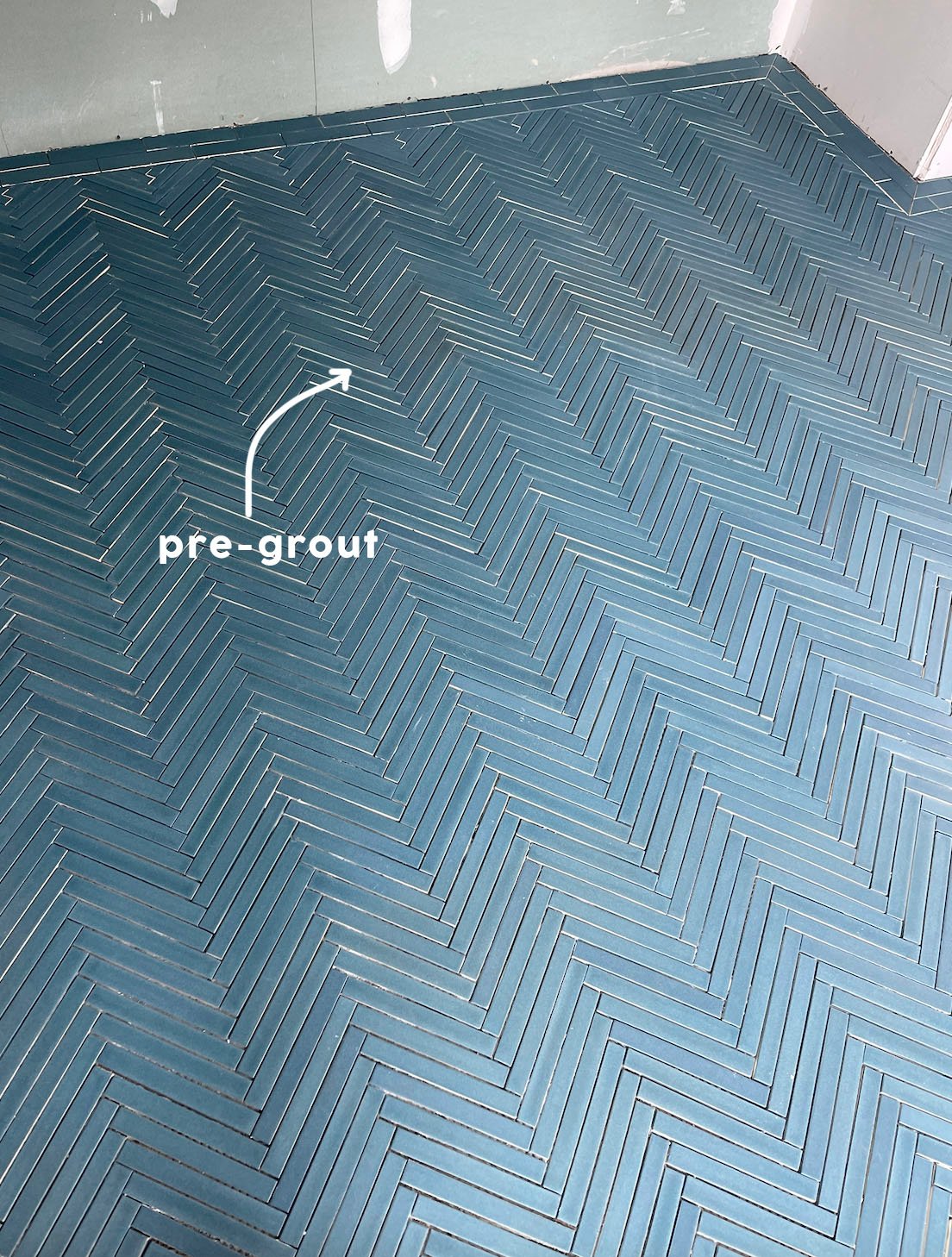
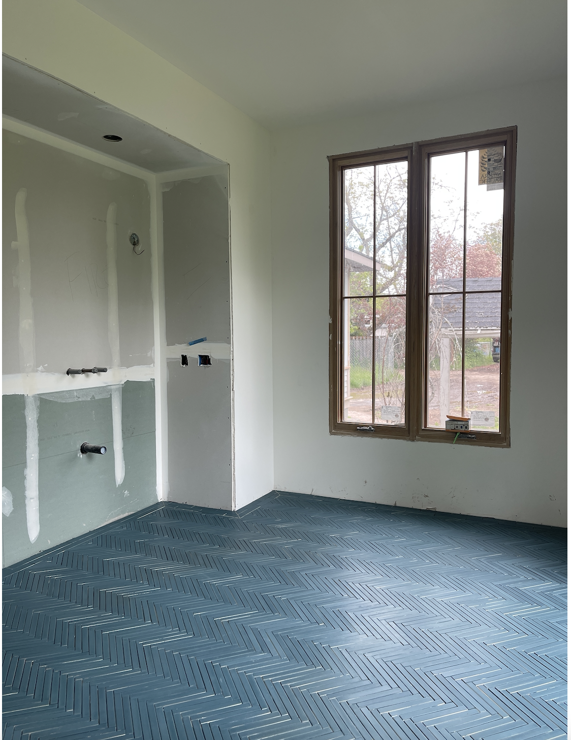
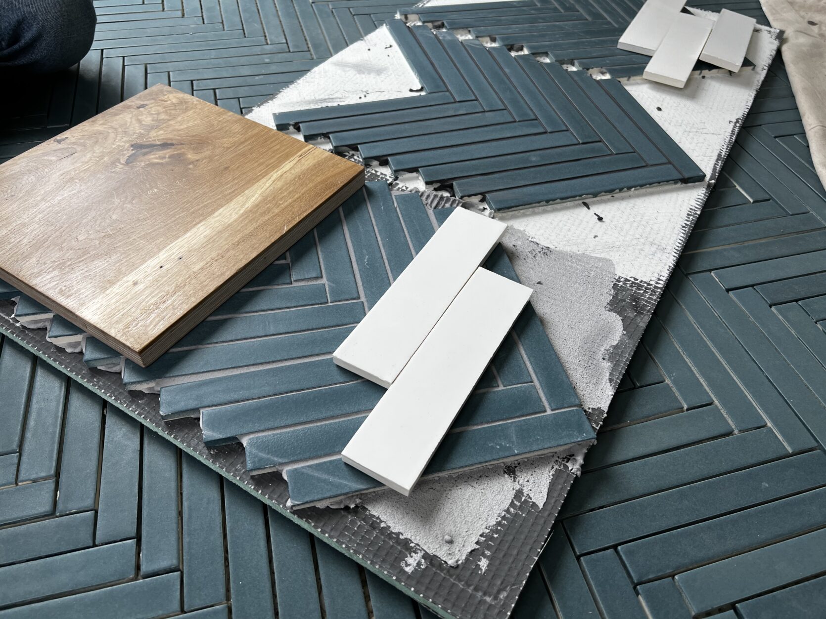
It’s absolutely incredible and this is even PRE-grout. So the question is what color do we want for that grout that will enhance the tile, but not distract from it? This seemed like a pretty fantastic time for us to do some sample boards, and by “us” I mean Erik and his Level Plane crew (Sergei! Vlad! Jeremy! – It warms my cold old social media heart to know that these dudes are cheering us on social media)
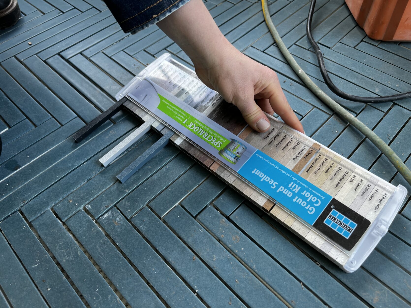
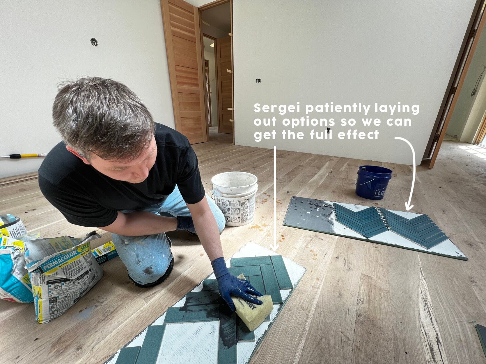
This is not something any tile setters will just do for you, but you might be able to pay a bit more for this and my goodness I’m so glad we did.
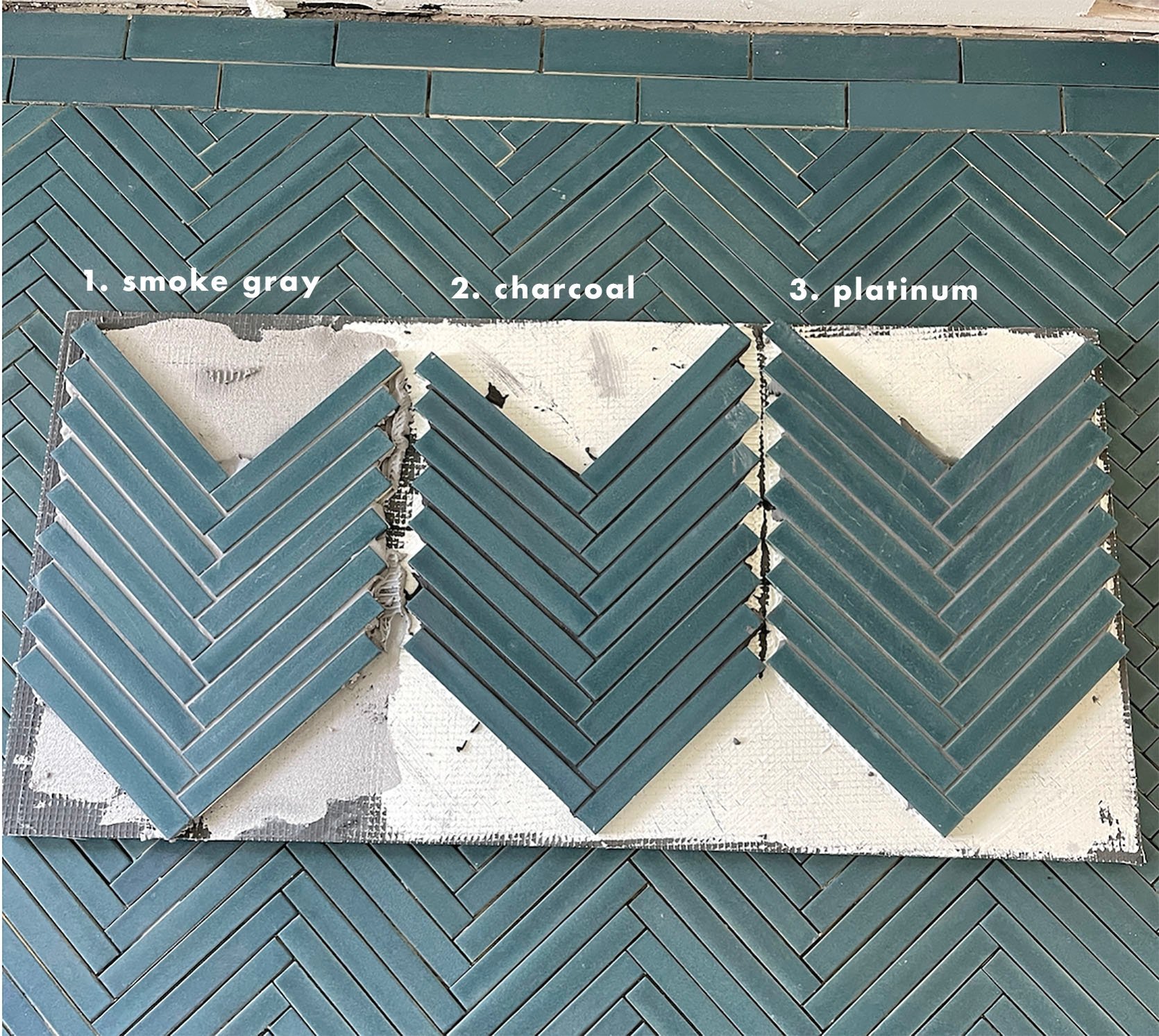
Our first instinct was that the middle (charcoal which leans black) is just WAY too modern and strangely masculine. Then the one on the left was beautiful but we feared that on the entire floor it would be too busy.
So we laid it on the floor in the bathroom and tried to give it more context – really picturing it over the whole floor with the wood to represent the vanity and the white tile that will go on the vanity wall. We still nixed #2 Charcoal, feared that #1 would be too busy, so I guess it’s #3? The one closest to Brian? I’m using question marks because it wasn’t a “hell yes” and I was not going to risk the beauty of this tile by messing up the grout.
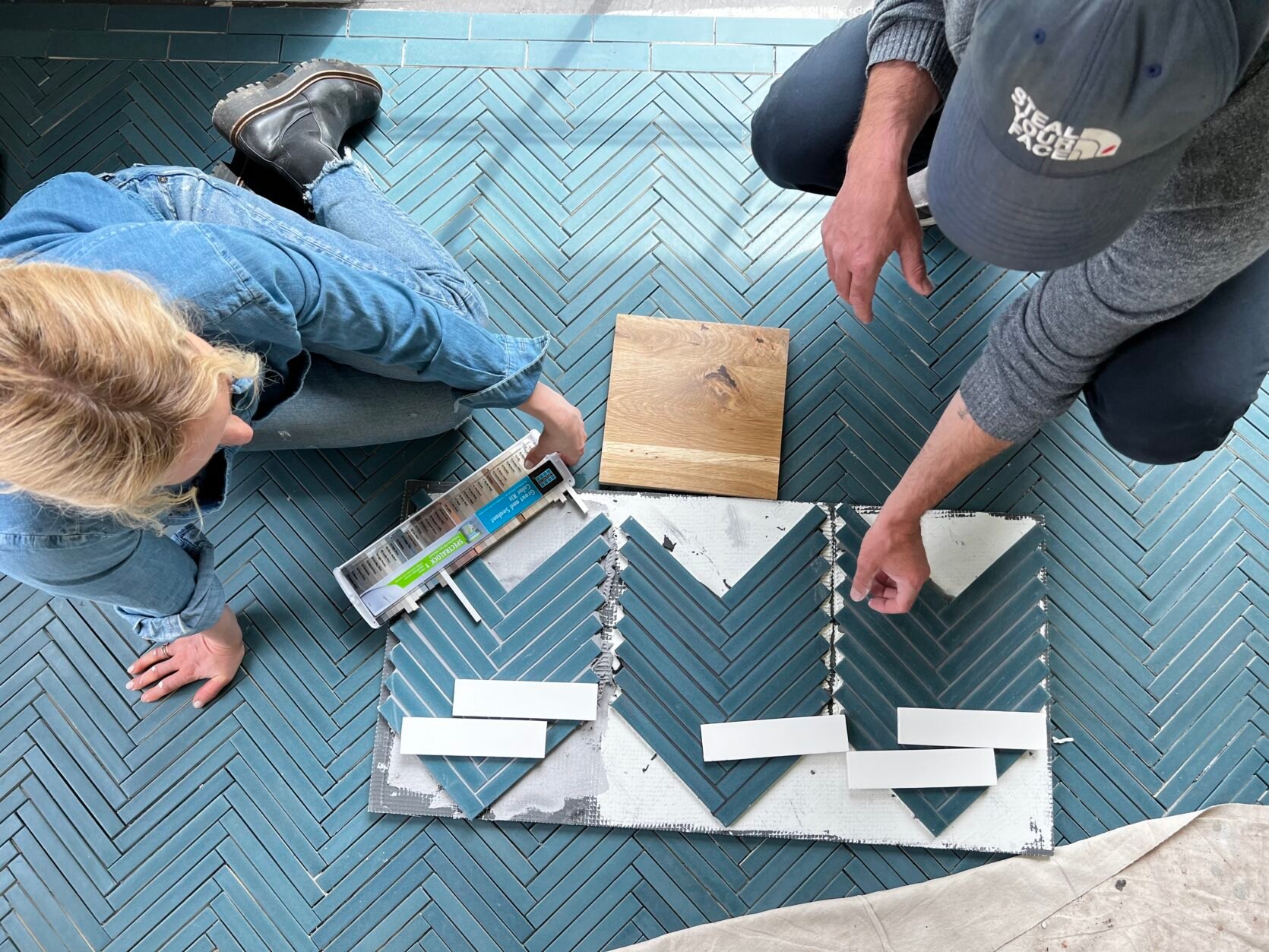
So I begged Erik to make one more board and promised to give so much love in exchange. Thank you, Erik!
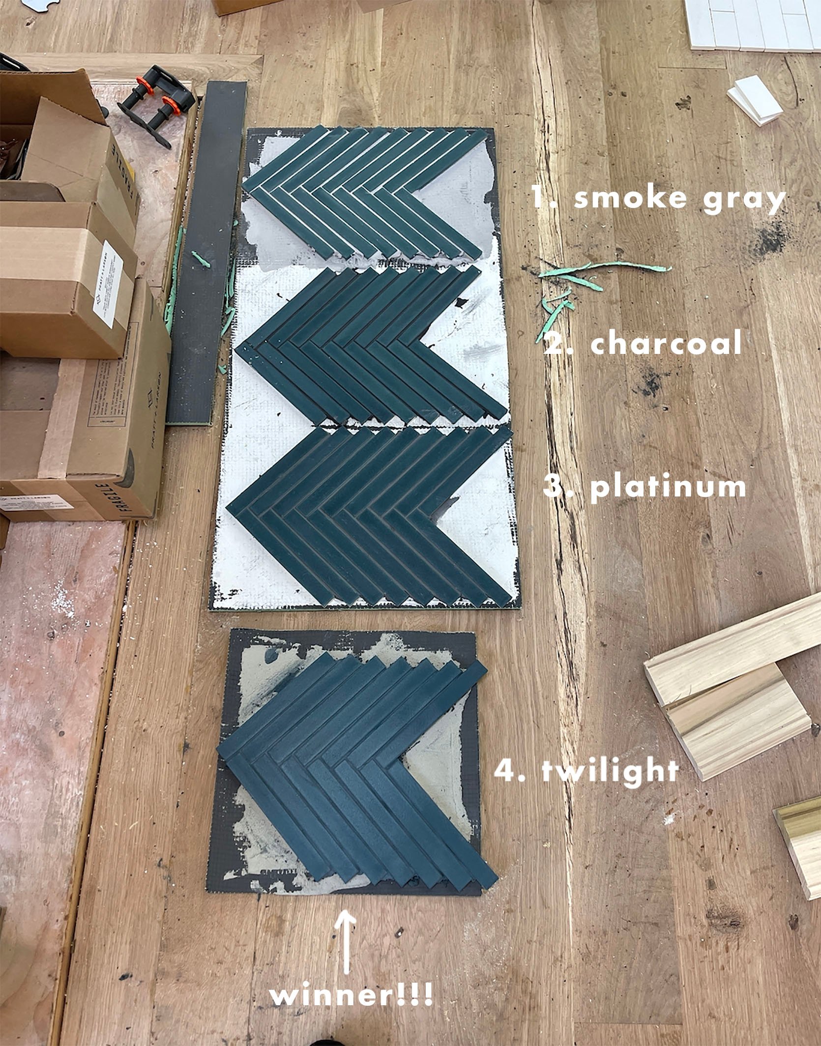
The second Brian and I saw the “twilight” grout it was a “hell yes”. Not because on the board it was the most dynamic, but because picturing over the floor of the bathroom we felt it did exactly what we wanted – let that color pop, drawing attention to the texture of the tile shape but NOT a busy pattern – almost like a beautiful quite sea of handmade blue texture. Incredible. Plus look how much it brought out the blue?!
The Guest Bath Floor And Walls
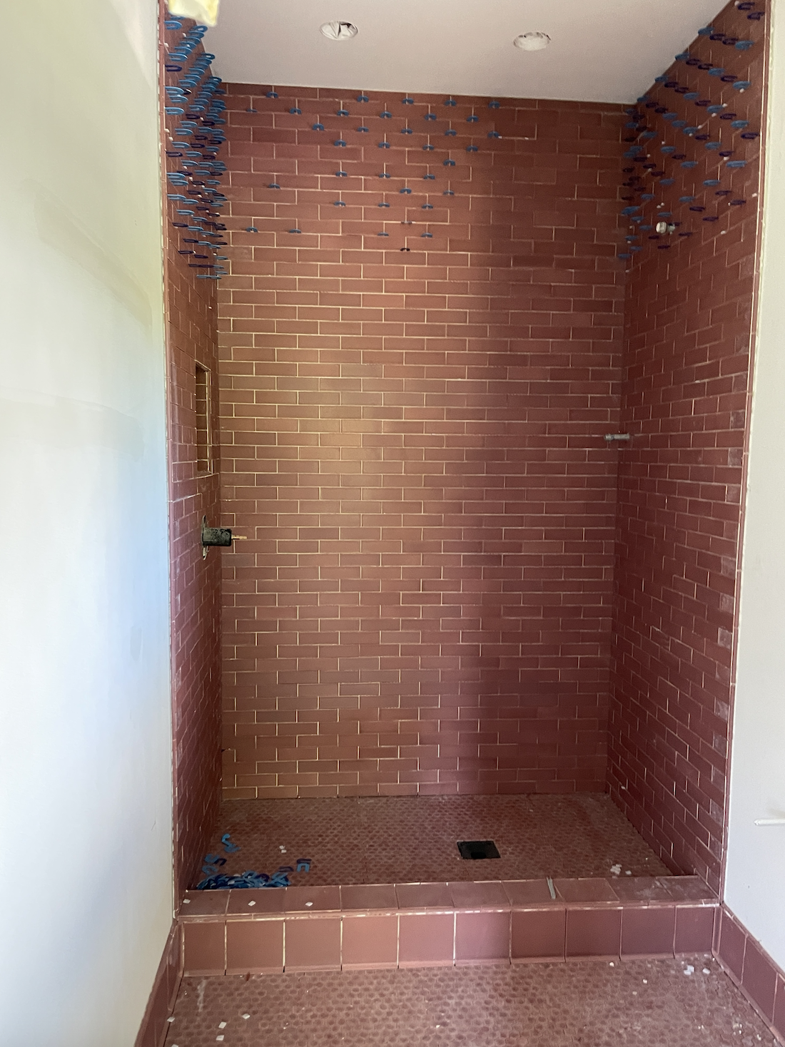
This is the first glimpse you are getting of our guest bath…and as I said we are leaning in on the tone-on-tone grout trend and kinda REALLY loving it. This dusty rose Pratt + Larson tile is such a striking color. The mixture of shape and scale is plenty to make this space feel special without accentuating the grout lines, so we chose to let them “rest”.
Somehow this one matched perfectly! Slightly darker which is GREAT. Isn’t that color just so beautiful and has so much variety! Again it’s a custom color from Pratt + Larson, but one that you can ask for.
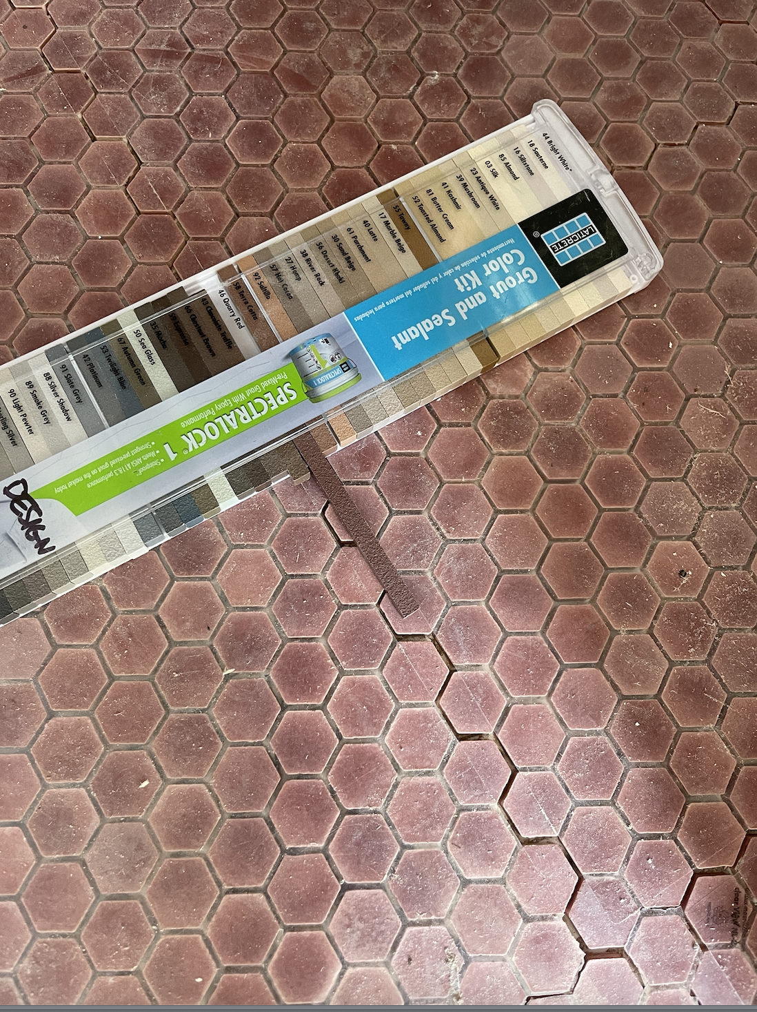
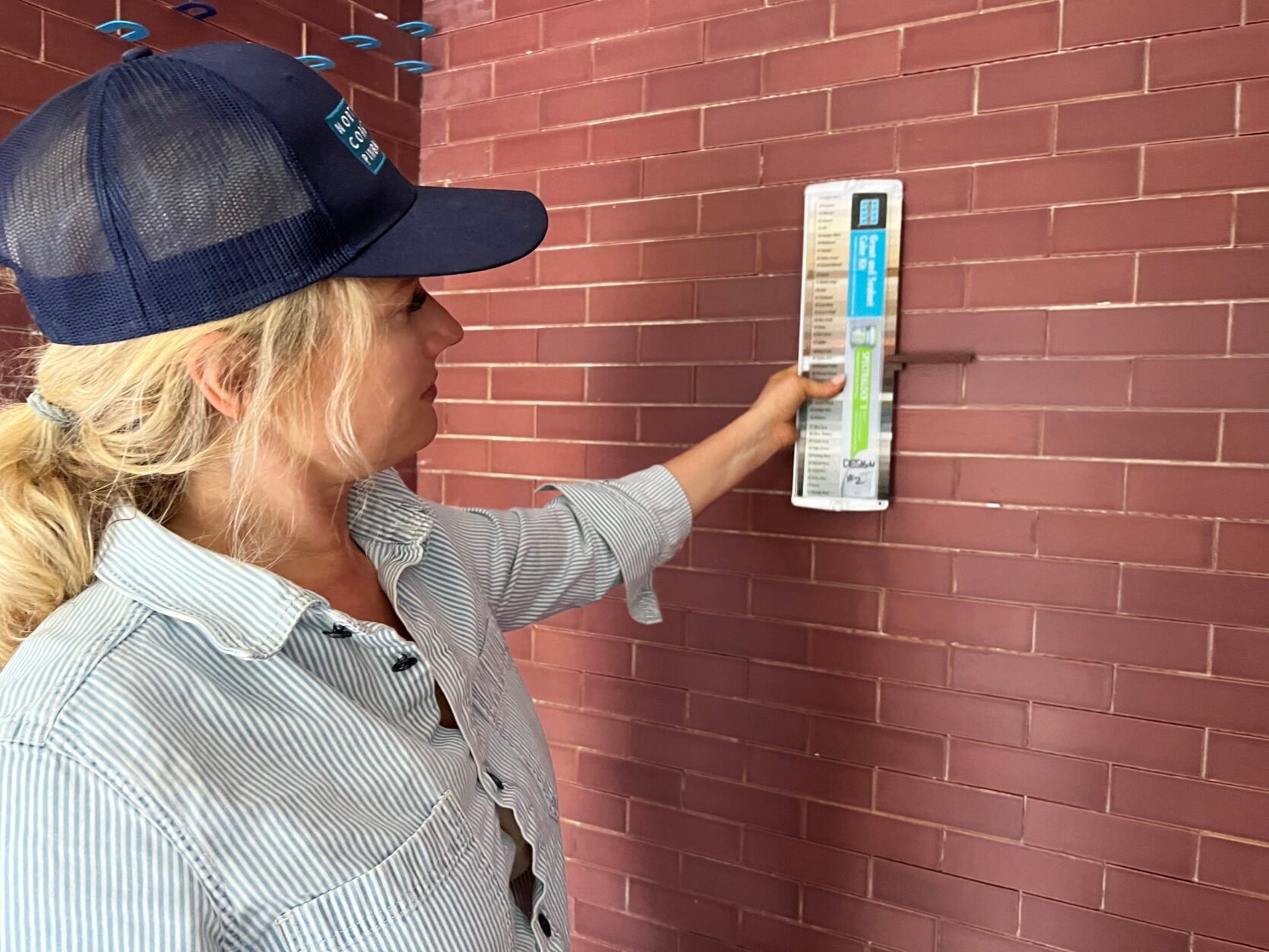
The grout is called “Quarry Red” and it’s a warm deep brick color. It was an easy decision and we didn’t need to get boards made.
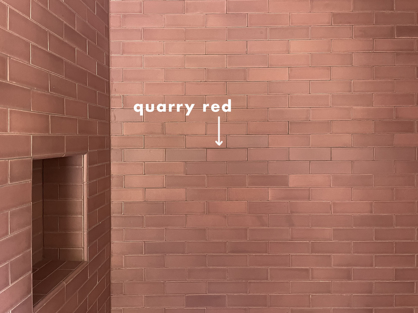
It turned out SO PRETTY. The grout really highlights the color variation and the texture of the tile, versus the pattern of the tile shape.
The Mudroom Floor
We chose this beautiful blue/green/gray tile with a “brownstone” finish meaning that it’s more rustic, which we thought was so appropriate for a more utilitarian space that feels like a landing spot for mud.
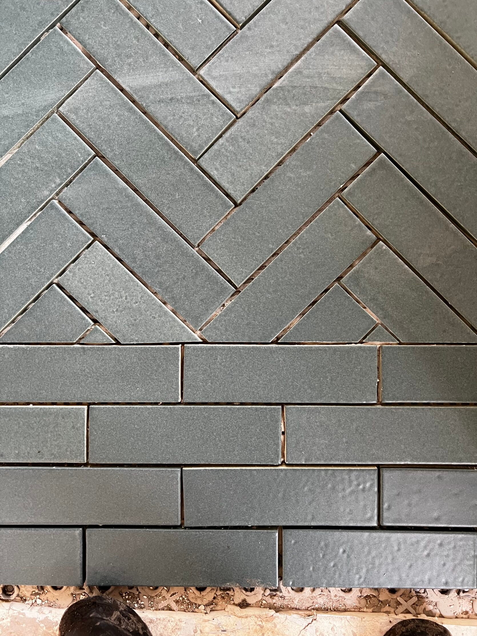
It’s a herringbone in the middle with a border around the outside that is just a staggered brick.
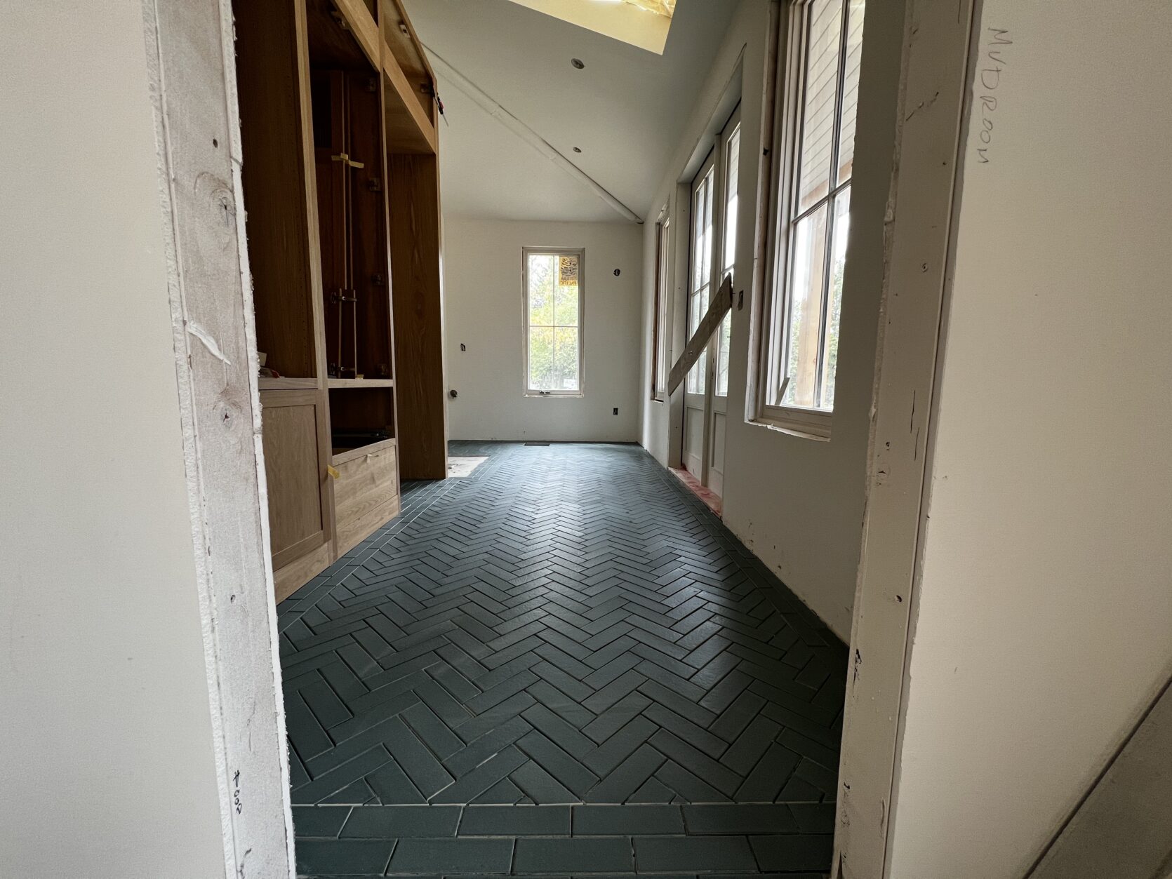
I can’t even express my love for this room. Something about that blue/green with the white oak cabinets from Unique Kitchens and Baths feels so perfectly PNW to me. But what grout? We needed to see this one mocked up as well so…
Erik and crew kindly helped us visualize by mocking up two boards.
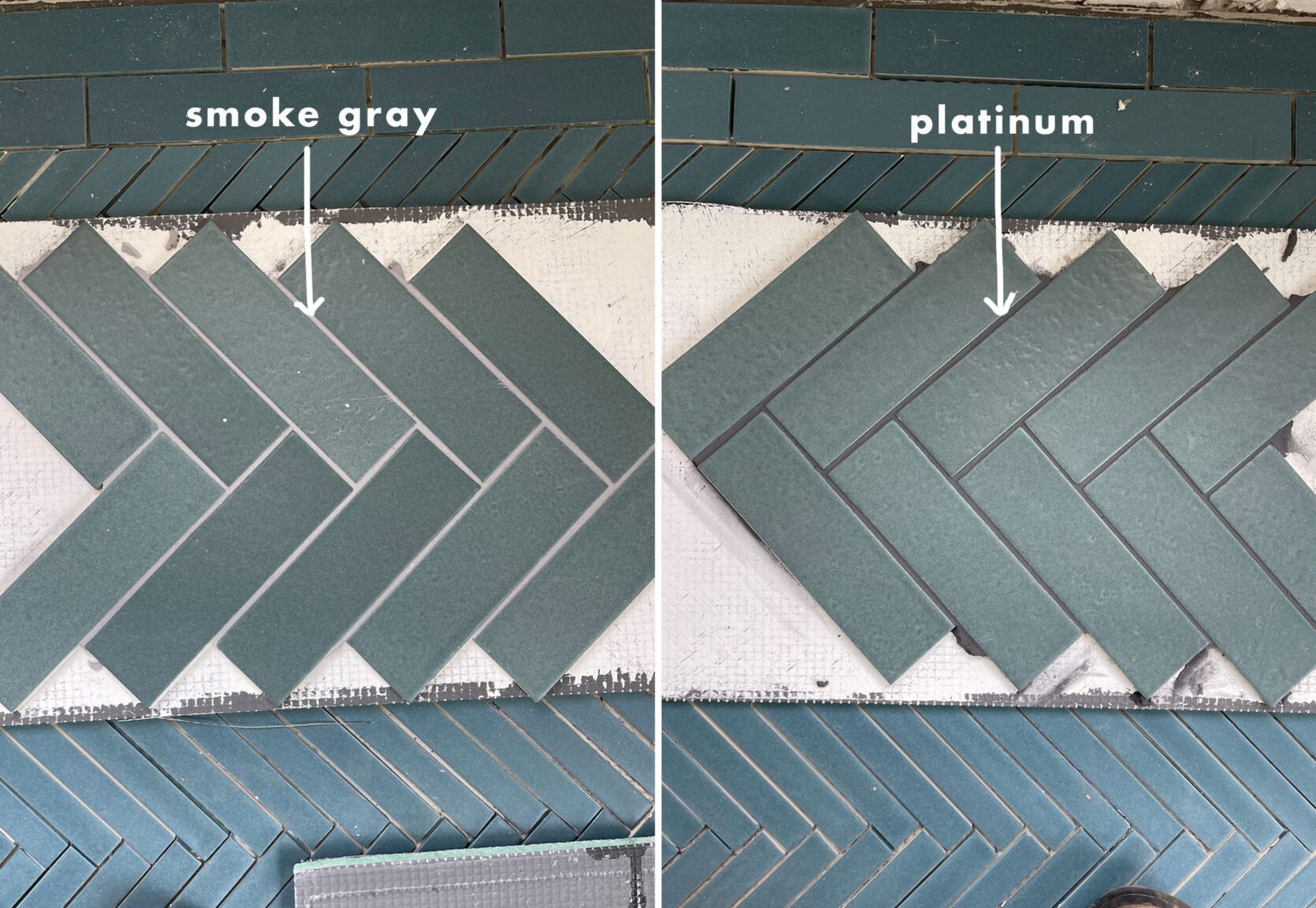
There was a pretty quick all-around consensus on this one. We liked both, the “Platinum” (which is strangely the darker grout) was so pretty and again calming. It went on light then dried darker. We felt that it would be way easier to clean since this room will get a lot of mud from the kid’s shoes and dogs.
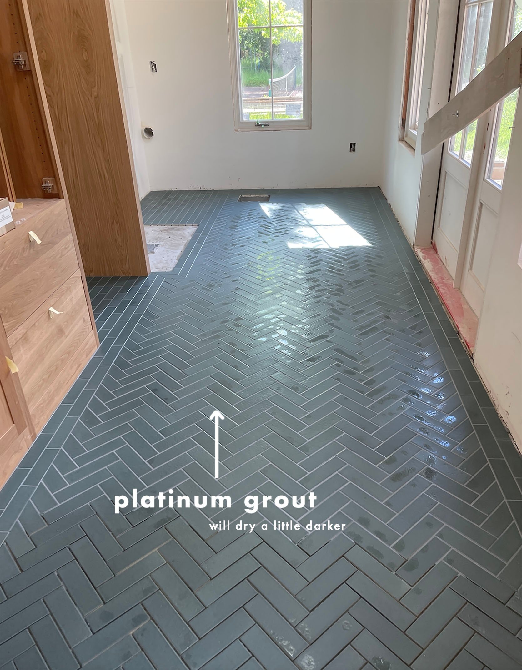
They had only started grouting here and the grout hadn’t dried yet (will be slightly darker). Right now this is turning out to be my favorite room in the entire house (probably because it’s the closest to being done).
Kids Bath
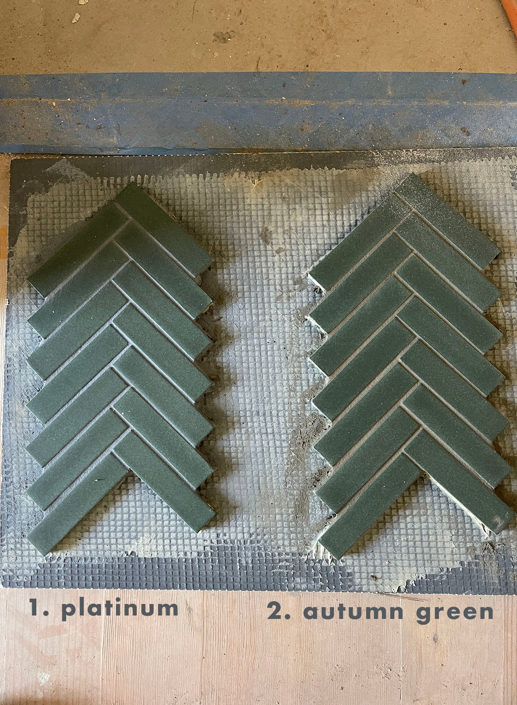
The floor of the kid’s bath was the biggest challenge thus far because this green had nothing we could match with. The closest was “Autumn Green” but as you can see it just read more brown than green.
While in a perfect world we would have ordered a custom grout that matched the green, we didn’t feel like it was important enough to set the project back a few weeks. I’m in the “let’s move in” phase of this renovation, so anything that sets us back too much is a big no-no.
So that’s where we’re at with our grout. It feels more real every day! Lots more content headed your way. xx
THIS POST WAS ORIGINALLY PUBLISHED HERE.
