Twenty years into this relationship I’ve realized a secret reason why I married Brian – he can be so decisive when I’m practically pathologically paralyzed with indecision at this point in the renovation. I weigh the pros of all the beautiful options out there and mentally exhaust myself with fear of making the wrong permanent choice. I’M SUPER FUN TO BE AROUND. He thinks this is a holdover from my styling days, where I was trained to literally think about every scenario, bringing prop options for every single shot, making “in the moment decisions” based on the framing to camera, and not really needing to commit to anything til the second before you click the camera. This doesn’t work for renovation and frankly is an occupational hazard. So when it came to paint, most recently the exterior of the house, Brian has been firm since day one that it is to remain white with an accent color. GREAT. He is immovable and won’t even let me take us in another direction and I’m honestly so relieved. I could have explored a medium color, a bright happy color a darker moodier tone, and even a two tone (with the sunroom being dark), but not Brian. He is firm and confident which brings me a lot of calm. That doesn’t meant there aren’t still decisions/mistakes/regrets to be made, but I’ve been leaning on him hard because at this point in the renovation I feel like I’m not my best self. I’m looking at tiny things I wish we had done differently that no one will ever notice. I’m DONE making decisions on my own and as much as ARCIFORM can help me, it’s not their house. So much of a renovation is simply a personal preference based on your lifestyle and practical needs. But that doesn’t mean that we didn’t look at some options in the renderings early on for the exterior, so today I’m going to walk you through our journey on what colors to paint our house.
Before – In 2019 When Life Was Simple….
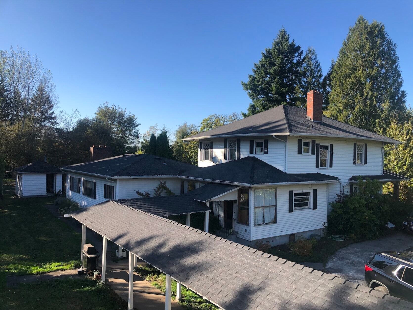
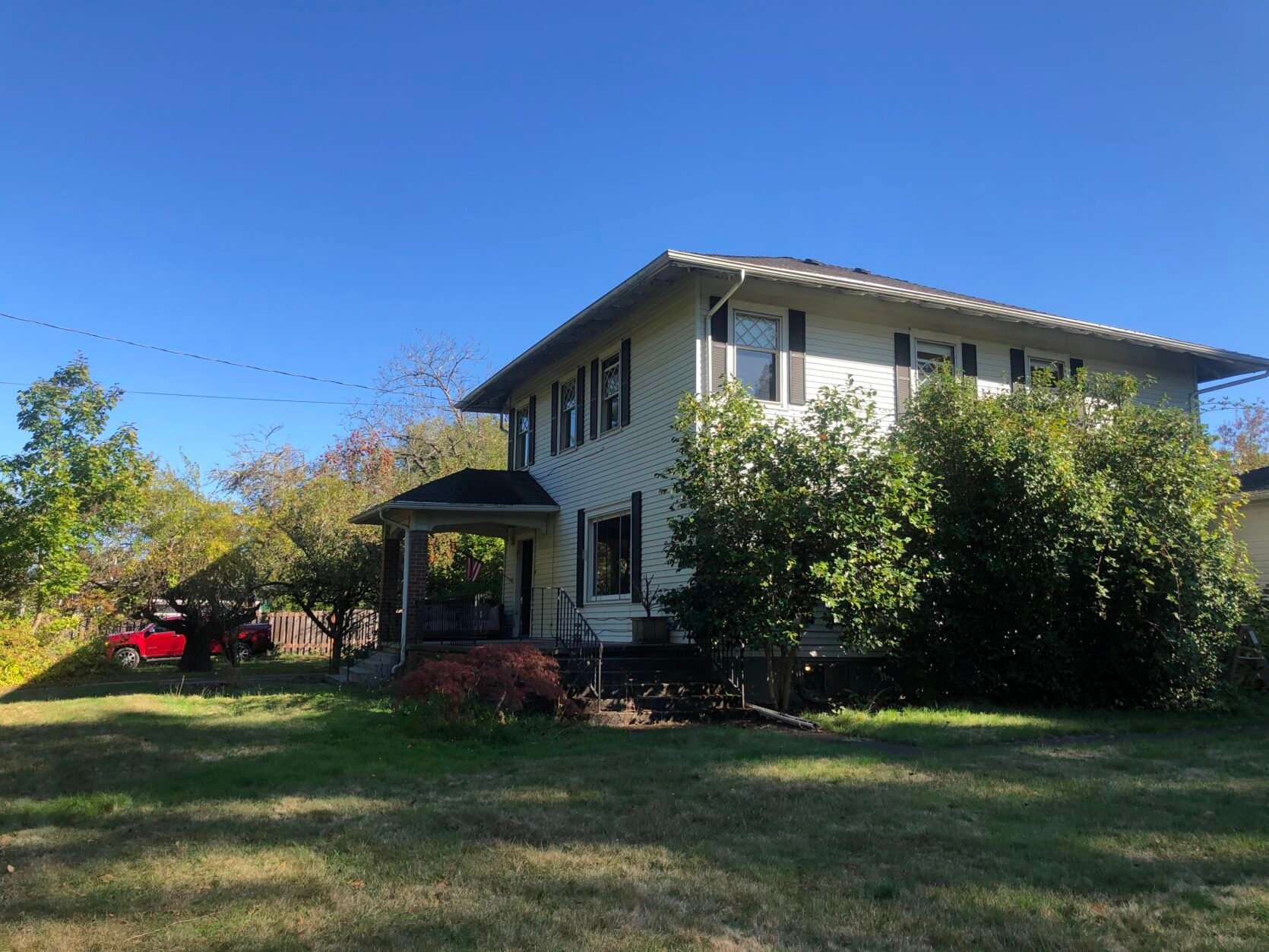
When we bought the house it was painted a sweet bright white, with an accent of black shutters. White did feel right for a farmhouse then, as it does now. The shutters didn’t fit the windows, which can be a pet peeve for some of us (although I see this on beautiful houses all the time and it can still be super sweet). Ideally shutters should look like they perfectly fit the size of the window when closed, despite not actually needing them to close. But the black was a nice accent against the white and broke it all up.
So I started Pinning For Inspiration …
Knowing that we would remove the small shutters the question became should this house be all white? Or white with a different color trim? Historically a lot of ‘farm’ houses are all white – including railing and trim. I looked up why and here’s what I found: “It all began with whitewash, also known as lime paint, which was used during colonial times to prevent mildew from forming on both the inside and outside of houses”, according to the Daily Press. That makes sense. I also think these houses were meant to be purely utilitarian and affordable – so one color made it cheaper to paint and just kept it simple. Like these…
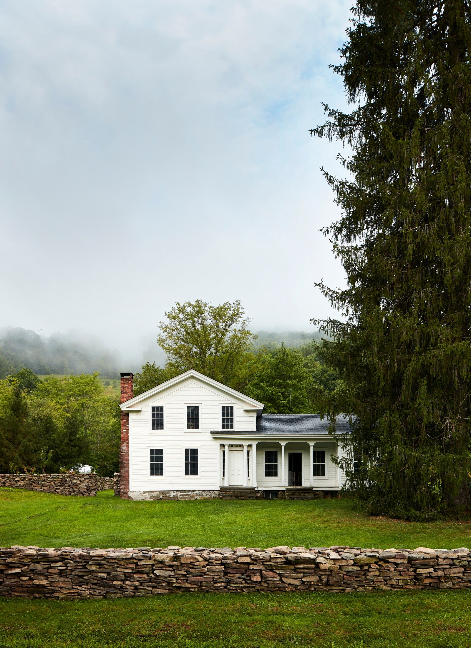
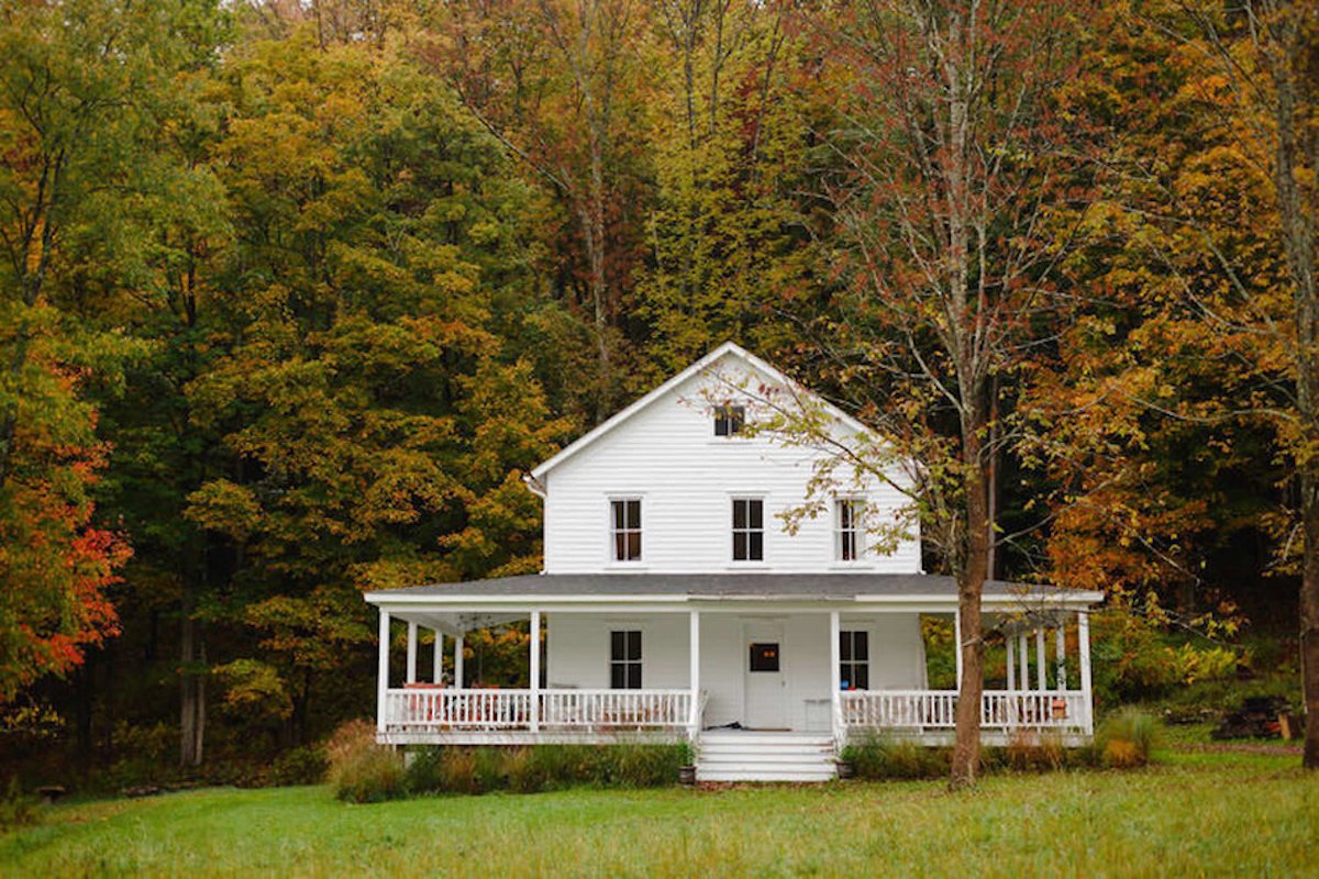
While this is pretty, I think the setting is what made me pin it. When I showed these two to Brian he said, “Absolutely not – that is very cold and boring” and he’s not wrong. So we started looking at adding some accents …
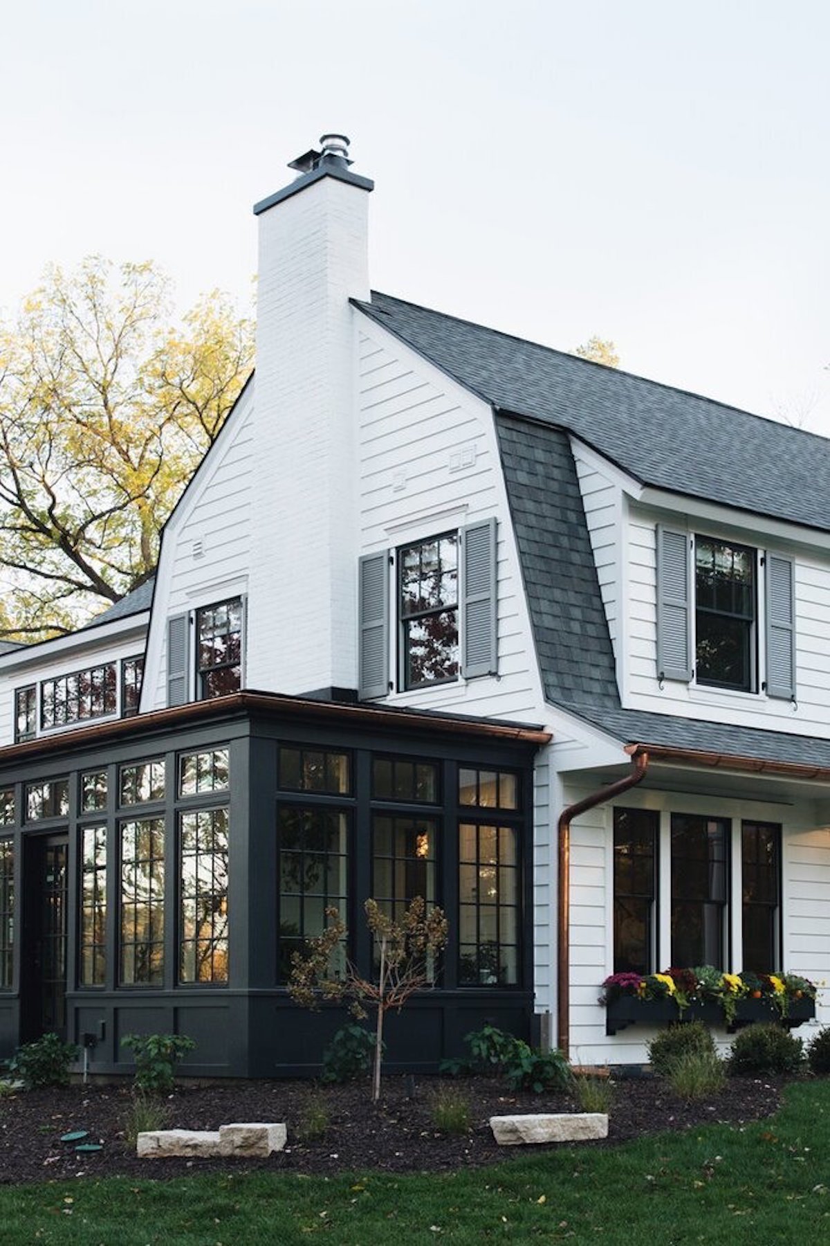
White House With Light Blue Trim
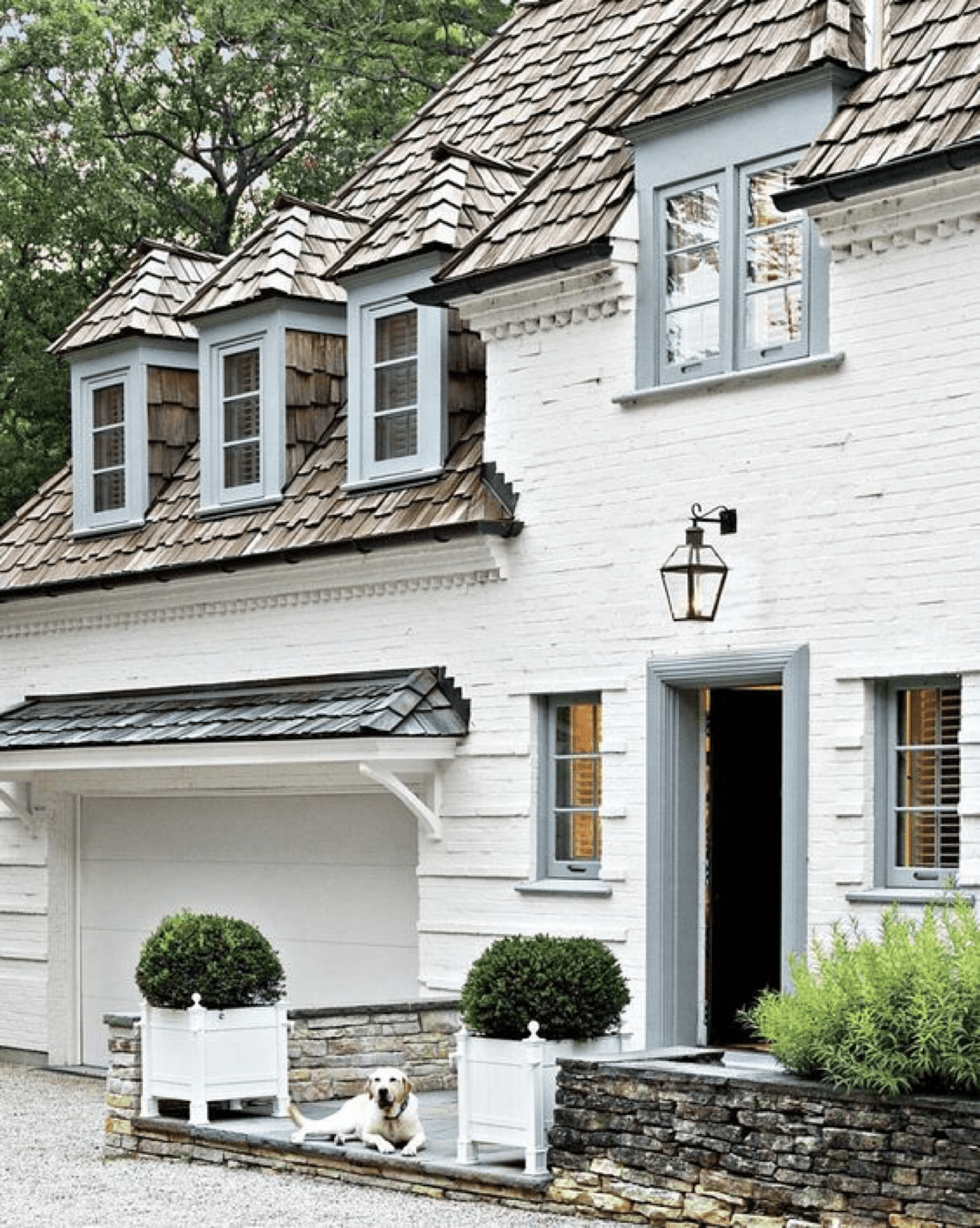
I love that house so much – that blue is so sweet. But clearly the brick in amazing, the shingled roof is beautiful and the stacked stones doesn’t hurt. So sometimes you have to check in with yourself and ask yourself why you like a photo – is it the dog? Or the blue trim? Hard to say.
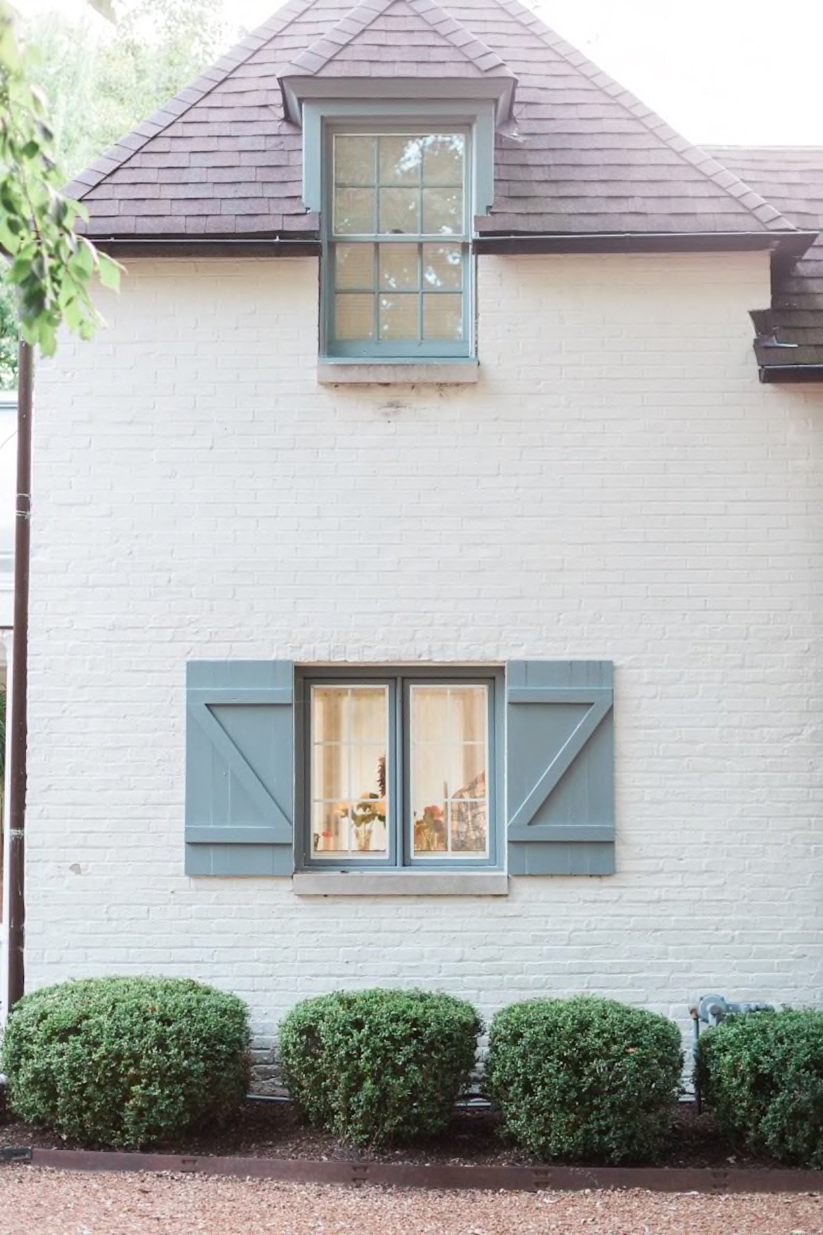
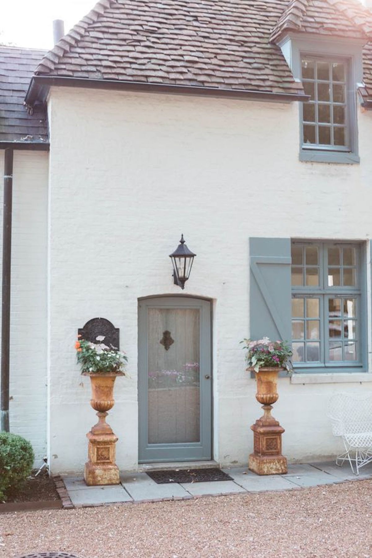
But I like that one, too!!! These were too blue for Brian, and Anne agreed. Too sweet and not classic enough. I still don’t totally agree, but like I said – I’m leaning on others right now with really firm opinions to help guide the decision. The truth is that the house is so beautiful and so well executed and the landscape surrounding it will be so pretty that I think any and all options could work. When you have high quality materials and good execution I think that ANY color you choose could work.
My Favorite Inspiration Image…
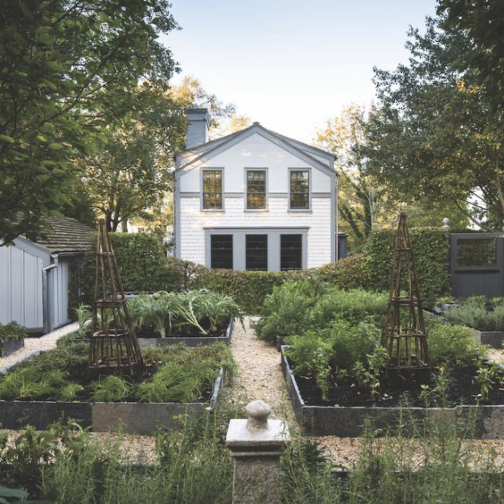
Then I found this image and I fell in LOVE. It’s white with a blue/gray trim, surrounded by green – like ours will be. It seems like the window sashes are painted dark and maybe the top half is a shade of gray? But the white and light gray color combination got me excited.
But Which Color of White Paint?
If you want to torture yourself or your partner, try choosing white paint. Even as a pro, I find it maddening. There is a reason that designers have their go-to’s and thats because they KNOW what works for THEM and use it over and over, I think to mostly preserve their mental health. My go-to has always been a crisp bright white, with no undertones.
Our Glendale House
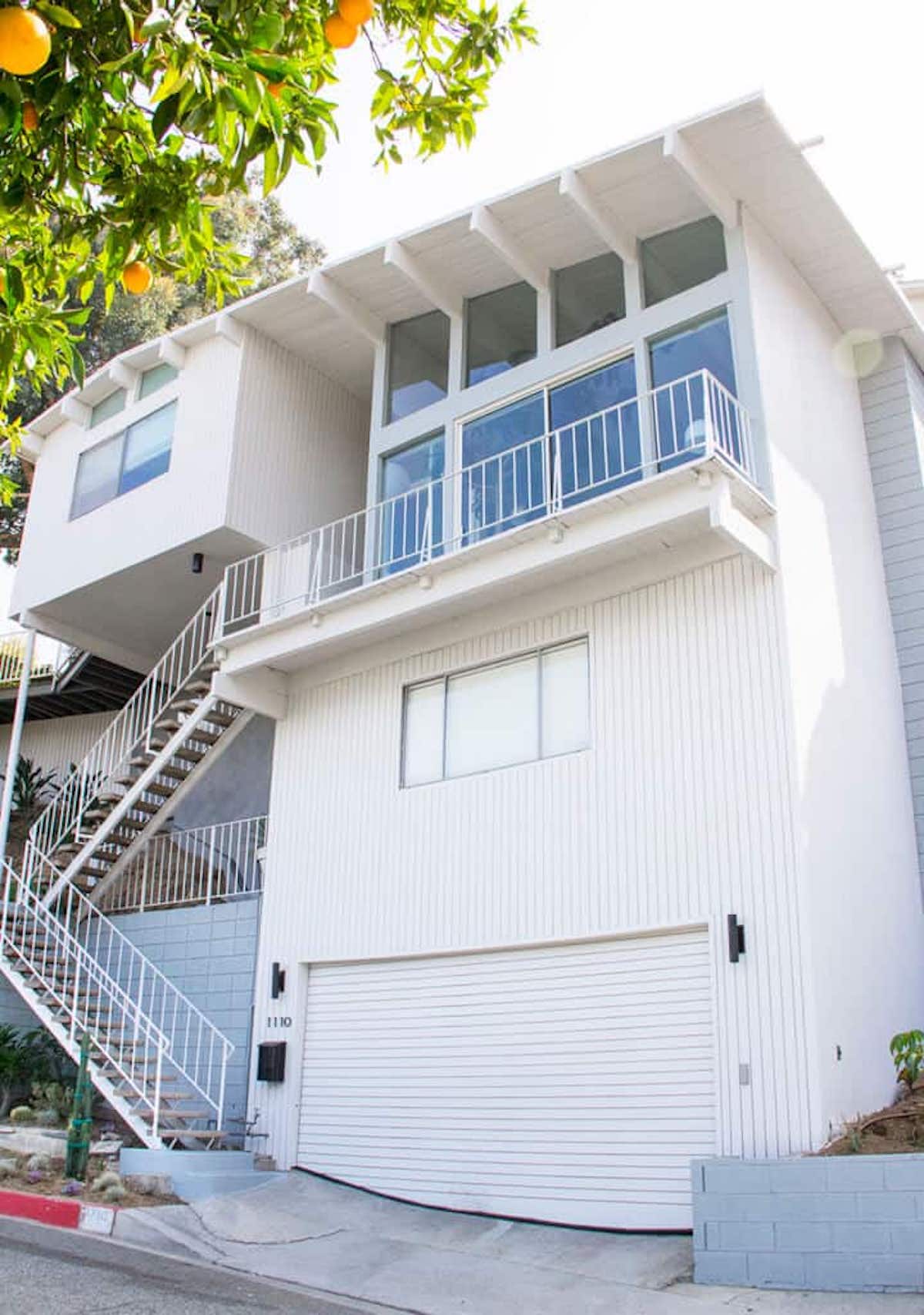
Six years ago we painted the exterior of our Glendale home Calm OC-22 by Benjamin Moore, and I really liked it. It had a slightly undertone that is a little warm but again, it looks totally white.
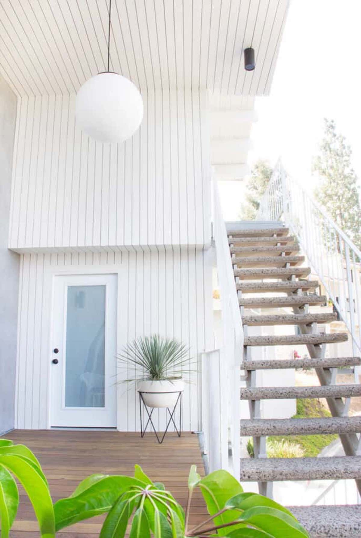
Man, I loved that house!!!
The Original Portland Project
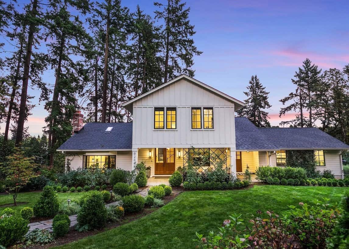
A few years ago I went with a warmer white for the Portland project (Sherwin-Williams Oyster White) and while it was slightly too warm/yellow for me when I first saw it, but I warmed up to it (HA). Sometimes that shock is going from primer to paint (because primer is so white) and ultimately it looked great. Now looking at it I’m realizing it looks TOTALLY WHITE, but I did take a note that I don’t love yellower undertones. I wondered if it was because it’s often next to so much green and gray? And maybe those two tones, being so cool, brought out its yellow-er undertones? Maybe.
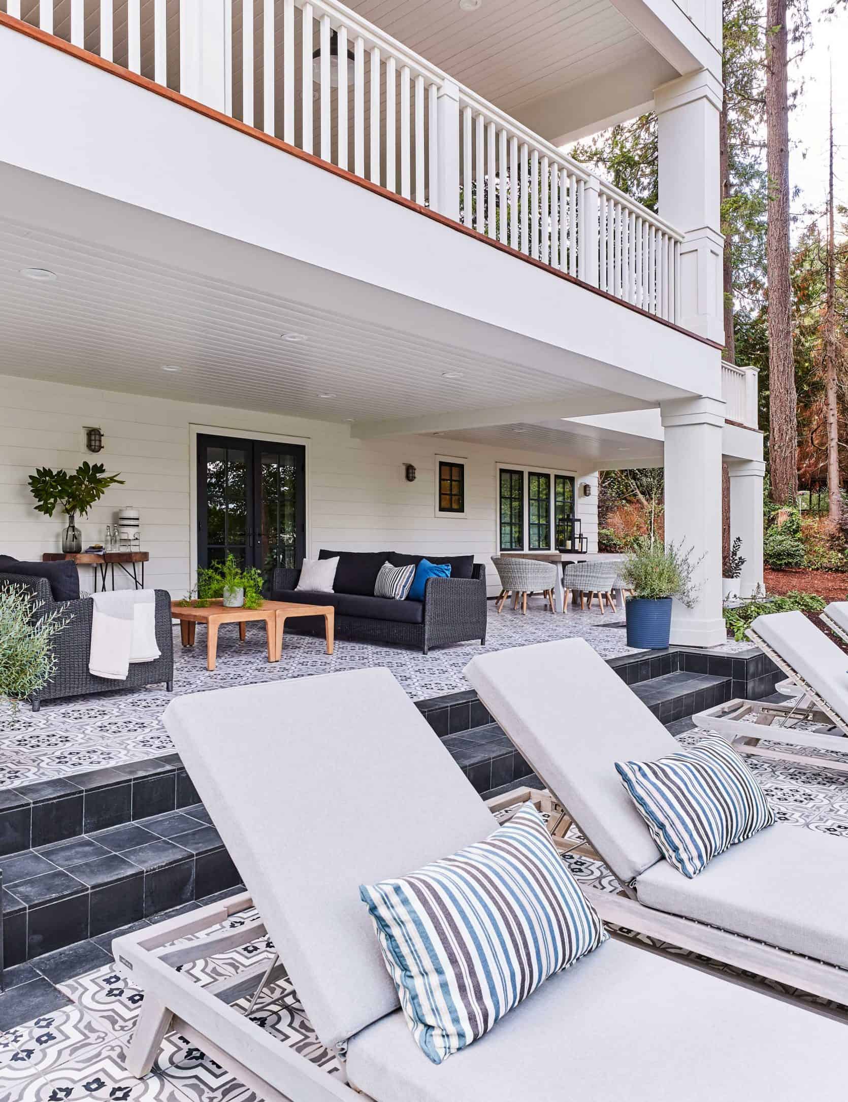
So I went on a recon mission around our rental house neighborhood (which is GORGEOUS by the way) and tried to note what colors I liked the most.
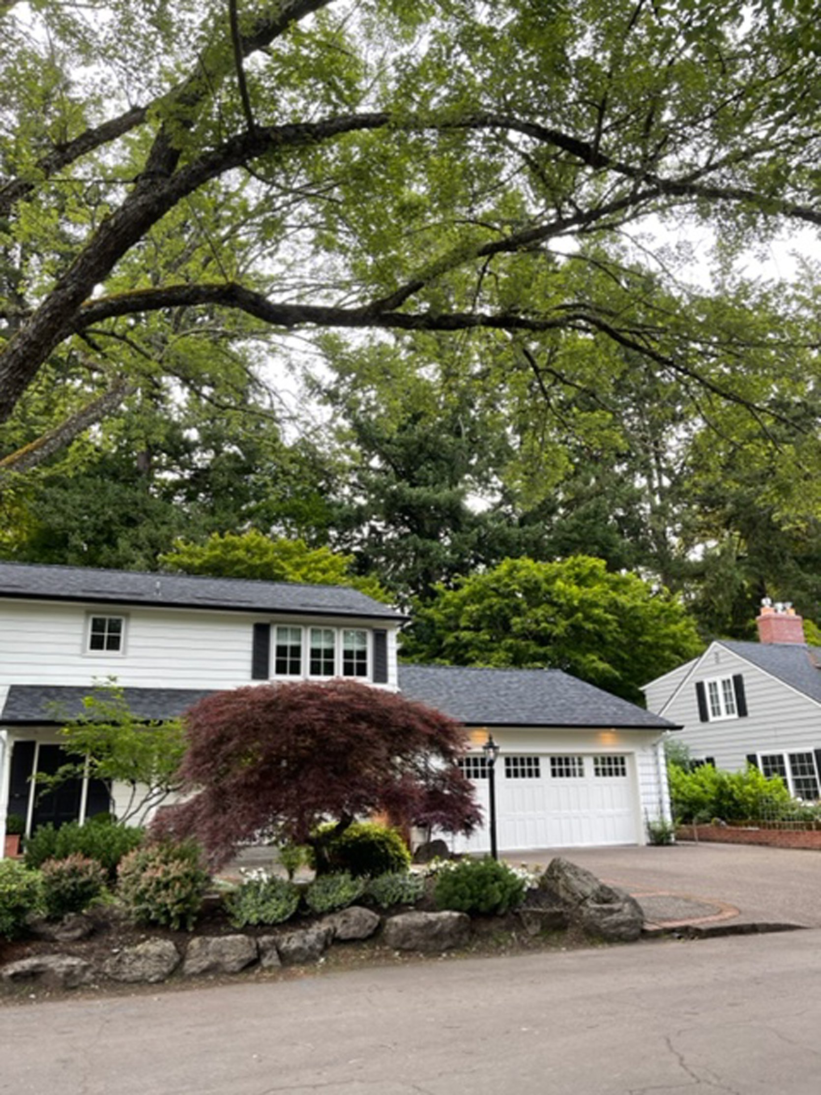
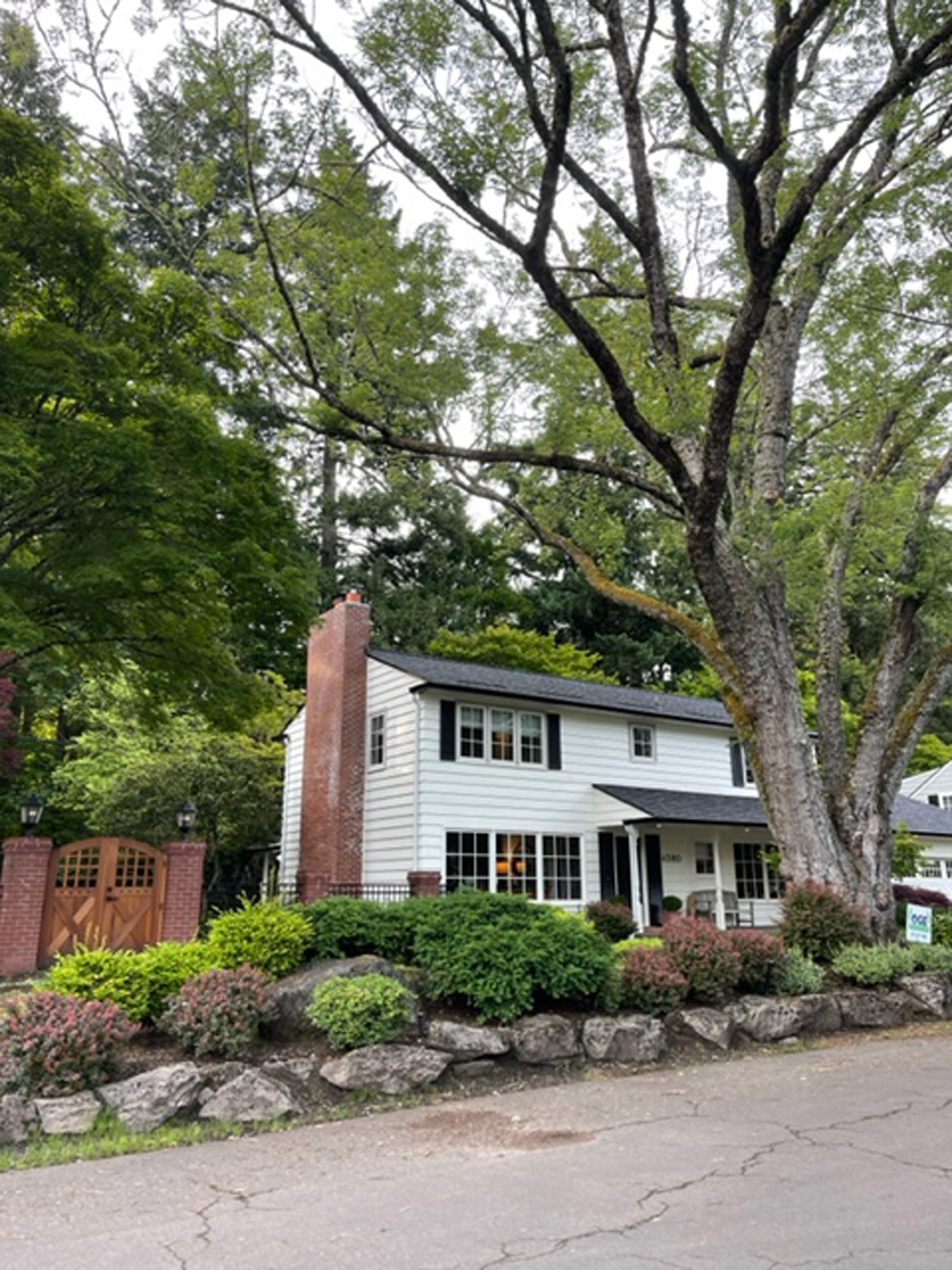
So many of the houses had a crisp white exteriors, with black accents and surrounded with brick and greenery. LOVE.
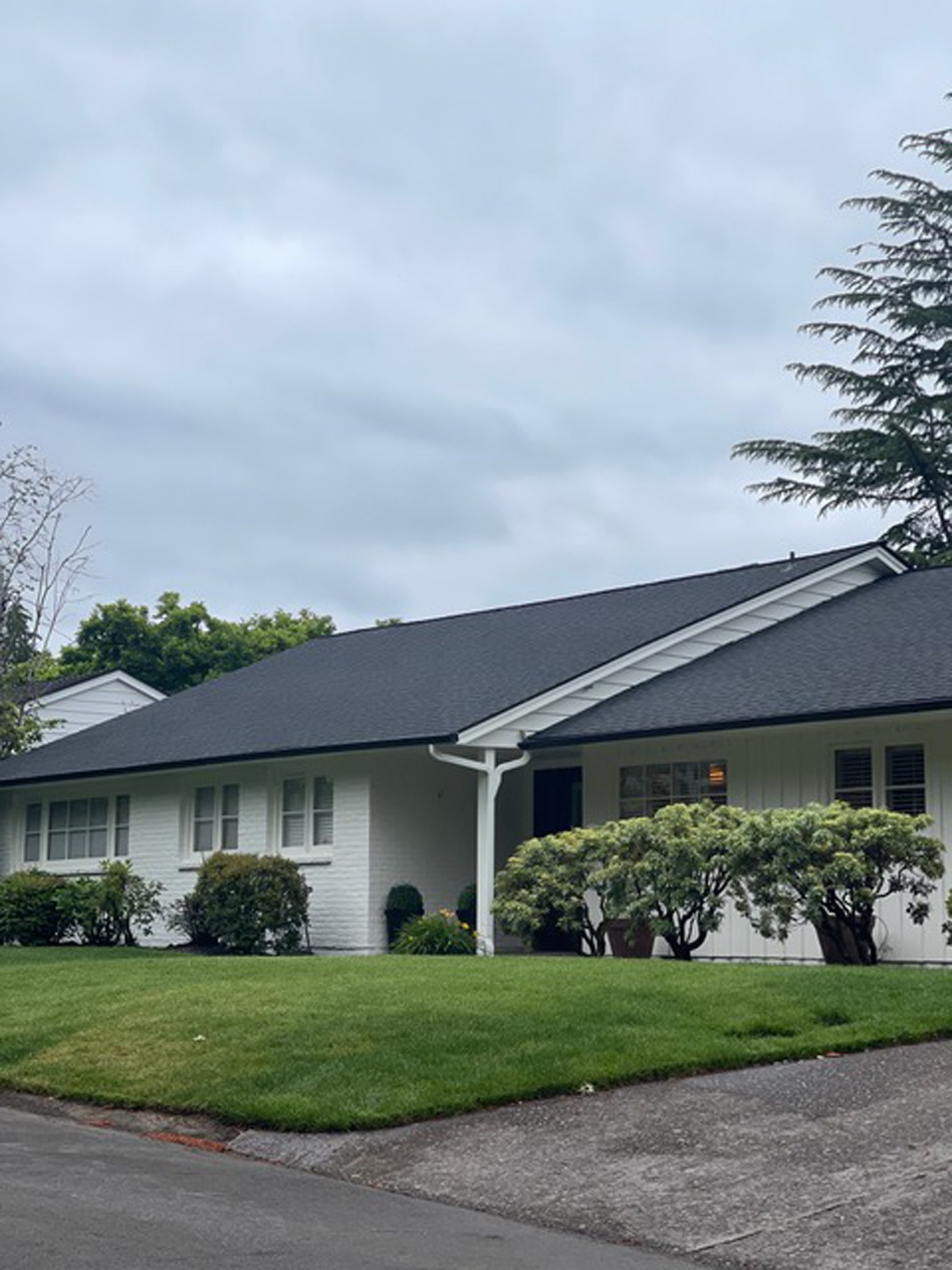
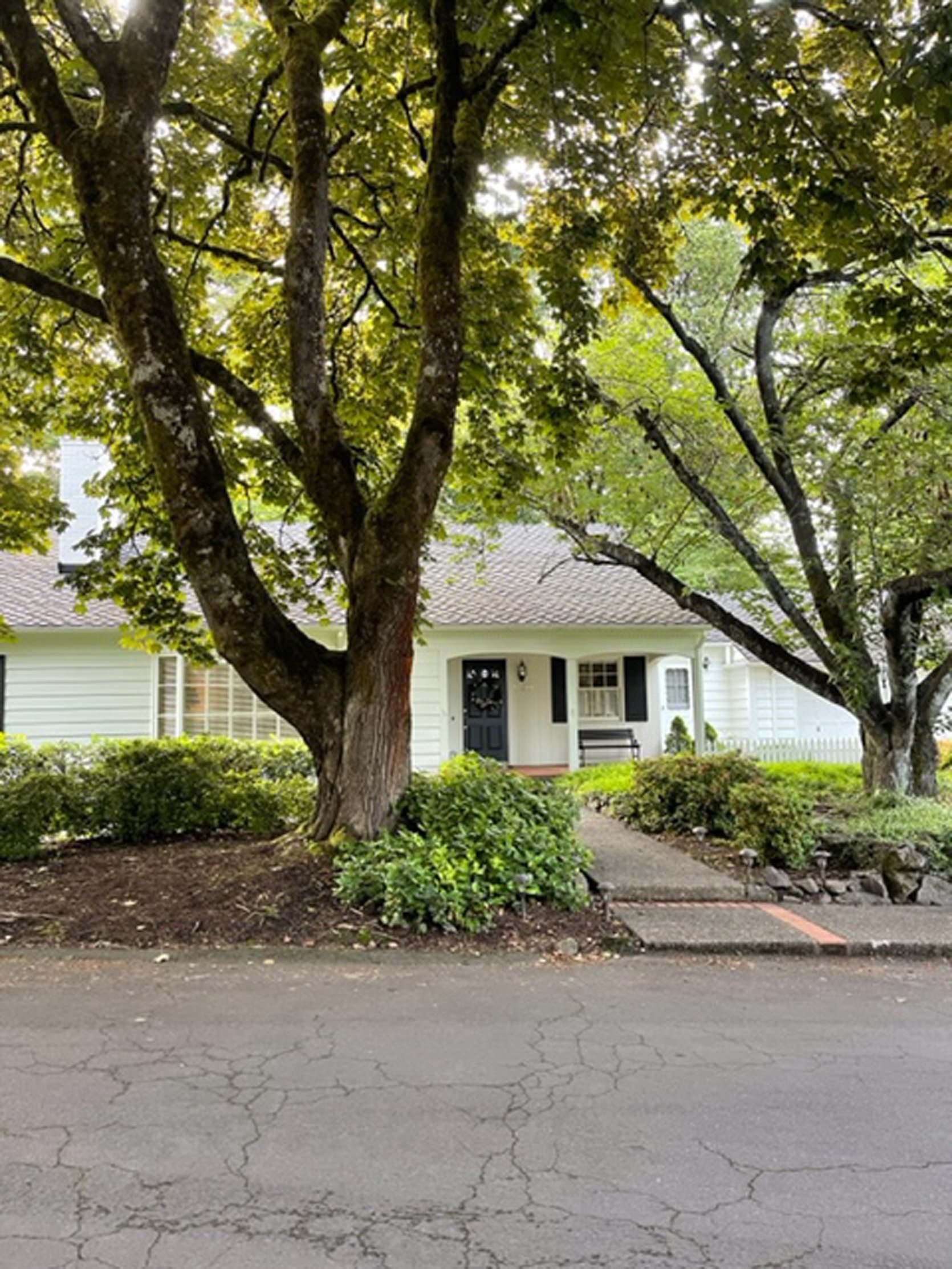
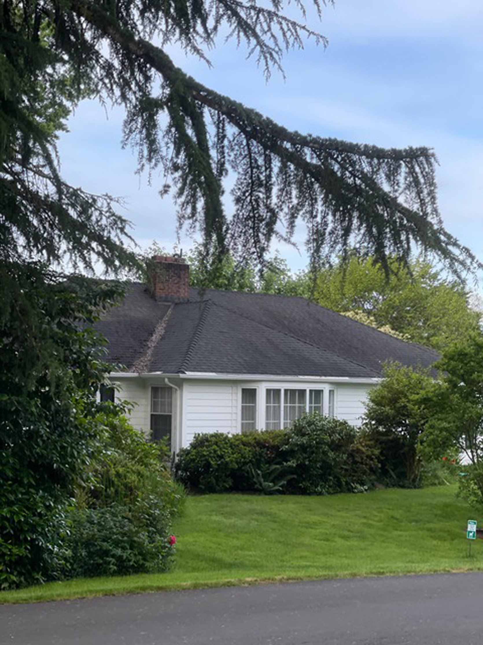
I think understanding your weather, your flora and fauna in your own locale is a good exercise. We really really want this house to feel bright, fresh and happy. Not muted or depressing, and staying far away from beige.
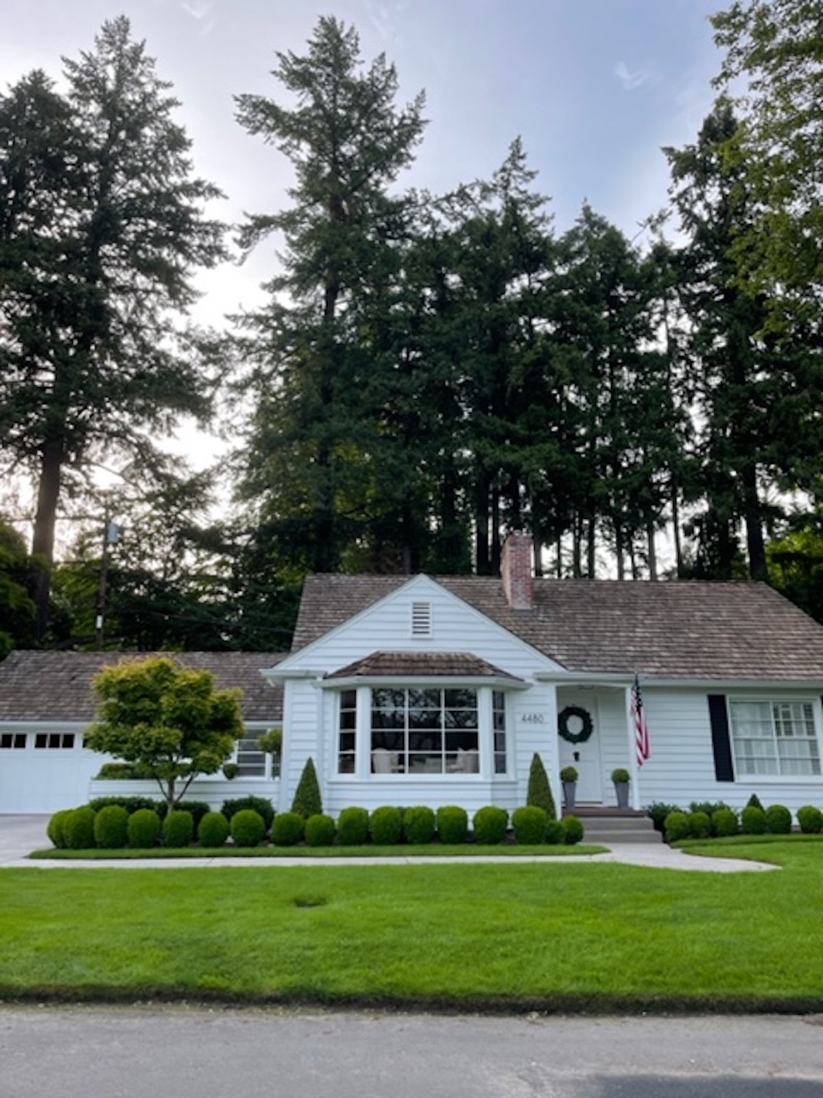
We like how the green and white really pop off of each other even though stylistically ours will be very different.
A Few Fun Options …
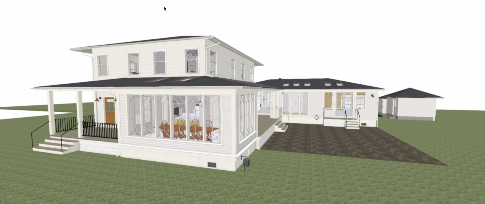
Months ago we asked Anne to play with some colors on the house – to see what a white (above) and a dark (below) trim color would do to the house.
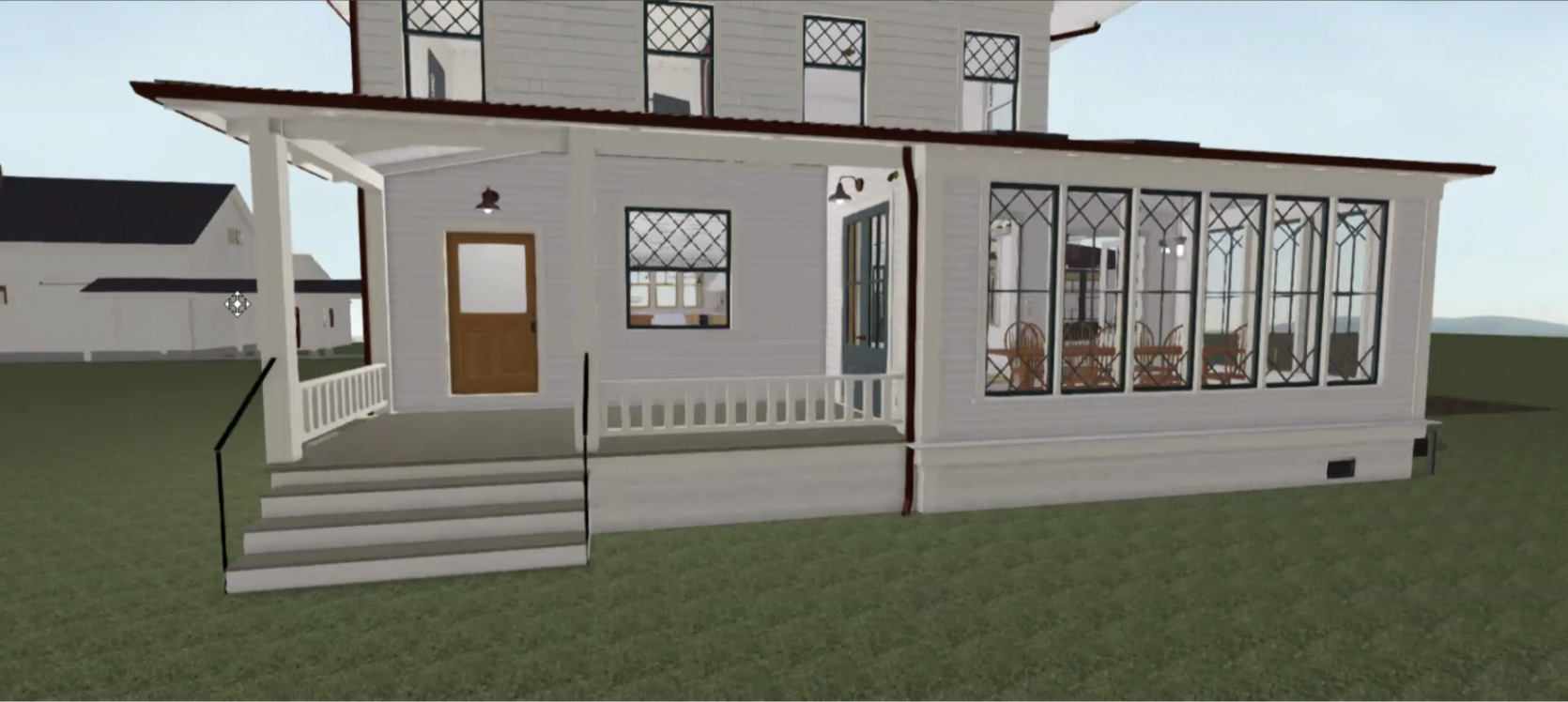
As you can see the white is a bit boring and the dark is a bit busy. So we felt pretty good about choosing something in the middle.
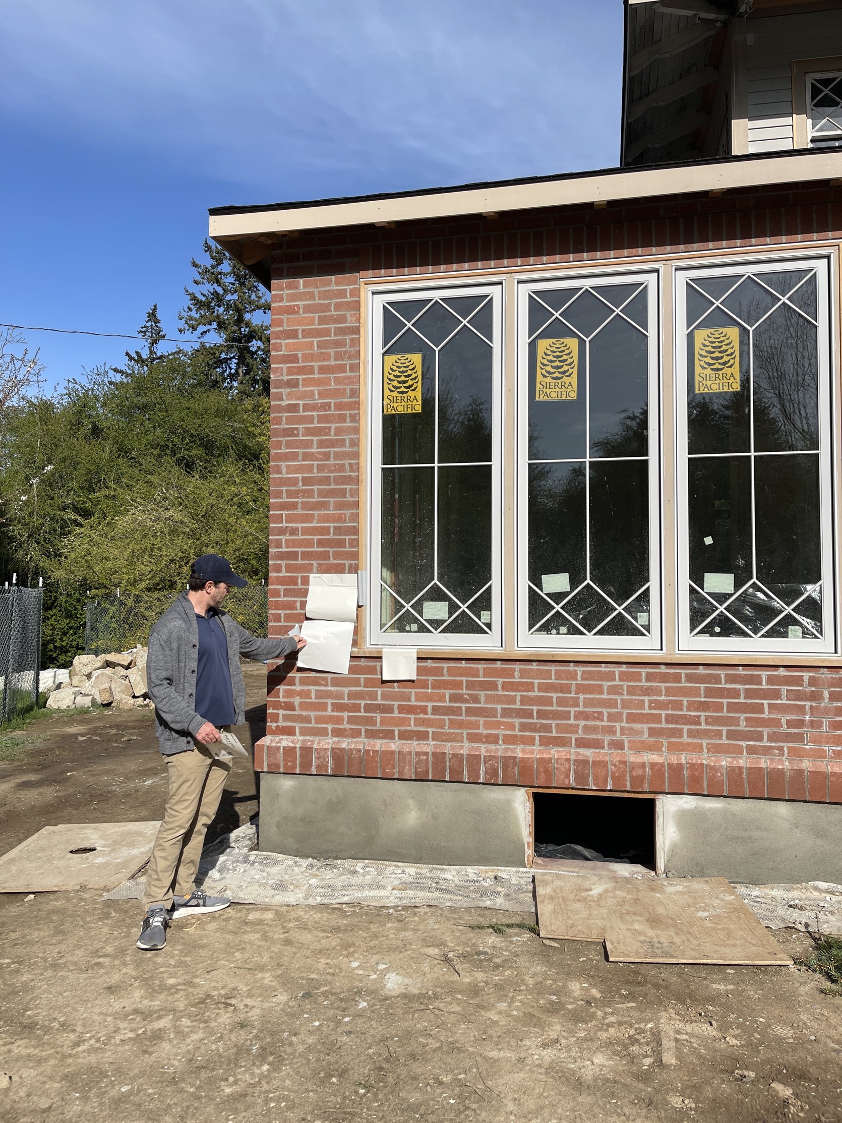
So we ordered a ton of Sherwin-Williams paint stickers in whites and light gray/blues and went around the house to see it in full sun and shade. The biggest thing we wanted to make sure was that we liked was how the light gray/blue interacted with the already clad steel blue gray doors and the Sierra Pacific clad windows.
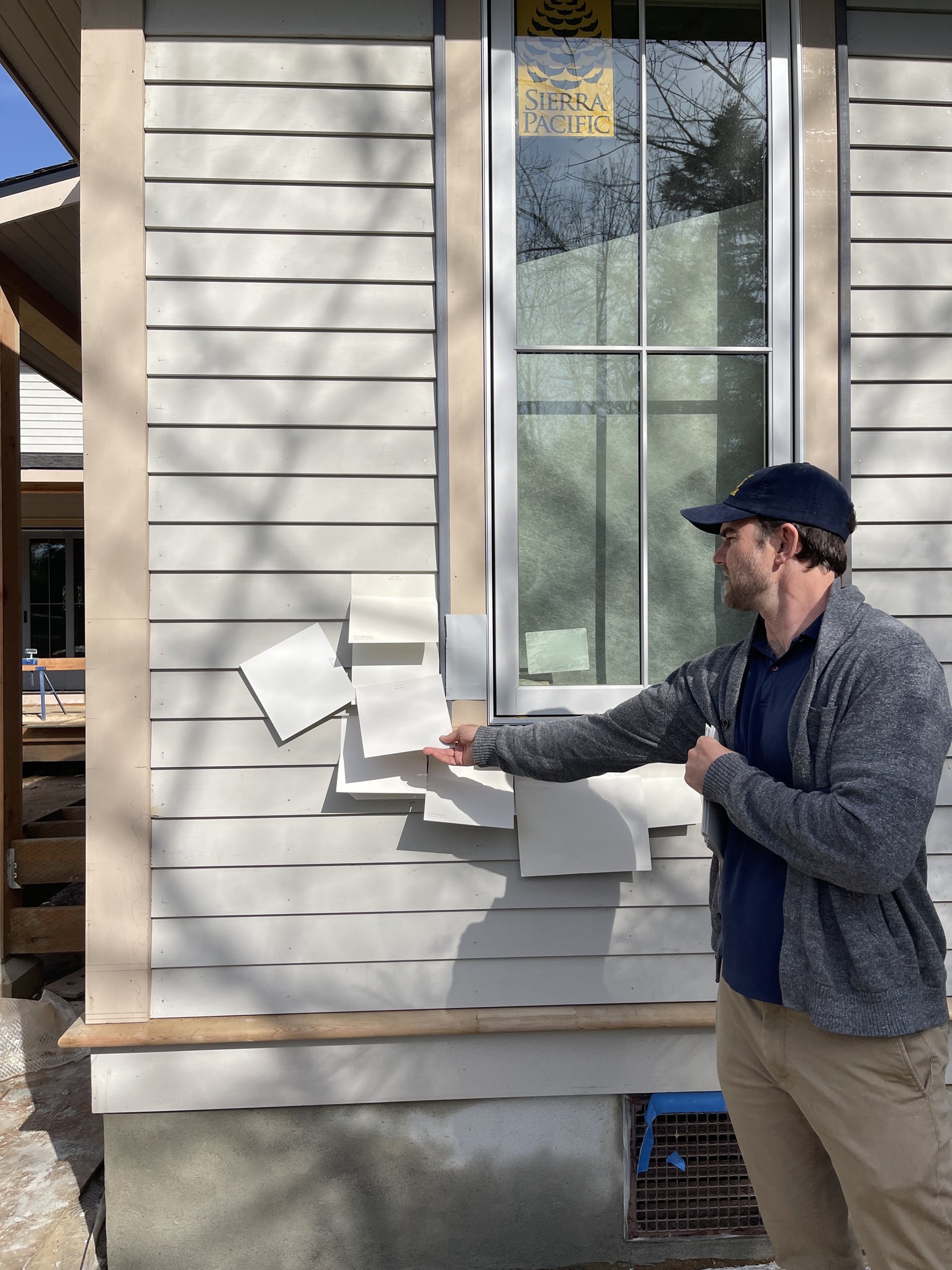
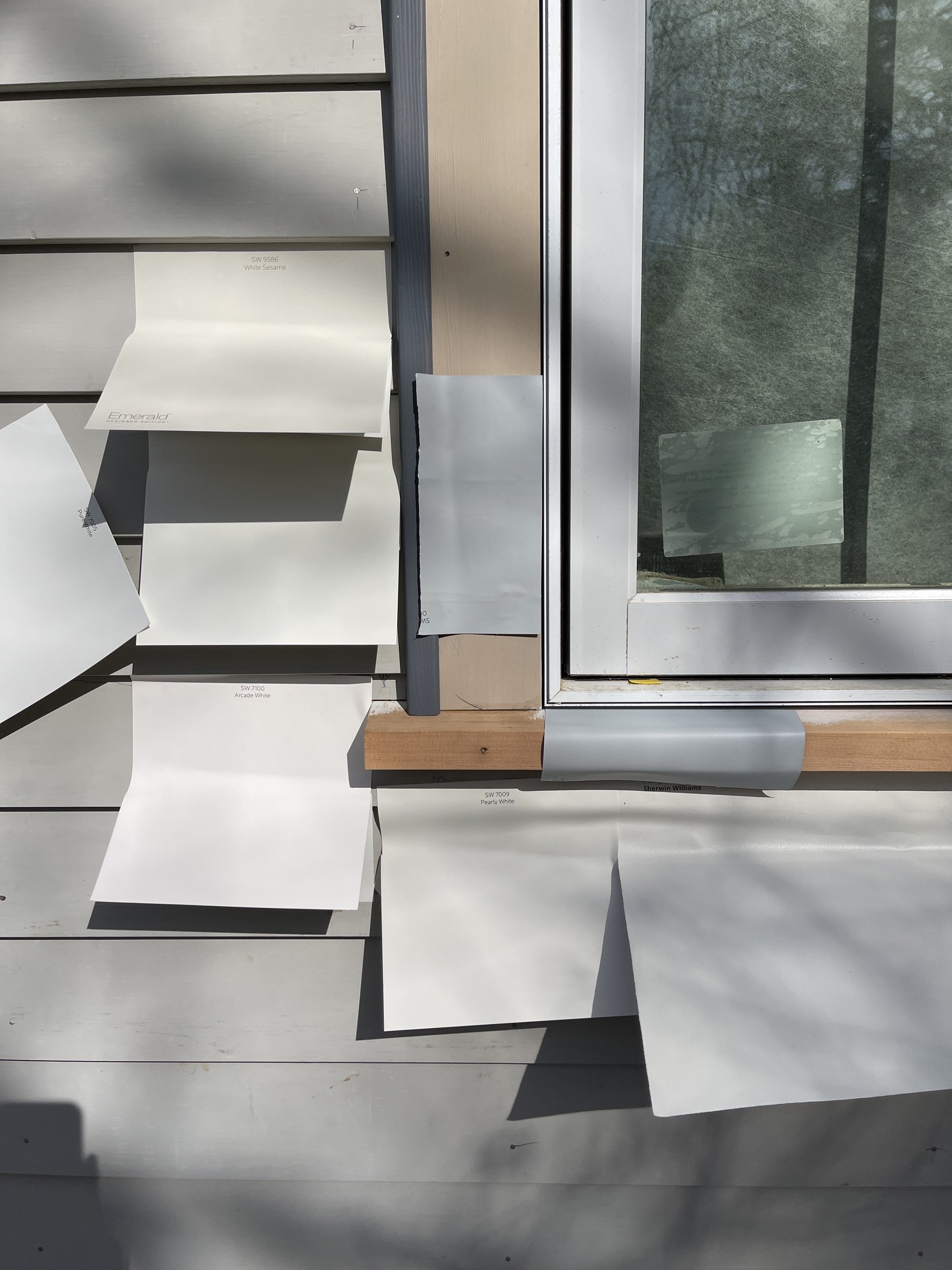
The gray you see on the window casings is Sherwin-Williams Online , and we really like how it interacted with the blue of the door (below) and the white windows.
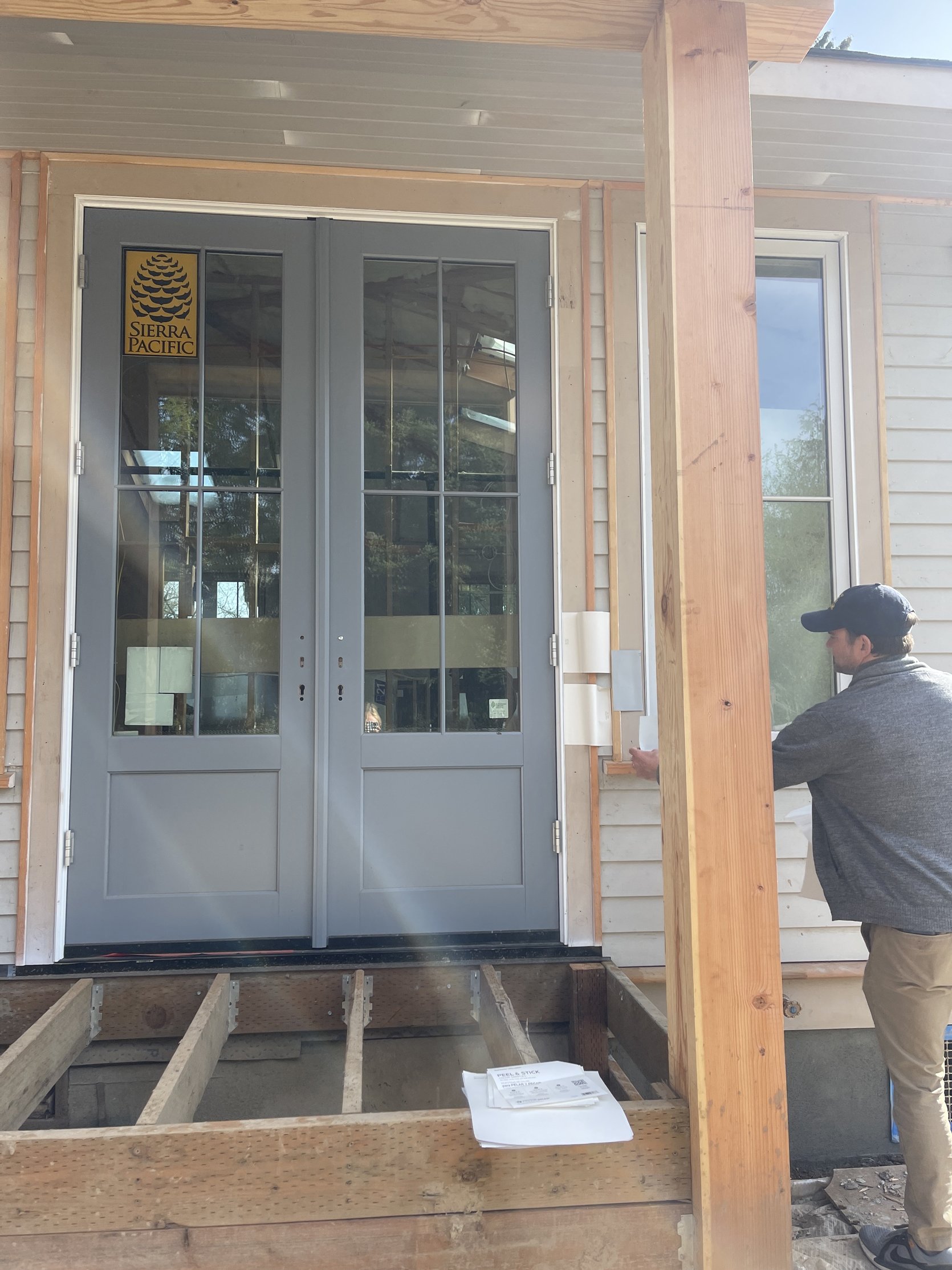
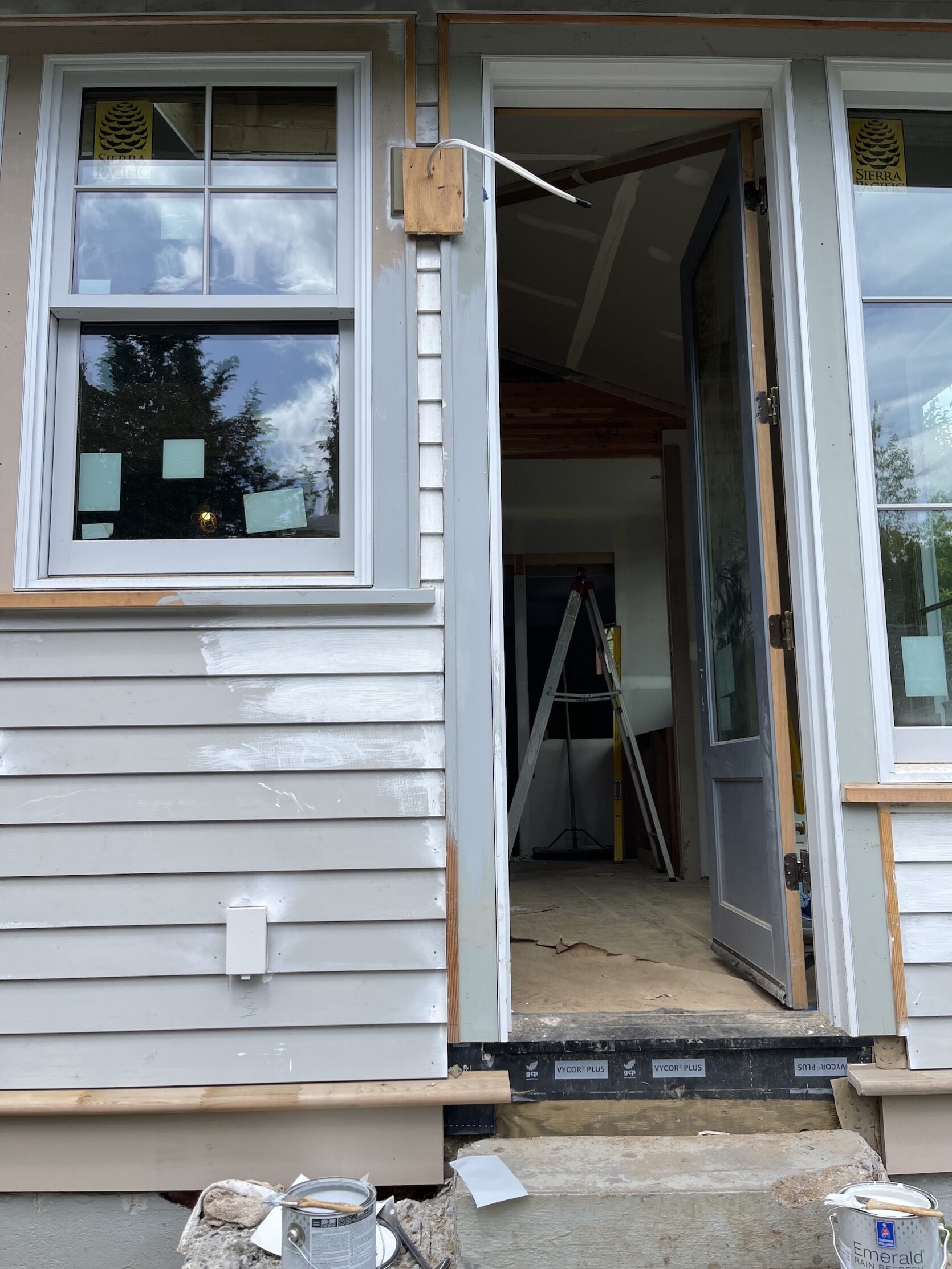
So we tried it out on the house with a couple of paintbrushes and really liked it.
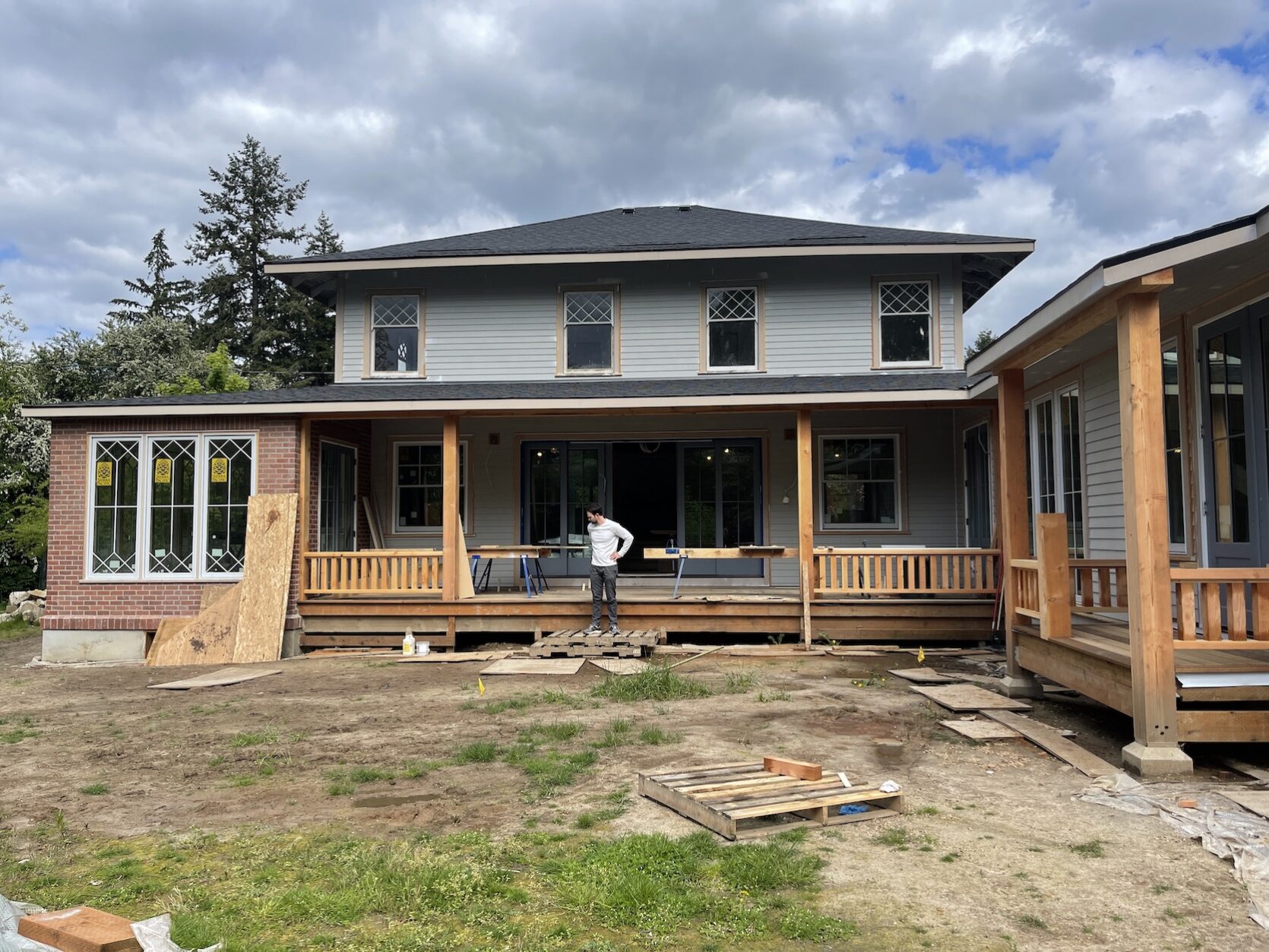
They have started prepping the house to paint, but we haven’t totally locked down the color. I’m a little worried that the Sherwin-Williams Online is not blue/happy enough, but Brian, Anne, Stephyn AND my friend/photographer Kaitlin all disagreed with me. They think it’s classic and classy. But like I said above, I think that no matter what, it will look really good. And yes, we do plan on putting shutters on the second floor in the same blue as the doors so I think that will help A TON. Here is the plan so you can visualize it more:
- The Body of The house – Either Sherwin-Williams Pure White or Sherwin-Williams Extra White in Satin Rain Refresh. They literally look identical. Originally I chose Extra White, but then I just realized that I’ve used Pure White a lot before (for the Portland interior) so I might switch.
- All door and window casings where there is wood siding – Sherwin-Williams Online in Satin Rain Refresh
- Smaller wood casings around sunroom windows – Sherwin-Williams Extra White
What I’m nervous about:
- For whatever reason we ordered the windows to have a white frame and a slightly light gray sash. I remember that we didn’t want a white sash because we wanted it to be less WHITE as to not look like vinyl, but unsure why we chose a different frame color and it can’t be changed (it’s aluminum clad, not wood), so it is what it is and we know it will be fine. But it makes me nervous to paint the original windows on the second floor a bright white if the ones on the first are a SLIGHT tone of gray. We all decided that I should CTFD and that it would go unnoticed since the light blue casing color would separate them all. Plus we’ll likely have shutters up there. It also means that there is a white strip between the sashes and the casing, which we decided that we think will look good if you even notice it. It ties in with the body of the house. But yeah, I’m a little nervous.
- I’m nervous that we should paint the window and door casing on the brick sunroom the light blue/gray instead of white, but it’s a much smaller profile of casing – which is more period appropriate. I just don’t want it to be ALL WHITE and have it feel like it’s missing that accent color. Those windows are so gorgeous and I want them to be highlighted. Luckily if that were the case, painting the light gray over the white would be easy-ish and likely something we could do ourselves.
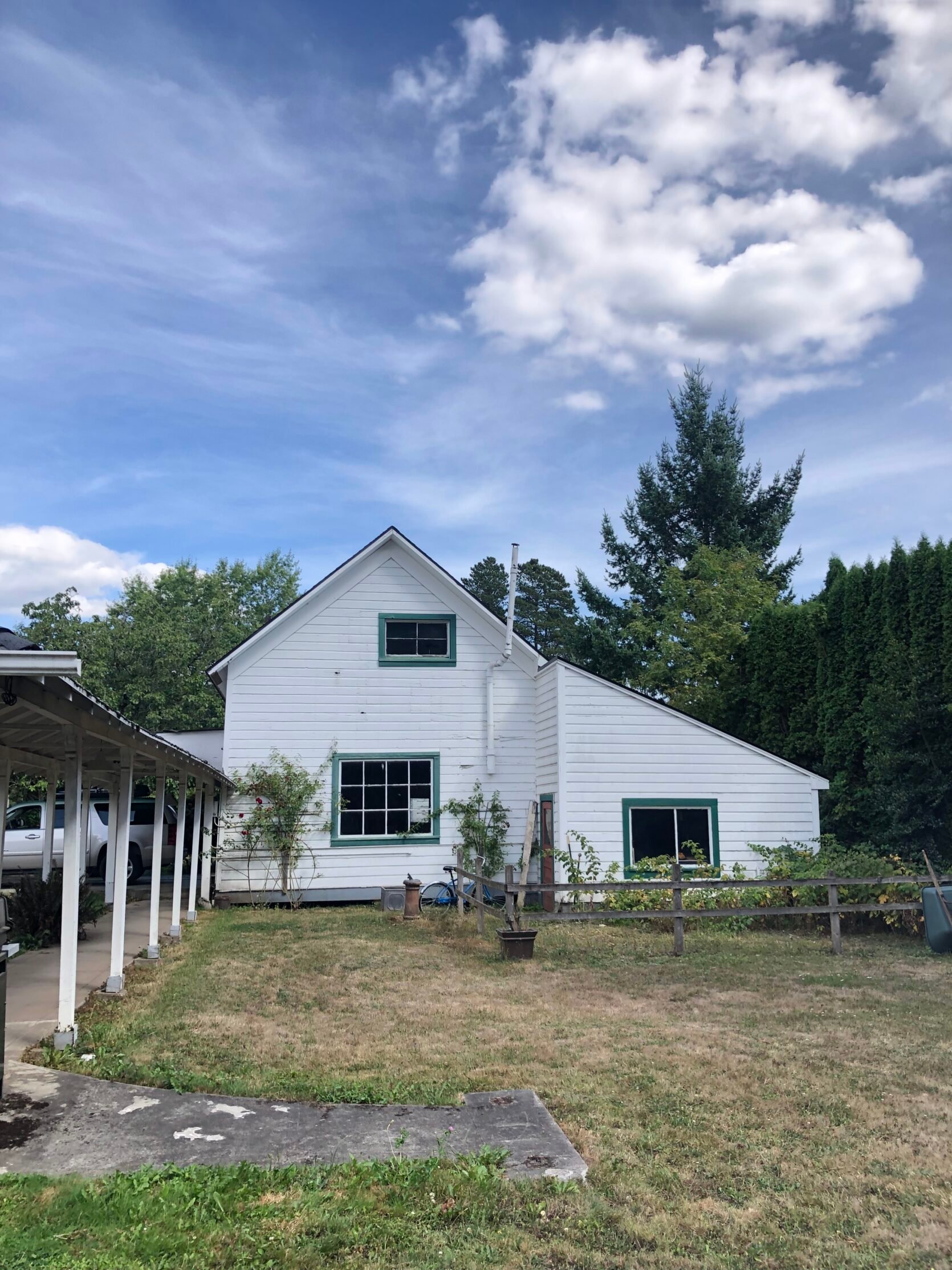
- Is our white too white? Maybe? What has made me feel better is that we held up the paint sticker onto to the old house on the property (the one from the 1850s – see below) and it matched perfectly.
I’m honestly just as eager to see how it turns out as you are. Some days I feel super confident in our decisions. ARCIFORM has been really involved in the more architectural decisions (like railing, stairs, windows and doors) and I trust them so much. Other times I’m nervous as this isn’t my wheelhouse and it’s super permanent. But I’m standing by my own advice – no matter what we will make it look GOOD. Will it be on the safer side? Probably. But thats ok 🙂 I’d rather be safe when it comes to these relatively permanent decisions, than regret that we went too trendy or playful. We are erring on the side of “classic and timeless” and I don’t think any of our decisions go against that – YET. 🙂 And I know that truly no one else will ever notice (except you guys as I point them out) the tiny things I wish I had done slightly differently. Remember (as I’m telling myself) this is the stage where you find yourself obsessing about how things are turning out, noticing that some things aren’t as you had pictured. But I promise you (me) that when it’s all done you will likely not notice them. It’s like we are standing in front of the mirror only wearing a blouse. You don’t have the full picture so you over analyze the stitching, the fit, the shade of color. But you have to trust that once you get the full outfit on, an outfit that you painstakingly curated, it will look amazing.
THIS POST WAS ORIGINALLY PUBLISHED HERE.


