If you’ve been following along with my home renovation journey here on Emily’s blog, you know that I’ve accomplished quite a bit in my home over the last couple of years. I’ve completed a primary bedroom renovation, a somewhat unexpected bathroom overhaul, a life-changing home office makeover, and a slew of smaller projects that have made this house really feel like home. And now… to shake things up a bit… I’M MOVING TO LONDON.
A little unexpected after all the momentum I’ve gained here, huh? Well, I’ve decided to take the opportunity to travel to Europe for a period of time. Starting this summer, I’ll be moving to London (woo!) and leaving my house here in Virginia in the hands of a tenant (and a property management company) while I’m away. I’ll definitely be returning here to Virginia (I have a lot more plans for this house and my heart is still in this area), but the stars have aligned for me to take this journey across the pond, which is something I’ve always wanted to do. So, cheers to that!
I’m excited to learn how European design, old-world architecture, and the British lifestyle will influence my ever-changing design sensibilities. I’m always looking for different ways to create memorable experiences through intentionally-designed spaces, and I think this adventure will give me a new outlook on different ways that might be possible.
HOWEVER, before I ship out in a couple of months, there are a handful of things I want to do (and a few things I NEED to do) in this house before renting it out. Namely, completing my final room makeover before I leave: the dining room!
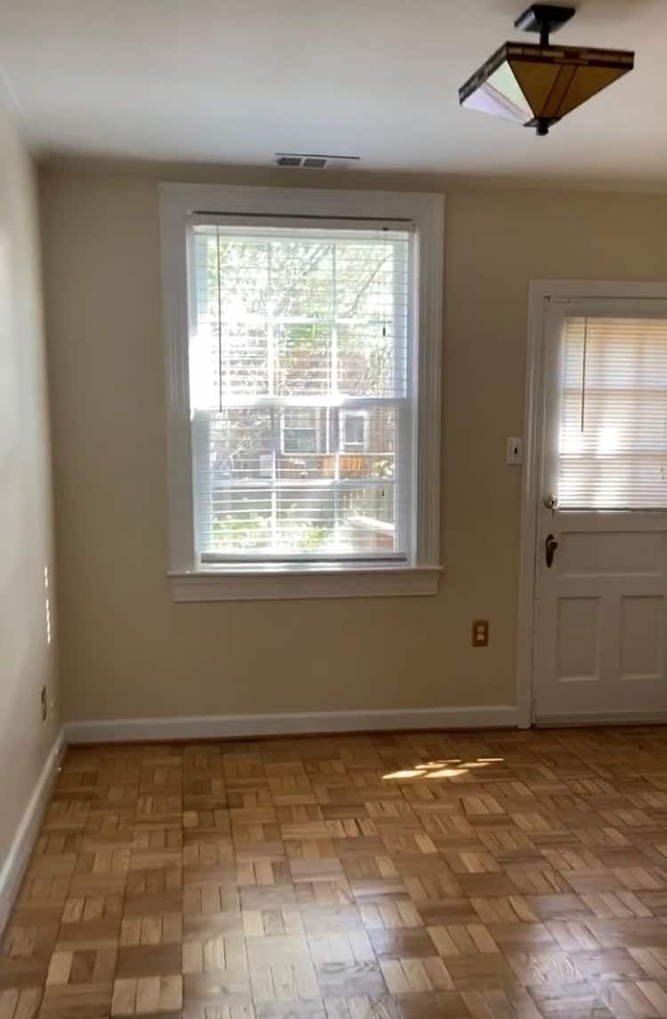
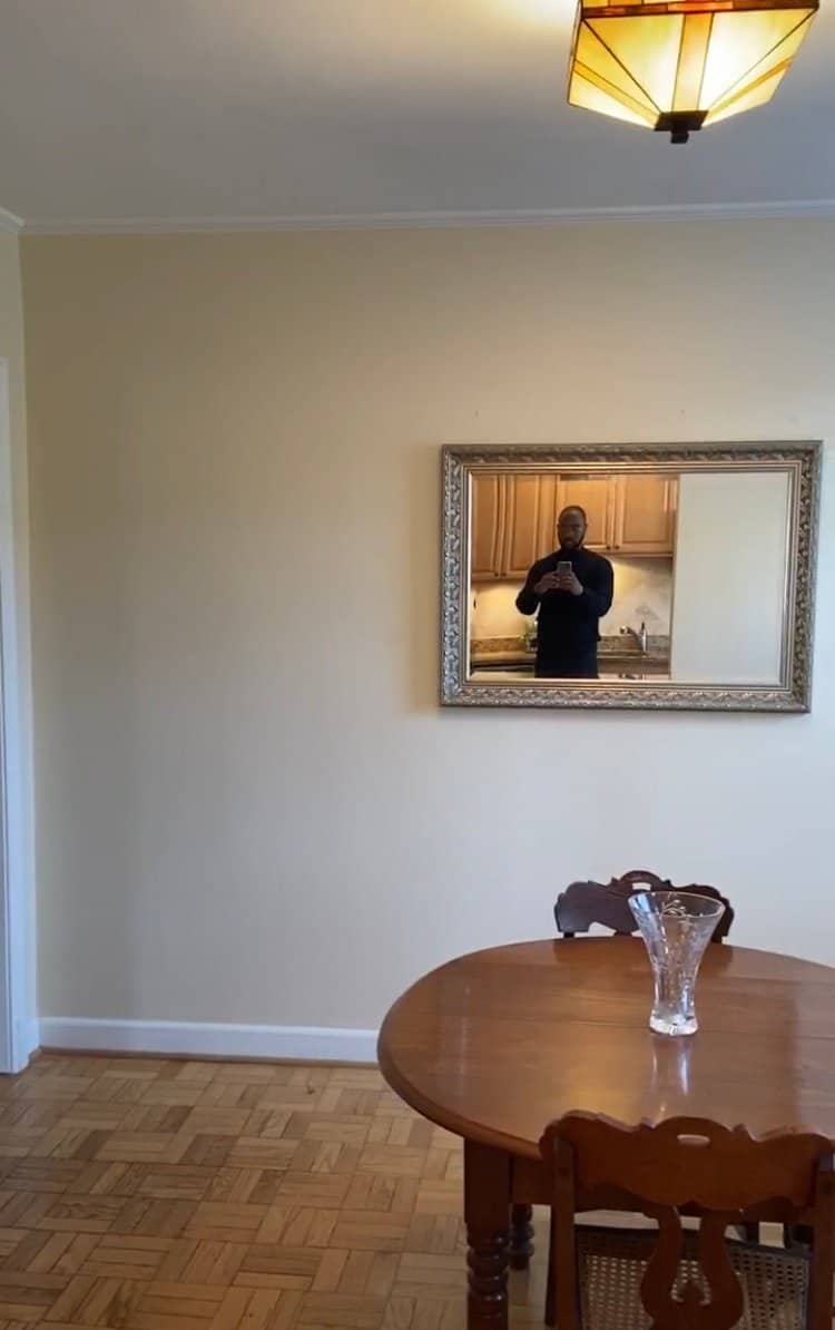
Now, planning this dining room redesign has been a little tricky, for a handful of reasons. For starters, while I’m mindful of the fact that I won’t be in this house much longer to enjoy the room in the short term, I still want the space to feel intentionally designed and consistent with the rest of my house. Additionally, while I would normally be open to buying new furniture/housewares/accessories for this space, it seems a little weird to buy brand new things that’ll just be put into storage in a couple of months. To those ends, I’m focusing on making quick changes that won’t be as labor-intensive as other makeovers I’ve completed (and that a renter will appreciate), collecting secondhand and vintage items to use in the space (that I’ll be able to enjoy when I return stateside full-time), and making changes that allow the room to flow seamlessly with the rest of my home (in an effort to create a boutique experience for my future tenants).
“QUICK” CHANGES
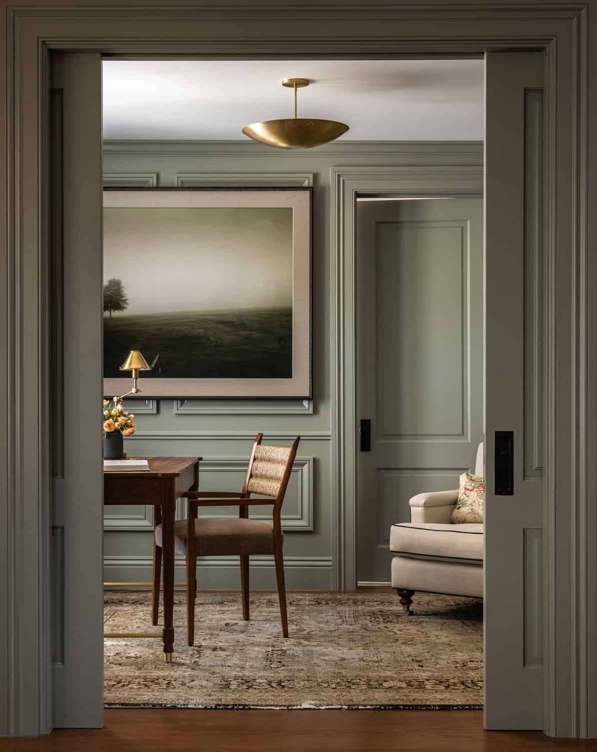
Typically, my renovations in this home have included a feature, large-scale DIY project. In my primary bedroom, it was a wood and marble headboard. In my office, it was custom-designed built-ins with concrete countertops and Semihandmade door fronts. While I don’t quite have the time or the resources to take on a massive project for the dining room, I’d still like the space to feel as custom and tailored as the rest of my home. Enter… a “simple” wainscoting project (those quotation marks are very intentional…).
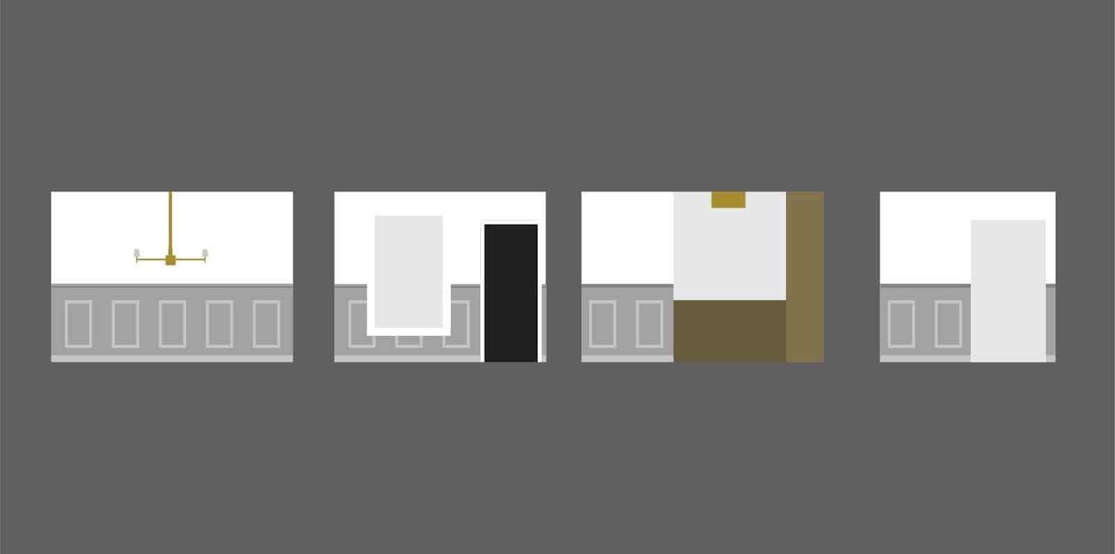
I completed a similar project in my last home, so I was confident that I’d be able to knock it out in a weekend or two for the dining room. And that would have been the case… had I not driven my FINAL NAIL FOR THE INSTALL into a wire behind the wall and cut power to my entire house. I wrote about the full story on Instagram, so I won’t repeat it all here, but to summarize: the problem has been fixed, it forced me to learn about the faulty electrical wiring in my house (eek), and this dilemma was a reminder that everything happens for a reason.
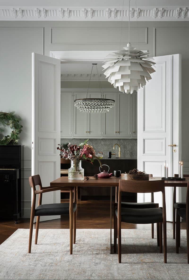
BUT, I digress. With the wainscoting figured out, it’s time to move on to choosing paint! This has been a tremendously hard decision to make, which would be the case under normal circumstances, but intensified this time because of my forthcoming move. Do I choose a bold color, or might that turn away renters? Do I go with a safe and neutral option, or will that be boring and unsatisfying? Ultimately, I do need to be mindful about making my house as rentable as possible, but I do think there’s a middle ground to be found (sick rhyme, bro).
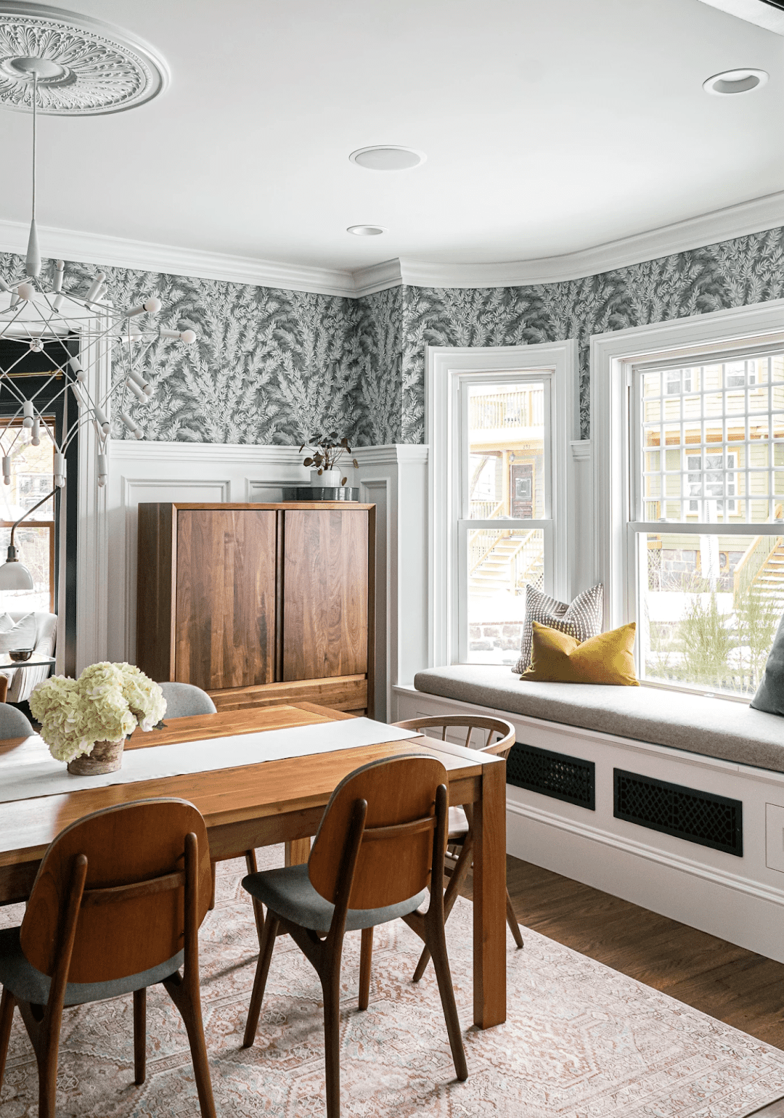
And, my friends, I think that middle ground is wallpaper.
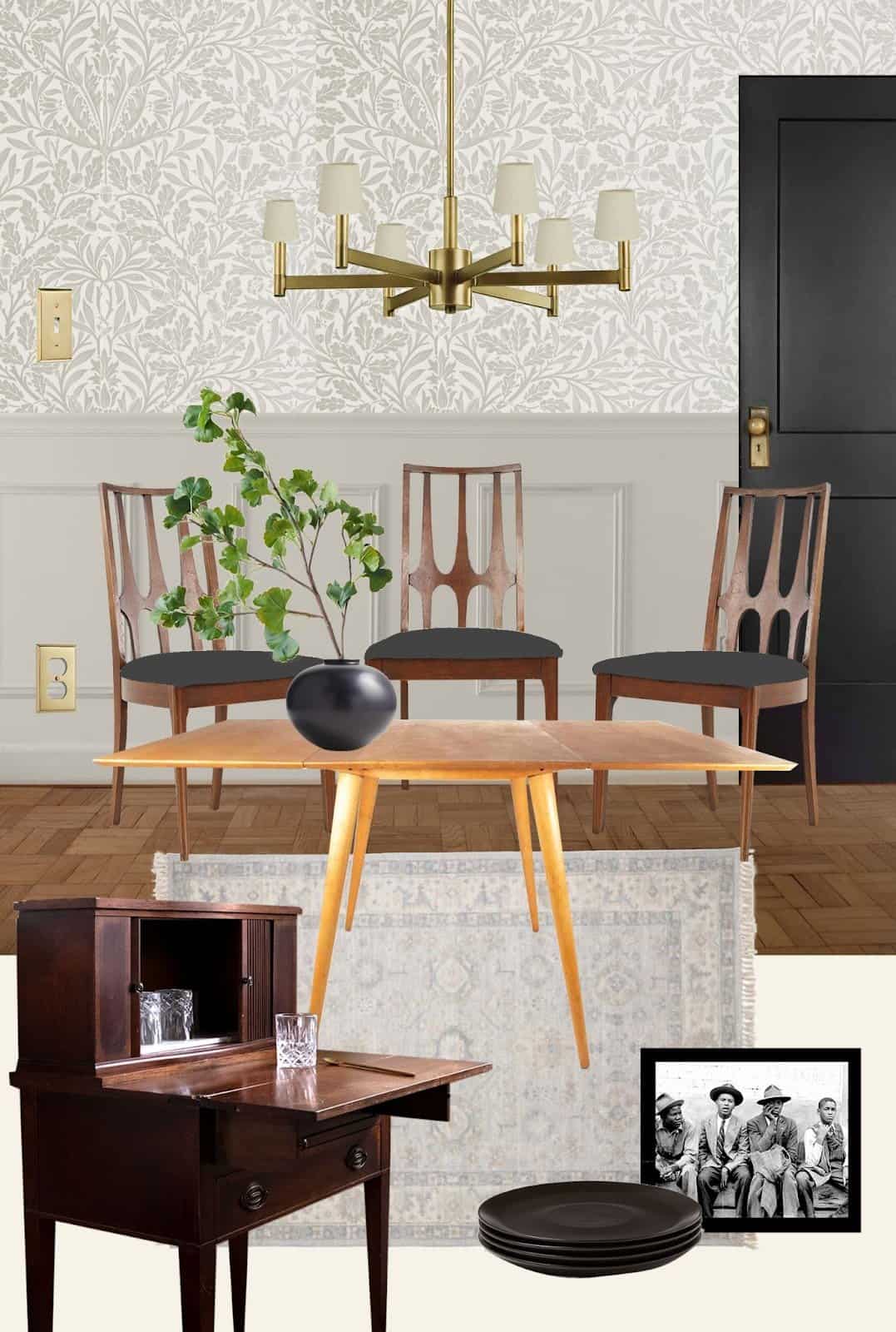
Stick with me. Pun largely intended. On the surface, wallpaper seems like a moderately permanent and style-specific treatment that might go against some of my previous points. But… What if… I can install it in a VERY impermanent way? I’m thinking of some version of large-scale artwork that gives the impression of wallpaper without any of the permanence of the actual thing. Even less permanence than sticky, removable wallpaper. I’m still working through the mechanics of it all, but it’ll likely include this William Morris print from Rejuvenation and a large piece of Sheetrock. Stay tuned.
Another quick change to the dining room will be switching out the old ceiling light for a new one. I’ve been itching to change up the lighting in here for quite some time, but couldn’t quite settle on the type of fixture that felt right for the space. Then, one day, I stumbled across this Kichler chandelier and pretty immediately felt inspired by it. The lines of the piece feel energetic, but not too out of pocket. The scale of it feels just right, and you know I love me a brassy moment. And the best part is: I scored it secondhand! Which brings me to my next point…
UTILIZING SECONDHAND AND VINTAGE PIECES
I was lucky enough to find the Kichler light fixture at Community Forklift: a salvage warehouse here in the DC area. I’ve always loved supporting Community Forklift—they uplift the local community by making home repairs affordable, reducing waste, promoting reuse, and creating green jobs. On top of all that, they just always have the coolest stuff. I love perusing the warehouse on a Sunday and just seeing what they have in stock.
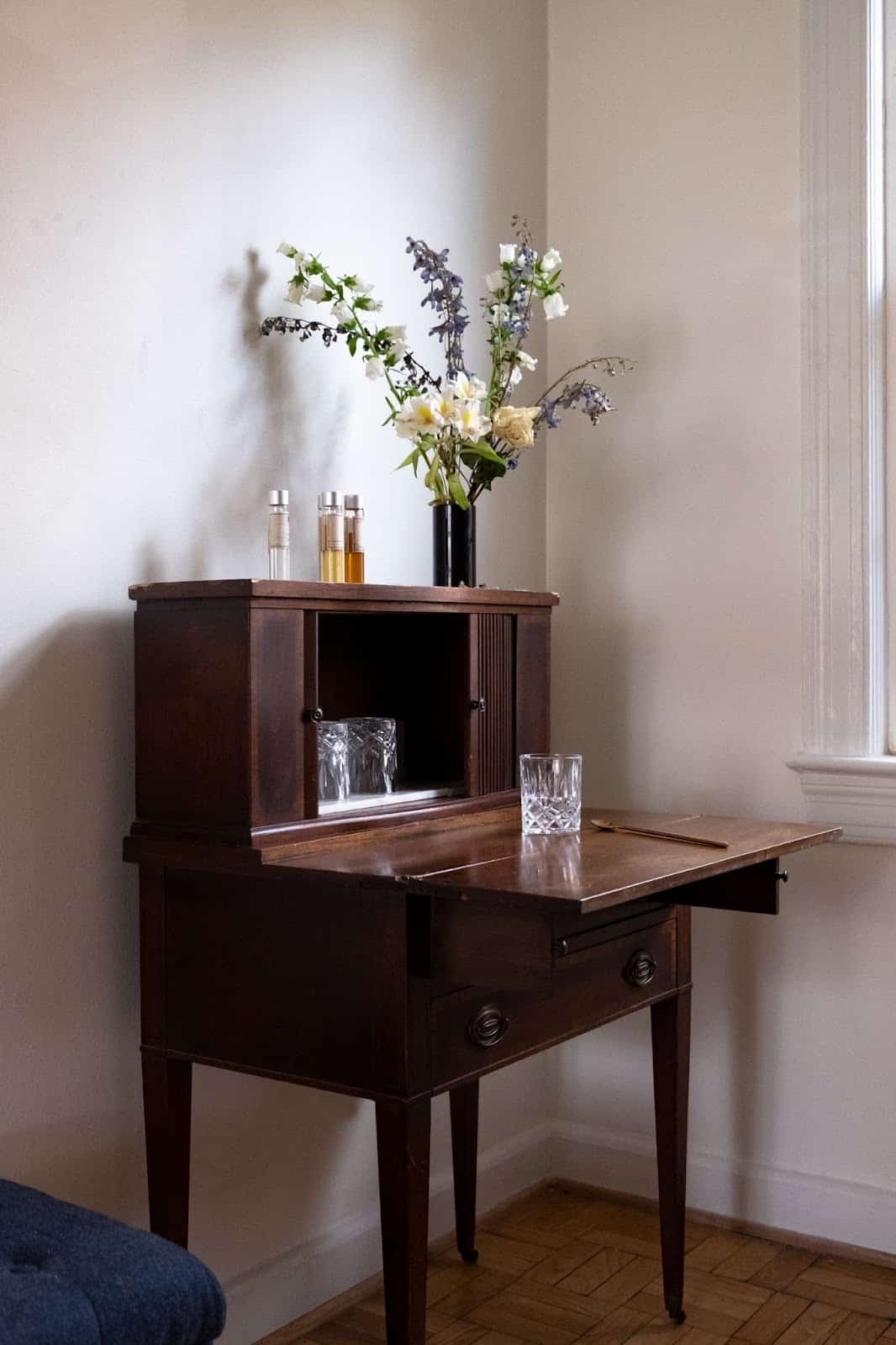
I also found this vintage secretary’s desk—which I’ve upcycled as a little bar cart—at Community Forklift about a year and a half ago! This will make its way into the dining room as well and will store cups, napkins, and other barware essentials. I love the fluted detailing on its sliding doors, the long tapered legs, and the marble slab I’ve added to the inside shelf.

Also, let me tell you… I’ve gotten REAL lucky on Facebook Marketplace recently. The manifestation for this dining room has been real. I’ve always admired the design of these Broyhill Brasilia dining chairs, and I was recently able to score five of them for a reasonable price on Marketplace. Crafted in the 1960s, the Broyhill Brasilia line was inspired by the style of mid-century Brazilian architecture. I lived in Brazil for some time as a kid, so I have a bit of a personal connection to this line in particular. But, also, these chairs are just sexy, quintessential examples of mid-century modern design. They’ll require some reupholstering (I’m not sure that the toile fits either my style or the style of the chairs), and I’m still deciding between a light and a dark solid fabric. Thoughts?! Let me know what you think.
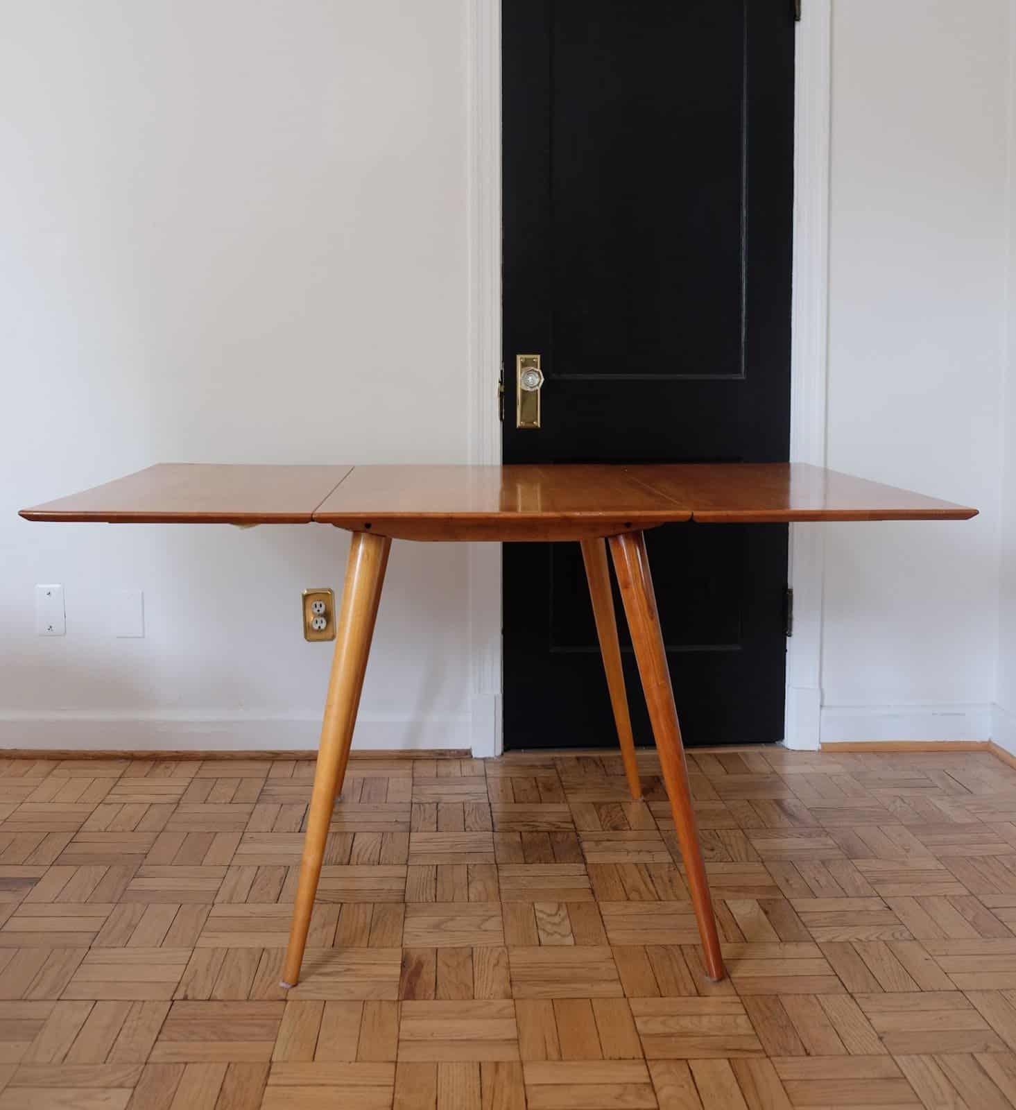
I was also able to snag this Paul McCobb dining table (!) on Facebook Marketplace, which was manufactured in 1950 and matches the vintage of my new Broyhill chairs. The finish/color of the table is notably different than that of the chairs, but I think they work VERY well together… The lighter striations in the wood framing of the chairs speak pretty well to the blonde coloring of the table, and the similar vintage of it all creates a very copacetic pairing.
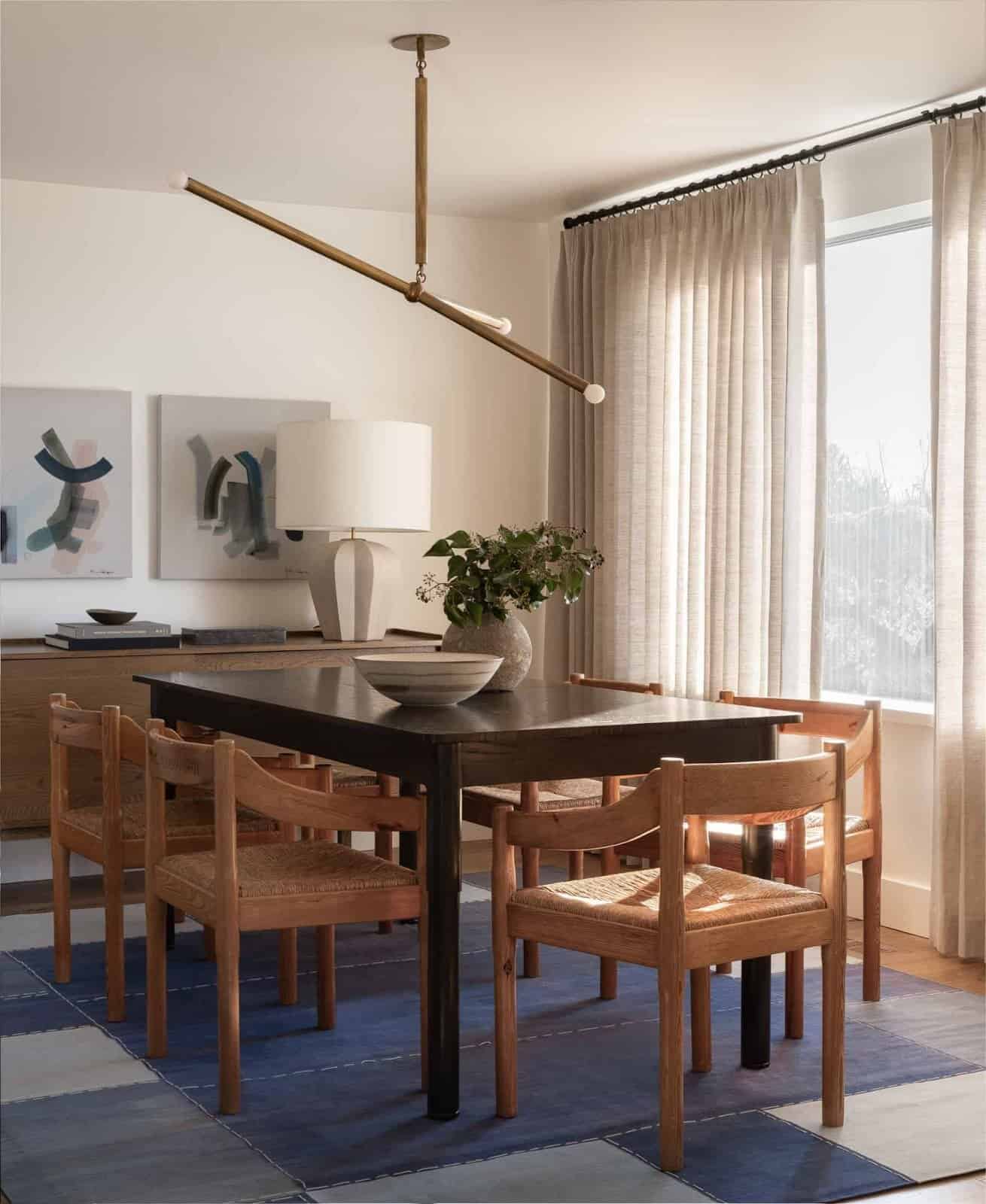
Procuring vintage furniture and accessories for this space really feels like the right thing to do, for a number of reasons. Firstly, I’ve been increasingly aware of the importance of using secondhand items whenever possible. There’s SO MUCH COOL STUFF already out there in the world, and it behooves us to take advantage of that. I certainly have never been perfect about reducing, reusing, and/or recycling, but there’s no time like the present to start, right? Secondarily, since I’ll be putting most of my belongings into storage fairly soon, it doesn’t feel totally appropriate to buy too many new things just for them to be stored away. Additionally, I’ve curated quite a few vintage objects over the years, and these Broyhill chairs and this Paul McCobb table are great additions to that collection. And… that point naturally brings me to my next thought…
CREATING A SEAMLESS DESIGN EXPERIENCE THROUGHOUT THE HOUSE
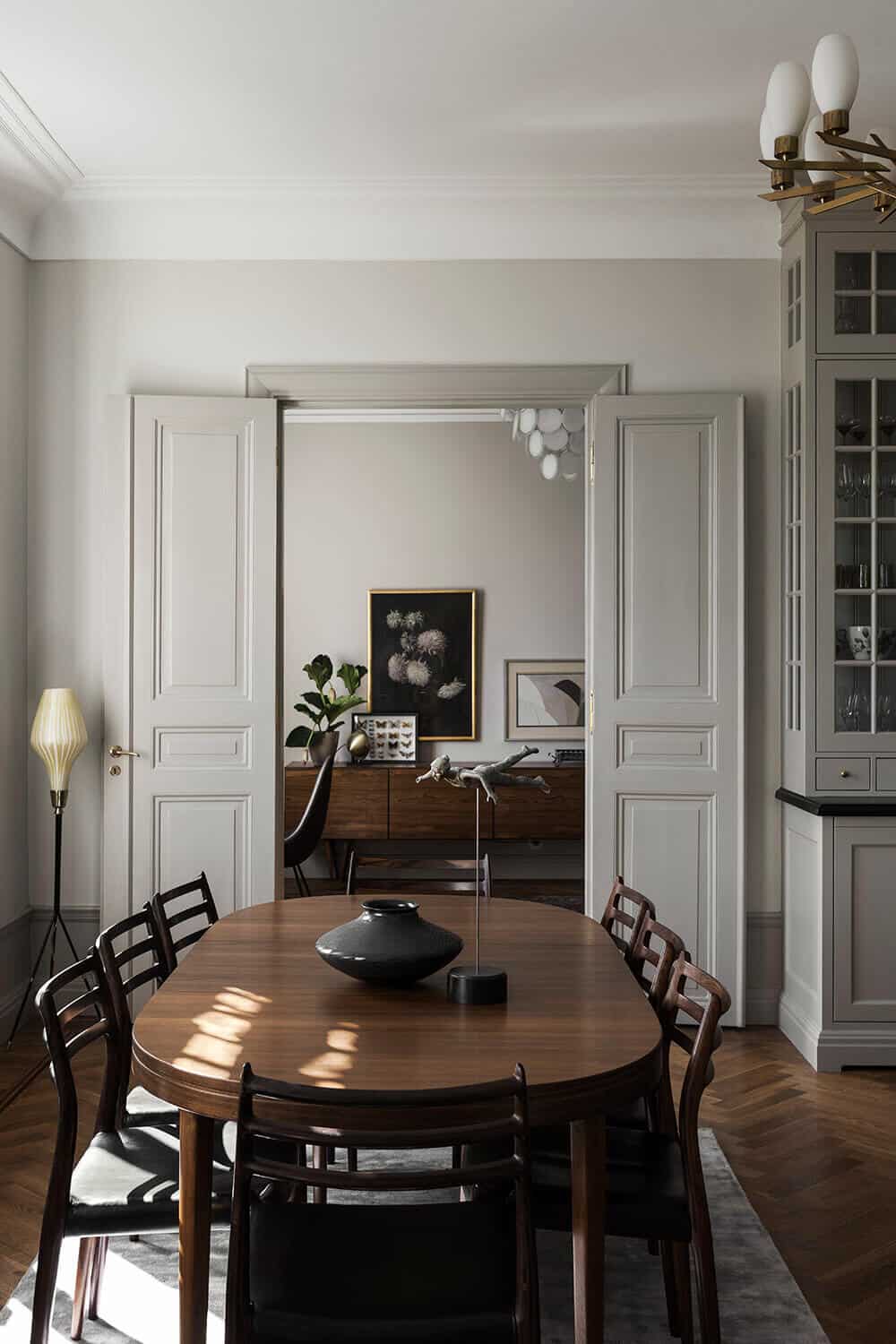
I’ve often described my overall design style (for now, anyway) as classic, collected, and tailored. To that end, I’ve collected lots of interesting and vintage furniture over the years—from the aforementioned secretary’s desk to a family-owned sewing table in my primary bedroom, and a secondhand barrister bookcase in my office. I’d like to continue collecting meaningful objects—regardless of my upcoming move—because while I only have a couple of months left in this house, for now, these objects will probably be in my possession forever. And there’s something very heartwarming about the notion of that.
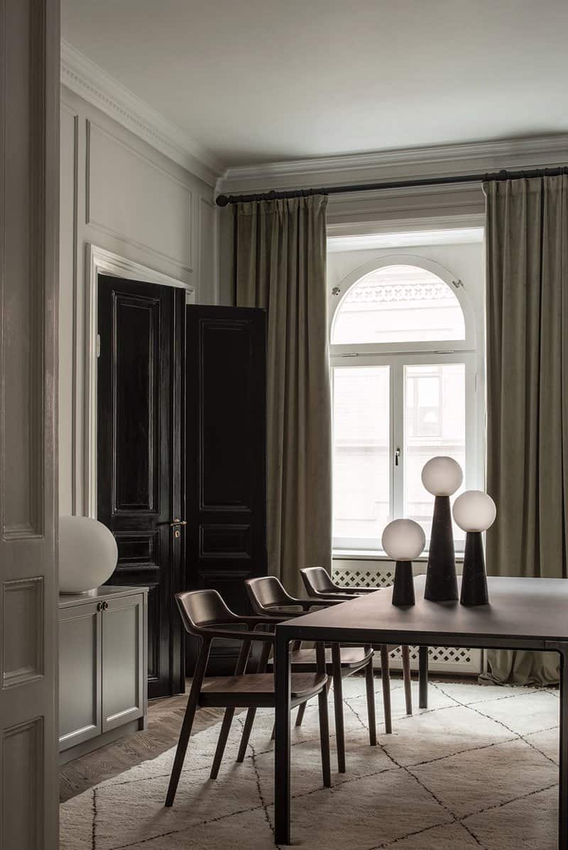
Contrarily, however, there are some elements of the dining room that I can change now—that’ll stay with the house in my absence—that a renter will be able to enjoy while I’m away. In a PERFECT world, I would list my home as a short-term rental and brand it as a boutique lodging experience, but my HOA doesn’t allow for it and won’t let me be great. BUT, I can certainly make it feel that way as much as possible, right? At some point in the future (manifesting it now, ok?!) I plan to develop a motel/boutique lodging experience, so why not let this situation be practice in some small capacity?
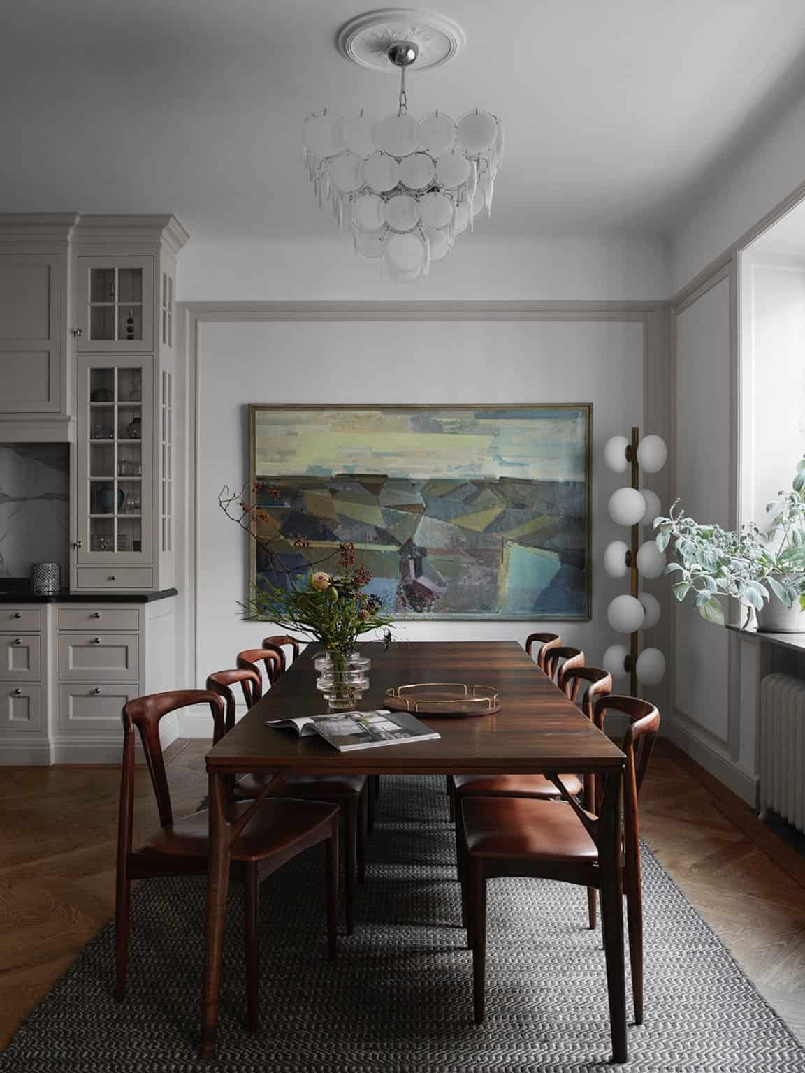
Two small elements that will make that possible will be wall plates and window treatments. When I redesigned my bathroom, I started to use these brass Rejuvenation wall plates for the outlets, which I then continued into the office. I’ve been slowly replacing all of the wall plates in my house over the last year to match, which I think is an easy way to create a seamless design experience throughout a home. I’ll be using the same wall plates here in the dining room, which will help the room speak the same language as other spaces in the house. Side note: I personally think high-quality wall plates are worth investing in. We see and use them every day, so why not make that experience a beautiful one? I’m also in the process of updating/streamlining all of my interior door hardware with Rejuvenation’s help, which will help to create an even more intentionally-designed home.
I’ve been thinking hard about the window treatments for the dining room, and how they’ll fit into the narrative throughout the rest of my house. Should everything match? Will a renter expect the same blinds everywhere, or is there space for creating unique treatments in each room? What would YOU expect, as a renter? Let me know.
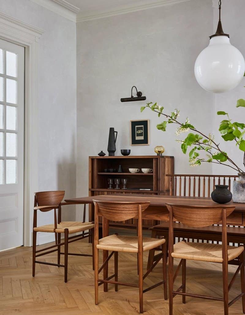
Otherwise, I’ll be paying a lot of attention to stylistic choices in the dining room to ensure that they make sense with other decisions I’ve made throughout the house. Making sure the wainscoting aligns with the other millwork in the house, painting the walls similarly to how I’ve painted other rooms, and choosing finishes (namely, brass) that call out to other spaces will all be key to making the whole house feel like a fully-realized experience.
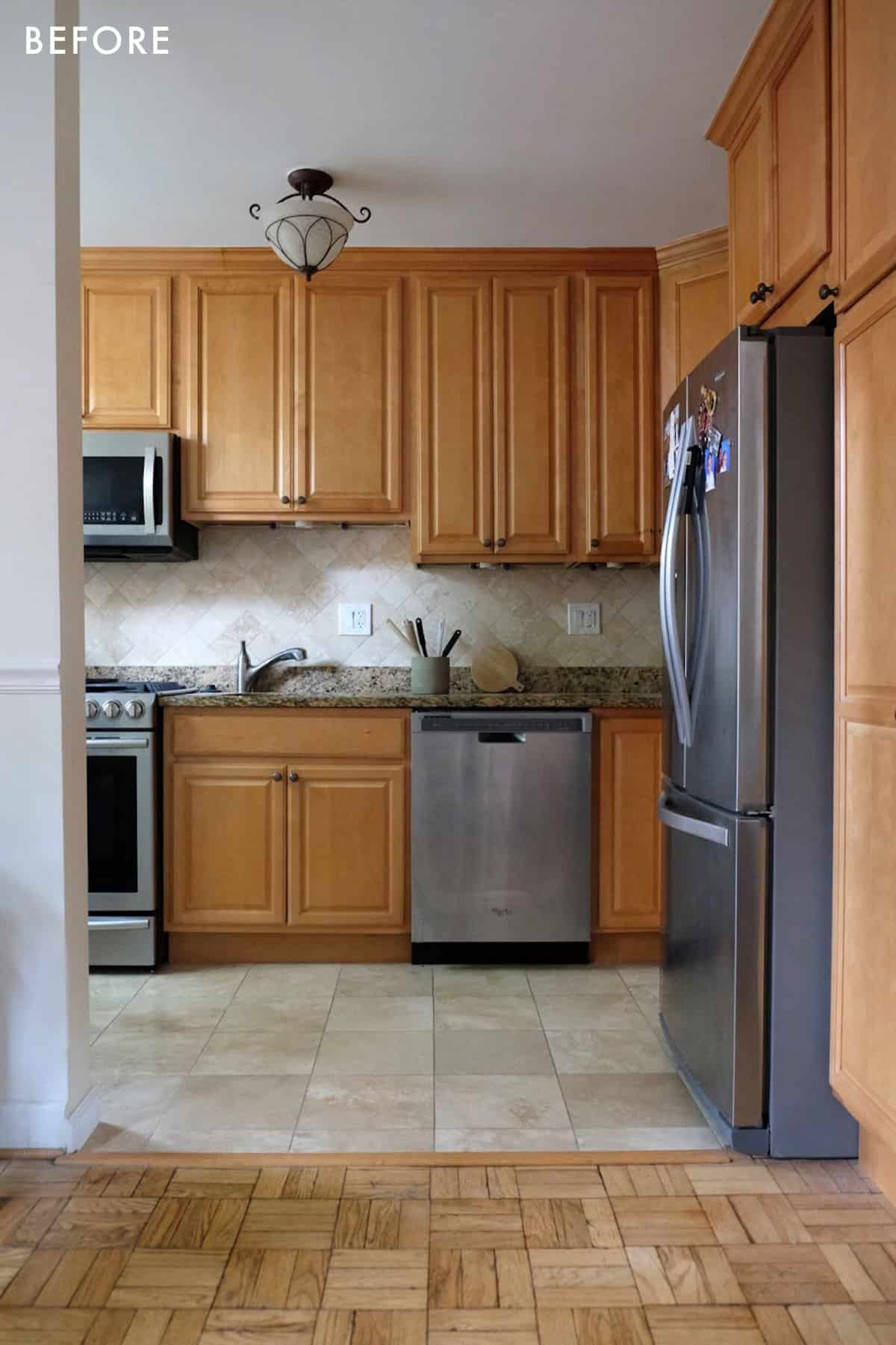
Now, the biggest challenge about designing the dining room to feel consistent with the rest of my home is that it sits adjacent to my kitchen, which is designed quite differently than the rest of my home. I haven’t touched it since I moved in two years ago, and there isn’t anything wrong with it, objectively. It functions well, its appliances are great, and it has more than enough storage space. The easiest way I can think of to bridge the dining room with the kitchen—for now—will be to switch out the ceiling mount fixture in the kitchen to be more consistent with the dining room. But… I have BIG PLANS for the kitchen at some point in the future, after I gain some European design sensibilities. 😉
While I’m excited about my upcoming move, I’d be lying if I said I wasn’t also heartbroken to leave this home behind for some time. We exist in a world of dualities, do we not? I’ve poured my blood (literally, sadly), sweat, and tears into my efforts of making this house a home, and it feels…weird…to hand over the keys to a stranger. However, I know [or at least hope] my efforts will be enjoyed by somebody else in the meantime. And, either way, I’ll return as a much better designer to finish realizing my vision for her.
Her, being my house.
In the meantime, let’s get this dining room in proper order, shall we?! We shall. Which part are you most excited to see come to life? For me, personally, the wallpaper project I’m conceptualizing is very exciting and has the potential to be a monumental idea for renters. Make sure to follow me on Instagram for regular updates about how this room takes shape!
Opener Image Credit: Design by And Studio | Photo by Nicole Franzen | Via Domino
THIS POST WAS ORIGINALLY PUBLISHED HERE.


