OKEE DOKEYYY NOW WE ARE IN BUSINESS!!! Oh geez. If that shot doesn’t do it for you then I don’t know what you are into, because those windows, with that paneling flanking the entry into the pantry, are what my fantasies are made of. Today you are going to get a pantry update post – where we landed with the stone, the paneling, and the windows and let you into the debate Brian and I are having about paint color. BUCKLE UP BUTTERCUP!!!
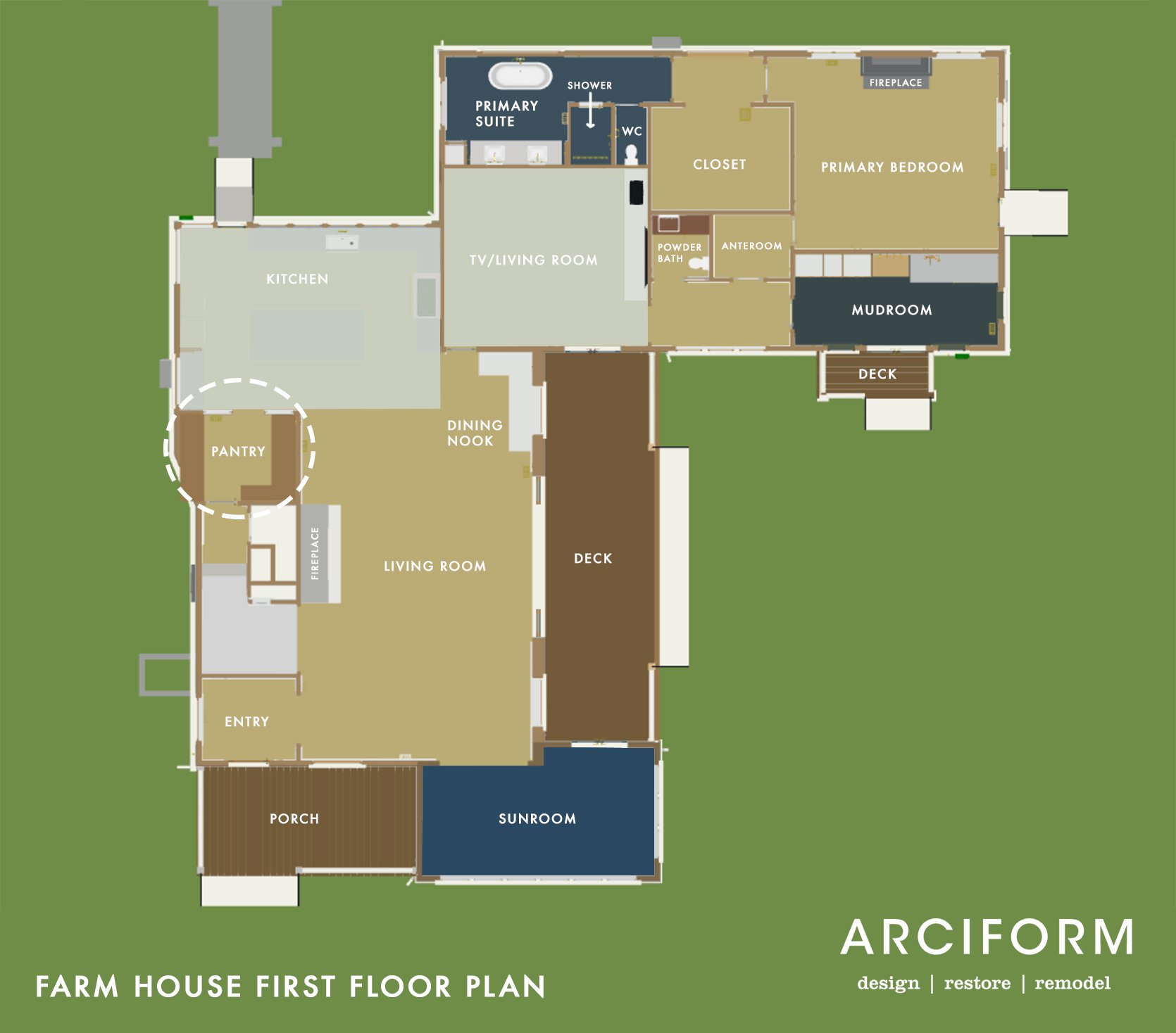
In case you don’t know where we are in the house, the pantry is conveniently off the kitchen, which shares a space with the living room. It’s an odd shape due to the exterior wall cutting in but we are in love with her as if she were the 3rd child that Brian wouldn’t let me have (jk).
Vintage Windows Are Back!!!

For those of you who’ve been following since the beginning of this farmhouse “adventure” (click here for all of the posts), you might remember the OG vintage windows in the living room. The reason we didn’t keep the OG windows where they originally were was three-fold:
- We wanted to lighten up this room a lot and open it to the incredible backyard. We could have done this by putting french doors in between these windows (and seriously considered it) but we didn’t.
- The 1st floor had three, 100-year-old shaky/rotting windows (like the two you see) but they were mostly aluminum and vinyl windows from different add-ons and remodels. We restored all the windows on the second floor but decided to make all the windows on the first floor new. Which left us with three vintage windows to somehow use in the house.

So we took the upper sashes from the two windows in the living room, with the diamond pattern and flipped them vertically to frame the doorway into the pantry. It’s a magical moment that brings me an unspeakable amount of joy. Not sure if any of you can relate, but after being in this field for 15 years you’ve seen and been around a lot. So in order for that jolt of serotonin to flow from your brain into your limbs, something really has to do it for you. This is it. It’s not that it is this crazy standout architectural moment (fine, it is for me), it’s the sentiment, and how hard my team and I worked to make sure that these original and now interior windows really WORK again in our home. Thank you, Jamie and ARCIFORM for making these work!!!!!!!!
But What Are We going To Paint The Windows?
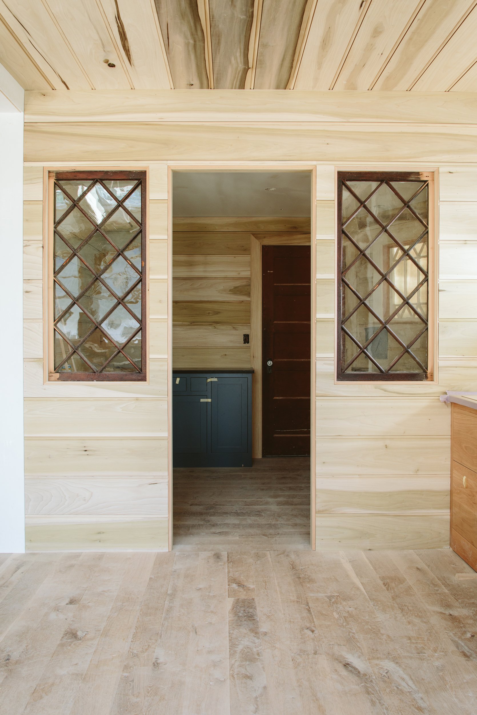
They will get painted the same as the paneling – a satin white. But the main question, and why I brought you all here today, is to help me decide what color we should paint the inside of the pantry. My original design (which I spoke about in this post) was to paint it the same color as the lower cabinets. So it would be just one dark moody blue, including the ceiling, paneling, and shelving. In the photo below you can see the large paint sticker (Slate Tile by Sherwin-Williams). Here are my thoughts in ascending order:
- Moody is super cool. Dark is chic and risky. I know this intellectually. Also…
- A pantry is a storage room, and shouldn’t feel like the kitchen (this is Brian’s main argument). But…
- Will the dark color make it feel like a dark cave that doesn’t pop? We have that vintage window in there that is currently covered on the exterior so you can’t get the sense of light in there (and neither can I). Brian thinks this window will bring in a lot of light and it might!
- I’m worried that the color we chose is so dark (without enough light) that it will just suck all light and the room won’t be inviting or pop. It might just look dead.
- So my thoughts are to paint the paneling and ceiling a lighter shade of blue. Not a crazy two-tone, but just lighter so that there is some contrast in there and your eye doesn’t read it as dead space.
- Brian doesn’t agree. He loves my original design and the thoughts around it and he keeps just saying “this is a pantry, not an extension of a kitchen”. I agree! In theory. I mean it was my idea after all. But when I went to find any photos of a super dark pantry nothing was inspiring. The original inspiration photos were all just close-up vignettes of shelving NOT full rooms.
- Brian is also so done with me questioning my own decisions that were made MONTHS ago. And believe me, Brian, me, too!!! Imagine how annoying I am to myself! However, we have made some decisions that I already regret (not big deals, but yes) which is all very very normal in this process. And you know what else is normal?? Rethinking your choices up until you make the FINAL decision. Now that I’m writing this I’m realizing how important and normal it is. It’s the final edit before you turn in the book – you might have thought some sentences were PERFECT, but upon the last look, you think “could they be slightly better???” AND THAT’S OK.
- And if you are worried about my marriage don’t 🙂 If this renovation was actually causing fights then I wouldn’t be writing about them to a million strangers. It’s a healthy level of debating that I frankly need from my partner and I’m grateful he’s engaged enough to have serious and firm opinions.

So imagine (as I am right now) that room being as dark as the bottom cabinets, with the kitchen and the vintage window wall all being white. Again, with that vintage exterior window in there being blocked, it’s so hard to tell!!!
The Paneling…
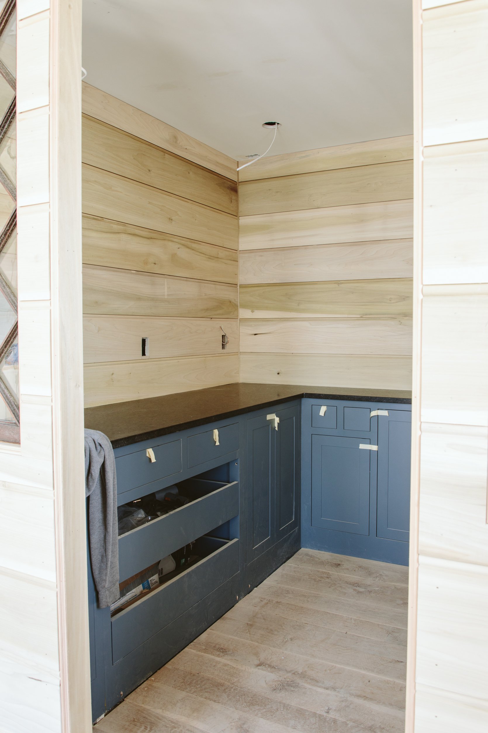
Throughout the house (where appropriate) we designed and installed this awesome paneling. It’s a custom run from a company in Portland called Creative Woodworking and they are 10″ boards with a 1/2″ bead. So basically a REALLY large beadboard, I’ll talk about it more later but it’s one of the more “unnecessary” things that we felt was extremely important to the home. Jamie, Taylor, Tourin, Steve, and the rest of the team have spent WEEKS installing it. If you are a real renovation/design geek these types of things are special, and if you are on a budget there are so many affordable V-grooves or beadboards out there.
Let’s Talk Hardware…
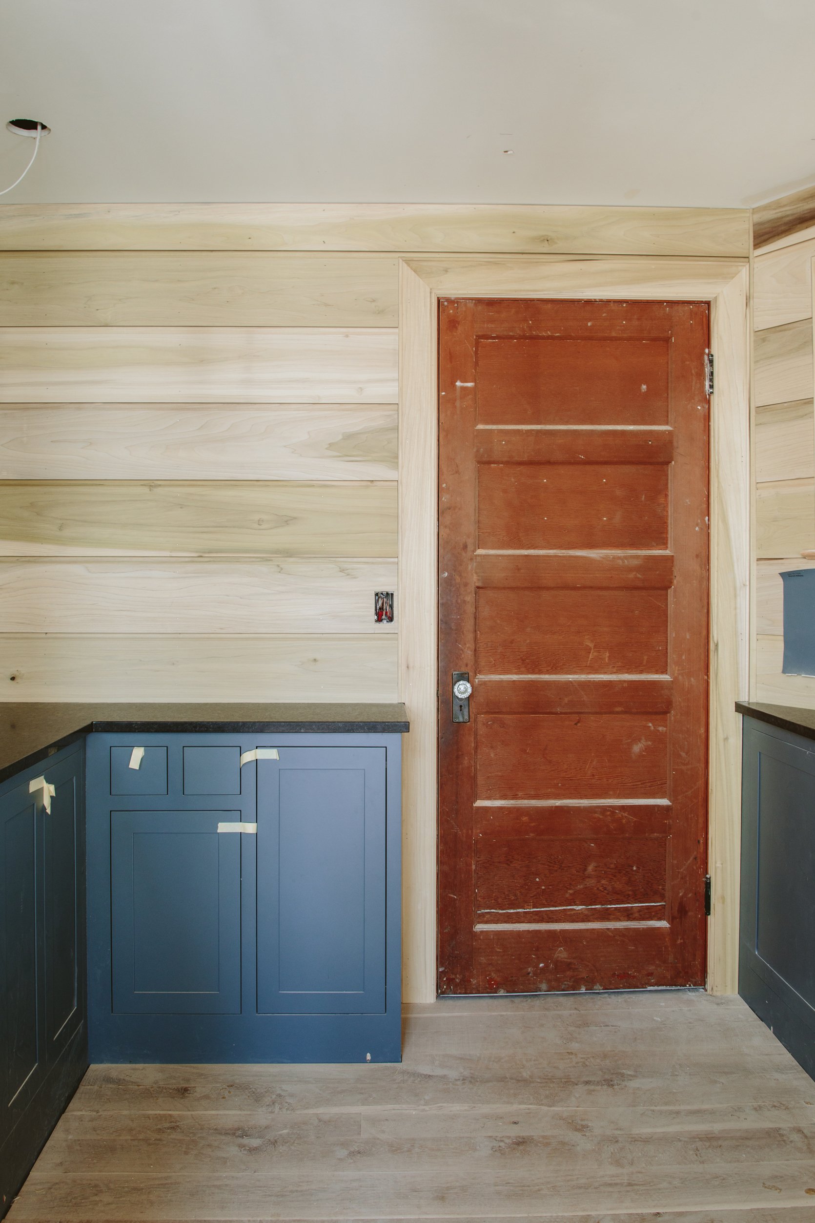
Real quick…again, picture that all dark blue! It would look so good (in theory, with the right light). Now for this room, we were doing the same unlacquered brass hardware as the kitchen, but after seeing the stone in there and the dark paint I realized I wanted it to be black. So we are getting the same styles but in the Oil Rubbed Bronze (which at Rejuvenation is almost black). More on that later. And for those of you worried about the damage on the base of the cabinets, we always intended and designed it to have a baseboard. So Unique Kitchens and Baths provided a trim piece that we have yet to install.
The Stone!
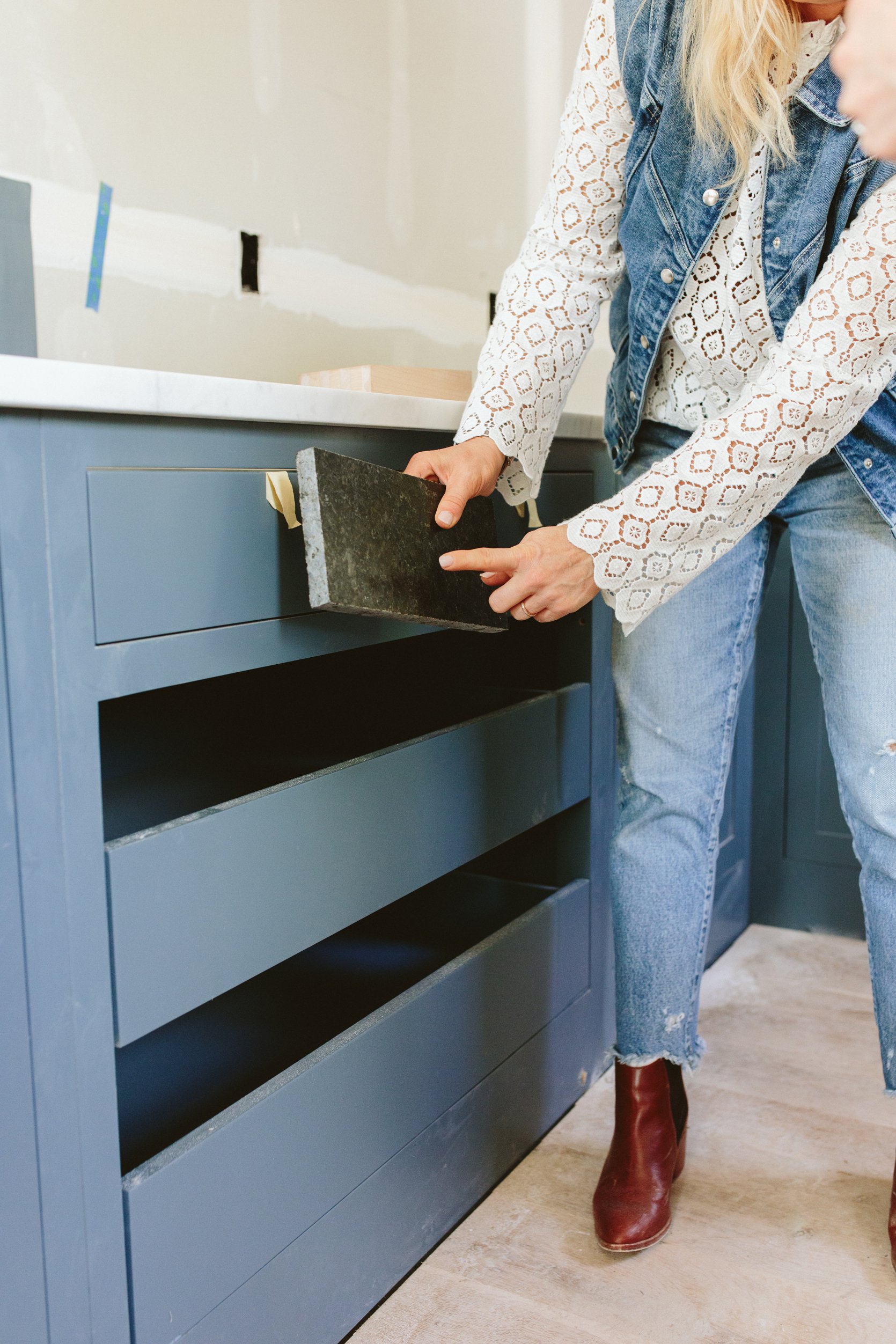
We chose this honed granite that is really pretty in dark but has some movement in it. It’s an extremely hardworking stone that will not markup or chip easily. We had leftover Carrera from our kitchen that we could have used but knew that A. Carrera is easily stained and our coffee bar is in here, and B. that would have been a lot lighter and looked like a kitchen counter rather than a pantry. I haven’t seen it in person but…
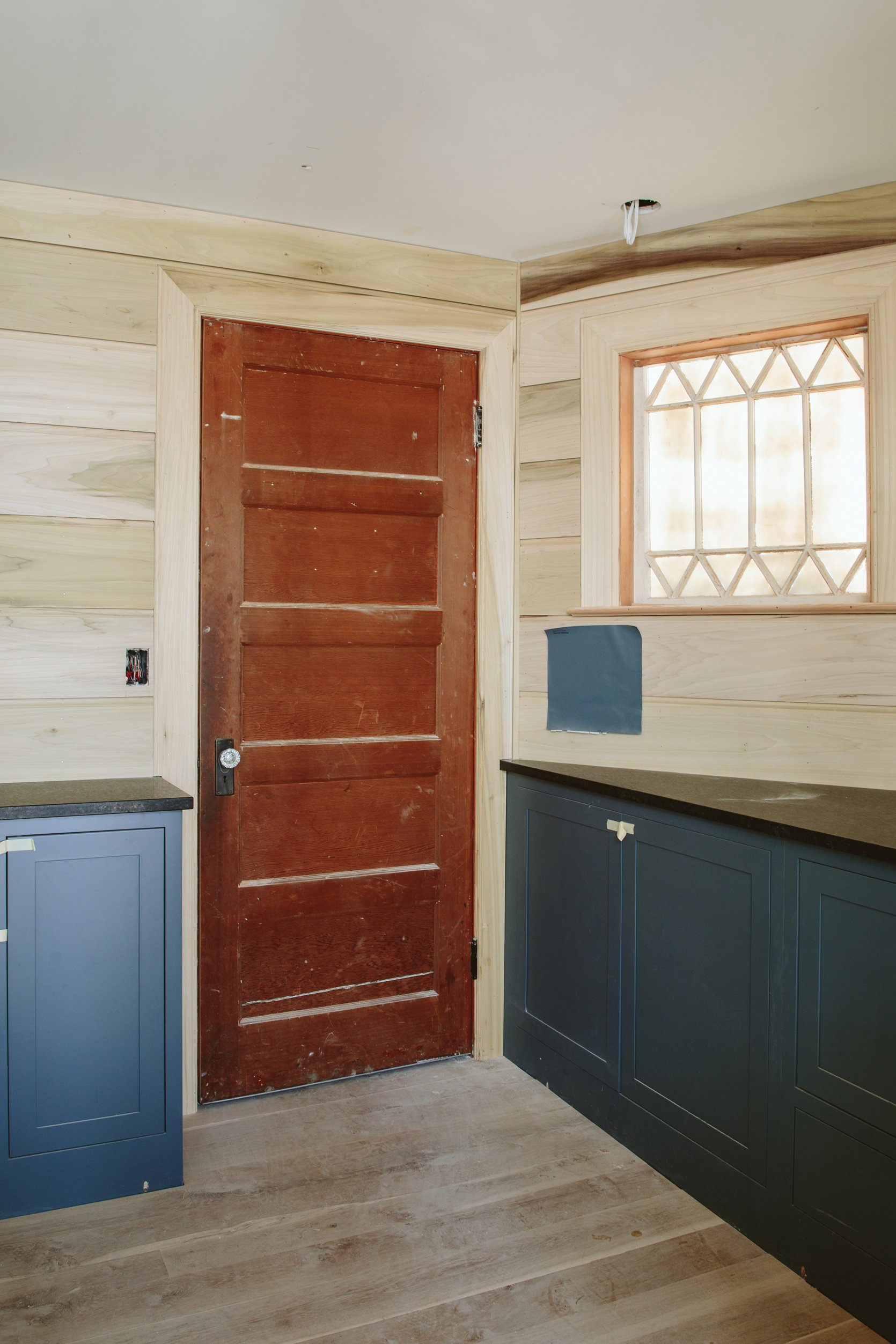
We bought it from Bedrosian, and thanks to Alpha StoneWorks for the fabrication. It’s simple, durable, and well-executed. Oh and yes, that door is getting painted (it goes to the basement where I’m going to store all my survivalist foods and canned tuna once I embrace my Mormon roots and actually start doing it again!!). My house is going to smell like tuna for weeks every year just like it did when I was a small child!!! Barrels of wheat here we come!! Y2K any day!! My kids are so lucky!!??!!).
Sneak Peek Into The Kitchen…
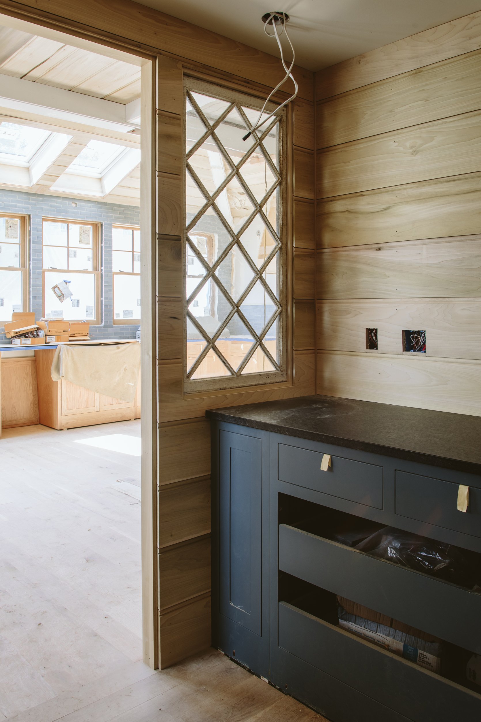
Y’all, I’m seeing this with YOU. Of course, I see it a few days ahead, but I haven’t seen any of this in person yet so these photos excite me beyond belief. More on the kitchen soon. But back to the pantry: the stone looks awesome. The paneling is so pretty. The cabinets are so lovely. The vintage interior windows are incredible but again…. LOOK AT THAT KITCHEN!!!!!
We are getting close. I feel extremely lucky, happy, grateful, and mostly relieved that I love it all SO MUCH. Thanks for reading 🙂 xx
*Photos by Kaitlin Green
THIS POST WAS ORIGINALLY PUBLISHED HERE.


