The first time I heard the term “brutalist” by way of interior design was the first year I started at EHD (2016). I thought to myself “Ooo intense and very cool.” And I was right. The expressions and examples I saw back then were primarily bold, dark, raw, and lots of concrete and metals. If that’s your exact style, that’s great. At the time, it mostly wasn’t for me. But I’ve since changed my tune because now what I’ve been seeing develop and come into the mainstream are still those raw, bold chunky, geometric shapes but in warm, inviting materials…mainly natural woods with texture that really draws you in. It’s no surprise to me that it’s now a trend because while it’s not for everyone, it’s undeniably awesome. I also think that adding some kind of brutalist piece into your home makes it feel intentionally designed and honestly a little aspirational. “But Jess, I want to feel cozy in my home. I don’t need to feel ‘inspired’ while I’m hanging on my sofa.” True! However, I think having a piece…or two…or three that bring some bold visual tension can give a room that spark a lot of us are searching for. So let’s dive into a BUNCH of really cool examples, talk about why they are awesome, and then end with a little lite shopping. Sound like a plan? Great.
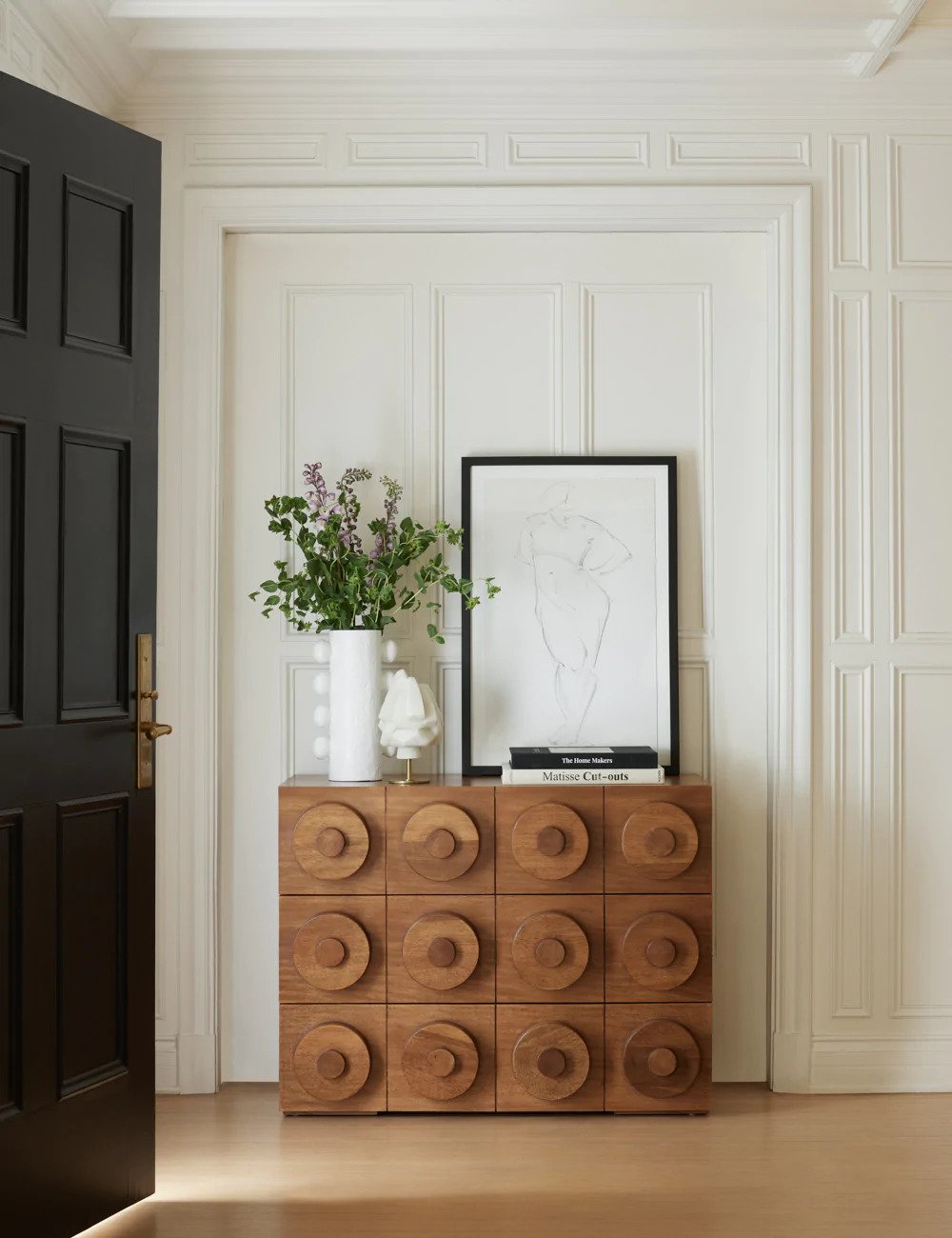
Let’s start with what actually inspired this post…this masterpiece of a dresser from the new arrivals at Lulu and Georgia. I was stopped in my tracks when I saw it and was immediately figuring out if there’s a way it could work in my bedroom (but also I’m not allowed to start designing that yet…one room at a time, Bunge). Actually, if you read my DIY cabinet post you’re probably realizing that I have a cabinet type:) But truly, after seeing this photo it hit me that this style was now a trend.
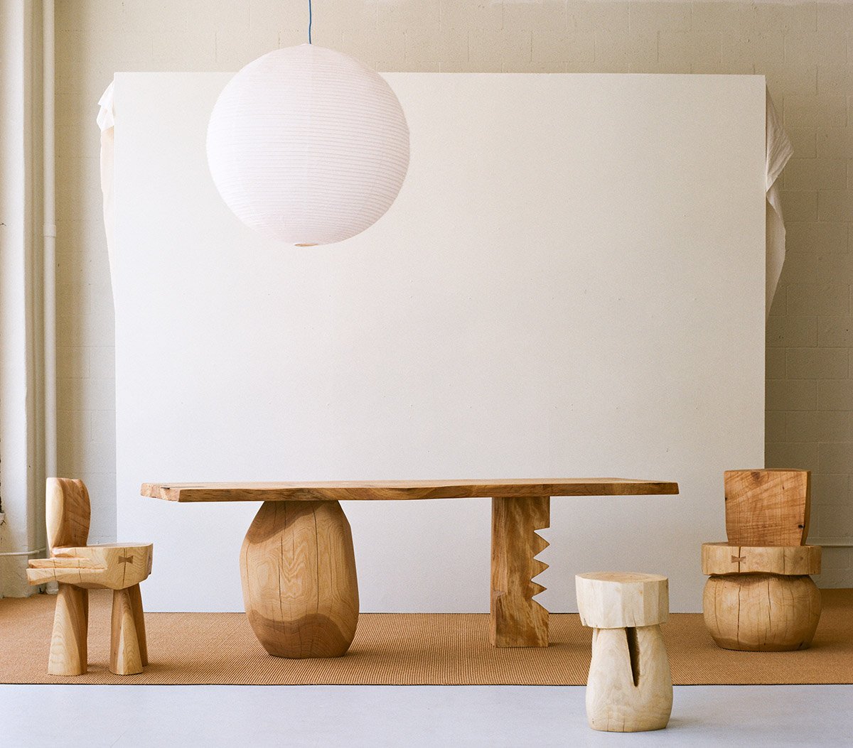
After doing some light research and talking to some design pals, brutalist architecture primarily started after WWII and focused on blocky geometric, monolithic-like shapes. And as I said before, raw concrete was maybe the biggest material used. Now in 2022, artists are taking an inspired approach, like Vince Skelly. As you can see in some of his recent work above they are indeed “blocky geometric, monolithic-like shapes” but in the most organic-looking form. They make you feel something when you look at them. Imagine the impact even one of these pieces could have in your home. For me, it would be an instant feeling of happiness.
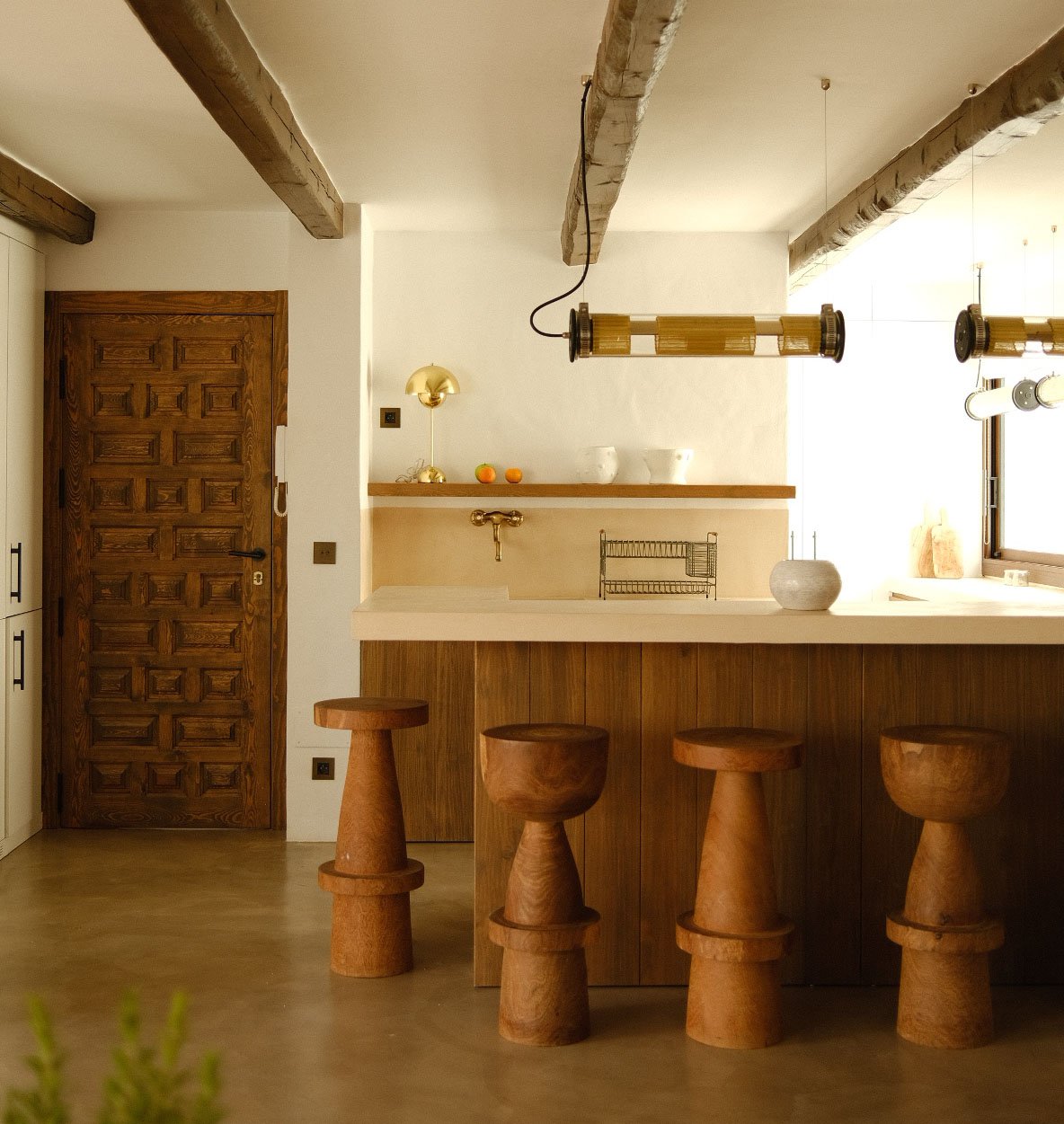
So “organic” doesn’t always have to mean without refinement or uniform. Take these incredible stools. They meet all the “brutalism” criteria in shape but the beautiful, near joyful celebration of the natural grain feels wonderfully organic, right? I guess even the term “organic brutalism” has tension in and of itself. Yikes, those stools are cool.
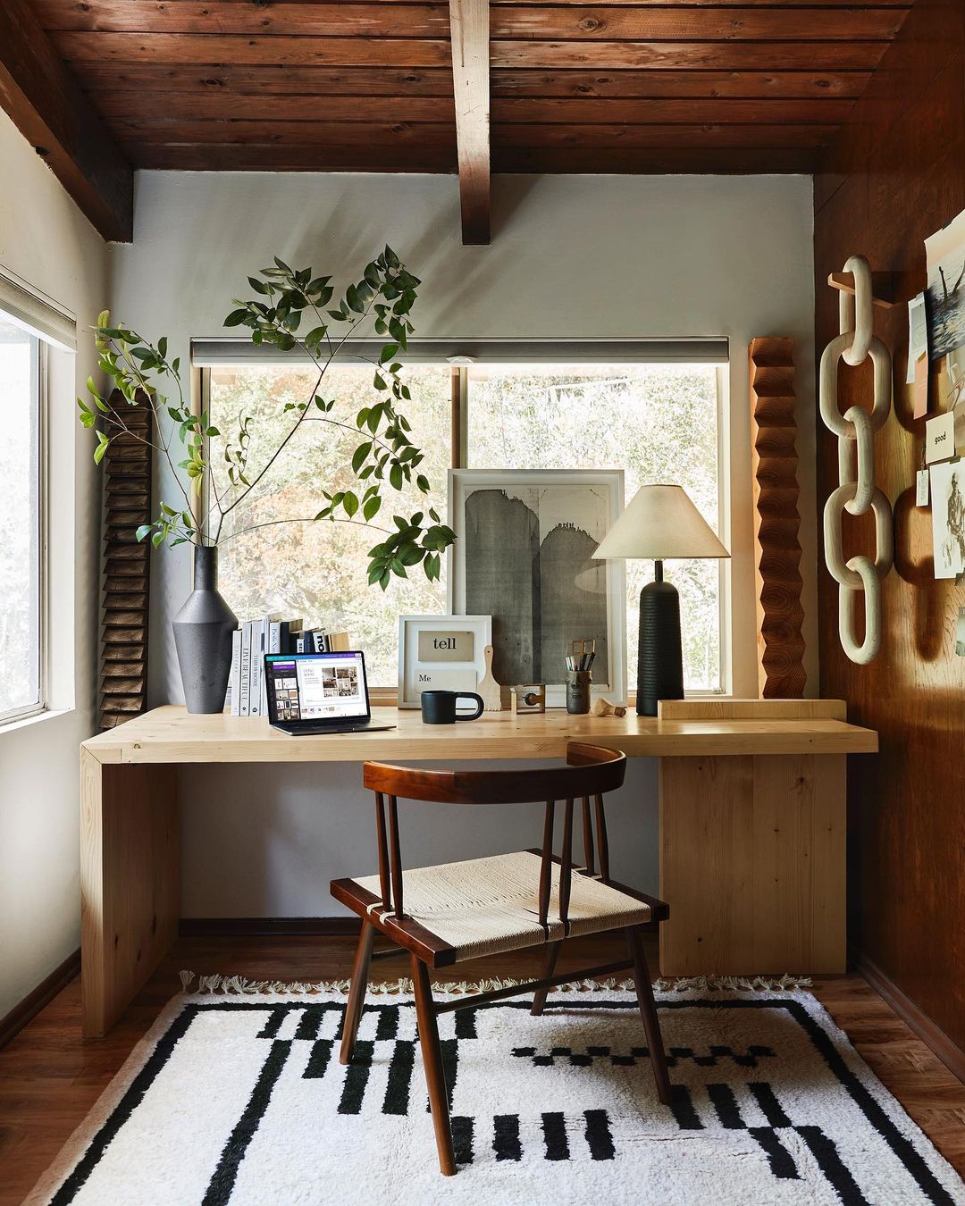
I would be remiss if I didn’t talk about the organic brutalist himself, Brady Tolbert (EHD alum for those who started reading after his time). My love for this style is directly due to being introduced to it by him. Brady loves a neutral color palette and a bold shape. His office is a perfect example of that. Take the desk he designed, the shapes and textures of the vase and lamp, and of course those wooden wall pieces. In another material, they might feel cold and harsh all in the same space. It would still look cool, but maybe not be somewhere you would feel comfortable hanging in all day. But because they are almost all in different types of wood, it’s a very chic “welcome in”:)
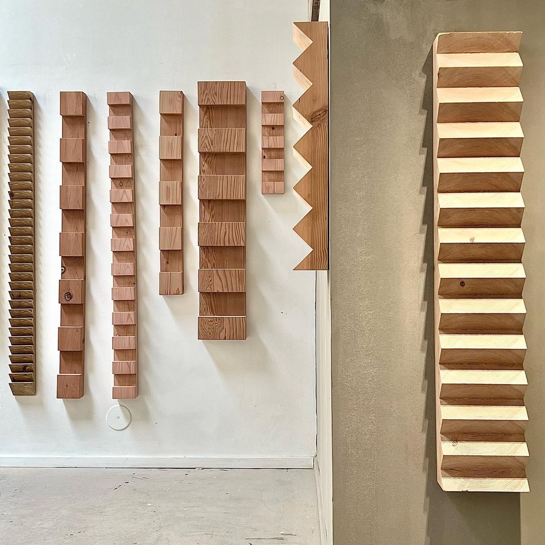
Now, I need to talk more about those wall art pieces. When I saw them on Brady’s Instagram I thought, “WHERE DID HE GET THOSE AND WHAT PERFECT HUMAN MADE THEM?!” That perfect human (and artist) is Bradley Duncan. His pieces are both visually simple but so so impactful. I truly could stare at them for days. He does play with color and non-wood materials but they are all incredible and still perfectly fit this style.
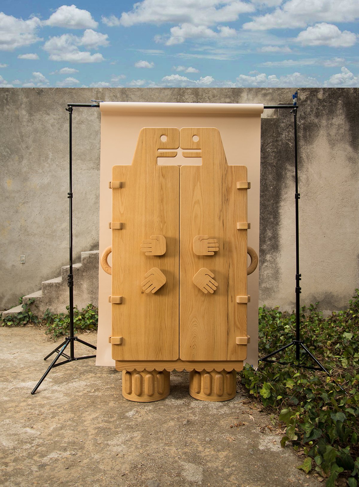
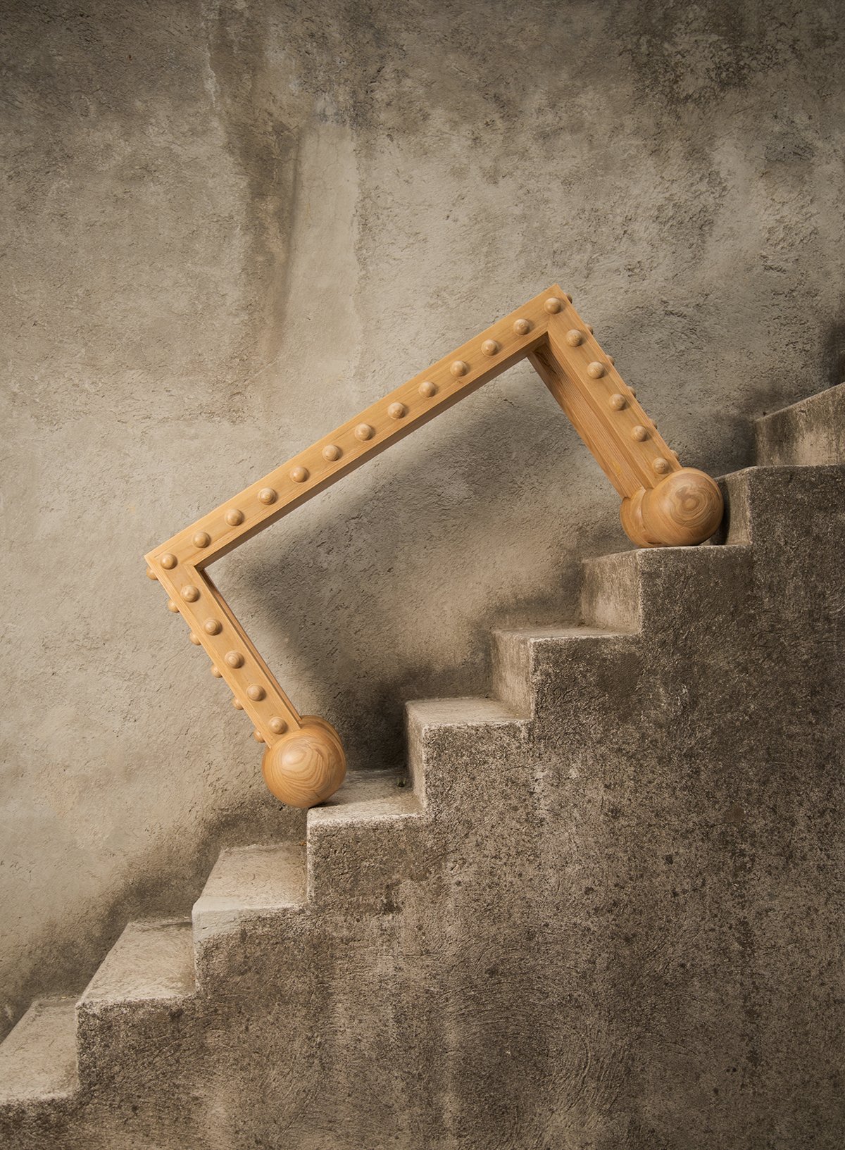
Now let me introduce you to another incredible artist (if you don’t know them already) that brings his culture into this style, Andrés Gutiérrez. When I went to Mexico City this past April, my friend and I happened to stumble upon Originario, a design store and were blown away. The whole space is amazing, featuring many other Mexican designers, but his work really took my breath away. As you can see above, his pieces are bold and geometric but also playful and deeply represent who he is. It goes to show you that there is always room to make something your own. I hope one day to have that table in my home!
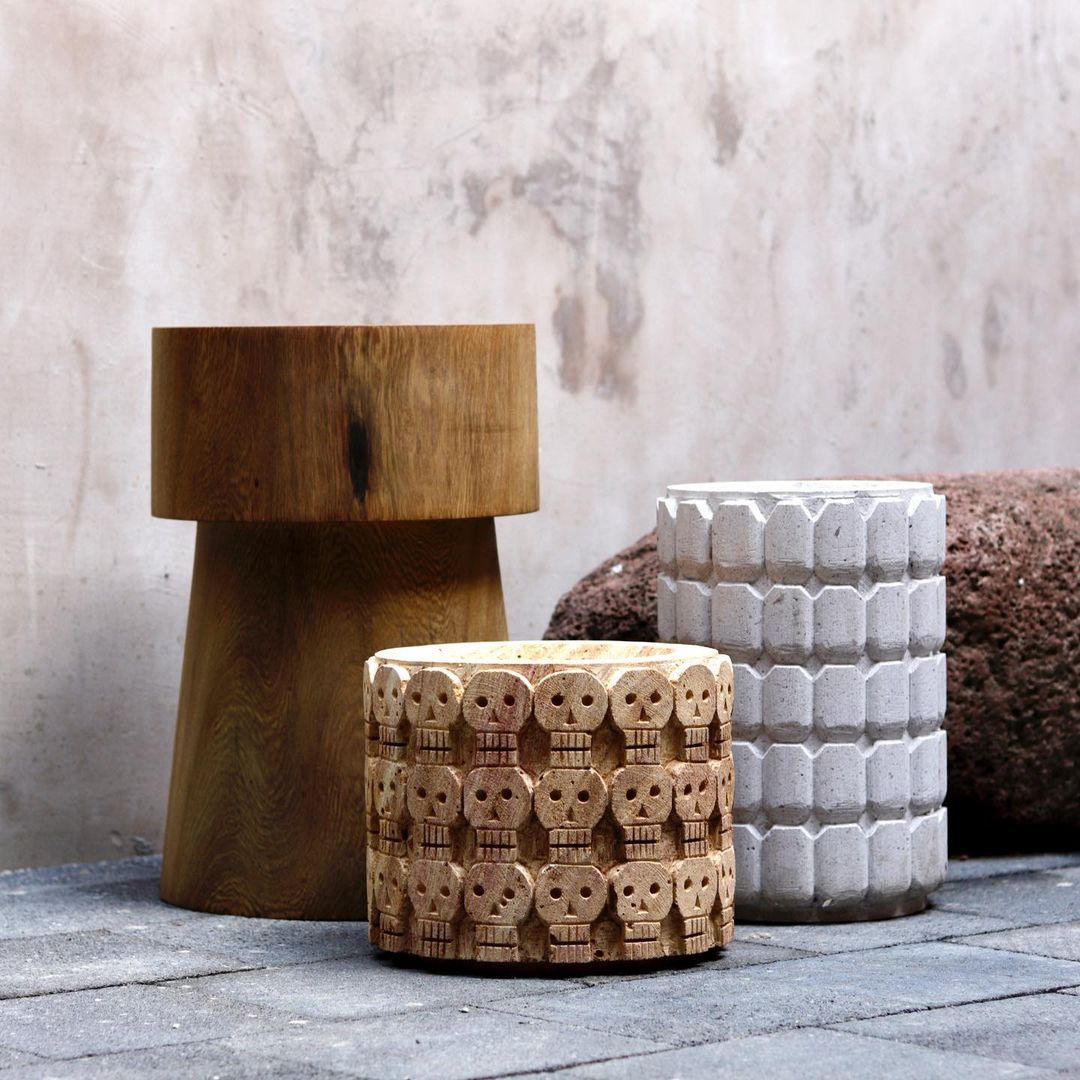
Speaking of making something your own, Piedrafuego also embodies that. While working with wood, they also work with stone (a classic brutalist material). Their bold shapes and perfectly imperfect patterns, give me the same organic brutalist energy. I love all three of these pieces.
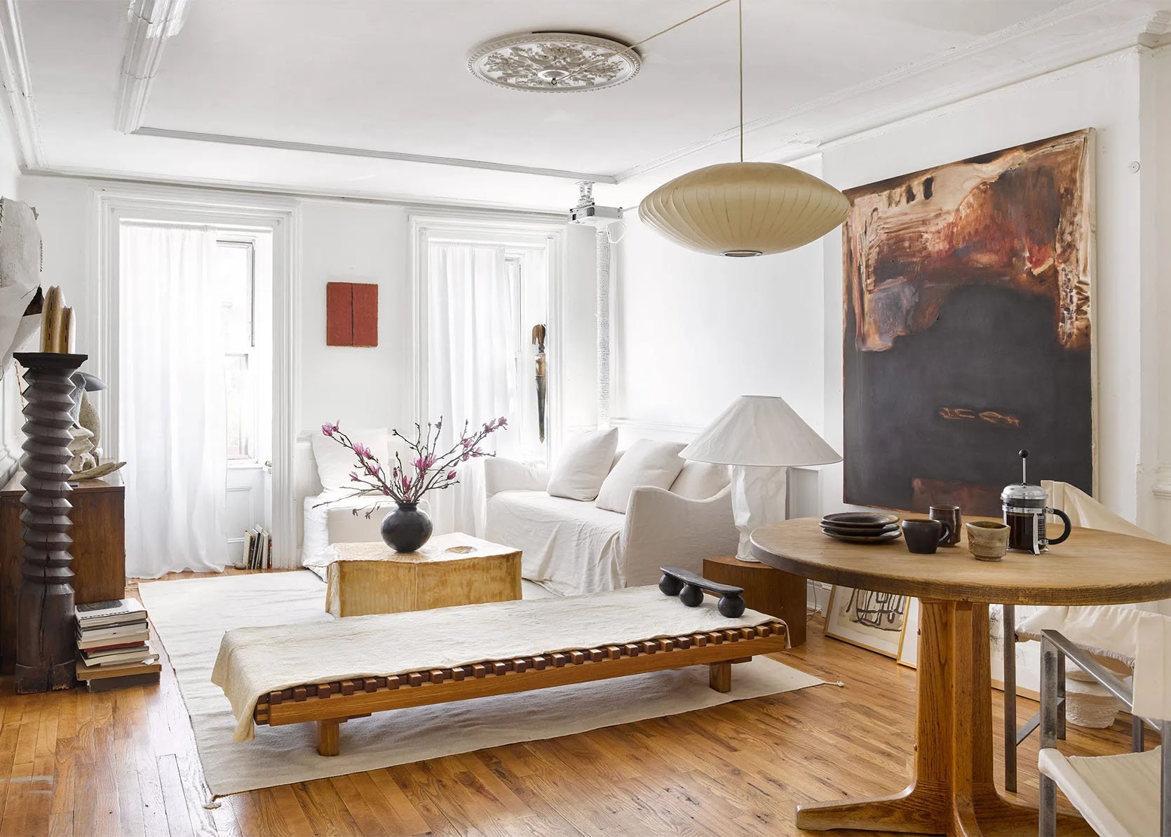
Ok now let’s look at some pretty rooms, huh? This living/dining room belongs to artist, Simone Bodmer-Turner. Her work most definitely falls into the organic brutalist category but far more on the organic side. See for yourself:
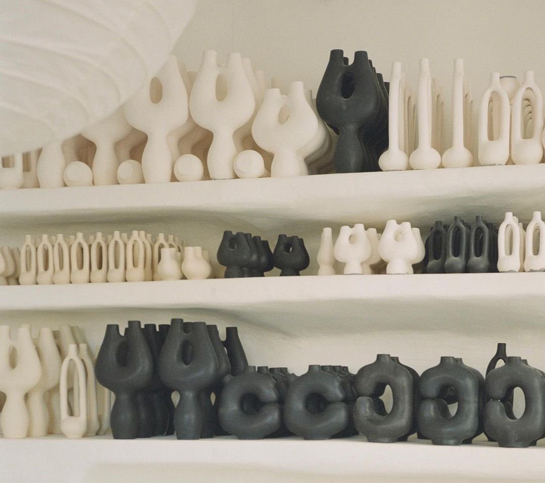
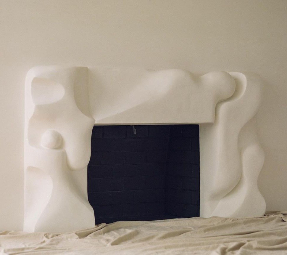
But what I want to talk about right now is the subtle organic brutalism shown in the benches pictured above and below. They both feature these medium chunky slats and very simple yet geometric legs. I know it doesn’t scream “brutalism” and you may think they look like something you’ve seen before, but take a closer look. The top slats in Simone’s home sit flush with the base frame. It just has a different feel to it and doesn’t look comfortable without some kind of cushion. I think that’s another element of brutalism that I haven’t touched on. This style, which visually stunning and welcoming via the material’s character, isn’t meant to look comfortable. It’s in the name…brutal!
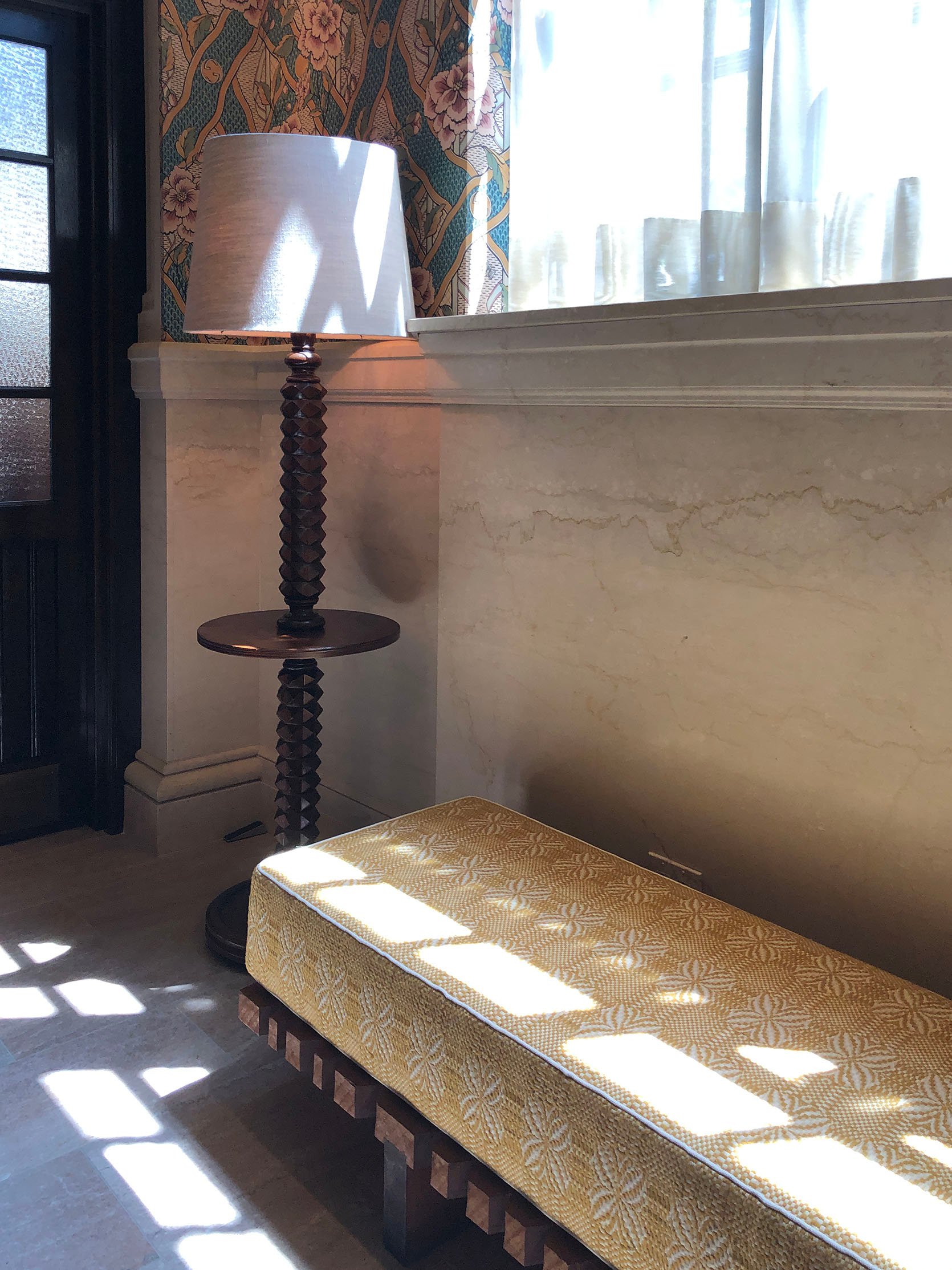
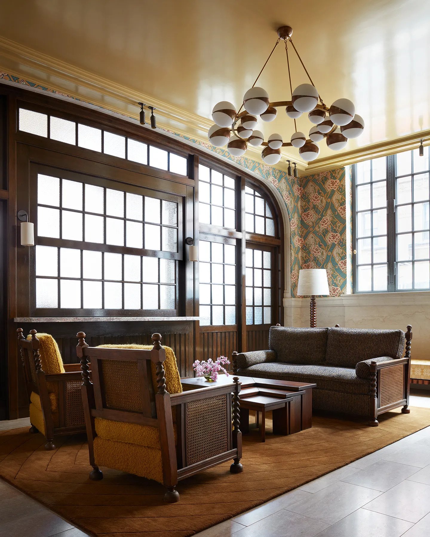
Then there’s this bench, sitting in the lobby of the new Nine Orchard I visited in NY a couple of weeks ago. I’m so bummed I didn’t get a better picture of it because it was so special in person and awesomely contrasted the elegant, almost antique style of the hotel. With this piece, the slats have varied widths and a metal base. Then adding that thick, happy yellow cushion on top connects the whole piece together with the rest of the space. That cool floor lamp also has some brutalist vibes, no?
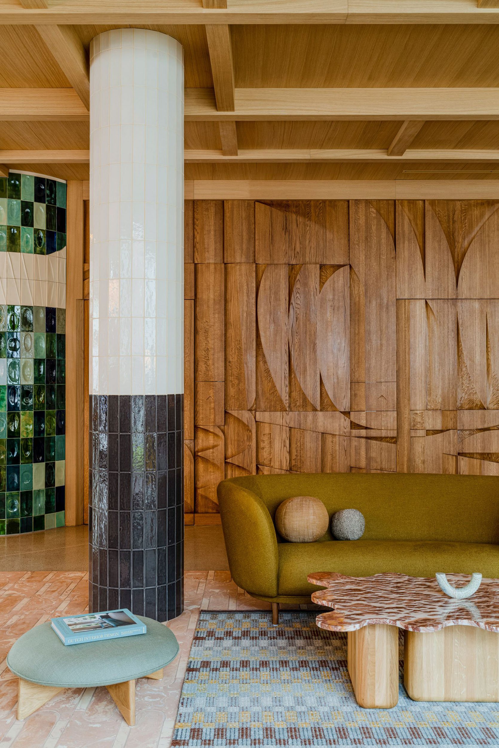
Now, it’s not just about furniture. Look at these incredible hotels. As you can see on the left, it’s not a surprise that this style originated in the 1950s. This beautiful wooden wall is very much “new mid-century modern”. There’s just enough randomness in the pattern to make it feel fresh and not a copycat of something you would have seen in a Mad Men episode. Actually, Rashida might be cooking something in this world up so stay tuned for that:)
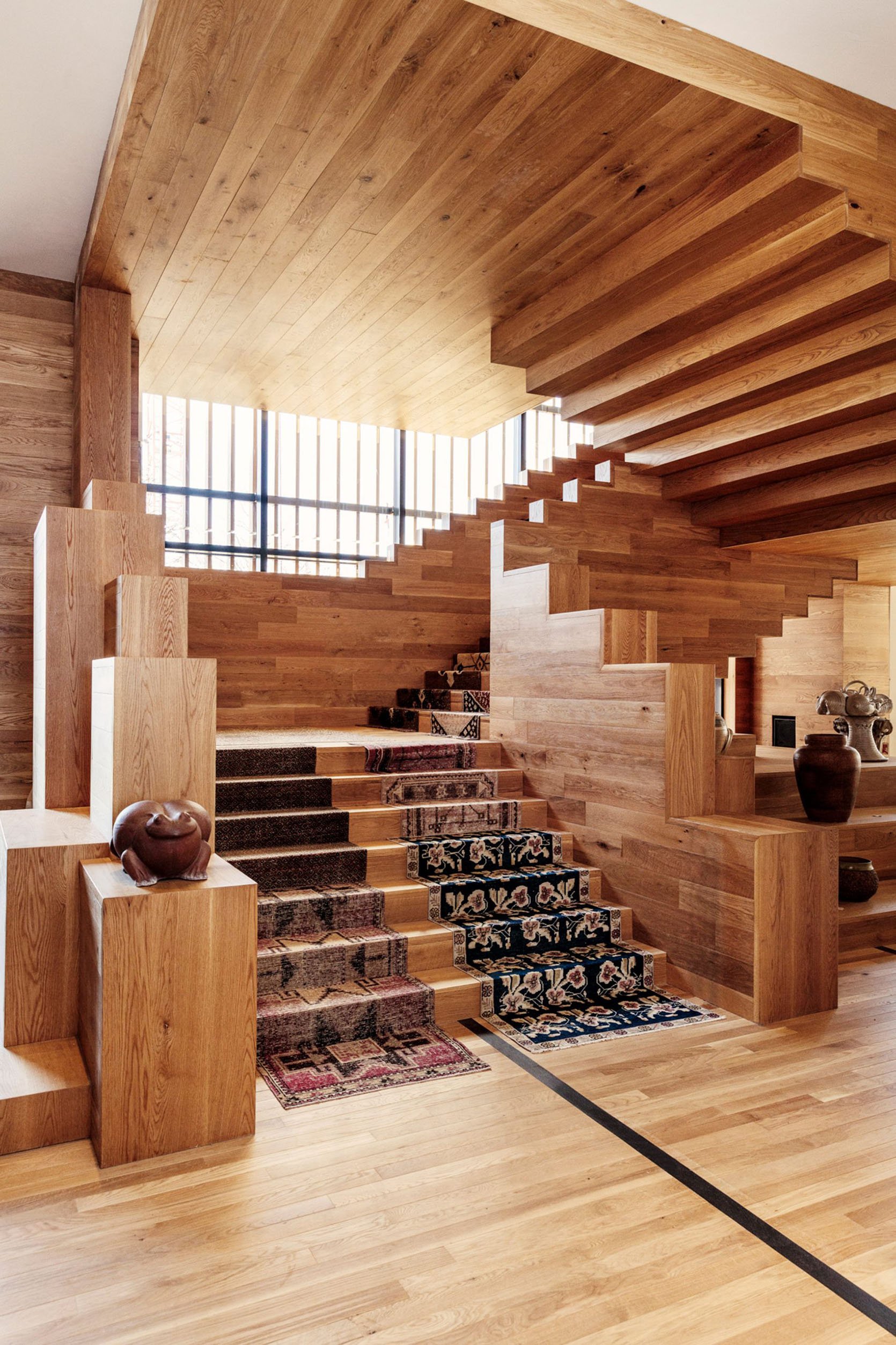
Then to your right, you have a staircase by the post-modern, brutalist-loving gal herself, Kelly Wearstler. Notice the mix of the stacking blocks on the left side of the stairs and the exposed rise and run on the right. Both are super geometric and together look so unexpected and grand.
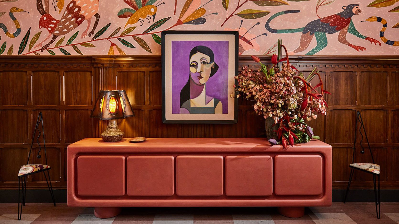
Let’s now go on a furniture adventure because I couldn’t stop pinning and these aren’t even all of them. This first one is also by Kelly Wearstler. It’s not wood, but the color is strikingly happy and the shape is bold yet soft. I think it’s very cool and if you have a chance to visit The Proper Hotel in DTLA, do it.
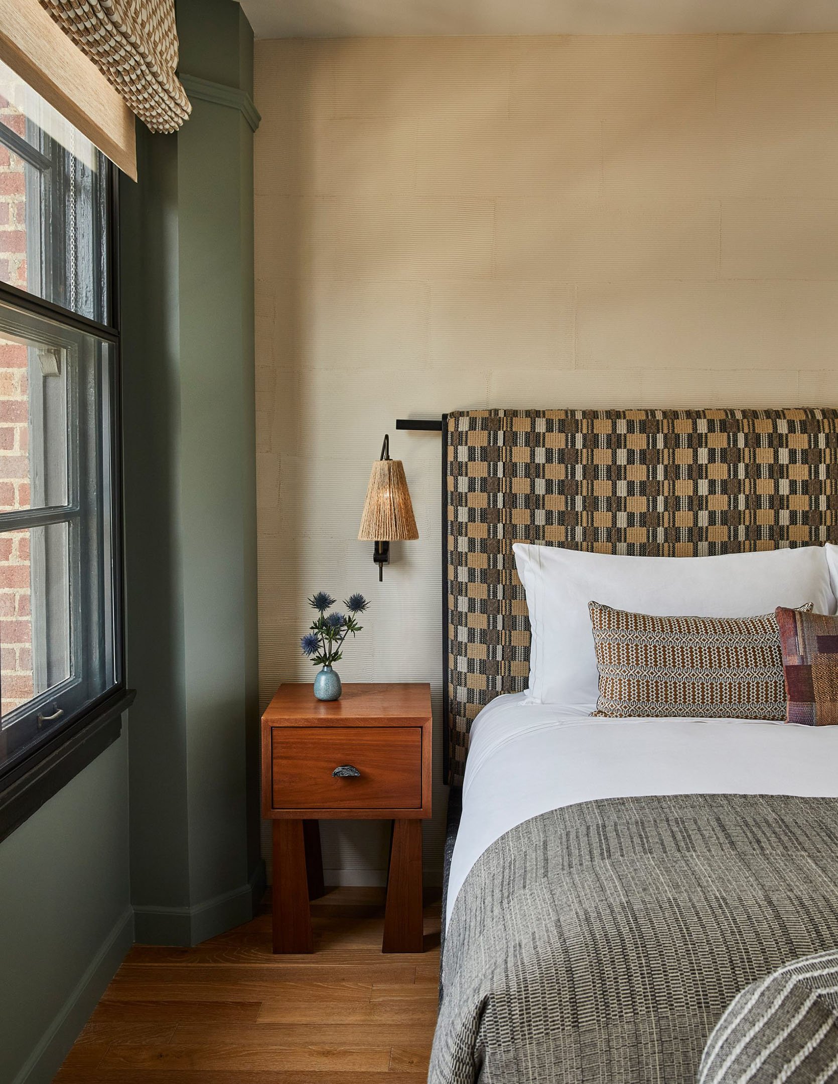
Here is a room at that same hotel. I wanted to point out that sweet, sorry, I mean “brutal” nightstand. It looks like fairly simple until you see the inner angle of the legs. That detail! It doesn’t have to be visually dominating to still nod to the trend. Dipping your toe if you will.
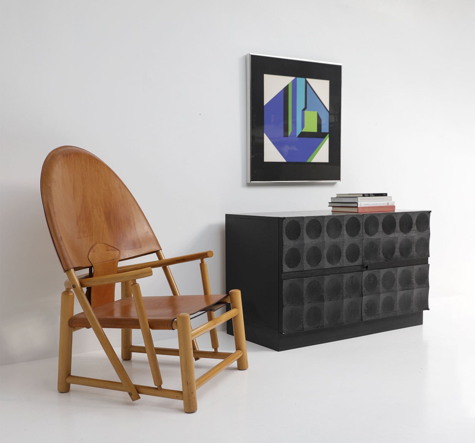
With this cabinet, we are getting a little louder. Love the blackened raw wood and LOVE the concave squares with circles. 10/10.
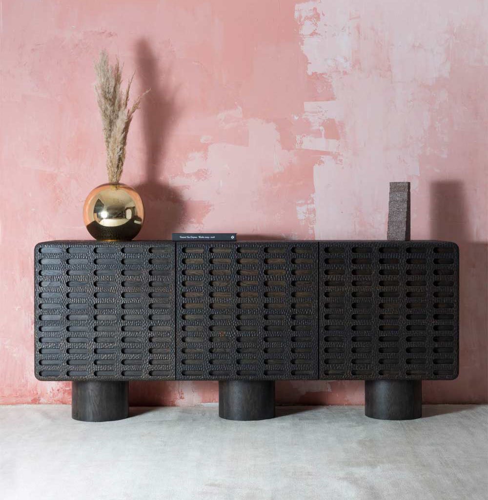
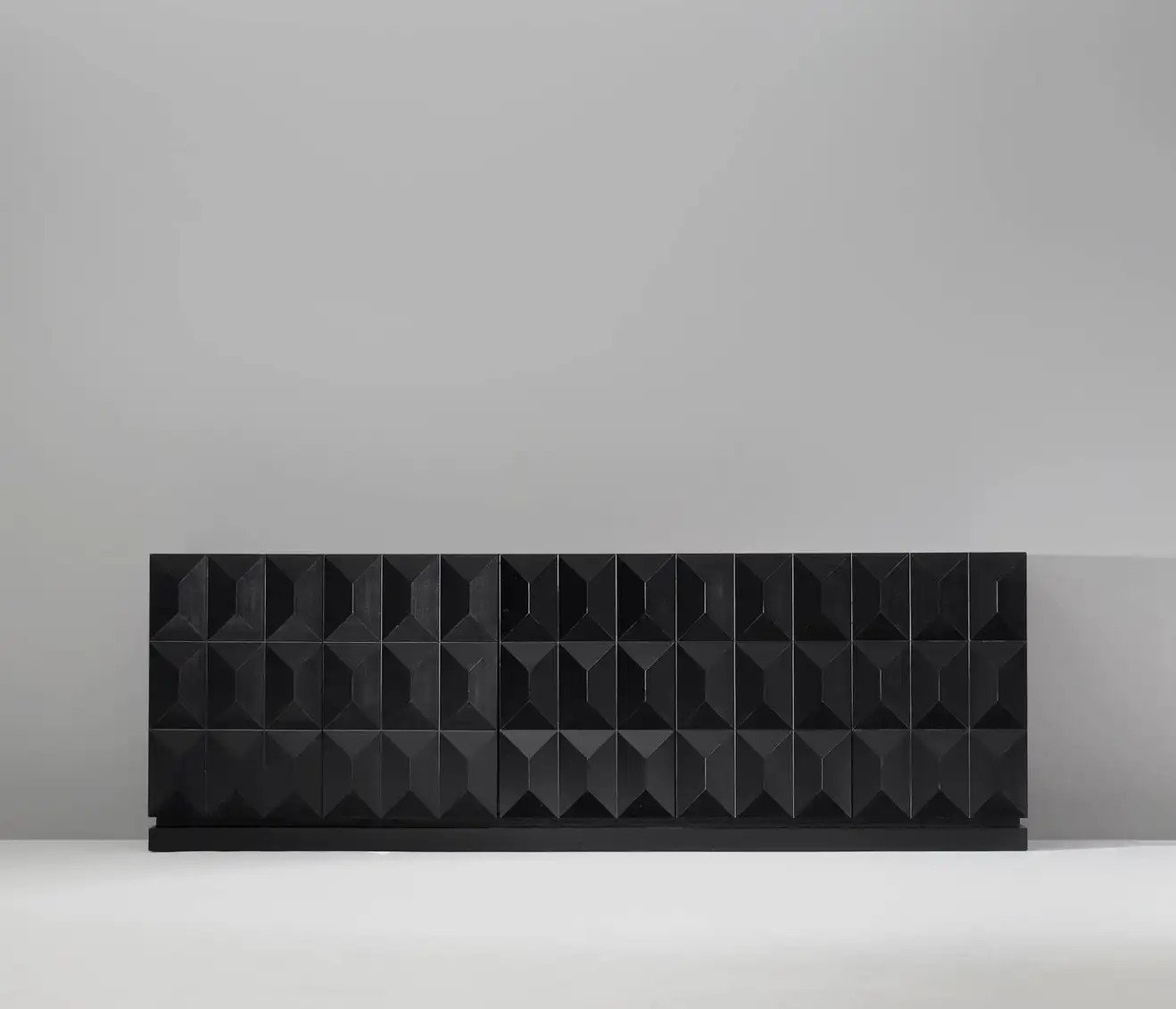
A little bit louder now (shout). Ha. But seriously, these credenzas are bold and textured and actually might lean a little classic brutalism if that’s more your style.
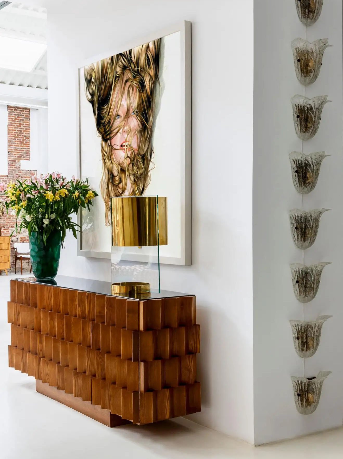
This stunner really does it for me visually! Look at those angles, look at that wood grain and medium tone! I might personally prefer it without the glass top but regardless it’s awesome.
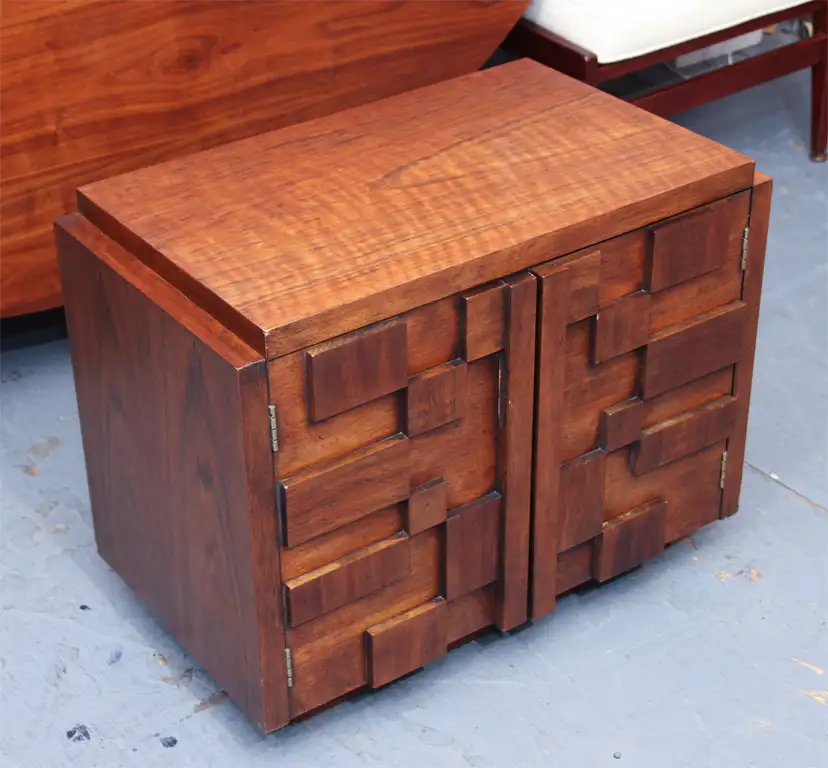
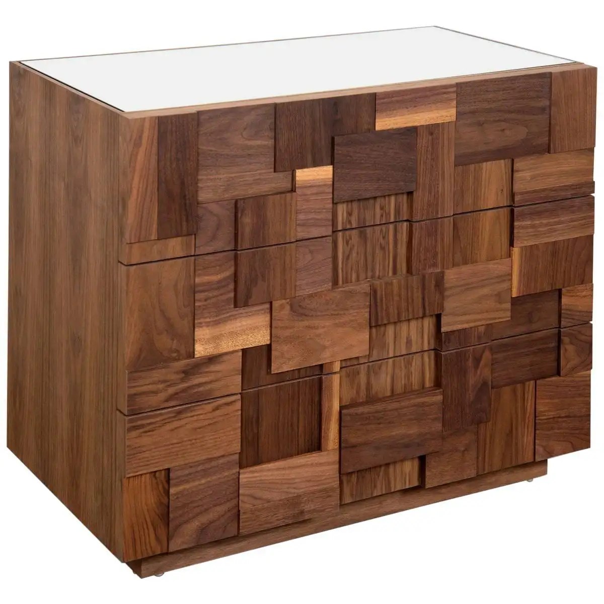
Geometric patterns for days. On the left is a vintage piece and on the right is a modern version. I have a soft spot for the vintage piece and the more pronounced negative space in the pattern. If you are handy you could probably DIY something in the same world.
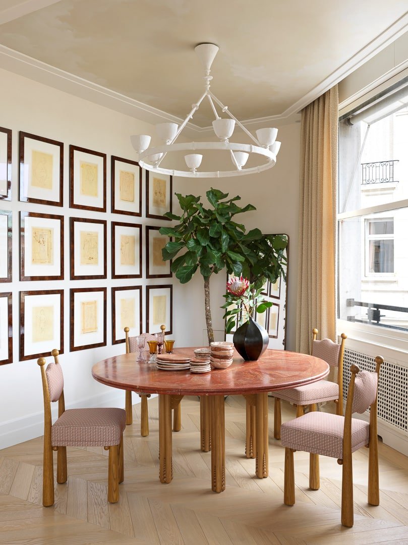
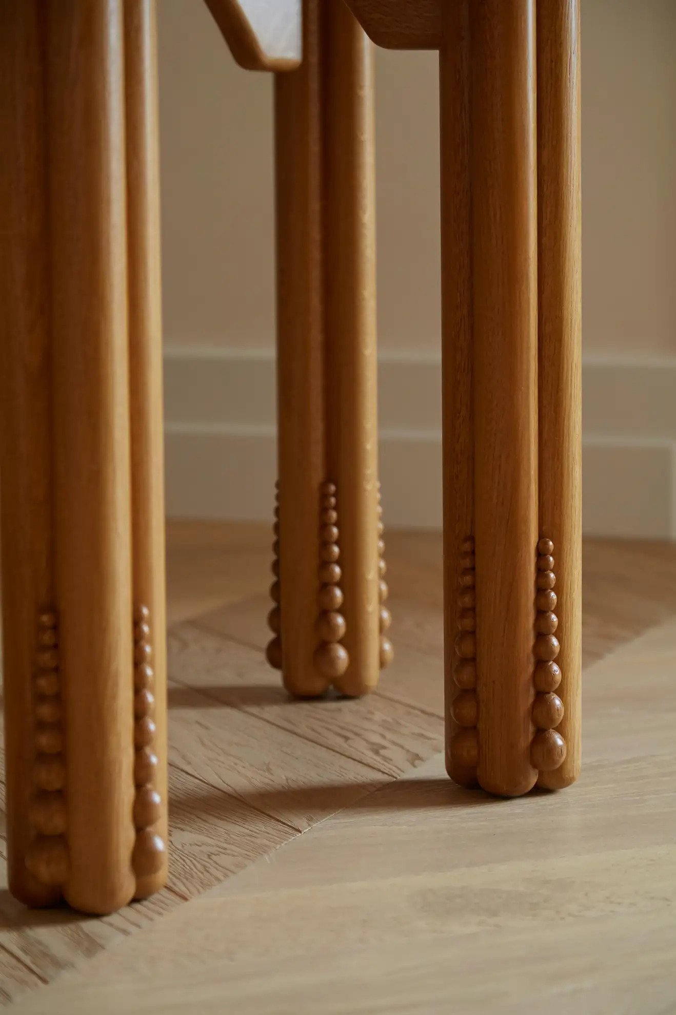
Here’s another subtle version but those legs and dot detail are incredible.
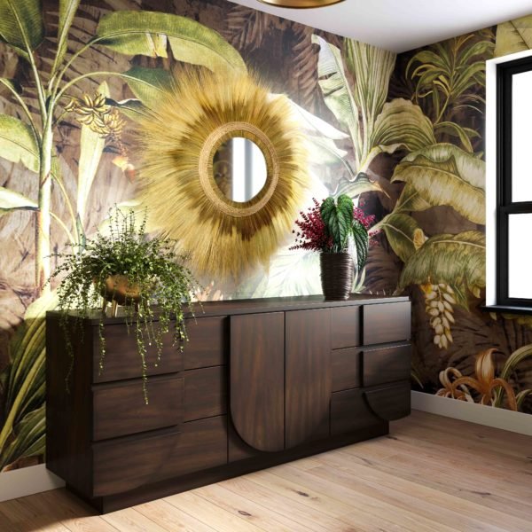
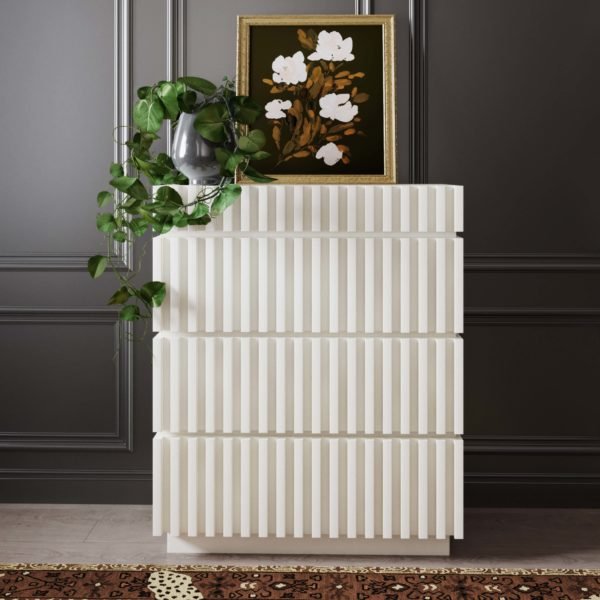
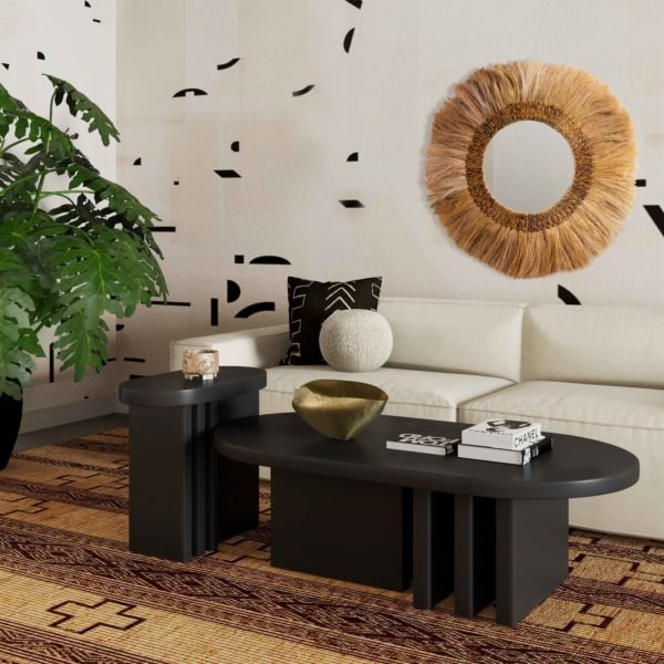
For a more affordable but equally as stylish option, may I remind you of Carmeon Hamilton’s line from Tov Furniture. I love that it toes the line between postmodern and organic brutalism. That white dresser could work with any style and add a perfectly bold moment.
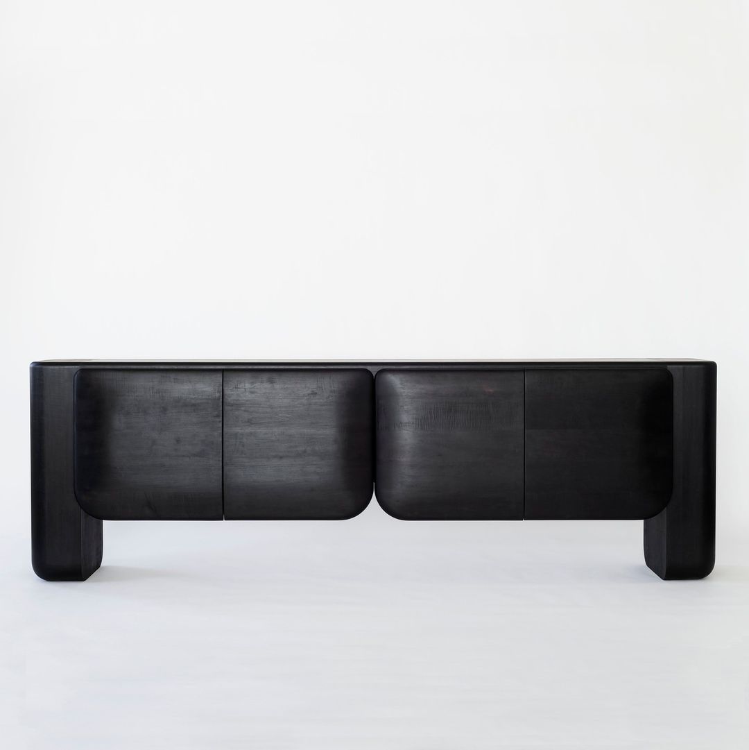
I just couldn’t not add this masterpiece. “To me, you are perfect”. All shape, all material, all emotional (me, not the credenza).
So while a lot of these pieces I just talked about are available for purchase, here are some more options I found:
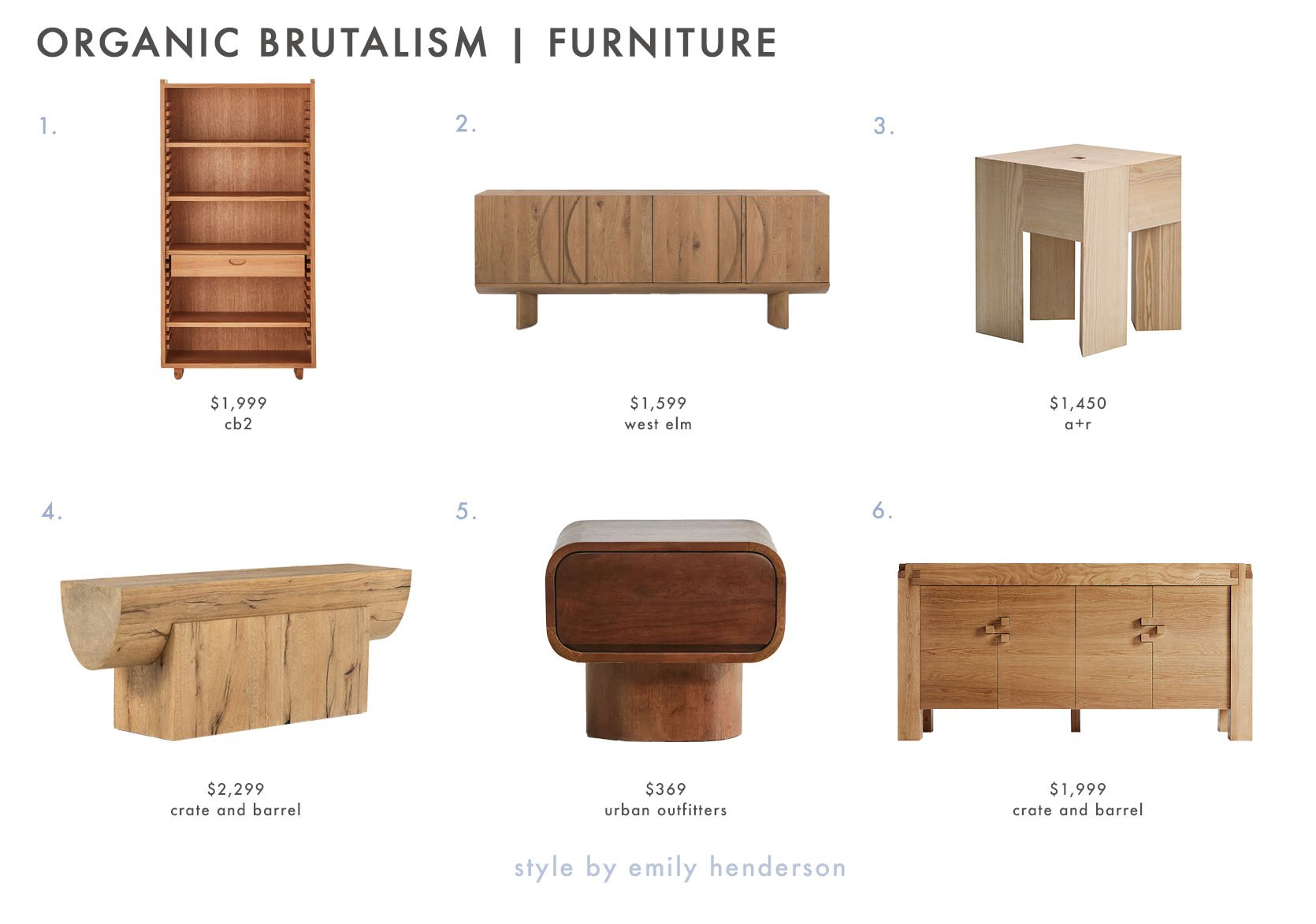
1. Ventura Notched Tall OakBookshelf (not totally organic brutalism but great for a little taste) | 2. Plinth Wood Legs Buffet (a hint of MCM in the most organic version) | 3. TriAngle Stool (very simple, very modern, very cute) | 4. Albie Oak Wood Console Table (the definition of organic brutalism and I love how the two pieces fit together) | 5. Huron Nightstand (love that shape and wood tone) | 6. Knot Rustic Sideboard (another subtle option that’s super versatile)
Ok, so I know those weren’t the most affordable. Honestly, you will likely need to hit the flea markets, thrift shops, and online secondhand options for budget-friendly options. BUT don’t forget about decor! Smaller, less financial commitment, and more affordable. I wish this style/trend was cheaper!
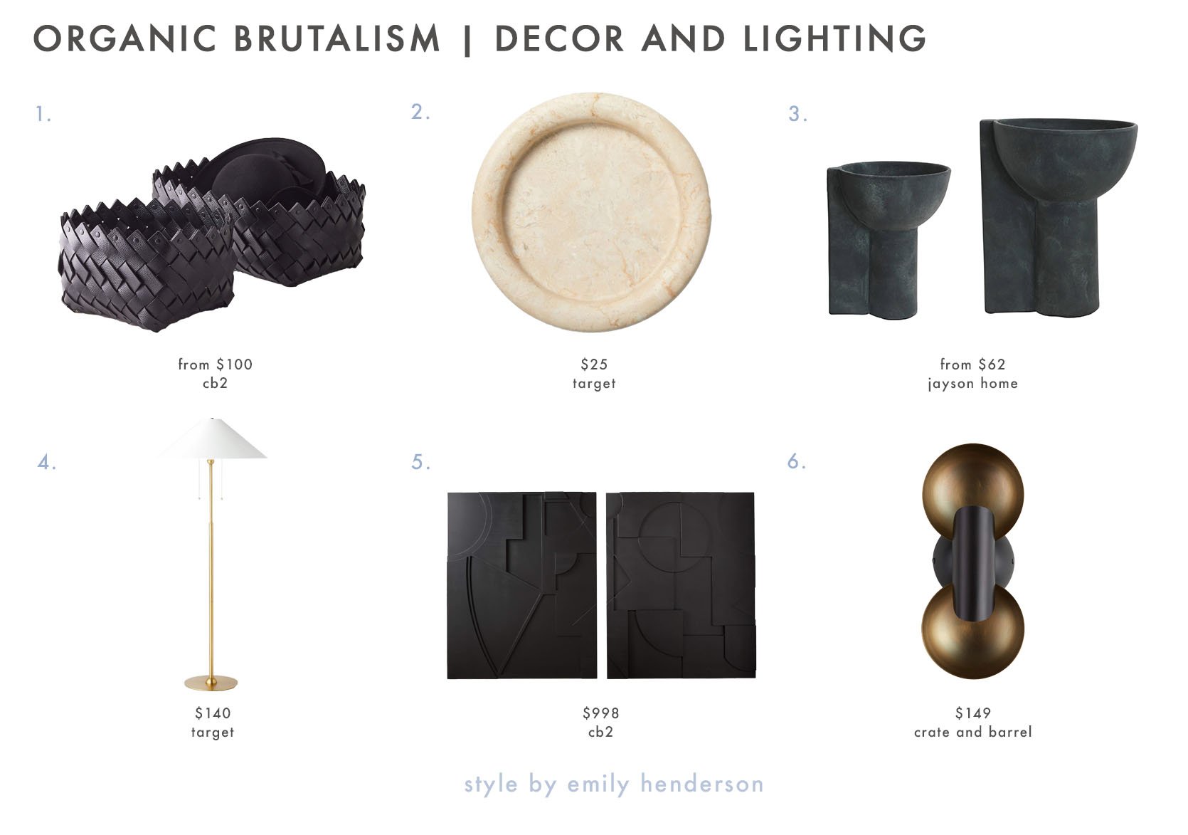
1. Willa Black Woven Leather Baskets (love the unexpected black leather and woven pattern) | 2. Marble Dish (I’ve almost hit add to cart 4 times! this is SO good) | 3. Cassius Compotes (cool, earthy, and chic) | 4. Floor Lamp (subtle but so pretty) | 5. Racco Wall Decor (Set of 2) (love the 3-D dimension and these would add so much character to a wall) | 6. Cyril Decorative Sconce (very cool and sexy).
So. Whadda think? Again, I know this will not be for everyone and by no means do we think everyone must incorporate this style/trend into their home. BUT if it doesn’t intrigue you go for it! Talking about/being introduced to new designs is fun and that’s what we are here for.
Love you, mean it.
Opening Image Credit: Design by Simone Bodmer-Turner | Photo by Annie Schlechter | via Curbed
THIS POST WAS ORIGINALLY PUBLISHED HERE.


