I walked into this room design process fully willing to let Birdie’s creativity lead. I would NOT try to control her effervescent light. But much like Halloween costumes, you can only impose your wants for so long before their “youthful” choices and tantrums dominate. The first few years you dress them in a costume that makes you and your friends laugh, like Mario Batali, “Weekend At Bernie’s”, or Dolly Parton (true stories). But around age 4-5 they want to be Elsa and Spiderman and you swallow your disappointment, embrace their generic choice, feign enthusiasm, and “Ok! ELSA IT IS!!” Again!! Big kid rooms are the same, unfortunately, but different because a dumb $18 one-night-a-year costume has far less implications than a full room design. As I wrote about last week, Birdie is extremely enthusiastic about design and color, she feels confident she will be an artist when she grows up, she wants a room that is full of her personality and will not settle. Not sure where she gets it from:) It’s exhilarating to be her mom. So I sat down with her, innocently, on Pinterest ready to find the “jumping-off point” when she said, “let’s just google unicorn wallpaper”. Against my better judgment, I typed that death wish on the keyboard and it all went off the rails.
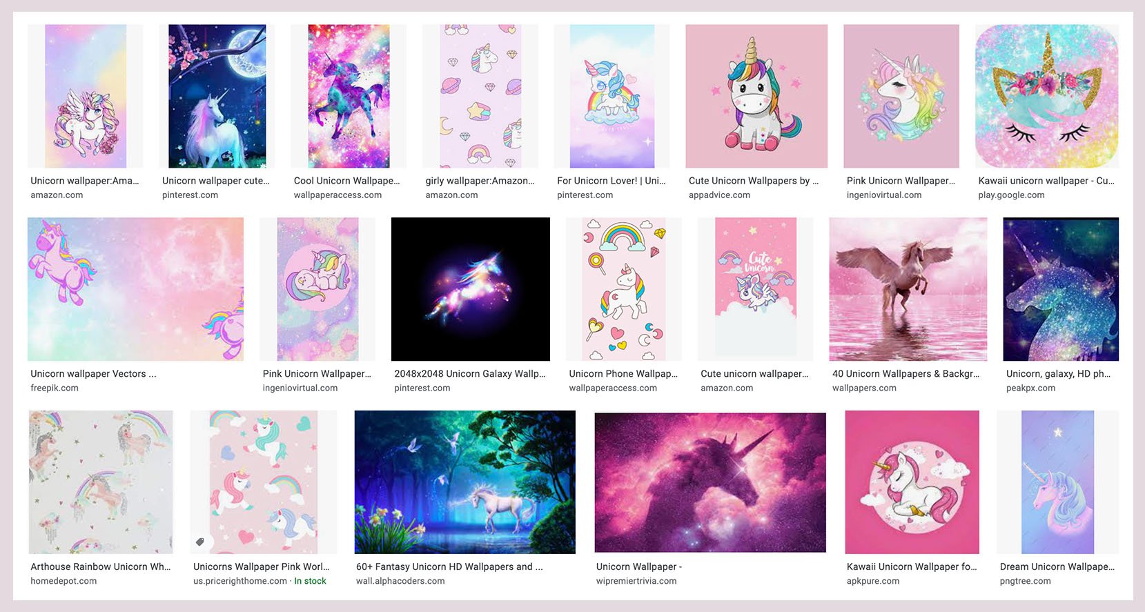
She squealed and screamed, “I want that! THAT!!!!”. These aren’t even “wallpapers” for your wall, they are digital art for your computer (mostly) but they are full of incredible energy and color and, y’all, that’s what she wanted. OOF. ROOKIE MISTAKE. I did my best “cool” mom act and said, “oh yeah, that’s so fun…but what if it was more like …” and then I plugged in “Scandinavian pink girls room”. Here’s what came up:
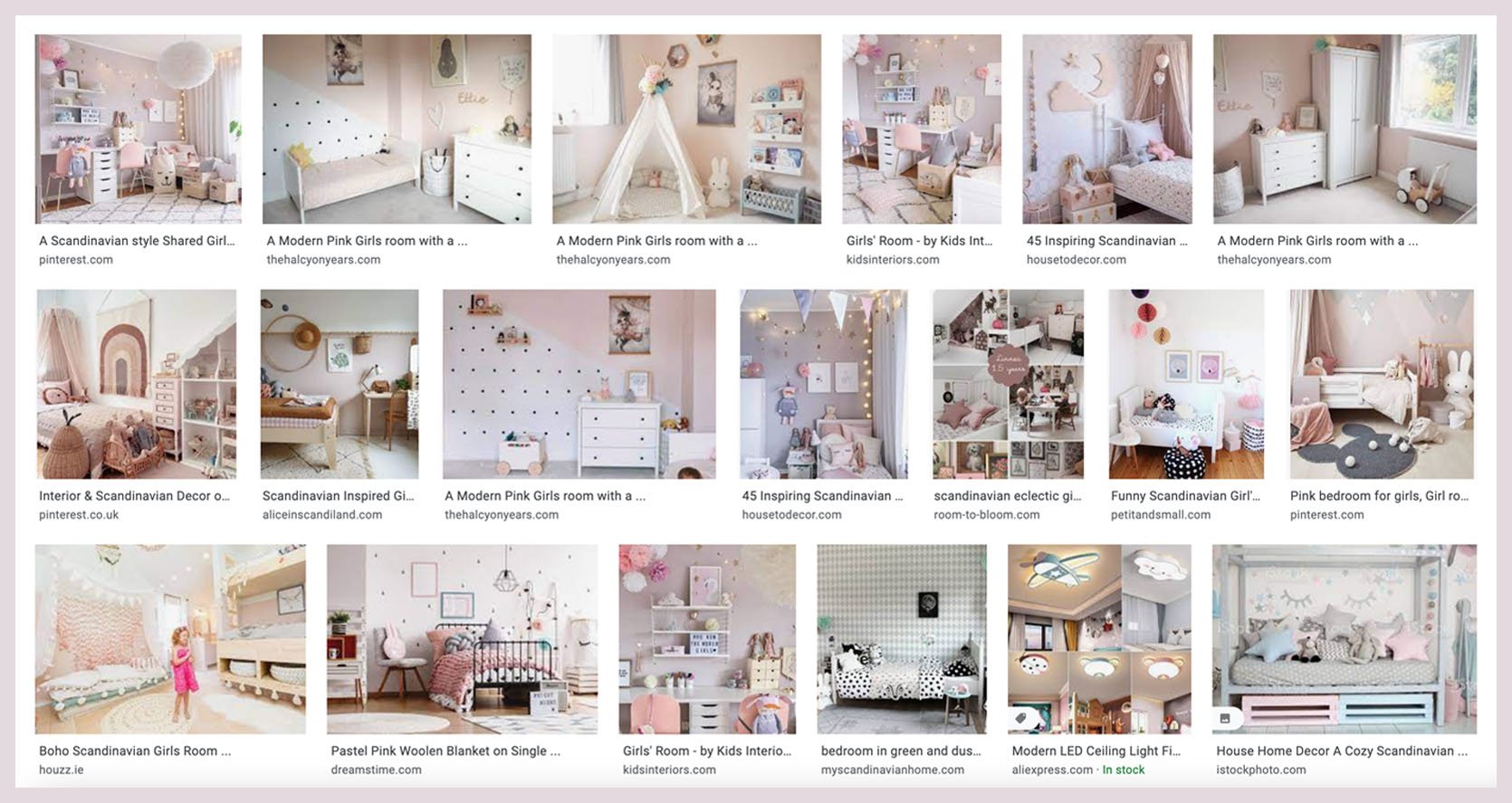
She responded in the most adorable voice on the planet, “Oh no thanks, mama. That is what you like. That’s not enough color. I want ALL the bright colors. ALL of them.” and then the kicker, “even orange and purple…”. I was quick to stammer, “of course, sweetie, it’s your room and I want you to love it,” while I panicked inside.
Then over the next few weeks, I used my brain and more developed manipulation skills and pulled up only sites where I loved all the options. i.e. House of Hackney, Schumacher, Hygge & West, Minted, etc. She made me pin every single one that she loved which was 99% of them with strong saturated bright colors. I tried my hardest Oscar-winning performance to show them all equal enthusiasm, while I obviously had my preferences.
Meanwhile, we were working on her dollhouse together. I told her that she could be the lead designer and that I would be her assistant. She could design it HOWEVER she wanted. We went to the craft store and bought “wallpaper” full of donuts, ice cream, unicorns, and 10 different flower patterns. She chose the paint colors and gems for all the furniture and I went to town making them all. I matched her enthusiasm at every turn because honestly, it was SO MUCH FUN doing this with her. As I in Tuesday’s post, cultivating a shared interest is an extremely important thing to me as I can see the potential for decades of fun, together (if I don’t mess it up).
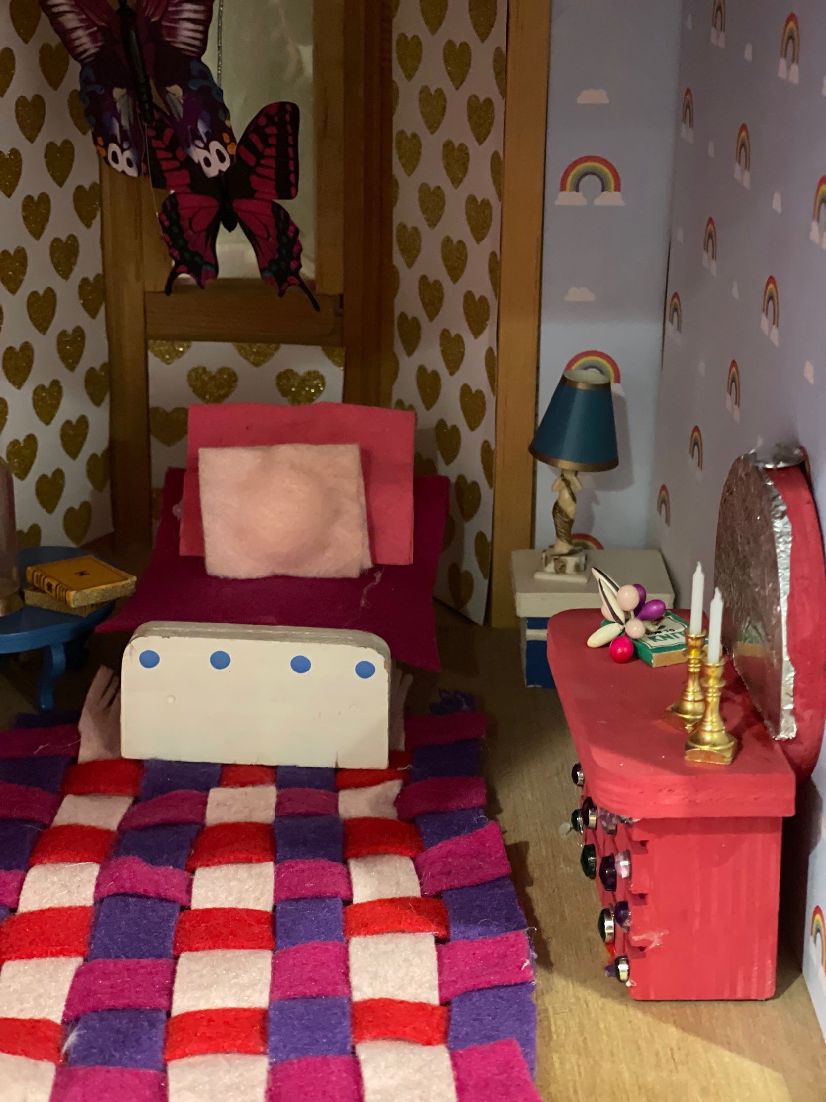
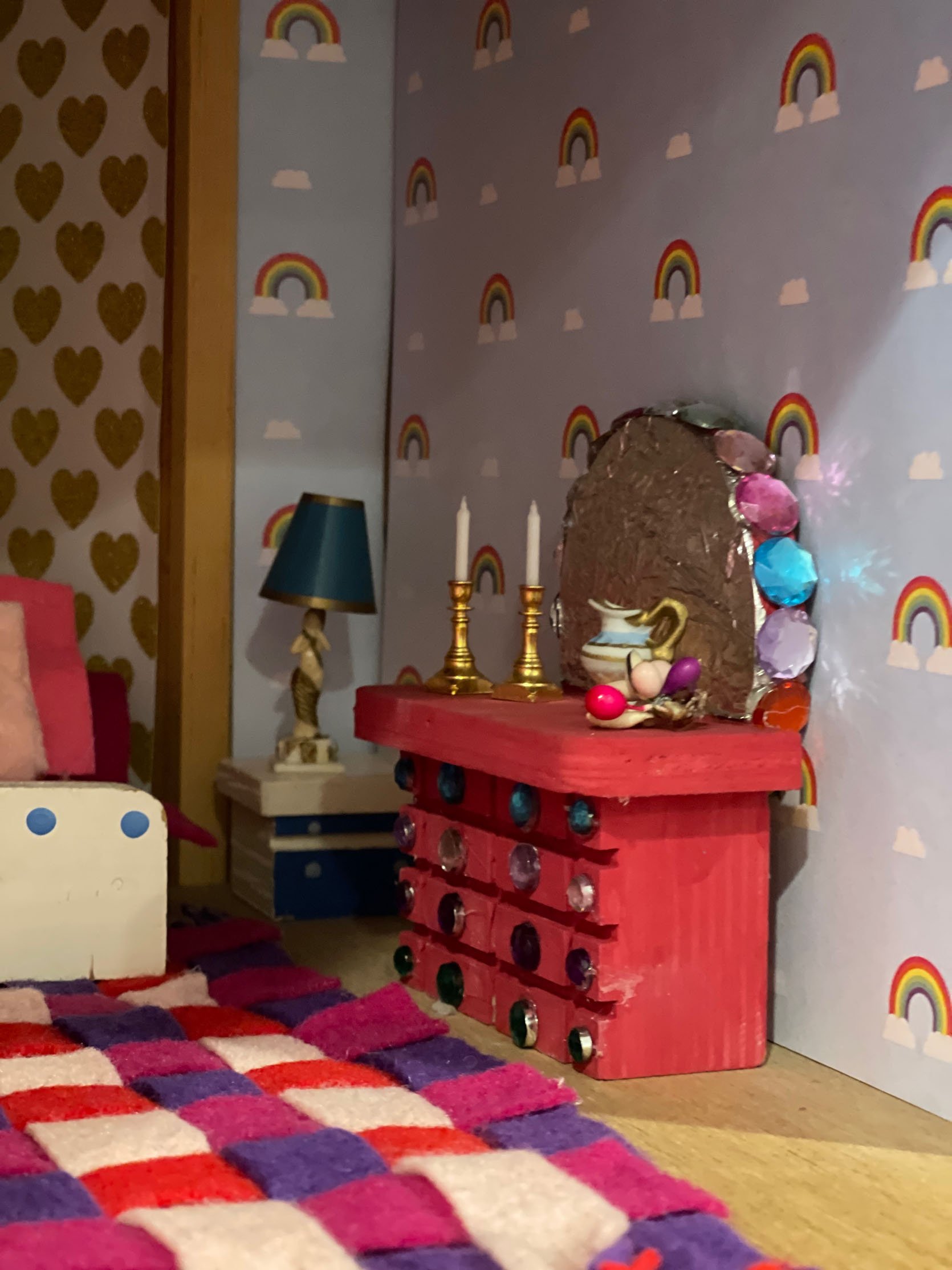
She would scream with delight, so excited when the donut wallpaper went up in her dollhouse bedroom. She wanted to hang paper butterflies in the corner like a mobile and I helped her figure out how to do it. Here and there I would try to teach her about focal points, balance, “restraint” (ahem), etc, and she changed some things but I honestly tried to bite my tongue and let her lead. I’m SO GLAD that I did. I feel like if we hadn’t had that dollhouse experience/experiment I wouldn’t know the extremes of joy that her own creativity induced in her. SCREAMS OF JOY. She was having the same reaction as I did to the pantry vintage windows and there was NO WAY I was going to deny her and myself that joy in her future, real bedroom. Lesson learned. This room is hers and we are going ALL OUT.
But at the same time, we talk a lot about waste and landfills in this house. They know that we won’t support buying anything that doesn’t have longevity. Not that we have to keep everything forever, but it can’t be plastic $8 LED unicorn lamps from Amazon that would break or that she’d hate next year. Further research and exploration were necessary:
So we listed what she loves and they were as follows:
- Unicorns. (fine, for now – we can bring them in…. somehow)
- Flowers (!!!!!))))
- Butterflies (!!)
- Birds (and all animals really) (!!!!)
- Hearts 🙂
- Candy/sweets
For colors she wanted the following:
- Pink
- Purple
- Teal
- Blue
- Green
- “All the colors in the rainbow mama, except gray”.
It gave me a great jumping-off point. I pitched an idea, that for her real bedroom I would be the designer and she would be my client. I walked her through the process, how I would present her ideas and she would get to choose. To be clear, she is super opinionated but also strangely reasonable and can compromise. She loves so many different things, I could easily convince her of the next thing if I felt like it didn’t work. Sometimes it’s like looking in a mirror. Maybe she trusted me because of the dollhouse experiment? She agreed to our arrangement so I narrowed down the wallpaper choices that I really hoped she would love.
As I was shopping I thought about the following:
- It HAD to be very very colorful and fun, or she would just say “No, mama”. Note taken.
- It had to last for a decade. Nothing too silly or young (like unicorns or donuts) and nothing cheap or too trendy.
- It had to work relatively well with the rest of the house and the other bedrooms upstairs. Nothing too cartoony, dark, random, or crazy busy.
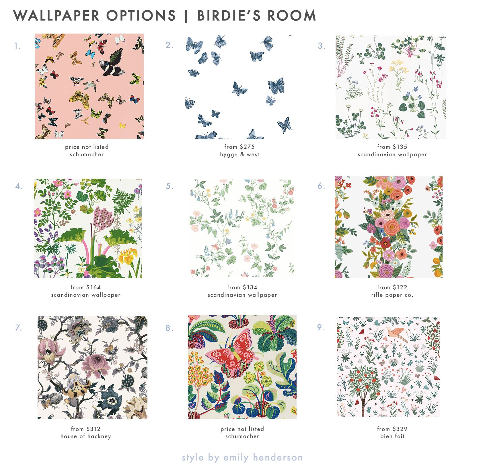
1. Queen’s Flight Panel Set | 2. Butterflies Wallpaper | 3. Simons Äng White | 4. Rabarber | 5. Midsummer Eve | 6. Garden Party Trellis Wallpaper | 7. ARTEMIS Wallpaper | 8. Exotic Butterfly | 9. Millefleurs
I felt pretty good about presenting all of the above to her. Just like a designer, I had my favorites, for sure. As much as I love busy patterns in photos, I don’t love living with them as much. So I was hoping that she wasn’t adamant about a few of them.
She nixed some immediately (for not being bright enough). She considered the unicorn wallpaper (oops not shown) but agreed that she didn’t know if she would still love them in 3 years (one of her formerly unicorn-obsessed best friends is 9 and no longer as into them). I may have stacked the cards a bit because the only physical sample that I bought at the time was the Butterfly Baudin from Schumacher because that is the one that I wanted. I felt that it checked the boxes that I wanted. Proof of said boxes:
- Light, bright and airy – it had a decent amount of negative space that kept it from being too dark, heavy and busy. While I love so many dark patterns, for these three bedrooms on the landing I want it to flow relatively cohesively.
- It’s feels kinda vintage-y and classic/traditional (versus a more contemporary butterfly or animal pattern).
- It’s full of so many wonderful colors. This girl wants everything in the room to be a bright color. So we have been collecting vintage/thrifted dressers to paint. While she loves neon and some lime green, etc, with this paper as our guide she has a ton of colors to choose from – all approved by her designer (me).
- The flora and fauna vibe still feels “Oregon farmhouse” appropriate.
- I loved how the pattern would interact with the diamond pattern of the original windows. while some graphic patterns could have worked I liked the juxtaposition of this more organic pattern next to the straighter diamond pattern.
- I could picture it from the landing and it just made sense with the house. Walking up the stairs and seeing through those light blue doors just makes me so happy and feels right.
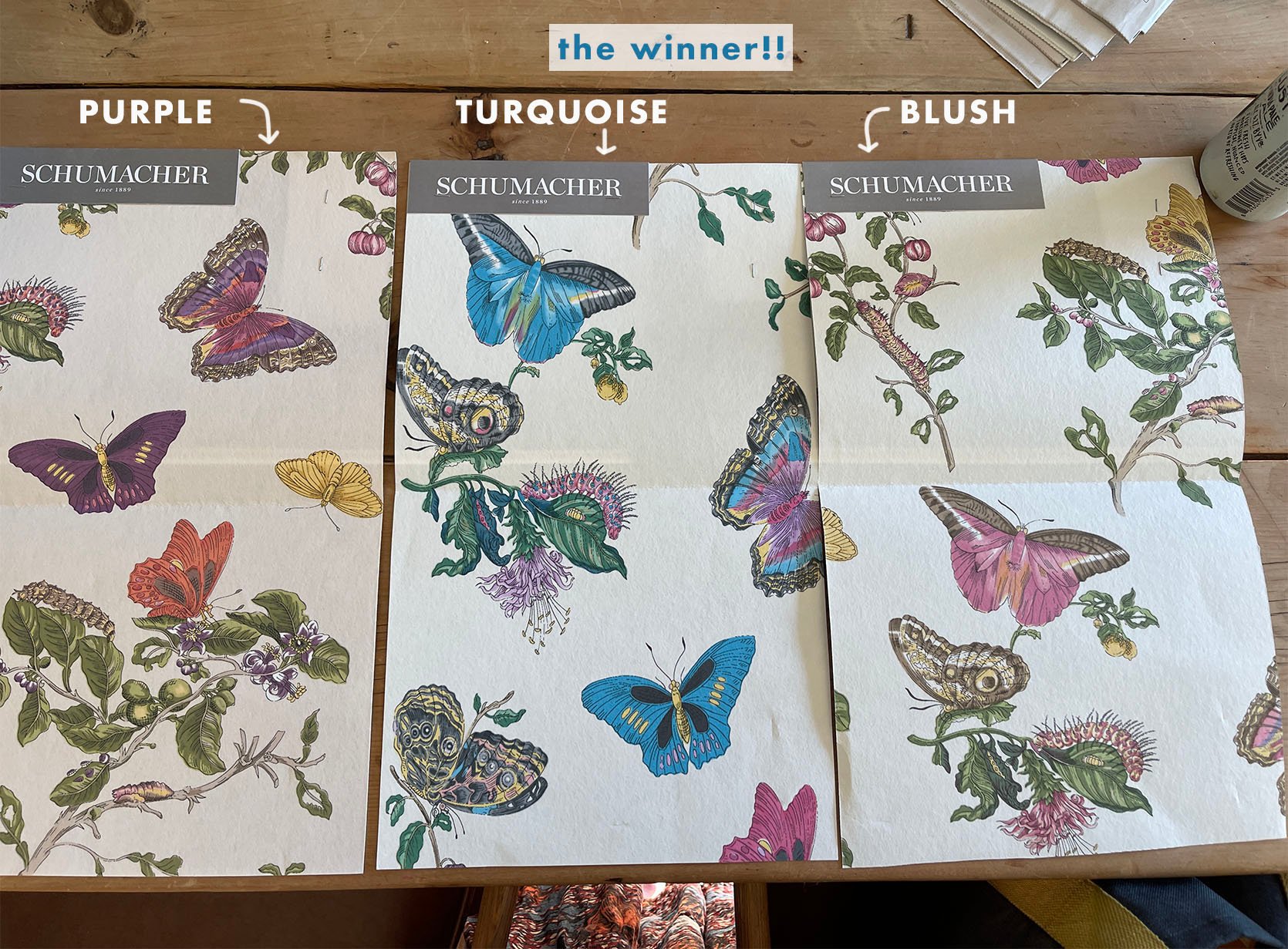
For me, the colorway was a no-brainer, but I put it on social media and the all-pink version was the winner. Not us. The “Never Bright Enough Henderson” team wanted the teal/yellow and pink version. I tried my best to conceal that it was my favorite until she made the decision herself. It was SO enthusiastic. I think she feels really proud that her choice was the one that a professional designer would have chosen. And it was a shared celebration that we had found the most perfect wallpaper (and WE ARE STICKING TO IT!!).

So we are off with an incredible jumping-off point that is making the room feel very clear and cohesive to me as her designer, and so wild and fun for her, my adorably involved and totally spoiled/sweet client. I had zero intention of even thinking about the kid’s rooms yet but she was so excited about the design and talked about it all the time. It’s such a fun way to spend time together. So y’all we are doing it. WE HAVE OUR JUMPING-OFF POINT!!!
Opening Image Credits: Design by Julie Rose for EHD | Photos by Sara Ligorria-Tramp | From: A Little One’s Mid-Century Magical Bedroom Reveal
Photo of Emily and Birdie by Kaitlin Green
THIS POST WAS ORIGINALLY PUBLISHED HERE.


