My Saturday morning online shopping tradition has been stunted by my internal common sense screaming, “you only have two weeks until you move in…live there before you buy one more thing.” But that doesn’t mean I don’t pin, narrow down, think, mentally decorate, etc. Besides, you can put a good bench or console in so many places so if I found a great one on FB marketplace I think it would still be a sound purchase (not sure if that is the vintage shopping addict talking or my common sense – Who knows?)
The Entry: When We Bought The House
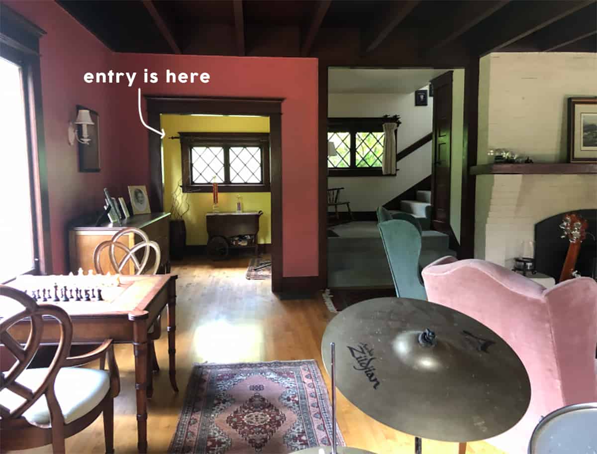
I don’t think I’ve had a self-contained entry before and I like how clear its purpose is. This room will greet you (which is why I want it to be really beautiful, not just a bunch of shoe bins) and needs to be a good coat zone for guests but otherwise, very little time is spent in here before you immediately go right into the living room. So it needs to make an impact, set the tone, and function with some storage.
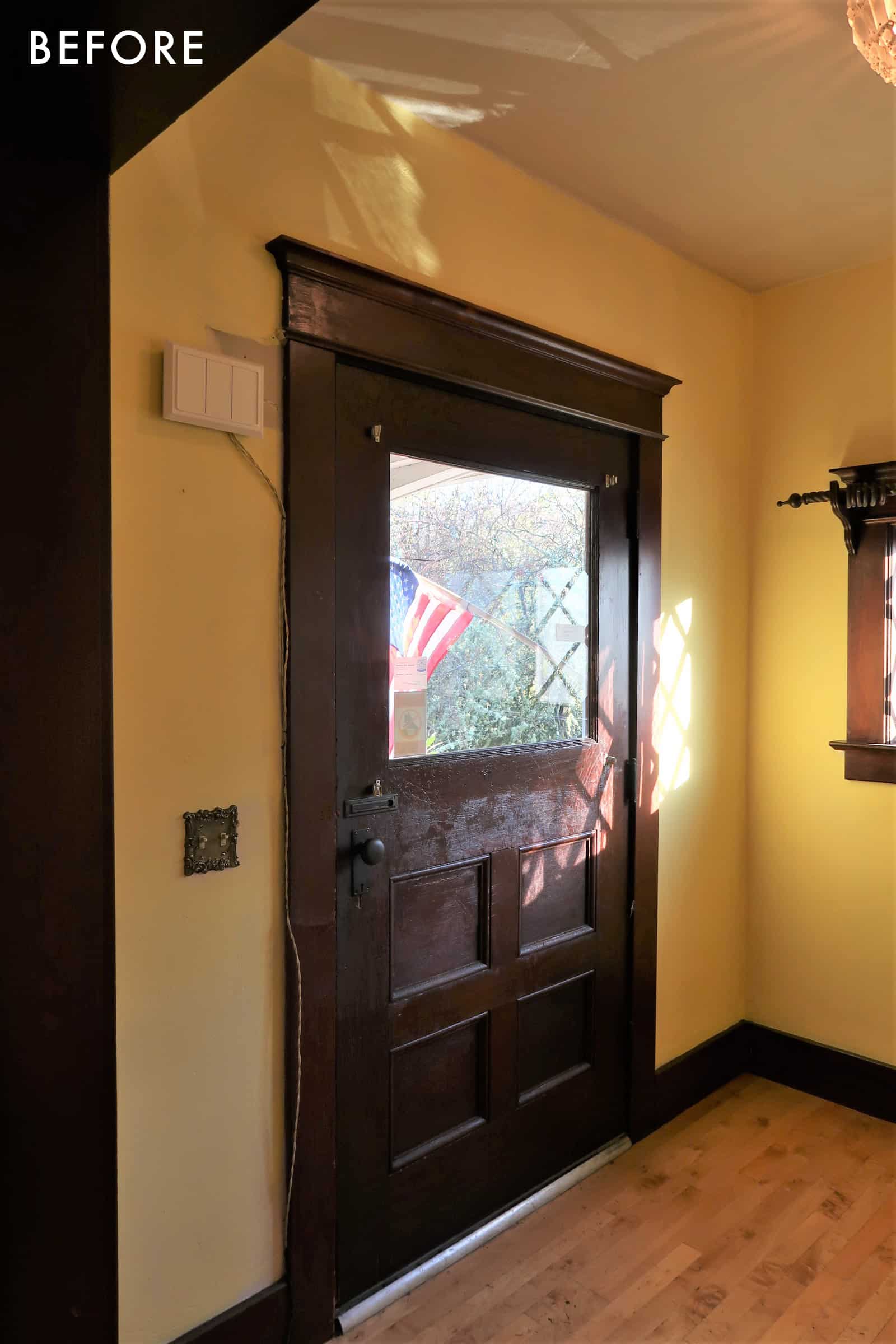
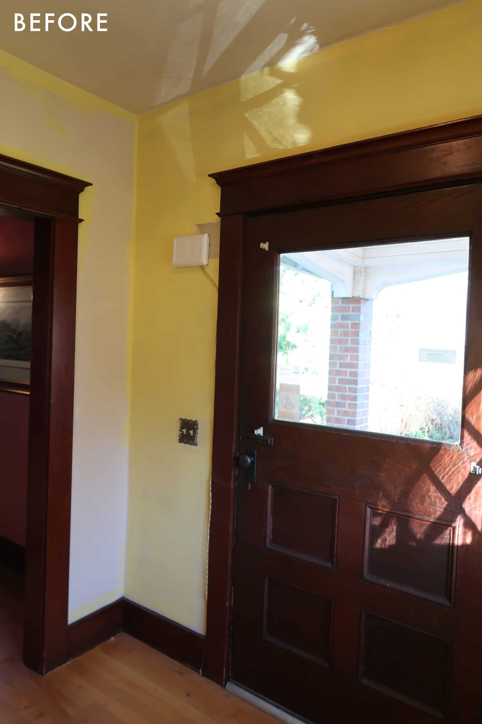
It’s a nice little space that will likely serve as a drop zone. My fear is that the kids are going to use the back kitchen door as their drop zone unless I use my hard-core parenting manipulation/bribery skills to change their patterns. And if you live in CA you might think, what’s the big deal with going through the kitchen door? But what you’ll quickly learn is that kids here are trained to take off shoes and coats almost immediately upon entering and if there isn’t a system, they will literally just DROP everything. And that is not acceptable in that dreamy kitchen corner (don’t worry, I’m designing it to withstand some dropping but no, I do not want it to be our dedicated drop zone). Anyway, my plan is to lock the kitchen door with a sign that says, “head to the mudroom, put shoes/coat away, and earn yourself a jelly bean.” Maybe after a few weeks, they’ll just automatically do it? Pavlov’s dog? I think I should write a parenting book.
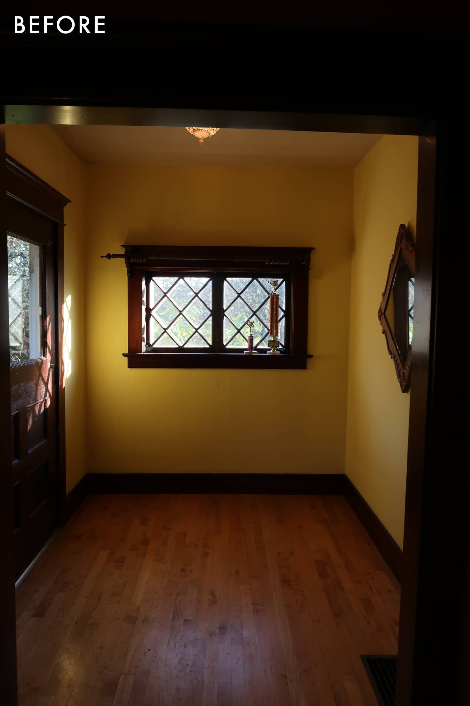
Then recently I realized that the front door (where we are today) is actually pretty close to the back entrance (the closest from their school path) so maybe this is the daily drop zone? And oddly I’m fine with that because at least it’s a contained space and really only needs to look super styled out for guests. That’s all to say we aren’t sure how much of a drop zone this area needs to be. I’m hoping it’s just a coat rack, a boot tray outside where it’s covered, then a bench or a table for potential purse/keys. But I don’t really know…
Entry Mid-Renovation
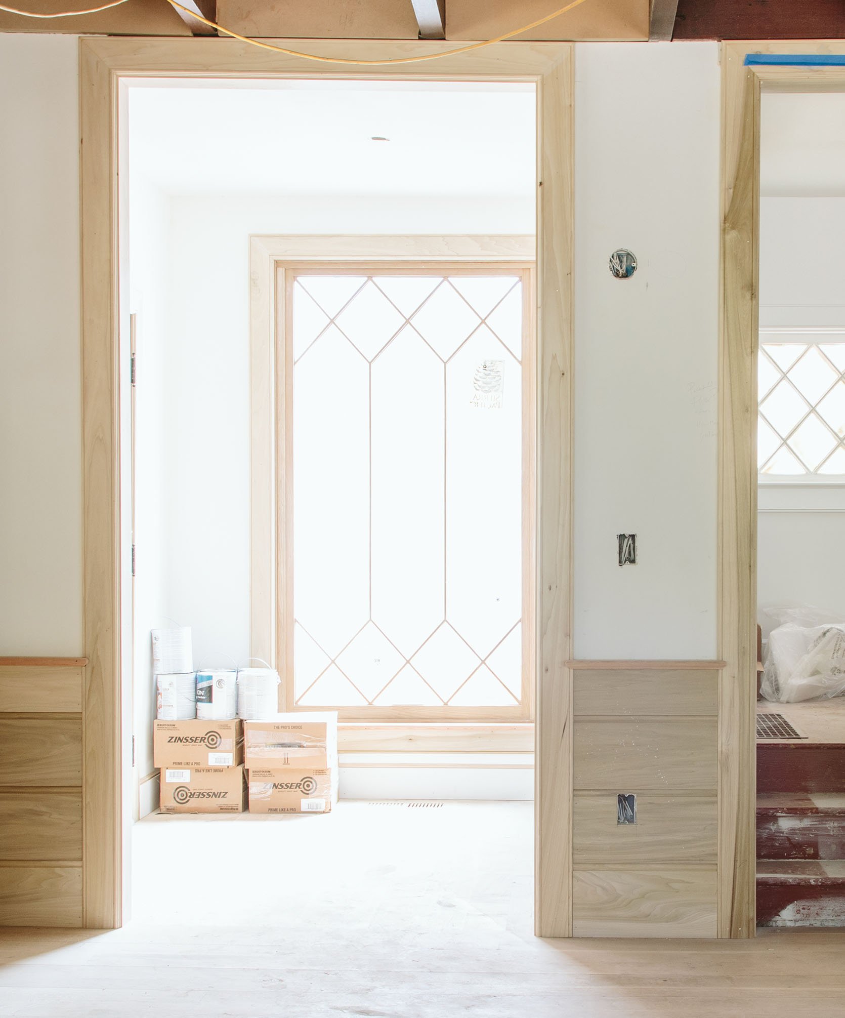
So as you can see we installed the most beautiful window ever, custom designed with Sierra Pacific. It’s just so pretty. So whatever we have we need it to be pretty shallow – 18″ is the total depth of the nook and for the length we have a total of 84″ I’m thinking somewhere between 55″-72″ for whatever piece of furniture we choose (but maybe even smaller, again I need to try a piece and see how it feels).
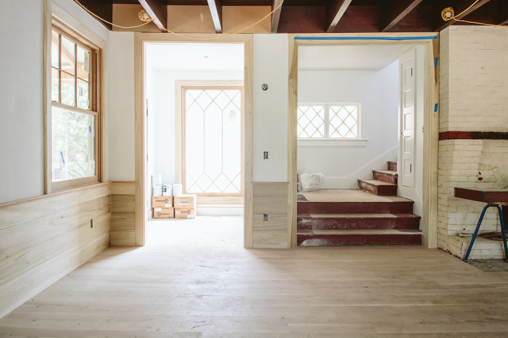
I really don’t want anything to obstruct this view – no bench arm or table edge to be seen from the living room. Instead, I want it tucked inside that nook (again this is just my current opinion that can change). I’m thinking of a coat rack or hook on the left and/or a beautiful airy tree that climbs over the window. In this house, I’m really trying to keep sight lines pretty clean (something we’ve really enjoyed at the mountain house). The window is the focal point from the living room so I don’t want to distract from it. BTW I’m just now noticing that the sconce isn’t centered on the wall between the entry and the stairs but Jamie has already moved it, don’t worry.
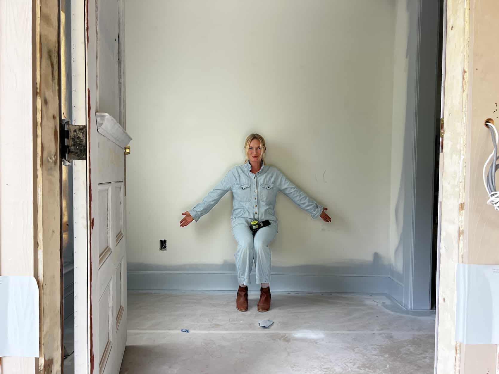
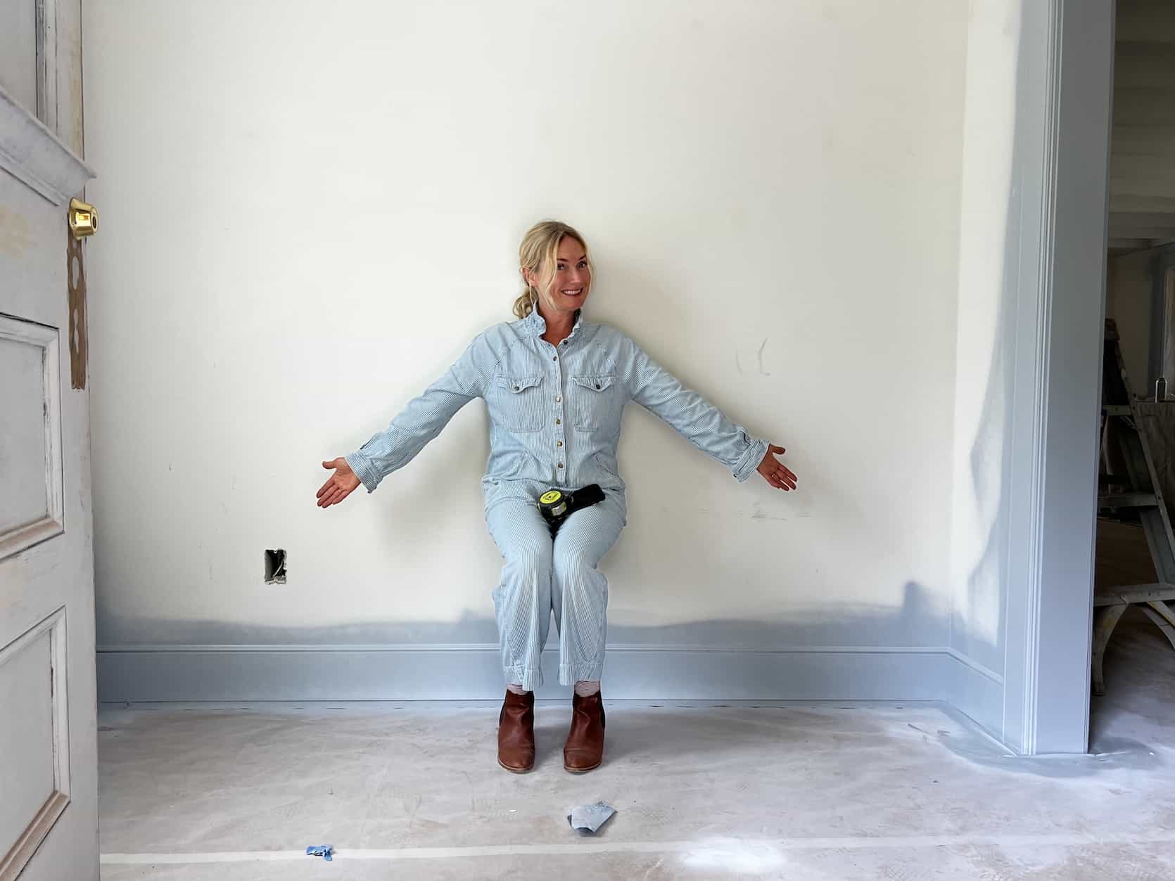
If you are wondering why the baseboard and casing are blue here it’s because we thought we wanted them all to be before we realized that well, we didn’t like it AT ALL (so yes, we wasted a 1/2 day of painting labor and some gallons). It’s a great color, (Upward by Sherwin-Williams) but too twee for down here and ultimately we just want white and wood and color in the furniture/decor. I actually really like it in this shot, but once you get into the living room it’s just too much and really detracted from what we love – the wood flooring, wood windows, natural light, and sense of openness and space.
So here, below, are all the benches that I have pinned, none of which have been purchased yet. What you’ll notice is that most of these have a very minimal arm – i.e. not sticking too far into the room’s view. Not all of these would work size-wise, but I really like them all for different reasons.
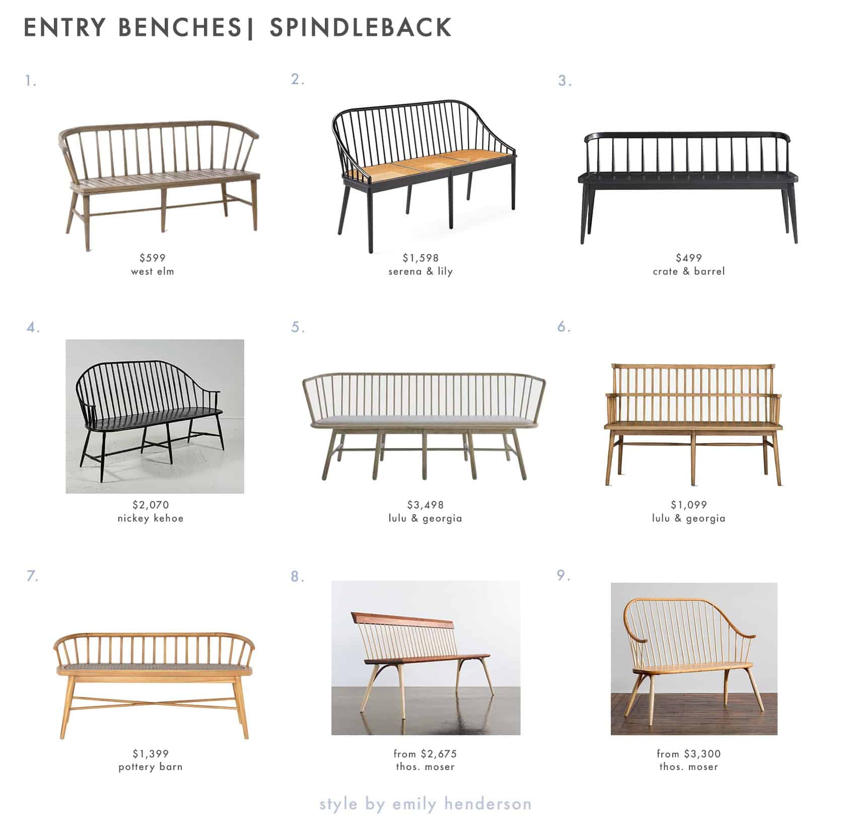
1. Dexter Outdoor 60 in Bench | 2. Millbrook Bench | 3. Pali Black Wood Dining Bench | 4. Windsor Bench | 5. Marissa Bench | 6. Lanae Bench | 7. Chrissy 57″ Indoor/Outdoor Teak Dining Bench | 8. Eastward Bench | 9. Continuous Arm Bench
#8 was my pick from this group (it’s just so pretty) and if it doesn’t go here it might work somewhere else. But then I thought that if we do a bench here maybe a rounded back (like #9) could work…
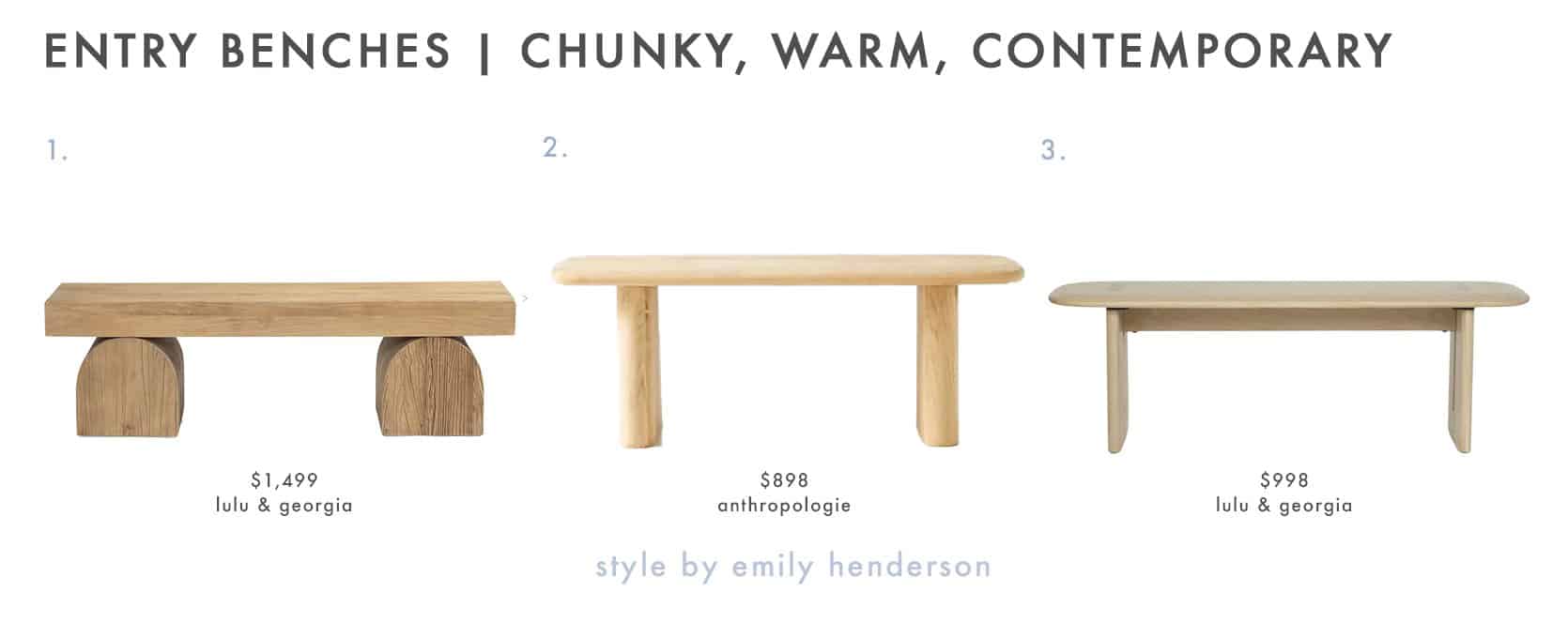
1. Laney Bench | 2. Kalle Sculptural Oak Dining Bench | 3. Henrik Bench
I love #1 even though I know it’s super trendy. It just feels so solid and grounding. I might put this in my kitchen window (by the back door).
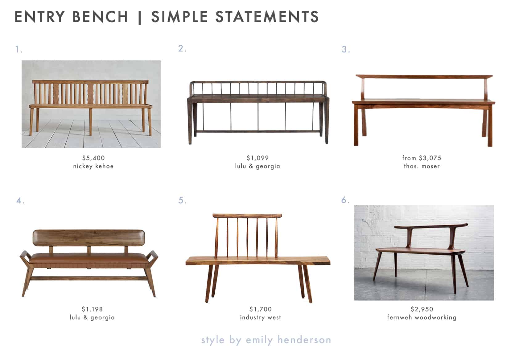
1. Nickey Kehoe Swiss Back Bench | 2. Eunice Bench | 3. Edo Bench | 4. Sienna Leather Bench | 5. Kyoto Bench | 6. Oxbend Bench
Originally I was going to get #6 (and still might), but we bought the counter stools from Fernweh already so I want to live with them before we commit to adding another one of their pieces in the next room (we’d get it in walnut, not black like our stools). Real big fan of #1 but it comes with a hefty price tag. So instead I searched for antique versions on 1stDibs (which also came with a big price tag and found a few).
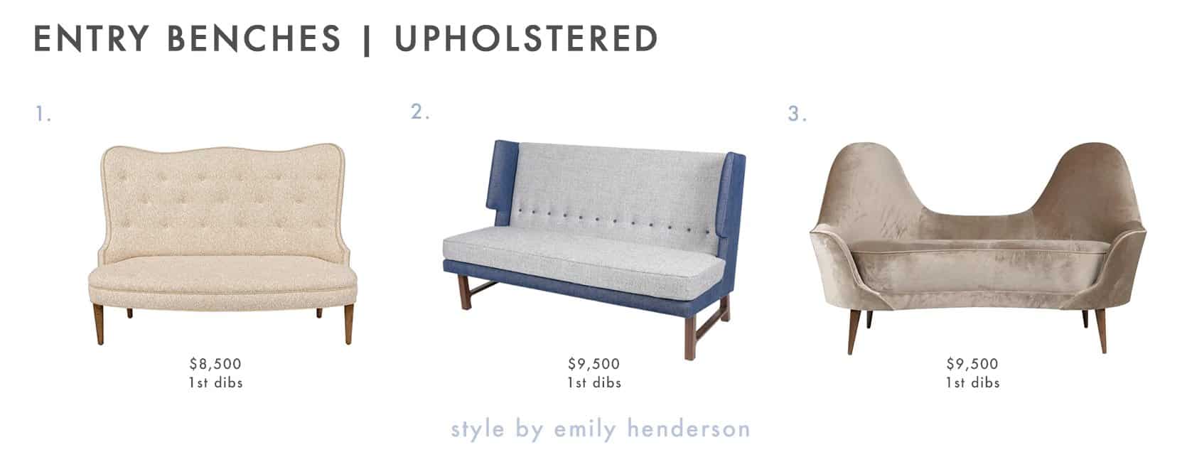
1. Italian High Back Bench | 2. Mid Century Style Wing Settee by Lost City Arts | 3. Italian Style Settee by Lost City Arts
For a hot second, I entertained the idea of a very slim upholstered high back bench – almost like a statement settee. Not totally sure why, but I do really love these – all armless and super shallow so technically they fit the dimensions, and boy would they be a statement walking in, but they don’t ultimately feel right (I also wouldn’t order these as they are a fortune, instead using them for inspiration to custom make something).
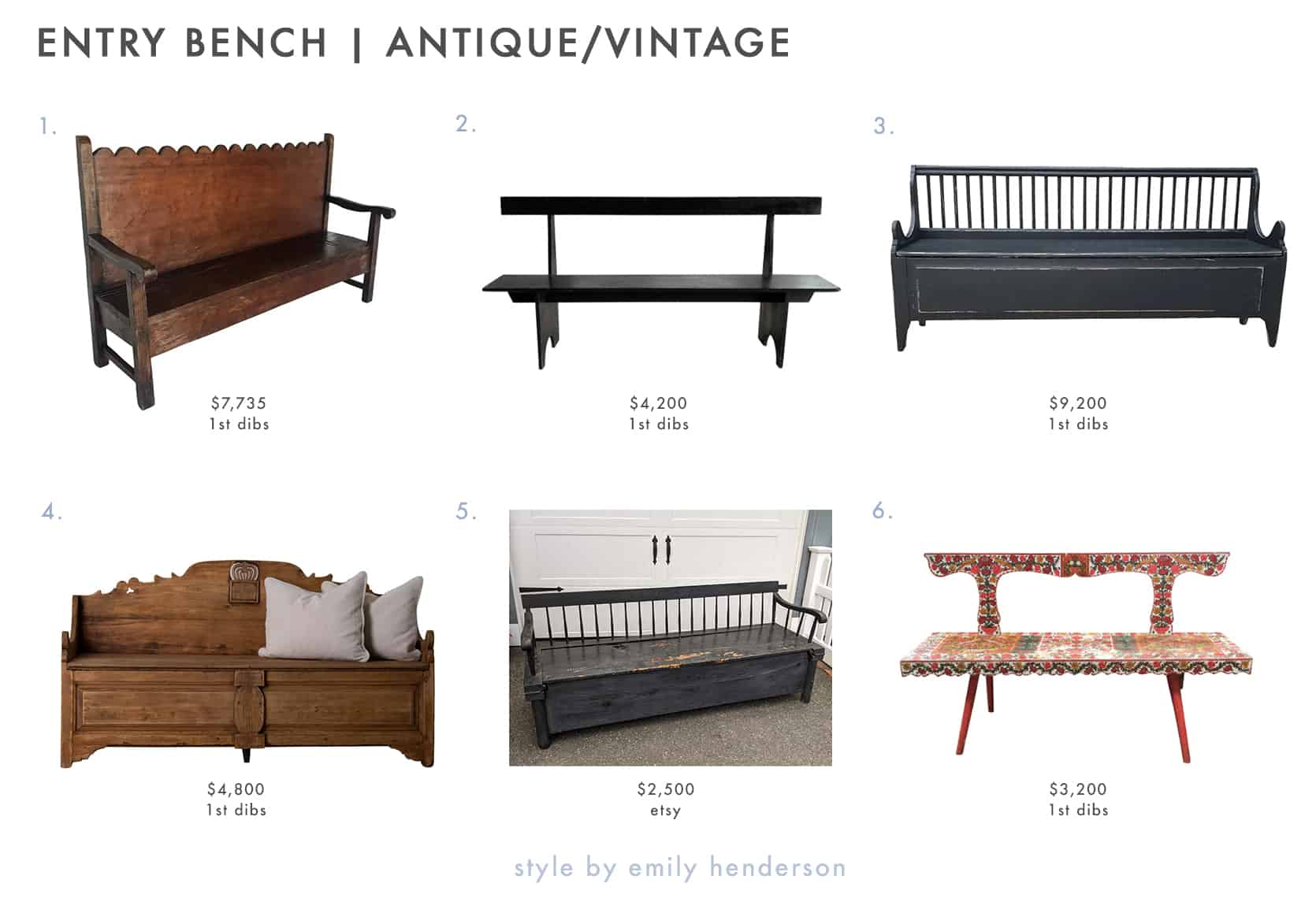
1. Rustic Chajul Bench With Tall Scalloped Back | 2. Pair of American Modernist Shaker-Inspired Benches | 3. 19th Century Black Swedish Gustavian FÅLLBÄNK, Antique Pinewood Fall Bench | 4. Bench Swedish 19th Century Bench | 5. Antique American Pine Deacon’s Bench | 6. Hand Painted European Bench
Not going to lie, #6 gets me so excited. I LOVE an old folk art painted piece. I like all of these for different reasons and yet none of them feel quite right, but figured it would be fun to show you what was on my pinboard.
Right before I published this post I showed Brian all the options (I left this one off because it’s $8,200 but if I could have any bench this would be it – see below). Brian’s reaction to my pinboard was like, “Sure I like them, but maybe you’ll want a console instead?” I was like immediately defensive until I realized he’s probably right. I think what happened is that I fell in love with the O&G bench, it’s such a beautiful statement. Feast your eyes on this:
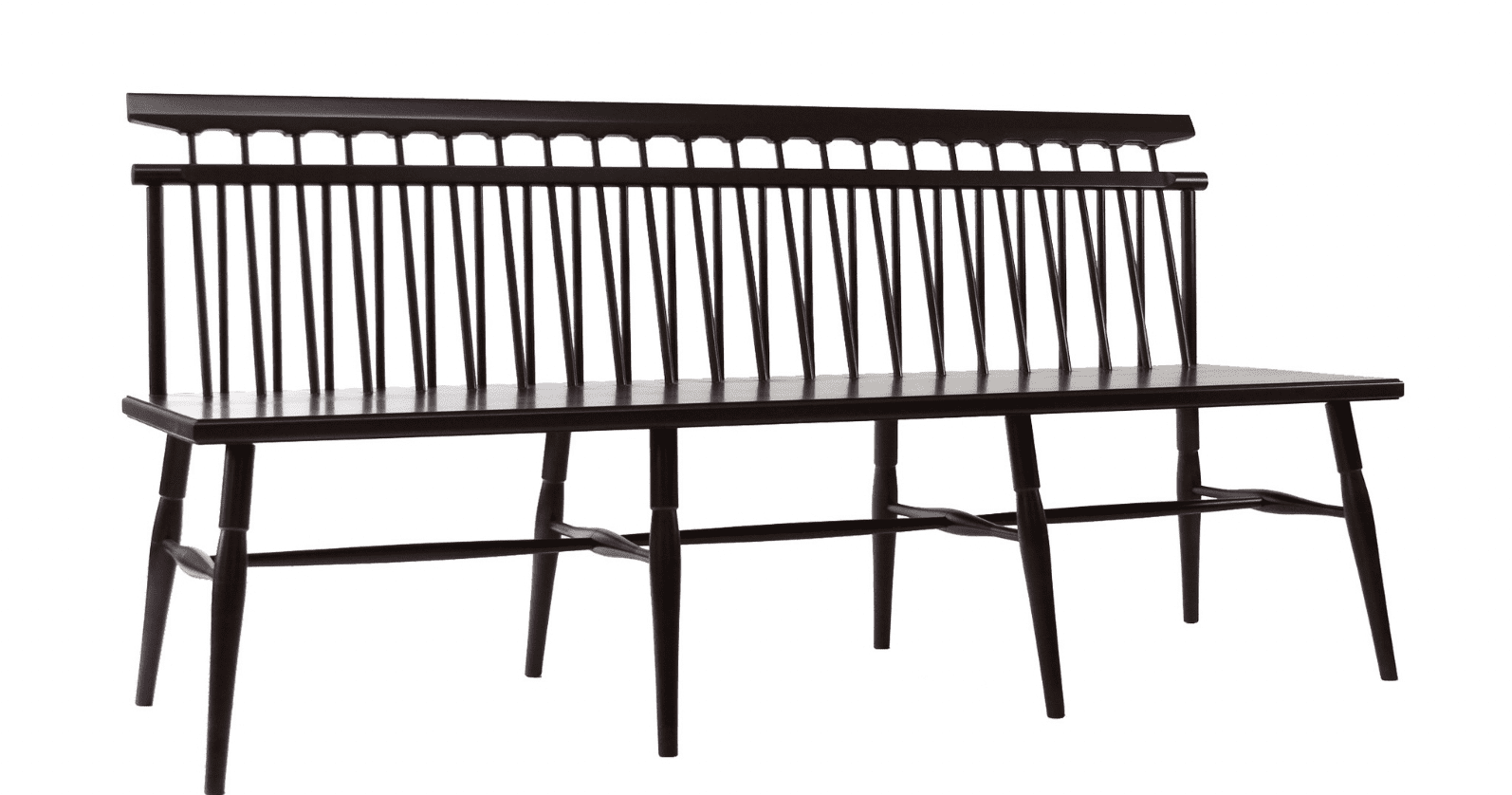
I pictured a piece of art above it and was like, “Boom. There, the entry has been nailed.” The joy I would feel daily by seeing that piece of art (the bench, not the actual art above) checked so many mental boxes. But due to its price, we knew that it wasn’t where we’d spend money. So I searched long and hard to find a more affordable version and definitely found some great ones, but I think I forgot to explore other pieces of furniture altogether because I just had “bench” in my brain. I’ve done this before. I fall in love with something unattainable, and try to find more affordable options instead of thinking about all the other possibilities. It’s a good lesson to be reminded of and ultimately I’m so grateful that this isn’t something we NEED to live in the house and we have time to live there and see what we’ll use the most (bench or console, storage or sculptural?) and then take my time to shop.
*Progress photos by Kaitlin Green
THIS POST WAS ORIGINALLY PUBLISHED HERE.


