I think I may need more kids just to dabble in my other fantasy design styles. I suppose this is why I became a stylist and not a designer and why I loved doing my show so much (13 years ago!!). As a stylist, every day is different, every job requires a different style, it’s so much more about aesthetics than function and it’s just incredibly creatively stimulating. Kids don’t care about storage or practicality so yeah, IT’S SUPER FUN. Not to say that kids can’t be really challenging clients, but like I’ve said before and will til I die – there is a good way to do every style. Name a style and I’ll show you a good version. You just have to get down to the “whys.” Like why are they attracted to whatever weird/tacky garbage thing they saw on Amazon or a TV commercial? Then you gotta be creative and more intentional about how to bring that feeling into the room. My almost 9-year-old wasn’t really interested in even talking about “decorating” until we watched “Get Out Of My Room,” an adorable makeover show where siblings redesign each other’s rooms (with a lot of pro help), perfectly executed. In fact, the production designer commented on a recent post so I checked out her site and it’s seriously INCREDIBLE. Charlie immediately wanted all of the “boy” stuff, even though he didn’t like baseball, doesn’t need a loft bed, and isn’t into Minecraft (because he hasn’t played it yet). I think that show opened his eyes to the fact that decorating isn’t just for “girls” and that you can really do anything. He told me he doesn’t want to “decorate” it, he wants to “make it cool” and since I’m obviously a “cool” mom (as written about last week – my words, not his). We attempted to figure out what his version of “cool” is. So like last week I went back through the EHD portfolio to show him other projects we have done that I thought he’d like and his eyes got bigger and bigger and bigger.
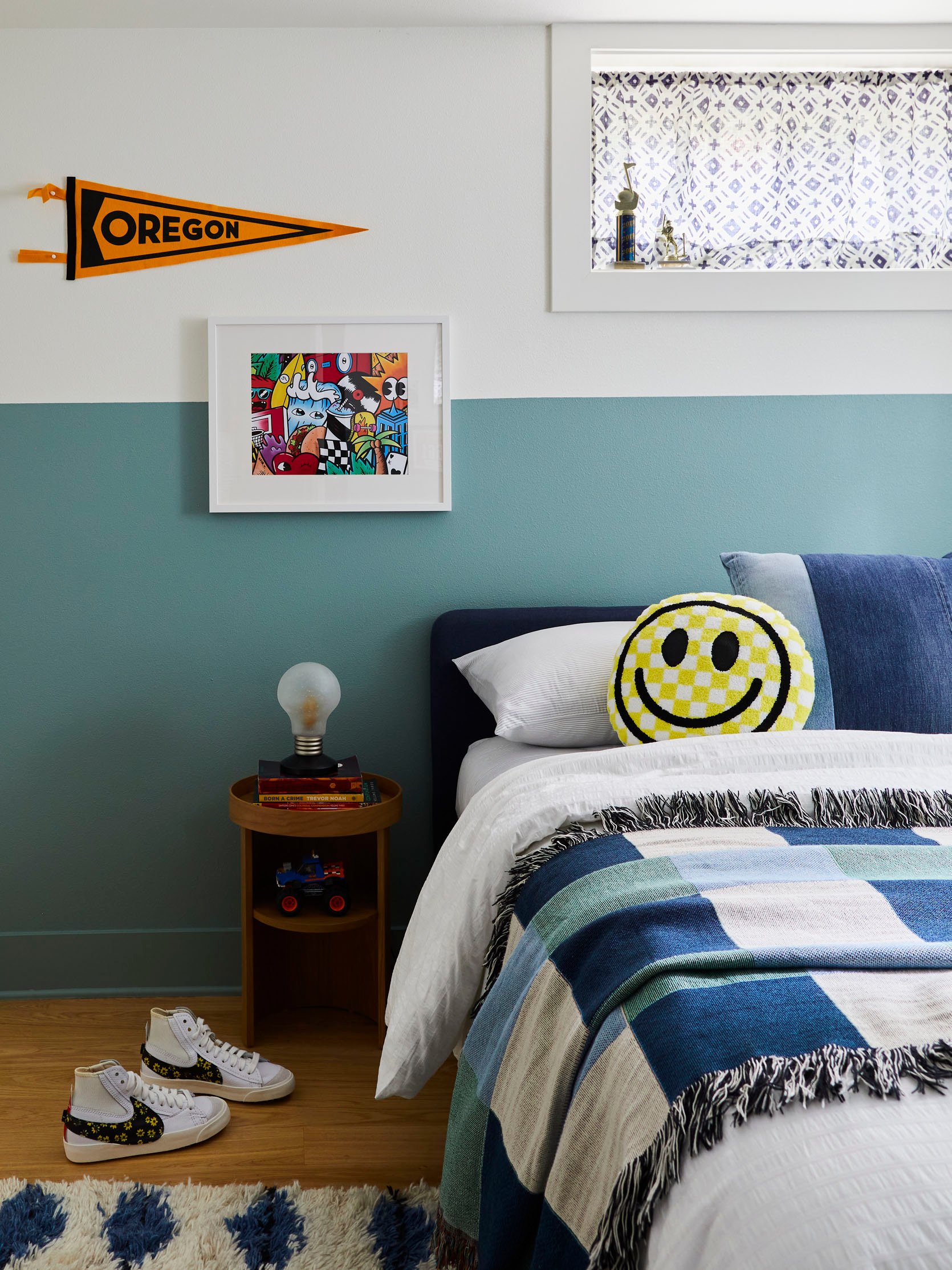
This is 14-year-old Jameson’s room, basically his cousin, who Charlie has looked up to since he was a baby. He loved the smiley face pillow (with a Bluetooth speaking inside), and the wacky lamp. He also loved the art and pennant because they were “cool”.
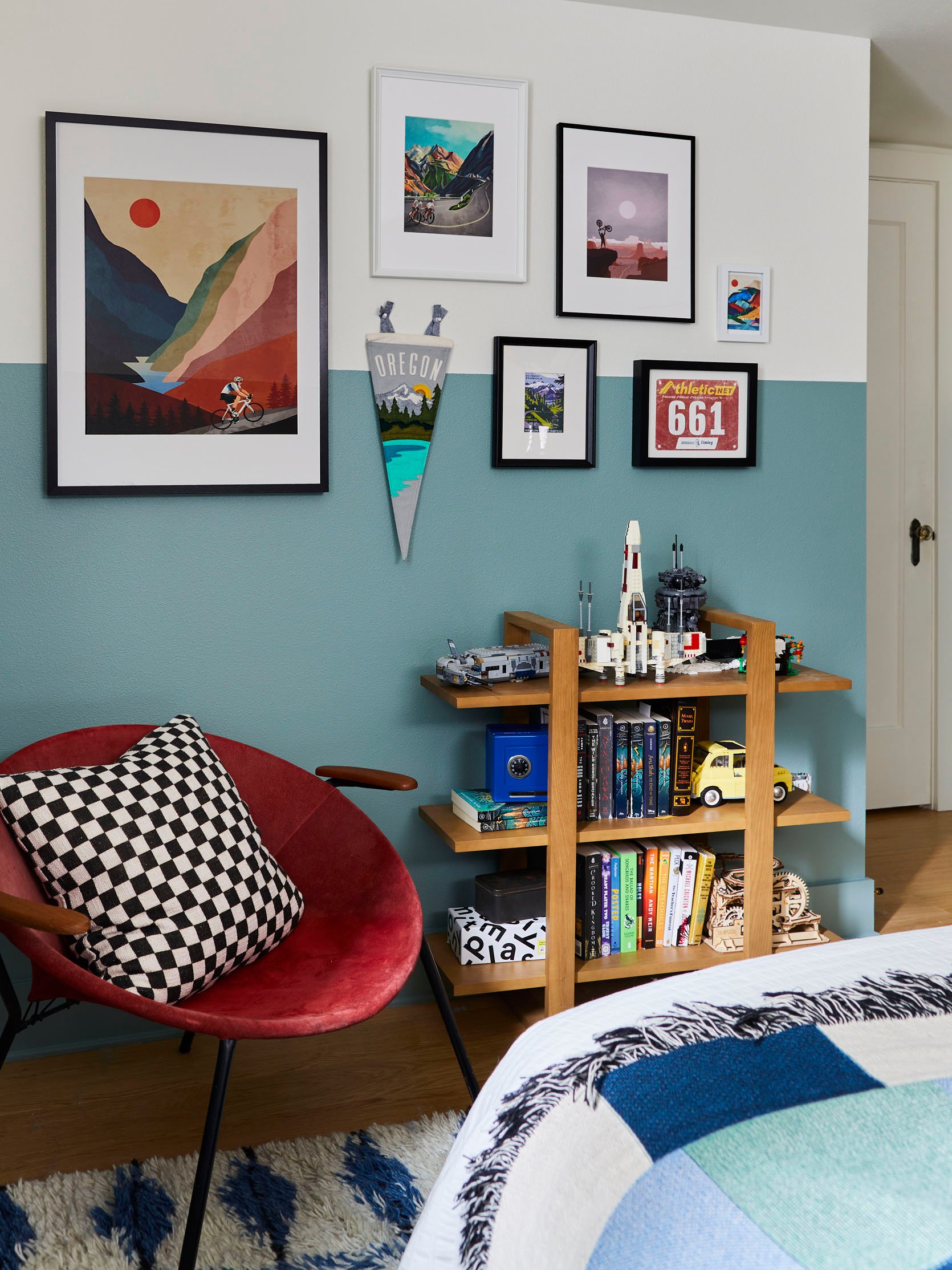
Of course, he loved the displayed legos and blue safe, and I was happy to remind him that the red hoop chair is actually ours if he wants it (he does). Jay wanted something more comfortable to play guitar on so we swapped this chair out after the shoot. Charlie said the rug was “cool” too.
But then…I remembered the project that Brady and I did with artist Timothy Goodman for that big Frame TV campaign. HE FREAKED OUT.

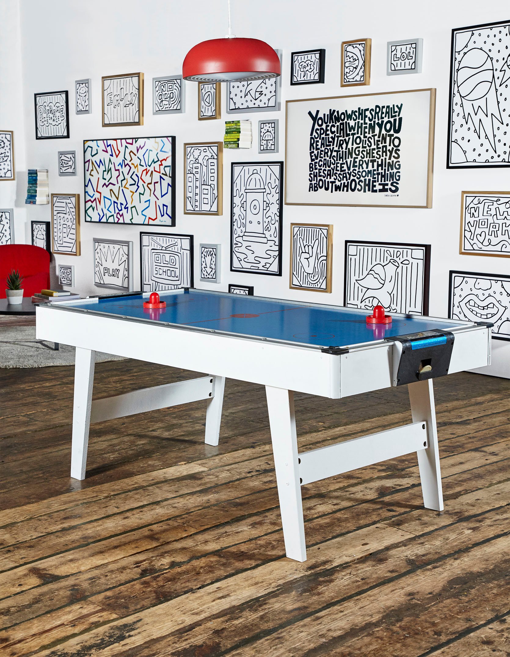
He mostly loved Timothy’s art, and then the colors, and duh, the air hockey table. But honestly, it was just the playfulness and while he didn’t say this I got a sense that it felt irreverent to him, like design isn’t supposed to look like that? And I remember feeling that way. It’s why I bought and still love my wood hand chair. Especially when you are young, design should make you smile and tickle parts of your brain that a white-on-white room just never can. If you are wondering why people (like me) change and get more neutral and boring as they get older, I’d say that it’s not that we change fundamentally, its just that so many other things stimulate our brains or make us smile that being comfortable and at ease at home sometimes outweighs bringing in rebellious creativity. So I’m very lucky I get to flex this impractical muscle with my kids and do designs that are first and foremost creative.
What We Already Have To Work With…
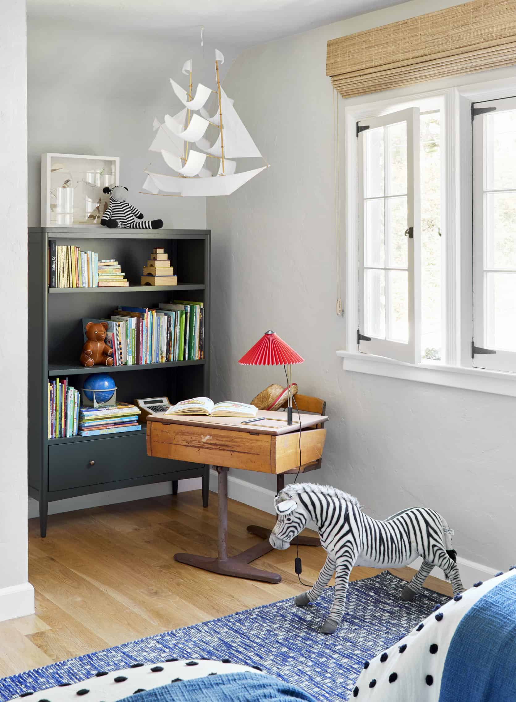
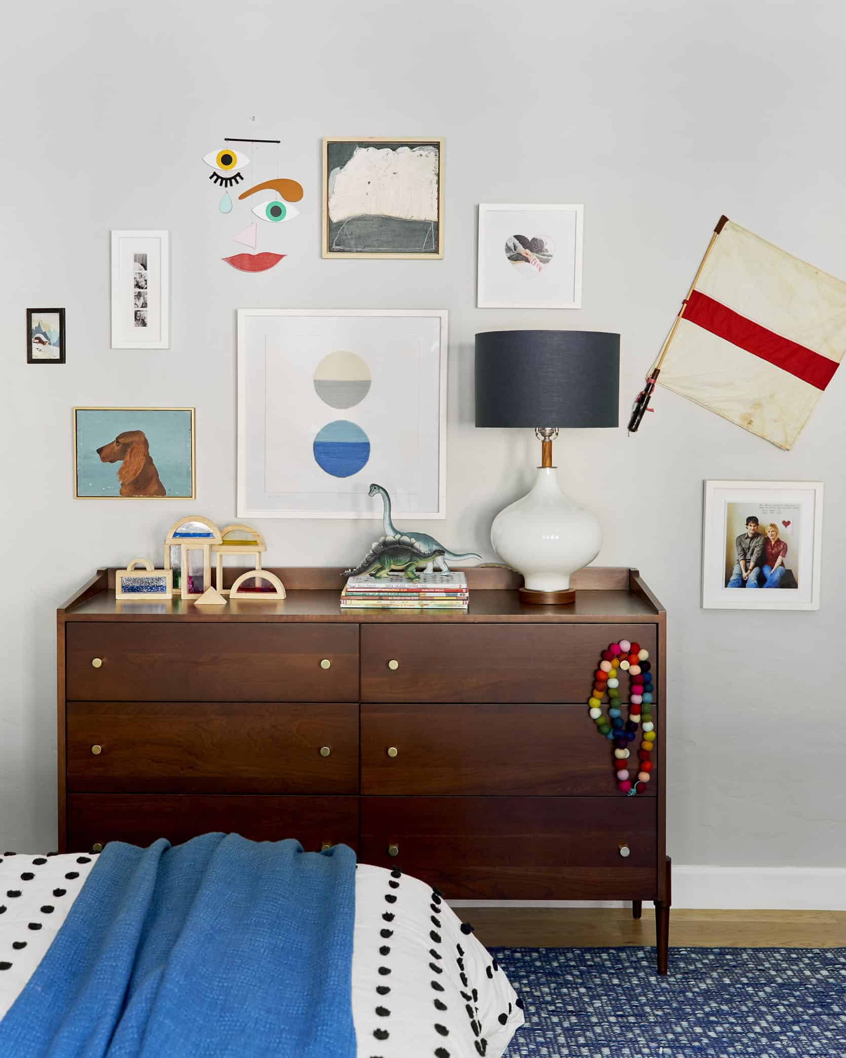
Ok, this is their old bedroom and he still loves a lot of this. He wants the art, that bookcase, the ship mobile, and the red lamp that he wants to use in his room (I’m pretty sure he doesn’t care about the framed photo of Brian and I from our wedding invitation 15 years ago). I’m calling dibs on the dresser and rug for now. He still likes all the red and blue. That boy likes a lot of bright colors and you know what he doesn’t like? Natural wood blocks:) No kid does. We prop stylists and magazine editors have really peddled them over the years because they are pretty, but Birdie has always been like, “Where is the paint…?”
Beyond that here are two images we found that we both loved. Of course, I’m not sure of how either of these would play out or if they are even possible, but they are cool and it got us excited even if the idea won’t go anywhere.

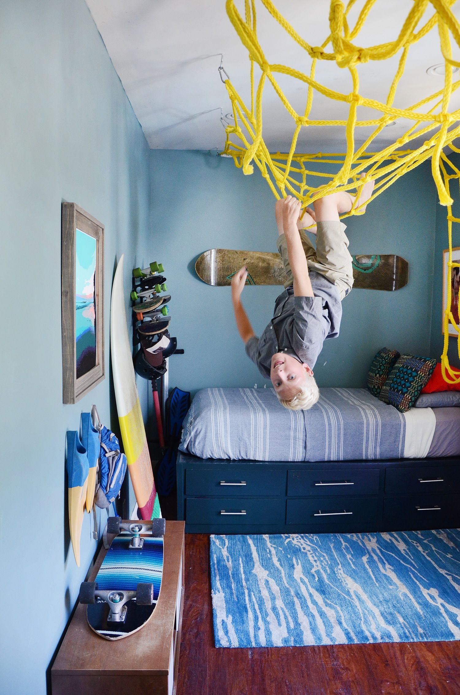
So after we went through that exercise we went back on Etsy and I plugged in “vintage pop art” and we found so many things he loved. To him, it felt wacky and funky and just irreverent, again like it was breaking the design rules. I started pulling together a board and here’s where we are now:
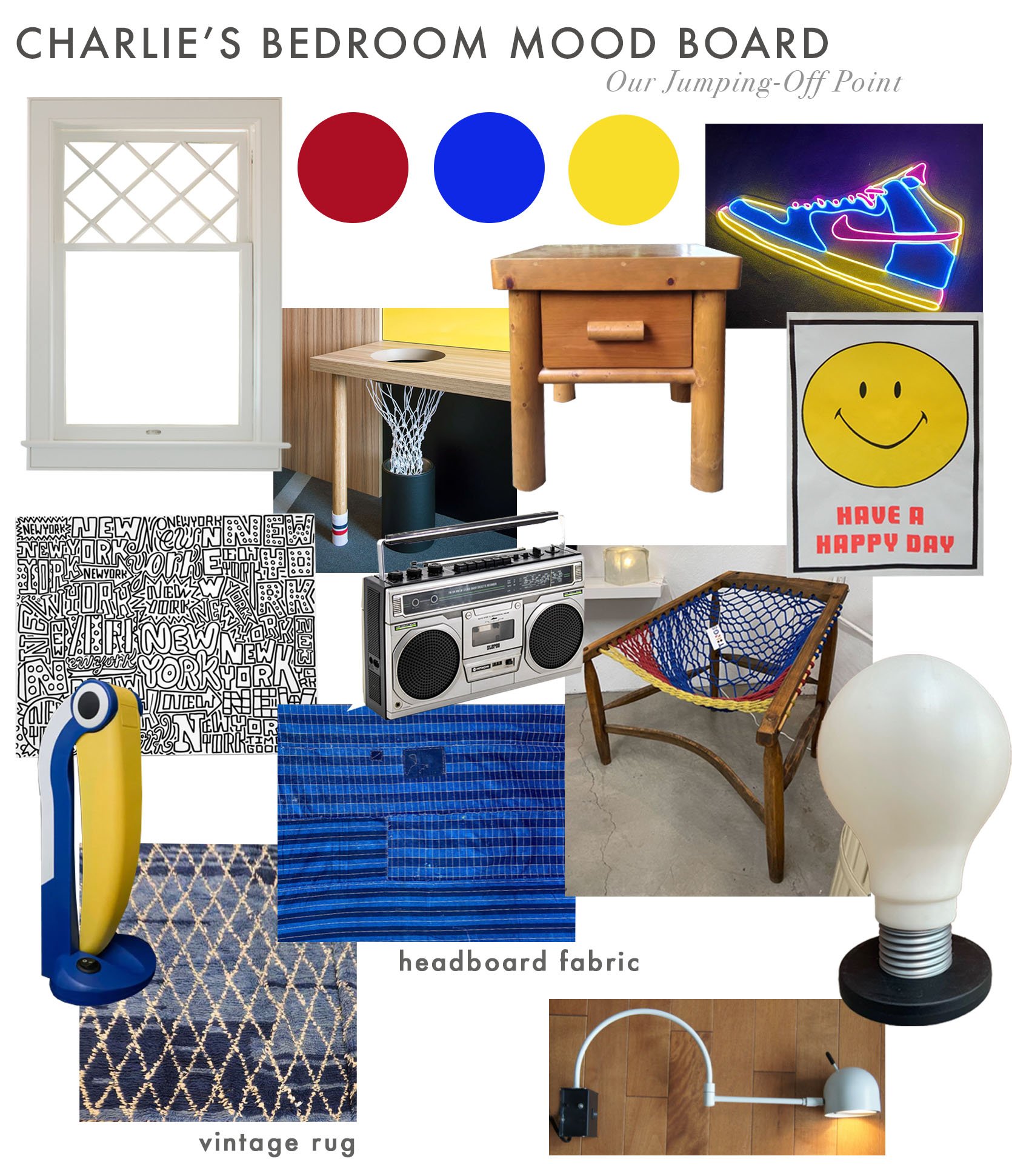
An awesome vintage plaid headboard with the basketball hoop chair that we both fell in love with. I’ve always secretly wanted the toucan lamp and the oversized lightbulb lamp (both plastic from the 80s but design icons).
It’s just a jumping-off point but I can see where it’s headed and I’m SO excited. It’s going to be full of fun weird stuff, mostly vintage or DIY’d (or what we already have), with a neutral backdrop and a lot of poppy colors. The one thing that he is begging for is a neon light so I want to figure out how to turn one of his drawings into one because that way it’s at least connected to his personality. More to come, but my client and I are very excited. xx
Opening Image Credits: Photo by Genevieve Garruppo | From: An Epic Gallery Wall With ‘The Frame’
THIS POST WAS ORIGINALLY PUBLISHED HERE.


