Perhaps one of the most difficult things to do when designing a room is creating one that is functional, stylish, cohesive, and reflects your personality. All rooms don’t have to be all of those things, but I think because we are used to seeing perfectly styled rooms that are also UNIQUE, it’s normal to crave that satisfaction in our own homes. But I must remind you (and myself) that the perfectly styled rooms we see on the internet are the result of SEVERAL professionals working together and often borrowing products and styling for one specific shot. Most people don’t live in magazine-worthy homes. That said, I know what it feels like to want a home that is functional, stylish, cohesive, and reflects MY personality. There are many ways to do this, but today I am talking about creating unexpected furniture and decor combinations to make a room feel fresh and exciting (but still cohesive). So how do we do it? I’m glad you asked. The three simple ways to achieve this are:
1. Don’t be afraid to mix several different styles.
2. Combine different textures, patterns, and colors.
3. Incorporate a variety of shapes.
Simple enough, right? And guys, you can even do all three! Just remember, the #1 rule is you can mix ANY style as long as you have a consistent color palette throughout the space.
So since Lulu & Georgia is having their annual Labor Day sale (praise be) and they are our favorite one-stop shop for all things furniture and decor, we put together some shoppable pairings that are exciting and make our hearts beat a little faster. (P.S. all of the products are currently on sale, and the price listed under the product photos is NOT the marked-down price. Be sure to click the link to see the on-sale price). Let’s get into it.
Sofas + Coffee Tables
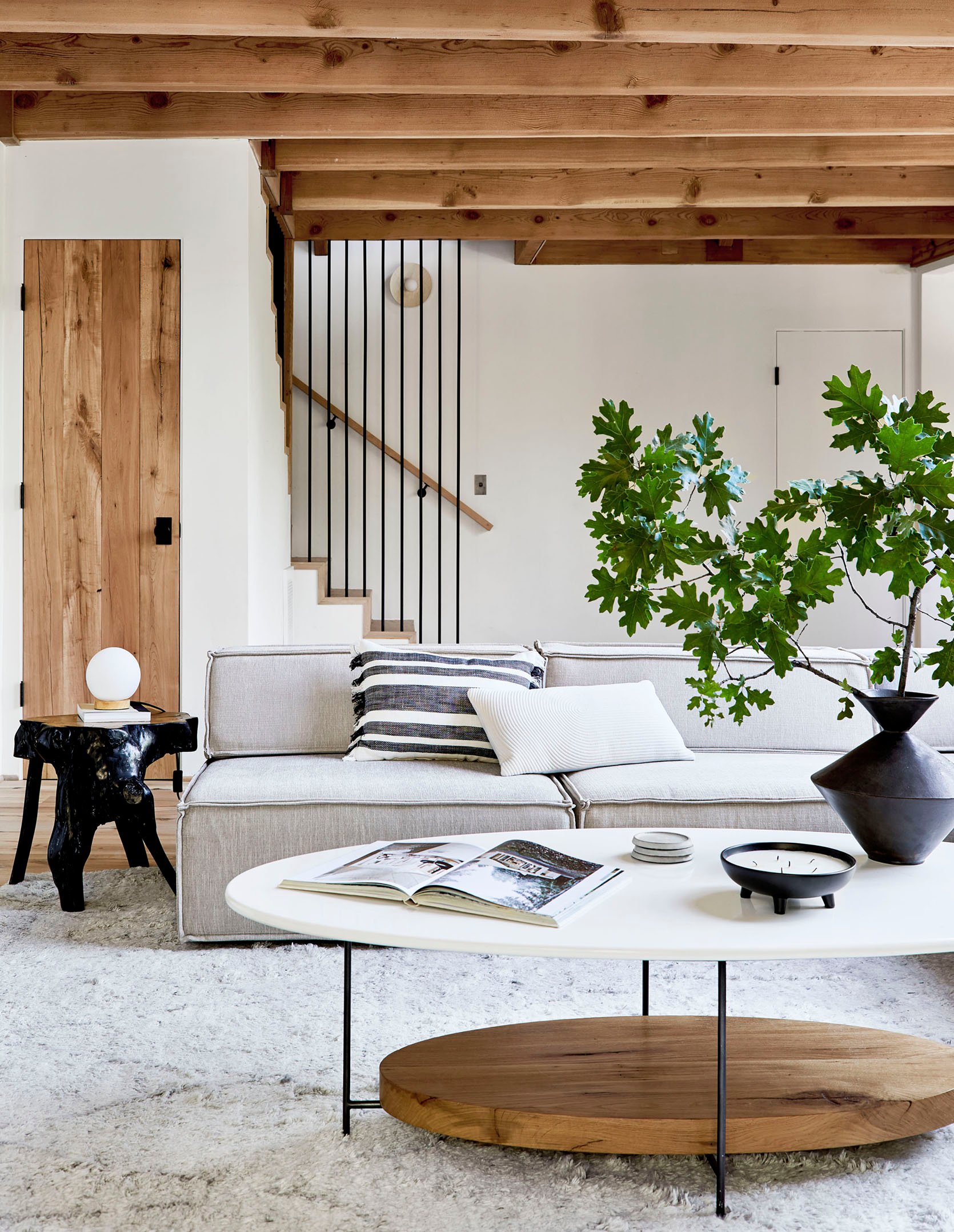
Let’s start with the main living room players: the sofa and the coffee table. In the mountain house living room above, Emily matched a modern vintage sculptural sofa with a modern organic oval coffee table. This choice feels unexpected because the shapes are so different, but they still feel cohesive together because both are neutral and work within the color palette of the room.
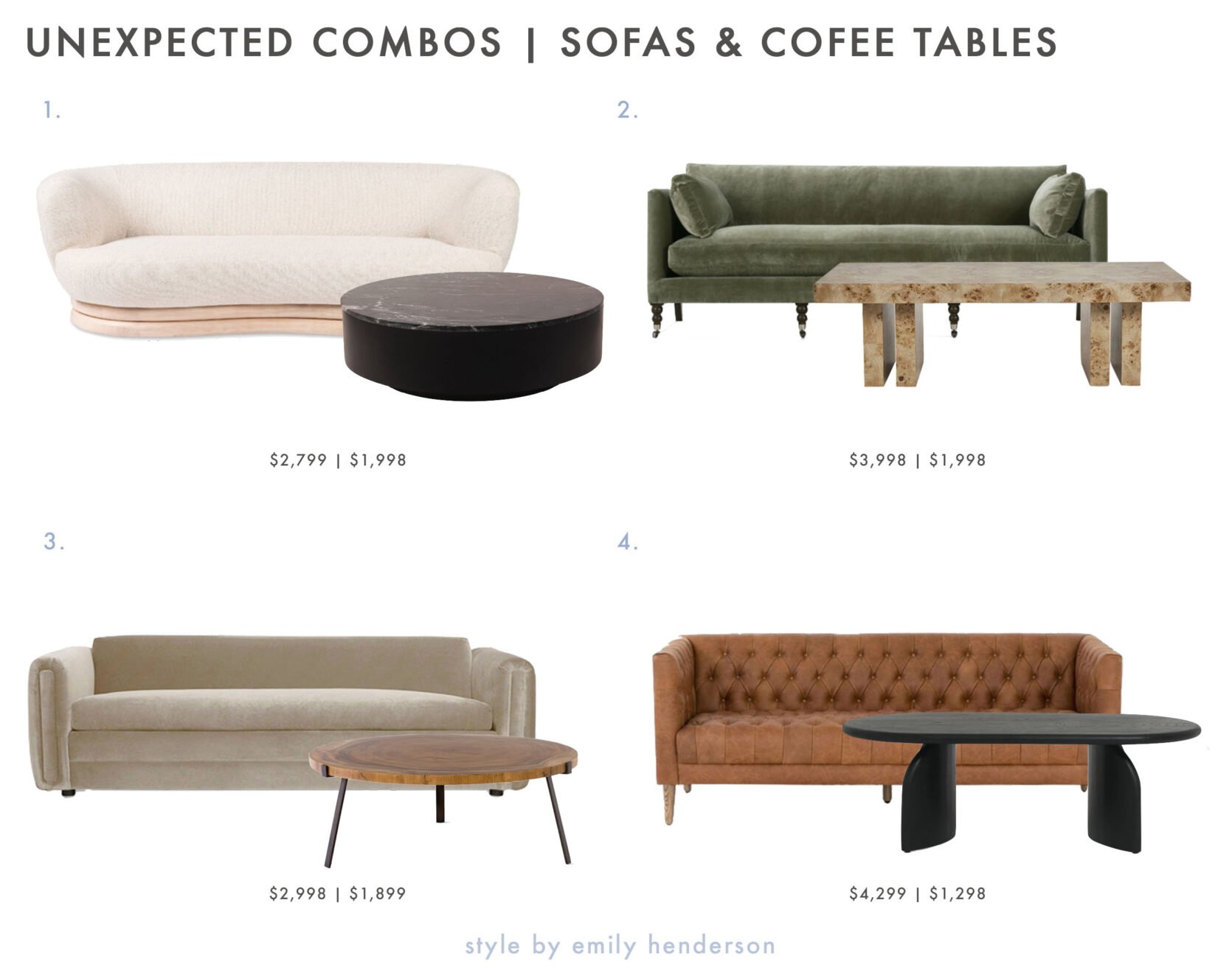
1. Gunther Sofa + Duke Round Coffee Table: I love that both these pieces have flat, curved bases but their style and color are different. The sofa is very quiet and minimal so it contrasts really well with a black table that has a dramatic marble texture.
2. Fabienne Sofa + Brisa Coffee Table: This might be my favorite pairing of all time!! The texture combination alone is breathtaking. Geen velvet and burlwood are a match made in literal heaven. Also, please note the legs on the sofa versus the coffee table. The round traditional curves of sofa legs mixed with the postmodern double-block coffee table legs creates a lovely and unexpected juxtaposition.
3. Eleanor Sofa + Dija Round Table: There’s no doubt that the sofa is elegant. She’s refined. She’s luxurious. So are you surprised she pairs so well with the natural wood industrial-style coffee table? It must be the hard lines of the table mixed with the curves of the sofa that make it such a unique (but oh so good) pairing.
4. Breanne Leather Sofa + Ada Oval Coffee Table: Last but not least in this category we have this classic brown leather sofa and modern coffee table. The sofa tufting, color, and shape give it a vintage look so when paired with the very contemporary oval coffee table it is surprising but really special. The thick coffee table legs really stand out against the tapered sofa legs. Like I said, SO good.
Side Tables + Lighting
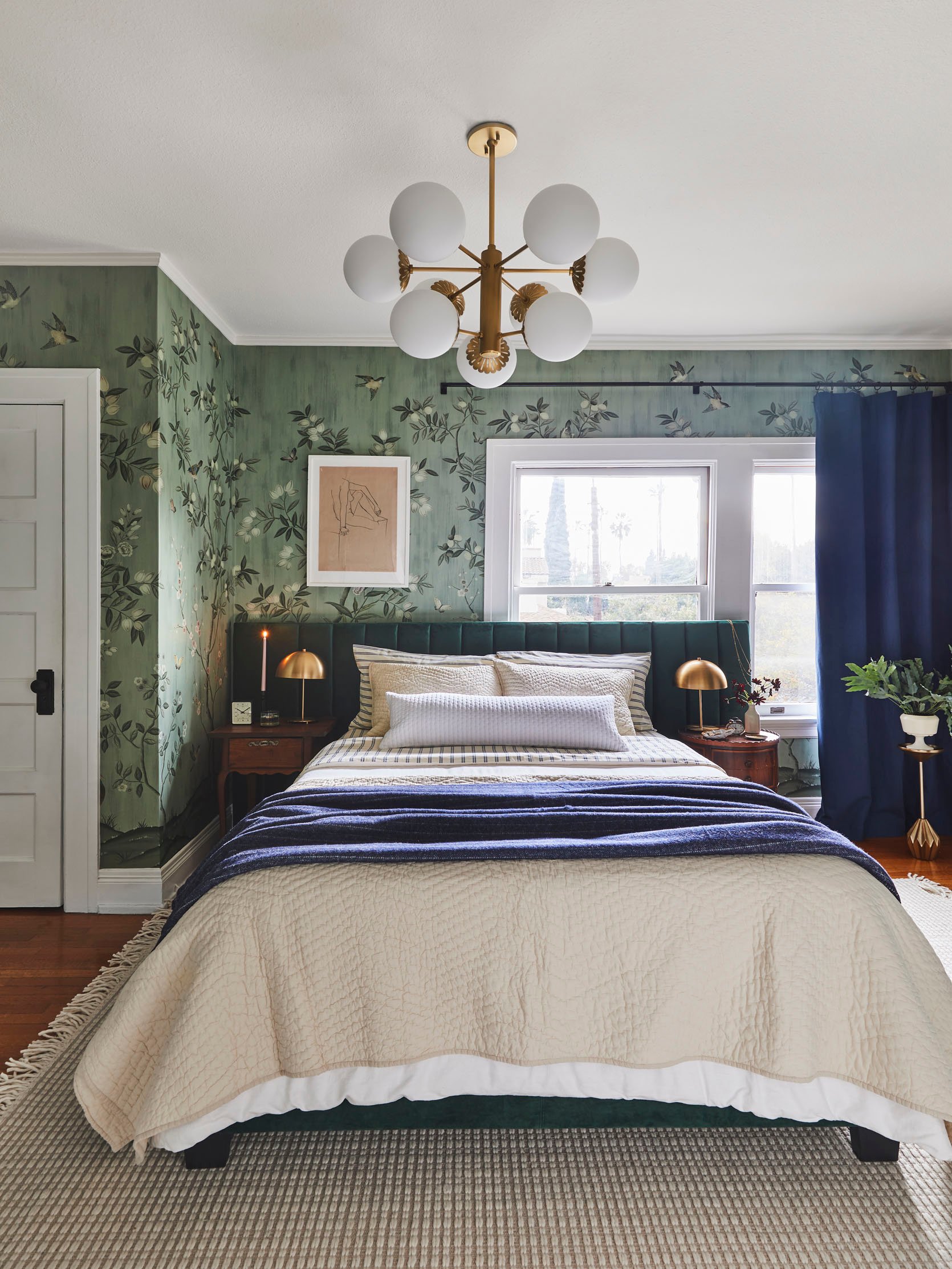
Side tables and lighting are often coupled together in a room, and both are small enough that you can really get creative by pairing different styles or shapes. In the above bedroom, Jess scored two vintage nightstands and added a modern flair by using two brass dome table lamps. The brass coupled with the dark wood is STUNNING and really gives the room a fresh feel.
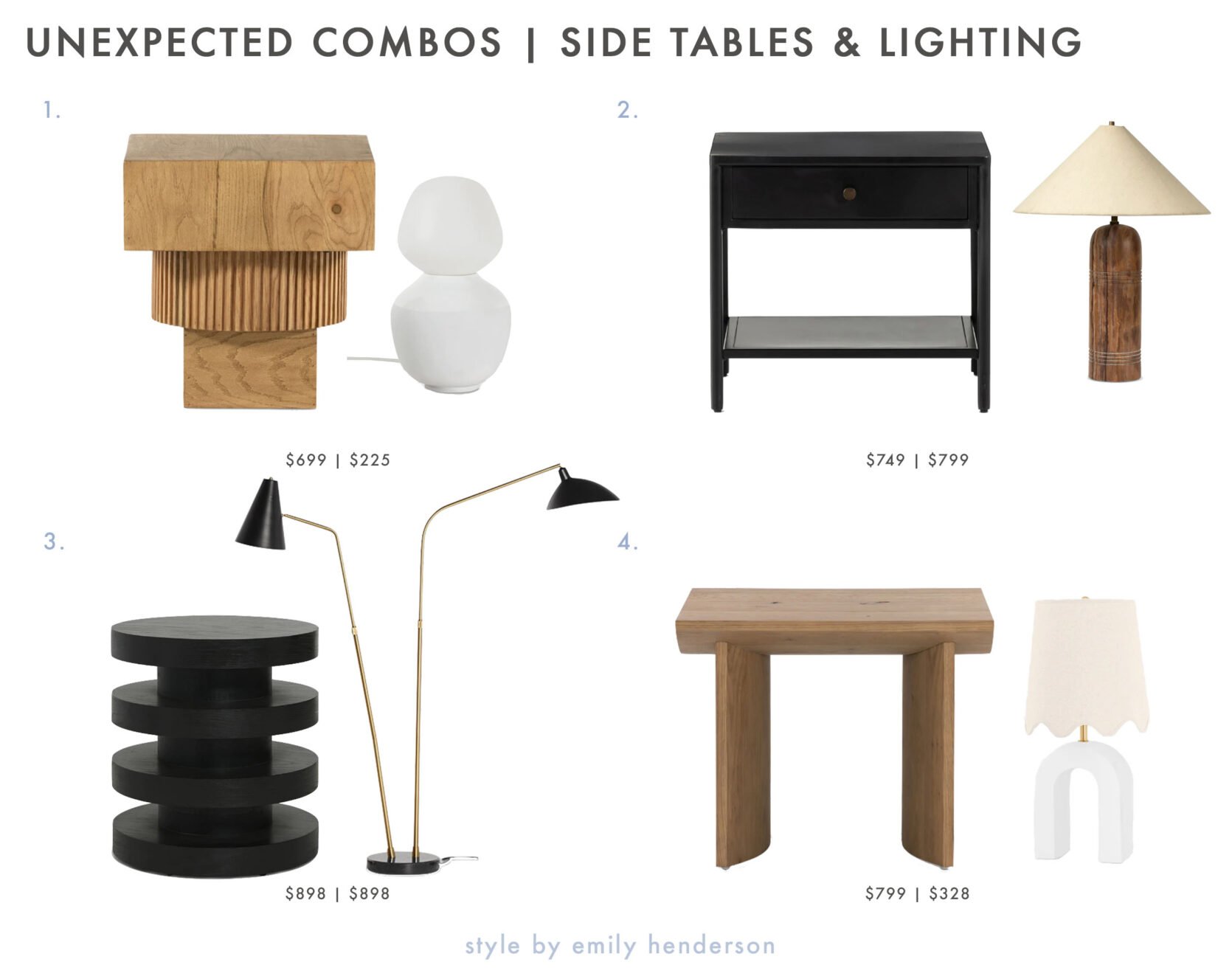
1. Culver Side Table + Enno Table Lamp: I love how the inverted triangle shape of the table makes it wider on the top and narrow on the bottom, and on the contrary, the bulb-shaped lamp has a wider base and narrower top. That contrast just looks so cool together, and the smooth all-white lamp really pops nicely against the natural wood grain and fluted detail.
2. Mathus Side Table + Thaddeus Marble Table Lamp: I love this traditional yet industrial matte black side table with a rustic wooden lamp. The large lampshade also adds a traditional flair that speaks to the style of the table. I NEED to see this pair in a room somewhere…
3. Pentwater Side Table + Annika Floor Lamp: That Sarah Sherman Samuel coiled side table already has an interesting shape and a lot of movement, so it calls for a mate that is more simple and classic. The double-necked floor lamp gives just that.
4. Remwald Side Table + Saima Table Lamp: I love the chunkiness of the side table and the light natural wood finish. Paired with the U-shaped lamp base and scalloped shade detail, the table feels modern and fresh.
Dining Tables + Chairs
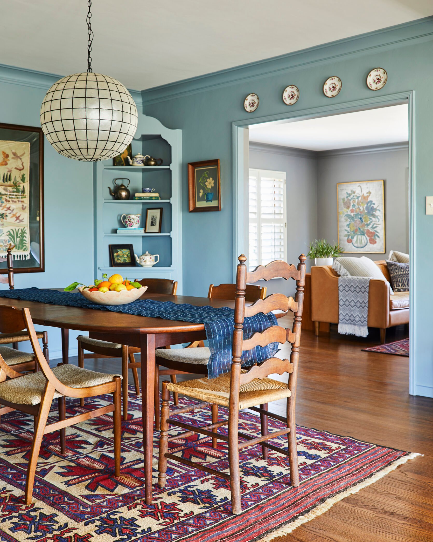
Mixing the style of your dining table and chairs is the easiest way to create a unique look in your dining room. The more opposing the styles, the better IMHO. I love in the above dining room by Allison Pierce, she mixed a sleek, mid-century modern table with antique farmhouse chairs. The chairs are so stunning and have the coolest details. Do you see those chunky back legs and the back design?? It looks so fresh and exciting paired with the more modern, hard lines of the table.
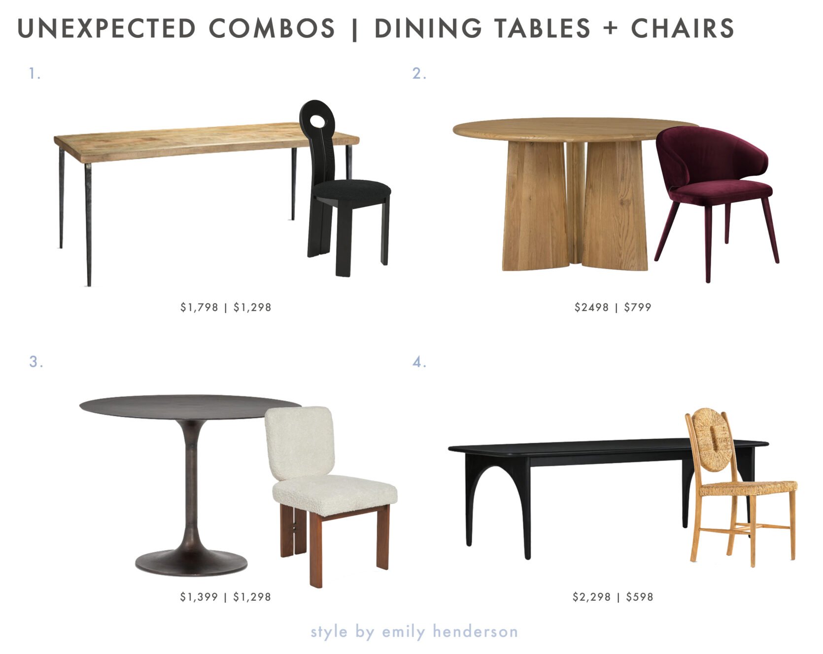
1. Sandy Dining Table + Whit Dining Chair: That Sarah Sherman Samuel dining chair is something else. It’s so sculptural and elegant that it could potentially look stellar with any style dining table. The unique pairing with the industrial farmhouse table though is such a cool look.
2. Nera Round Dining Table + Lerri Dining Chair: I can easily imagine this chunky wood table in a minimal home with light wood chairs, but paired with a colorful upholstered one, the irregular shape of the table really stands out which makes the pair so interesting together.
3. Maelea Bistro Table + Sydney Dining Chair (Set of 2): I think anything industrial paired with an extremely modern or sculptural element will turn heads. Mark today as the day I learned boucle and aluminum are meant to be together.
4. Ashford Dining Table + Raiatea Dining Chair: Not only is the dining chair woven giving it a beautiful texture, but it also has a unique shape. That texture and shape mixed with the sleek lines of this table are so good, plus I just love a light color chair paired with an all-black table. SWOON.
Rugs + Wallpaper
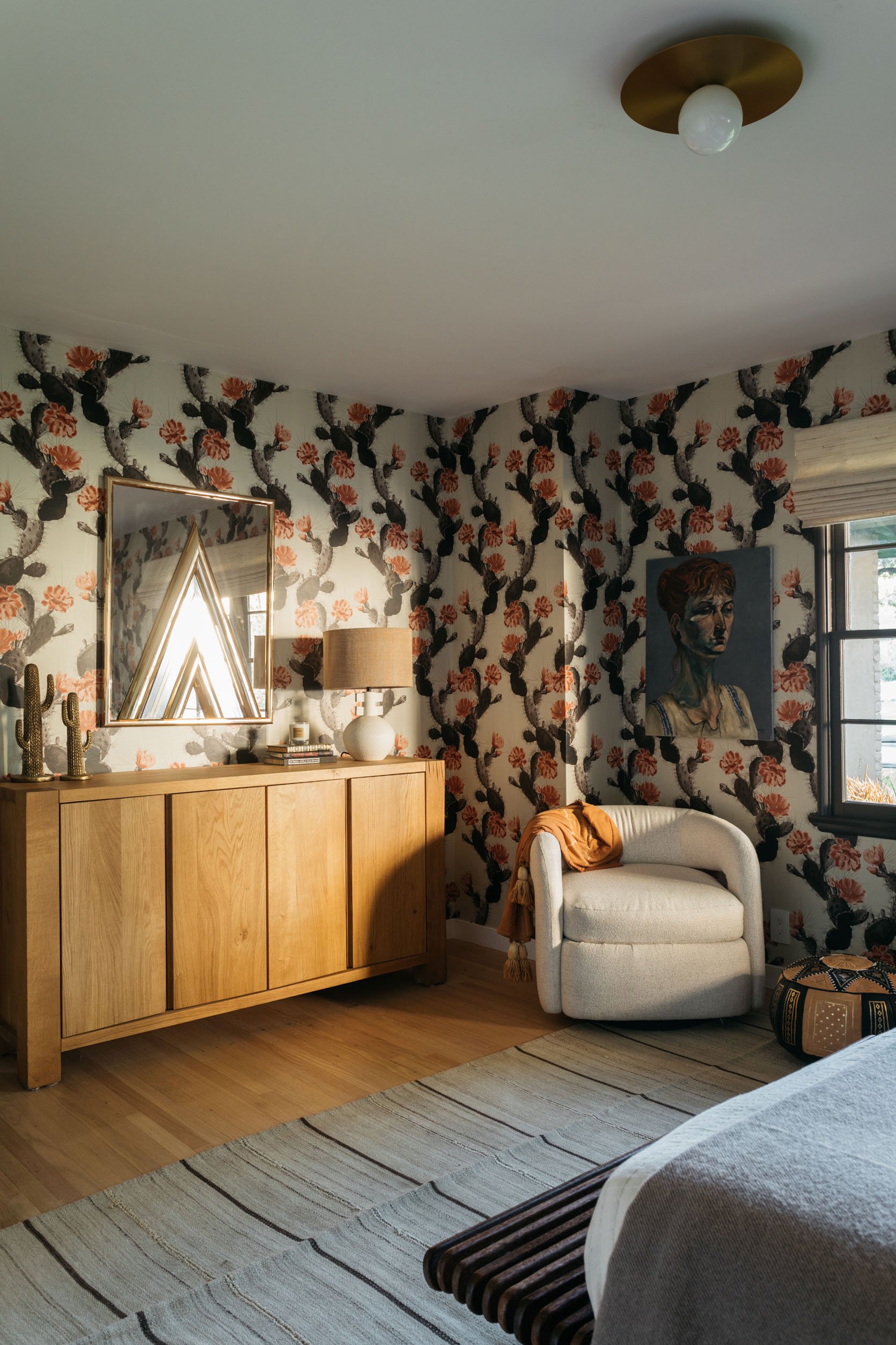
Wallpaper or a rug can easily be a jumping-off point for designing a room since they can be very large and stand-out pieces. If you want to create an exciting room right off the bat, you can start with a bold wallpaper mixed with a bold rug. Take this bedroom for example. If you don’t immediately recognize it, this is home of Kirsten Blazek, who I personally revere for her expert use of wallpaper. I love how the large-scale, colorful cactus flowers bring in an eclectic desert vibe, and then the rug grounds the room but still has a pattern and color that contrasts the wallpaper. The pair together truly elevates the room and is so pleasing to the eye.
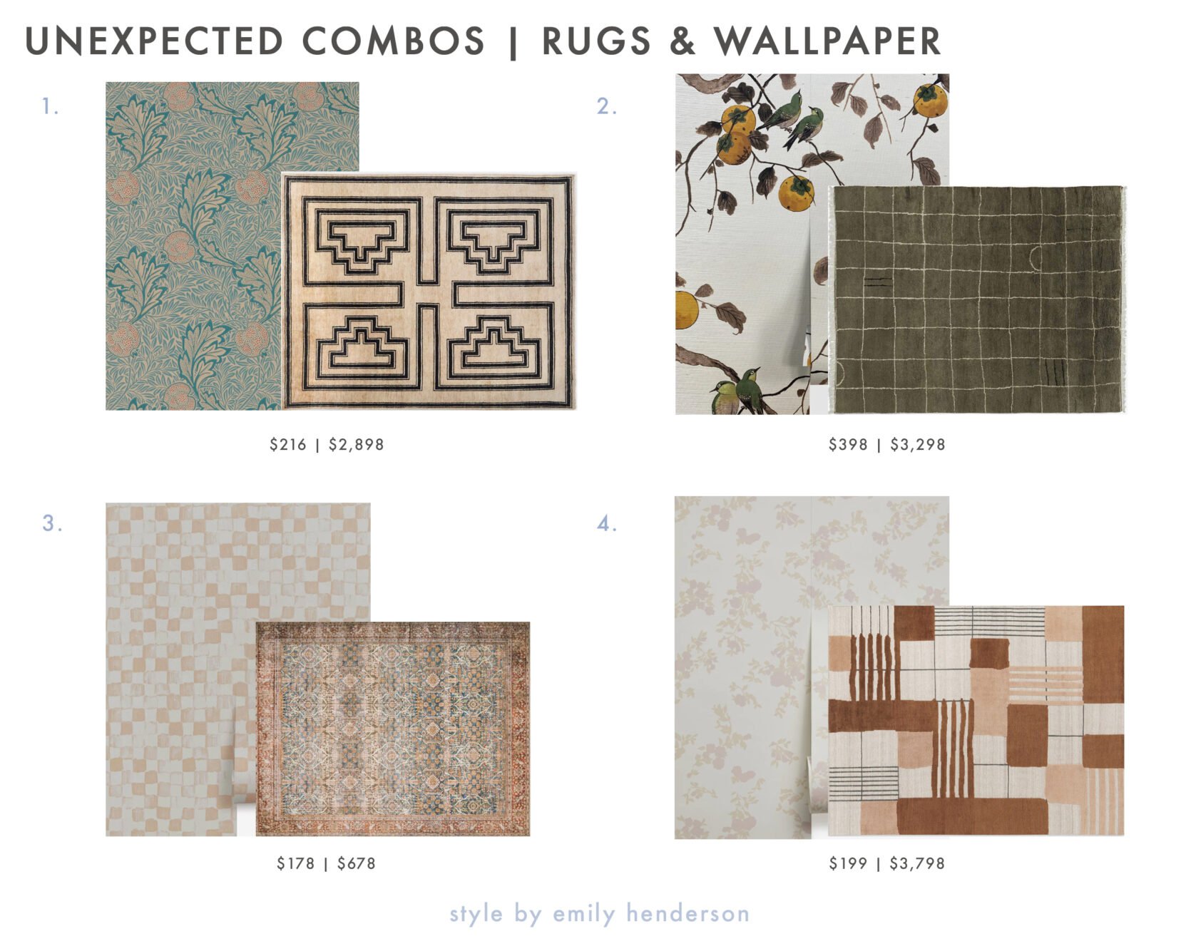
1. Apple Wallpaper + Senna Rug: Moody Victorian-style wallpaper plus a thick geometric lined rug equals me falling head over heels. I really want to see these two in a room ASAP.
2. Persimmon Birds Wallpaper + Irregular Grid Rug: I love this pairing so much it’s making me rethink everything. I am not currently trying to design my bedroom (since my husband and I will likely have to move to a two-bedroom soon) but that botanical wallpaper with the irregular grid rug would be perfect to create a cozy yet eclectic bedroom.
3. Checkerboard Wallpaper + Daelon Rug: Remember when I said you can mix any style as long as you stick to a consistent color palette? I think this pair here proves that. The trendy checkered wallpaper looks like it was made to be matched with a vintage-style Persian rug.
4. Francois Floral Wallpaper + Benita Geometric Striped Rug: I think this pair proves botanicals and grids are perfect together. The floral pattern is timeless and the grid is more trendy so the two together creates an exciting look. But again, these two are working well together because they have a similar color palette so the clashing of patterns is still easy on the eye.
Wall Art + Decor
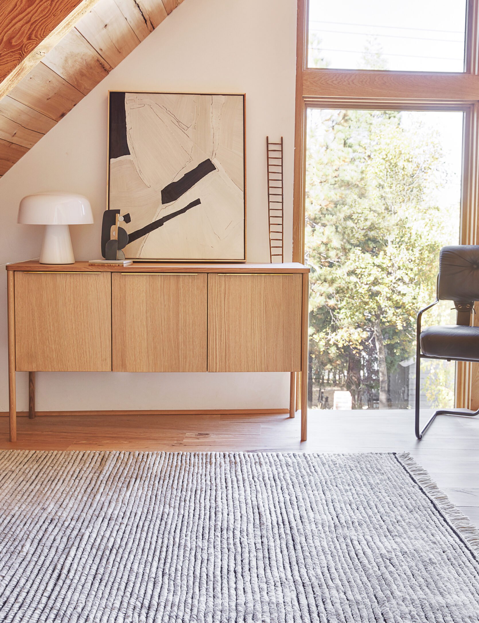
Our final category is wall art and decor which is probably the area you can have the most fun with. Decor is often smaller in scale (I say often because statues and large sculptures do exist and are AWESOME) so it’s low risk and high reward. In the above vignette, a large abstract painting (leaned instead of hung which is one of our favorite styling tricks) is matched with a miniature ladder. I love how the ladder feels eclectic yet quiet and vintage, while the painting is modern and bold. The two together feel special and intentional.
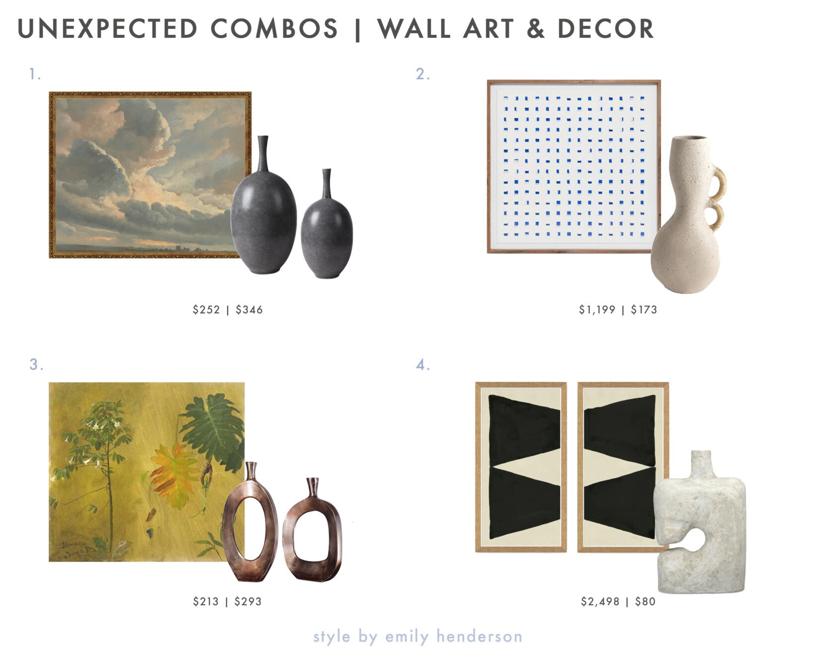
1. Study of Clouds + Ema Vases (Set of 2): A classic vintage style cloud painting with muted blue tones pairs beautifully with these two marbled gray narrow-necked vases. I love how the modern vase shape and dark color contrast with the soft colors of the painting and the ornate brass frame.
2. See Through Wall Art + Cascina Vase: This abstract modern art piece is quiet enough that it is complemented by the organic-looking vase really nicely. I especially love the rattan-wrapped handles that bring in a rustic flair.
3. Botanical Study + Minah Vases (Set of 2): The way the cast-aluminum finish juxtaposes the yellow and green hues of the botanical painting is almost too good for my eyes to handle. Once again, a vintage-style painting with modern vases creates such a fresh and unique look.
4. Sculpture I & II Print + Sina Vase: This large-scale block art has hard geometric lines so an organic-looking, sculptural vase creates movement that is really fun to see. I love how this vase can be a flower vessel or just stand alone as its own sculptural decor element.
Alright my friends, this is where I begrudgingly leave you (I swear I could fantasize about unexpected furniture pairings all day long). Which one is your favorite? Are you feeling inspired to try any of these out in your home? Tell me everything. xx
Opener Image Credits: Design and Styled by Emily Bowser | Photo by Sara Ligorria-Tramp | From: All Your Living Room Styling Questions Answered
THIS POST WAS ORIGINALLY PUBLISHED HERE.


