I’ve always thought that having a home with floor-to-ceiling built-in bookshelves would be a dream, but such a luxury can actually be quite sinister. When you have shelves galore the cold hard truth is that you’ll need things to fill up said shelves. And ideally, you’ll have things that speak to you and your style which takes time and effort to curate. Once you do have all your things in order, then you have to face the daunting task of styling. Luckily, there is somewhat of a formula to follow if you want your shelves to feel collected, stylish, personal, and intentional. So today, I am walking you through our 5 steps to get your bookshelves looking better than ever. Class, let’s begin:
Stack Books Vertically And Horizontally
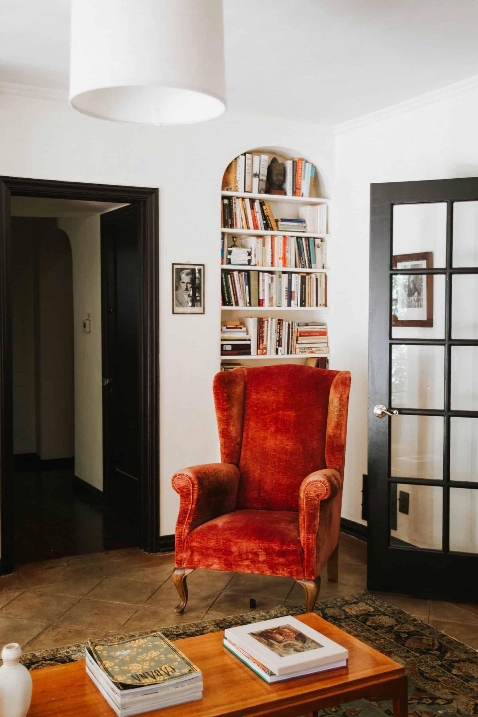
The first step to styling bookshelves is to arrange your books. Whether you have a few books or an entire library, start by stacking them vertically and horizontally. You can play around with this as much as you want, but make sure you leave room for your decorative objects if you plan on using them. In the above photo styled by A 1000 X Better, they opted to fill most of the shelves with books, creating an eclectic library look. However, there is still room for small objects so some personality and flair are added to the space.
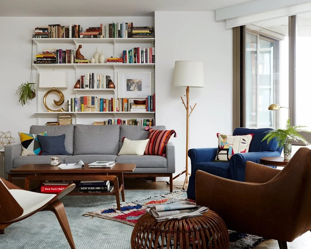
Remember when Emily helped design and style Joanna of Cup of Jo’s living room all those years ago? Name a more iconic duo!! On these shelves, they left more space between books to play around with art and decor. As you can see, arranging the books horizontally and vertically allows the decor to be dispersed in unexpected ways. Books take up much of the shelves, but where there is decor it’s very special. Like, do you see the brass swirl lamp?? It’s such a statement and makes the shelves feel very “styled” instead of random. There’s also a small collection of narrow-necked vessels that creates an intentional styling moment.

In my living room, I styled my entire bookcase with books if you can believe it. Boring, I know. But I did this because A) I have a lot of books and needed the storage and B) I wanted to create a scholarly library look. Since I was going for a real library feel, I kept most of the books stacked vertically but when I needed more space, I stacked books horizontally on top. This is a very relaxed way to style bookshelves and works well in a space you want to feel lived-in and inviting.
HOT TIP: For a collected look, avoid putting the same color books near each other (unless you want your shelves to be neat and color-coded). Instead, pepper the light and dark colors around to create an eclectic yet pulled-together look.
Lean Art
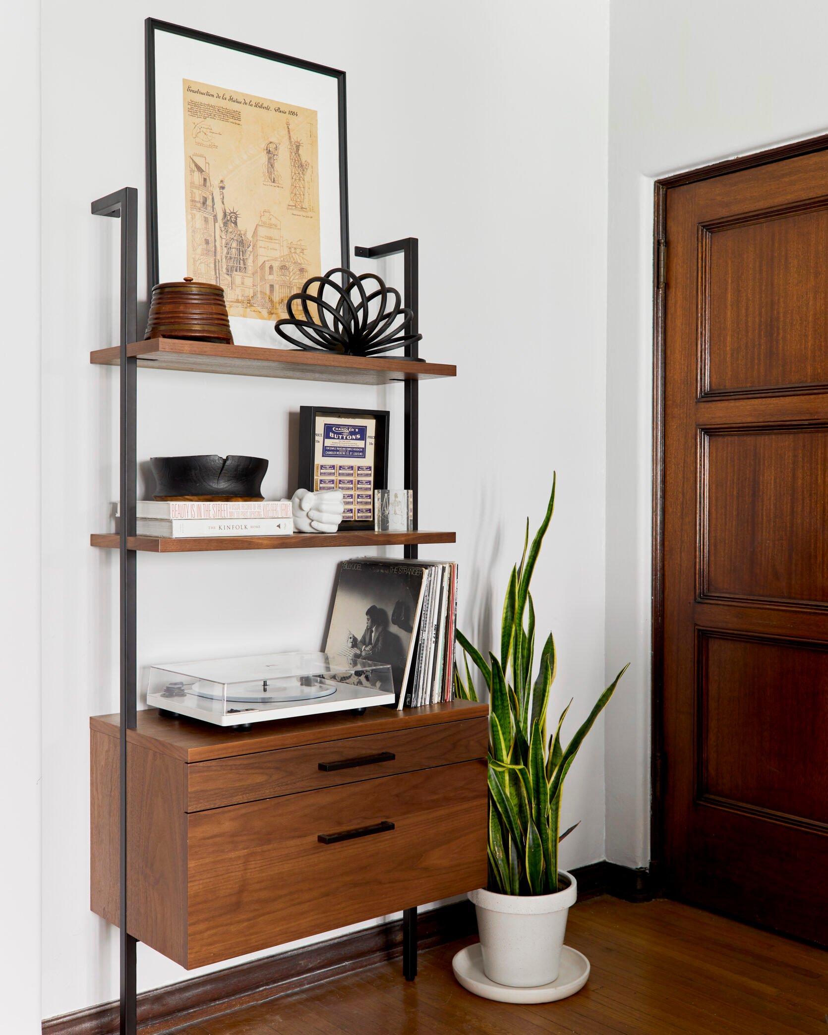
Using art is our number one trick to styling your bookshelves like a pro. Framed art scattered between your books and various decorative objects will make your bookshelves feel like their own design moment. In the above living room styled by Julie Rose, she chose to create height and take up unused wall space by leaning large scale framed art on the top shelf.
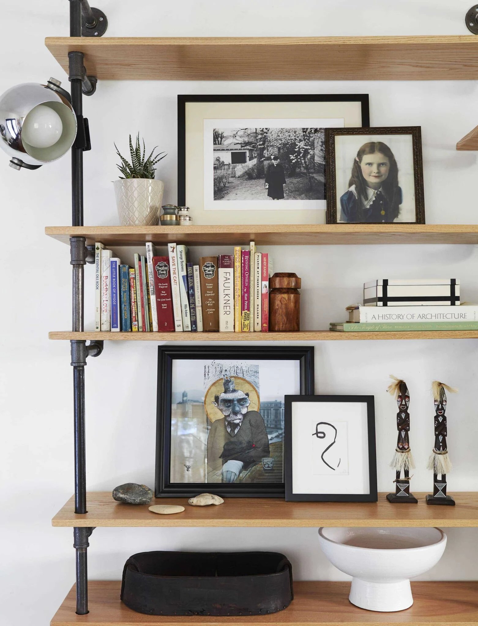
When you lean art on shelves it draws your eye to the back of the shelf, making the space feel deeper and layered. Above, Velinda couples two framed pieces in her living room by leaning them on top of each other to create a relaxed but collected look. As we all know, art shows off personality so if you have the room to play with it on your shelves, we always encourage you to go for it.
If you are looking for some fun art to play with here are some ideas:
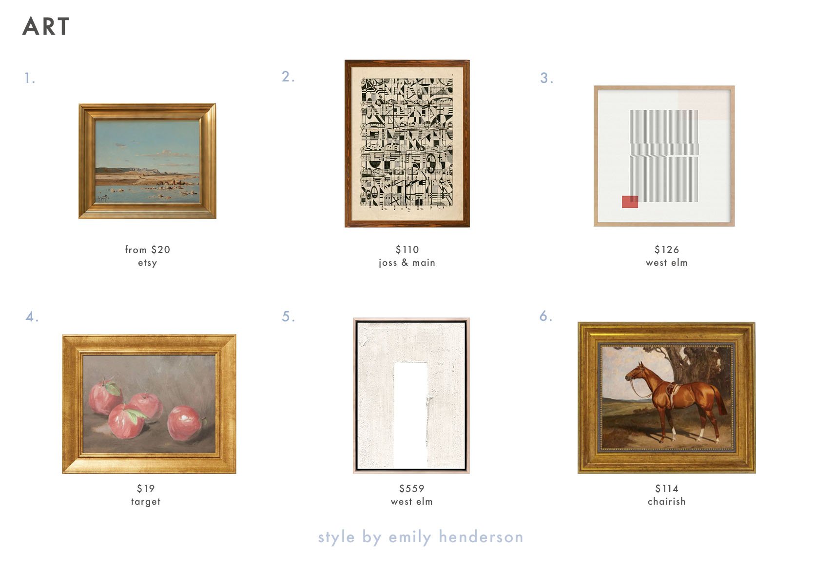
1. Vintage Beach Painting | 2. Graphic Notes by Paul Cezanne | 3. Folded Lines Framed Wall Art by Minted for West Elm | 4. Fruit Still Life Framed Wall Art | 5. Center Disruption White Framed Wall Art By The Holly Collective | 6. Saddled Chestnut Race Horse
Create Vignettes Within The Shelves
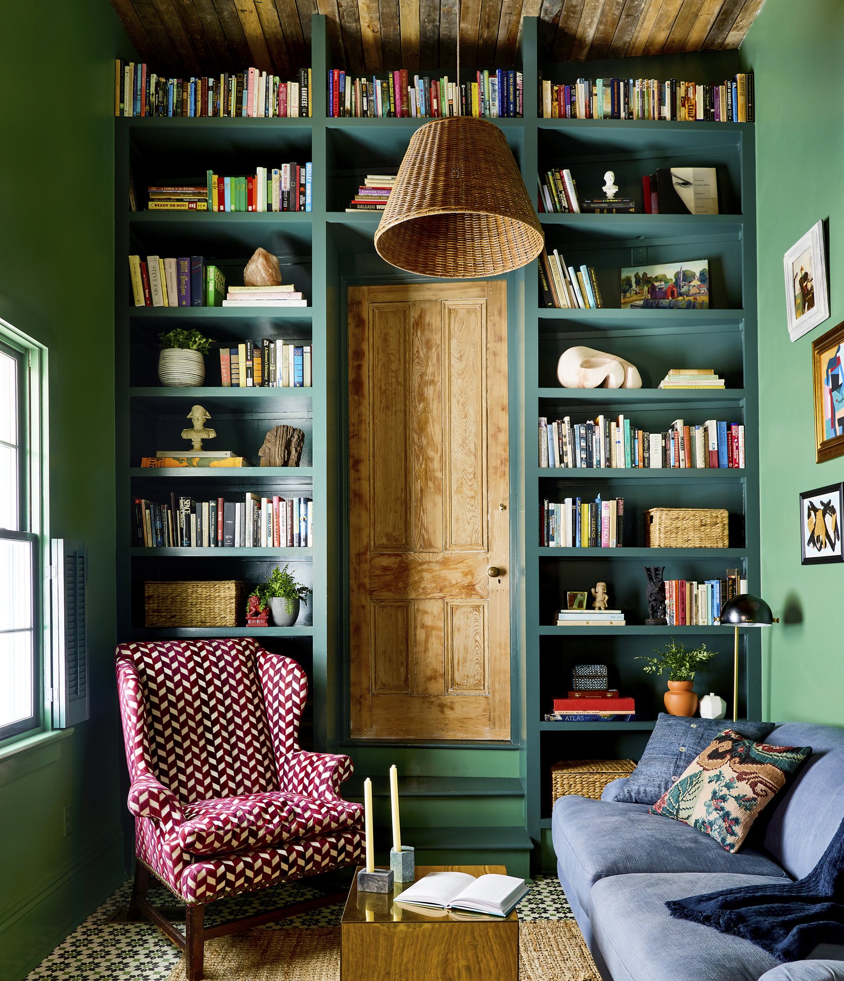
To prevent your shelves from feeling like a thrift store with random objects laid out next to each other, try creating vignettes within the shelves. If you focus on making one cohesive vignette at a time, the entire shelf won’t feel as overwhelming. You can start by adding books, stacking them horizontally and vertically, and then start to layer in your art and objects. In the above room designed by Sara Ruffin Costello, most of the shelves are split into two separate vignettes (one on each side) which leaves some breathing room within the shelves. Keeping some space open gives your eye a break and keeps the shelves from looking too visually heavy.
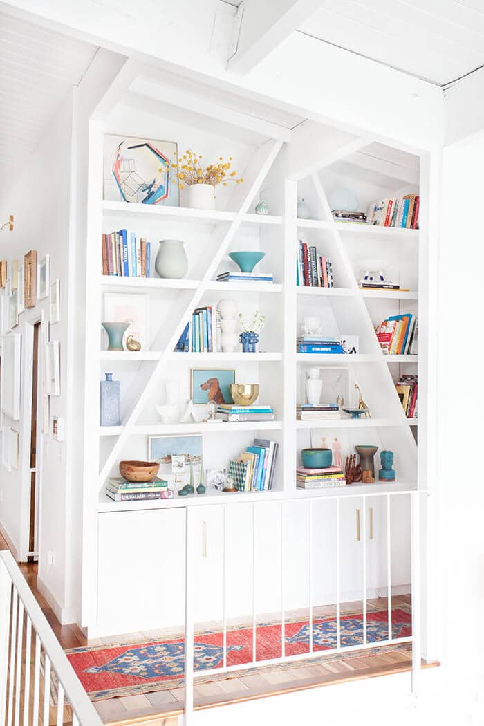
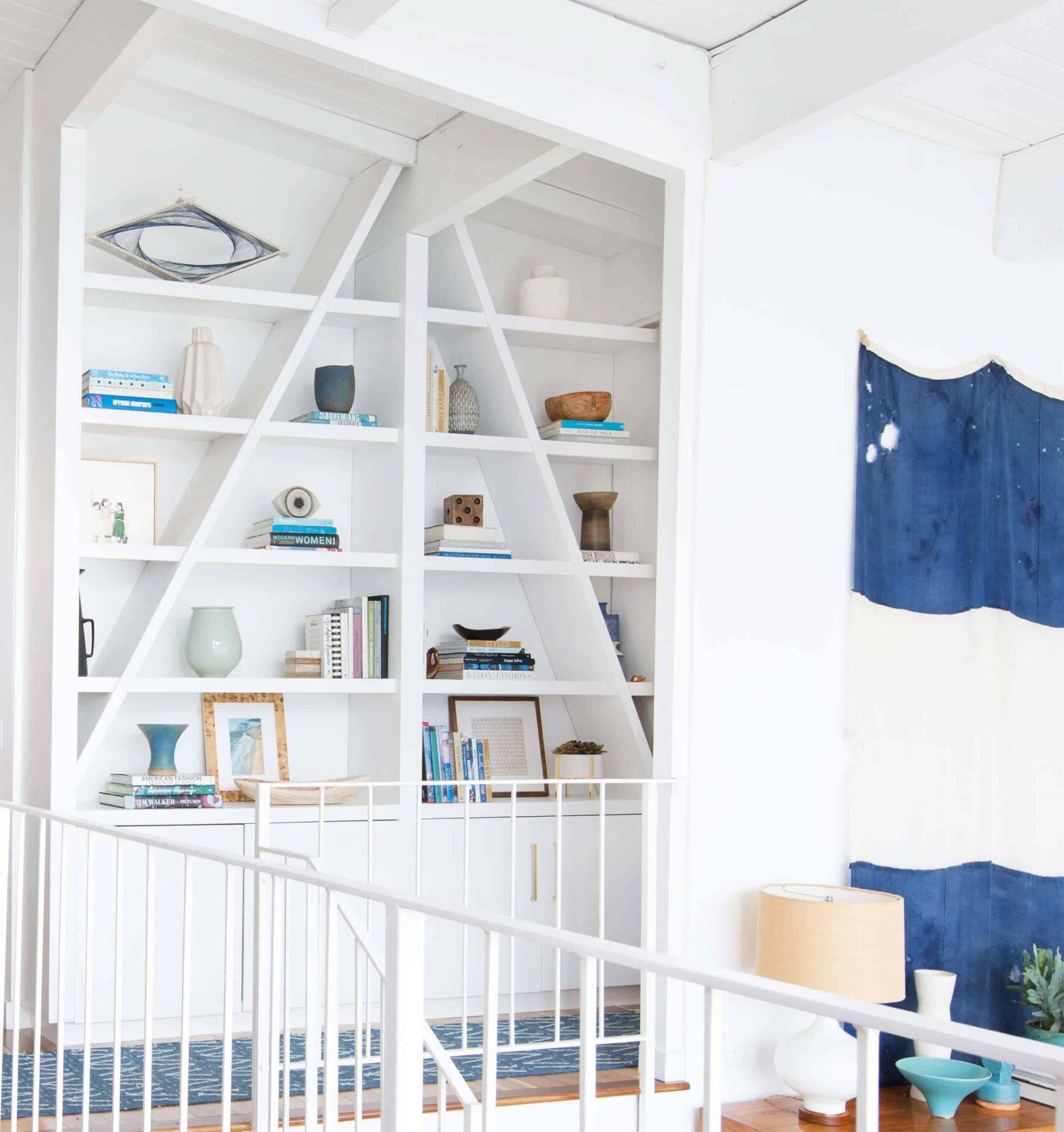
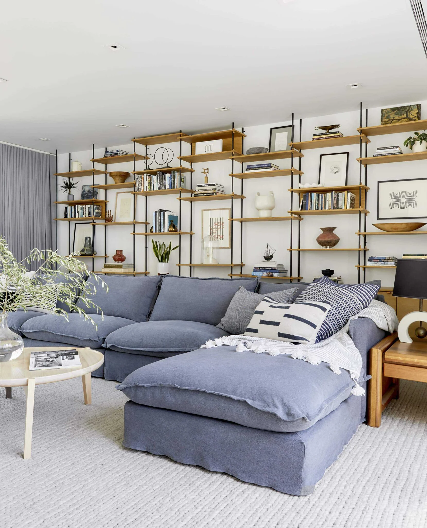
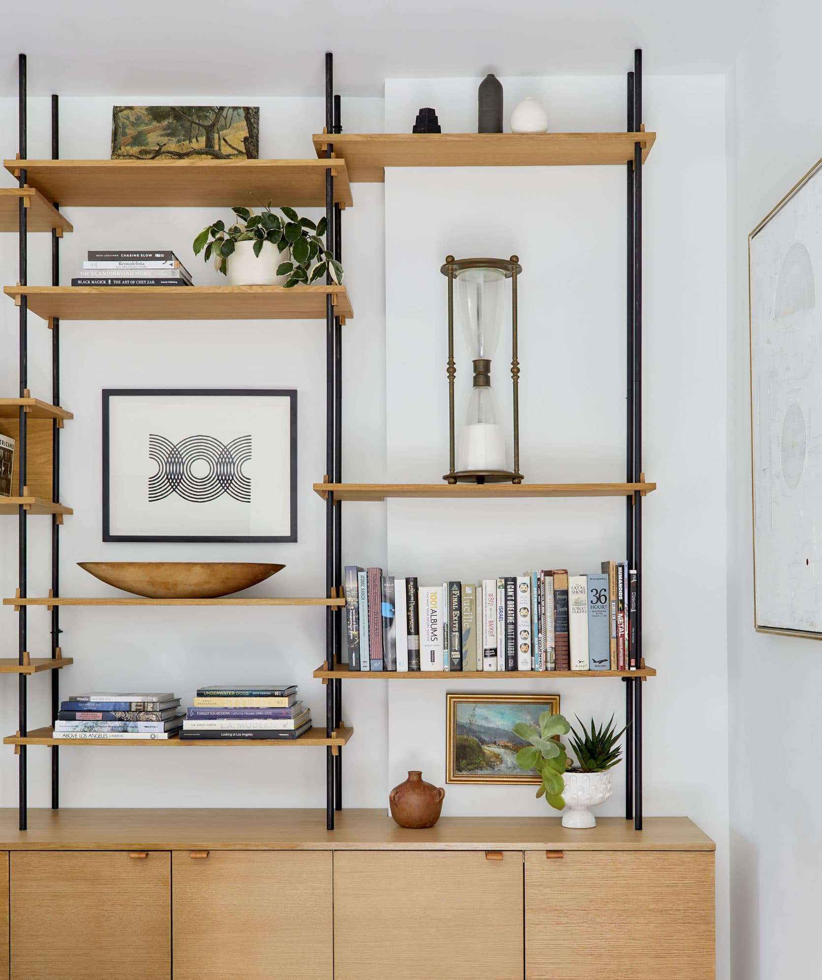
This built-in bookcase from Emily’s Glendale home will always be the prime example of shelf styling. These shelves have seen many iterations but a few things remain the same: the color palette is cohesive, enough space is left open so you can take it all in at once, and she mixes up the decor so the shelves feel balanced and collected.
HOT TIP: Make sure to mix it up. When arranging your objects, sculptures, art, books, and even lighting, be aware of the textures, sizes, and styles, and avoid putting a lot of the same elements near each other.
Here are few decorative objects we love:
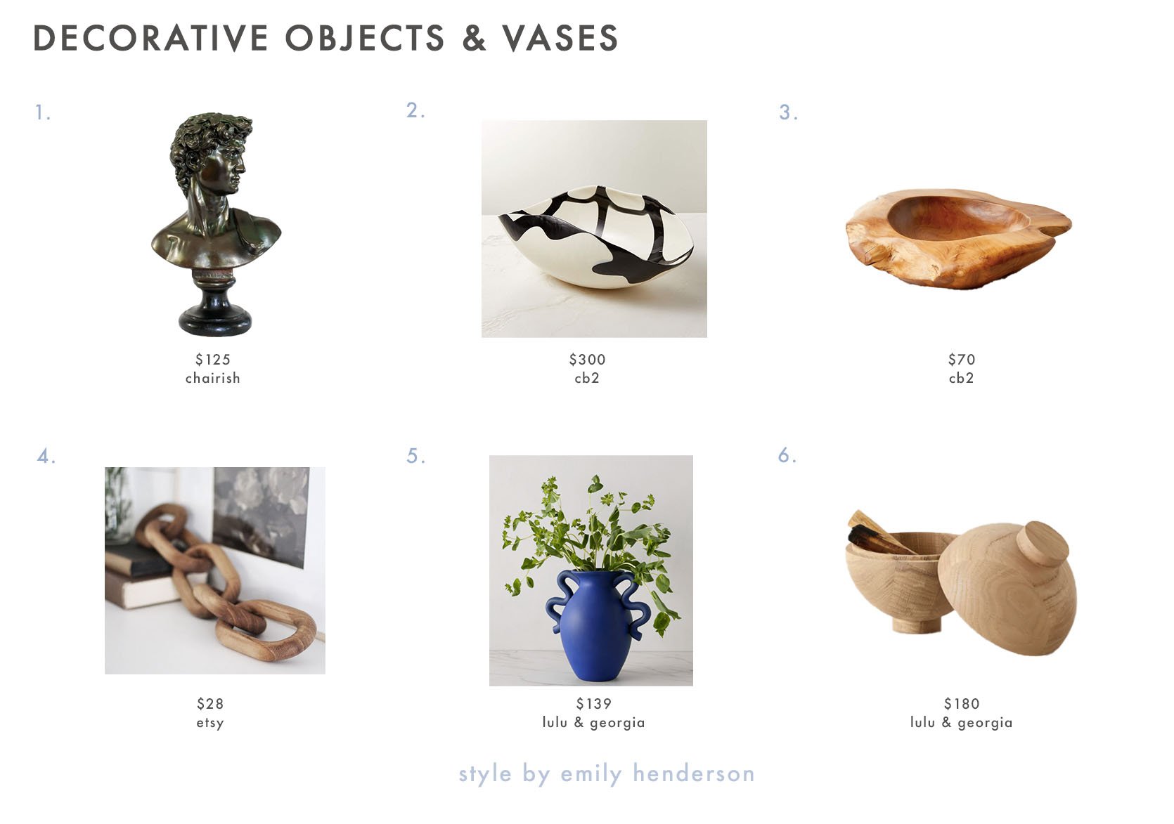
1. Vintage Bust of David | 2. Zeta Murano Glass Bowl | 3. Emmet Teak Bowl | 4. Five Link Hand Carved Wood Chain Decorative Object | 5. Calabria Vase | 6. Wooden Sphere
Include Greenery
To easily bring in some movement, add a potted plant or even a vase with branches. Plants are a surefire way to add color and vibrancy to your shelves without disrupting the color palette or style. Plants can also create height and shape, and quite literally bring life to your shelves.
HOT TIP: For a less expensive option, go outside and forage for branches. The more dramatic the branch the better, and add them to a vase for an easy yet impactful styling moment.
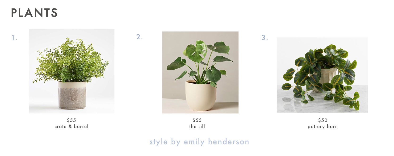
1. Faux Potted Greenery | 2. Monstera Deliciosa | 3. Potted Houseplant Wandering Prayer
Use Bookends
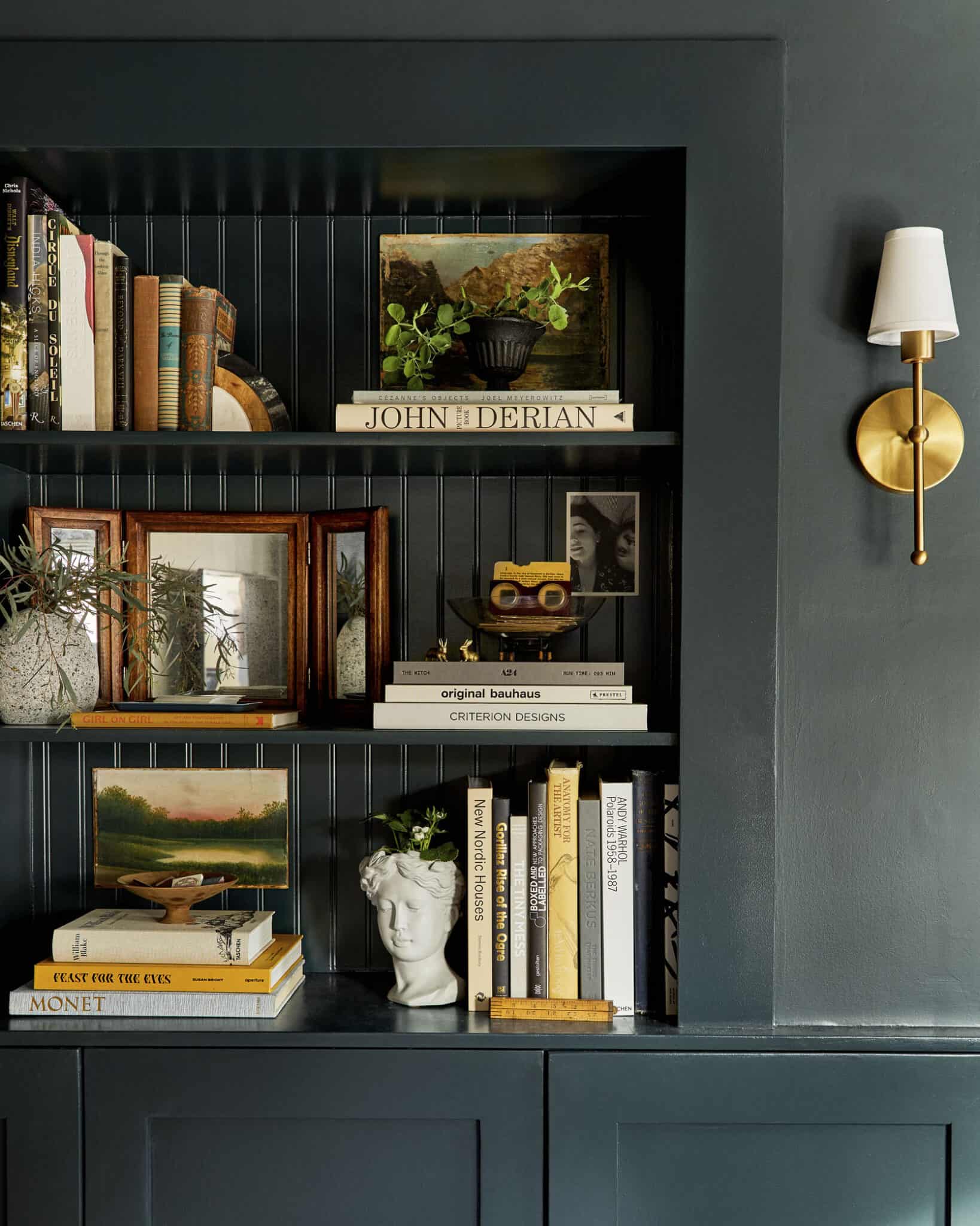
You might think that a bookshelf would eliminate the need for bookends, but bookends are actually a great way to allow for space within the shelves. On Sara’s built-in above, she uses bookends to separate her individual vignettes and to keep her books from falling over. Unique bookends can also provide style and texture while serving a purpose. I love how Sara used a potted plant bust as a bookend which adds a ton of personality. She also has marble and wood half circle bookend on the top which adds a round shape and even more texture to the shelves. If you are considering adding some bookends to your space, here are some we love:
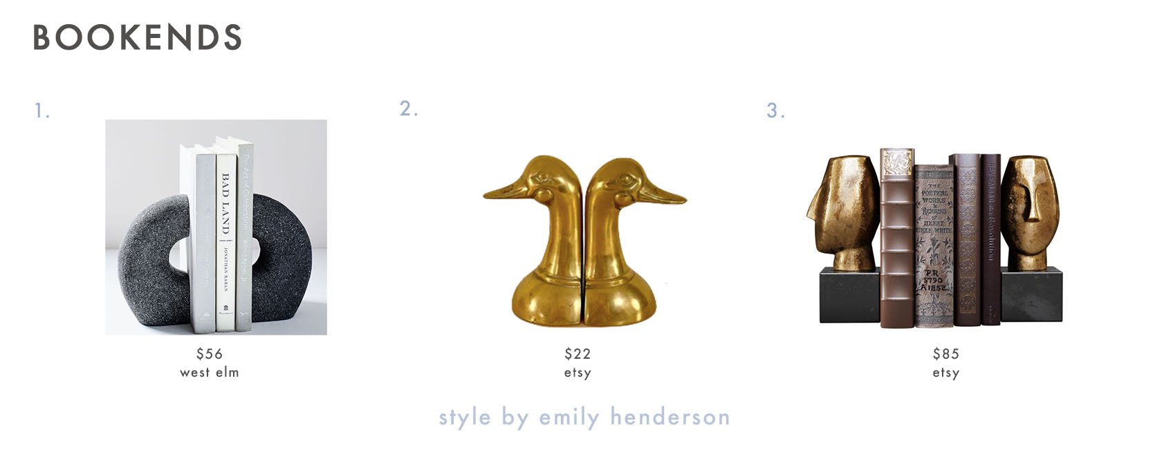
1. Gray Lava Stone Bookends (Set of 2) | 2. Vintage Brass Bird Bookends | 3. Human Heads Bookend
Annnnd congratulations! You’ve just graduated from styling bookshelves school. I hope you now feel empowered to tackle your shelves like an actual pro. Now I would love to know what other styling questions we can help with so please drop them below. Happy Monday! xx
Opener Image Credit: Home of Corbett Tuck | Styled by Velinda Hellen, Erik Kenneth Staalberg, Emily Bowser, & Julie Rose | Photo by Sara Ligorria-Tramp for The New Design Rules
THIS POST WAS ORIGINALLY PUBLISHED HERE.


