When I brought up the idea of this trend to the team there were mixed responses. Some were like “I LOVE this” while others didn’t deny its budding resurgence but weren’t necessarily sure about it. I had been seeing it pop up, feeling like we had a trend on our hands when last week on Elle Decor had it in a trend roundup article. Even as I was prepping this post AD did a piece on how mirrored walls are back! Needless to say, it was time to do a bit of a deep dive.
To start off, real antique mirrors age because for a long time “a thin layer of mercury was spread over a piece of tin then glass was placed on top which caused a reaction between mercury and tin causing the mirror-like substance to adhere to the glass” (Thanks, SFGate for the info). So that’s why over time the mercury will tarnish or oxidize creating that aged look. A good one can look sooo special. I have an old family mirror that has some age on it and I LOVE it so much. It’s history staring at you while you stare at your face:)
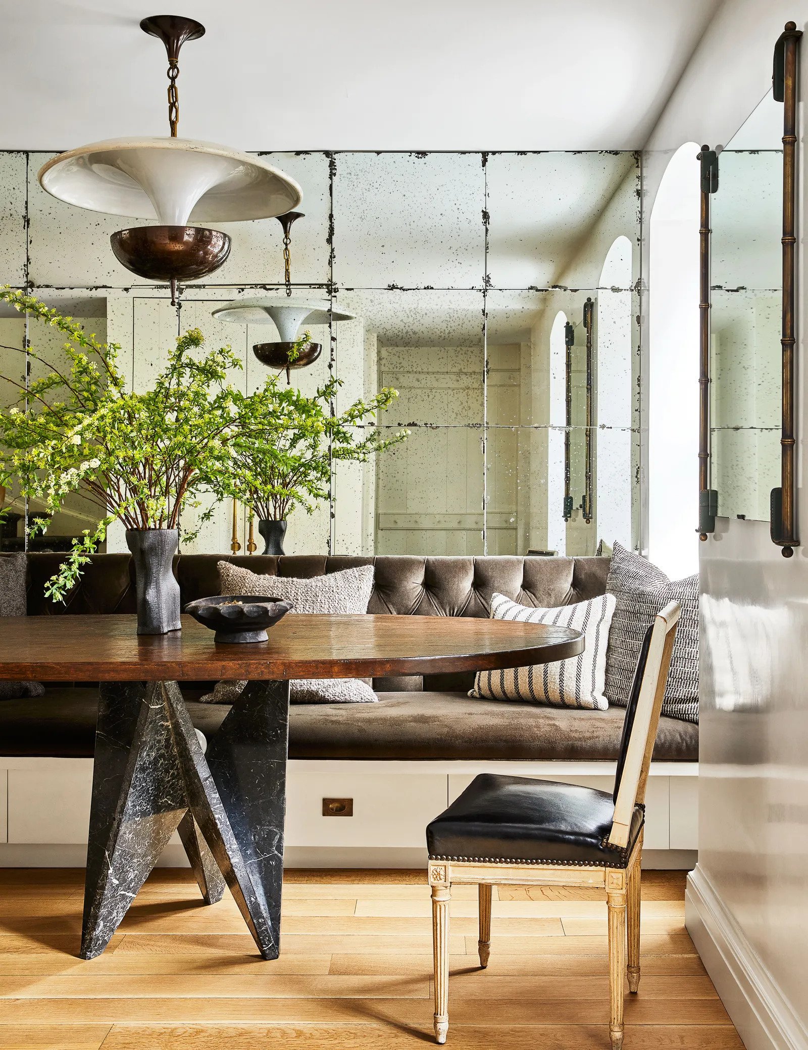
Now, I don’t know of any current designers that love an antique mirror or an antique mirror wall than Nate Berkus and Jeremiah Brent. I’ve been bingeing their shows (highly recommend if you were also wildly behind like me. Discoery+, baby!) and there is almost always some kind of aged mirror in every reveal. However, this love is proven most in their own homes. Take the first photo and this one above. These mirror tiles are A. real antiques and B. add both a ton of character and light to the space. A quiet, rich statement if you will.
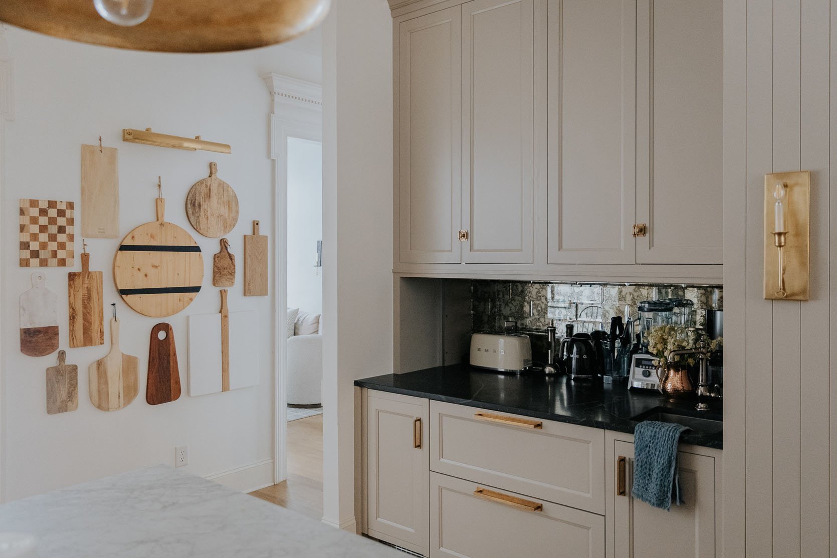
Here is an example of using a faux-aged mirror in tile form. Julia and Chris did a great job making this tile look chic and natural in their colonial-style home. I think the key to successfully adding faux-aged decor into a home is to do it sparingly (and make sure it’s the good version:)). So with this backsplash, it totally works because there’s very little that’s also faux-aged in the room and naturally, they picked a good version of this kind of tile. If you like this look but want a larger statement, Pottery Barn is usually a good place to go. Take this wall mirror for example. You also can do a faux-aged DIY if you are feeling ambitious. Here is a video I found after a quick search.
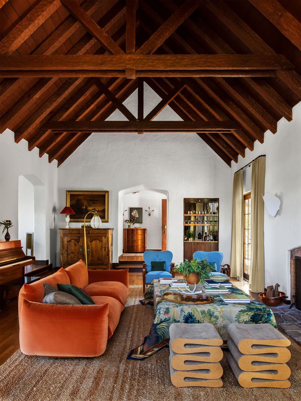
I truly just can’t get over this room by Frances Merrill. Every time I look at it I see something new. So it wasn’t until the second or third time I stared at this photo that I noticed the bar nook had what looks like aged glass (faux I’m sure)! It’s a pretty fun and sophisticated accent. It’s warm but also makes the space feel a bit grander.
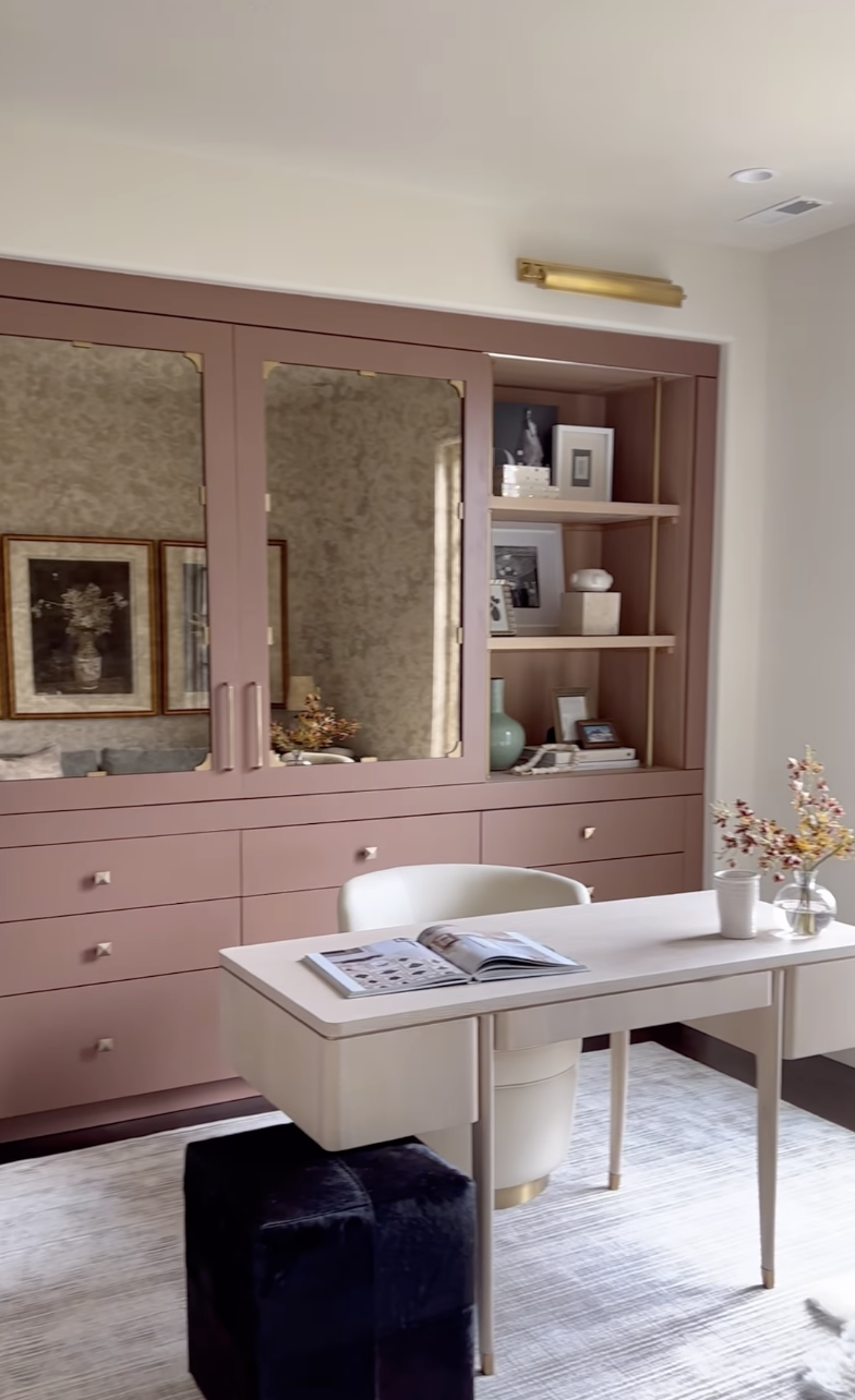
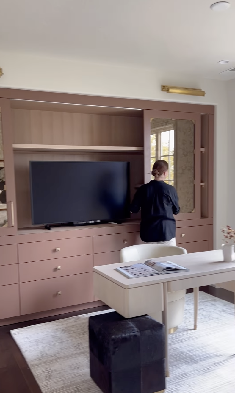
These photos are from a reel I saw the other week which only continued my opinion that this trend is absolutely happening.
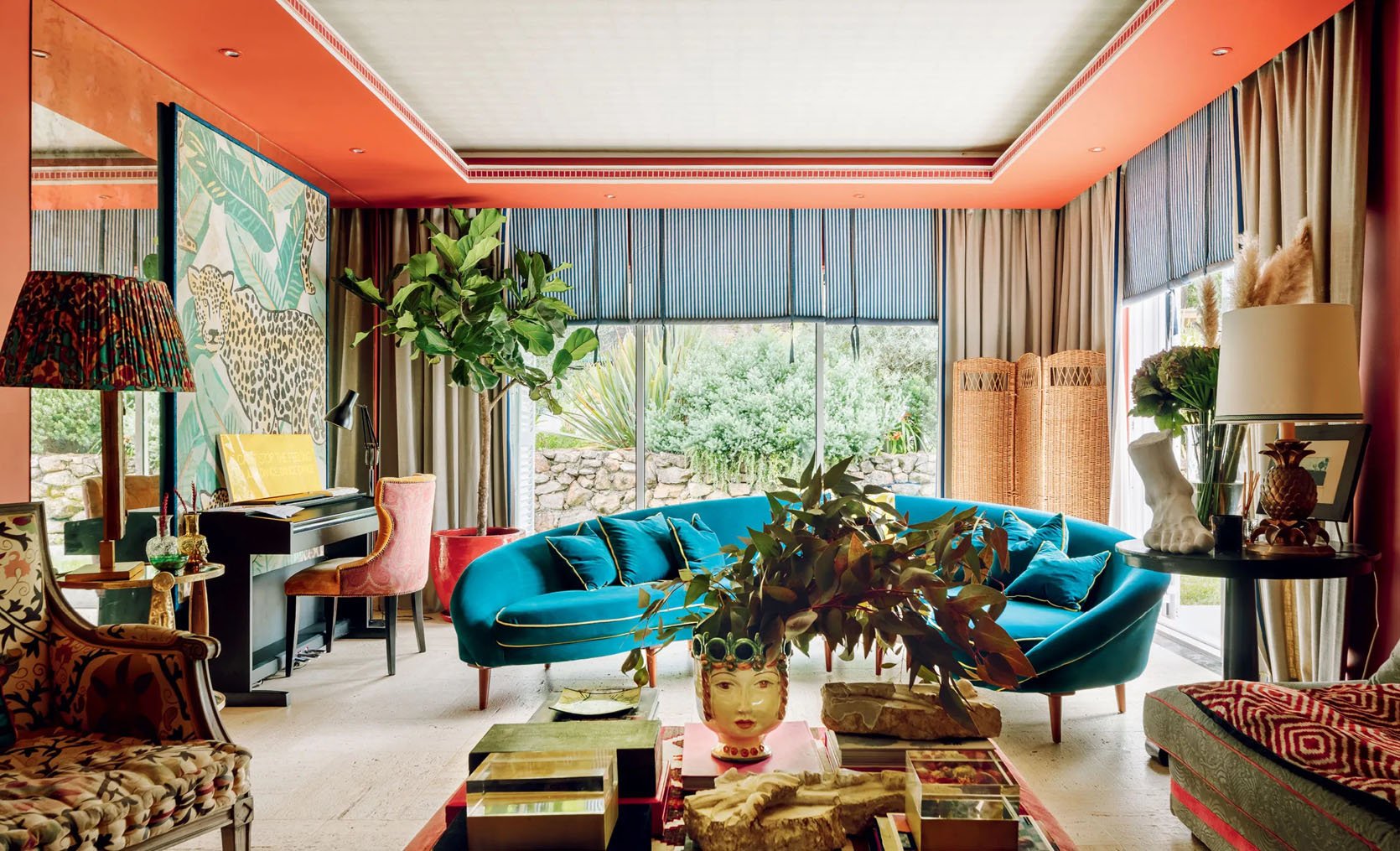
Look to your left! A mirrored wall! What I love about this wall is that the light “age” complements the vintage feel of all of the other pieces in the room. It also, of course, bounces the light around the room but isn’t overwhelming because of that incredible piece of art that’s been put right in front of it. It just adds more texture to the space!
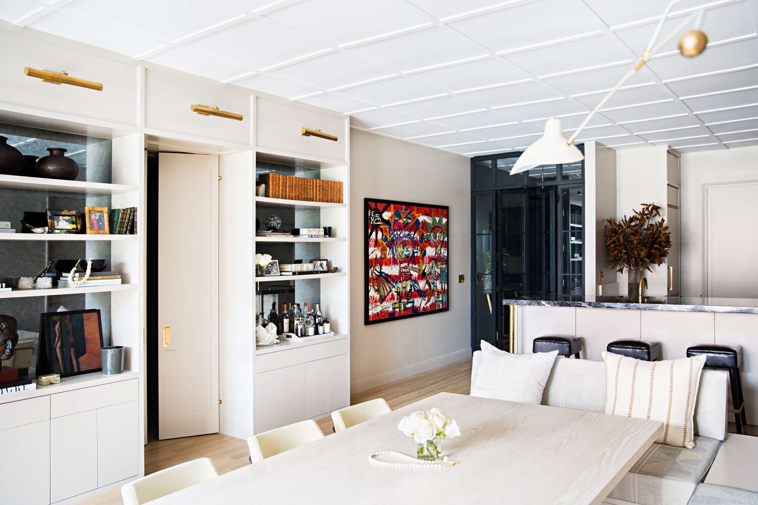
After looking at these photos, I think my personal favorite way to incorporate a faux-aged mirror is as a background piece like in the bar in Francis’ home and here in the back of these shelves designed by Jeremiah Brent. That way you get the visual texture and don’t immediately think, “Woah that’s a big faux-aged mirror.” It’s more of a fun surprise.
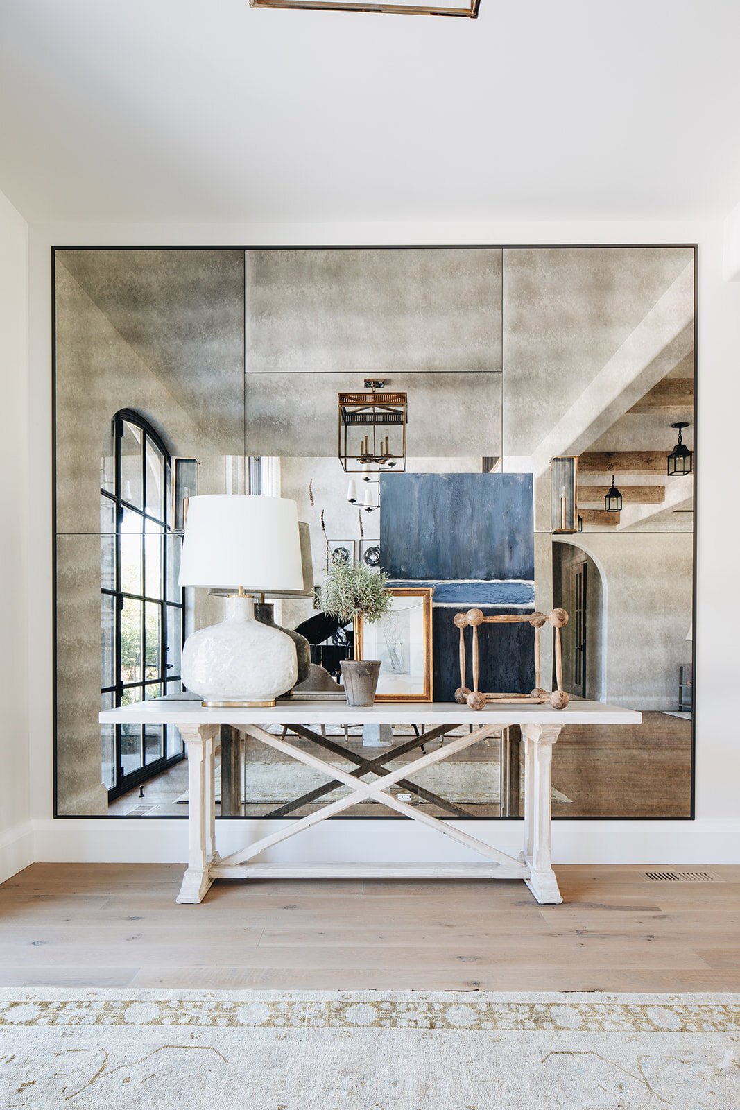
To further prove my point, I think having this entry table and its decor partially blocking this faux-aged mirror breaks up the intensity of its size and detail. It feels more welcoming. Also, look at how modern a faux-aged mirror can look?? It’s for all styles:)
Now, I think we’ve talked enough faux and should get into the real deal antiques…
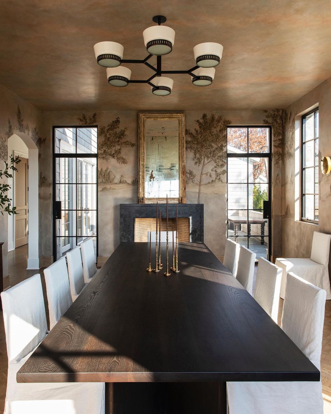
I mean…STOP! It’s mirrors like these that make me never want to look at a new mirror again. This baby has almost too much soul. Save some for the other mirrors, K? It should also be stated that the one and only Jake Arnold designed this room which puts another official stamp of approval and makes this “trend” cool. And look, antique mirrors literally aren’t new to the design world and Jake isn’t the first (duh) to use them. BUT it is a good reminder of how goooood they are and how you won’t regret adding one to your home. It’s science.
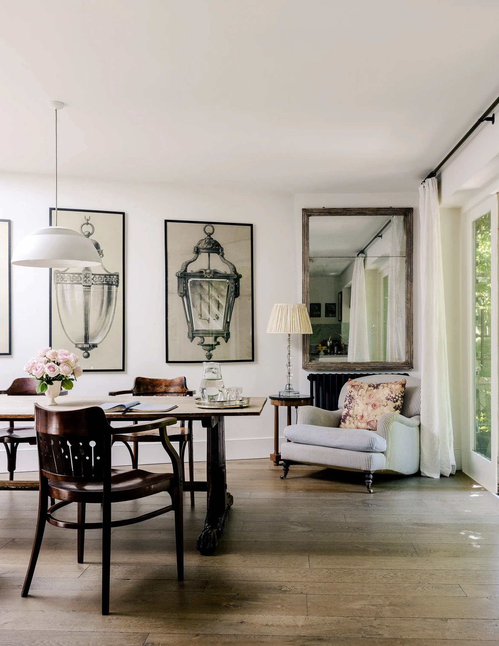
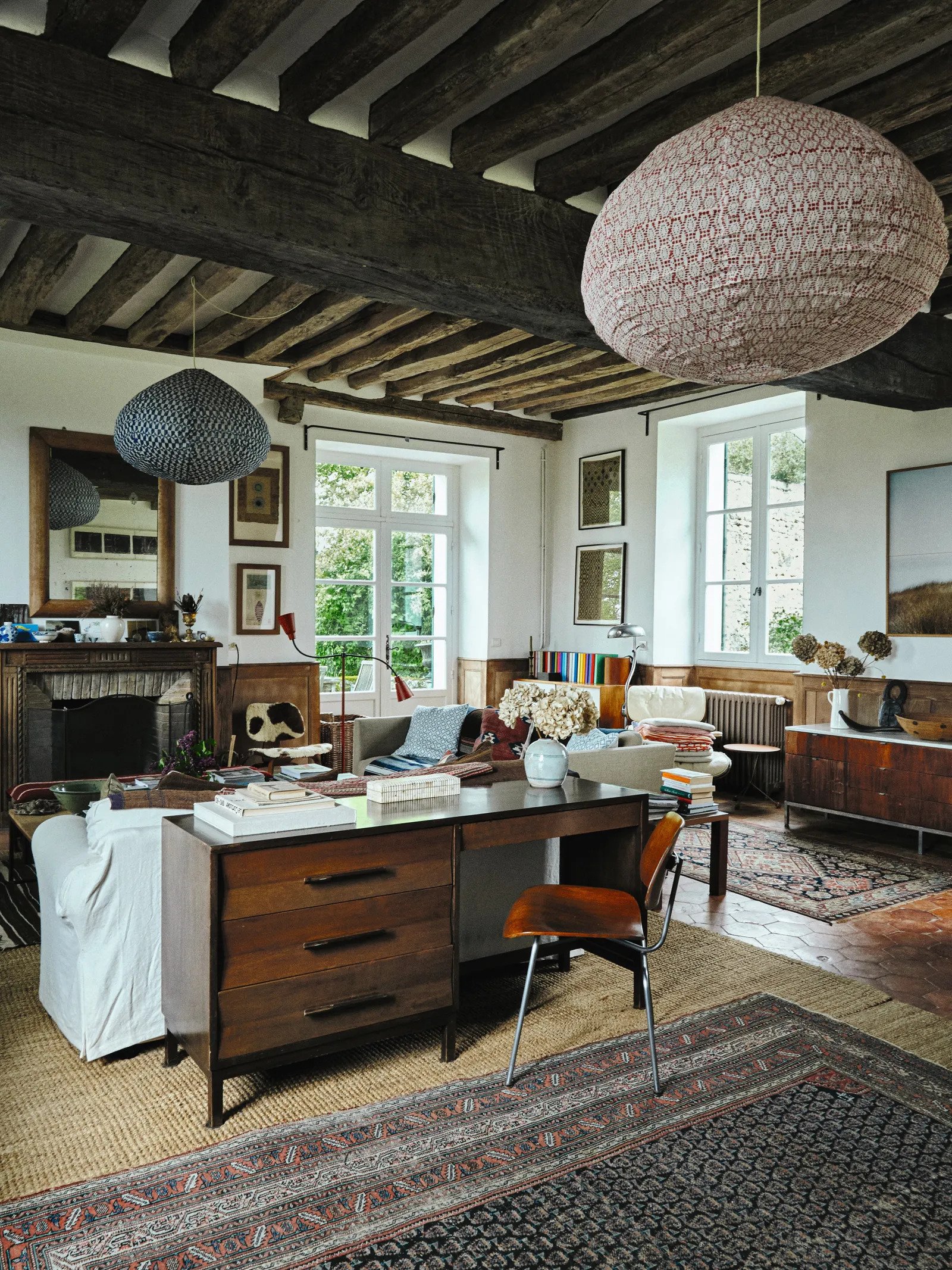
Remember that there are leveling degrees of “age”. If you like the idea but don’t want your mirror to look like it came straight out of the Haunted Mansion, then go for one with light aging. Make it work for you and your style. You want balance within your vintage too. If everything looks 300 years old and is falling apart, it might feel heavy and lack any sort of freshness. But…
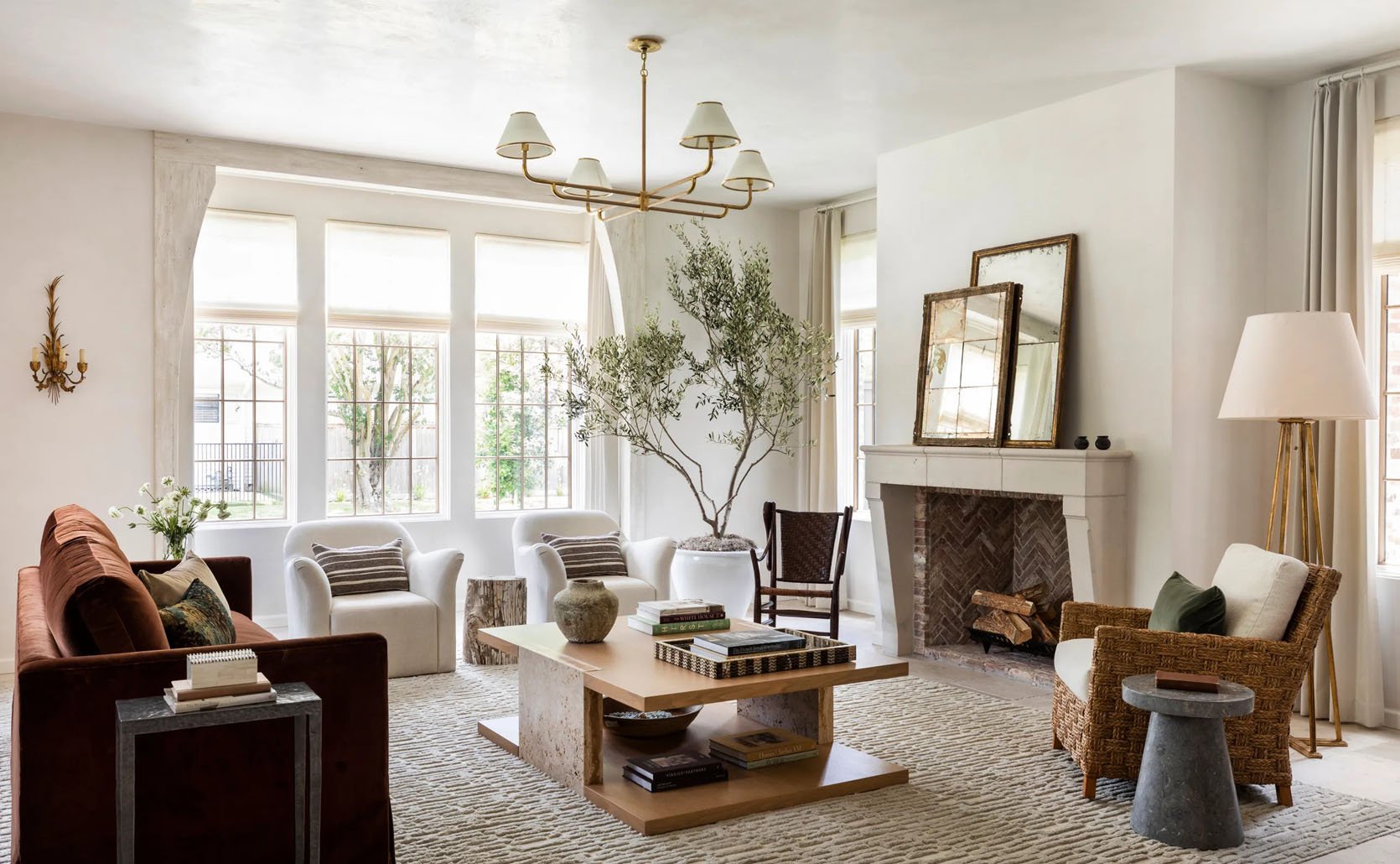
…on the flip side, this pretty room needed some pieces with age because everything is so new. A new modern mirror would have still looked nice but these add depth and dimension.
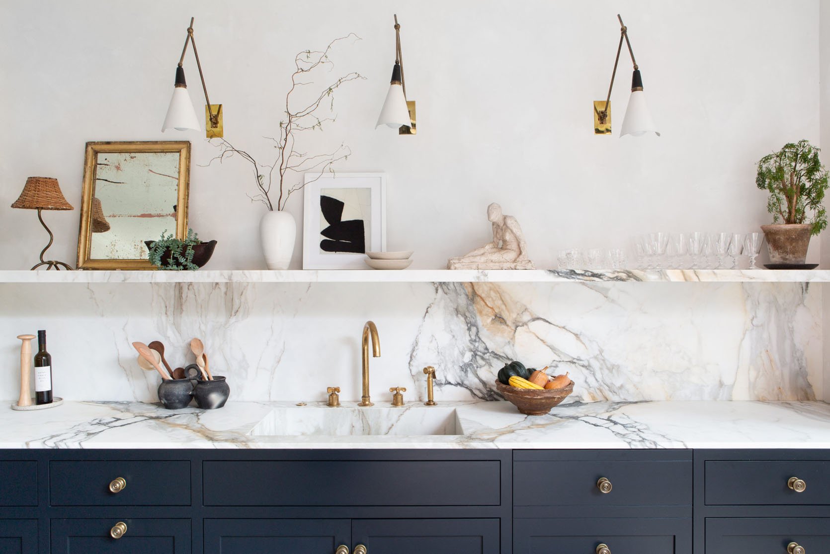
They also can just be a little accent like in Athena Calderone’s kitchen. There are a ton of beautiful little aged mirrors on the internet, at vintage shops, and in flea markets. It’s an easy and affordable way to hop on board!
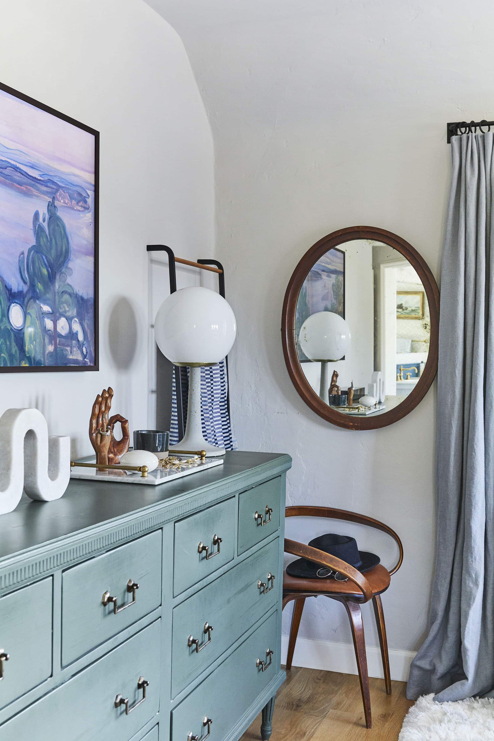
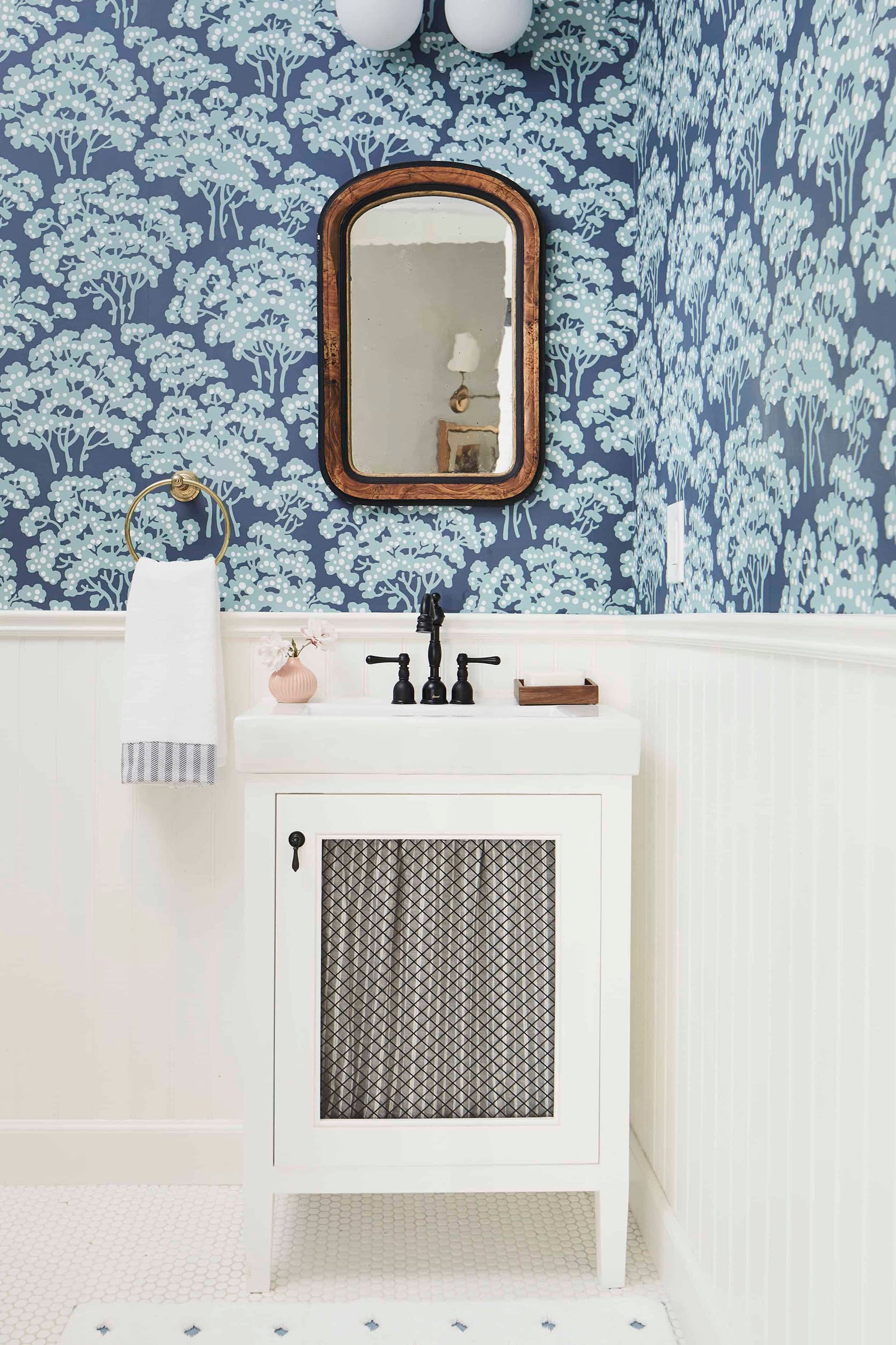
Emily is of course a fan of the real deal and has used lightly aged mirrors a ton. Above are two examples of them in her last LA house. I remember when she bought the oval one on the left and how enthralled she was with it. I’m pretty sure she wasn’t even 100% where it was going but she knew it was so special (and simple) that there were a ton of spots. She wasn’t worried:)
And that’s the beautiful thing about most old things, they never truly go out of “fashion”. So again a word of advice. Be very picky if you are going faux to make sure you love the added patina. Faux of anything can be a great affordable alternative because not all of us have that Berkus and Brent budget… maybe someday though, right? RIGHT??
Thoughts? Experiences? Any fun finds? Let’s talk!
Love you, mean it.
Opening Image Credits: Design by Nate Berkus and Jeremiah Brent | Styled by Dorcia Kelley | Photo by Kelly Marshall | via Architectural Digest
THIS POST WAS ORIGINALLY PUBLISHED HERE.


