First Farmhouse reveal, y’all. And I really, really needed it. Seeing one corner, one small “moment”, totally finished is wildly satisfying even if it’s just a literal door (and surrounding area). All hail the power of a great paint color (thank First Farmhouse reveal, y’all. And I really, really needed it. Seeing one corner, one small “moment,” totally finished is wildly satisfying even if it’s just a literal door (and surrounding area). All hail the power of a great paint color (thank you, Sherwin-Williams). So today I’ll walk you through the front door color decision-making process and you’ll see what we landed on (I was scared and feared some regret, but now I’m SO HAPPY).
To recap – we wanted to keep the original door because it was beautiful. We thought first about stripping and staining it, but it was in such bad shape (cracks, holes, missing moldings, new lock placements, etc.) that the restoration of it would have been very extensive (read: expensive). And we were at the “maybe-let’s-stop-spending-money-dear-god” phase of the project, so we said we’d patch and paint: DONE. But choosing a front door color is HARD! What vibe do you want? What do you want people to think and feel when they drive/walk up? More importantly, how do YOU want to feel when you drive up after a long day and see the first glimpse of your home??? It’s the first impression rose (spoiler) and really sets the tone for what you might find inside.
Here are the facts:
1. We were painting the house Pure White SW 7005 which we LOVE, with a light gray trim color, Online SW 7072, that works really well with the steel blue exterior door color (aluminum clad, not painted). So we felt that we probably had enough blue/gray (I don’t totally agree with this, but sure, fine).
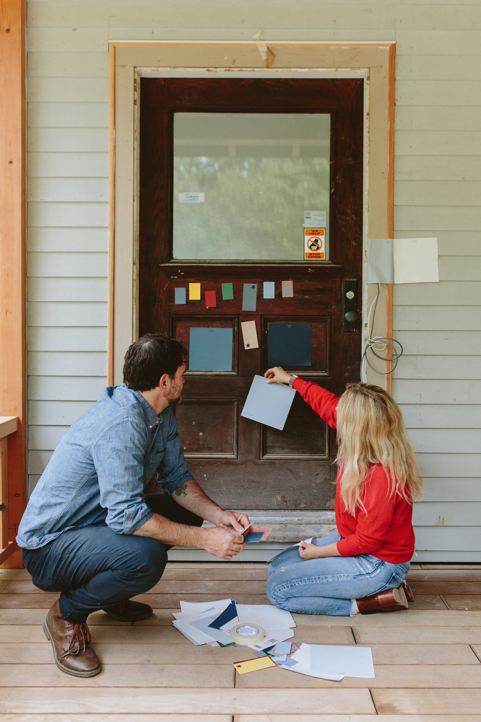
2. Brian was super pro-red door and I mean, I LOVE red (our LA house had a red door and the kids were also team “red”). I wondered if we should do something bolder so I snagged a lot of samples from Sherwin-Williams – both in their little free paint chips and their peel & stick samples (which you can order here). I was even open to bright yellow or an almost black green. As you know, I like to weigh a lot of options and honestly am open to many different types of vibes. The options I was thinking of were black (classic!), yellow (so happy!), dark green (happy but more “Oregon), or even blush beige (their 2023 Color of the Year is so beautiful, Redend Point SW 9081).
3. However, throughout this design process I’m constantly being reminded that Brian likes more traditional and leans even “sweet.” I think it’s mostly because of the farmhouse that he grew up in (classic red barn, white house with black shutters) that every time I try to push him into a more current or trendy look he resists. He wants “classic,” and he really thinks that a red door is what this house and property wanted.
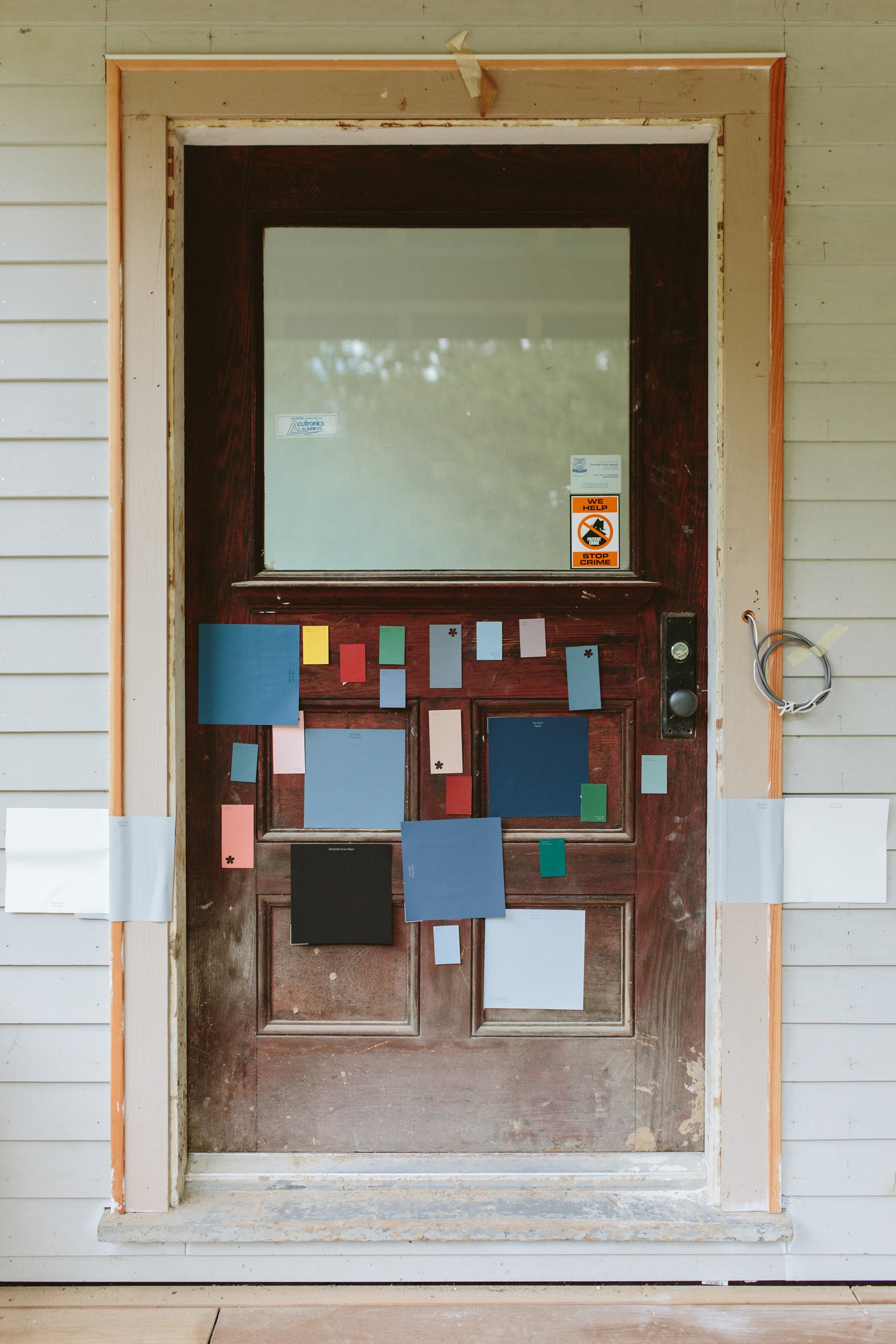
Great! I can go there. He quickly got me on “team red,” but that’s not where the debate ended obviously. WHICH RED DO WE CHOOSE, BRIAN HENDERSON??
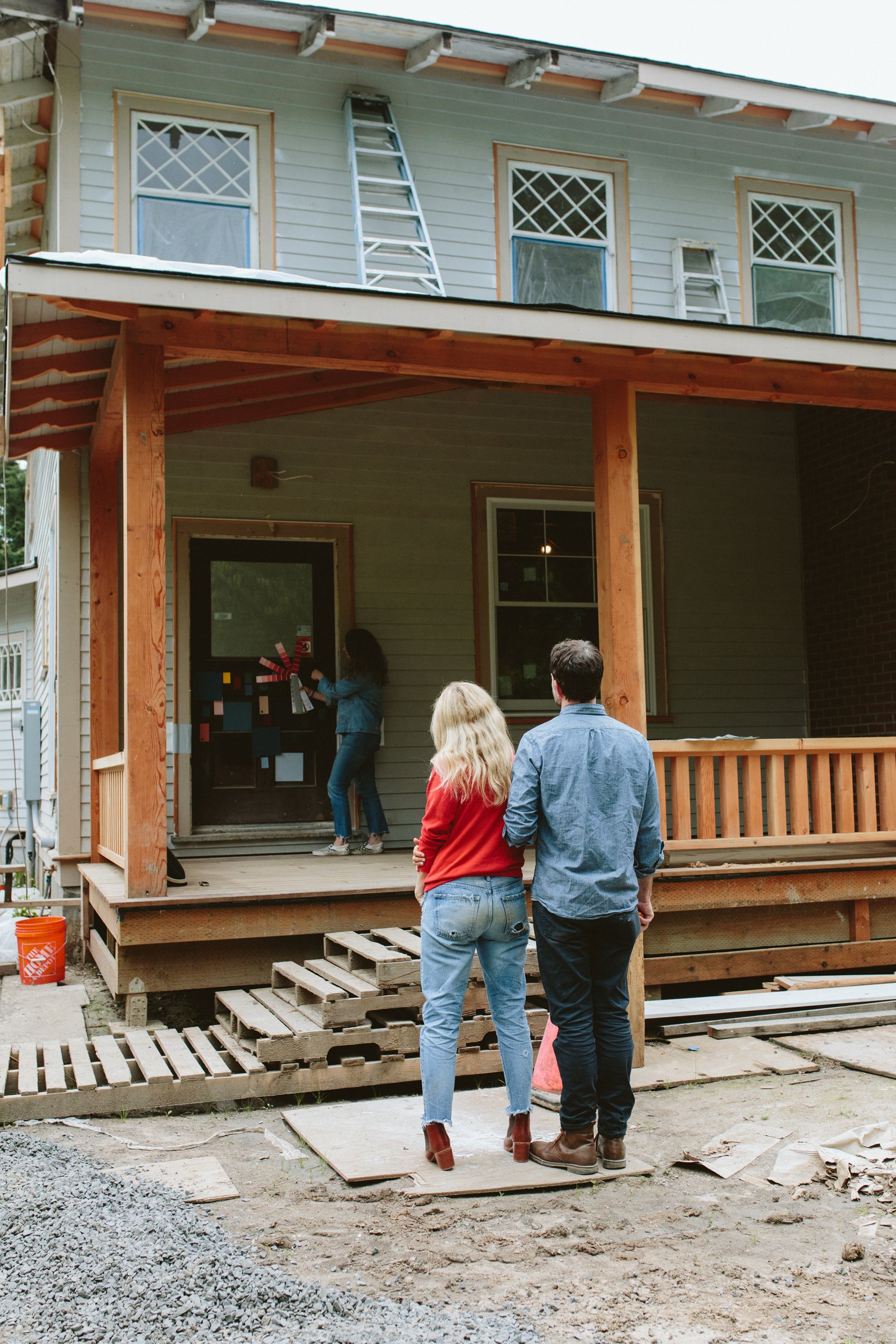
We went round and round on this. He wanted a bright red, and I agreed but offered this advice – too bright might be annoying to look at and a darker red will read as “bright” even though it’s darker than some other reds. Anne and Sarah were both there agreeing with him, but I kept pushing back to get a darker red (that is still a red). So we ordered a ton of different great red samples from Sherwin-Williams.
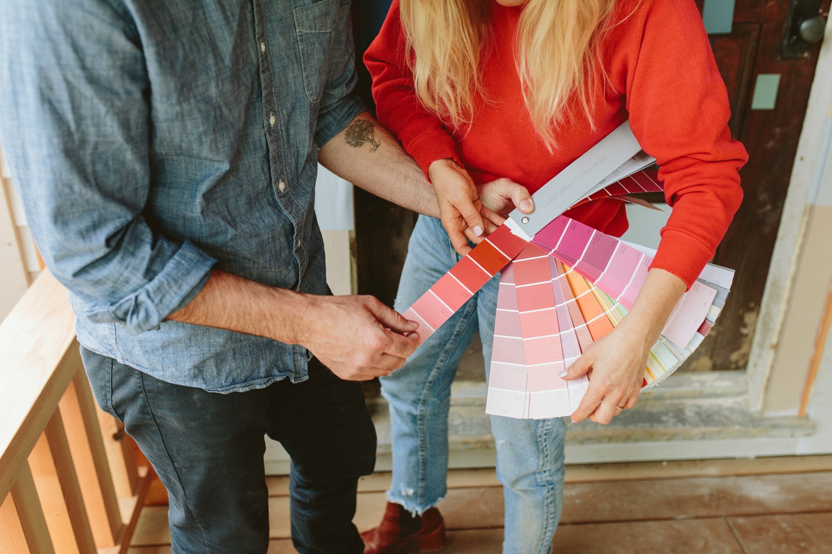
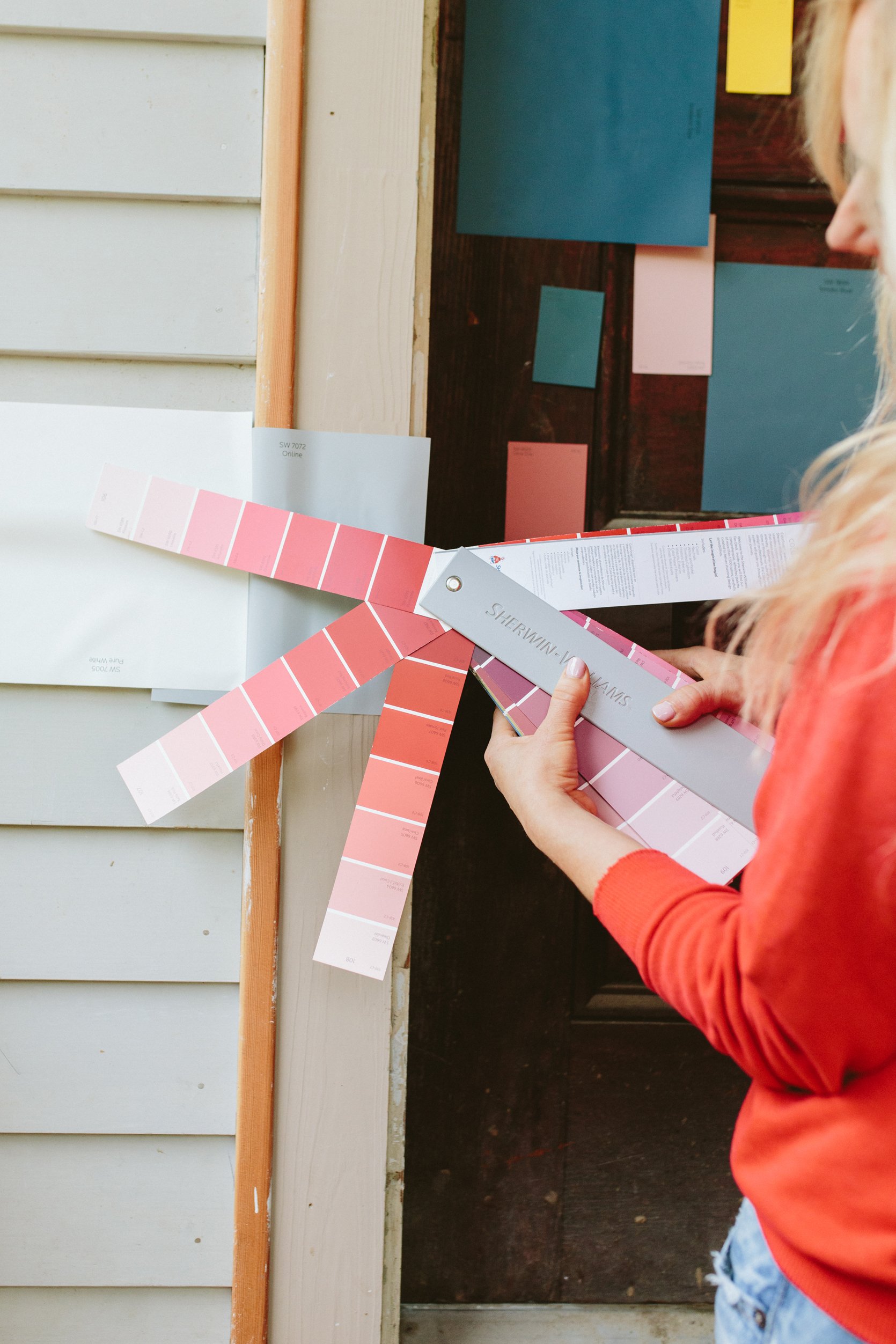
Time To Stare At Red Paint Samples For 3 Days:
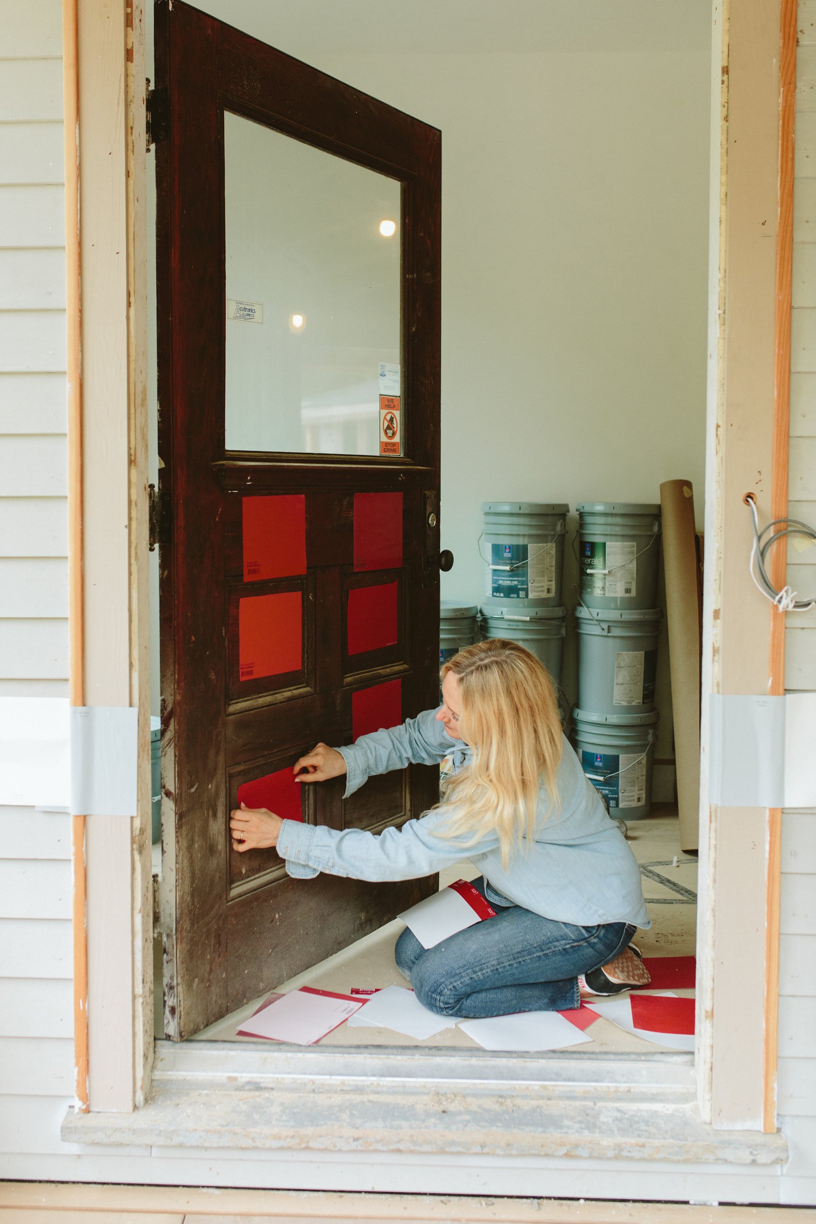
We ordered the sticker samples of a lot of reds and stuck them to the door. So easy and useful.
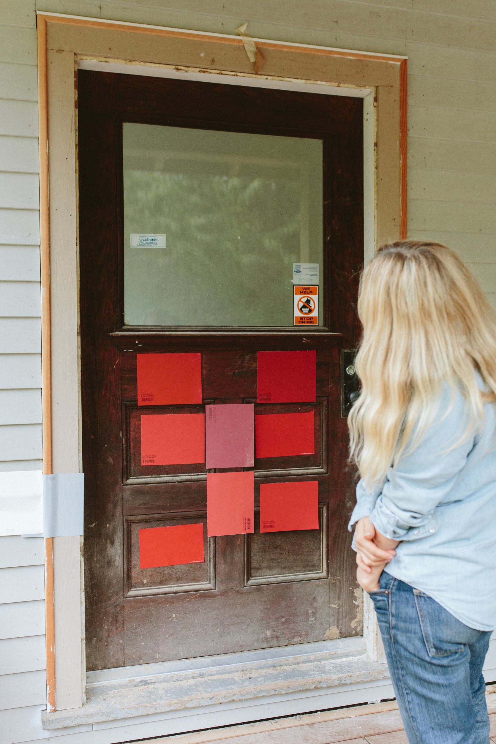
I did a LOT of staring and debating, but I wasn’t terribly stressed out because if we got it wrong it would likely just be a quick coat on top to darken.
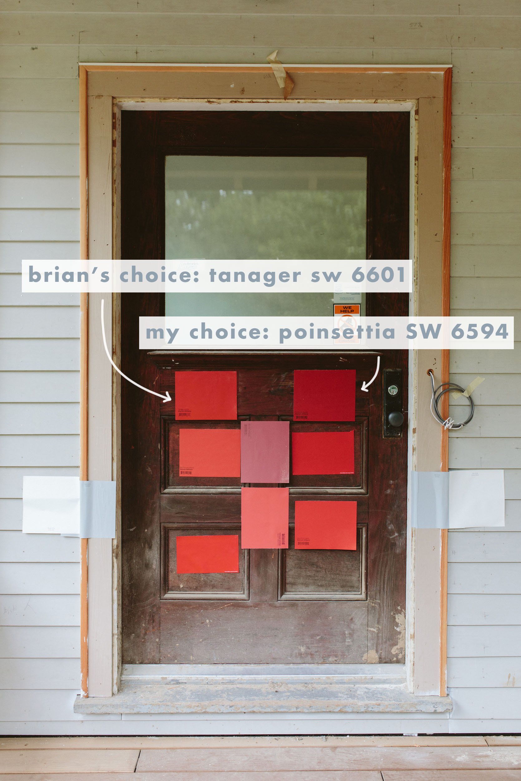
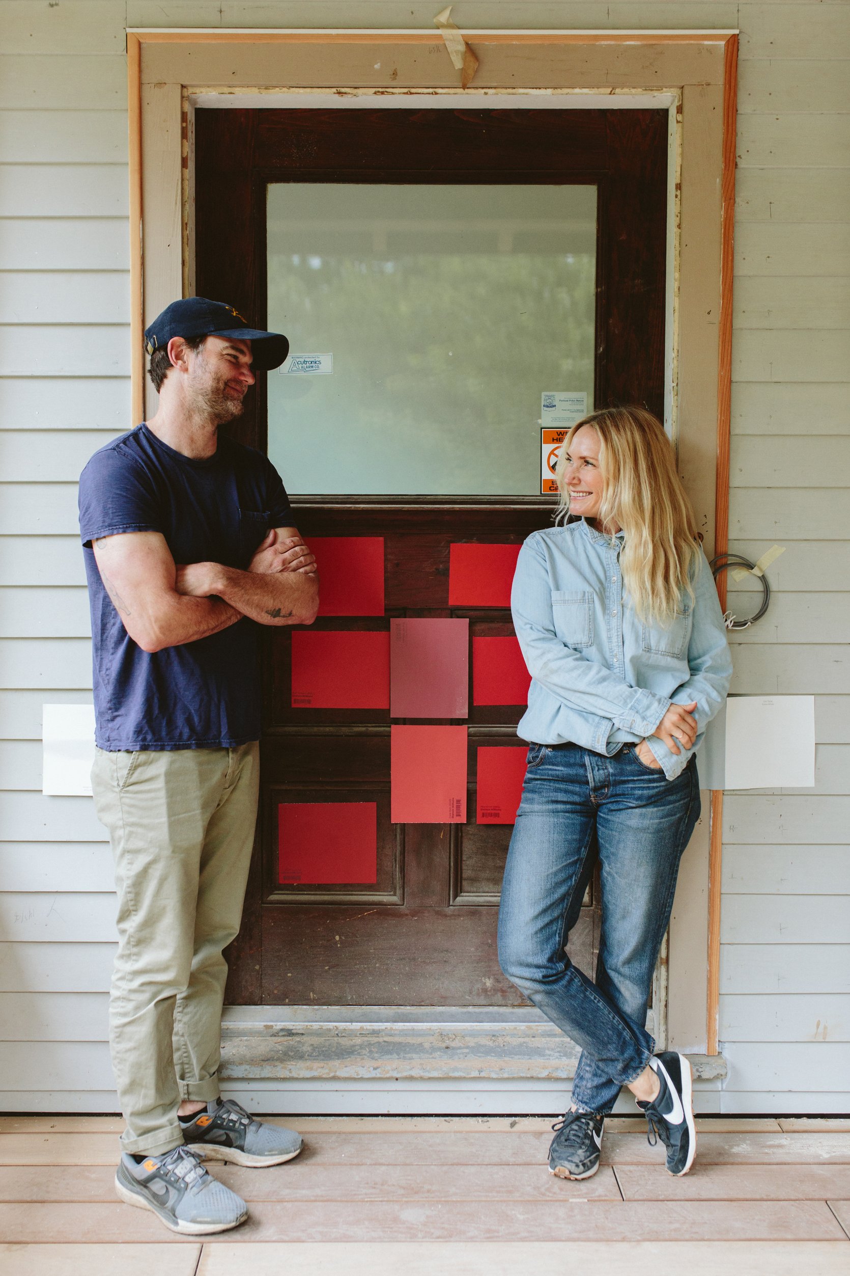
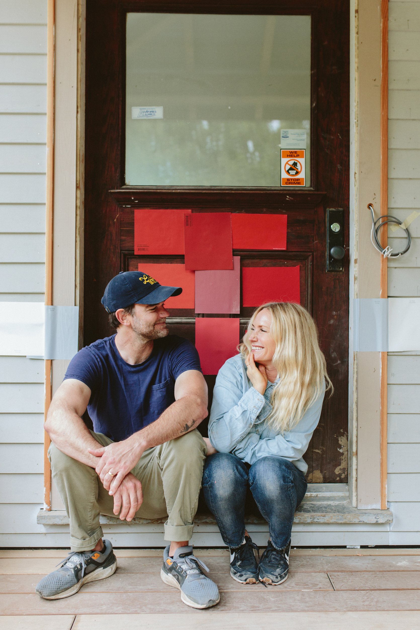
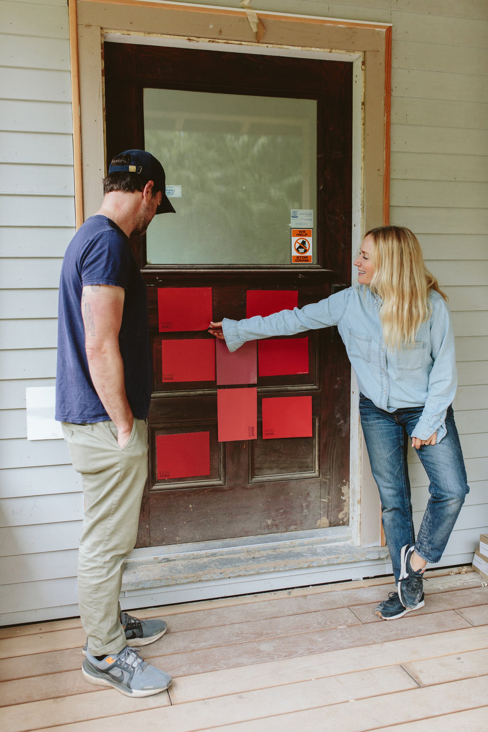
We ended up choosing Poinsettia SW 6594 by Sherwin-Williams, but Tanager SW 6601 was a close second and checked the box. Done. Chosen. We agree. Great!
My Reaction At First Look
Then a couple of weeks later the painters painted it and it looked like this:
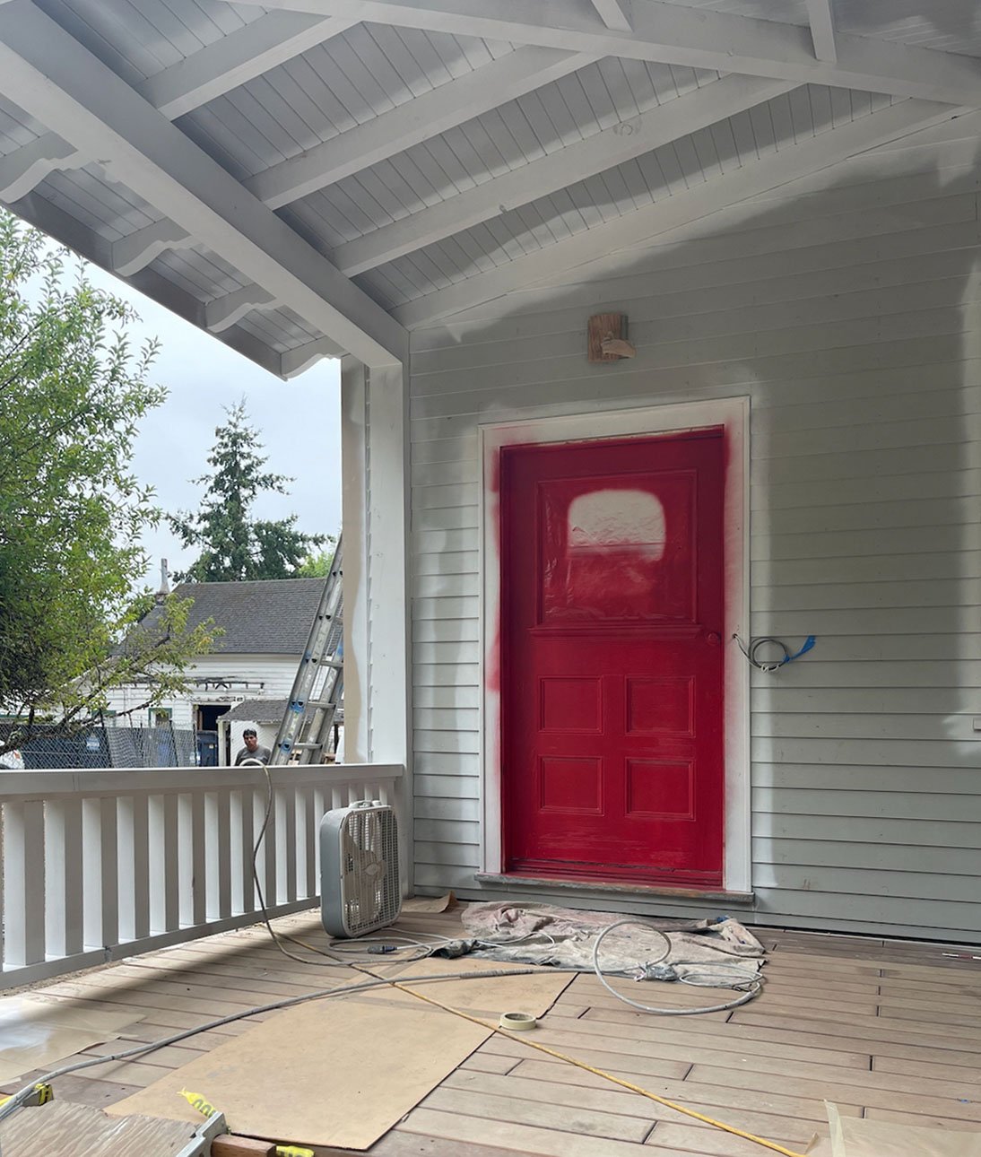
My first reaction was “horror movie, cool it’s a horror house,” but Brian reminded me that A. That was just one coat and B. Obviously they over-sprayed intentionally which contributed to the terrifying look, and C. The rest of the house isn’t done! Just wait! So I did, but I was already planning the repaint in my mind… It was a great red, but was it too much for me????
Next up they finished the body and casing colors – again Pure White SW 7005 and Online SW 7072 both by Sherwin-Williams.
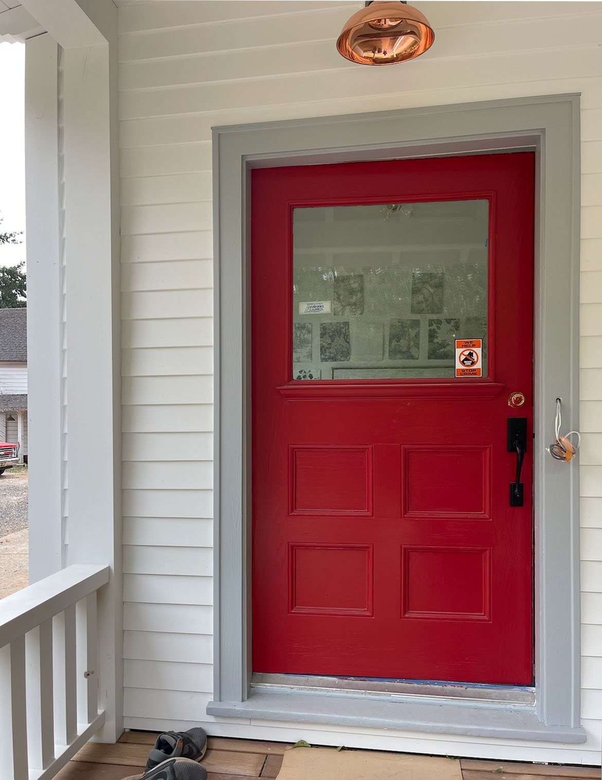
We rounded the corner of the driveway that day and both gasped. We were so delighted with the body and casing colors (so bright, classic, and happy!), but we both immediately said that we didn’t like the red with the gray casing color. I couldn’t totally figure out why, but it’s like the red made the Online color (which is a gray) look even grayer and just kinda flat. Maybe it’s because they are both two mid-tones and the Online would have been fine with a really dark color. Either way, we both had the same “meh” reaction. But the casing was the same throughout the entire house! On every window and door! You can’t just have a different door casing color for your front door, can you??? So I asked ARCIFORM and they said “of course you can, we do it all the time,” and the next day my painters painted the casing around the door the same color as the walls, Pure White. I was afraid that it would look like we forgot to paint the casing but y’all, as you can see for yourself, it looks AMAZING (see below). I freaked out for no reason and while I would say “lesson learned” the truth is that freaking out and self-doubt are often just part of the creative process. I guess what I did learn is sometimes just let it play out and don’t let your initial doubt and fear takeover. YET.
The Final Painted Red Door And How We Feel
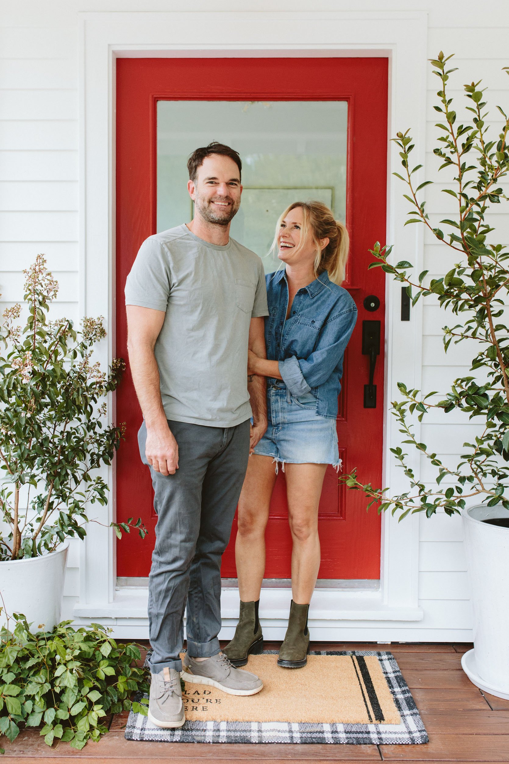
We ABSOLUTELY LOVE IT. It’s bright and happy, classic and timeless, and injects so much joy into our front porch (and lives). After I styled it out, I looked back at it and almost cried. Not everything has turned out as good as I had hoped, but this area turned out so much better than I thought.
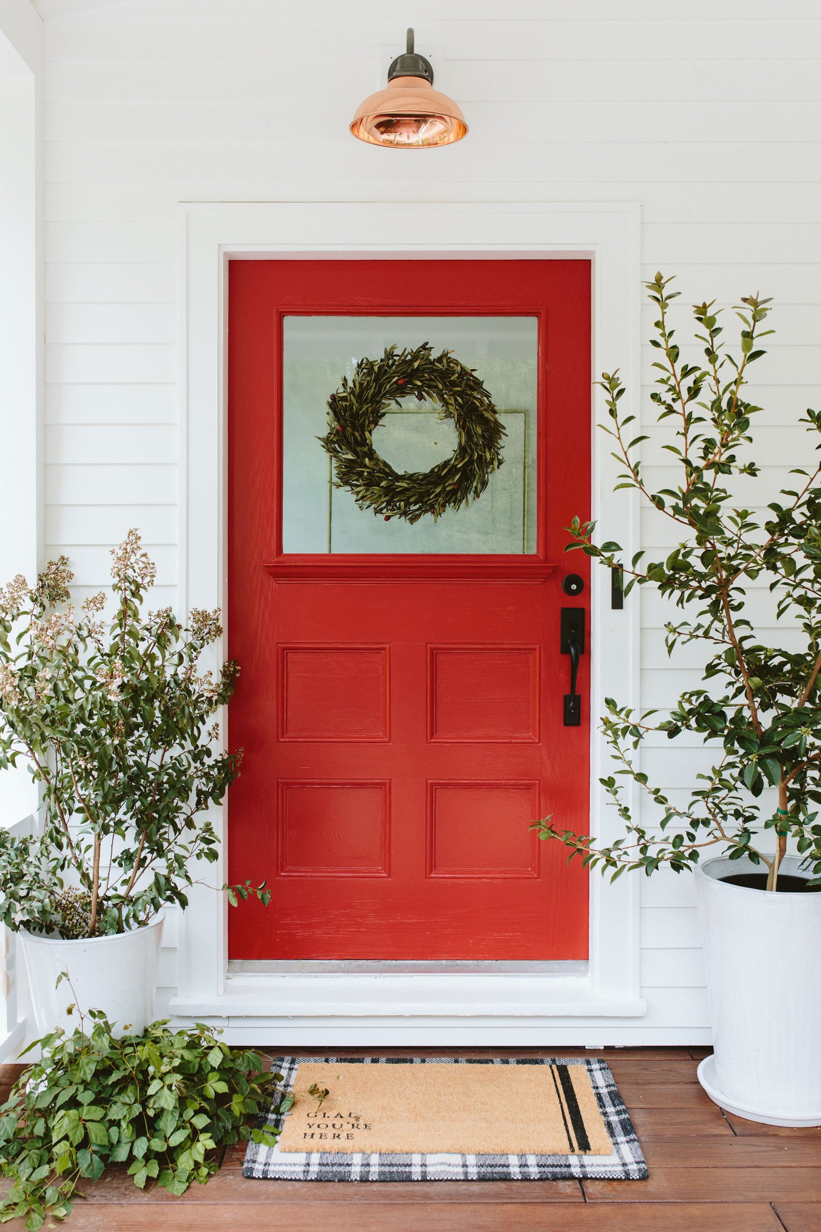
I’m incredibly happy every single time I see this door. That’s what red does – it’s a jolt of joy! And the right red, in this case, Poinsettia SW 6594, is REALLY really good. We shot it first with that wreath which can’t help but lean a little holiday (I’m ready, are you ready?) so we took it off for the rest of the shots, but how sweet is that door? The rest of the house is an absolute dust-barren construction zone, but this front porch is my little glimmer of hope. We actually hung the hanging porch swing right next to it the following week and I can’t wait to show you how it all looks together.
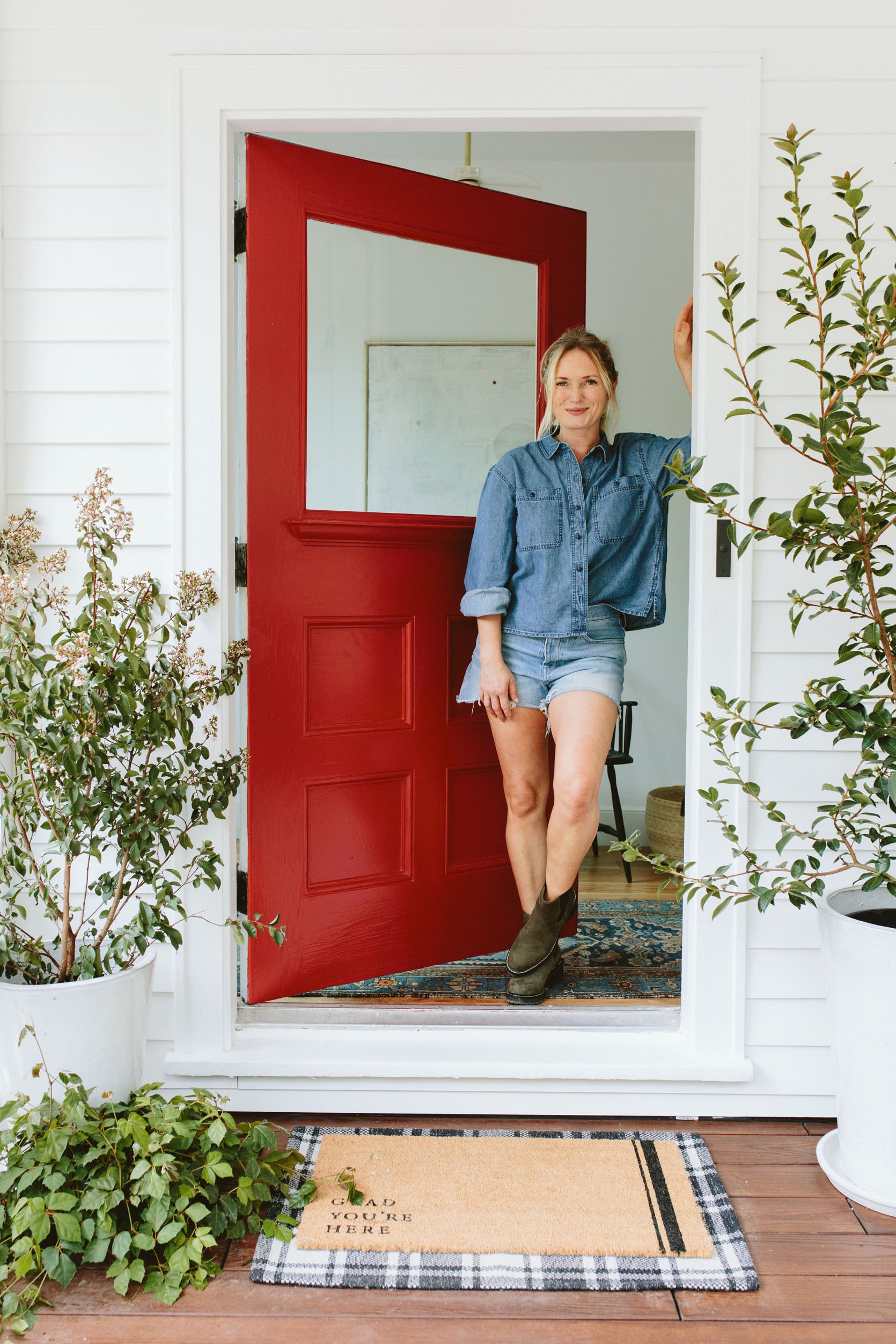
We chose a semi-gloss finish for durability and boy, it just POPS. I read somewhere after we painted, that a red front door means you’ve paid off the house, which is a really hilarious joke, but to me, it means “Welcome! Come on in and be ready for some fun family time.”
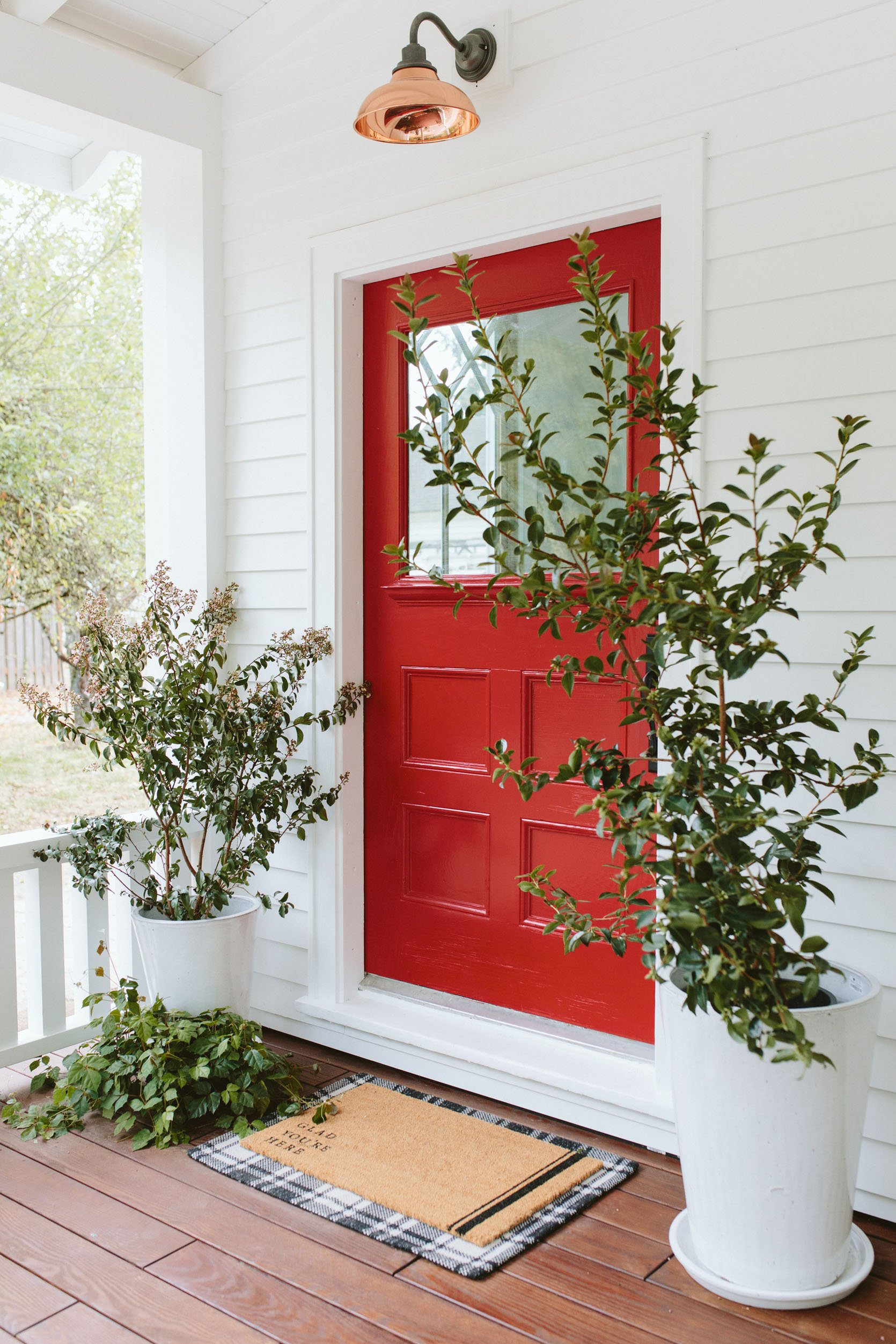
Pots (Local Nursery) | Glad You’re Here Coir Doormat | Plaid Doormat | Sconce | Wall Paint | Door Paint
I went to the local nursery and snagged these pretty pots and plants (one Crate Mrytle that I’m going to have to move to more sun and one Camelia tree that will stay here – I love those winter blooms). The welcome mats are both Target (HOT TIP – if you have a big front door just layer a classic mat over an indoor/outdoor rug), and the copper sconce is of course Rejuvenation.
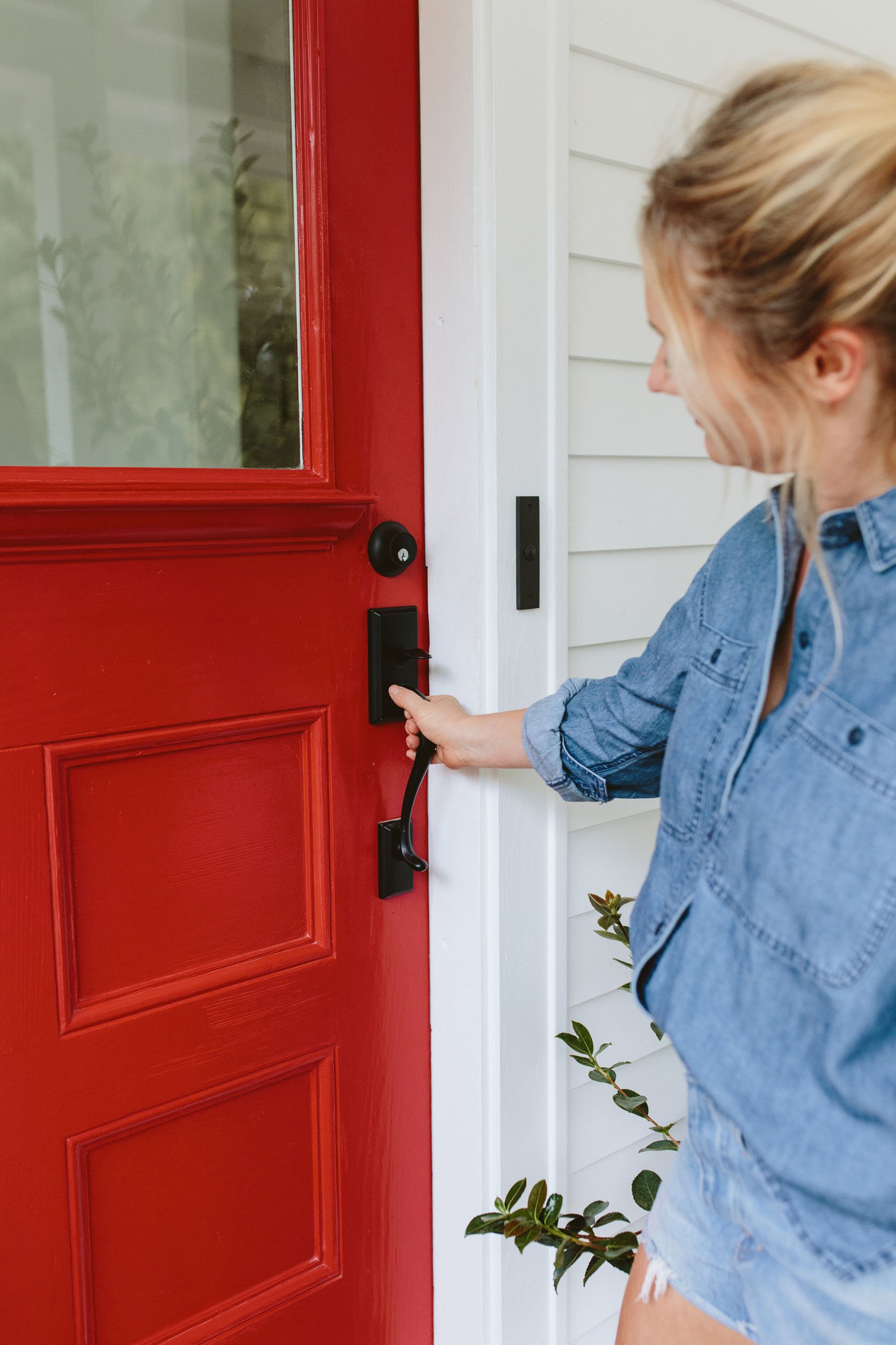
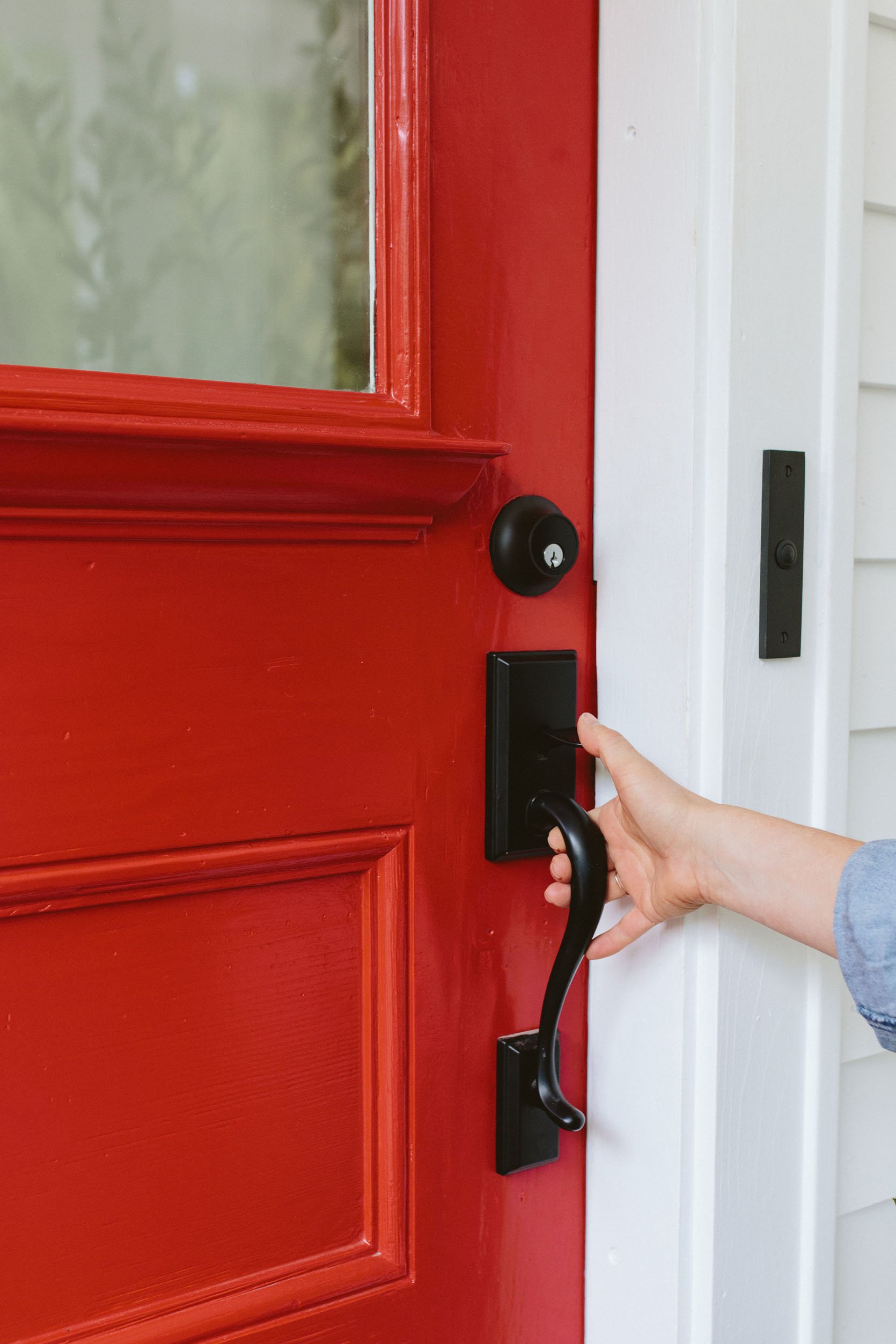
We Are So VERY VERY Happy!!!
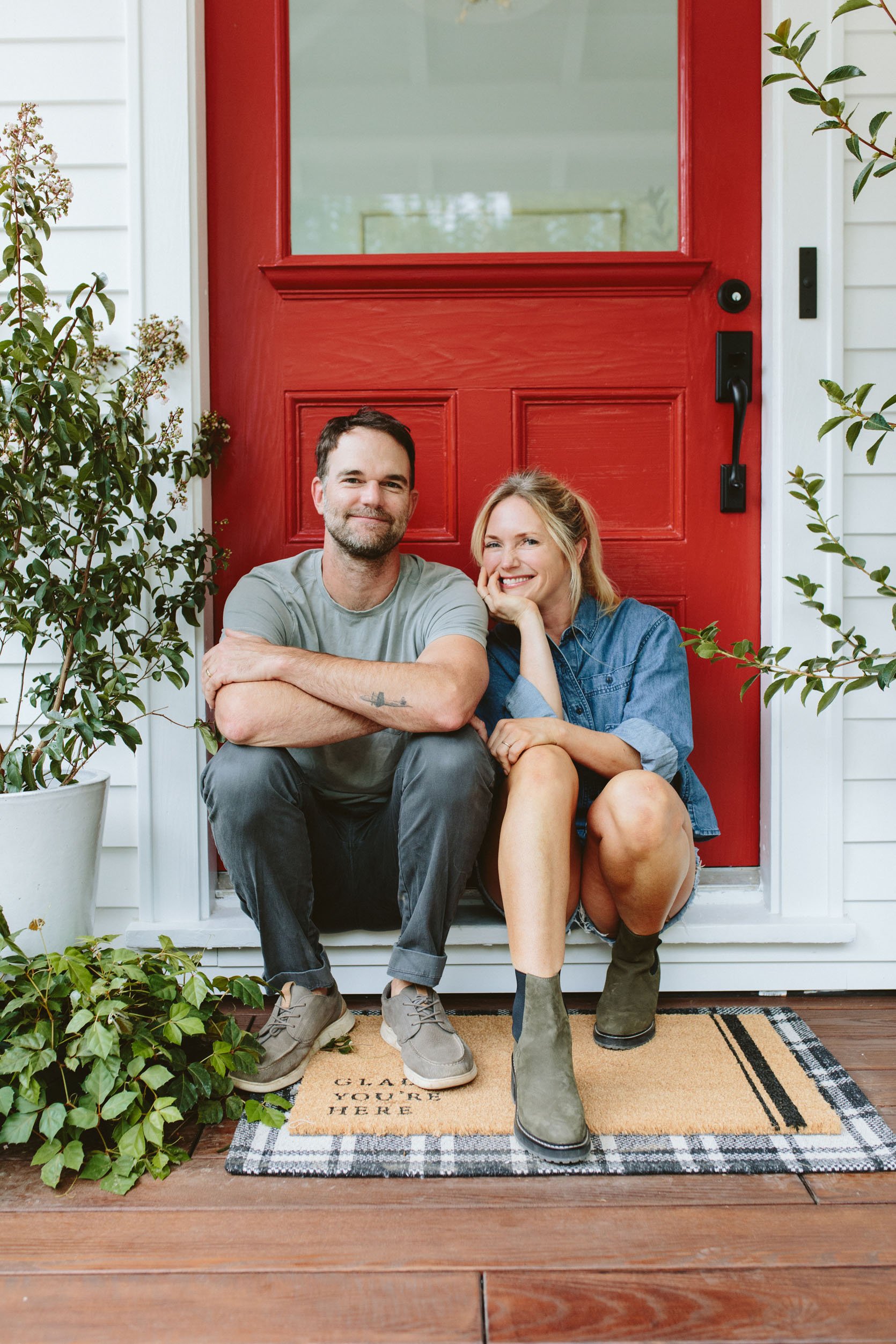
Maybe a red door won’t work on every color of home, but on this classic white house it feels incredibly natural, like it was always meant to be red. When I told Brian he was right, he gave me the satisfied but sweet “I told you so” look, and instead of me reminding him that I pushed us to the darker red – the ones he wanted would have seemed almost florescent red they were so bright) I just said “Yep! You were right – we are indeed ‘red door people.’”
*Photos by Kaitlin Green
**Sponsored by Sherwin-Williams
THIS POST WAS ORIGINALLY PUBLISHED HERE.


