My friend Scott Horne has the most refined taste of anyone I know. I would describe him as picky, but not snobby (this is true of most good stylists I know). I’ve fantasized about having a super curated online store and hiring him to be the Creative Director/buyer for it, but when I drunkenly pitched it to him 5 years ago he quickly said “oh, hell no”, which I thought was a hilarious reaction to a job offer (and took no offense). Turns out that giving up your freelance freedom to work 100% for your possibly-at-the-time-un-hinged good friend/influencer might be a recipe for a friend divorce. So wisely we didn’t venture into that together. Instead, I shot his new house for my book, almost 4 years ago now (NUTS!) and while it’s all over the book, with captions on what he did that we love, etc, I wanted to put them all in one place as more of a house tour. I think he does such a great job of making his home so effortless and still comfortable and I wanted to show it off, and brag about my friend.
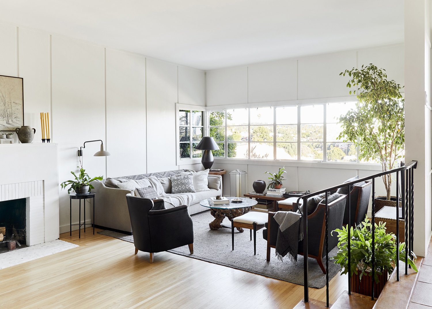
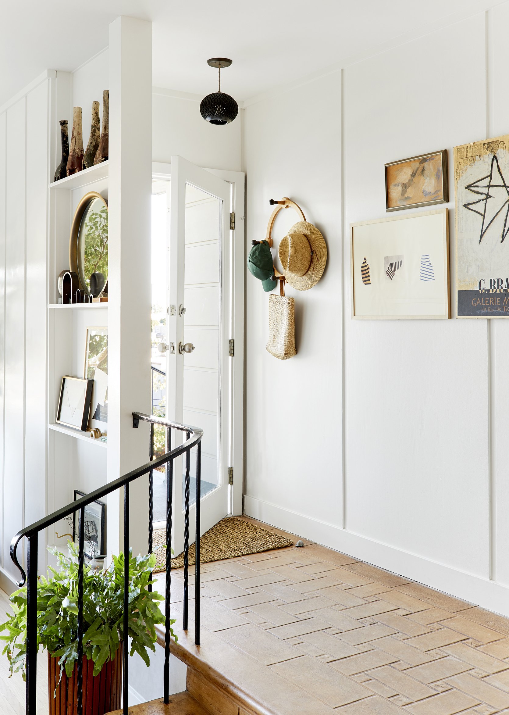
This house was the first space we shot for my second book, and I was actually there to style it (many of the other homes Velinda and Erik did all without me), so there is a weird nostalgia for this space. Feels like a whole different time – living in LA, running a much larger team, feeling hopeful about a book that would go on to take 3 1/2 years to finish … CRAZY TIMES. His space, like his last one, is just so inspiring because his stuff is so cool and it’s just full of creativity. His home is located on the hills in Silverlake (near Echo Park for all you Angelenos) and has incredible lights and views. You walk in and then down to the sunken living room (why don’t we do that more?) and he designed it to be really cozy and bright.
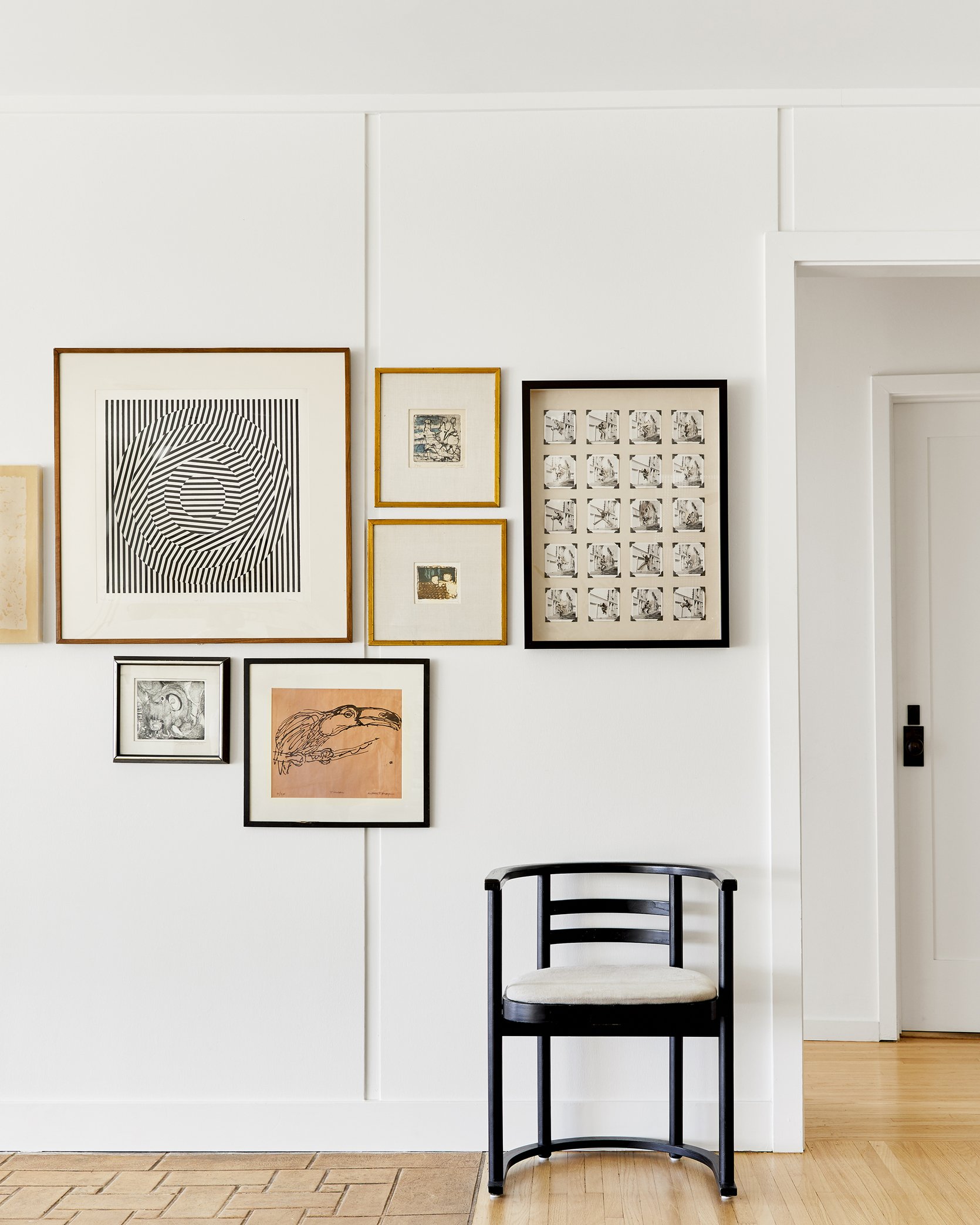
A New Way to Hang An Art Wall We All Loved
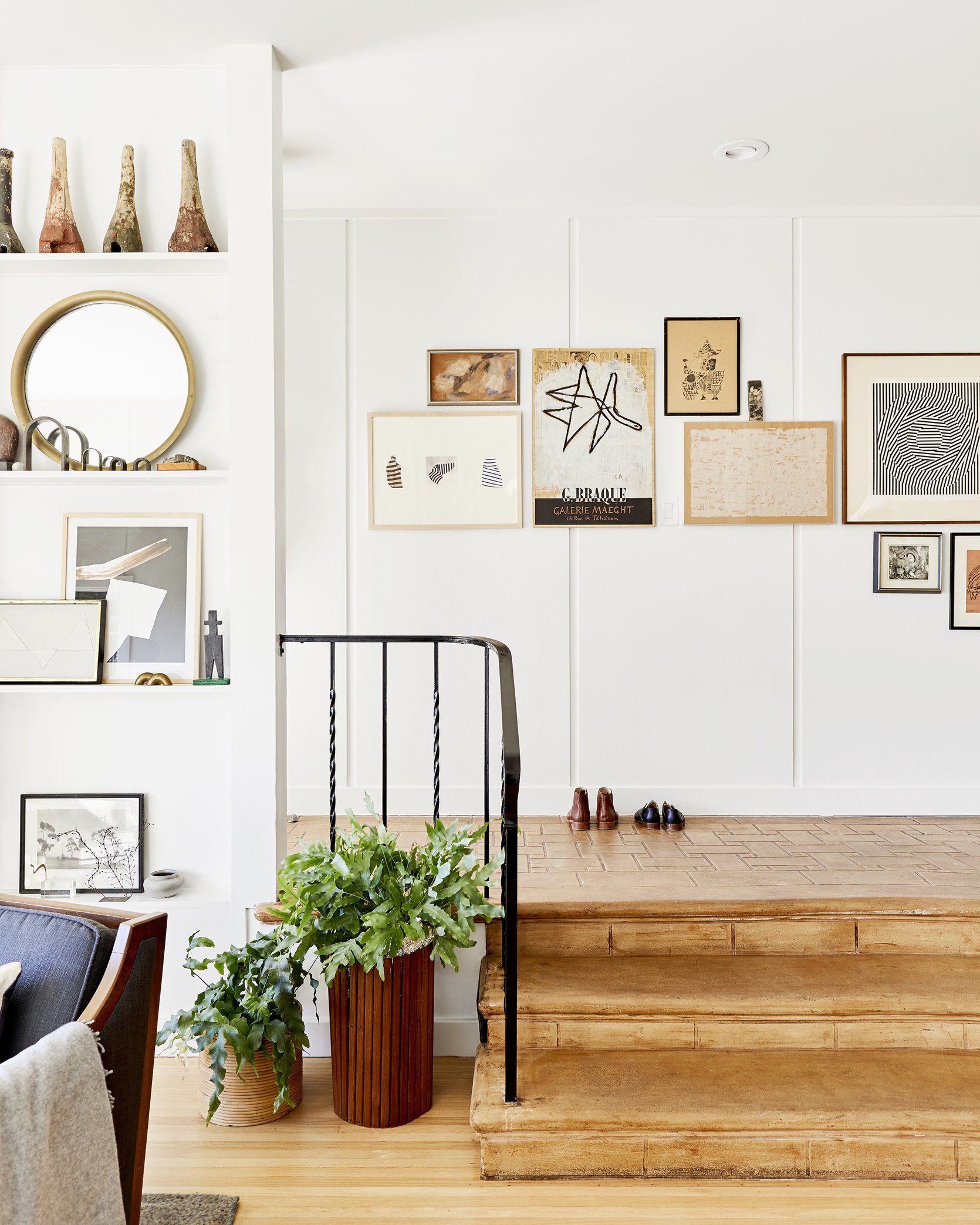
I wanted to call this out his gallery wall, hung in a way I have never done before. He used one median line and then hung up and down from there. So pretty. It’s both organic and structured.
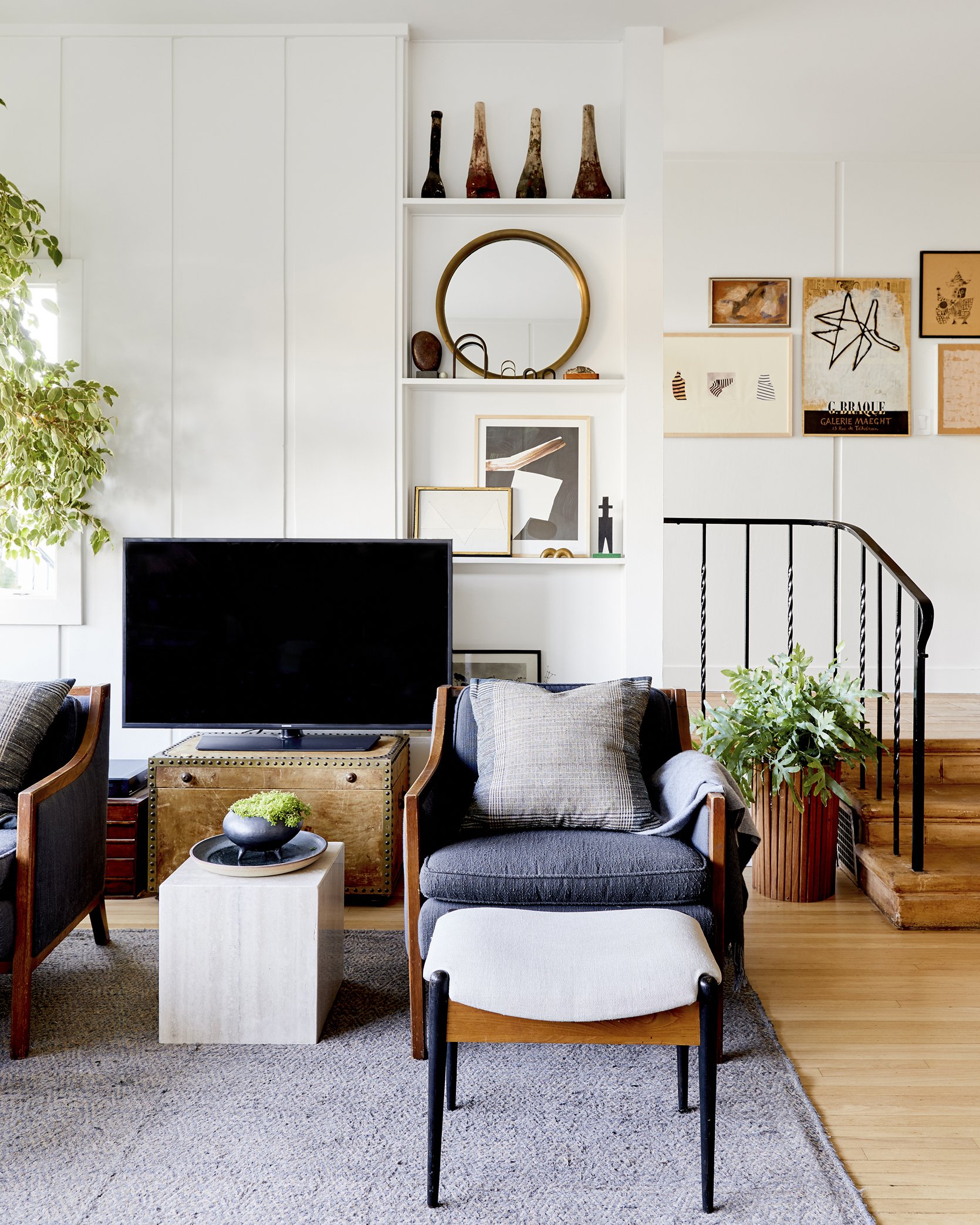
The whole place is a vibe. The blue/gray tones, wood, vintage everything (obviously I’m very into it).
Such a good example of mixing materials and textures, but with a limited color palette.
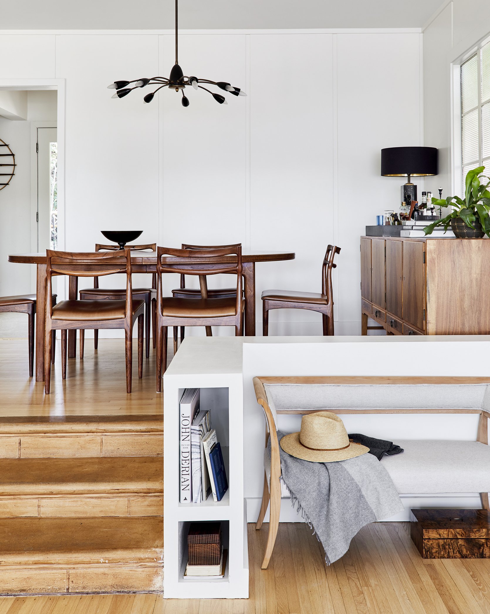
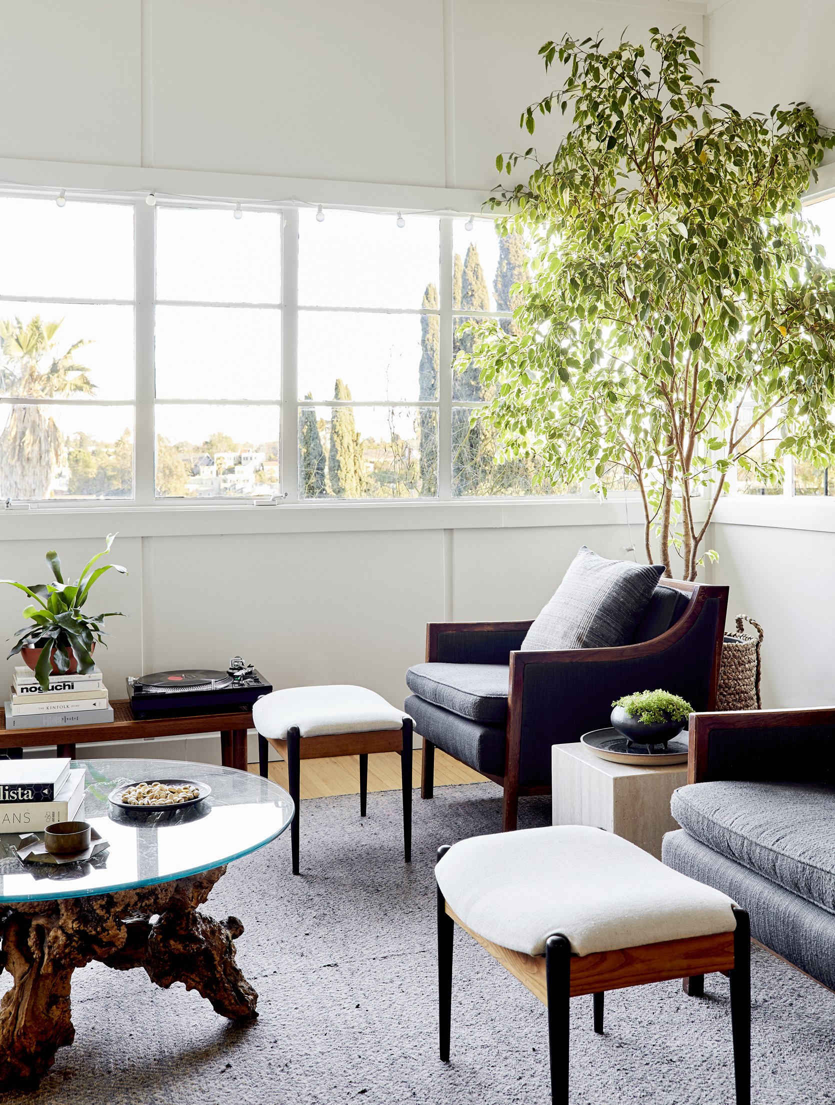
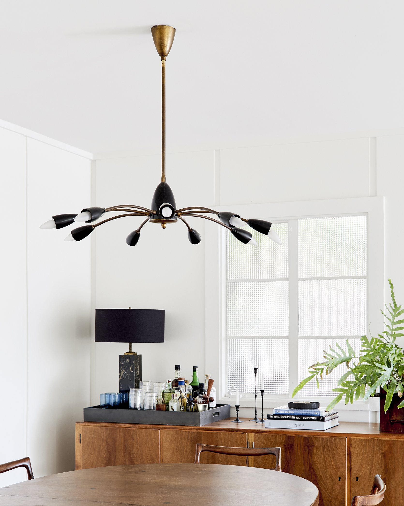
Scott is so good at finding awesome stuff, but more importantly, splurging on the right pieces that last him for years and years – both functionally and stylistically. That dining set (not sure if it’s an actual set) from MidCentury LA is just so stunning. He had to get them refinished and add new leather on the seats, but so worth it.
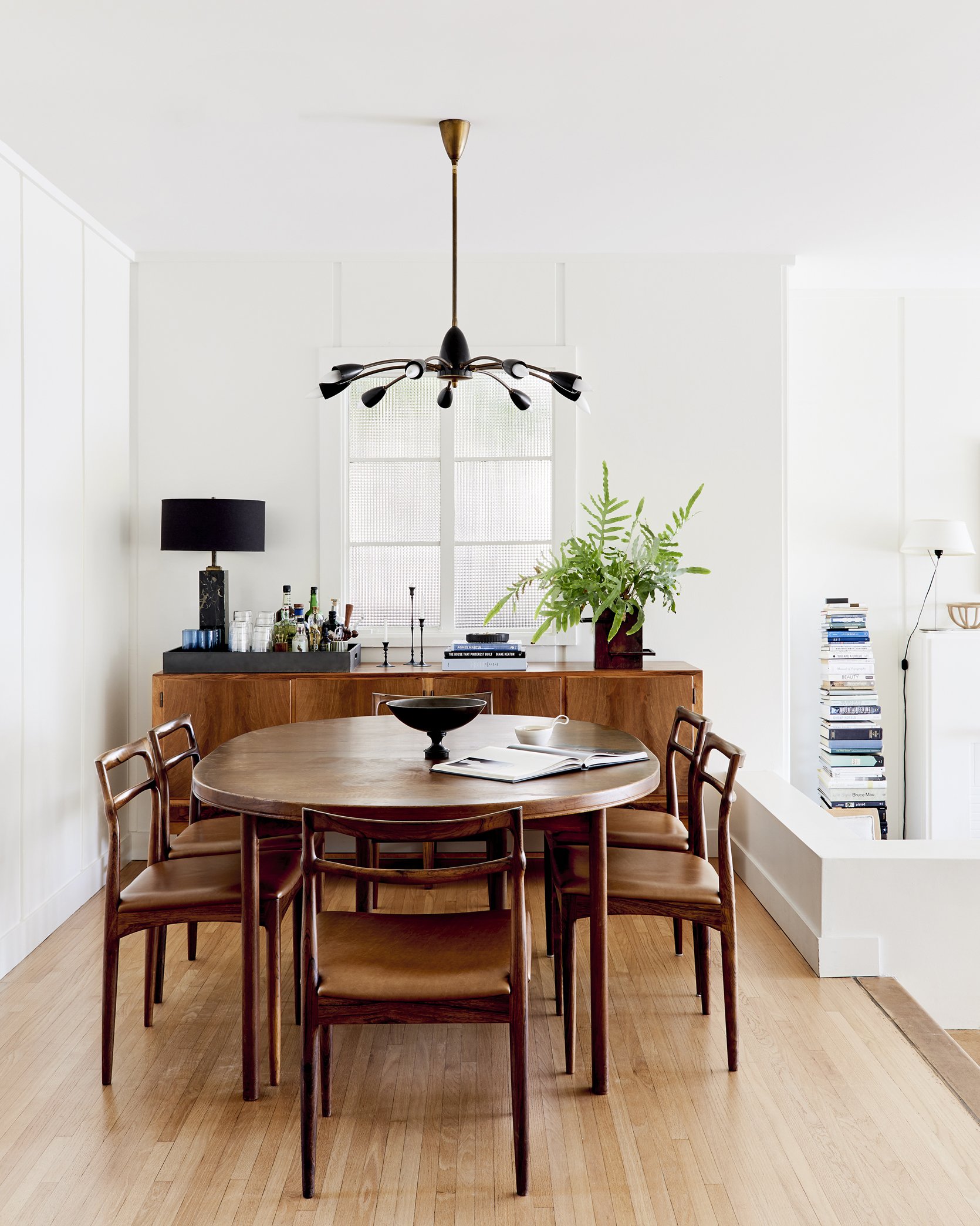
It’s not a dining set you’d see in a magazine right now – it has strong Midcentury vibes, but done in rosewood (not teak) and the scale of it and the shape of the backs are just so pretty. Also, these are so comfortable to sit in. The point is, he finds something he LOVES regardless of how ‘current’ it looks and puts it in his beautiful world.
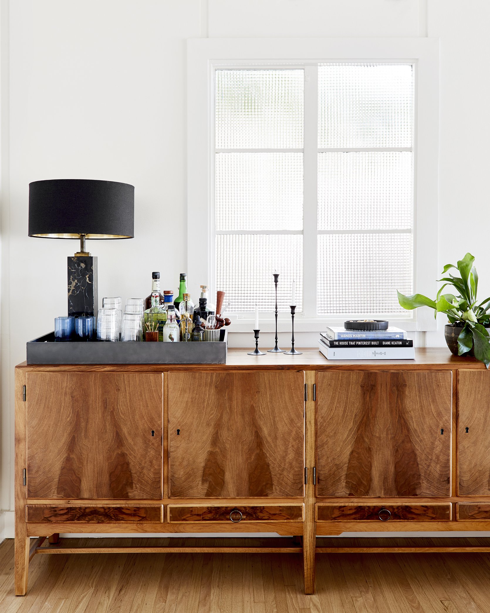
Gah. That credenza!!!! It’s EXACTLY what I want in our sunroom (looking for at least 80″ piece to go under the blimp art I’ve had forever). That wood grain is just nuts (it’s vintage, I think also from MidCentury LA).
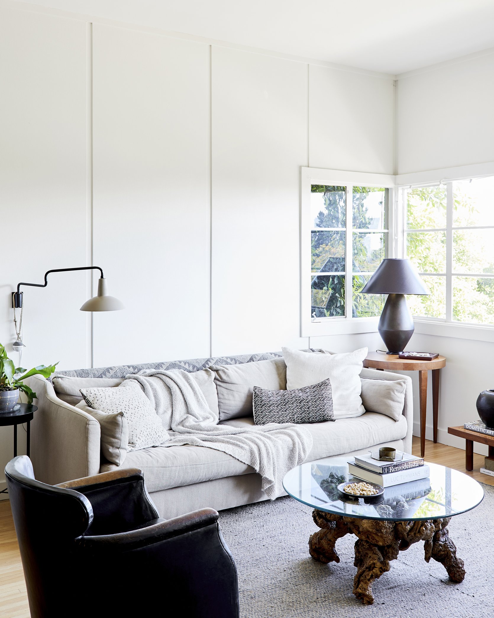
The Bedroom – Airy and Yet Cozy
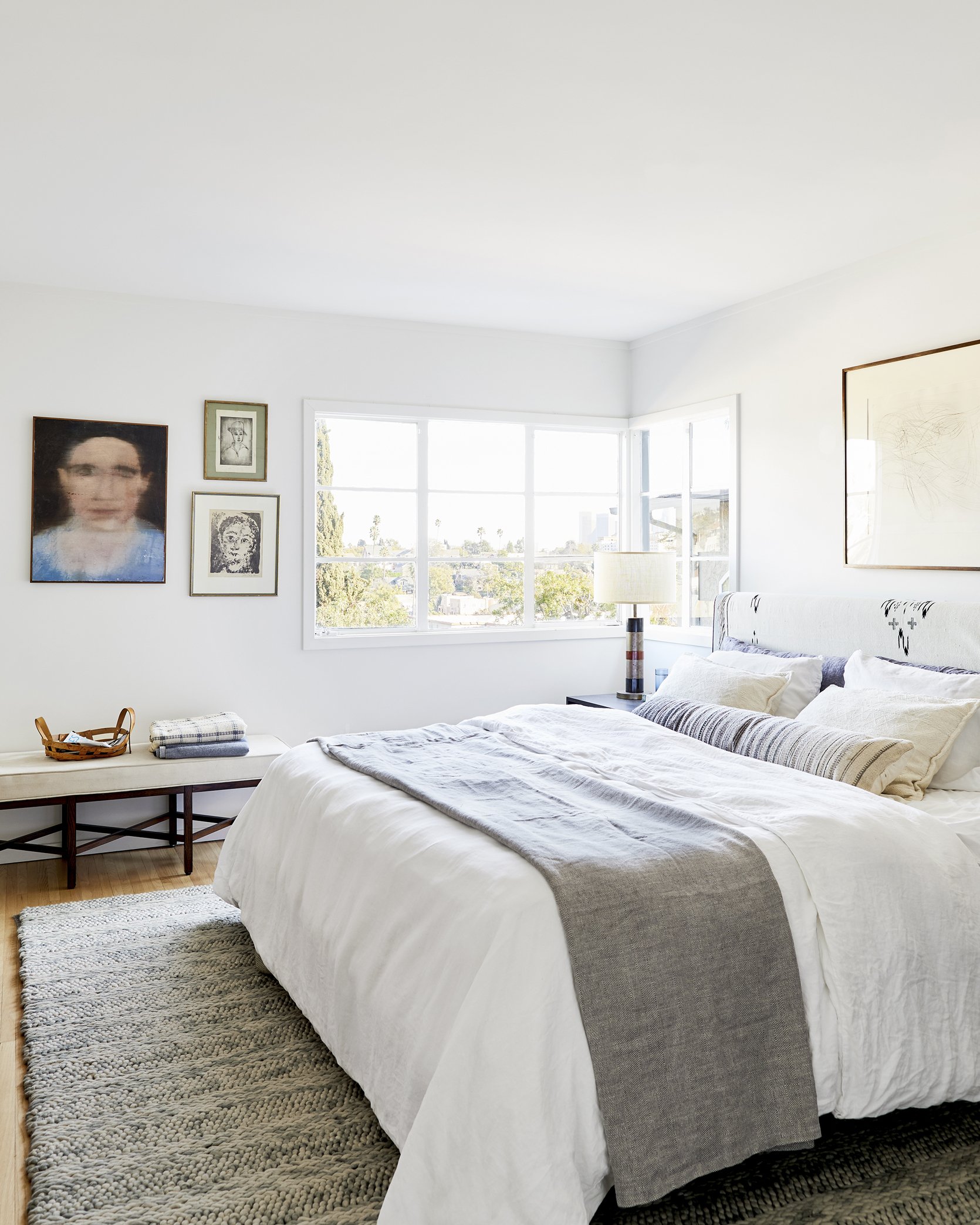
Every stylist loves linen and Scott and I like to fight about linen bedding – I’m firmly against it (on the skin side anyway, fine if it’s on a comforter on the top side). I find it itchy and prefer a percale or even a jersey in the winter. And he is very pro-linen sheets/duvets (he styles most of Parachute bedding catalogs which is why they always look so beautiful).
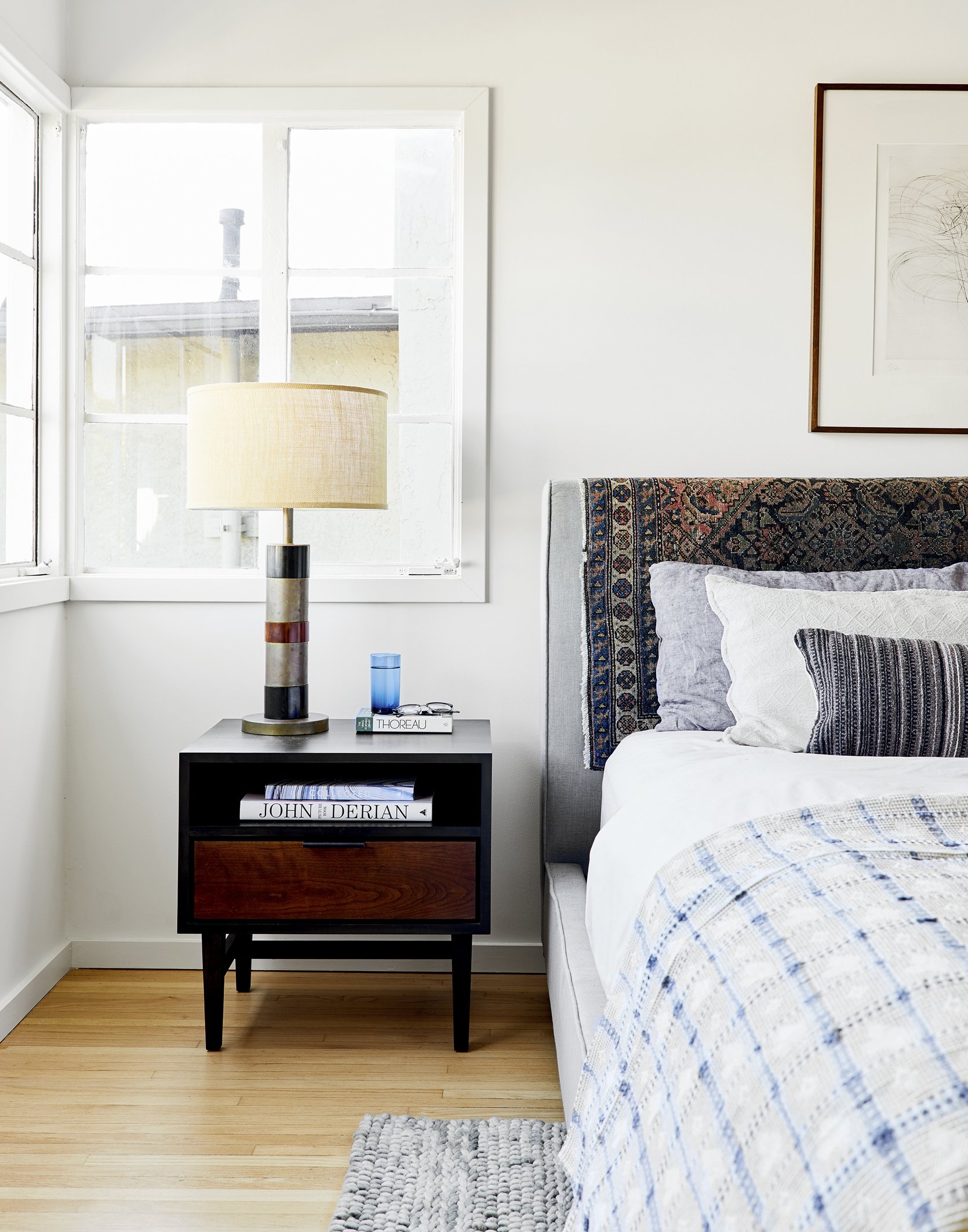
His vintage rug over the headboard hack is always inspiring to me – and one of the reasons we went for a simpler bed for the Farmhouse primary bedroom– so that we could transform the bed with different vintage fabrics (hearts in February, easter fabric in April, etc – JKJKJKJK).
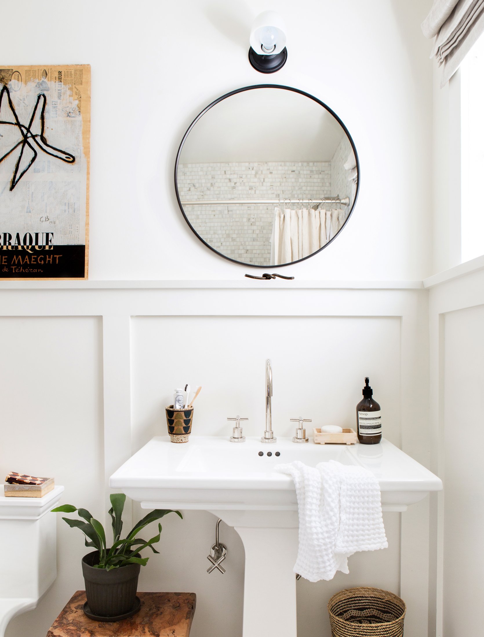
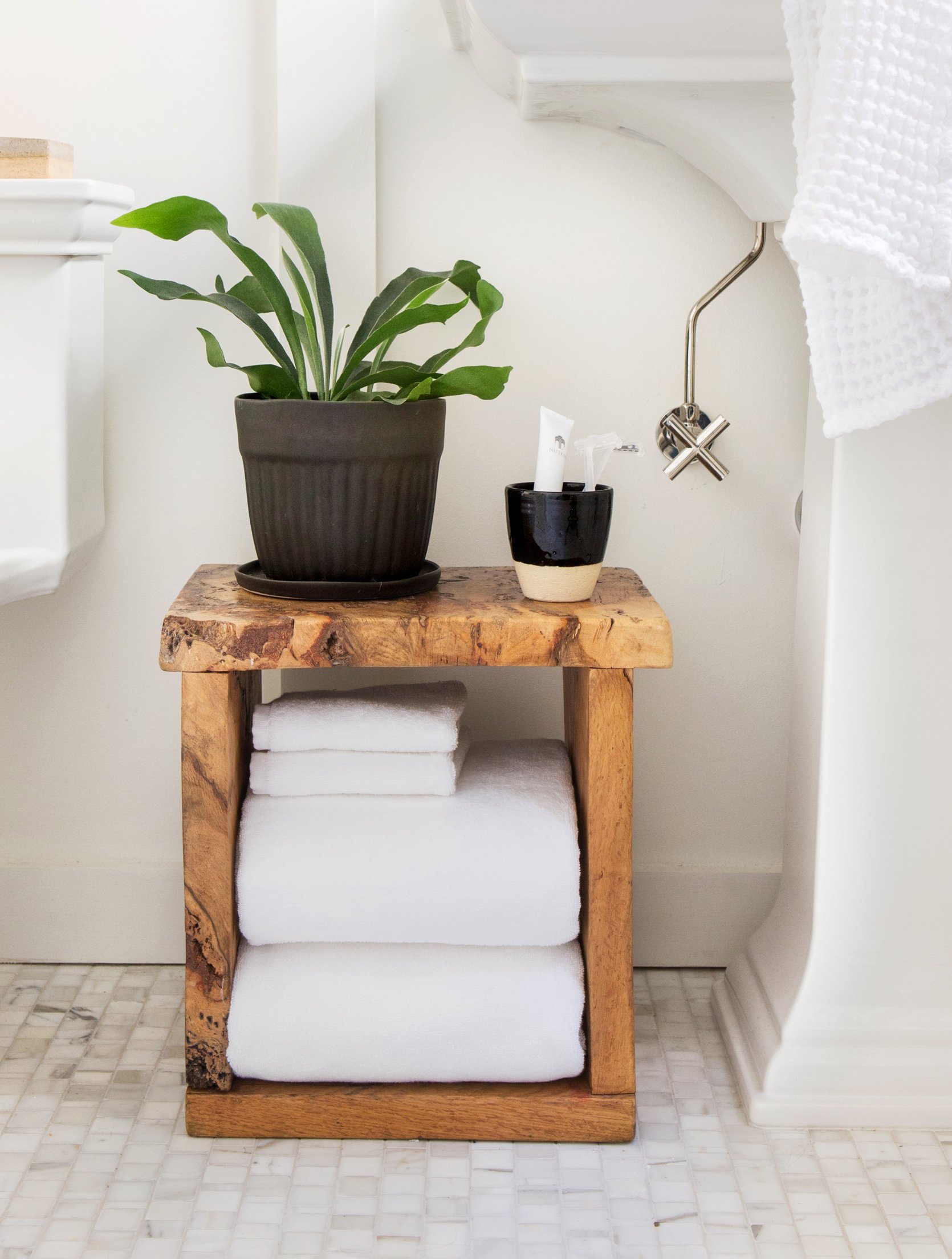
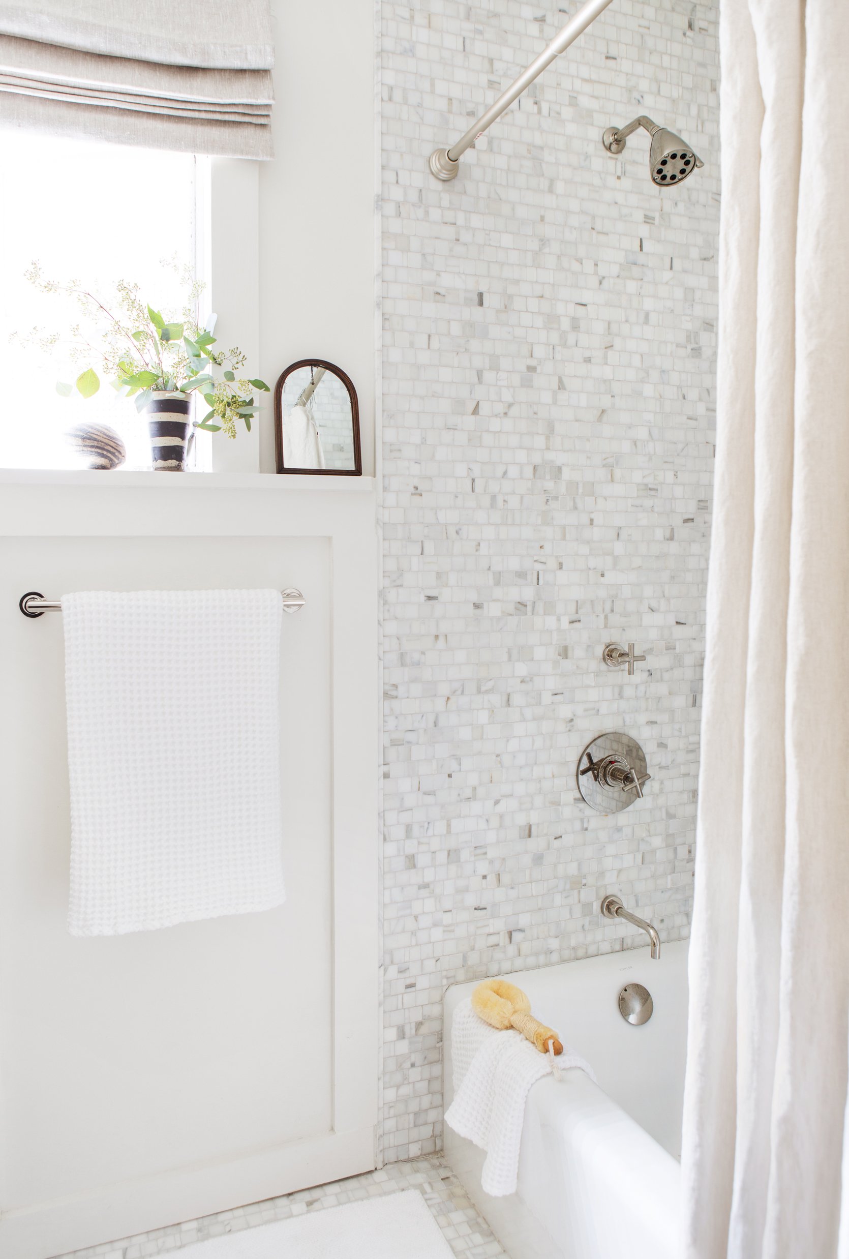
The Bathroom – Neutral And Textured
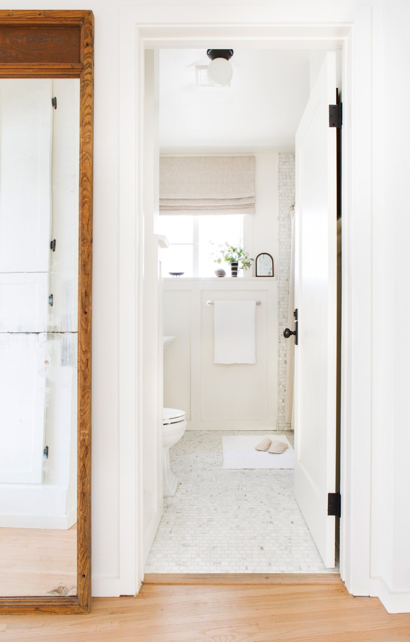
I think we’ve published this bathroom before but it’s just so beautiful and classic. Please note that he hung the roman shade all the way to the ceiling to make the window look as big as possible.
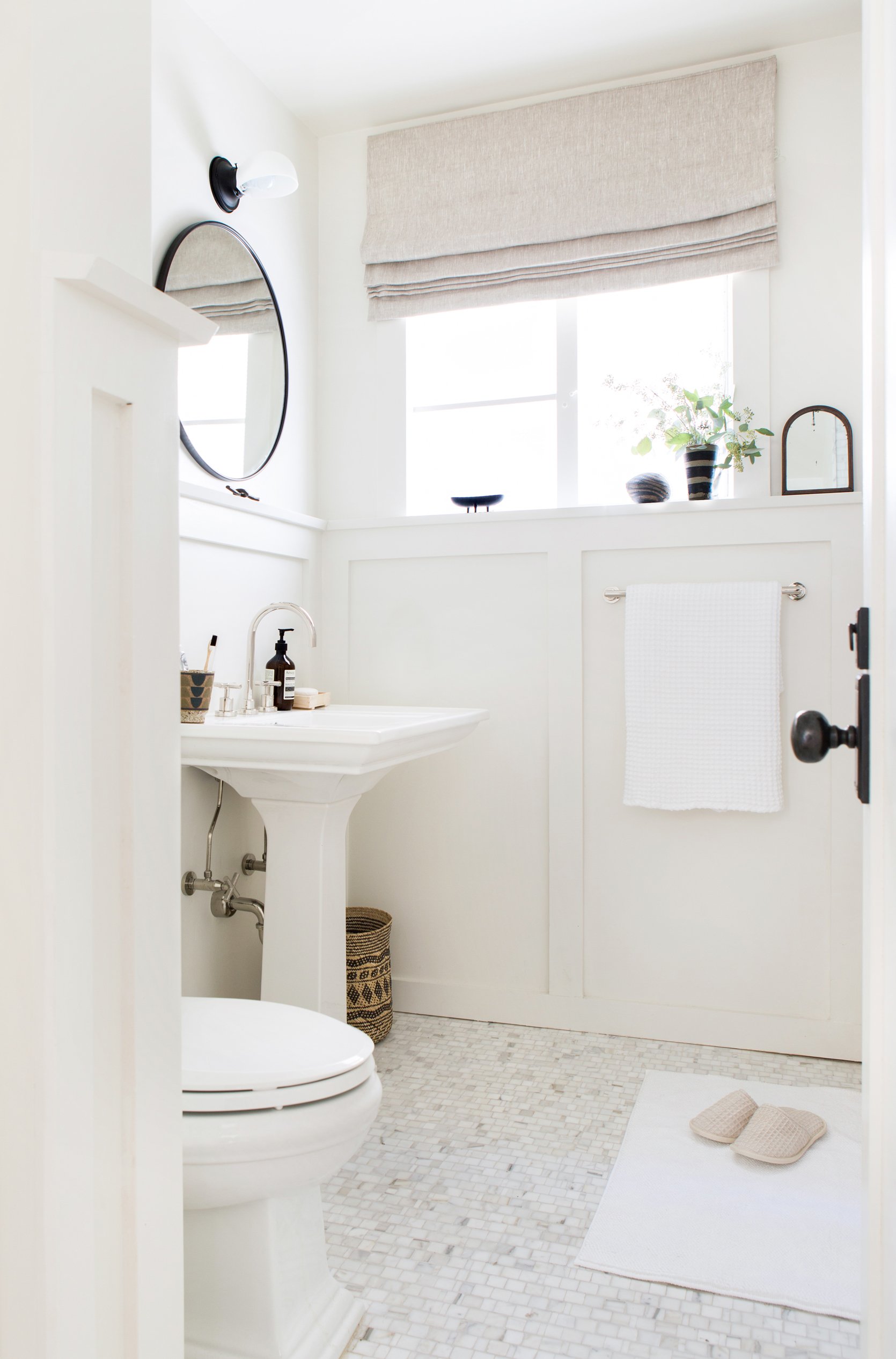
You would think that the white-on-white color palette would be too boring, but with all the variation in the marble mosaic tile, there is a lot of warmth.
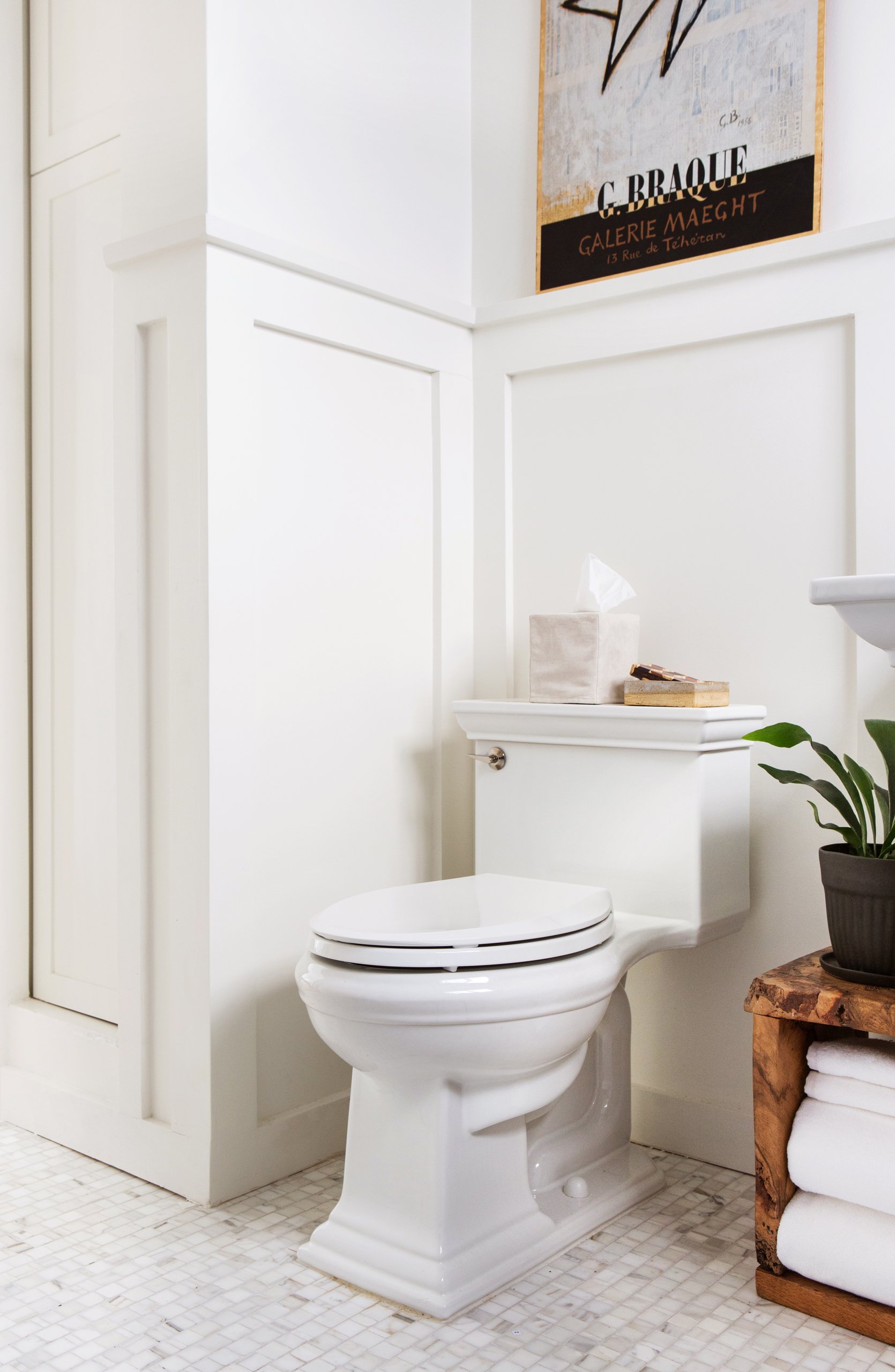
So rarely have we ever taken a shot of a toilet (it’s a thing that magazines or blogs never show toilets) but we shot this when we planned on a huge plumbing chapter in the book and I wanted to show all the different styles and types of toilets. It really is such a pretty toilet, though!
Thanks, Scott for letting us feature your beautiful home. I miss you 🙂
And if you want to pick up the book with more homes like this, feel free to snag it here. xx
*Design by Scott Horne
**Styled by Emily Henderson, Velinda Hellen, & Erik Kenneth Staalberg
***Photo by Sara Ligorria-Tramp
THIS POST WAS ORIGINALLY PUBLISHED HERE.
