Hi everyone! *pops up for air*
I can’t believe how many months have already passed since my last blog post…and even more since my last reveal. Sheesh! I am, however, the consummate multi-tasker; so while I was still in the throes of planning the first–ever Meridian Experience Weekend, we were also finally completing an overdue reno at the hygge ranch – our powder room… a.k.a. washroom!
When we bought the house, we suspected that the washroom was the only bathroom that hadn’t been renovated by the previous homeowners & it was confirmed by our inspection. While working on the launderette last year, I’d actually devised a parallel design plan for the washroom, which shares a wall with the launderette. Unfortunately, we had to take a long pause on that project…and that pause turned into a pivot…and that pivot turned into a hard stop…until this year. Between recovering from the kitchen renovation, unexpected plumbing hiccups, having to reprioritize other home improvement projects, planning The Meridian Experience, and life just life-ing, the washroom kept getting pushed down to the bottom of a long list of must-dos. Instead of fighting it, I just came to accept that the renovation would get done in due time, also keeping in mind that in our first year of home ownership, we tackled A LOT of projects. While not welcomed at first, the forced break was a necessary one.
Fast forward…
Doing the renovation in the background of the conference preparations – albeit messy – was actually a perfect little distraction from Meridian when time allowed. Being surrounded by the uncontrollable chaos of organizing a large-scale event, this mini reno was kinda comforting by comparison. Both were necessary. Both were a test of patience. And both were perfect illustrations of how you can accomplish a lot with a little.
Now let’s get into the design…
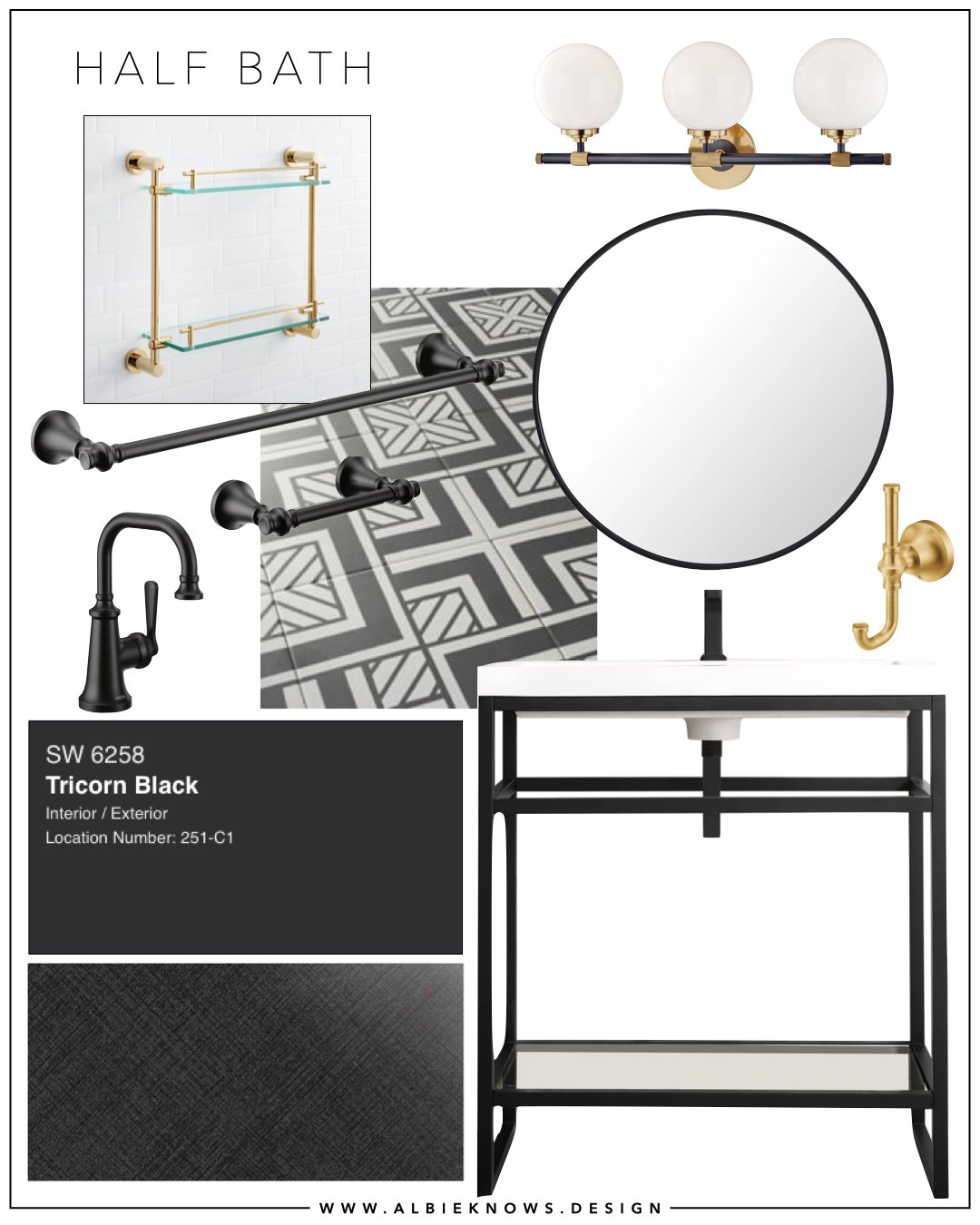
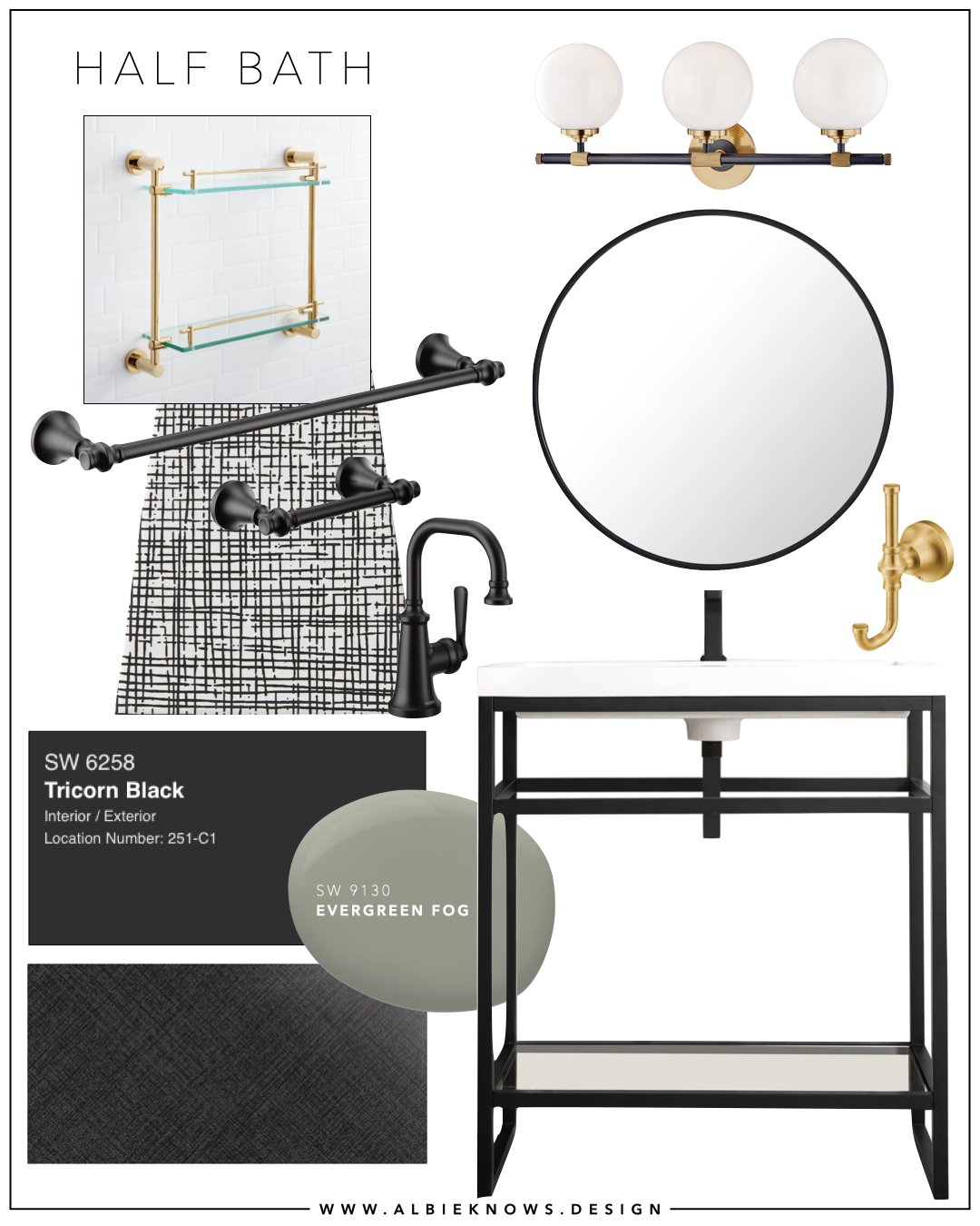
The design plan was set – so I thought lol – and the only concern was what we’d find behind the walls, specifically the shared wall with the launderette. Plumbing & electrical can be tricky & unexpected, and we’re not professional plumbers or electricians. I should note that we didn’t have any plans to hire out this project… not if we could help it.
As with the launderette, I partnered with The Tile Shop and Build with Ferguson for all of the finishes for this 5’ x 5’ space. There are renovations that are a need, while others are simply a want. This was definitely more want than need, since the bathroom was completely functional…just not pretty.
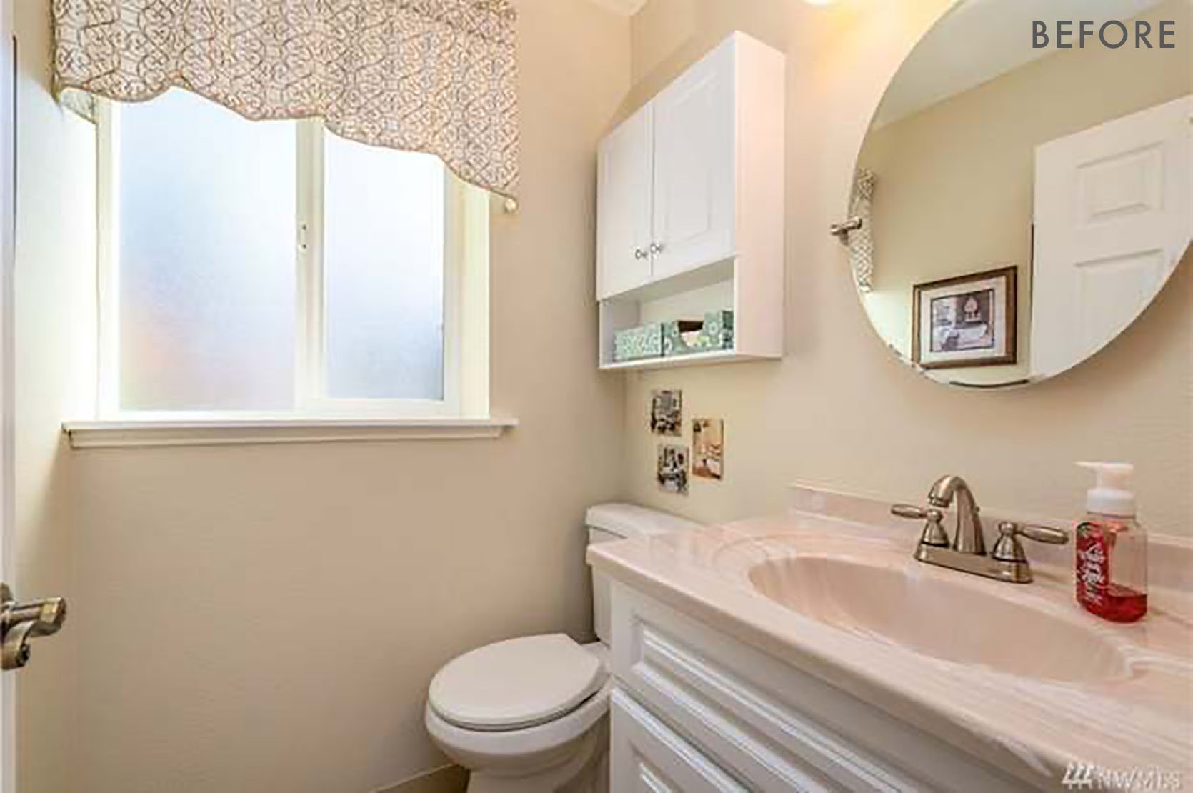
Top of mind for a space this size is how to optimize, not increase, the square footage. This meant deciding to keep it as a 2 piece washroom. We would be keeping the existing toilet – although now I’m rethinking that decision but more on that later – and replacing everything else…
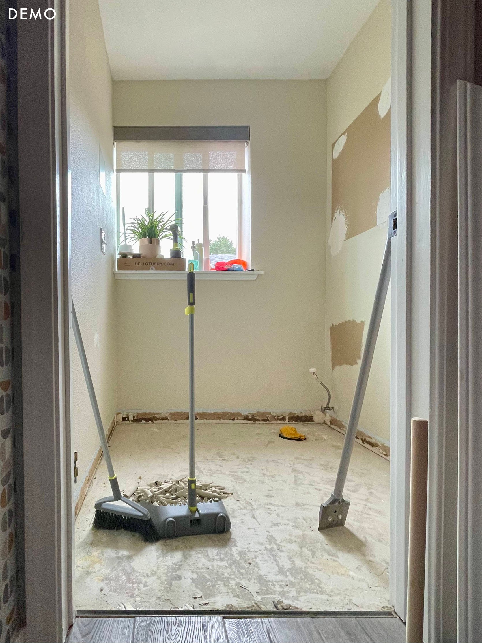
The To-Do List:
- Flooring
- Paint
- Window Treatments
- Sink
- Lighting
- Mirror
- Hardware
- Storage
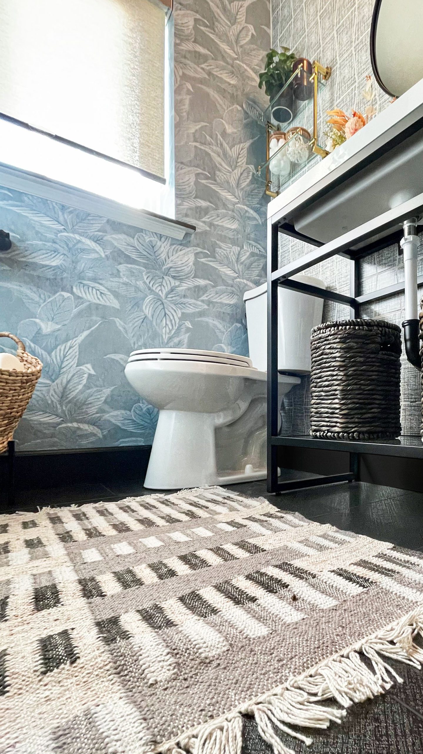
To transform the dated powder room into a sleek & modern washroom, I went with the same color story as the launderette with subtle luxe finishes, including the same Harley Lux Black 12 x 24 porcelain tile for the flooring.
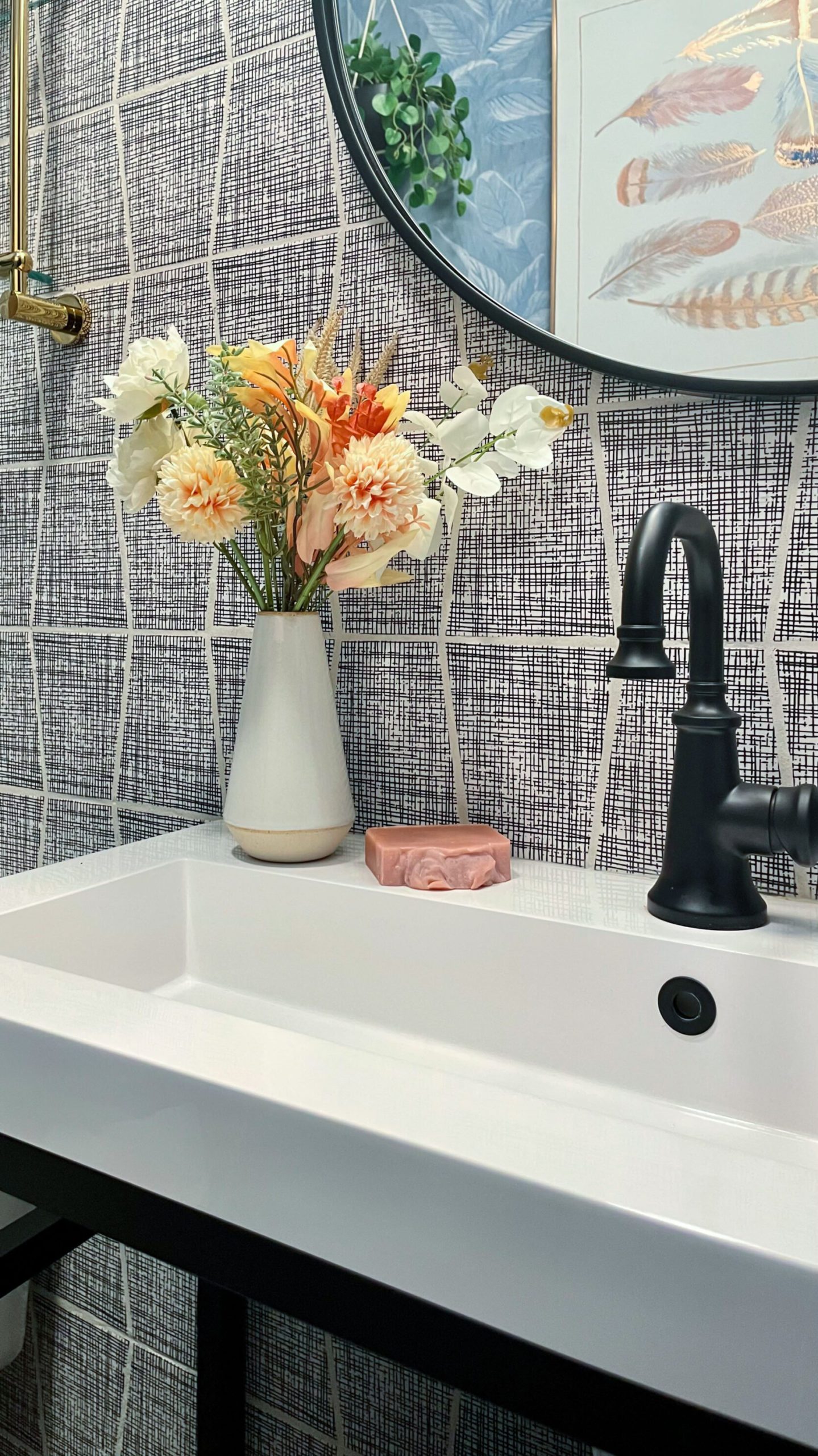
On the plumbing wall – the full wall – we used a deco-inspired black & white porcelain tile. This design choice allowed me to make an impact without overwhelming the tiny space. I went back and forth on whether or not to carry the tile around the entire bathroom, and we ultimately decided to stick to the one wall. This is a decision that, like the launderette, we can always change our mind about later – it’s much easier to add tile than to remove tile.

The remaining three (3) walls – the door wall, the window wall, and behind the door – were slated to be painted Evergreen Fog SW 9130, the Sherwin-Williams 2022 Color of the Year. With paint shortages left & right, we decided to just finish up a can of paint of the same color from the launderette to keep the reno rolling along. This was a compromise I could live with that would, ultimately, end up paying off.
After having tiled the launderette & kitchen, my husband has become a lot more comfortable with DIY tile installation. It really is one of those things that the more you do it, the better you get – practice doesn’t make perfect, however, it does allow for progress & improvement. Already knowing that our old house has some less than perfect walls, the isosceles trapezoid shape of the tile turned out to be way less intimidating than we anticipated, also creating very unique grout lines. With the backsplash wall being the wall requiring the most cuts to accommodate the plumbing, the process went a lot smoother than anticipated.
The most challenging part of the process turned out to be the plumbing itself – zero stars, do not recommend. Is DIY plumbing difficult? That’s relative. Is it annoying? Absolutely. Tack onto that the age of this bathroom, and it becomes a downright pain in the neck. Plumbing lines that weren’t securely installed, off-center fixtures, rotted innards…all very gross & annoying, and still, very doable because we (and by “we” I mean “he”) did it. Okay, so maybe one star.
You know what’s almost as annoying as plumbing in an old house? Electrical. In the washroom, we updated the vanity lighting and overhead lighting with a vent – both equally challenging and culminating in the vanity junction box falling clean outta the wall one day. That was a sharp reminder of the potential deficiencies of tackling some renovations without the help of a professional tradesman. In our case, the issues were reparable with a few quick trips to The Home Depot for more updated lighting components, including a new exhaust ducting kit, j-box for the vanity, and GFCI outlet.
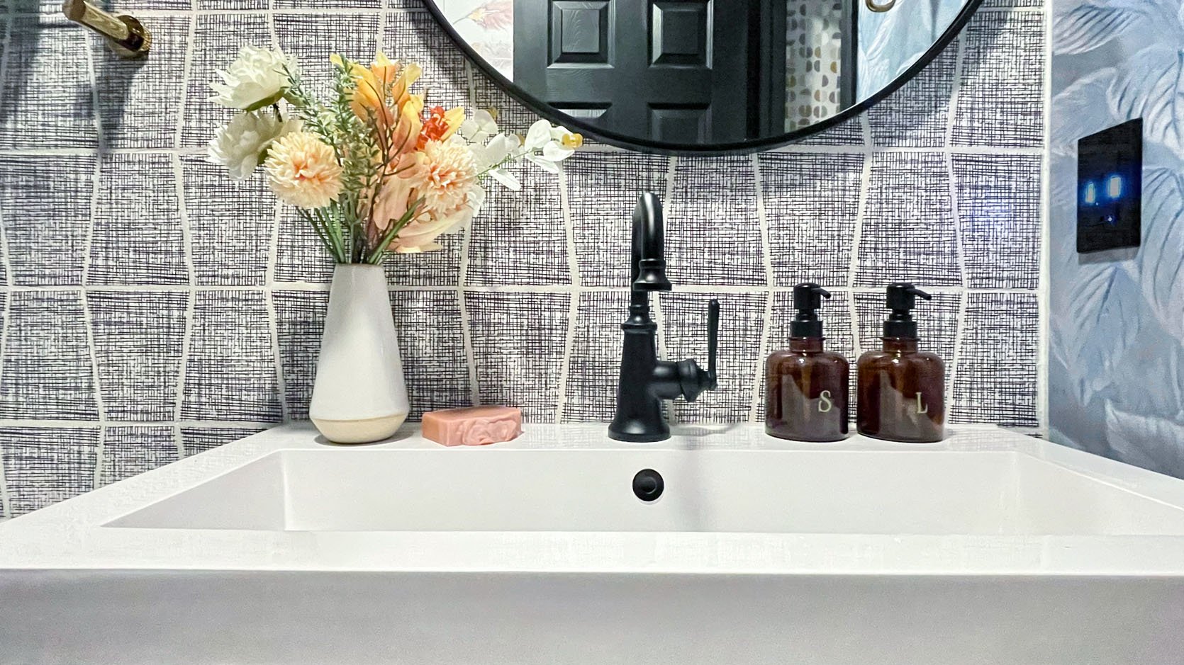
Wall Tile (unavailable but here is the same shape) | Faucet | Faux Flower Arrangement | Amber Glass Dispensers | GFCI Outlet
Now that we’d completed all of the major problem-solving, it felt like we could begin to breathe again. You ever reach a point in anything you’re working on – a renovation, a term paper, a work project… whatever – and you take a step back thinking you’re finally done, only to look at it and think “mm… not enough”? No? Just me? Well, that’s what happened here. I stepped back, looking at what anyone else would call “complete,” and just knew something was missing.
Maybe it’s the recovering perfectionist in me talking.
Maybe it’s the anxious procrastinator in me talking.
Maybe it’s the imposter syndrome in me talking.
I don’t know whose voice it was. I just know it was loudly screaming at me that this space wasn’t ready for public viewing yet. Two things jumped out the most – the walls needed to make more of a statement and the toilet needed to be black.
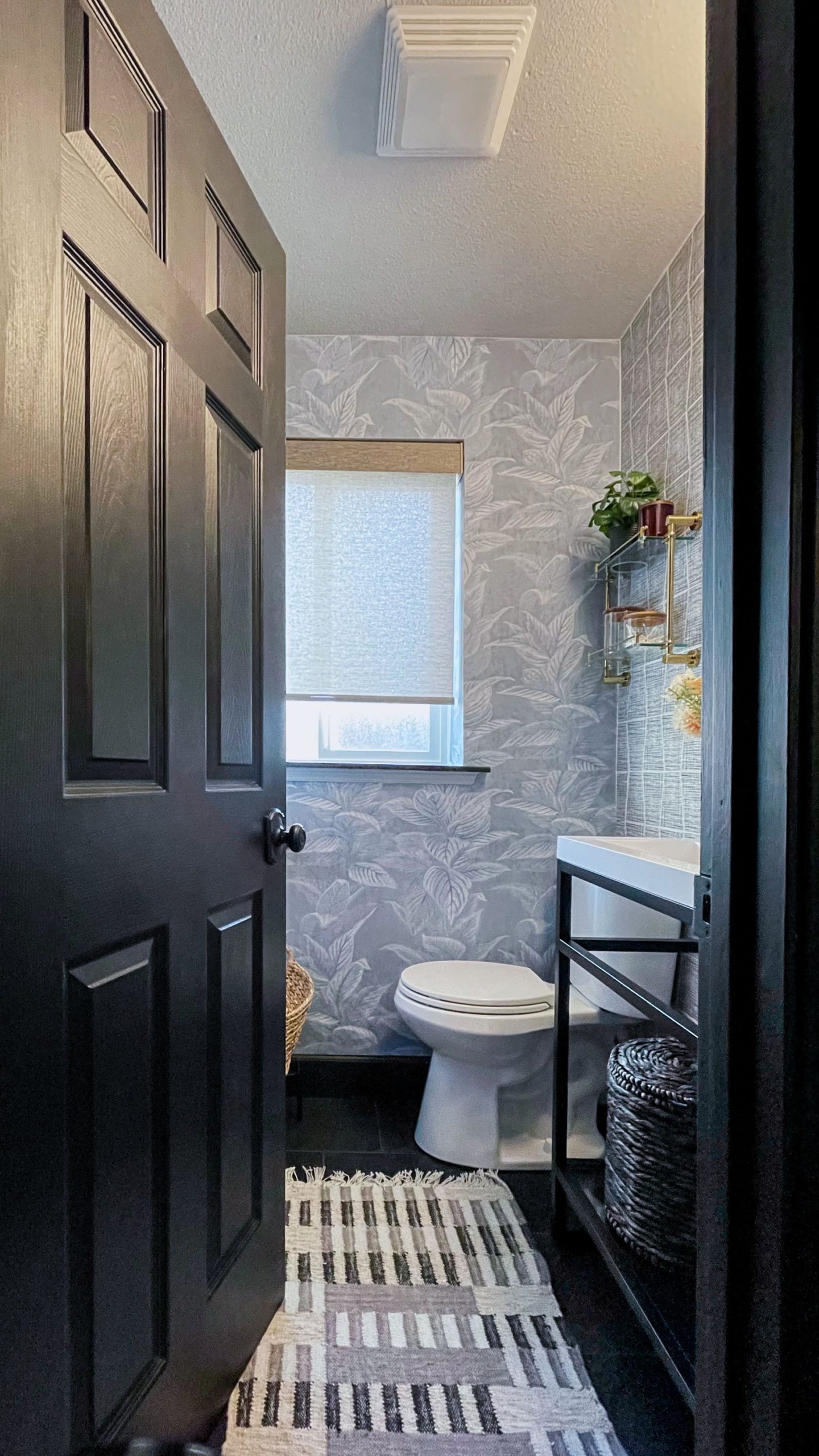
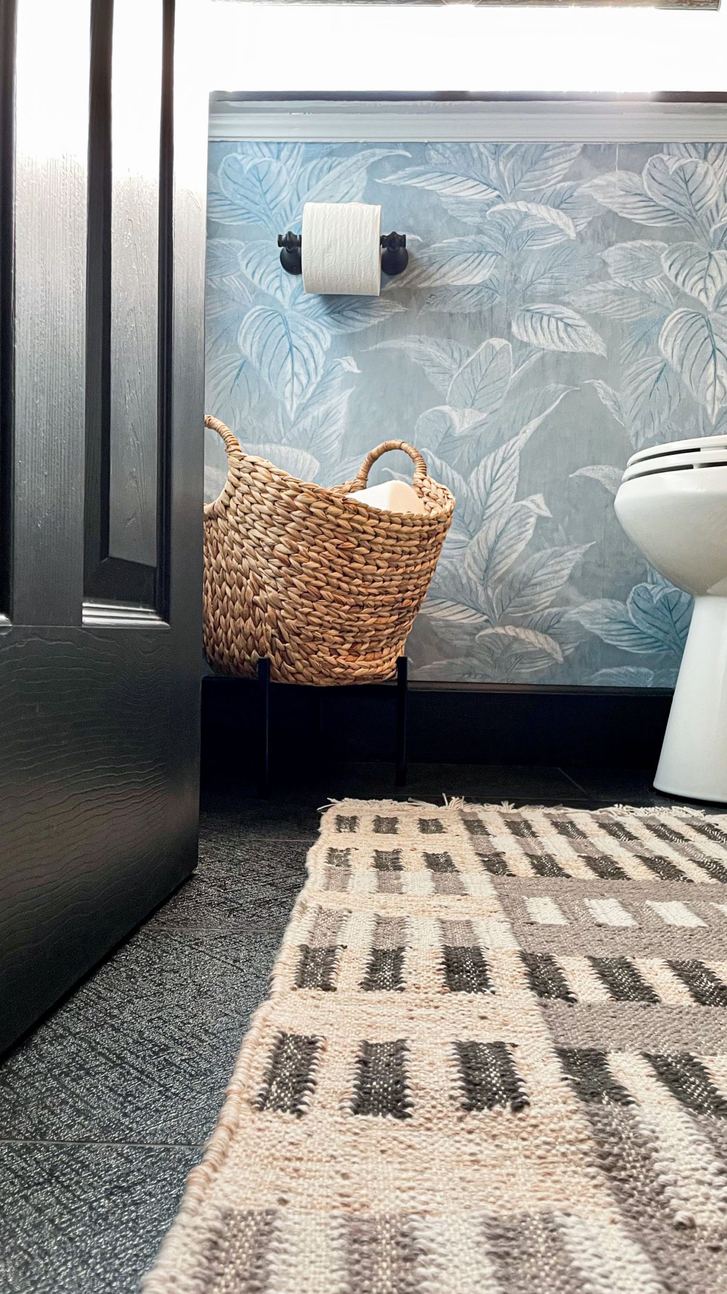
Door Color | Door Knob | Peel and Stick Wallpaper | Floor Tile | Rug | Console with Sink | P-Trap | Black Woven Waste Basket
A black toilet would serve two purposes – aesthetically, it’ll provide a continuity of the bold drama of the floors; and functionally, a slimmer, elongated style will be a better fit (literally) for the space. While it was too late for me to do anything about a toilet – risking a 2023 reveal lol – I could absolutely do something about the walls. Earlier this year, I’d gathered peel & stick wallpaper samples from Tempaper specifically for the washroom…just in case. Those instincts paid off. One of the samples was the exact punch this tiny space needed to bring everything to finally feeling like actual completion.

Roller Shade (Lisley in Bronze Sheen, Semi-Opaque) | Toilet Paper Holder | Floor Basket (Similar)
The juxtaposition of the cool wallpaper from Tempaper and bronze sheen of the roller shades from Decorview was an illustration of how a design can be delicate & dignified, with just a little bit of unexpected whimsy… a total metaphor for my life by the way.
Even with all of the delays and such, my hygge-inspired design ethos never wavered.

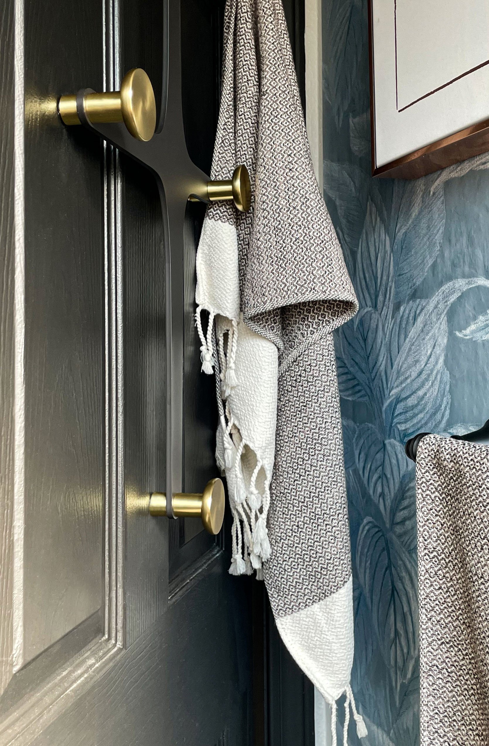
Toilet Lever | Mirror | Single Hook | Wall Towel Bar
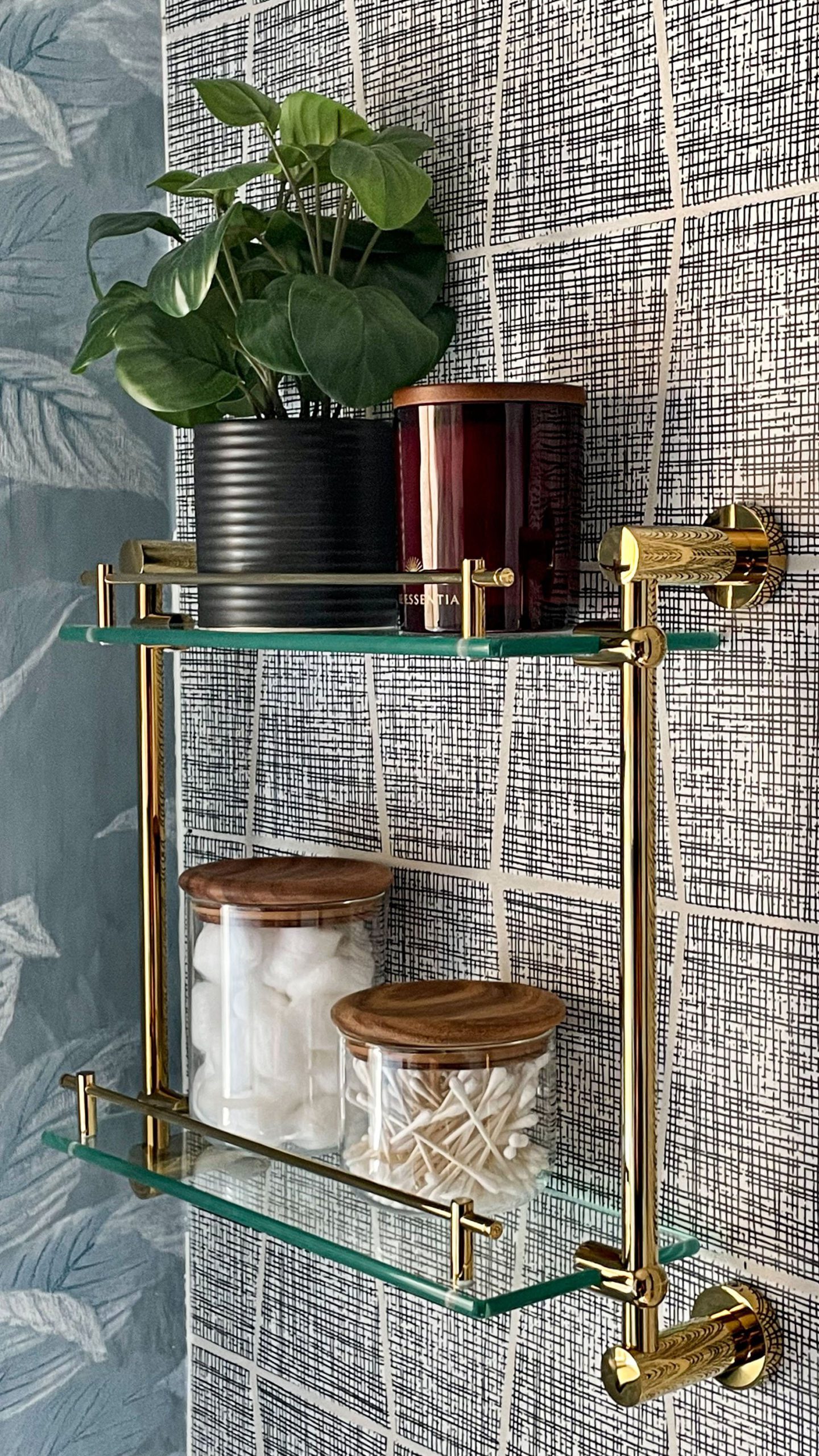
I look at the washroom and it reminds me of my living room reveal from almost 2 years ago. The Cloud Velvet sleeper sofa always catches people off guard, in the best way. It doesn’t take away from the hygge-inspired design elements. It doesn’t take away from the modern luxe elements. This is what I strived for in the washroom. Moen hardware introduced a combination of matte black & brass hardware, much like the vanity lighting from Hudson Valley Lighting, for an effortless luxe combination. Textures – like the textured rug from Rejuvenation – and warm hues of brass & amber punctuate the entire design so that, like the rest of the hygge ranch, everything just plays together nicely. Also, like the rest of the hygge ranch – stylish storage solutions.
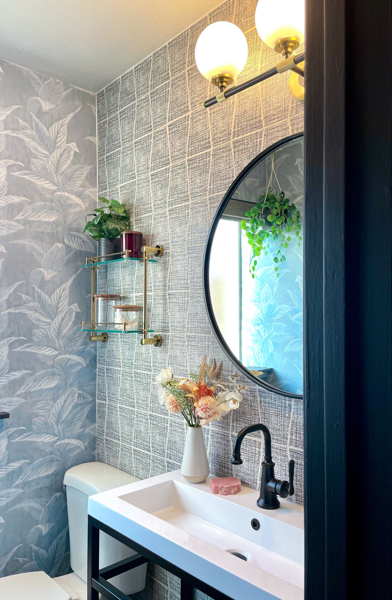
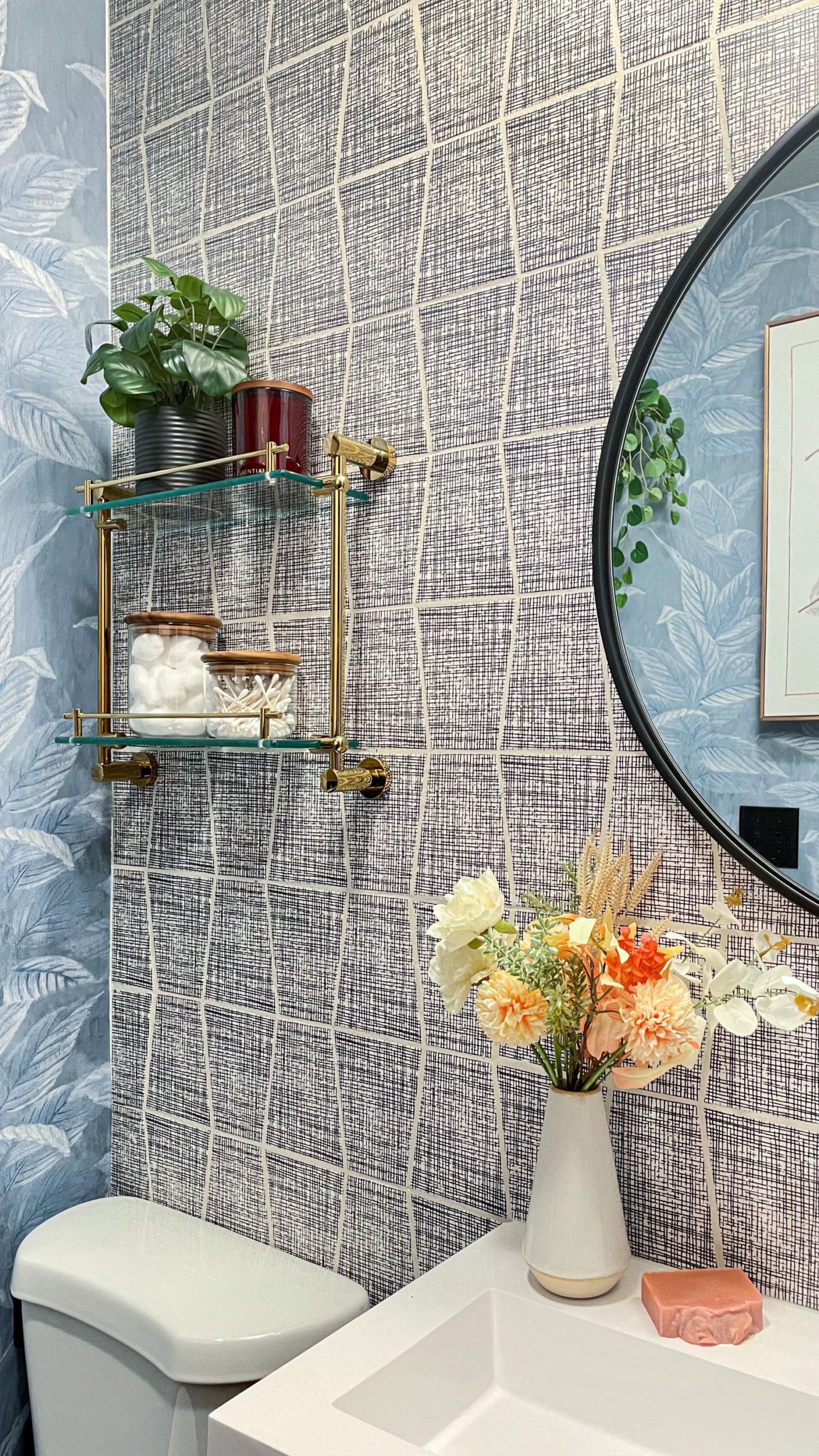
Vanity Light | Wall Shelf | Glass and Wood Canisters | Candle
At the top of the post, I talked about how this project paralleled The Meridian Experience Weekend… however, it wasn’t just in the timing. When I look at Meridian, I see a culmination of circumstances that don’t seem like they’d make sense together, and yet, in the end, I created an experience that was – wait for it – both delicate & dignified.
The completion of the washroom also means the completion of our home’s “must be nice” spaces. In case you saw my media room reveal last year, then you know it’s one of the spaces I dubbed as “must be nice” spaces – media room, launderette, flex lounge, and now…the washroom. This part of our home is where I designed all of our “luxury” spaces… more than just the creature comforts of our bedrooms, living room, kitchen, etc. These are the spaces that carried me through all of the turbulence of this year. This is where I freshen up after a quick workout in between work tasks. This is where my husband washes his hands & face as soon as he comes in from work. This is where the mini cleans up after creating her latest masterpiece. This is where we take bathroom breaks during movie nights. It’s our washroom.
I learned a long time ago, when things are seemingly going wrong, fighting against it is futile. Things are happening the way they happen to teach me something or lead me somewhere. Allowing for everything to transpire as it did, however, got us here and I’m happy with here. And I’ll eventually be even happier with my black toilet:)
I always try to wrap up every reveal with some sort of takeaway…more than just the design. The takeaway here is that no matter how big or small, to continue creating a home that can bring you joy when the world is unkind, will grant you peace when life is a little hectic.
*Design by Albie K. Buabeng
** After Photos by Ellie Lillstrom
THIS POST WAS ORIGINALLY PUBLISHED HERE.


