If you’ve followed for a while (thank you:)) you know that I have a probably-not-so-unique condition where my job and life create a lot of “stuff” (not begrudging it, these are the facts), but my heart/mind/eye can’t stand clutter. I like a clear unstyled countertop, a single long throw pillow on my bed, and dedicated closets/rooms to throw the mess and pretend it’s not mine. It’s part cognitive dissonance, part denial, maybe some ADHD tendencies, and definitely a byproduct of my job. Containing the mess just makes it manageable. Today, I have for you our styled-out, non-messy version of our pantry and I’m SO excited to walk you through it.
So where is the pantry?
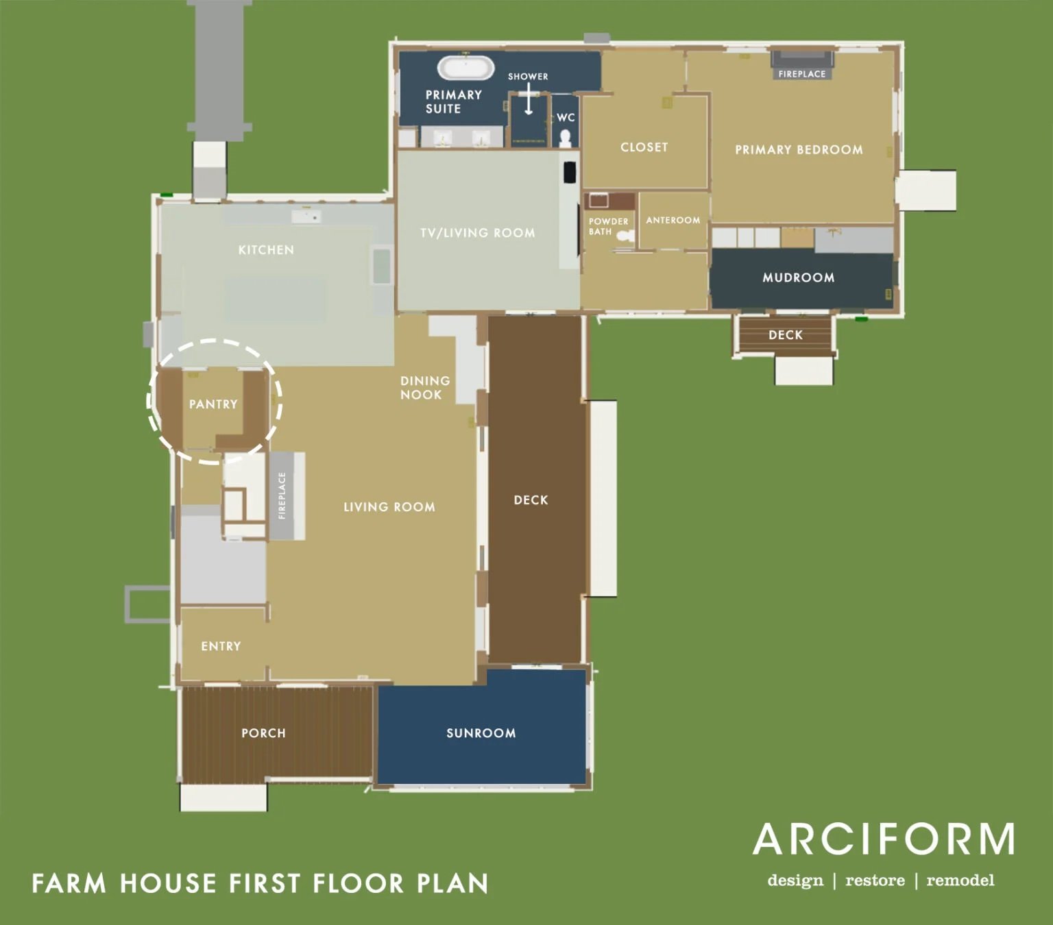
As you can see we created this room from the old kitchen, carving enough space to make it really functional.
Here’s a fun video to give you a real sense of the space before we get into the pretty photos! (Just wait for the ad to play:))
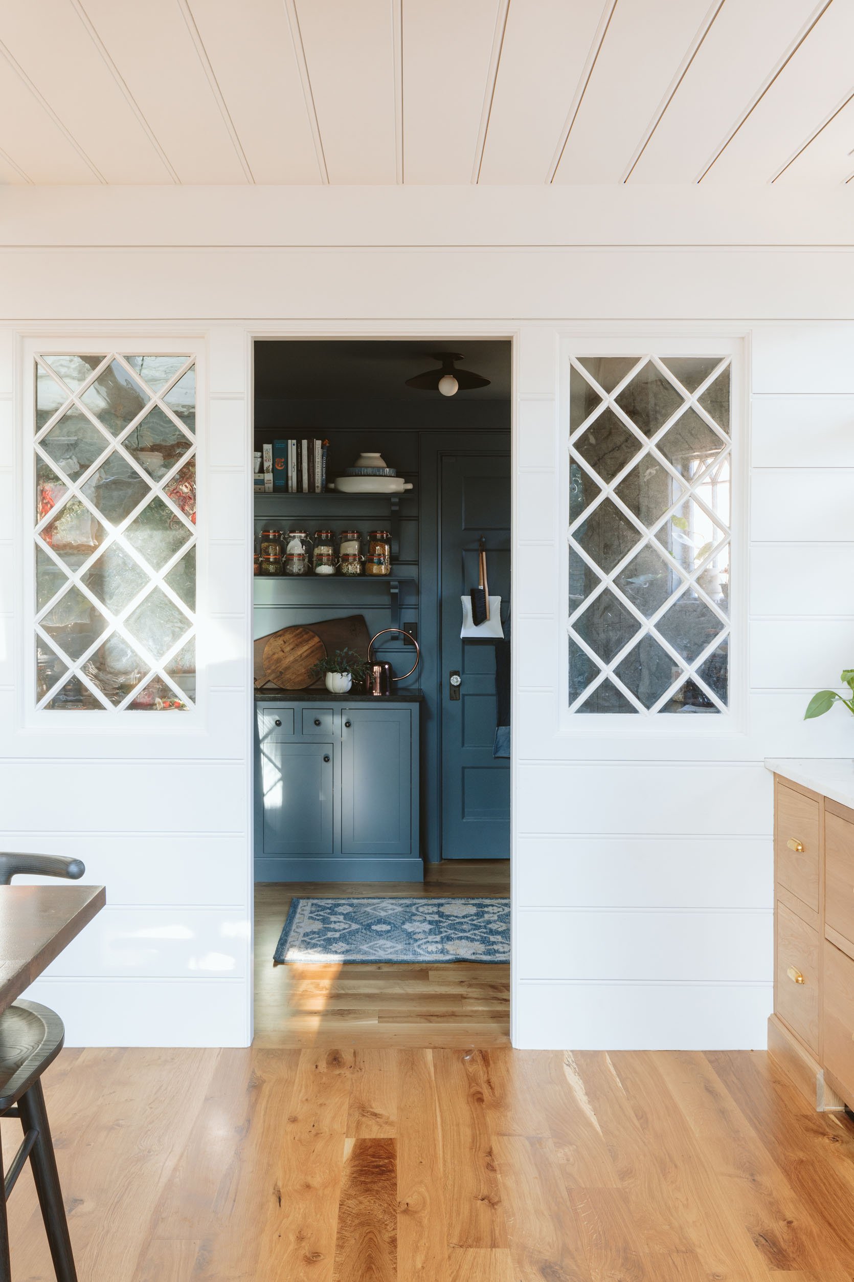
This is the first time that we’ve had a room for kitchen storage, and it’s obviously a luxury that is at the top of my gratefulness journal every day, y’all. I personally think it’s worth having a smaller kitchen if you can create a room to throw all the other stuff (I feel the same about a smaller bedroom + larger closet). This room is right off the kitchen, obviously, and after arranging and rearranging based on our needs, I finally put everything where it can go, while also giving myself some visual happiness. So much to say. Where to begin!!!!??
How Do We Use This Room?
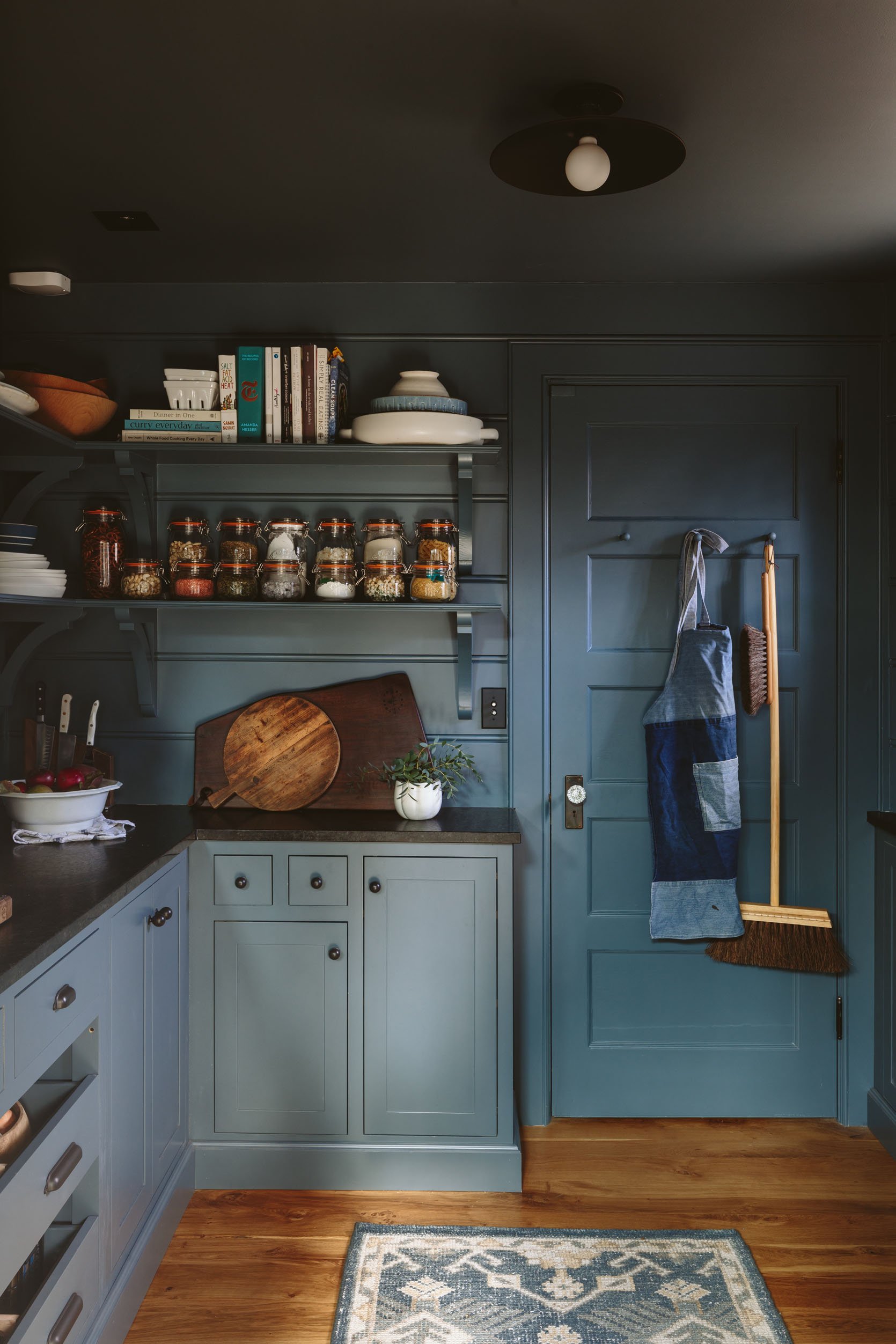
This room is 75% storage and 25% coffee/tea prep. While I used to think that we would use the tabletop appliances in here, I tend to bring them into the kitchen (besides the toaster). I think this is because the kitchen is just so wonderful to cook in so if I’m blending a soup, I bring the blender out, not the soup in. That’s all to say this is not a prep kitchen, it’s for food, cookware, utensils, cookbooks, countertop appliances, and coffee/tea.
We also have not figured out where the kid’s school stuff should go (papers, so many papers). So often this becomes the mail drop and kid clutter zone (not by choice, but better than on the island).
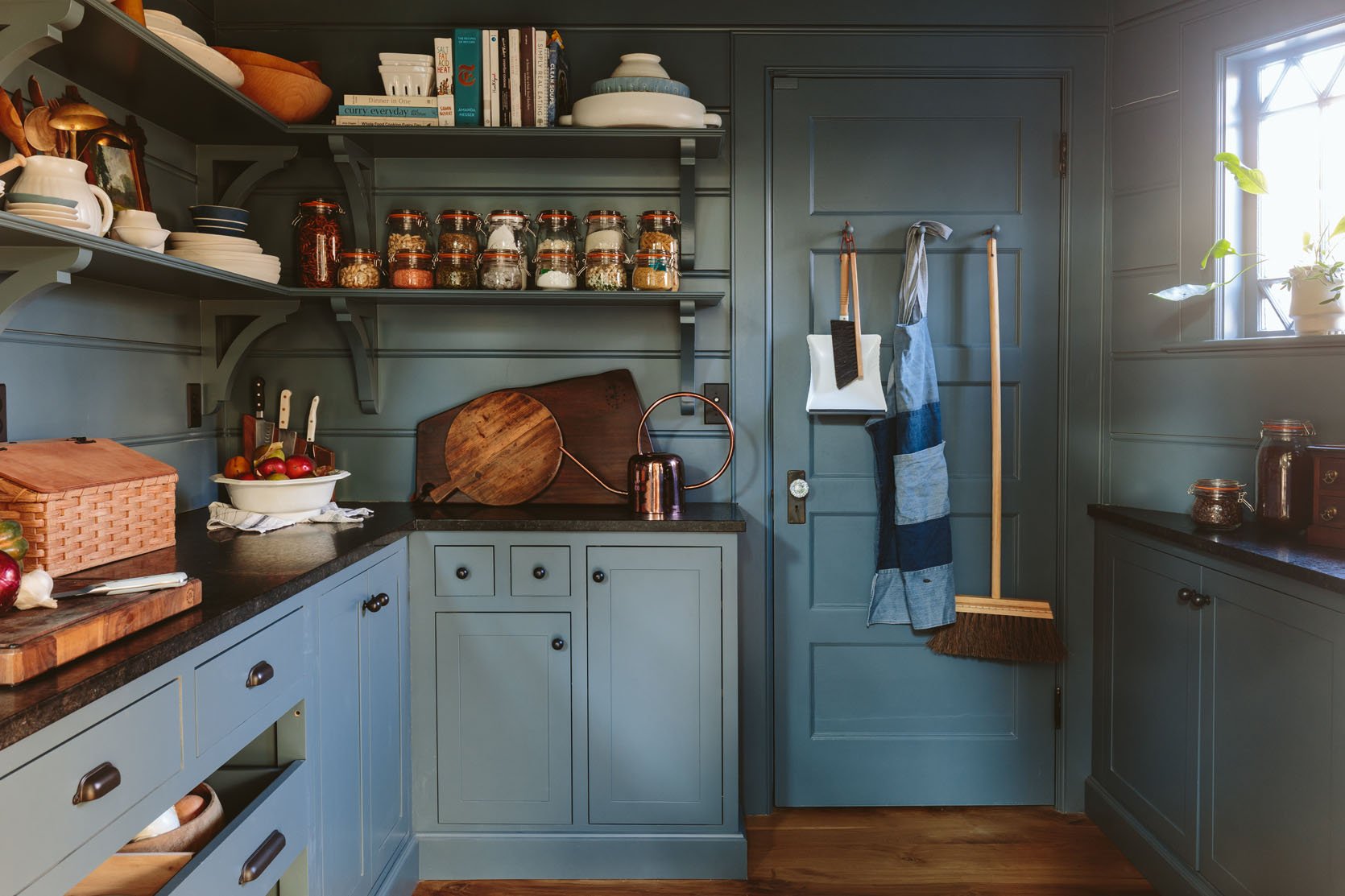
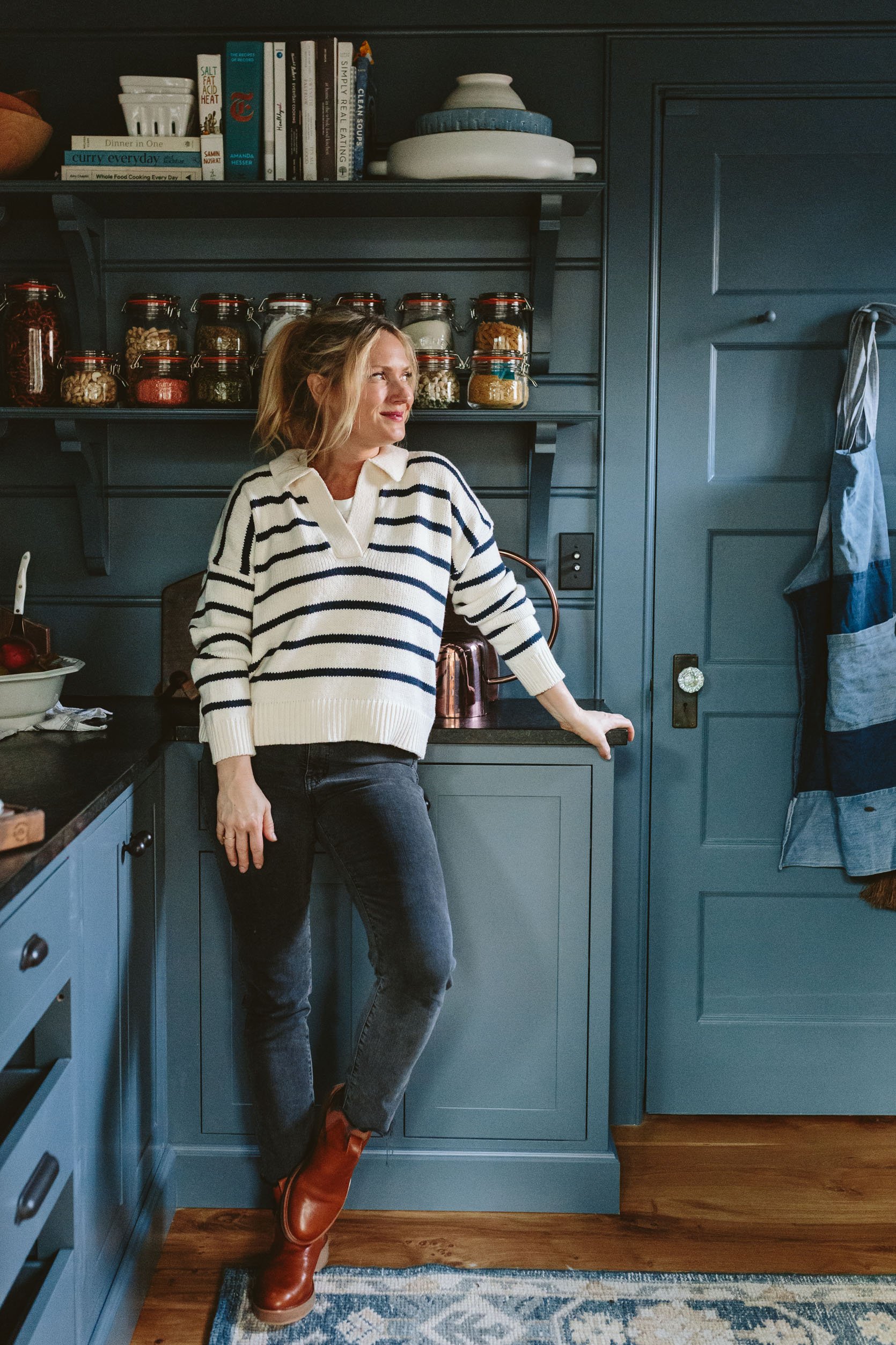
The cabinetry is made by Unique Kitchen and Baths, laid out with ARCIFORM and myself, of course. They are SO BEAUTIFUL, high quality, and stunning. They mimic the style of the kitchen cabinets but were painted a beautiful deep blue/gray called Slate Tile by Sherwin-Williams. The color is perfect and I want it in more places. We chose a dark-honed granite as the countertop from Bedrosians, knowing that we wanted (at the time) to keep it moody and also there will be a lot of coffee making specifically in here so a light marble was the wrong choice. And if you are in the market for beautiful quality cabinetry I have a little discount code with Unique Kitchen and Baths: EH2022
What Do You Mean You “Wanted To Keep It Moody At The Time“?
Well, I think the main thing I would have done differently is painted the walls, shelves, ceilings, and door a complimentary color to the slate blue of the cabinets – but lighter. When you are in the kitchen this room can feel really dark because the kitchen is so bright. This was a huge debate in this blog post and a decision was made (to keep it dark). I’m not into big “I told you so’s” (many of you agreed with me) but yeah, I was right. I wish we had painted it a powder blue on top – not white, just not quite so dark. Again, it’s not the darkness that bothers me – once you are in the room it’s AWESOME, it’s the contrast from the kitchen. When you look into the room from the kitchen it feels more like a dark storage room, than a pantry that draws you in.
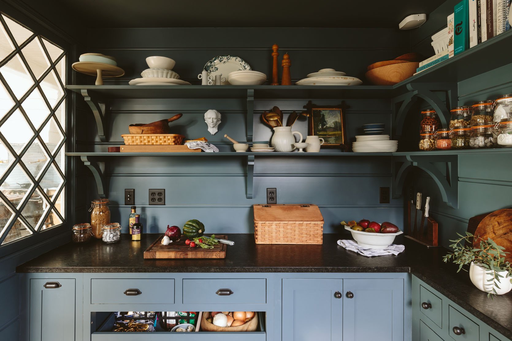
Interior Windows (vintage) | Drawer Pulls | Knobs | Switch Plates (Lewis Collection)
But I will say this – after I styled it out, I really fell in love with it. I leaned into all my favorite serving pieces in whites, blues, and woods and love how they pop off the blue. For accessories, I bought a few vintage ironstone pieces, then splurged on those incredible candles from a store in Portland called Spartan as well as some gorgeous pottery and plates by another local favorite, Notary Ceramics. I also shopped at a local shop, JP General (in Multnomah Village), which is awesome (and is where the cakestand is from).
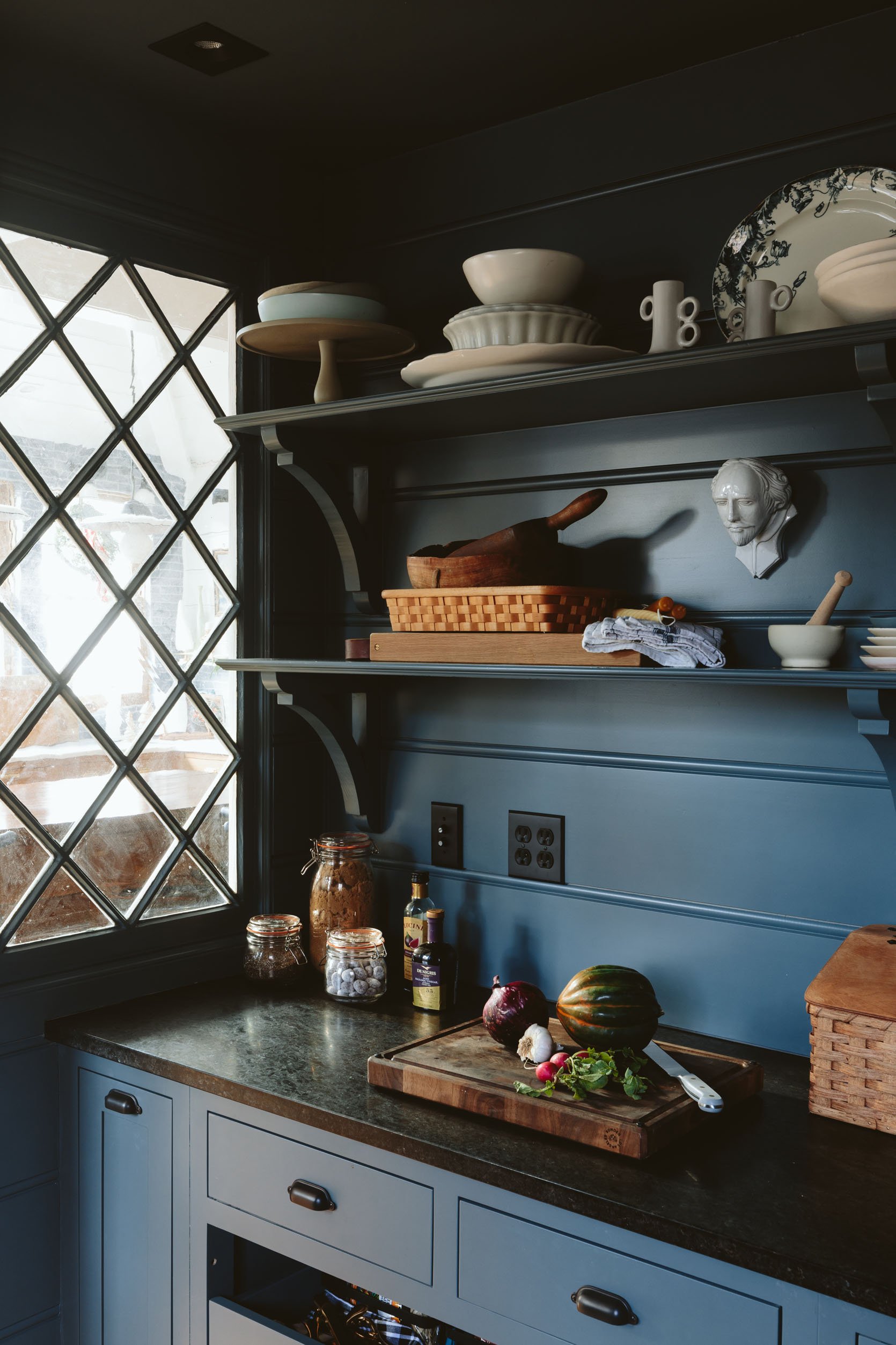
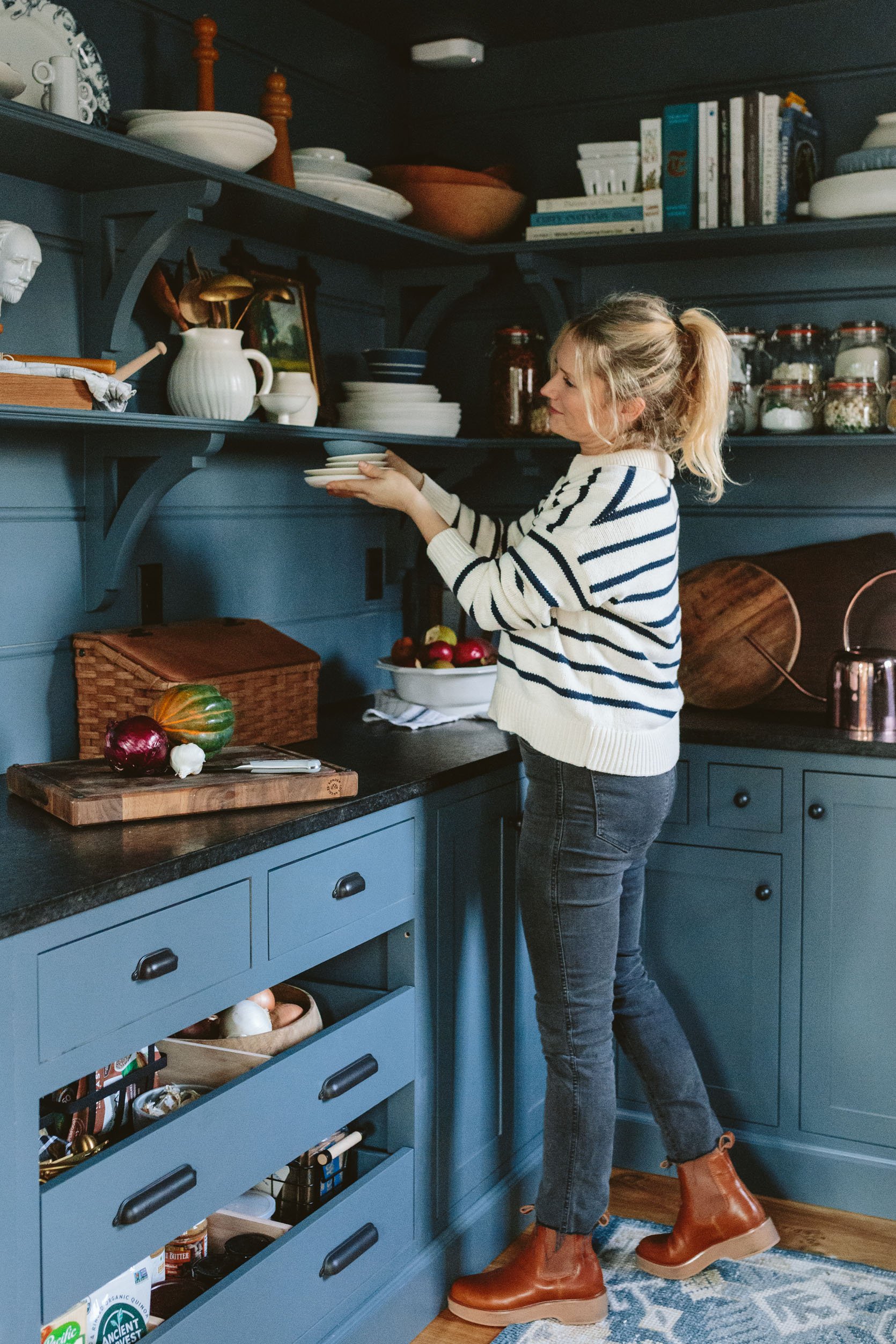
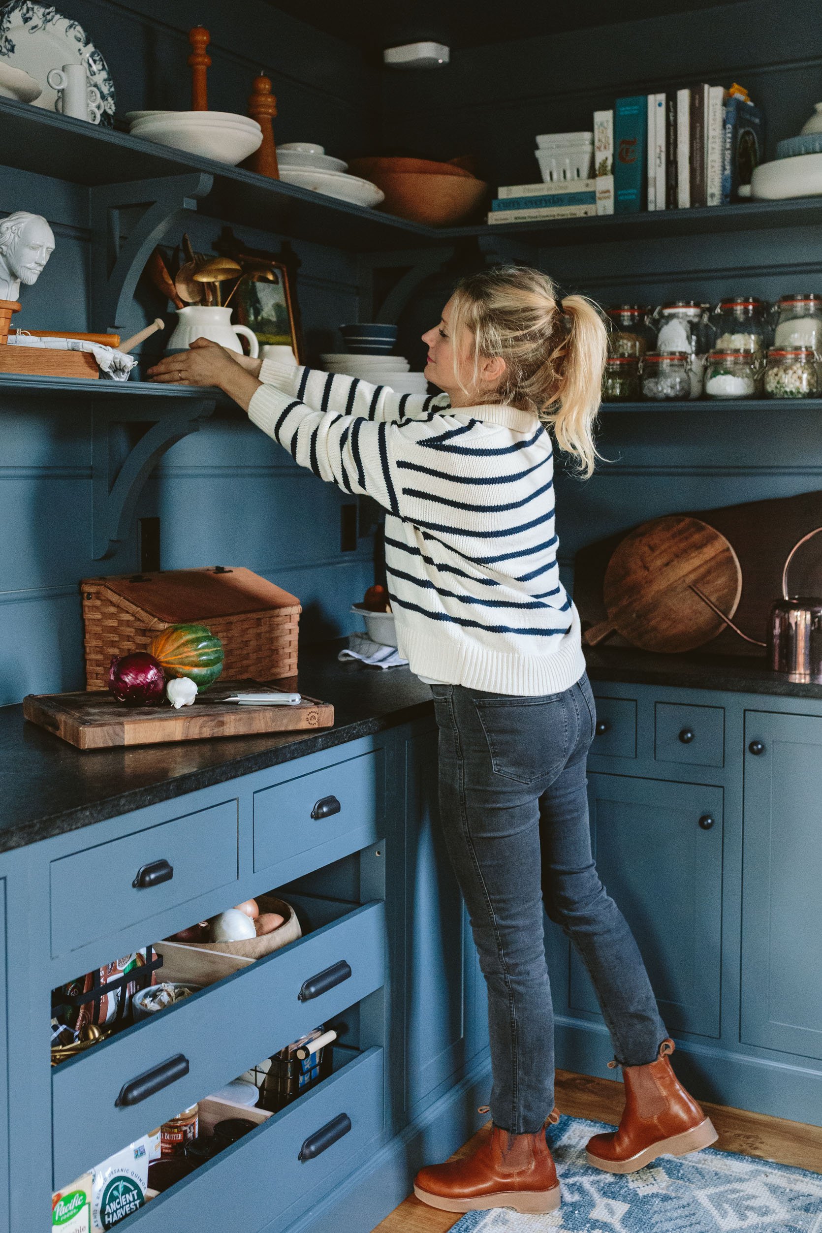
We used the vintage original windows to flank the opening to the pantry (as seen above) and they let in so much light. (We tried cleaning them but when the sun hit the old glass it looked foggy like that haha, WHOOPS). The hardware, outlets, and light switches are all Rejuvenation in Oil Rubbed Bronze (which is really a very warm black – so pretty). I originally had baskets of food on the shelves, but they were bumming me out. So I attempted to fit all the food either in these decanted jars or in the cupboards and drawers. Once I did that and could display my pretty things it changed the whole room for me. We have plenty of storage honestly, so right now this is totally working, but should we need to put some salty snacks on a shelf we’ll do that, too.
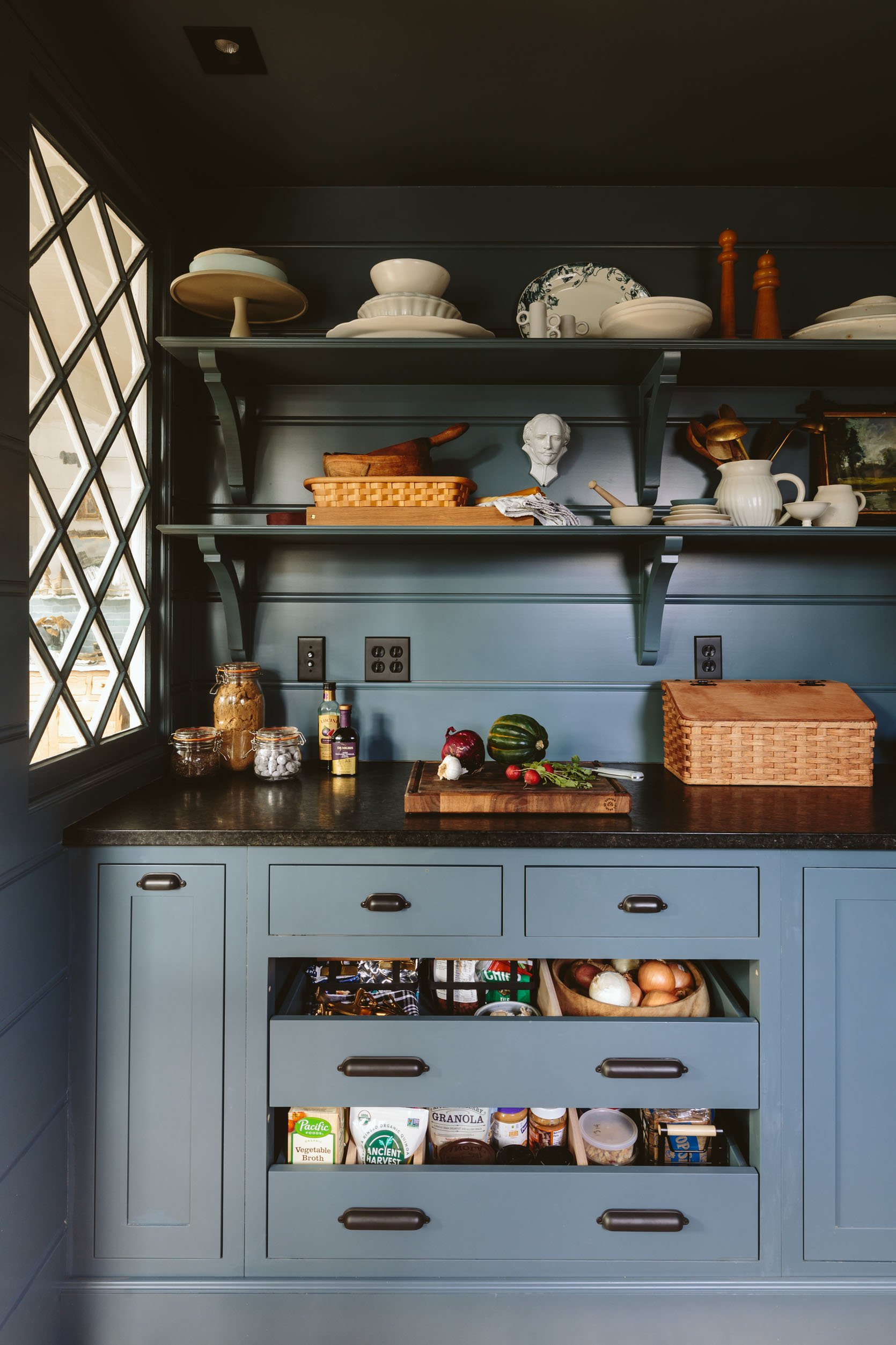
I love the large horizontal beadboard and the more decorative wood brackets are so old-world and charming (IMHO). Jamie and the ARCIFORM team did a stellar carpentry job.
Where’s All Your Food?
As you can see the big drawers hold most of our snacks, onions/potatoes/garlic (so nice to give them their own dark but airy home), and broths/peanut butter/popcorn, etc. I really like how we only did a 1/2 drawer – giving air to the perishables which sends a more utilitarian vibe. That woven wood box is a bread box from the online Amish store that indeed houses our bagels and bread.
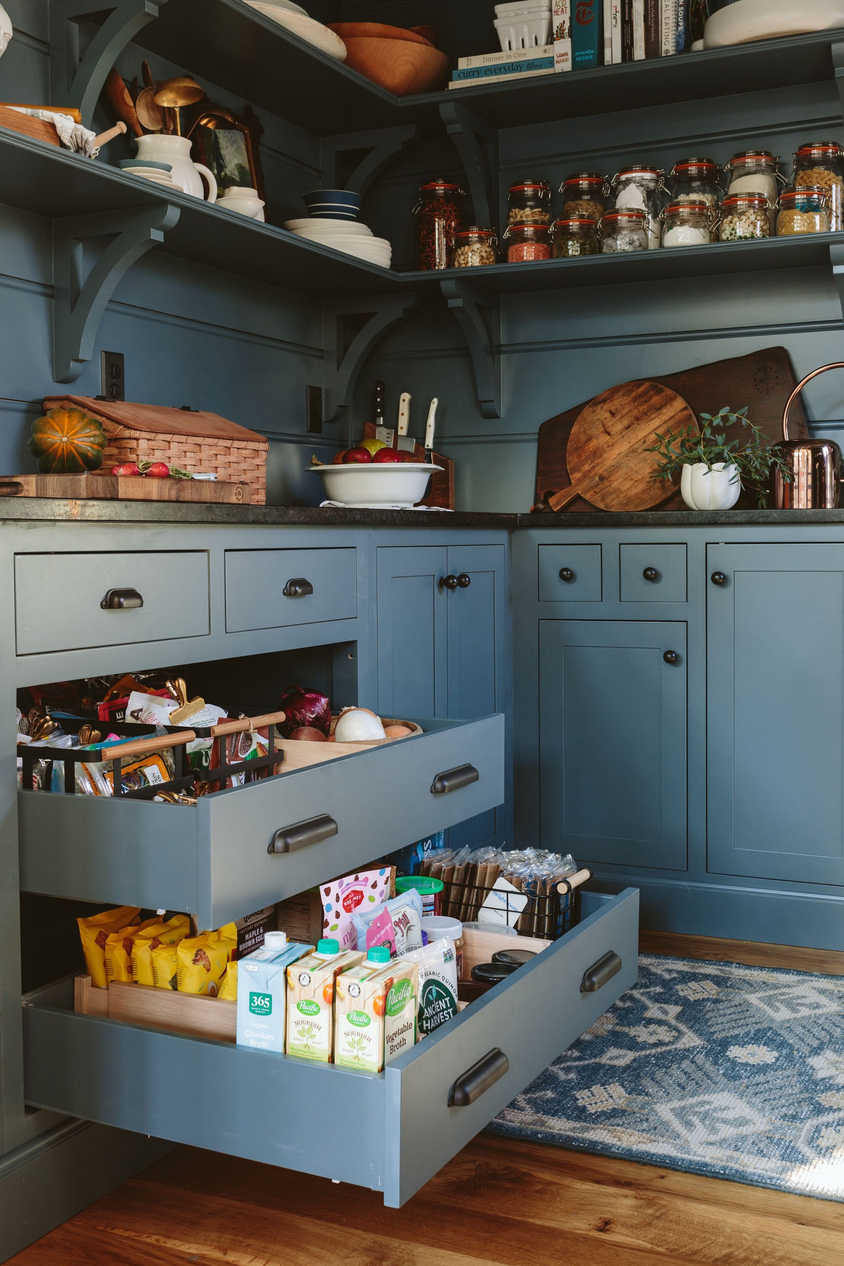
Large Black Metal Basket | Slim Black Metal Basket | Wooden Drawer Divider
Once pulled out you can see how much these drawers hold – we have plenty of space and room for even more. We also have a basement (through that door) that is finished but empty (and only 6′ tall) where I might put in shelving to add backup canned goods or anything else that needs storage that we rarely use (thinking pots for plants, maybe cleaning supplies, our dumb huge Instantpot that we use once every two months exclusively for boiled eggs, etc).
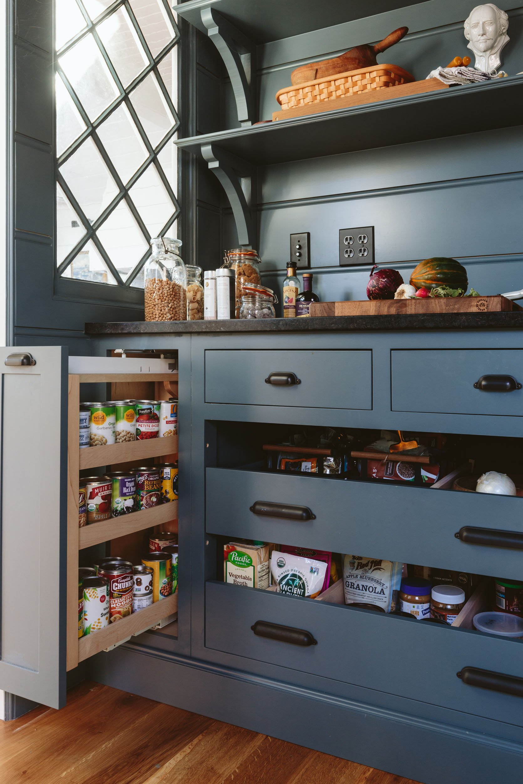
We moved all the canned goods to the pull-out drawer with shelves which I really, really love. It’s a great way to free up space and while you have to bend down to choose the right bean, you don’t have to pick up each one to see what it is. The top two drawers house vitamins, aprons, and other miscellaneous items. All our spices and oils have designated drawers in our kitchen so we don’t need to house them in here. Same with our pots and pans, Tupperware, ziplock bags, etc. We are very, very lucky and grateful to have this much kitchen storage.
Where’s All Your Ugly Stuff?
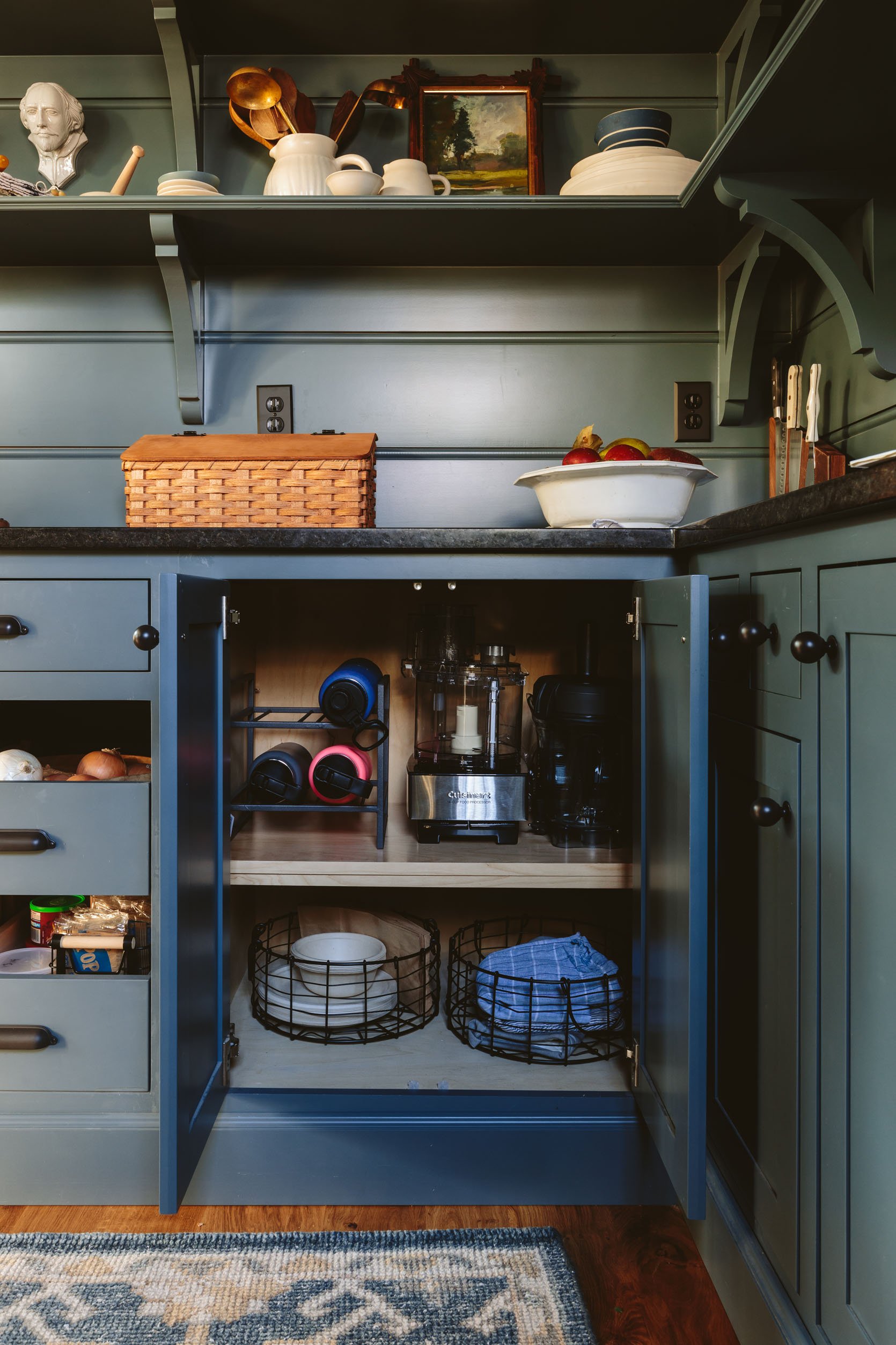
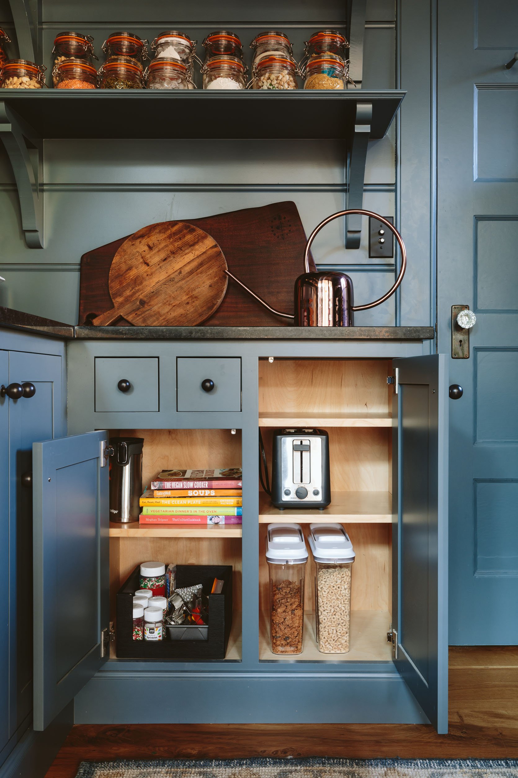
Round Metal Basket | Cereal Containers
I got you. Don’t worry we have ugly stuff too, but as someone whose eyeballs really like to look at my pretty serveware (I know I’m not alone), I tried so hard to design this pantry to hide the less than nice looking stuff inside the cabinets. We worked closely with Tanya and her design team of UKB (and ARCIFORM) to make sure everything had a place. So on the left up there you have our water bottles and countertop appliances. I had them on the upper shelves before but realized getting them down was almost harder than pulling them up. I’ve had that food processor for a month and haven’t used it, and have only used the blender three times so I’m fine with them being enclosed. Then on the right, we have the kids’ cereal and a toaster in an accessible cupboard so that they can access it without us. We also have the bin of cookie/birthday stuff and the cookbooks that are a little less pretty to look at.
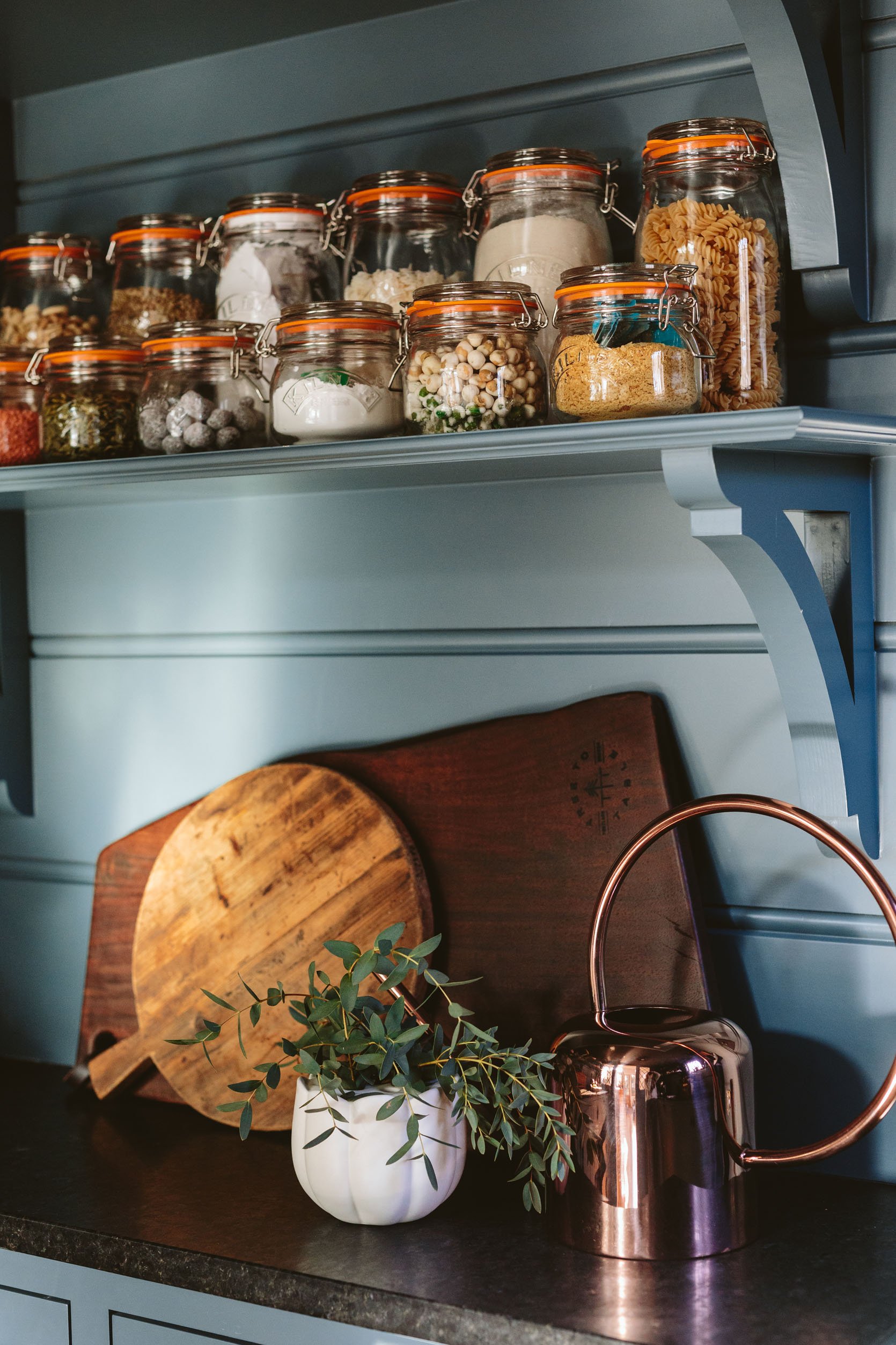
I have come to enjoy decanting our dry goods that I buy frequently in bulk (namely beans and nuts) but individual decanters can be so expensive and often too modern. So I found these classic canning jars, with the tops attached (no screwing on lids, just closing), that are airtight and come in different sizes. I bought three sets of 8 in different sizes and really really love how they look. They are labeled on the top with a sticker for now which is working. You might notice that in some of them (like quinoa) I shoved the bag inside of it so I know how to prepare it – quite the hack, I know.
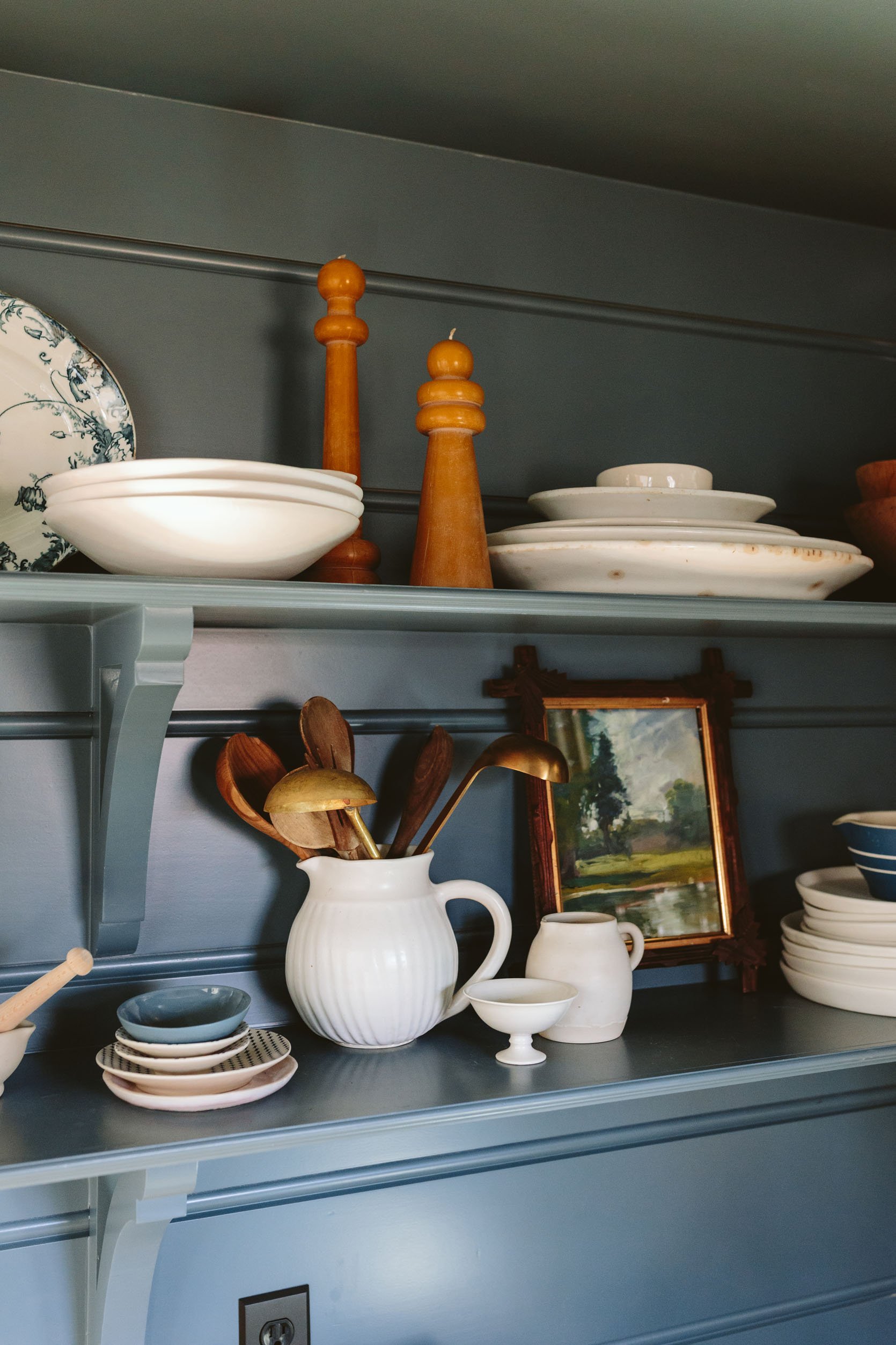
Ohh how I love my pretty little things. At one point I had 9 white pitchers of different sizes in this pantry, obviously drawn to the shape and old-world vibe. I use them more for flowers than for cream or water. I’ve been collecting ironstone and vintage transferware platters for while and am excited that they all look so good together. The painting is vintage, in a vintage frame that I found and the stack of dishes on the bottom right and bowls on the top left are from Notary Ceramics – I love her stuff so much.
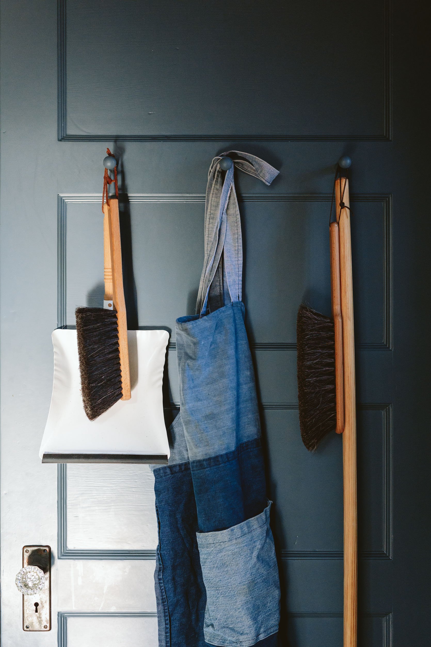
On the back of the door, we put some pegs and in my fantasy world, they hang aprons and brooms. Right now until the landscaping to the mudroom is done we come in and out of the kitchen door making this basement door the home of many a coat. But as of the week before Christmas, the flagstone was almost done and we started bribing the kids with an M&M every time they come in and out of that door – like baby seals. Real innovative parenting, I know.
The Vintage Window
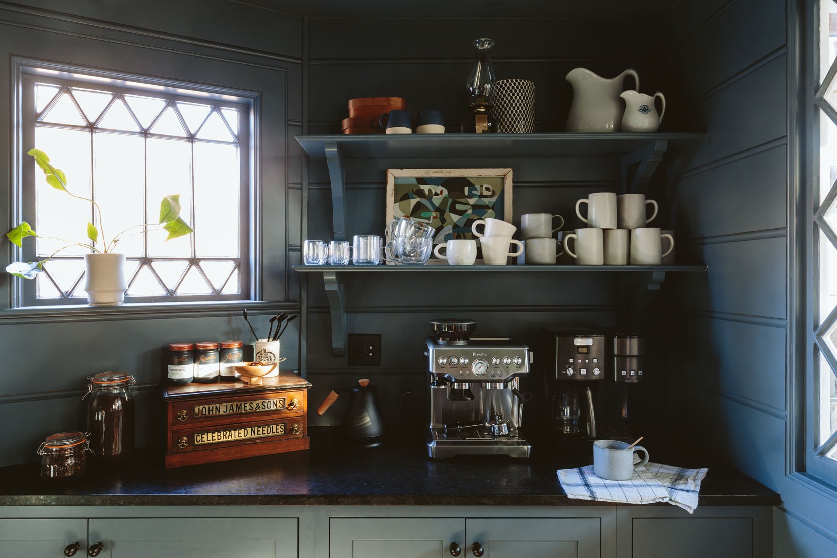
First off, that window didn’t exist before and I’m SO GLAD we put it in. I found it on eBay for $200 (probably could have sourced locally from Aurora Mills) and liked how the pattern worked with the original diamond pattern. We made this decision before they re-sided the house so ARCIFORM and Jamie were able to frame it out and plug it in. It’s non-operable, but lets in so much light and is such a pretty architectural element.
The Coffee And Tea Station
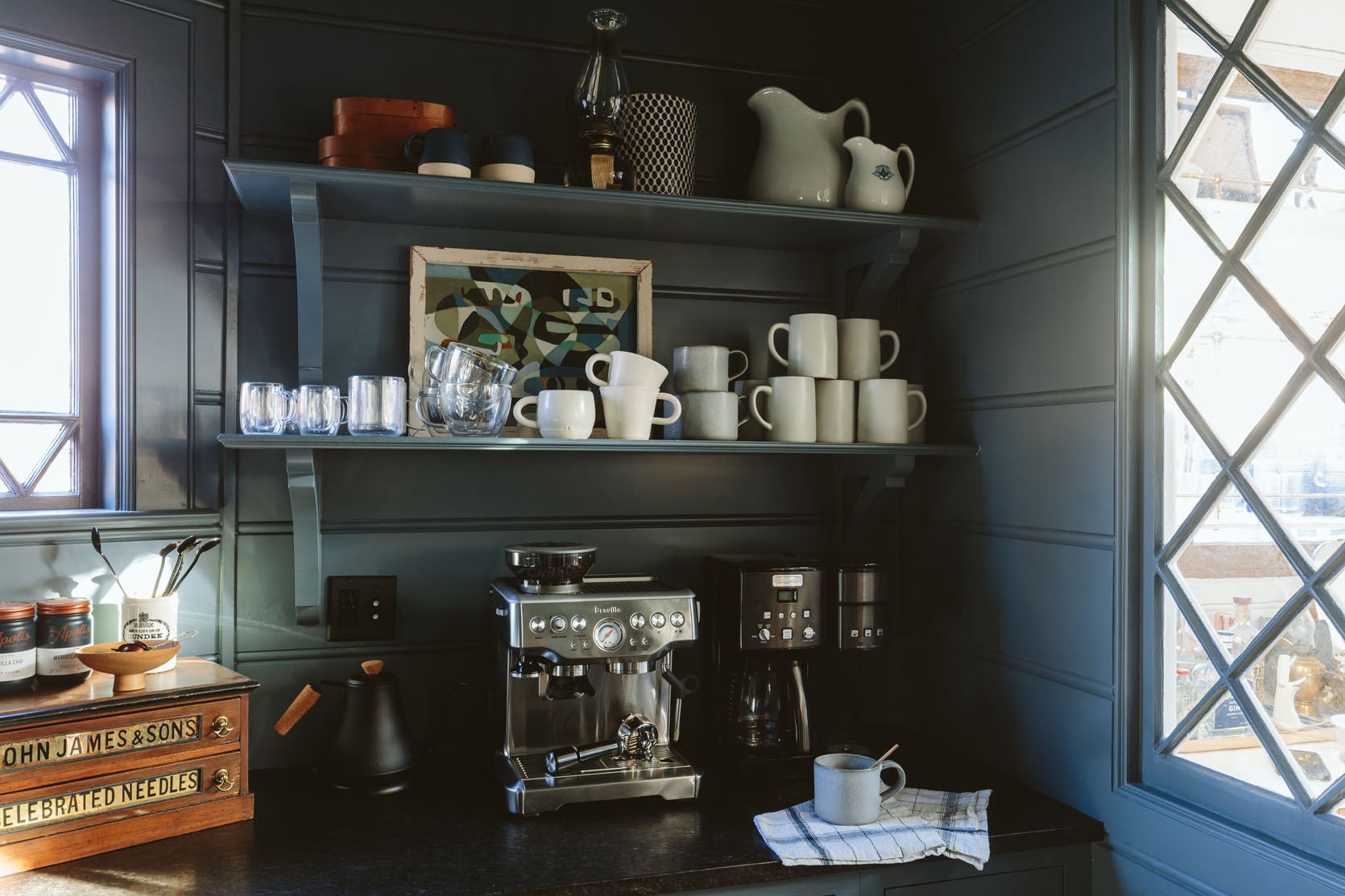
Espresso Machine | Glass Mugs | Gray Mugs | Small White Mugs | Tall White Mugs
We are real coffee people and have various needs for various times of the day. At 6 am, I have drip coffee from a coffee maker to head out and walk the dogs before it’s even light out, so a programmable coffee maker is a MUST.
More recently around 10 am or 1 pm I’ve been craving an afternoon treat/boost but brewing another pot feels excessive. Kaitlin and Emily (who shoot at the house with me twice a week) practically forced me to buy myself this espresso/latte maker for Christmas – you know, for the crew 🙂 It’s WONDERFUL. It’s such a luxury that many people might not need if you don’t work from home, but we LOVE and is a fun treat for all of us.
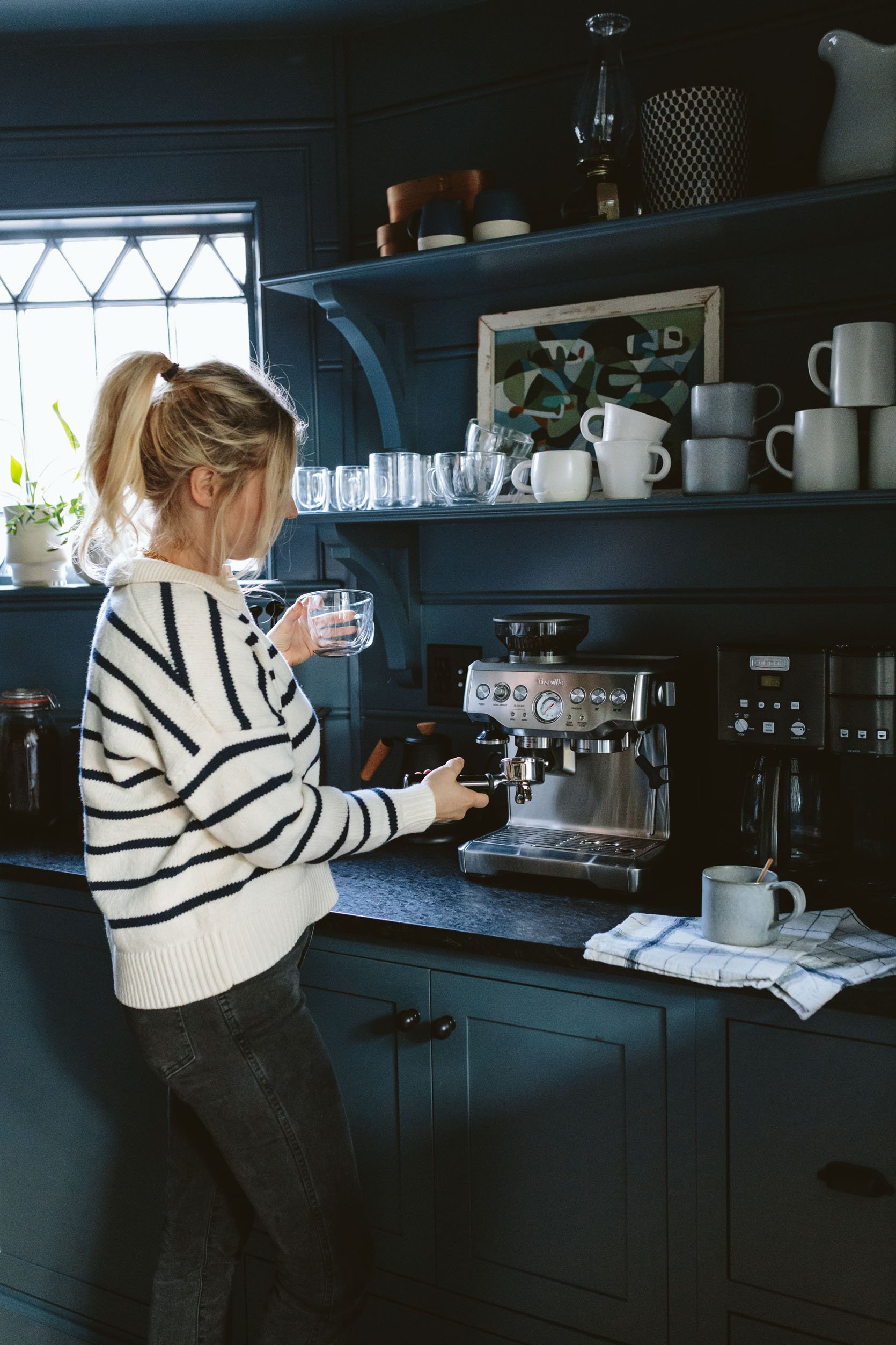
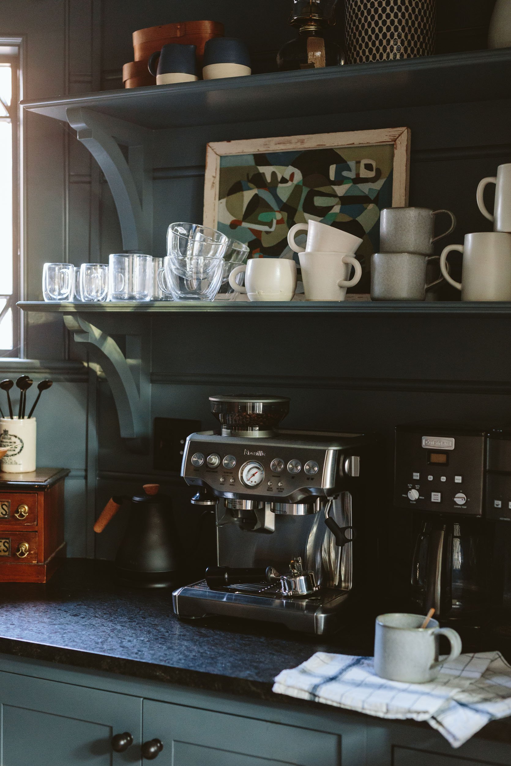
I really upped my mug game for this pantry shoot – with the clear double-walled glass ones for lattes and espresso (so luxurious), pretty white pottery to support local artists (from Spartan and JP General), larger Rejuvenation mugs in gray, and then my deep Target mugs that I’ve had forever. I really like how it’s mixed up and interesting but not messy.
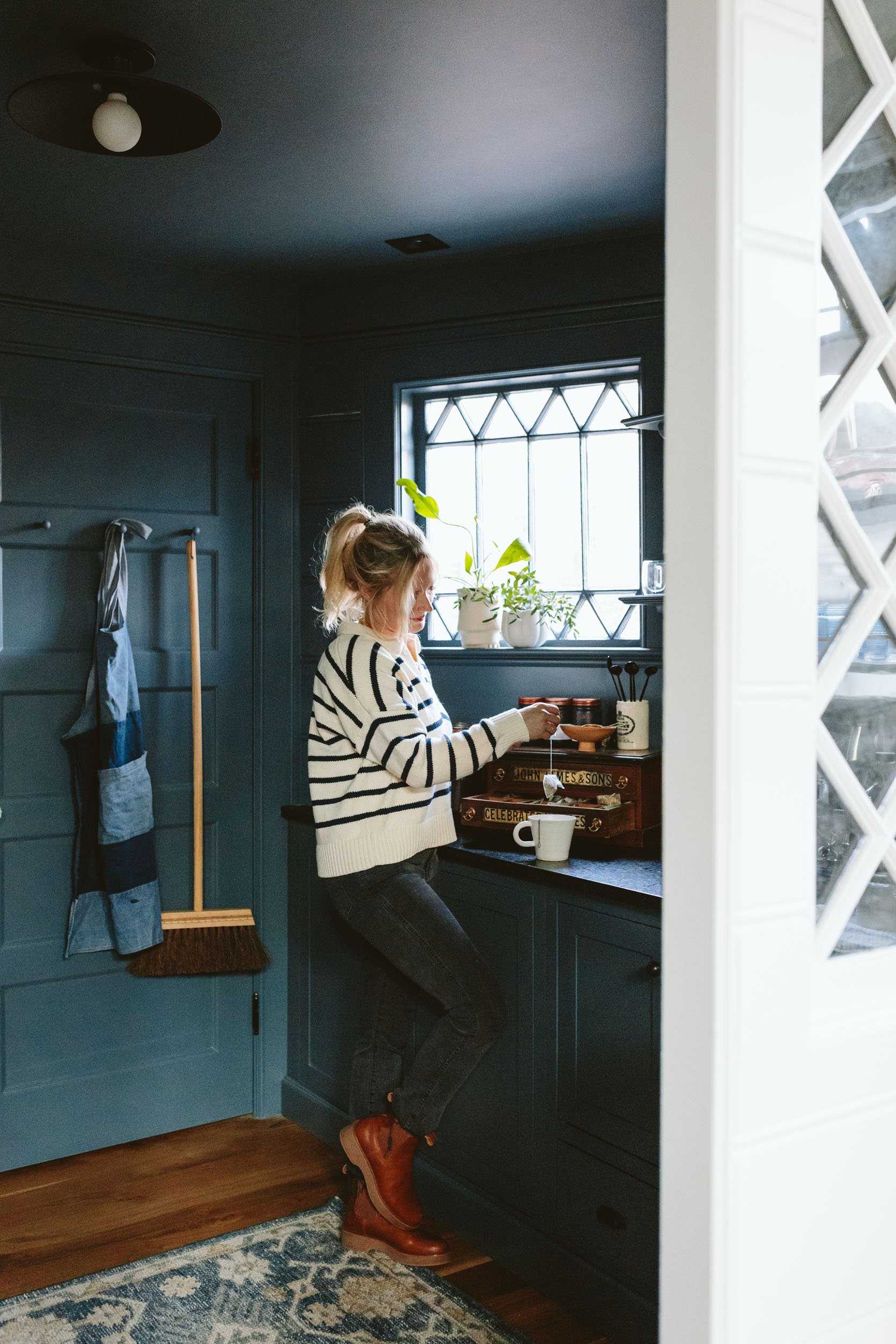
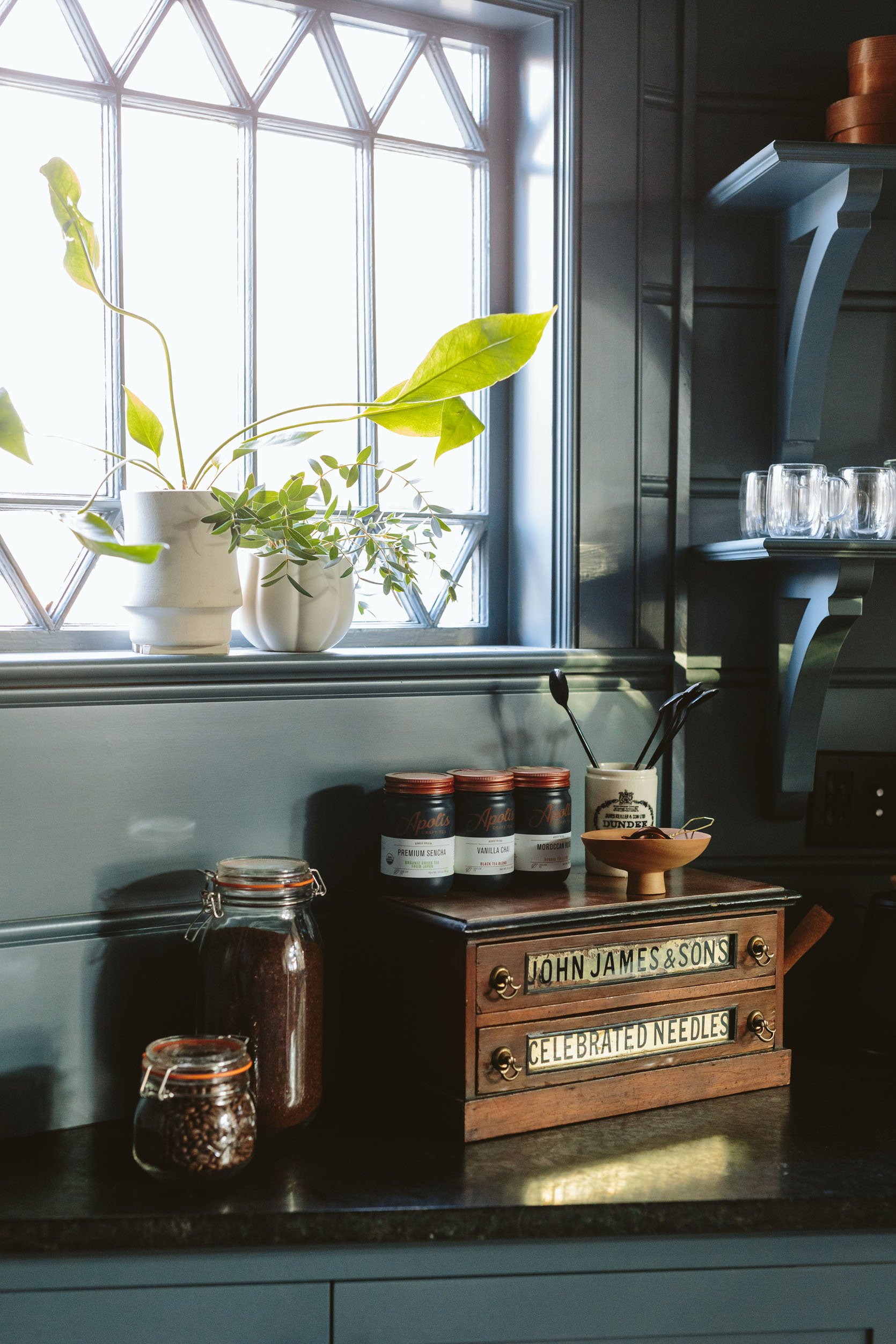
I’ve also upped my tea game for nights and consider tea a new healthy hobby. I found that vintage store drawer cabinet at a flea market and knew that I wanted it but it was expensive and unsure it had a purpose. Then I realized it could be the home for my tea bags, which fit in the bottom drawer. It makes me SO HAPPY.
Wait, Do You Have A Microwave?
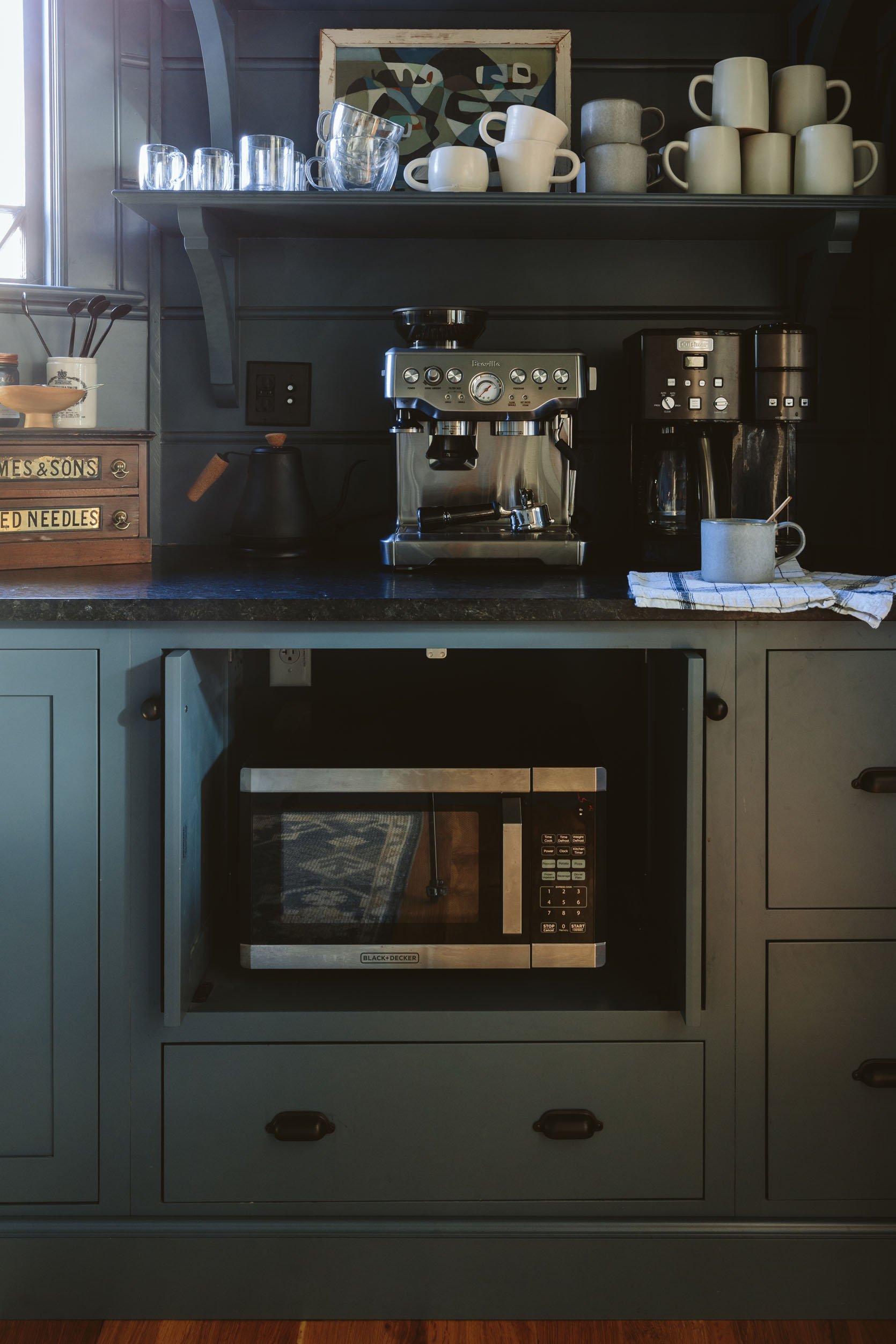
We sure do have a microwave. We hid it behind retractable doors on this side of the pantry, low for easy access for the kids, and it’s pretty darn easy to use. In retrospect, we don’t use it terribly often and didn’t need a retractable option (which I’d imagine is more expensive than a normal hinge), but it’s nice to have as an option (just don’t feel the need to splurge on it – we normally just leave the cupboards open when we heat up anything).
What Would I Change?
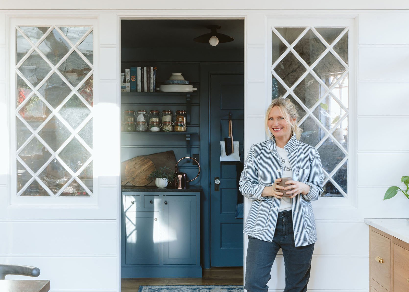
I really, really love so much about this room – the color, the function, the space, the style – I love it. But I also love telling you all my thoughts and feelings (remember the first episode of DesignStar? It’s a pathological need). So there are three things that I might have done differently.
- Paint the walls/ceiling/door a lighter color (leaving the cabinetry the dark slate tile blue). As you can see in the above photo the contrast between the white of the kitchen and the dark blue is almost hard for your eye to process – the white becomes whiter and the blue comes darker. Not a huge deal, but just wanted to call it out. We might change this, but also might not.
- I would have added another pull-out trash drawer for additional recycling. We have trash and recycling in the kitchen next to the sink, but Oregon’s recycling is intense and we need to have a separate bin for glass, aluminum cans, regular recycling as well as trash and compost. So right now we have two freestanding garbage cans that crowd the pantry…
- There are many nights and mornings when I secretly wish we had put a small filtered water sink in here – for coffee and tea. Walking 15 steps to the kitchen sink is absolutely not a big deal, but it would be a three times-a-day convenience, so if you are wondering if I wish we had one the answer is “sure” 🙂 Not sure where it would have gone, BTW (maybe at the bar?).
We have plenty of storage and function, it works so well for our family.
Y’all. I love this room so much and we feel very grateful to have our first walk-in pantry, allowing for the kitchen to be easier to keep clean and clutter-free. Thanks for reading and feel free to comment and share (per usual).
Pantry Resources:
Cabinetry: Unique Kitchen and Baths
Paint Color: Slate Tile by Sherwin-Williams
Flooring: Zena Forest Products(Oregon grown and milled)
Countertop: Bedrosians Tile & Stone
Countertop Fabrication: Alpha StoneWorks
Hardware: Rejuvenation
Light Fixture: Rejuvenation
*Design by Emily Henderson and ARCIFORM
*Photos by Kaitlin Green
THIS POST WAS ORIGINALLY PUBLISHED HERE.


