OH MY FRIENDS AND FAMILY DO I HAVE ONE FOR YOU. This lady, Mrs. Mudroom, is quite possibly my favorite room in the house (rivaled by the kitchen, sunroom, and our bathroom, TBH). I’m not joking that every single time I walk into it I feel joy and happiness through the sense of light, space, and sheer ease of function. All the design elements came together just as they did in my mind – NO, even better. At this point in the farmhouse reveal/progress postings, you’ve heard me walk you through my regrets and disappointments (to an almost painful degree…for all of us) so I hope that when I say I truly love something you believe me. I’m not trying to brag or pat myself on the back here, although to hell with it – I’m going to celebrate this room today and every time I walk into it because pulling together a room that you truly love, after putting so much hard work into a space, especially in the midst of a larger stressful renovation is worthy of a GD local parade. Floats! Fireworks! If you can relate to this at all, I encourage you to CELEBRATE EVERY SINGLE WIN. I made and own a lot of my personal mistakes and regrets in this house that I have to fix publicly (and am now excited to) but this room, this wonderful hardworking space that I’m so lucky to call ours, had (almost) nothing I would change about it when we moved in this past September. Sure, there is the hilarious and totally permanent overlook/mistake that none of us caught which I’ll explain below, but it doesn’t bother me anymore, and hell, maybe it is even better. If you really want to know what’s happening in this brain, I just got back from a 4 day spiritual/wellness retreat with two of my closest friends because this last year and a half I was not my best self, and I feel totally realigned with joy, capital L Love, the universe, God, nature – all of it/us. And y’all, I’m going to try to bring that energy here every day. Starting today with this happy hardworking space that I can’t wait to tell you about.
The Design Plan + Functional Needs


We’ve never had a mudroom before because in Los Angeles the need is more for a “drop zone” which we barely had, but it was fine. Up here in the PNW, mud and wet shoes are a part of our daily lives so people often carve out mudrooms from other spaces if they don’t have one. Same with us. This room was very much prioritized to mitigate the mud/dirt/coats/shoes in the rest of the house. I feel like I can’t say with full honesty that the kids and dogs solely use this room because we are still landscaping and the flagstone path to those exterior doors just got installed over Christmas. But yes, as of two weeks ago we are now trying to ONLY use those doors when we go in and out to walk the dogs or play in the backyard on nice days. To accomplish this lofty goal, the kids are getting a piece of candy every time they come in via that room. Like seals. They do their trick, they get a candy. More specifically every time they drop their shoes/stuff in the mudroom, take/unload their lunchbox to the sink we throw them their tiny treat. It’s absolutely questionable parenting and yet totally working.
We thought about all design elements through the lens of durability and ease to clean. In the name of not being boring, I still compromised here and there for beauty, as I’ll explain in a different post (and dabble in today). Btw if you want to watch a video walkthrough of this room, I’m giving you the full tour here (just wait for the ad to play, please and thank you :))!!
The Incredible Dark Teal Herringbone Tile
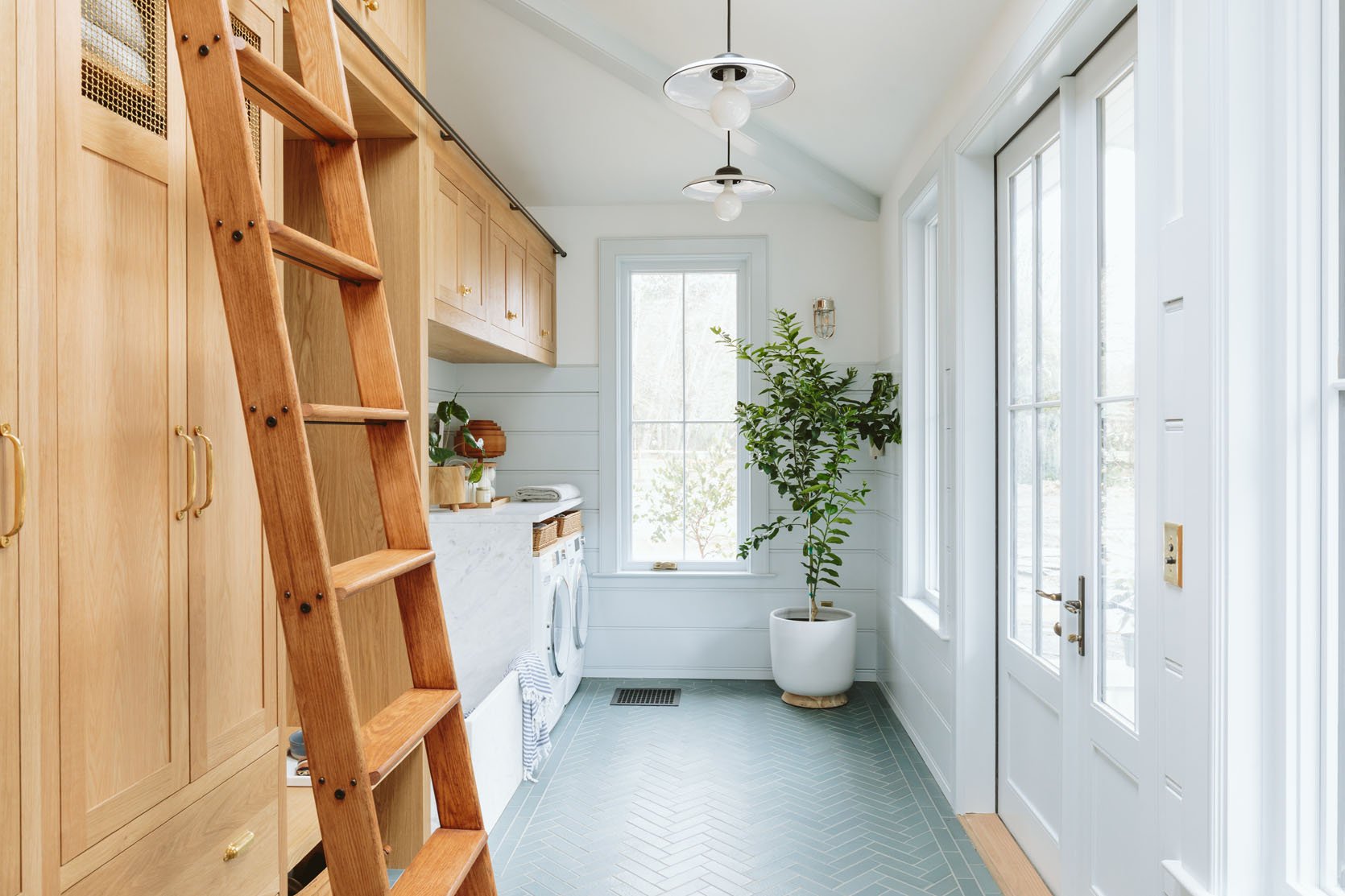
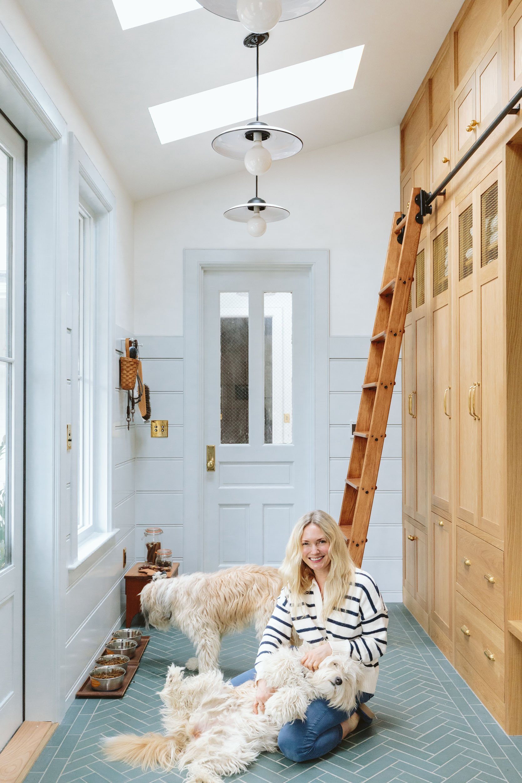
This tile was chosen very early on as the perfect “mudroom” floor color because it felt fresh and clean but darker, textural, and forgiving. It is a custom color through Pratt + Larson in their brownstone collection – is really handmade with more surface movement. We chose 2×8 bricks to be herringboned with a straight run border of two tile widths. I know this detail (the border) might not be something that everyone will notice, but my goodness, to me it makes the whole room feel more pulled together and special. I don’t LOVE when herringbone ends against a wall and prefer for a border to stop it (not a huge deal btw if you have done this, just a slight preference that is, yes, more expensive to execute).

We hired Level Plane to install the tile and they were extremely meticulous in making sure it was balanced. They did the border first, then calculated the brick herringbone to make sure that it looked as intentional as possible. We used a 3/16th grout line (which is on the larger end of “very small” and the smallest that Pratt + Larson recommended for this size of handmade tile) and opted for Slate for the grout color. The grout color is super important y’all because had we gone lighter you would definitely have seen the dirt or it would turn brown, but really dark (which we did a sample for) changed the entire look of the room to be more intense and super serious.
The White Oak Floor To Ceiling Cabinets

A real dream, made true by Unique Kitchens and Baths. We customized these to be pretty darn special if you ask me with specific storage for each drawer or cupboard. They did an incredible job building them and 8 weeks later came shipped on a truck in blankets where Jamie and the ARCIFORM team installed them. They are white oak with a clear natural sealant and they are extremely durable. We chose a natural wood in here, like the kitchen, mostly for durability after years of dealing with chipped paint on cabinets (which is avoidable but in my personal experience, fairly inevitable if they are painted wood). Plus the wood hides dirt should the dogs shake off and I don’t wipe it up immediately.
We shook up the design of the cabinets with the metal grates at the top. This is mostly an aesthetic choice, but certainly adds venting should there be future sports uniforms in there. We originally had them on the bottom of a couple of the cabinets but apparently, they can easily be kicked and damaged down there. We will absolutely do a show and tell of what’s in all the cupboards as soon as I organize them (but yes, there is a pull-out dog food bin). ARCIFORM (shout out to the incredible Stephyn and Anne) did the first round of drawings and helped us dial it all in with UKB, but what is so great about UKB is that you don’t have to have a designer – they will design the kitchen with you and do all the drawings (thus saving you a crucial step). If you are interested in their cabinets they are giving my readers a 10% discount with code EH2022 (yes I got a discount, too).
Cabinet Hardware
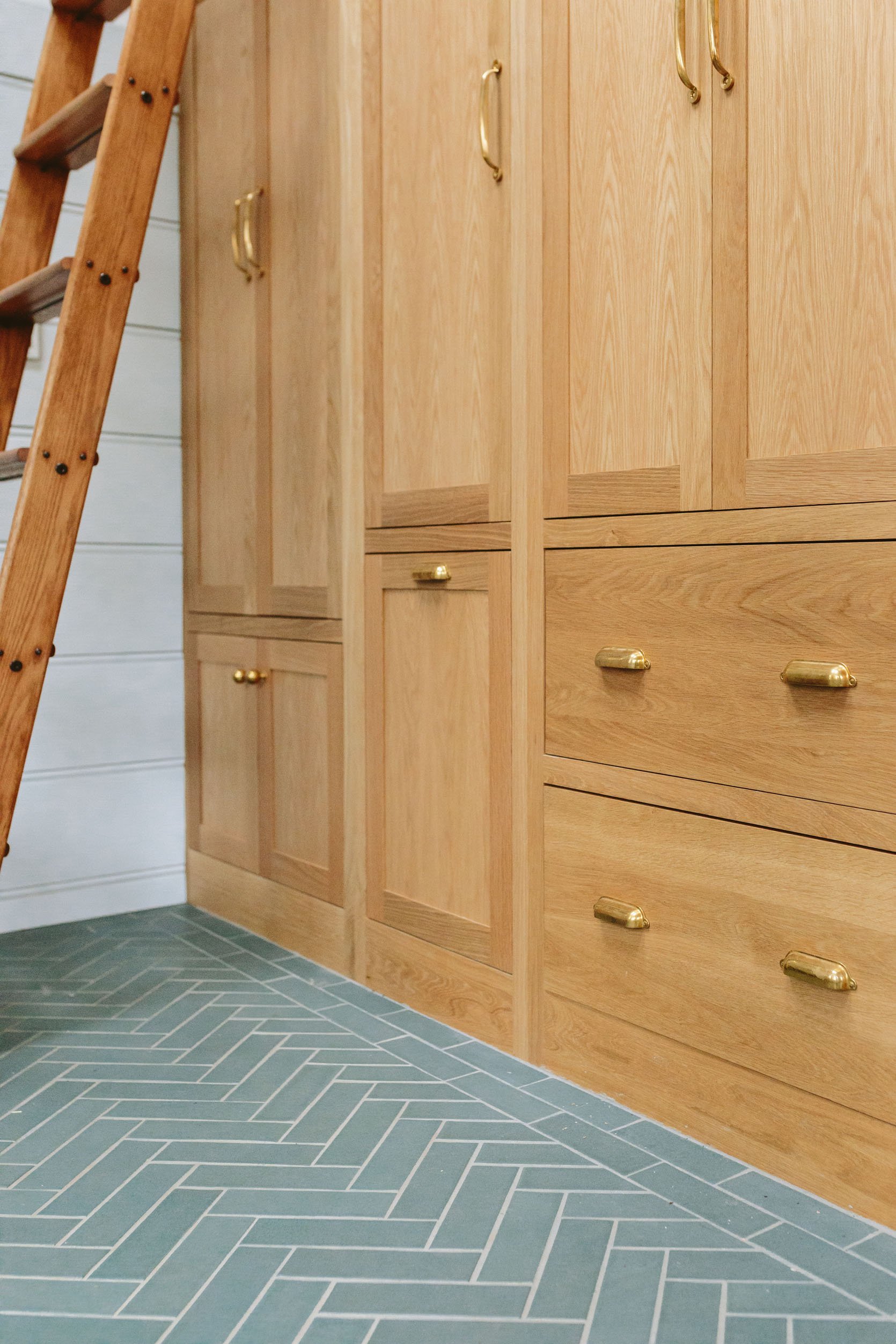
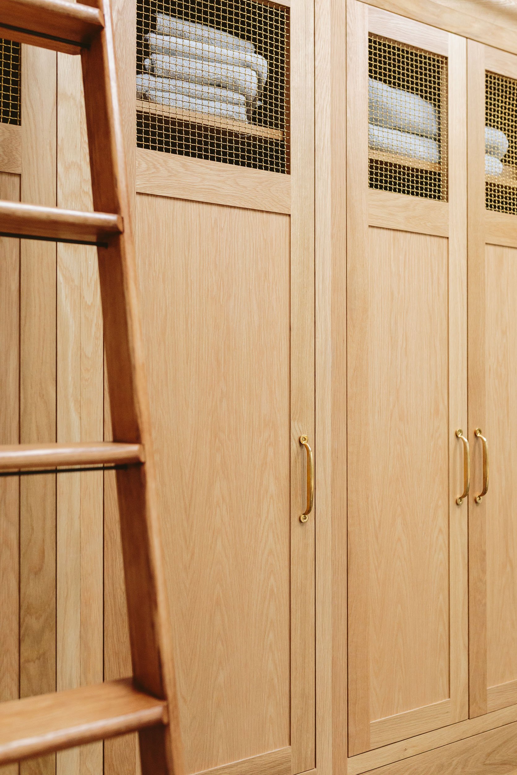
Drawer Pulls | Cabinets Handles
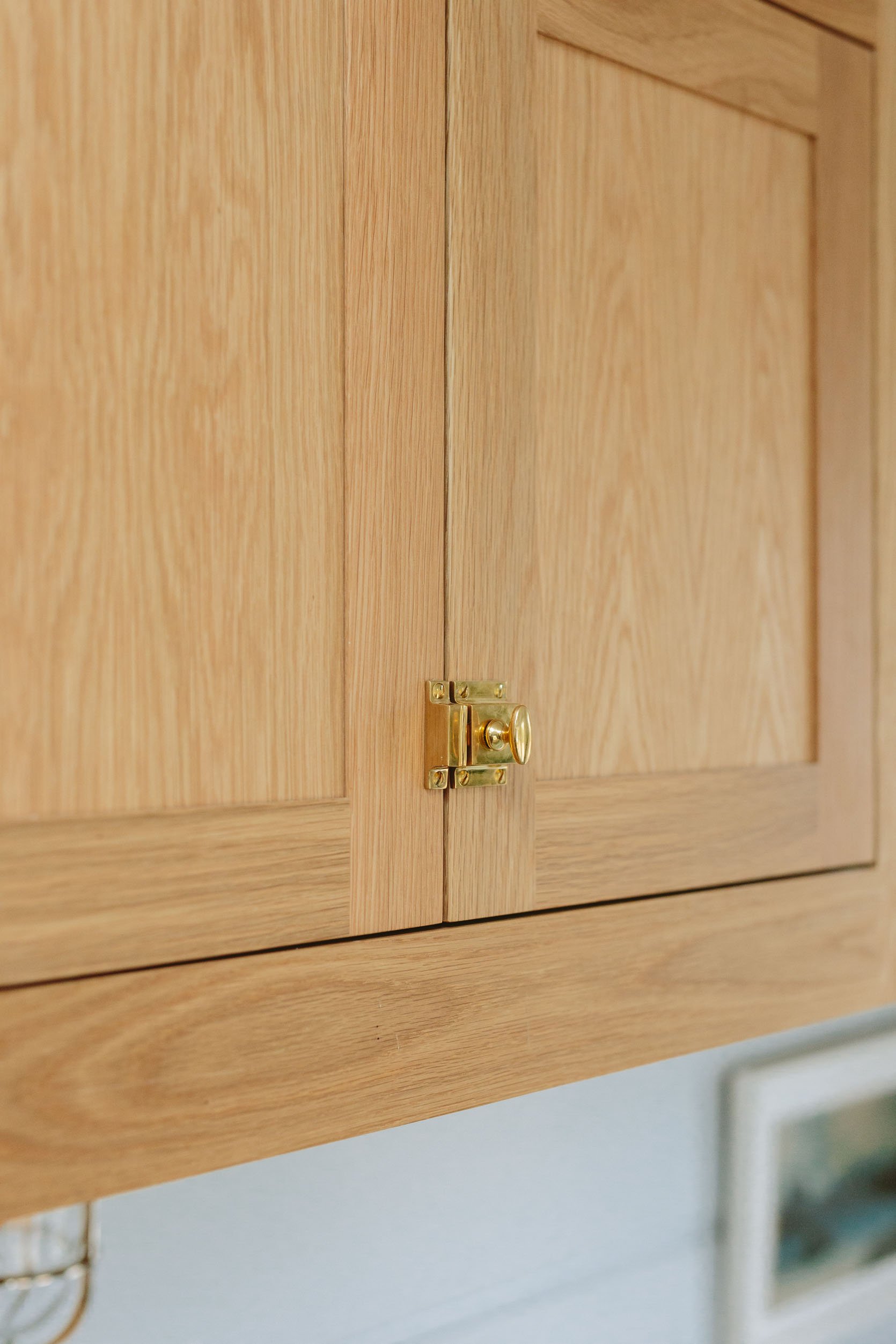
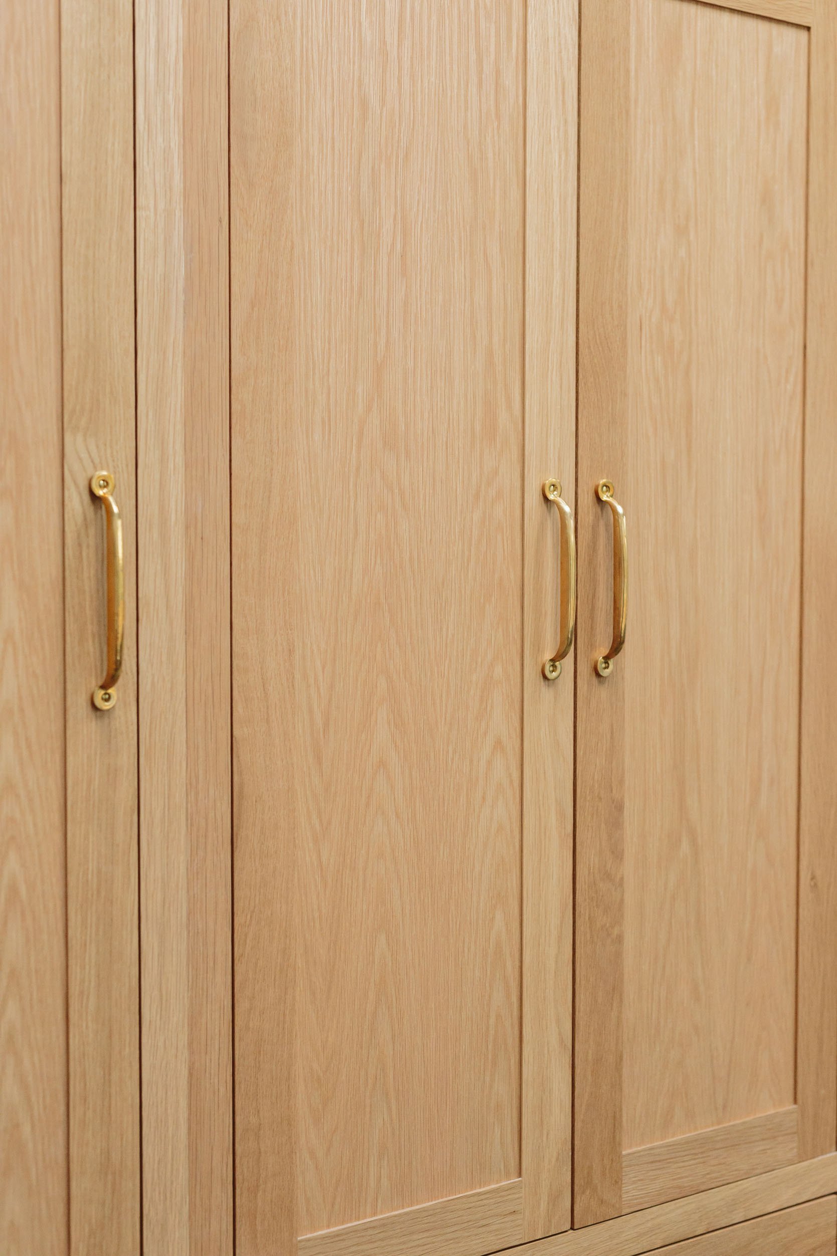

While we are here I wanted to show you the cabinet hardware from Rejuvenation, which is echoed in the kitchen and is just so classic and perfect. We chose the unlacquered brass which has already patina’d PERFECTLY in 3 months and looks so beautiful against the white oak (it’s a quieter look, less of a big pop which I also love, but for this room and our kitchen, I loved the brass and wood tonal look). I chose a mix of knobs, bin pulls, and latches so it looks special but cohesive. We used similar hardware in the kitchen and the Oil Rubbed Bronze version in the pantry. I just love how you can mix and match and really dress up the cabinets.
The Most Soothing Paint Color Yet – Dew Drop By Sherwin-Williams

Wall Color | Paneling and Trim Color

My new goal in life is to feel the same about all paint colors as I do this one. I walked in and it was an immediate “oh my gosh this is so good”. Literally, everyone who walks in has the same reaction. It’s an extremely soothing pastel that has both green and blue undertones. It’s light and bright, but with the white above it, you can see the tone more. I think this in a darker room would probably lose some of its power, but in a room full of natural light it just envelopes you in this soft song of wonderfulness. We are also so glad we went with wood paneling and semi-gloss in here – it’s SO DURABLE and has wiped up so easily as the pups shake off mud all over it. Even if I let it dry, it comes up easily without leaving any mark at all. Some of the other paint colors I could “live with” because they were good (like the kid’s bath and the powder bath), but through this process, I realized that for all the hard work that was put into this house by so many people and companies, I need to love every color as much as I love this one (which is so much). So in a way, my love for this prompted me to muster up the energy and money to paint the others (which I’m SO HAPPY WITH THANKS THE UNIVERSE ABOVE). Sherwin-Williams has so many to choose from and I’m getting better and better at understanding both undertones as well as homing in on what I really want in this house after living here. More to come, but if you are in the market for a super fresh, soothing, and still totally sophisticated light pastel color – Dew Drop by Sherwin-Williams is your new best friend.
The Dog Wash Station

Wall Hooks | Wooden Boxes (vintage) | Marble Tray | Blue Bowl | Wallet | Shoe Basket (vintage) | Boots | Dog Washing Station Stone
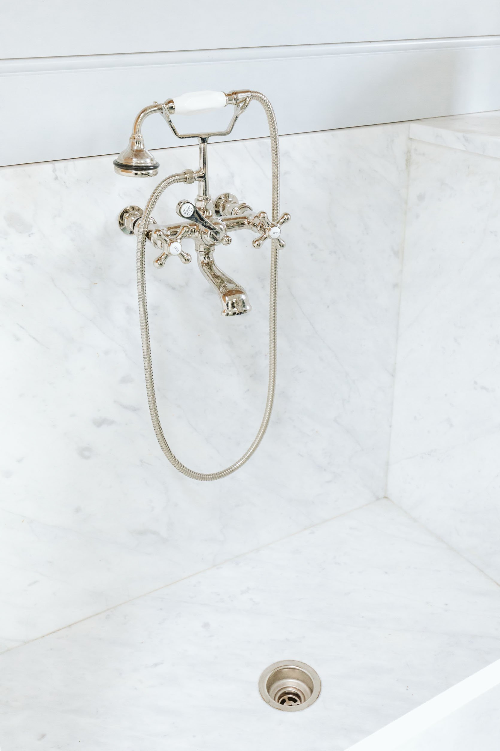
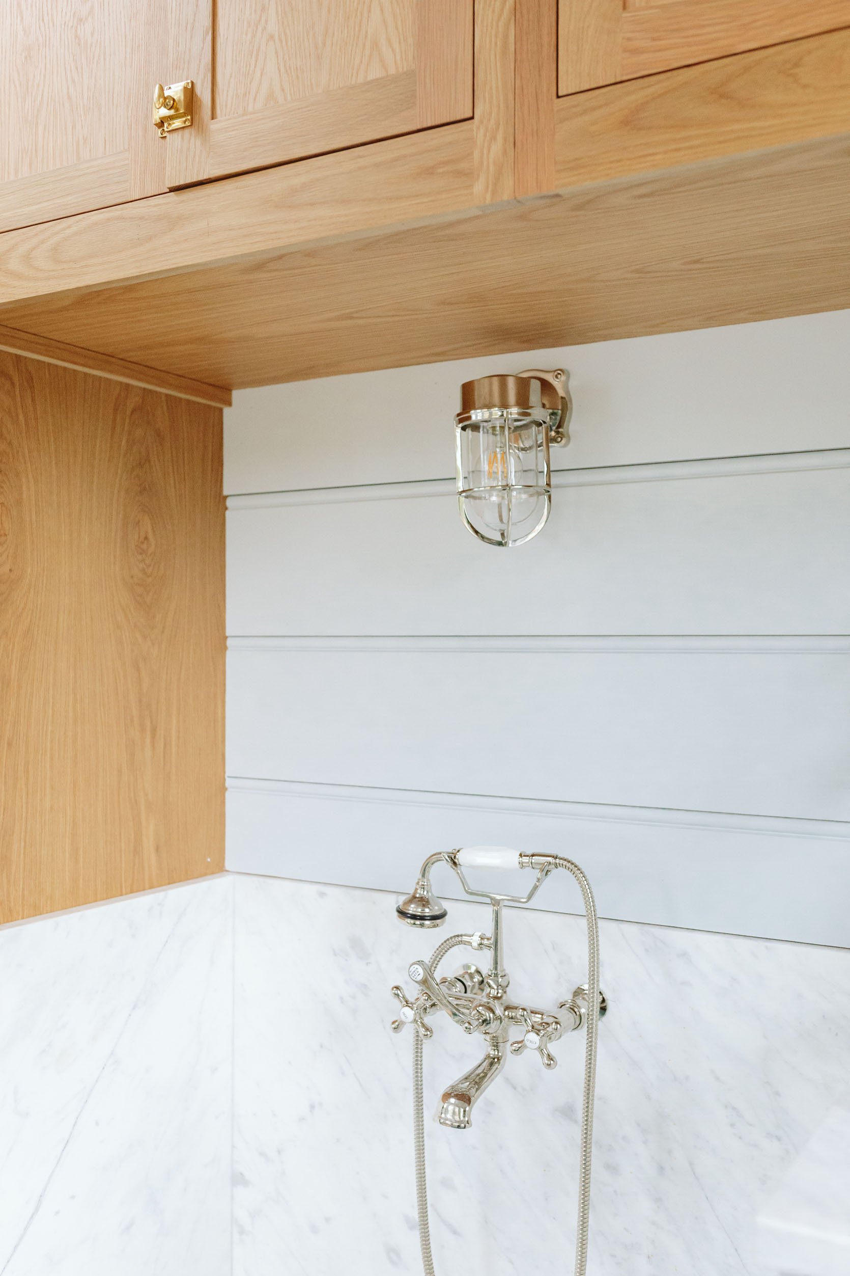

There is a lot to tell you about this which is why it deserves its own post in regard to size, function, and tips I’ve learned. But as you can see we have this dog washing station and so far we’ve used it no less than 5 times a week. Not necessarily for a full bath (mostly because Brian likes to shower with them which keeps them more contained), but it is excellent for the daily paw cleaning after walks which is what it was designed for. We fabricated it out of stone (the same Carerra as the rest of the house) and it turned out beautifully (Alpha StoneWorks was the fabricator for anyone local). The faucet is from Rejuvenation in polished nickel mostly because I felt that the gold in here would be too garish for a dog washing station. The hand shower works so well to get the dirt out of their paws and they even kinda like it! Likely because I say, “good boy” and “good girl” over and over in that annoying voice that somehow comes out when I talk to my dogs. Ask all of the details in the comments re this area so when I write that full post I can address all of them.
The Washer And Dryer
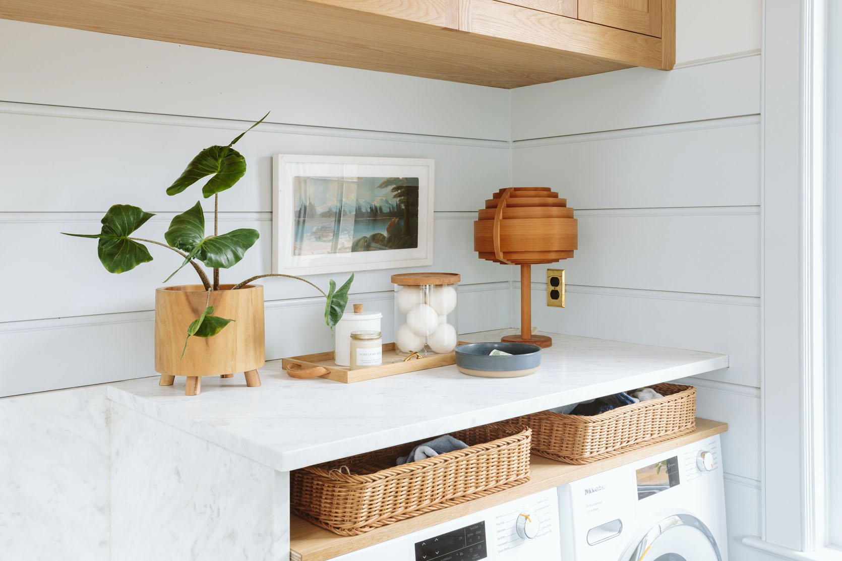
Wood Planter | Wood Tray | White Canister (similar) | Wood and Glass Canister | Art (vintage) | Lamp (vintage) | Blue Bowl | Outlet Cover | Woven Trays | Washer & Dryer
So here’s a funny story. About a year and a half ago or hell, even more, we had the mudroom where the kitchen is, but much smaller. It was going to be a drop zone with a small washer/dryer for more of the wet soccer clothes, dog towels, etc. We were also going to have another laundry set up on the bedroom floor for most of the clothes and sheets. Then we changed the layout, moved the mudroom into this corner of the house to make the kitchen bigger and better (so glad we did by the way), and dragged and dropped these units into this new room in the drawings. We designed the rest of the room with all the specs in place. You know where this is going. We didn’t catch until later that we hadn’t upgraded to a larger size. We already had the washer and dryer and the more we thought about it we figured that most of the laundry would be upstairs – kids’ clothes, their bathroom, and 3 bedrooms of sheets. So as long as we had a larger size up there then we’d keep this one for our clothes and kitchen/dog towels (not to be mixed, btw). I was worried it would look out of scale with the room and maybe it does but I’m so used to it and I really like it. This Miele set is really famous in Europe for being so energy efficient, using such little energy. Two things I’ll note: the capacity is smaller than a normal size, and often I have to do a timed dry to get it all fully dry (I’ll likely line dry more in the summer). But I love that the soap is integrated and they are just so pretty, clean super well, and relatively quiet. We worked with Build With Ferguson on all of these appliances (and handpicked the brands we wanted in our home). The washer also speaks German with a sweet little “Willkommen” instead of “Welcome” which is real cute.
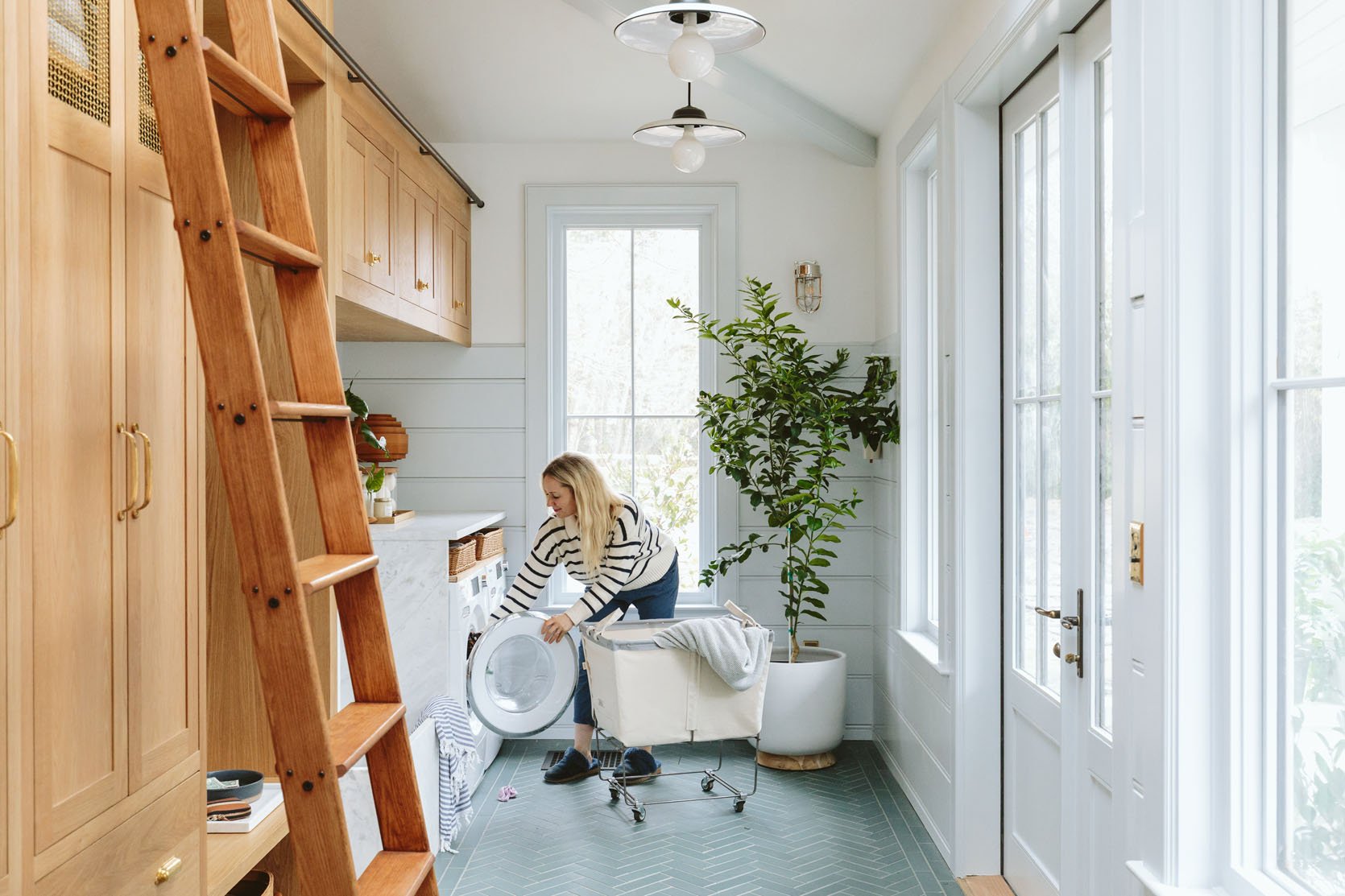
Laundry Basket | Dutch Blue Towel | Striped Towel (similar)
Pendant And Sconce Lighting
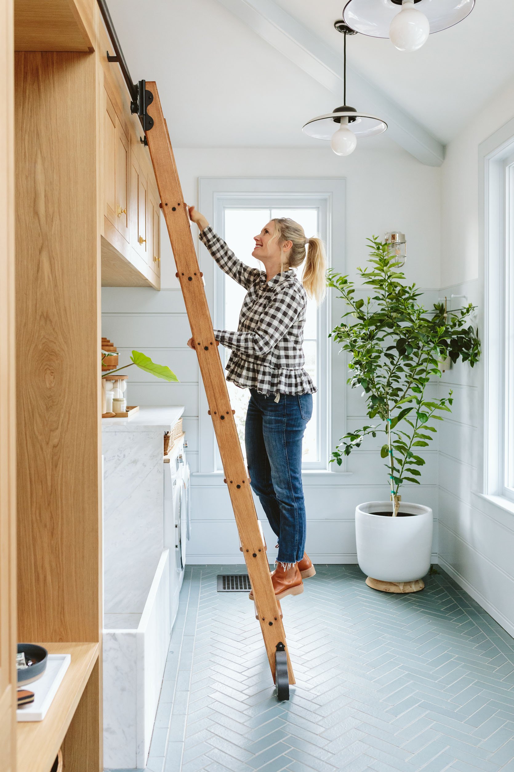
Pendants | Pendant Bulbs | Planter
As you know I love these pendants so much (we have the same in our kitchen) because the flat proportion with the round bulb is playful and modern. I love how utilitarian and simple these are (plus gives off enough light that we don’t need recessed lighting). They hang about 16″ down from the ceiling with a cord (which was our preference, so they felt more casual). These are from Rejuvenation and are often used for covered outdoor areas, but I loved them inside in this space so much. They are perfect for in here and for us.

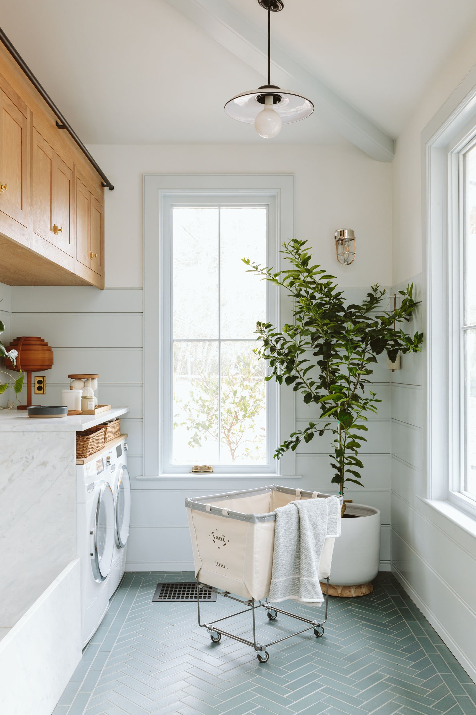
The Tolson cage sconces are the ones that I’ve loved forever and are so classic without being boring at all. I especially like them in hard-working areas as the glass shade and metal cage are obviously durable and can handle moisture so well. We matched the polished nickel of the faucet and it’s so lovely with the white oak and the Dew Drop walls.
Windows And Doors


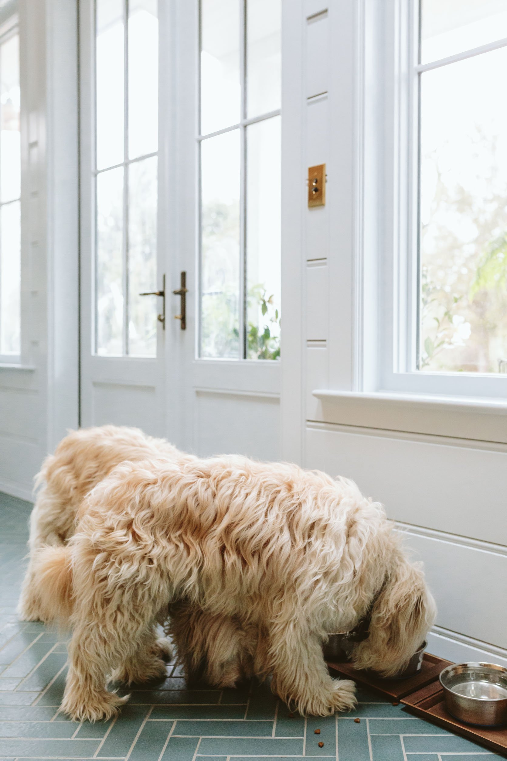

Do you need a lot of natural light in your mudroom? Not technically. But with north-facing light (which is so soft and pretty) we knew this room could be so lovely and bright with no harsh light. So we worked with Sierra Pacific on the windows with a modern 2×2 configuration, with paint grade on the inside so we could paint them the same color as the paneling. The french doors are also Sierra Pacific and they lead to the backyard with the flagstone path that the pups walk on to go on our walks through the neighborhood. All excellent quality with some operating and some fixed. The light in here is pure magic even on the cloudiest and rainiest of days.
Velux Skylights

Skylights | Wood Trays | Metal Bowls (similar) | Bench (vintage) | Glass Canister | Broom and Dustpan | Switchplate
In the name of getting the best natural light for most of the rooms, we added two skylights in here which to no one’s surprise just really helps it feel bright, airy, open, and even more connected to nature (seeing the sky while in a room is really joyful). Velux never disappoints – both in function and making a space so much better through natural light.
Anything I’d Change?
NOPE. Besides needing a better dog mat for the door and tray for the food. I couldn’t bear to shoot what we had which was plastic, rubber, and ugly. I am shopping for a great version of both of those that won’t take away from the design and yet function better than these super cute wood trays (that I got from one of our favorite stores JP General in Multnomah Village).
More To Come…
This post is already pretty darn long, but I want to break down the dog washing station as well as the rolling ladder for you in separate posts. So let me know any questions in the comments and I’ll address them 🙂
Thanks for reading, always. I don’t think I say it enough but those of you who dedicated time to read this and get here in the post just know I really really appreciate you. CHEERS TO ANOTHER REVEAL and more reveals to come very soon. This one was a big win for me personally, a room I feel so proud of and grateful for. Thanks for letting me share. xx
Mudroom Resources:
Cabinetry: Unique Kitchen and Baths
Wall Paint Color: Extra White by Sherwin-Williams
Paneling and Trim Paint Color: Dew Drop by Sherwin-Williams
Floor Tile: Pratt + Larson
Tile Installer: Level Plane
Dog Washing Stone: Bedrosians Tile & Stone
Appliances: Build by Ferguson
Skylights: Velux
Stone Fabrication: Alpha StoneWorks
Hardware: Rejuvenation
Light Fixtures: Rejuvenation
*Design by Emily Henderson and ARCIFORM
*Photos by Kaitlin Green
THIS POST WAS ORIGINALLY PUBLISHED HERE.


