When this kitchen was pitched to me I had a few instant thoughts. First, it’s beautiful (duh), how fun that it’s located in a town I grew up next to, and I loved that it featured one of my favorite 2023 kitchen trends without looking “trendy”. That trend being the use of darker metals. Then as I looked deeper and read more about it, I knew I had to share it with y’all. Designer, Erin Brown, not only created a beautiful, richly toned kitchen amongst a sea of homes with light, white kitchens (pun intended:)), but she also made some really cool choices that you might not catch or know at first glance. One choice being that since this was a gut home renovation, she decided to move the kitchen to the second floor so that she and her family could all fully enjoy that stunning ocean view (and the beaches I grew up loving).
So I sent Erin some questions to really dig into how she created this dreamy kitchen so let’s dig in, shall we?
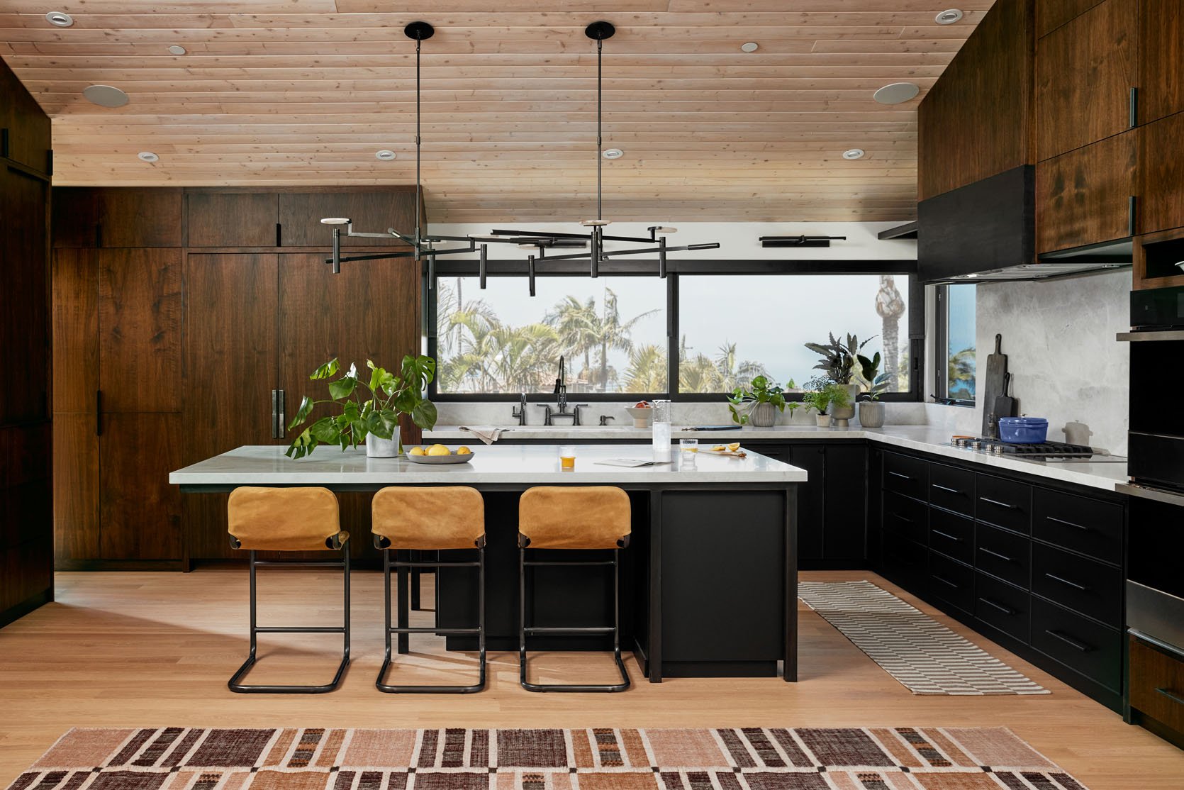
Appliance Pulls | Chandelier | Stools | Rug | Runner | Cabinets | Windows
As a former OC gal myself – light, bright kitchens are the standard when renovating, especially by the beach. What made you decide to go for a richer color palette?
Heyyy, SoCal in the house!! You are right, a white kitchen is classic and timeless. Right now a white oak kitchen is trendy and in demand. I adore a light bright kitchen, especially if natural light is lacking the light color is so important.
Because our kitchen has a 12’ long LaCantina window that faces Southwest, we have no shortage of natural light. Our abundance of natural light combined with my love of rich tones played heavily in selecting all dark cabinets. Using dark Jacobean stained walnut cabinets combined with our black BOXI cabinets suited my personal preference of deep saturated colors.
Additionally, I love the design tension that light and dark colors create. By pairing the richer, darker color palette of the cabinetry with light floors, countertops, and backsplash, to me, that tension actually is quite harmonious. It is a color story I carried from the exterior through the interior of our home, dark wood carpentry with contrasting lighter elements, such as light flooring, stucco, and paint.
As an aside — the kitchen could have gone super light. Originally, I was going to put the kitchen on the first floor, an area that does not have the same bright afternoon light that we now have. I would have gone light to counter the lack of natural afternoon sunlight. And probably darker counters.
Jess here! Now I also love a light, bright kitchen, because they are beautiful, but I think Erin really shows that color and material tension in a space is so powerful. I mean those light wood ceilings against her dark walnut cabinets, get outta here! It looks fresh yet soulful with a perfect 2023 nod to mid-century modern design. However, she definitely makes an important point about natural light so that’s always something you should consider when choosing colors and materials.
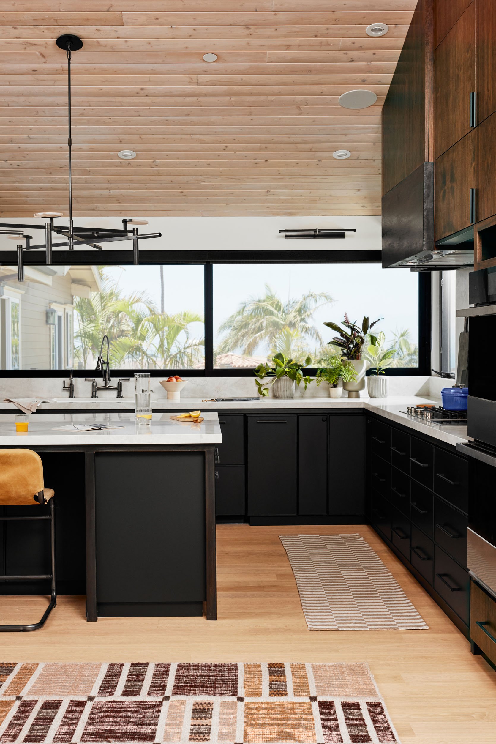
I think it’s so cool that you decided to take advantage of the view and moved the kitchen to the second floor. Were there any unexpected challenges or things someone should think about if they also want to move their kitchen to a second floor?
Well first, prepare yourself for people to question your decision! It’s funny, the pushback that can happen when you choose something that is not the norm. From plaster shower and bath surrounds to vanities that were higher than the standard to our kitchen on the second floor — people questioned if I really thought it was a good idea. And yes to all three! I personally believe that if you live in an area where the view exists from a certain perspective, I’d encourage you to choose to spend the most daylight hours centered on that view! An ocean view from our bedroom was the first option, but we just don’t spend a ton of waking hours in our bedroom, and I felt like the view would be neglected most of the time.
From a construction perspective, I experienced no different challenges with my kitchen on the second floor than on the first floor. However, we took our building down to the studs. Everybody’s structure is unique in terms of being able to access plumbing and proper ventilation. The only real challenge of having a kitchen on the second floor is simply getting the groceries up and the trash down. But that is not unique only to a second-floor kitchen — anyone who lives in a multi-story building deals with this. Putting the kitchen on the second floor was one of the best decisions we made. Those sunset views make doing dishes a pleasure!
Jess again:) So as I stated in my question, I LOVE that Erin chose to flip the floors and make this house (and view) work best for them. Plus if they decide to sell, I can’t imagine any future buyers being upset that they actually get to enjoy this view for the majority of the day. But with great windows and beautiful views can also come with harsh sun for parts of the day. I spotted her very tucked-away shades and wanted to know the details.
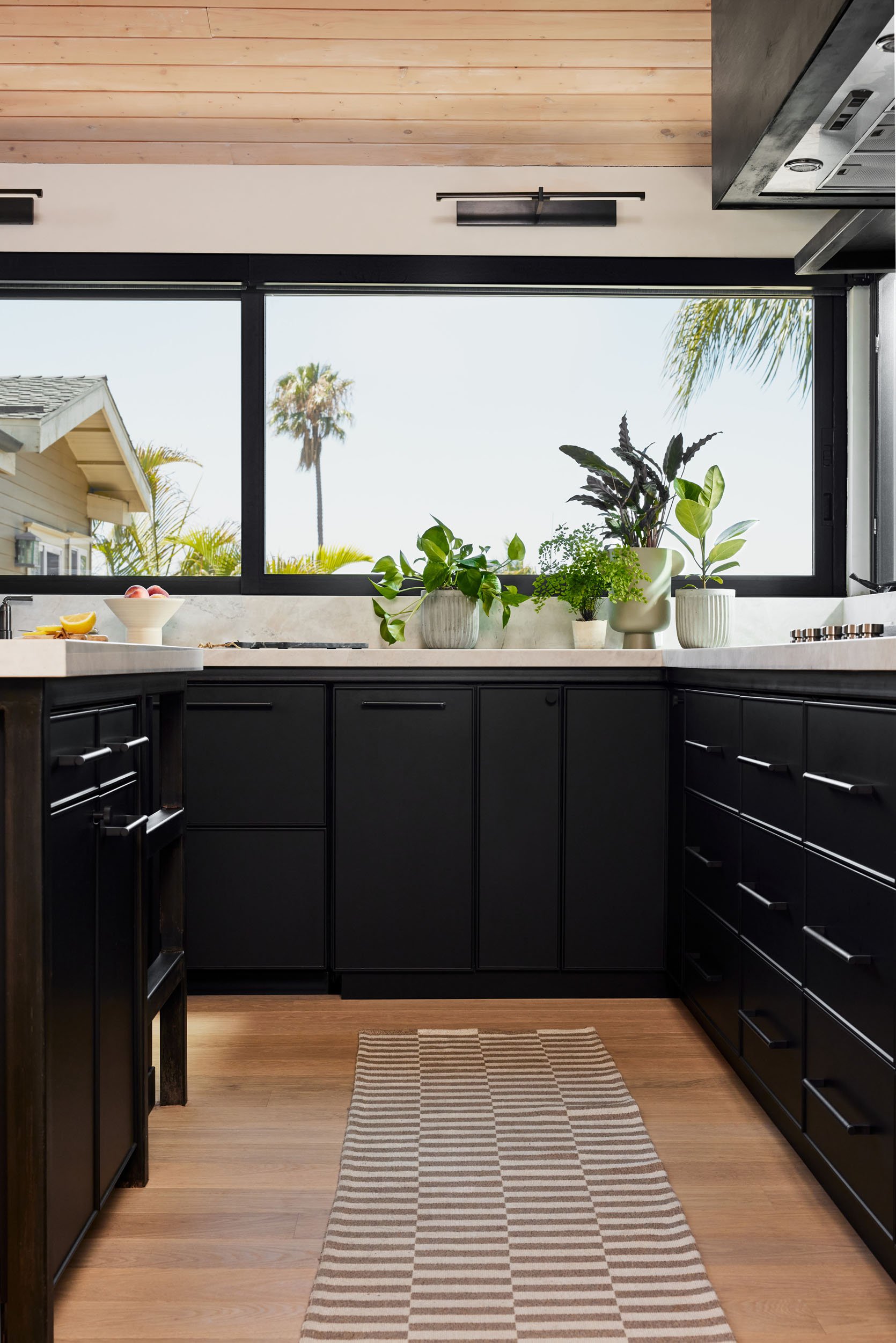
Can you talk to me about the window shades and where they are from?
It’s so interesting you noticed the shades! They are motorized solar shades with a metal valance to echo the steel elements throughout the home. They are perfectly indiscreet when raised and so functional when down. These shades are truly for cutting the southwestern sun, heat in the summer, and glare off the TV year-round, yet we have that ocean view so I didn’t want it to be eliminated with a shade down. Fortunately, a dark color and 3% solar shade gives us sun protection, and more privacy while maintaining the view. Interestingly a lighter color shade does not allow for a very clear view through the shade.
So drumroll please – these are Bali solar shades in “Suit” from Lowe’s. And I’m proud to share that I got them on sale during a promotion! Haha! During each renovation, the budget needs to do a lot of stretching. I am a firm believer that the most expensive finishes should be the ones that will be most disruptive to update. As a designer, I am always updating elements of my own home. So for window coverings, I got the clean aesthetic at the most budget-friendly price point. I do fully intend on swapping these out in a few years. But the motorized functionality is a game changer! 10 out of 10 recommended!
Ok, now let’s get “trendy” and talk about Erin’s decision to use steel for parts of her design…
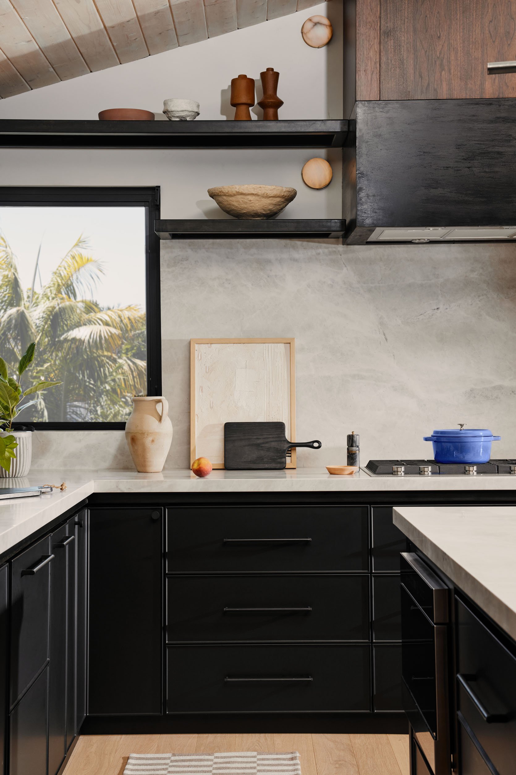
Sconce | Black Cutting Boards (similar) | Pepper Grinder (similar) | Art (Erin is still looking for the artist and we will update asap!)
The steel in your kitchen is so stunning. Have you worked with steel a lot or is this something new you decided to try?
Thank you! I have used steel elements in commercial restaurant projects and a residential patio structure. What I love about steel is that it changes the physics and dimension of virtually everything because of its strength. In Arizona, I was able to create a shade structure that was 11 feet tall underneath, whereas if I hadn’t used a steel structure, the patio would have only been eight feet tall as it attached to the home.
In our current home, steel allows elements to seemingly defy gravity. From our floating curved staircase to the cantilevered kitchen island, and even an L-shaped bench hovering without visible support from the ground beneath it. For me, steel’s elegance is so understated especially when it has the deep, virtually black patina we applied.
Jess here. I think that even I would be slightly hesitant to use steel, in fear of it making a space feel cold, but as we can all see that’s just not true when mixed with the right materials. As Erin said, it’s so elegant with the patina she used and adds a quiet visual texture. So while steel may not be a fit for every style of kitchen, this is proof it’s a stunning option if it is.
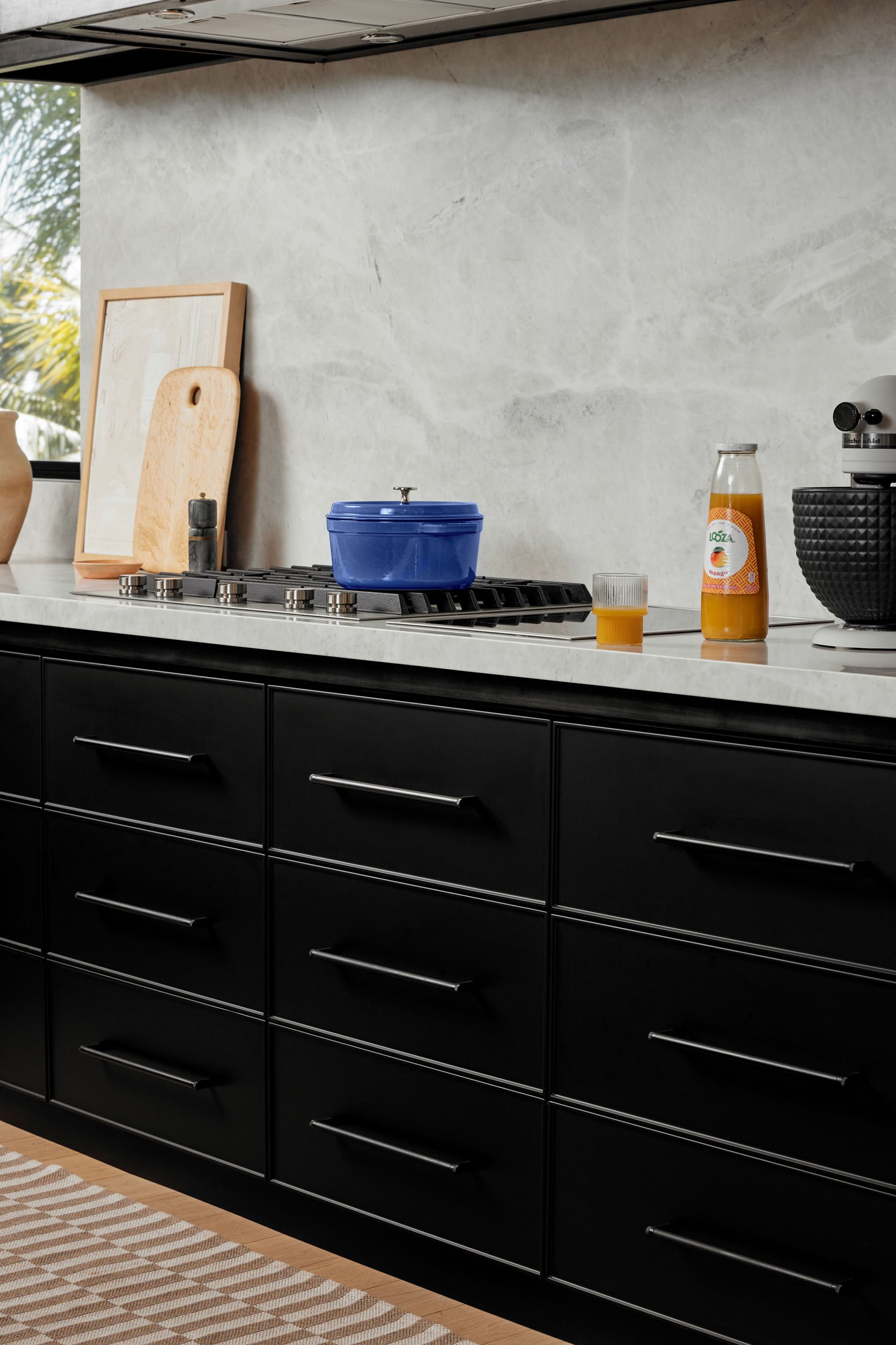
Light Wood Cutting Board | Cooktop (similar) | Indcution Options | Dutch Oven | KitchenAid Mixer | Studded Bowl | Fluted Cup
Is your stovetop part gas part electric? If so what was your reasoning behind this decision?
Yes! JennAir offers modular stovetop units in both gas and induction. I went with 2/3 gas & 1/3 induction split because I wanted the best of both worlds- the environmental consciousness (and efficiency) of induction since our home has solar but the old school gas burners to mimic the restaurant cooking I love. But honestly, I wish I had reversed it- 2/3 electric induction and 1/3 gas. I use the induction far more than gas. Switching to majority induction cooking was a surprise to me! The induction cooking is so even and the cleaning is a breeze. The JennAir induction top is actually insane- it boils water in seriously two minutes. I don’t know how it happens but it’s actually bonkers. The only thing to know is that you need either new pans or cast iron pots and pans like Le Creuset.
Another endorsement for induction stovetops! But now let’s talk about a really interesting and smart decision Erin made in terms of her cabinetry. She had metal frames made for the lower cabinets so that if and when Erin decides to switch them out, the countertops, flooring, etc remain totally intact. I’ll let her explain it in more detail.
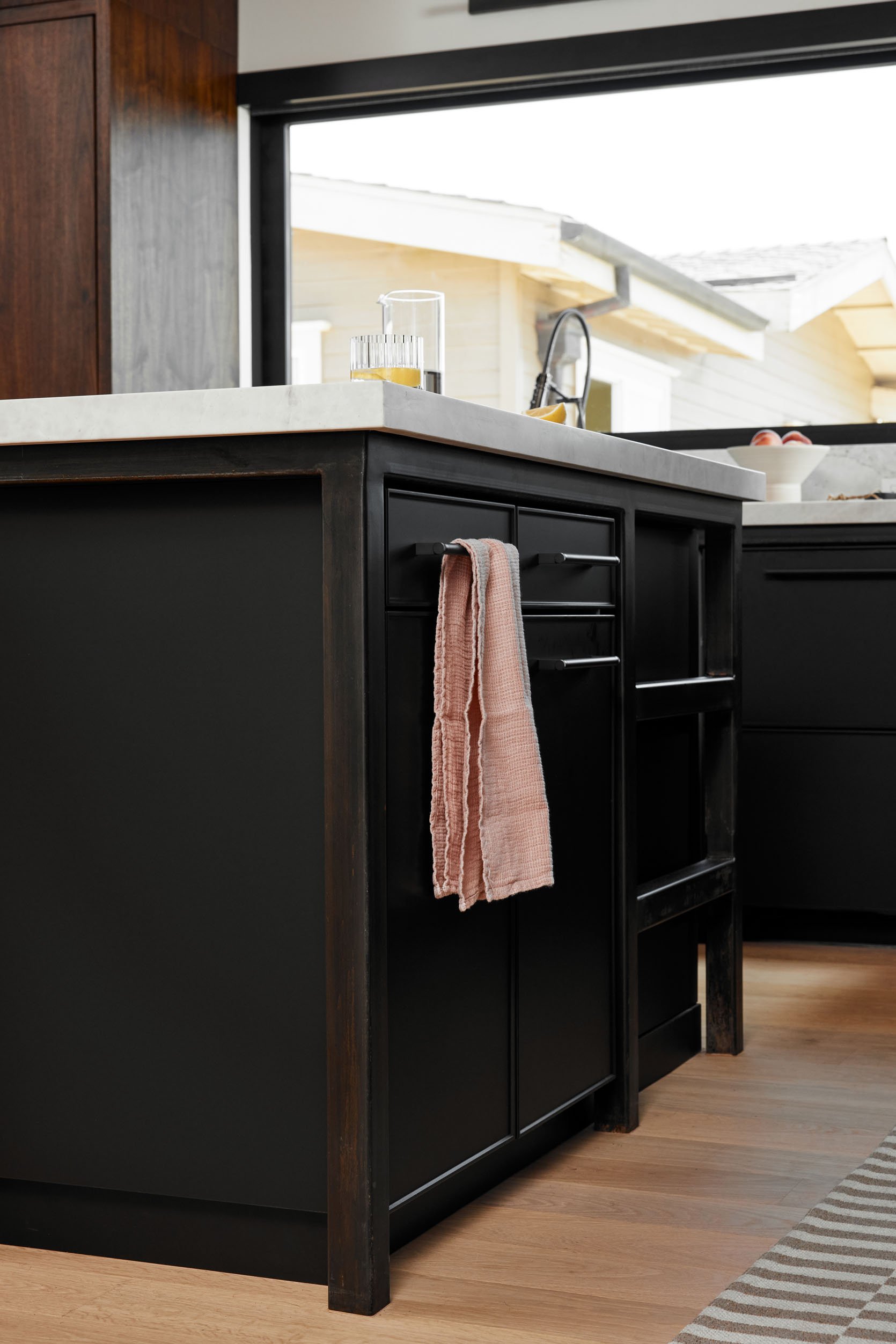
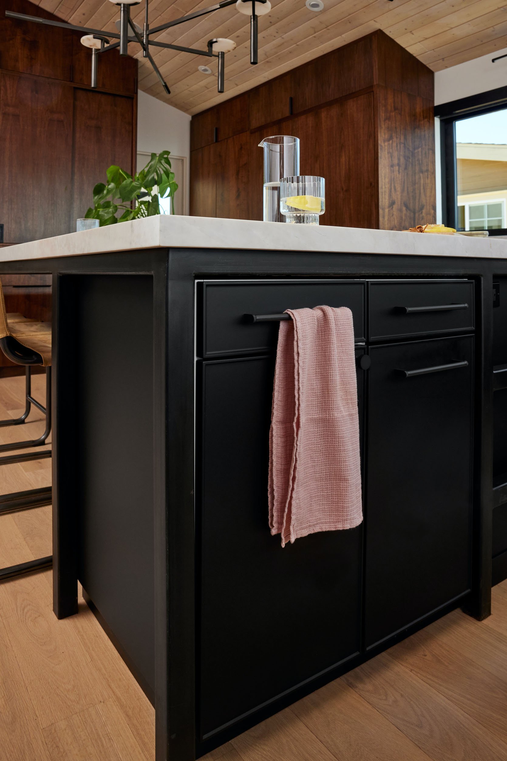
Can you walk me through the cabinet install and the metal frames? Are the cabinets just essentially just sitting on top of the floors?
The cabinet install was a breeze! Because we received our BOXI cabinets so quickly, we were able to place them in the kitchen and build the frame knowing the exact layout of the uninstall cabinets. Once the frame was constructed we patina the steel, remember that’s the messy part! Read more for details. Then the BOXI cabinets are set on top of a toe kick, which is essentially a 3” tall wood rectangle placed on the ground everywhere we have cabinets. Our carpenter made the toe kick, but anyone who is good with a saw- a handy homeowner, a contractor, or a carpenter could make these toe kicks. Then, yes, the BOXI cabinets were placed on top of the maple toe kick and we used the facing material, ordered from BOXI, to match the toe kicks exactly to the cabinet finish. BOXI truly has thought of everything to make their cabinet offerings look, feel and function like customs! The cabinets do come with legs you can use instead of a toe kick. But that was not the aesthetic I was looking for so we opted for building the toe kick and finishing it off to blend seamlessly with the cabinets.
This might sound crazy, but I wanted to find a way for cabinets to be more easily swapped out. Essentially the idea behind the metal framework is so that I am able to change out the cabinets without disrupting the countertop, appliances, or the sink! As a designer, I am constantly inspired by new colors, materials, and finishes. So I intentionally made it possible for my kitchen to become a bit of a canvas that I can recreate in a whole new way!
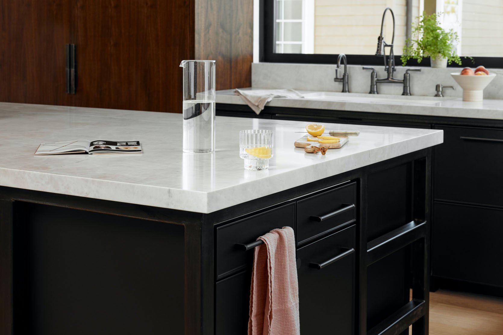
Do you have any tips for working with steel or metals as a main kitchen feature?
Oh, yes! I learned a lot on this project. Because this was my own home, I was willing to experiment with exposing steel in a non-industrial aesthetic. As I mentioned the dark patina transformed the material. I even patina’d a few of the pieces myself. I was fortunate enough to be advised about applying and sealing patina by Martin De Winter of DEWINTERMETALWORKS — if you want to see someone who is truly mastering their craft, check him and his team out!
Preparing metal for patina can take a long time and elbow grease but adding the patina requires a faster approach because the color changes as the chemicals are exposed to the air. It’s truly a humbling process. Sealing it quickly was important for the color results I was looking for and in order to keep the metal/patina from rusting. It can begin to rust within minutes. Our metal elements turned out amazing but as general advice, this kinda makes me giggle as I think about the stress of the patina application and sealing, I would recommend hiring a professional to patina metals. From a design perspective, I would advise incorporating steel where you want to create a wow factor! Steel is also great for areas you want to reclaim square footage, so an element that can float instead of be grounded – think staircases, countertops, and benches or seating areas.
However, be warned the fabrication and installation of steel is one of the messiest and potentially dangerous parts of the construction process – a.k.a. a fire hazard from all those flying sparks! So the earlier these pieces can be installed and then protected the better for the sake of the other finishes.
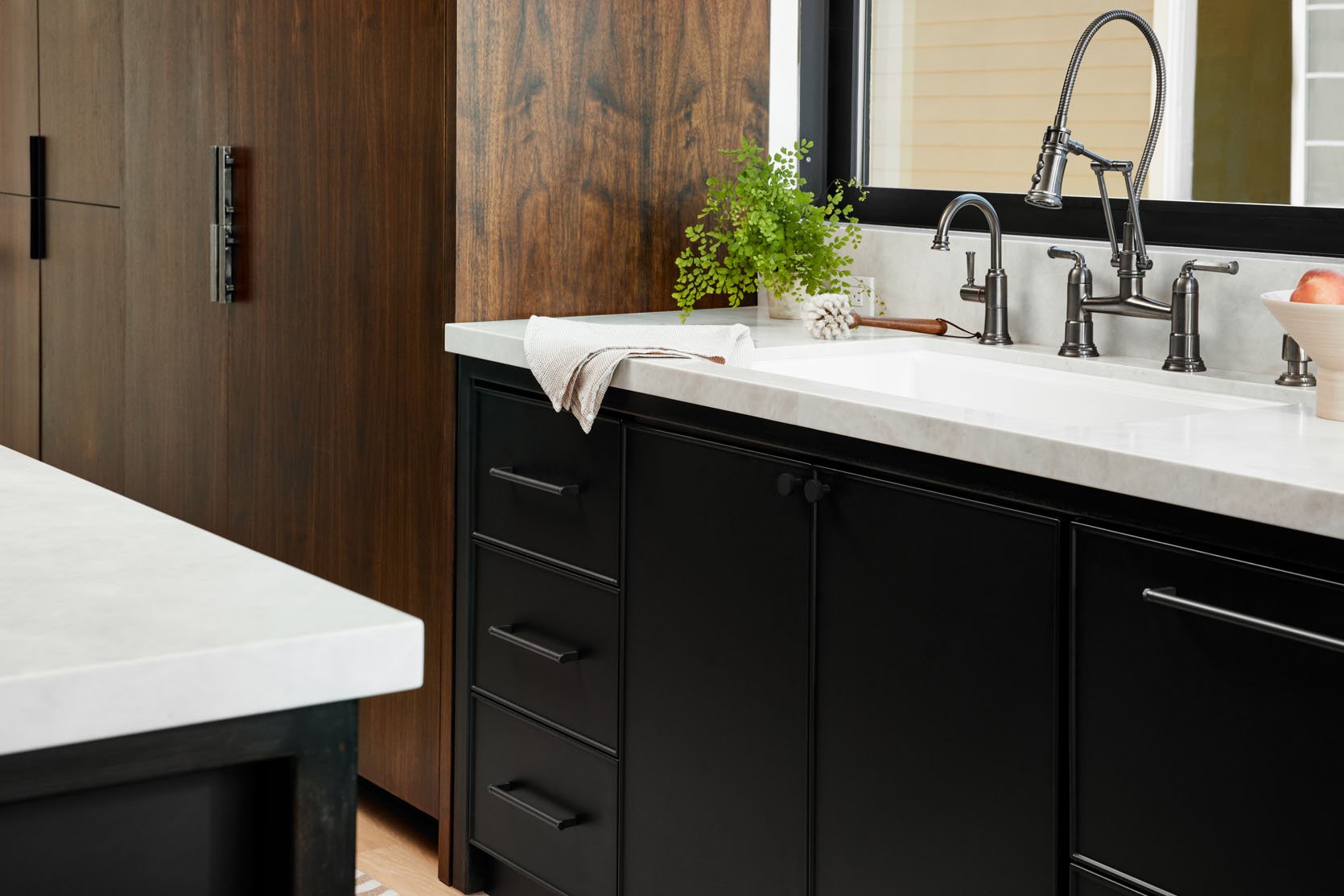
EHD gal pal here – Please note the darker-toned faucet too. I promise I’m not trying to prove that my trend prediction was right but this isn’t a bad start to the year:) I would also like to profess my love for these walnut cabinets. They completely drive home the MCM style in such an elevated way. Also, pay attention to their style too. They are inset without any visible framing which is also very MCM but also just clean and chic. Then the cherry on top is those sleek exposed double-wall ovens. While Erin integrated the fridge, she made a point to expose those ovens which also really made this makes this kitchen feel like an updated version of a mid-century modern home. I just love it.
And speaking of the ovens I had one final fun question. Well, I think details are fun so…
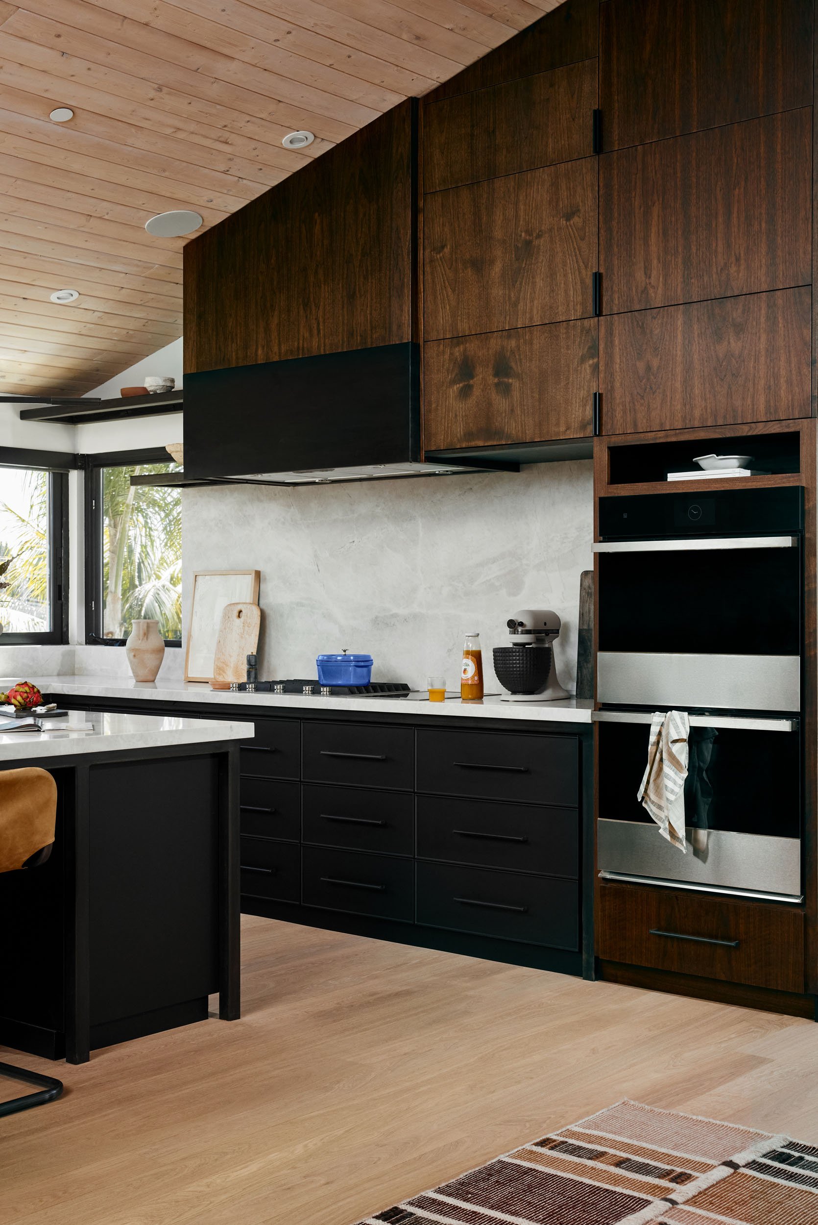
I love the cubby above the wall ovens! Was there a purpose/function for it aside from displaying pretty things?
Thank you for noticing that detail! Short answer: that cubby came about because I am tall and my eye (and brain) love straight lines. With kitchens, there can be many constraints, appliance height being one of them. Because I am tall, I wanted the hood to be as high as possible so that I didn’t hit my head on it when I was cooking and the uppers run in a relatively straight line off the hood. I could not bring the JennAir double oven up to that height because I’d probably burn my arm on the door of the upper oven as I reached in. But the beauty of a custom space is to make every detail just right for the people living there. I suppose at the intersection of functionality and form a tension is created that allows for an interesting solution. My options were a flat panel with dead space – I am a big believer in not wasting any space so that got scrapped, a sliver of a cabinet would have ruined the proportions so it became a little nook that I just adore. As you said, I can rotate pretty things alongside whatever cookbook I’m obsessing over. That small space with a dark backdrop treats whatever object is there like it has its own spotlight.
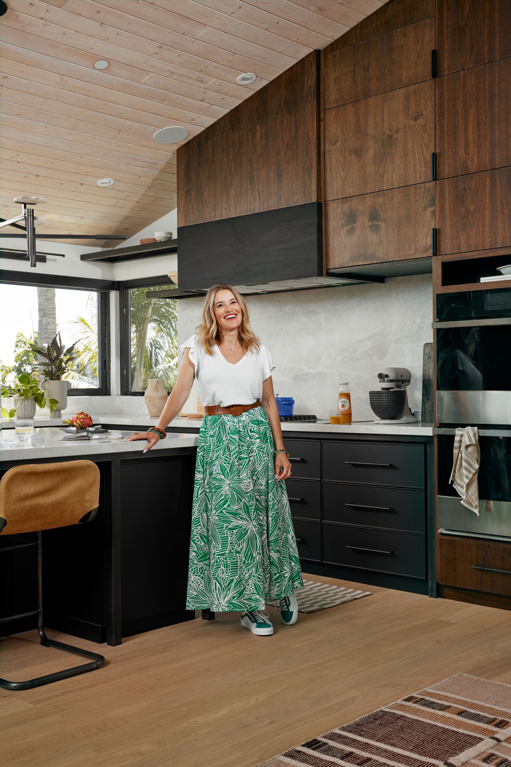
I want to thank Erin for letting us feature her wonderful kitchen and hopefully, if you have been toying with the idea of using darker metals in your kitchen, this made that decision a clear yes! And while we deemed “dark metals” a trend this year, when used in a beautiful and thoughtful way, it’s not going out of style. So now go follow Erin and see her rainbow tile bathroom!
Love you, mean it.
*Design by Erin Brown
** Styled by Nidia Cueva
***Photos by Zachary Gray
THIS POST WAS ORIGINALLY PUBLISHED HERE.


