I’ve had a love affair with statement sconces for a long time. I’m a sucker for a simple yet dramatic design moment. For statement sconces specifically, not only are they a piece of art in their own right but they also have a very useful function–lighting up a room. What’s not to love?? To me, it reads “I love design and know how to put it into action”. Honestly, they are kind of a design hack. Take Brady’s old bedroom sconce in the opening photo. His room would have still been amazing without it BUT with it, it’s completely elevated, visually interesting, and it adds an inherent chicness in my opinion. Bring on the drama, baby!
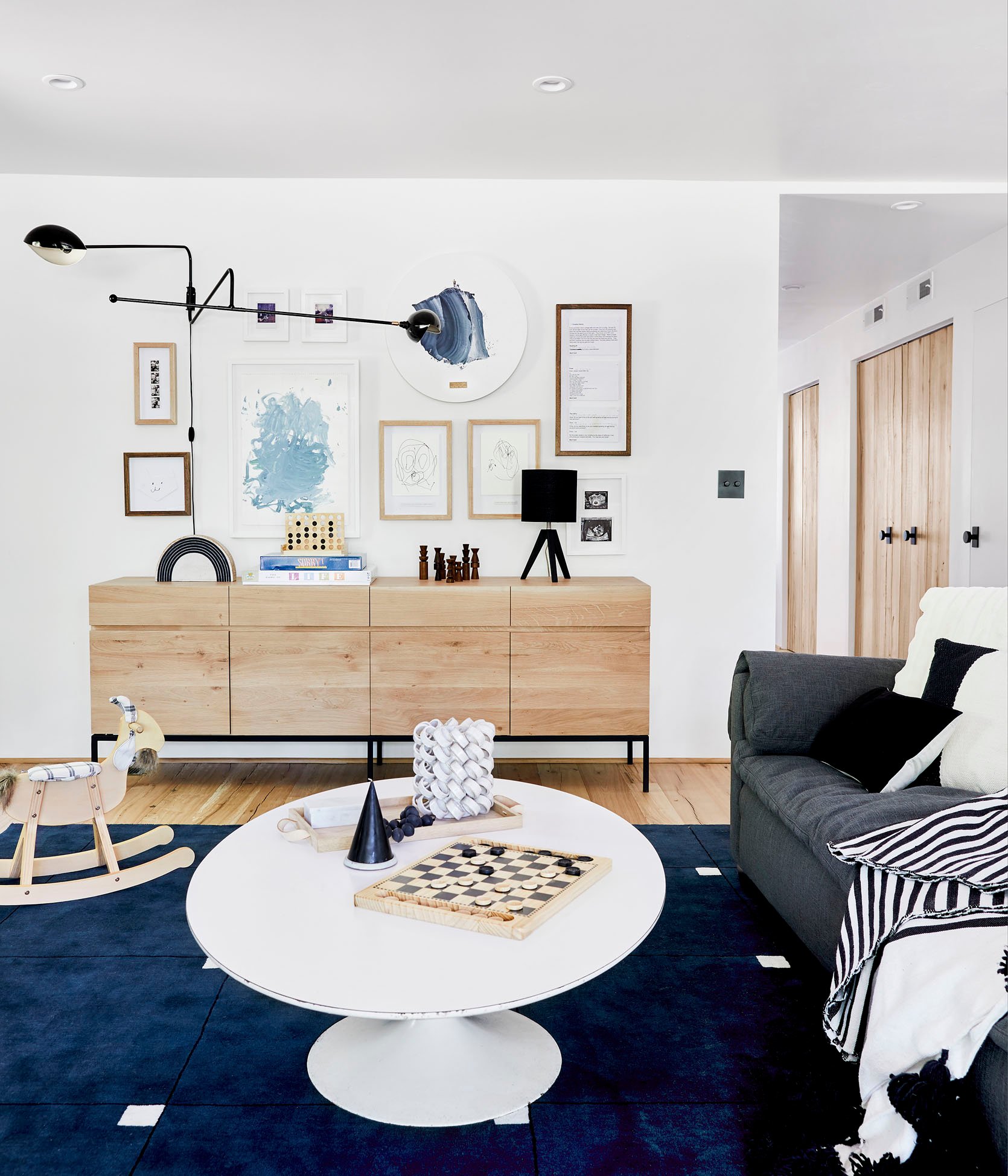
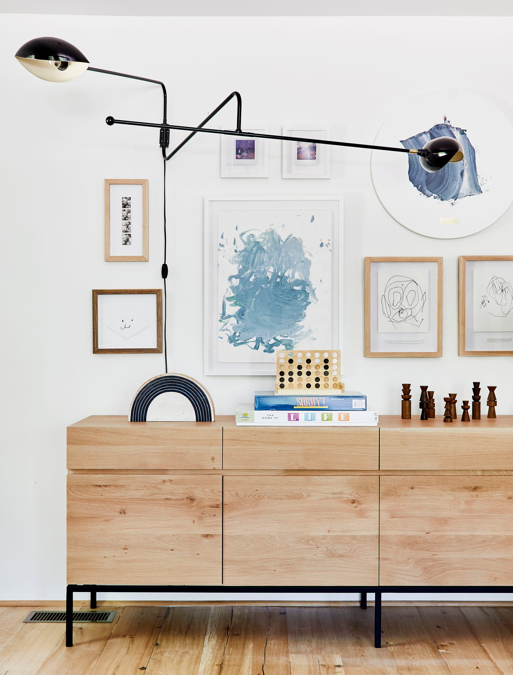
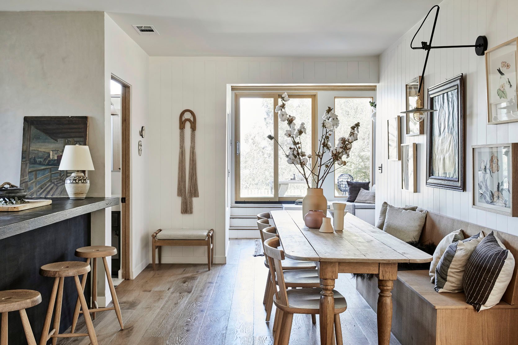
Emily did a similar thing with her family room gallery wall at the mountain house. I love how she made a gallery wall that was filled with sentimental and personal things from their life. Again, without the sconce, it still would have been a great-looking gallery wall. But do me a favor and use your finger to cover it. See?? I think we can all agree the stunning sconce adds that “designer touch” and makes the whole wall feel more sophisticated.
I also want to note that for this awesome visual effect, this sconce must be big and wide. Something small could have still looked pretty, but it’s the inherent size and simplicity that makes this wall extra special, extra cool, and like a professional designed it. So if you want something similar GO FOR IT, K???
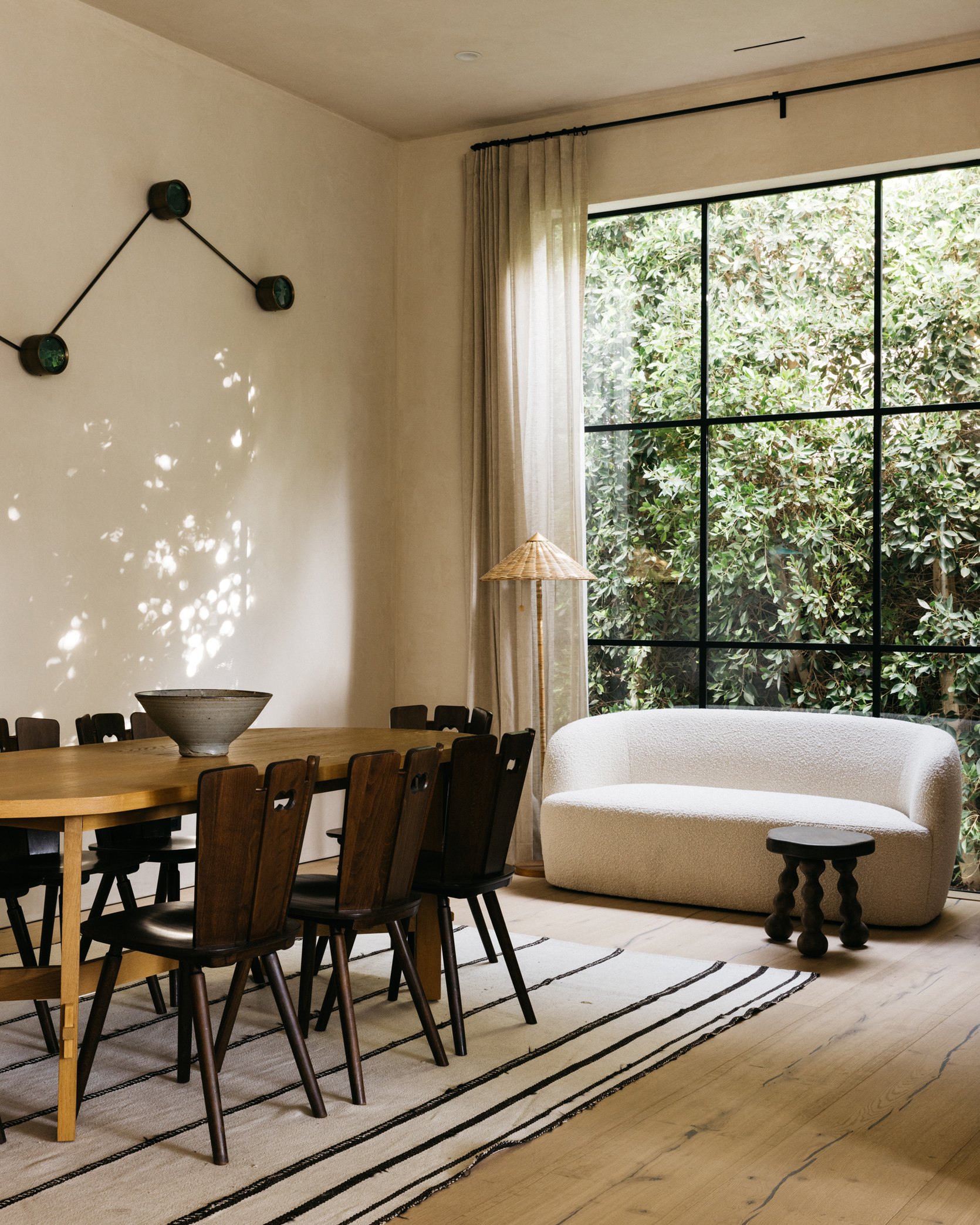
What is also incredible about a large sculptural wall sconce is that it can act as a big enough piece of artwork that you may not need anything else on the wall that it’s on like in Rob Diaz and Anastasia Ratia‘s incredible design.
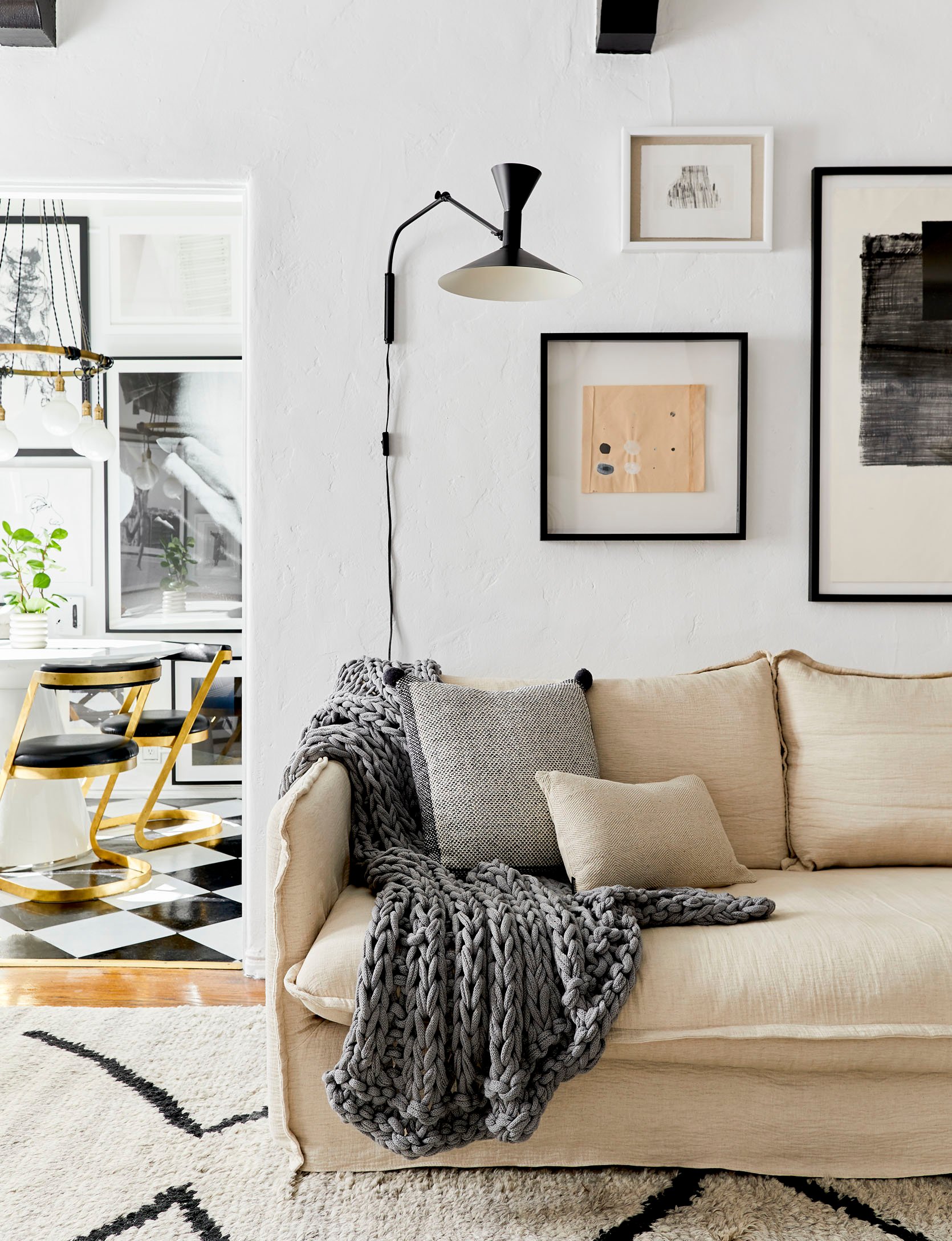
But let’s say, you like the idea of a super wide sculptural sconce but you don’t need or want it to take over the majority of your wall… just add something more vertical to a gallery wall like the sconce master himself, Brady Tolbert, did in one of his last versions in his old apartment. It still has that oversized sculptural, geometric feel but is a liiitle less intense. If you’re into that sorta thing:)
Scale and those dramatic geometric lines are really the most important elements to think about when shopping for your own. Repeat in your head, “This is the kind of drama I want in my life.”
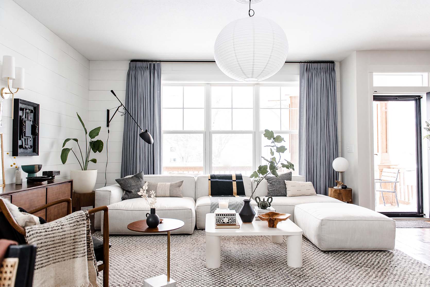
See how Lea’s perfectly oversized Serge Mouille-inspired living room sconce takes the design of the whole space up a notch? It says, “Yes, I’m a pro.” It’s moments and design choices like this that really change a space. Do the finger thing again to see. I know I sound like a broken record already but I want to prove my point. SORRY!
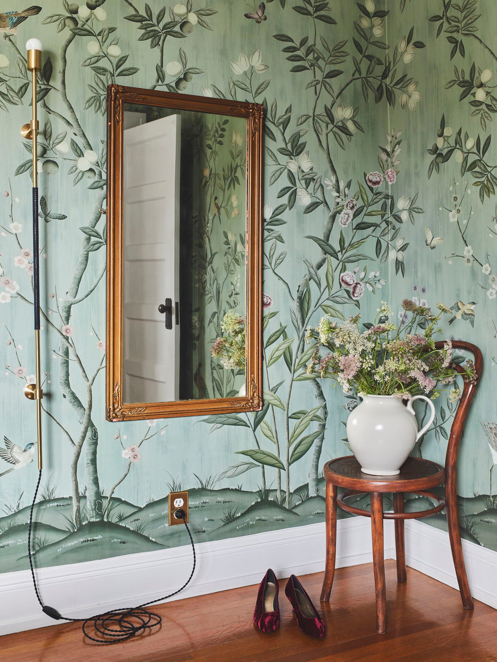
I actually also played with scale when I designed my friend/neighbor’s bedroom. I LOVE Katy Skelton’s lights and have always wanted to use one of her pieces. So when it was looking like their room need a hint of modern drama, I knew I wanted to use that sconce. My friend told me that it was the one decision she was a bit hesitant about but after it arrived and was installed it was one of her favorites. So like I pushed her (because I believed in it so deeply), I want to push you to play with scale in your sconces. It’s fun, I promise.
Now let’s get into the real reason I decided to write this post (per Em’s request). I knew the moment I stepped into my apartment’s living room that I wanted a statement, sculptural sconce on this wall (see photo below).
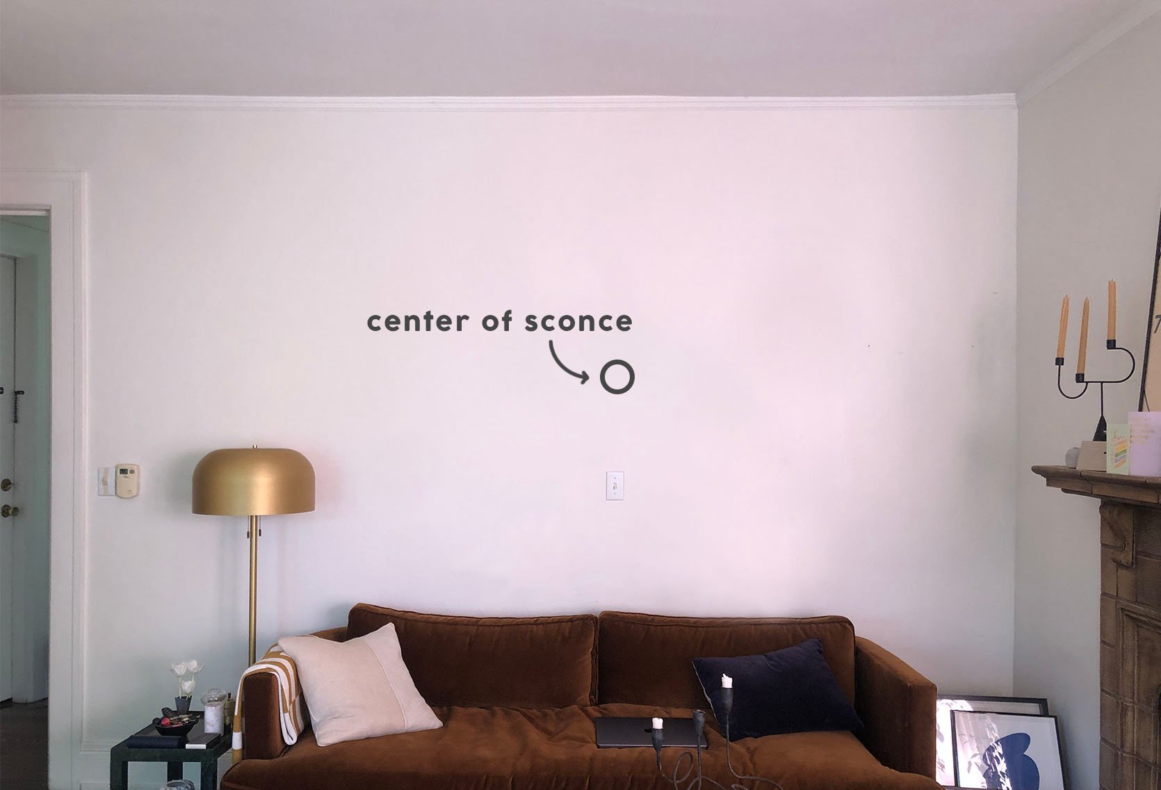
I didn’t want to simply do a gallery wall like my last place (even though I LOVE a gallery wall). Also FYI my beautiful, unfluffed sofa was only against that wall because I was having my birthday dinner party and needed space for another table. It is now back facing the fireplace where it belongs:) For a few reasons, I couldn’t take a more current photo. SECRETS…
Back to the sconce idea. I photoshopped out the “original” sconce that came with the apartment to give you a clean visual slate but there is a junction box in case you were wondering. But truly, isn’t this wall begging for a gorgeous huge sconce?? I wanted (as always for my spaces) to create a California/European vibe and a sculptural sconce would do that beautifully.
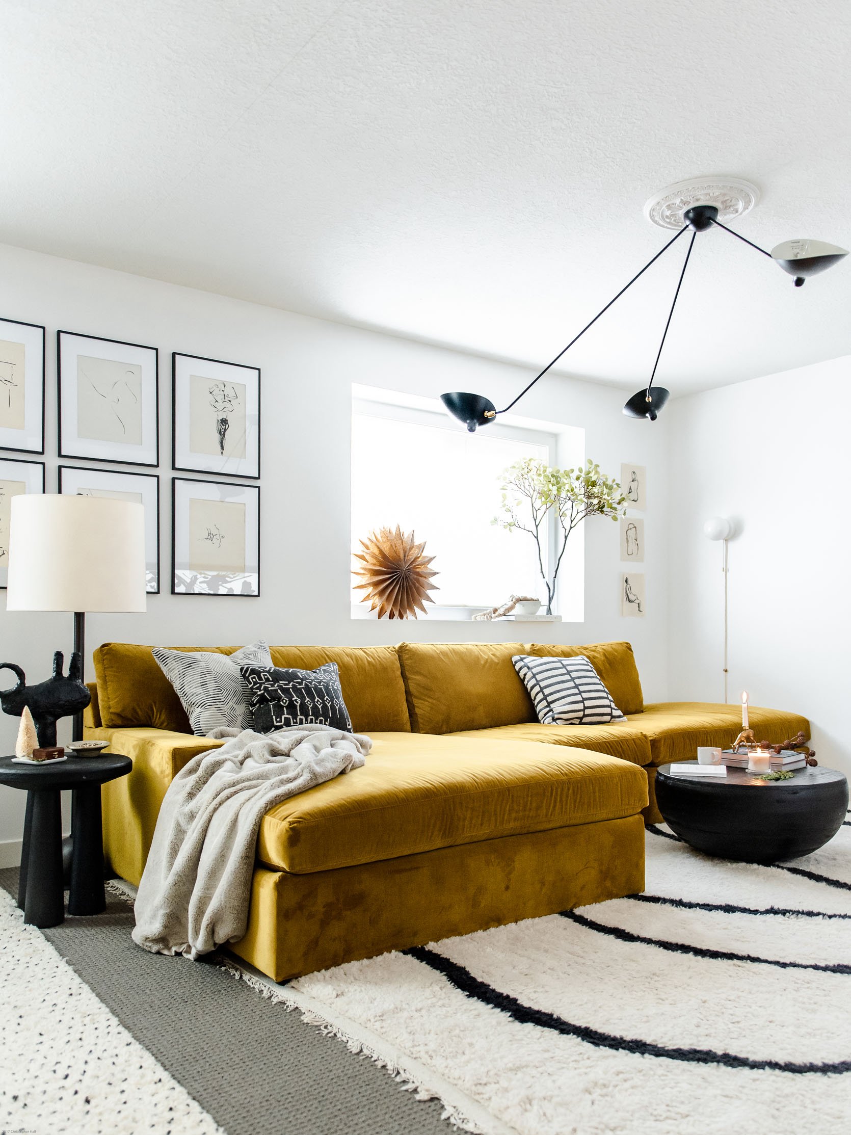
I’d been searching for a while and kept coming back to this Serge Mouille-inspired light fixture that Lea used in her basement as a ceiling light. For a second it made sense. It was going to feel very French/European, check. It was a HUGE visual statement, double-check. And I had always loved them, check, check, check! Plus I found one around the $500 mark which felt doable if they weren’t able or interested in gifting. They have some examples of it as a wall sconce if you look at the photos. It’s very cool if you have the space. Also, while these lights have gone in and out of being “trendy,” ultimately they are a classic.
But then I taped it out…
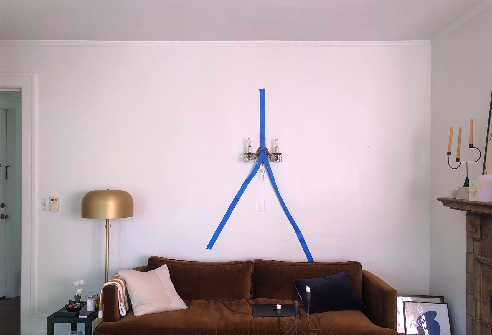
Honestly, even taped out I was still on board (remember that’s not the real location of the sofa). However, after I realized how far into the room it would protrude I knew I had to say goodbye. I’m sure a ton of you can relate to those moments. You think you’ve figured out a perfect piece to your design puzzle only to realize it doesn’t actually fit. RUDE. Someday I’ll have a larger room where I can use this as a sconce but that day is not today.
So what next?? Well, I had another secret French lover that I kept swooning over but this one wasn’t “inspired,” it was the real deal. If you haven’t heard of Wo & We, you’ve definitely seen his lights. You will have a hard time looking at any design magazine or site and not see one at least once. And I’m not just saying this but I have been a fan since I think before I worked for Emily. Getting one of his sconces would be a piece I would keep forever. I should also mention I am working with the amazing BuildLane to design a custom “shelving unit” and the light I wanted to get was going to work perfectly with my idea. So with all of that in mind, I knew this was the sconce and it was purchased.
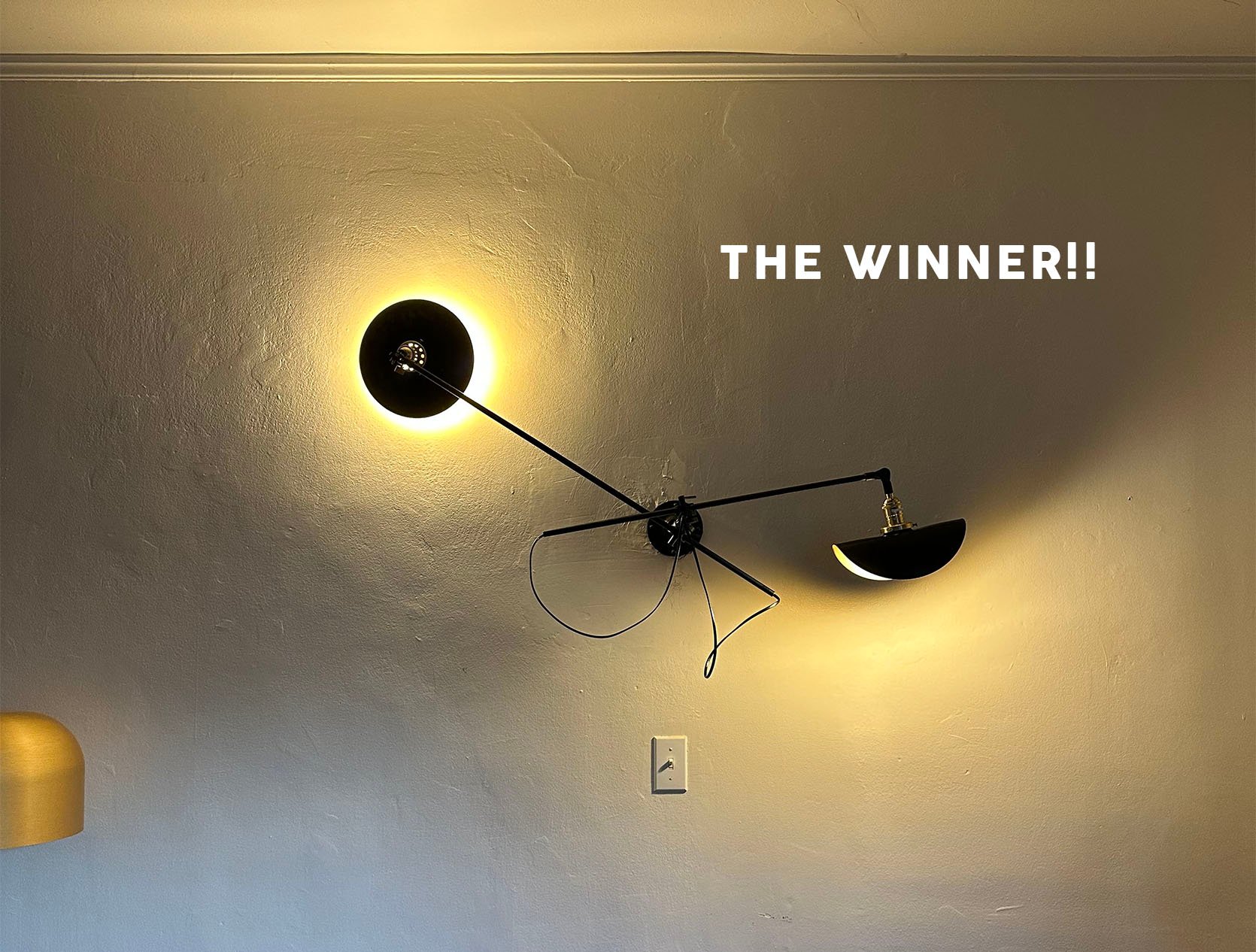
Ok, the photo is bad on purpose because I want the reveal photos to really feel like a WOW. I stare at it every day and can’t believe I have one. While absolutely not cheap, the price wasn’t as outrageous as I was expecting and was very on par with the market. Plus all of the lights are made in Lyon, France in the Wo & We factory. I even emailed directly with Oliver the owner and he was wonderful to work with. I was also able to slightly customize the length of the center pole since originally it was too long and going to come too far into my space. The thing I was most excited about was that I was going to finally get what I have fondly referred to as the “taco shade”! He calls it “bented” which is much cooler:) So that’s my little sneak peek surprise for today.
Now of course I wouldn’t leave you without some options for you to shop from if you are in the market. If you can’t tell I think you should do it.
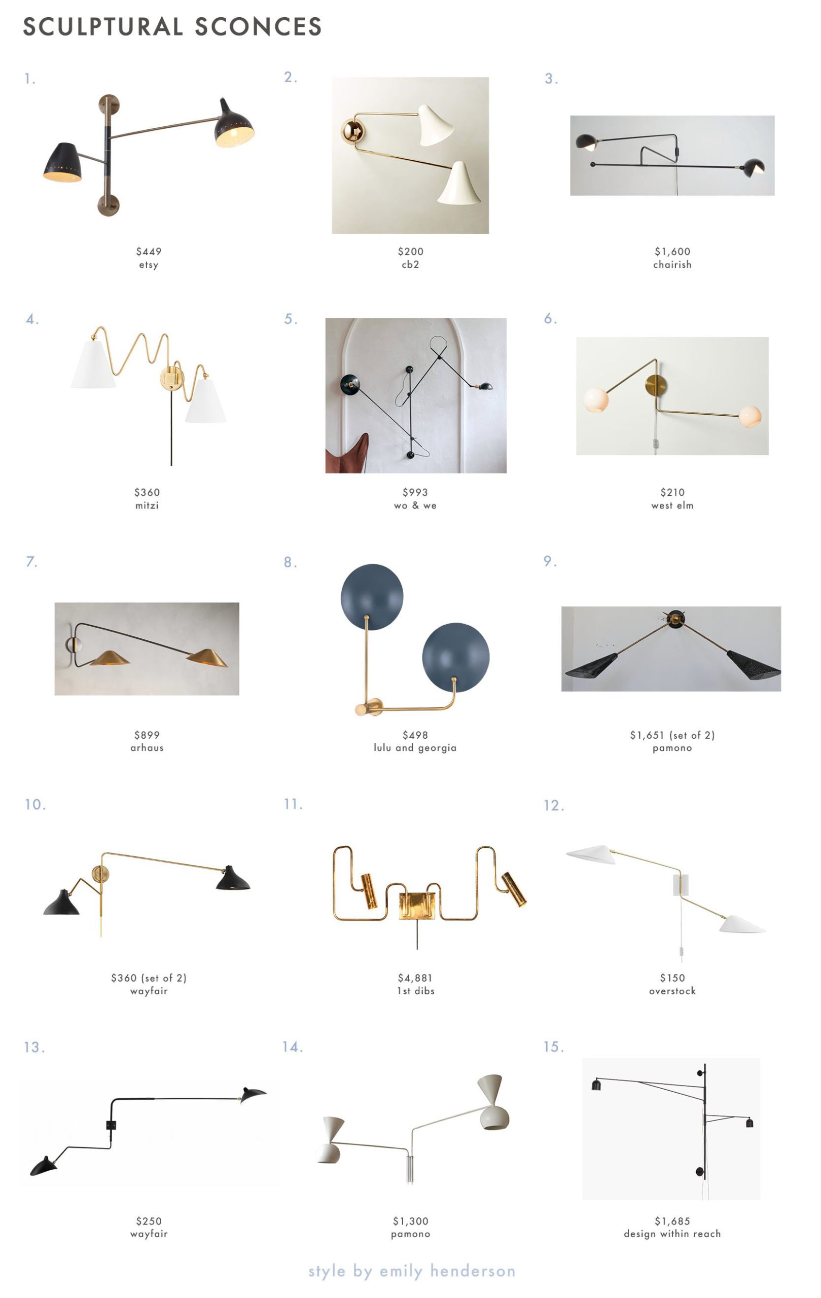
1. Articulated Modern Brass Two Arms Sconce | 2. Cypress Champagne Double Wall Sconce | 3. French Articulating Double Zig Zag Light Sconce in the Style of Serge Mouille | 4. Onda Plug-in Sconce | 5. Adjustable 3-Arm Wall Lamp | 6. Staggered Glass Adjustable Sconce | 7. Simms Long Arm Double Sconce | 8. Sereno 2-Light Plug-In Sconce | 9. Mid-Century Brass and Perforated Metal Shade Wall Light (Set of 2) | 10. Alyra Steel Swing Arm Sconce (Set of 2) | 11. Pivot Double Wall Sconce with Articulating Arms Made | 12. Journey 2-Light Swing Arm Wall Sconce | 13. Adelone Two Arms Rotating Swing Arm Sconce Wall Sconce Lamp | 14. Paz Light with 2 Arms | 15. Awkward Wall Sconce

I tried to give lots of options with a variety of prices and styles. But most importantly each of these is at least 3 feet wide. That’s the kinda width you want for making a visual statement. As I have stated 8,348 times already in this post, if you are looking for a show-stopping yet simple statement this is a truly great option where there’s something for every price point. Take a risk and go oversized. Oh and this is renter-friendly too (especially the plug-ins)! I can say from experience it’s so worth it.
Love you, mean it.
Opening Image Credits: Design by Brady Tolbert | Photo by Tessa Neustadt | From: Brady’s Bedroom Makeover With Parachute
THIS POST WAS ORIGINALLY PUBLISHED HERE.


