When we first revealed the kitchen we had many comments asking for exact measurements of literally every. single. thing. As a total design nerd myself I, too, wanted to see the exact measurements. So we started working on the post that got pushed and pushed due to holiday stuff. Finally, 2 weeks ago it was ready to go except for me writing it (that’s always the hold-up). So when we saw literally the exact same concept published by the super talented Chris loves Julia team, with literally the same graphics, we exploded on slack, jokingly accusing each other of being the mole (Caitlin wanted me to publish the timestamped slack about it all which would be funny but perhaps more in the
“the lady doth protest too much” category). We almost scrapped it entirely but it was almost all done! So much went into it and heck, it’s a different kitchen full of different measurements, therefore full of totally different information. Then we figure if you are renovating you are likely curious about everyone’s measurements and you should definitely check theirs out, too, HERE. I found it so helpful and interesting. So back from the “almost deleted drafts” archive today I have for you all of our kitchen measurements and how I feel about them.
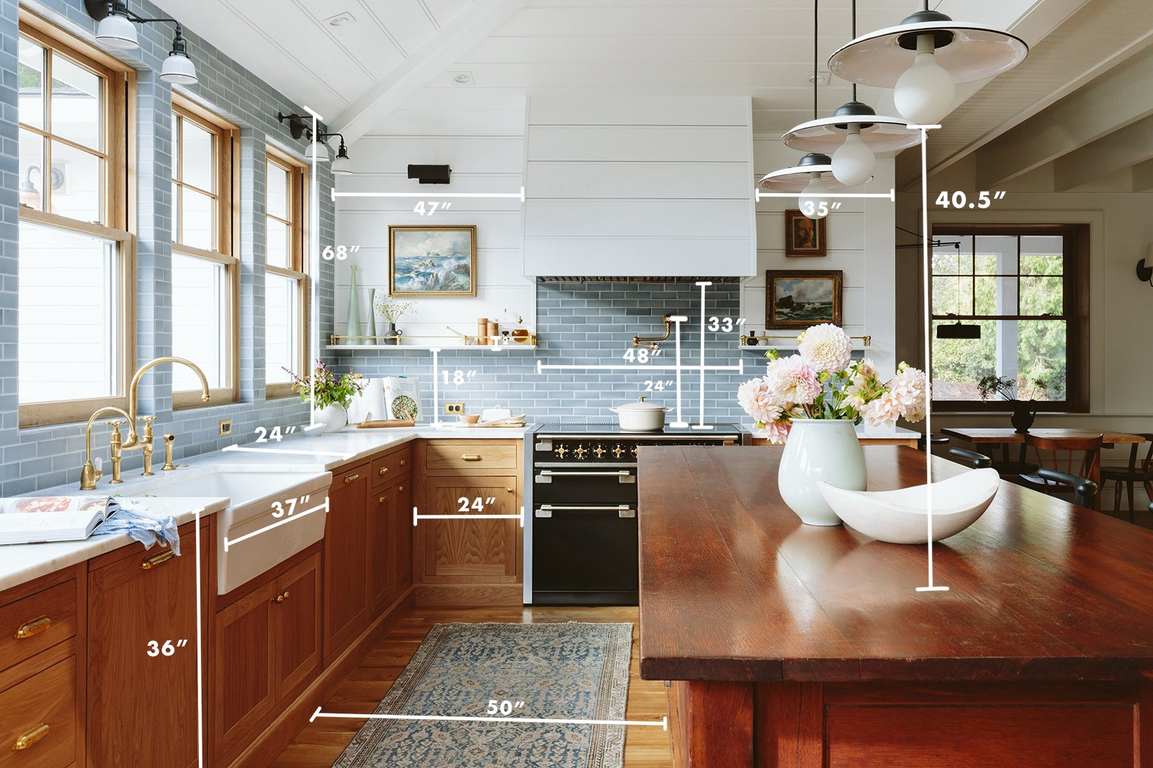
Now there are many measurements that are standard (and even dictated by code) and then there are preferences based ones depending on how you cook, how many cooks are literally in the kitchen, how tall you are, how high you want to reach (how long are your limbs??), how tall your ceilings are, etc. Most of that is based on your own anecdotal experience of being a human being in your own body, in your own kitchen. So this post is obviously all about ours – Emily and Brian Henderson’s bodies and y’all this kitchen functions SO WELL for us to cook in and almost as important, to hang out in.
Most cabinets are 36″ tall and 24″ deep – nothing newsworthy there. What I have found the most interesting and more specific are clearances (the space between furniture even when you have the drawers open) and adjustable heights of things that come from the ceiling. So as you can see the clearance between the sink cabinet and the island is big – weighing in at 50″ wide. Now 40″ is ample clearance (much less is also very doable if you don’t have a dishwasher). We were nervous that it would be too wide and feel vacuous, but y’all, it’s wonderful. I want to, of course, state the obvious that many kitchens can’t warrant this much clearance so just saying “more space is awesome” can be unhelpful to people. But if you are wondering if going larger on the clearances has its downsides I’ll tell you right now that we haven’t found one yet. The kids can unload the dishwasher and while I’m begging them to do so, I can chop onions and Brian can be at the stove – we can spread out easily on this side of the island.
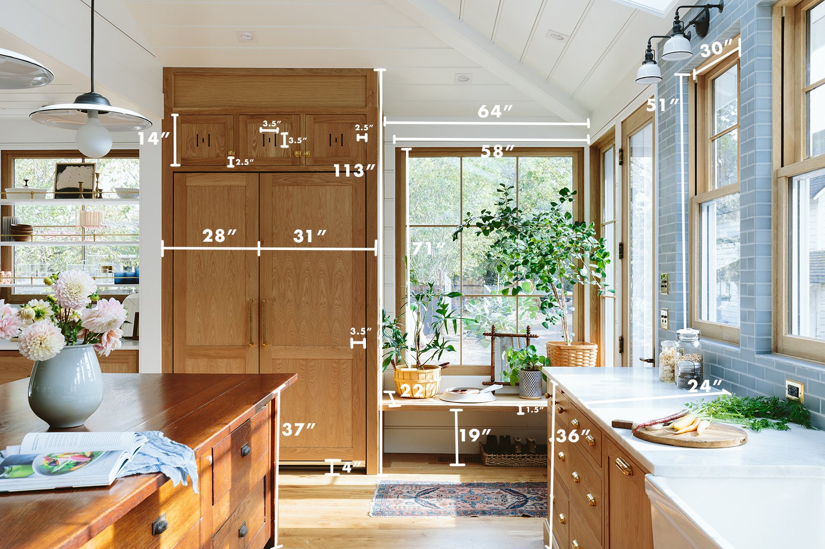
You’ll notice the vintage island is higher than the cabinets – and no one has ever noticed. If you are wondering why we didn’t take the upper fridge cabinets to the ceiling it’s because when we ordered the cabinets (from Unique Kitchen and Baths) we hadn’t built the ceilings yet so we decided to do them lower and fill in with white oak whatever was left.
Also a random note – 2″ is ALWAYS bigger than you think it is. I think we talk about 2″ like it’s nothing, so I’m always surprised when a 2″ thick something is actually pretty thick (generally 1 1/2″ thick for a shelf or a stile/rail is plenty).
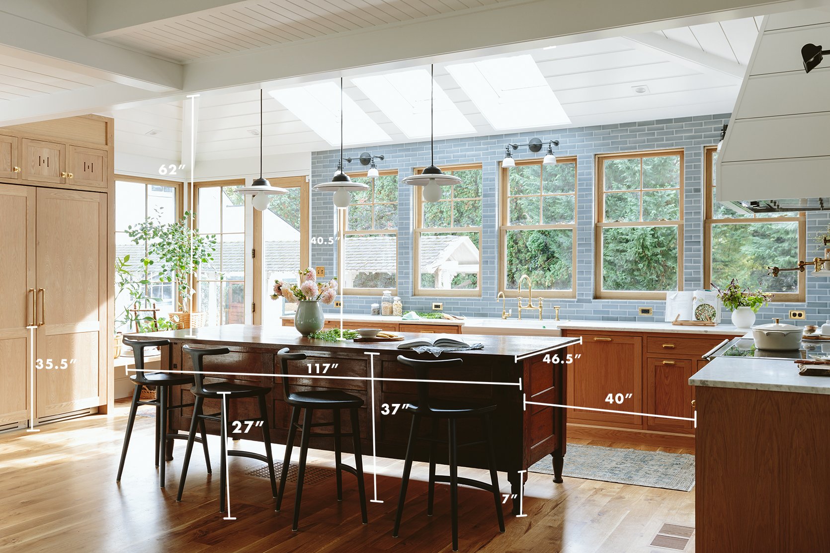
I think I stressed about the height of the fridge handle for so long that Jamie just DID IT, thank god. As you can see, the bottom of out pull handle started at 35.5″ – but ultimately just put your hand on your fridge as if you were going to pull and then screw it in where your hand naturally lands (I think I was afraid of it interacting with the horizontal panel in an odd way). You’ll notice that the bottom of the bulb of our pendants landed at 40.5″ which is higher than it needs to be but it’s perfect in here since our ceilings are very tall on that half of the kitchen. If we had lower ceilings they could have been closer to 36″. But honestly I’d rather have them above even the tallest person’s head so that the light doesn’t shine in their eyes let alone block conversation (so err on the side of higher).
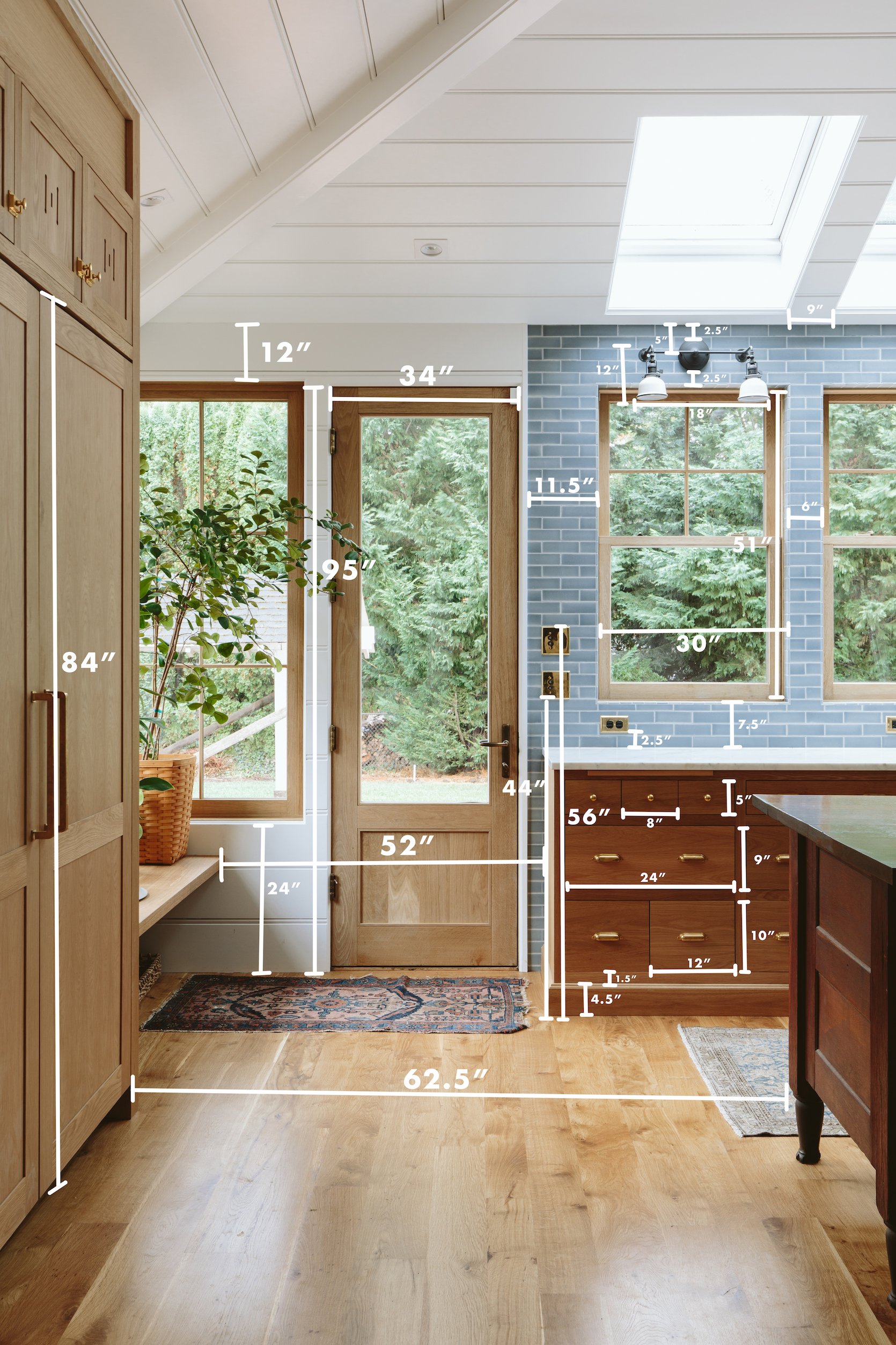
As you know we divided up the cabinets there into three little drawers, one big and two small and while that cost a decent amount more to do (full custom) I will say that those tiny little drawers are far less annoying than you’d think. They are essentially three small junk drawers, but since they are so small nothing gets lost and they can have their own dedication. Also, the Velux Skylights are exactly the width of the Sierra Pacific Windows (at 30″) which was intentional and I love how it turned out.
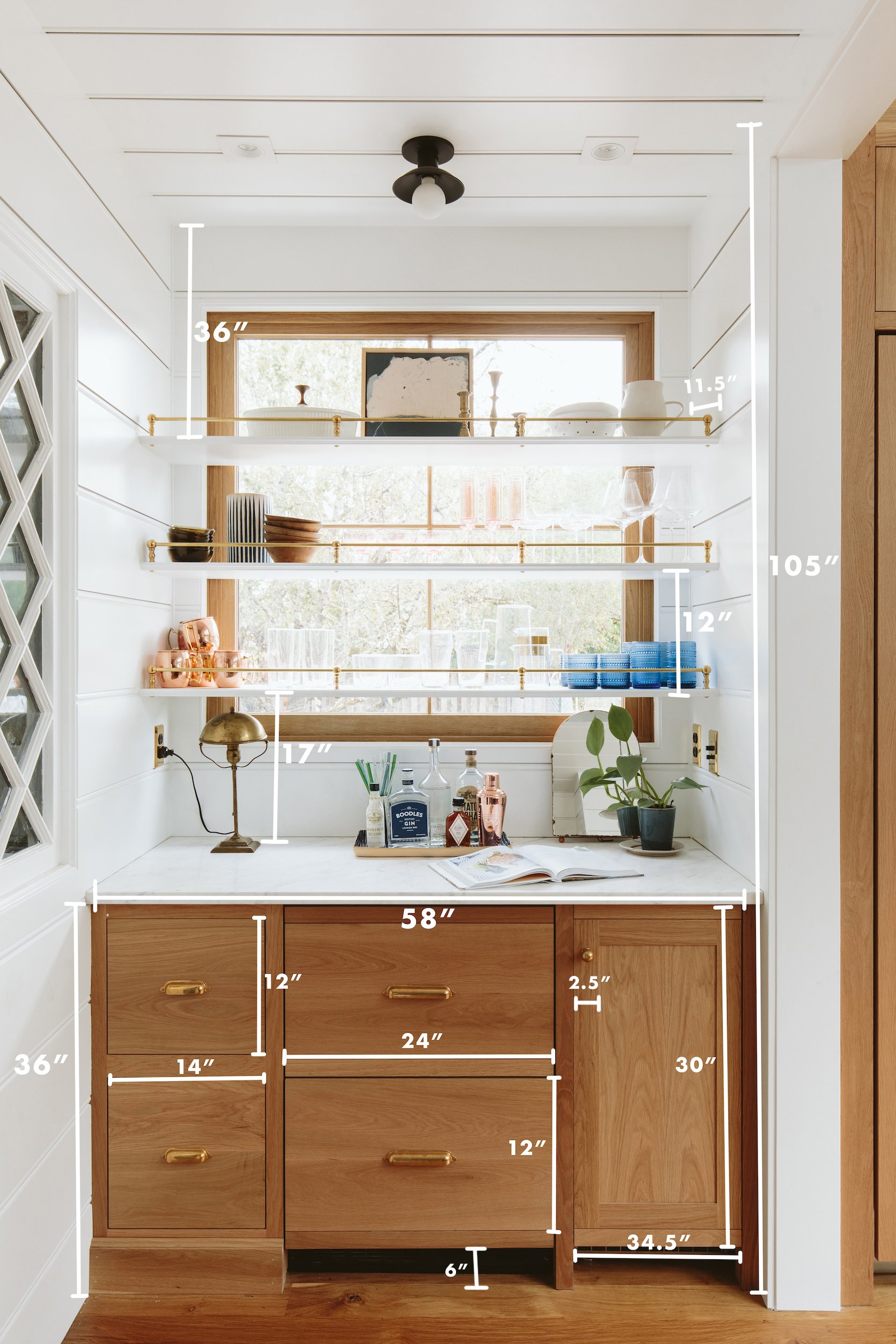
The height of a floating or bracketed shelf can be SO HARD to determine. We found that 18″ gives us enough height to work underneath it, but since our paneling lined up at 17″ Jamie installed it there (which works perfectly). The depth of the shelves is 11.5″ which is great because much deeper (more than 14″) and things get lost/hard to put away and less than 10″ is not enough space for a lot of plates. So keeping them around 12″ is the sweet spot.
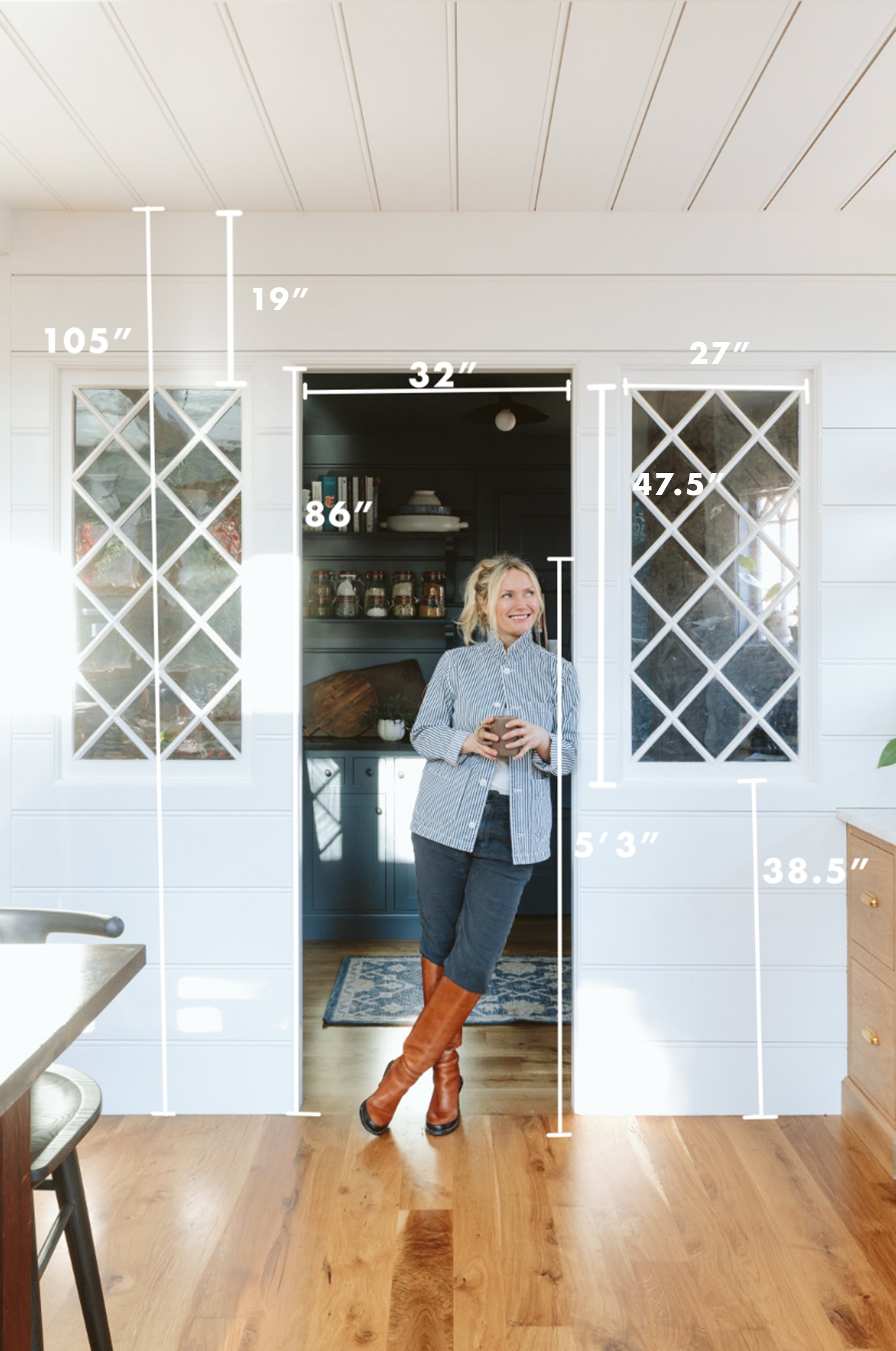
Me, for scale. Weighing in at 5’3″ 🙂 I don’t think we missed one measurement in this kitchen (thank you Mal for the many Facetimes pulling this together). But certainly, let me know any questions in the comments. I will say I have zero placement regrets to tell you about, thank goodness but I know that when you are in the middle of a kitchen remodel it feels like a wrong measurement can be life or death 🙂 Hopefully, this post can help. xx
Kitchen Resources:
Cabinetry: Unique Kitchens & Baths (Get 10% off with the code “EH2022”)
Countertops: Bedrosians Tile & Stone
White Oak Windows and Doors: Sierra Pacific Windows
Skylights: Velux
Tile: Pratt + Larson
Appliances (sans Fridge and Freezer): Build with Ferguson
Fridge and Freezer: BlueStar
Flooring: Zena Forest Products(Oregon grown and milled)
Lighting, Switches, Outlets, and Sink: Rejuvenation
Wall Color: Sherwin Williams, “Extra White”
Faucets: deVOL Kitchens
Vintage Island: Aurora Mills
Counter Stools: Fernweh Woodworking
Rug: District Loom
Brass Gallery Rods: Pepe and Carols
*Design by Emily Henderson and ARCIFORM
*Photos by Kaitlin Green
THIS POST WAS ORIGINALLY PUBLISHED HERE.


