It’s pop-quiz time, how many of you are currently sitting in your living room, looking around at things and wondering why something feels off but you can’t totally put your finger on it? If you have to take a second to think about it then this post is for you. And if you are confident that you’ve got everything all together in your living room then this is a good quiz for you to take to see how your living room measures up to “EHD’s Living Room Rules”. Think of these as the 10 Commandments of arranging furniture in your living room although technically there are 22 rules. However, unlike said commandments sometimes design rules can be broken and things can still look good. We get it, it’s confusing, but we pulled these together to act more as guidelines to follow more so than rules. All of these “rules” below should help you answer the basic questions that we get asked every day like, “how tall should my coffee table be in comparison to my couch” or “how big should my rug be if my living room is blank big” or maybe “where should I hang my TV”?
In case you need more design rules, check out: Bedroom Design Rules | Dining Room Rules
Today we are talking living room layout, planning rules, and all the basics so that you and your living room feel pulled together.
Furniture Placement
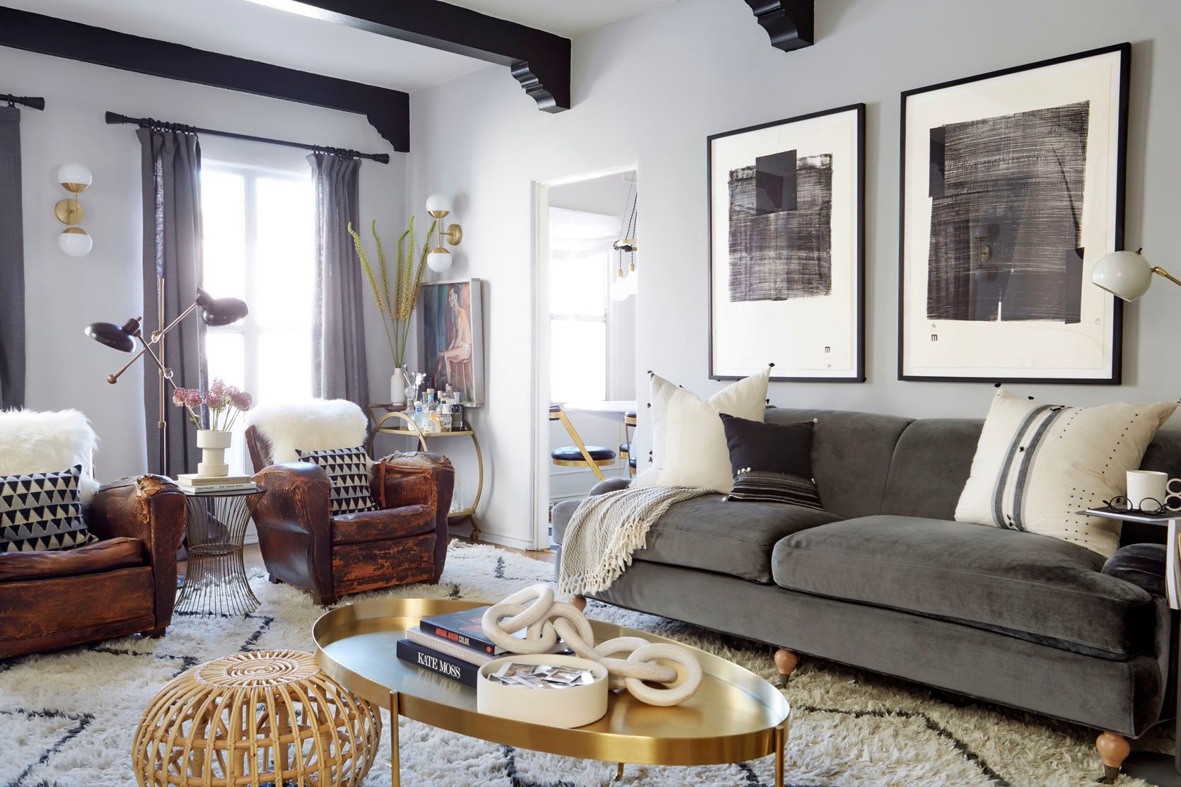
RULE: Give 30″ to 36″ of a walkway between large furniture pieces (if your living room allows for it) if not then at least 18″-24″.
This rule specifically pertains to the large pieces of furniture in your space and is here to help you avoid overcrowding your living room with too many large pieces which will have you and your guests trying to squeeze between pieces. There’s a lot of pretty furniture out there but when designing a room you want to make sure have enough space to walk around it. Bruised shins are a bummer as is having your space feel too crammed with stuff and having to shimmy in between a sofa and another large chair. If your room is on the smaller size then opt for pieces that are more small scale which will give you the negative space you (and your shins) need.
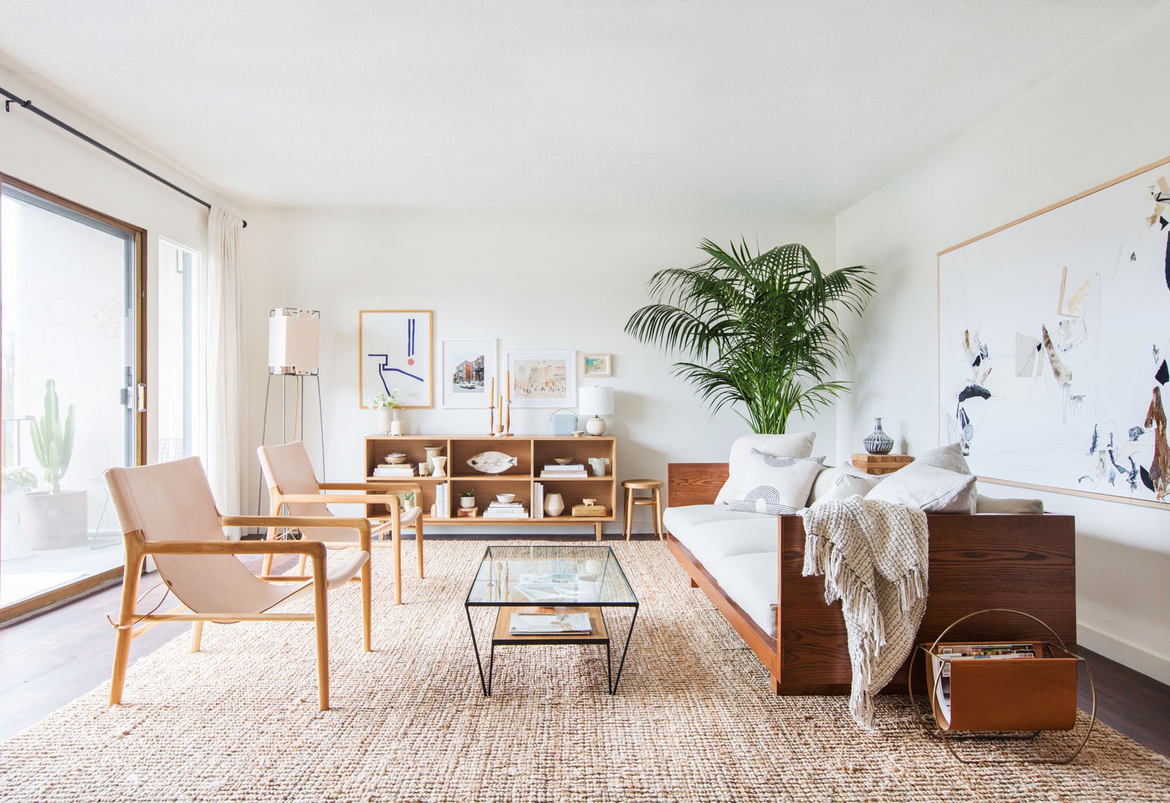
RULE: Make sure there is no less than 3.5′ and no more than 10′ of space between seating.
This rule helps you to space out your seating for maximum enjoyment. We’ve all been on that awkward date where said date leans in WAY too close to ask you questions and talk to you during dinner. It’s an invasion of privacy and just too close for comfort. So it goes with your living room layout. This general rule helps make sure you aren’t too cramped or have so much space that you end up shouting at the person across from you.
Sofa
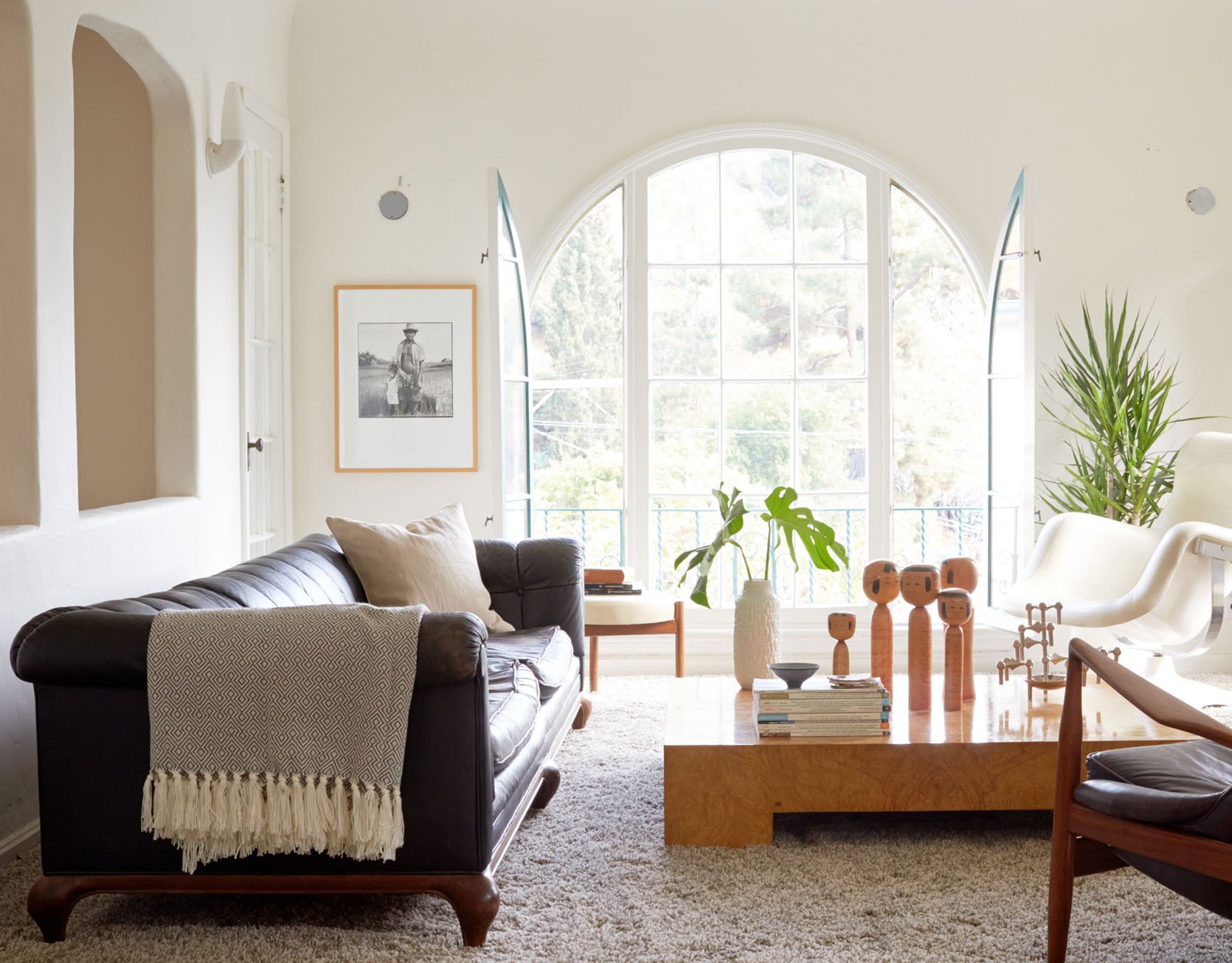
RULE: If possible sofas should never be flush with a wall. Pull it out 3-5″ and give it some breathing room.
While this rule can be tough when you have a small space since you need to make every inch count and it may sound contrary, it does help the room feel less crammed together if you can spare a few inches to get your sofa off of the wall.
Coffee Table
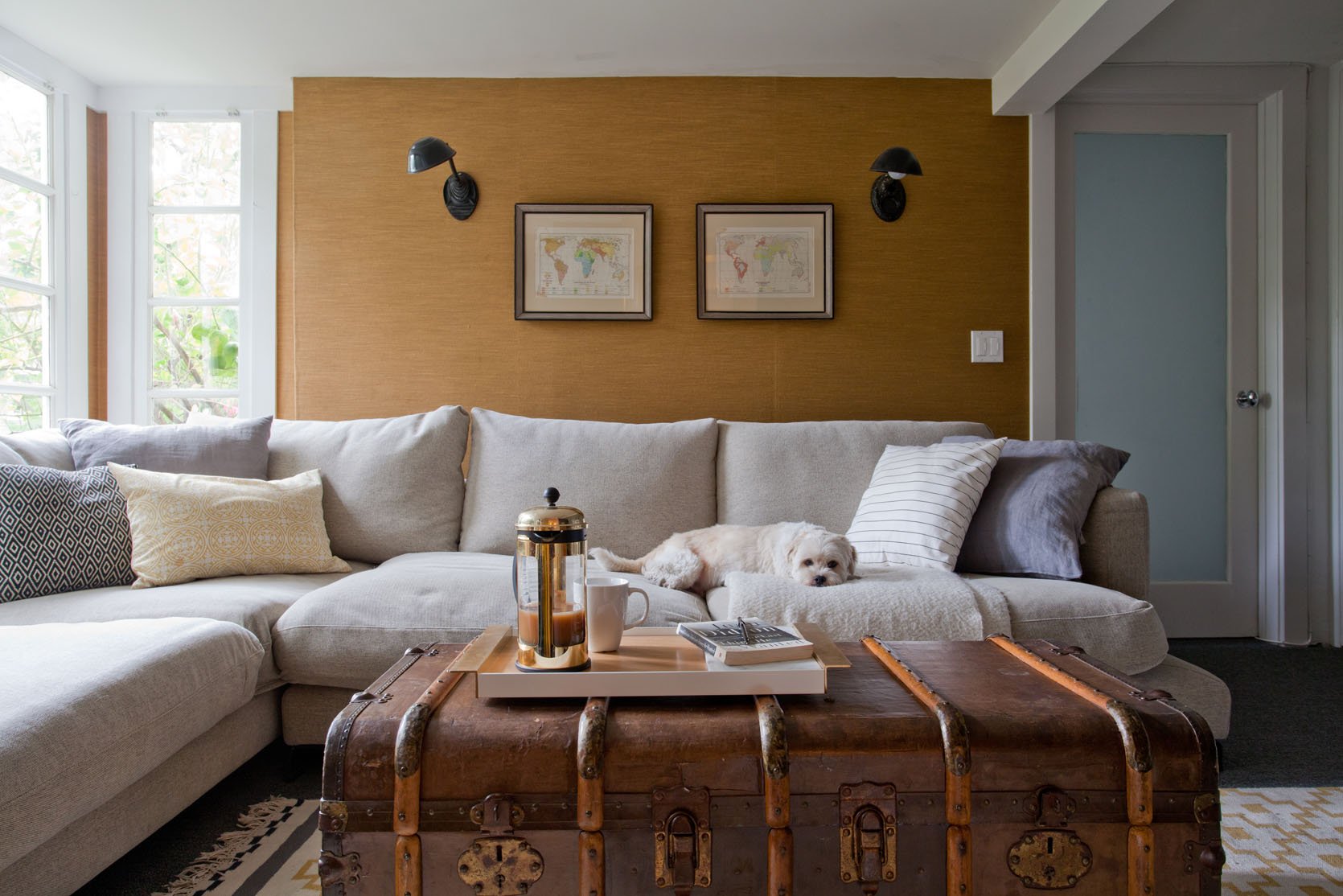
RULE: Your coffee table should be at least half the length of your sofa.
Scale is key in making any space cohesive. Making sure your coffee table is at least half of the size of your sofa will ensure that the two pieces look great and belong together.
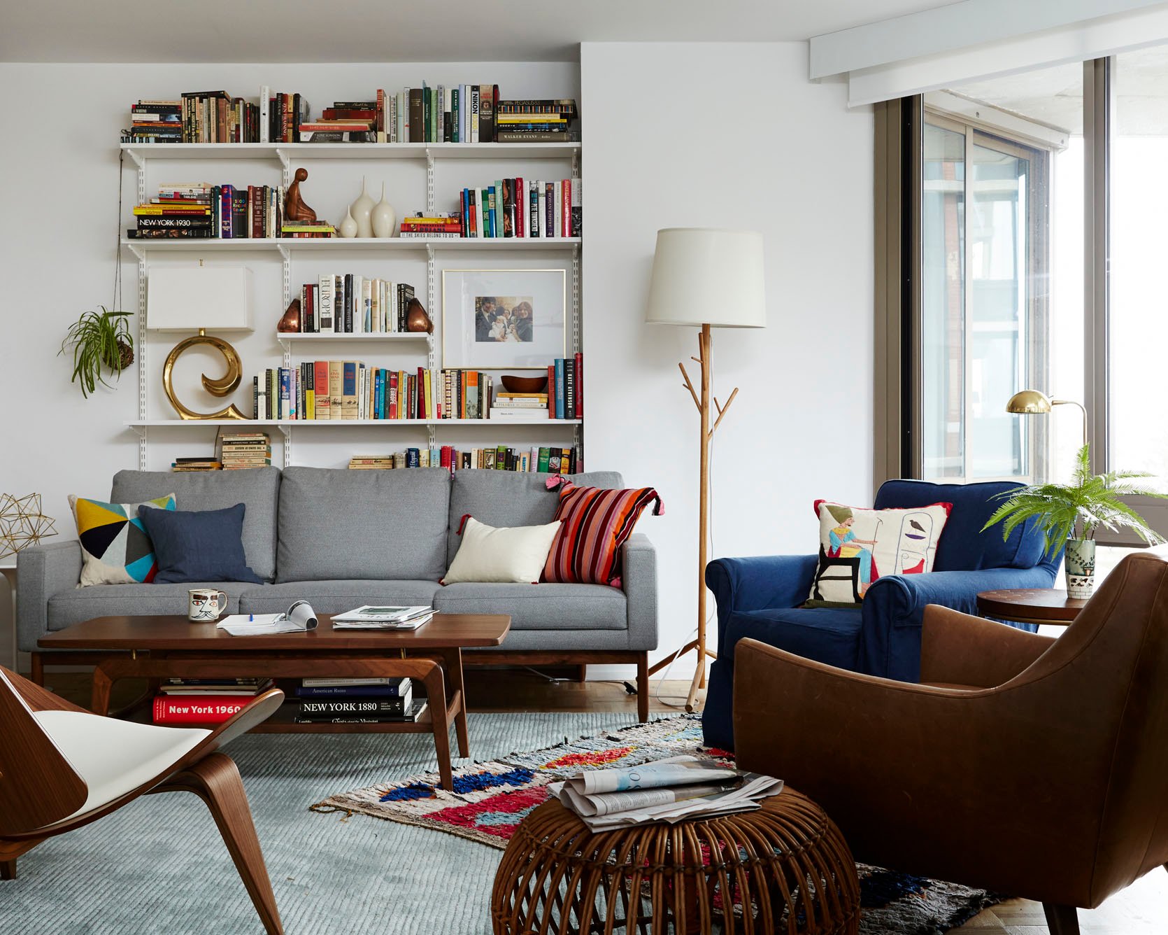
RULE: Your coffee table should be no more than 4″ higher or shorter than the top of your sofa seat cushions.
To avoid the awkward visual of having your coffee table too high or low in relation to your sofa’s seat cushion use the 4-inch rule. There is no reason to have your coffee table feel like a high countertop or have it so short that you hurt your back bending down to grab a drink.
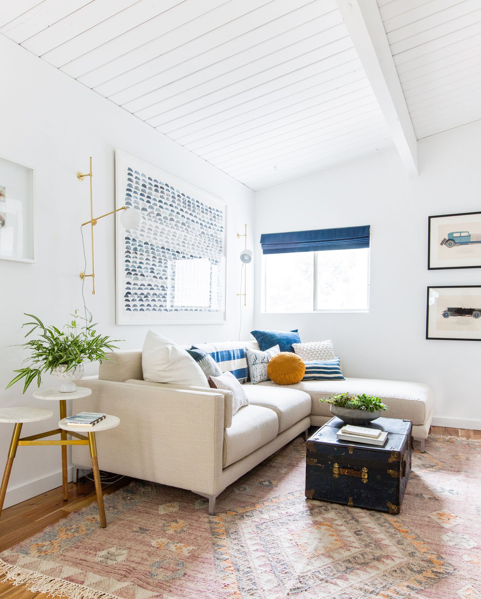
RULE: 16″ to 18” is the ideal distance between the sofa and coffee table.
While every room is sized differently you don’t want to have your coffee table so far from the sofa that you can’t reach your drink or put your feet up after a long day (depending on your house rules, of course). Keep them at least 16″ apart so you can walk around it but not have to get up to walk over to it.
Area Rug
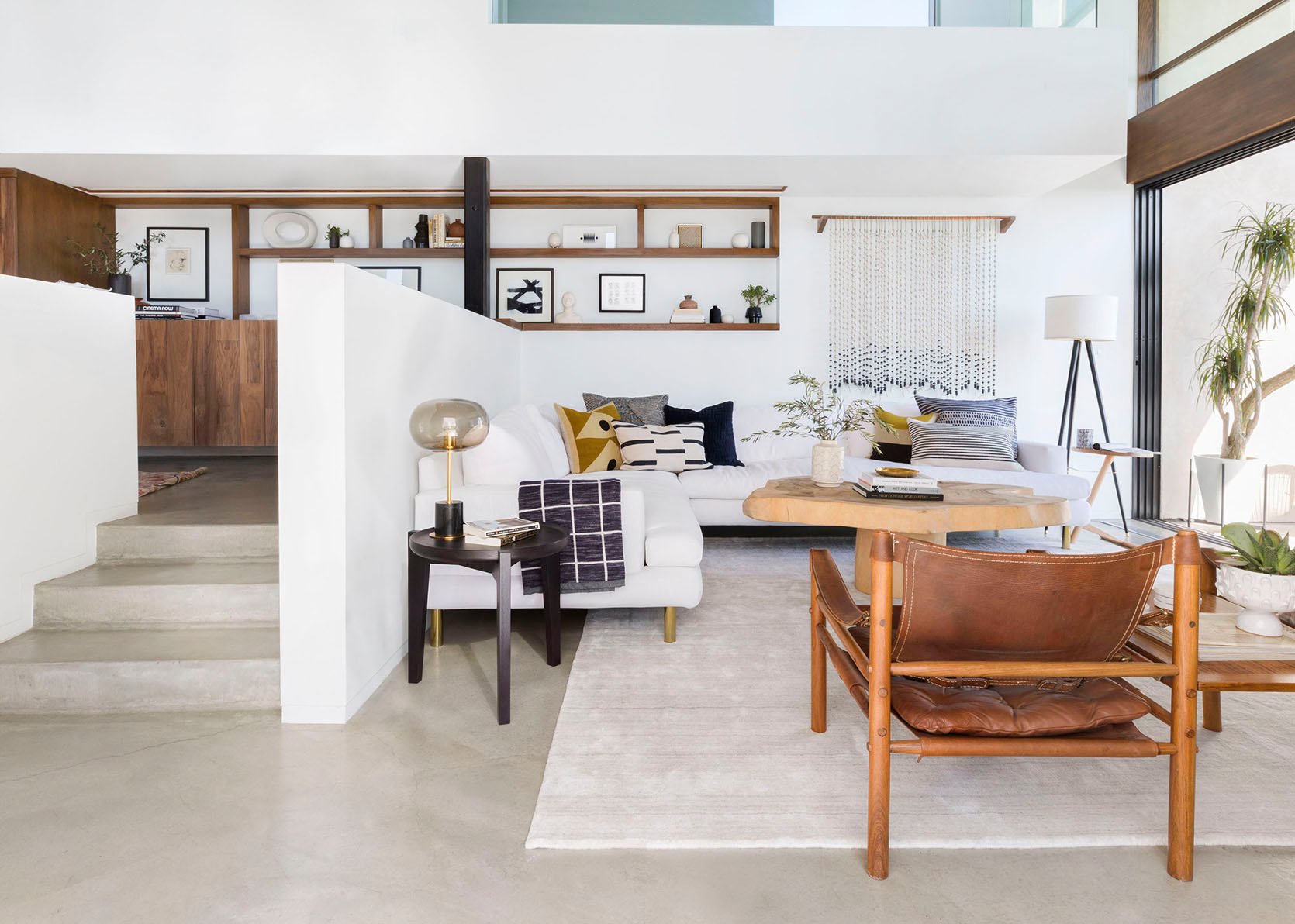
RULE: Your area rug should be large enough for at least the front legs of the sofa and all chairs to rest on top of it.
Rugs that are too small for a room are like trying to fit into your jeans from high school. Sure, you may be able to squeeze into those pants but wouldn’t you look and feel better in a bigger size than one that doesn’t allow you to properly breathe? The short answer is YES to pants and YES to your rug. Most living rooms need at least an 8×10 with most needing larger. Don’t try and “stretch” a small rug into the room and then have all the furniture floating around it.
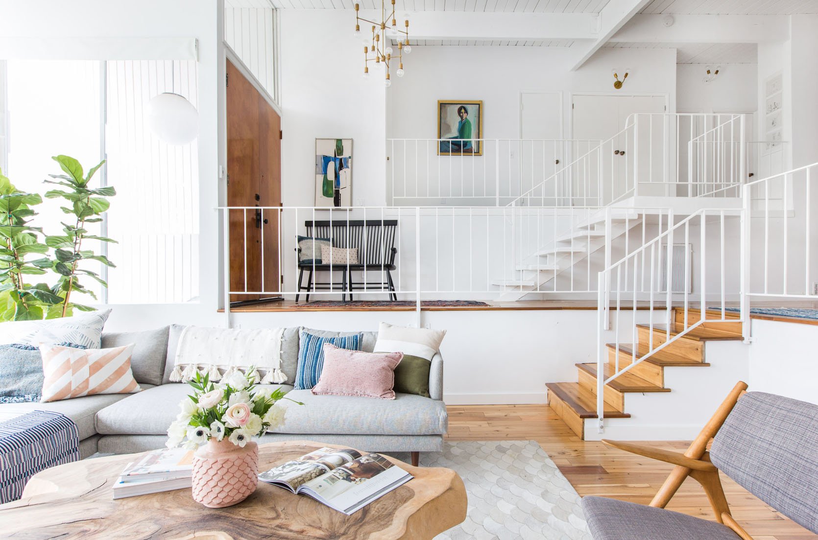
RULE: Allow about 24″ between the wall and the rug in a large living room, and between 10″ to 18″ in a smaller one.
We are talking about the need for negative space and breathing room. Your rug is not wall-to-wall carpet, so don’t make it look like it. If you follow this rule it will immediately make your living feel airy and light while giving a defined seating area to your space. This will also help any furniture (aka console, upright pianos) that are against the wall from being unsteady in a half on half off thick rug scenario.
Lighting
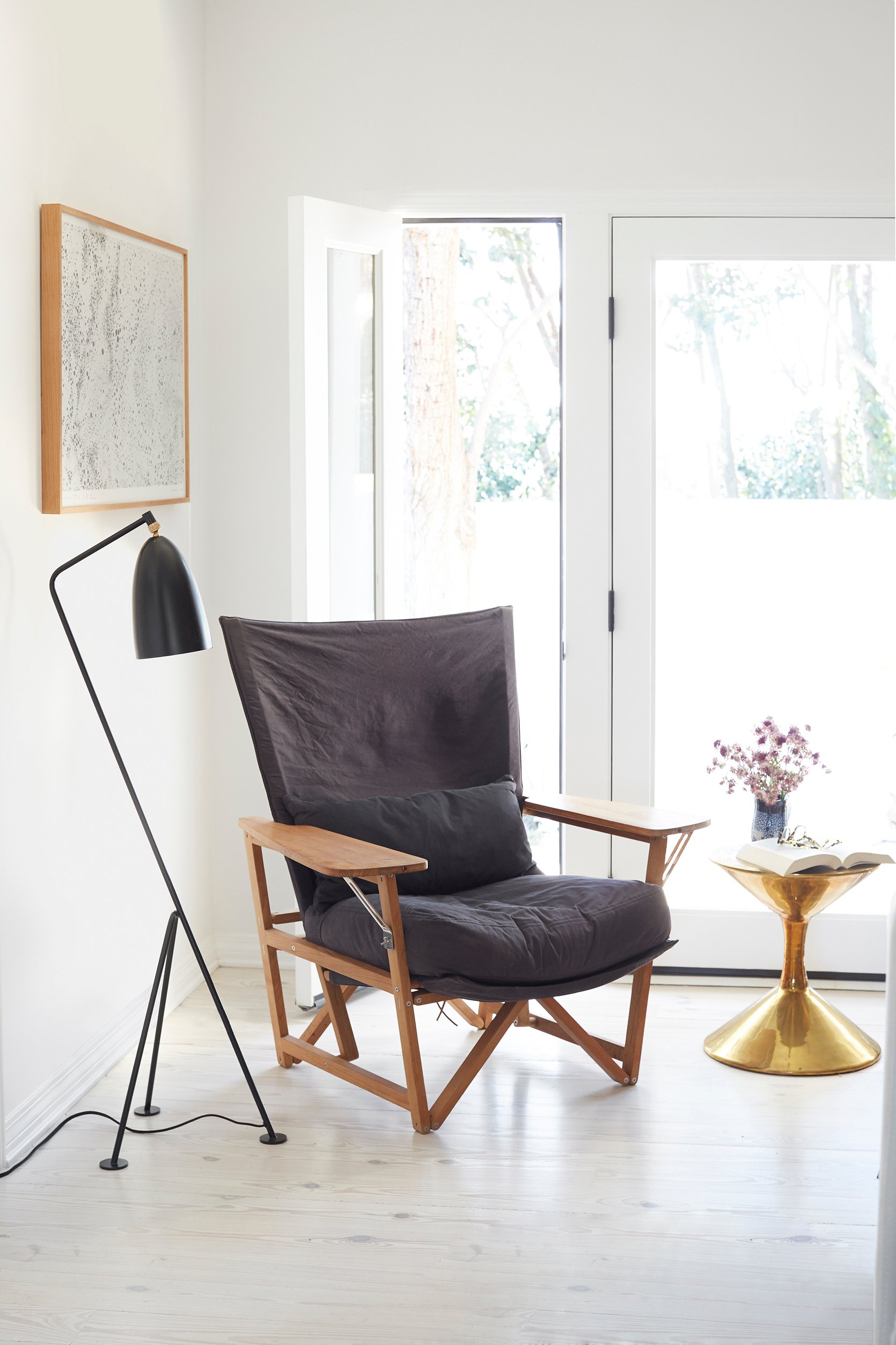
RULE: Make sure the shade of your floor lamp is covering the bulb when you are sitting down.
Nothing is worse than trying to have a relaxing evening on the sofa and having a harsh light in your eyes every time you look over at your lamp. It is said that the ideal floor lamp height is 68″ but that all depends on the seat height of the sofa or chair. When you pair a lamp with your seating make sure that the lamp isn’t so tall that a bare bulb is glaring down at you or so short that when you go over to turn it on the light blinds you from below. Ideally, the light should be at around eye level when seated, which brings us to our next rule. Also, porcelian bulbs are a great way to avoid harsh light!
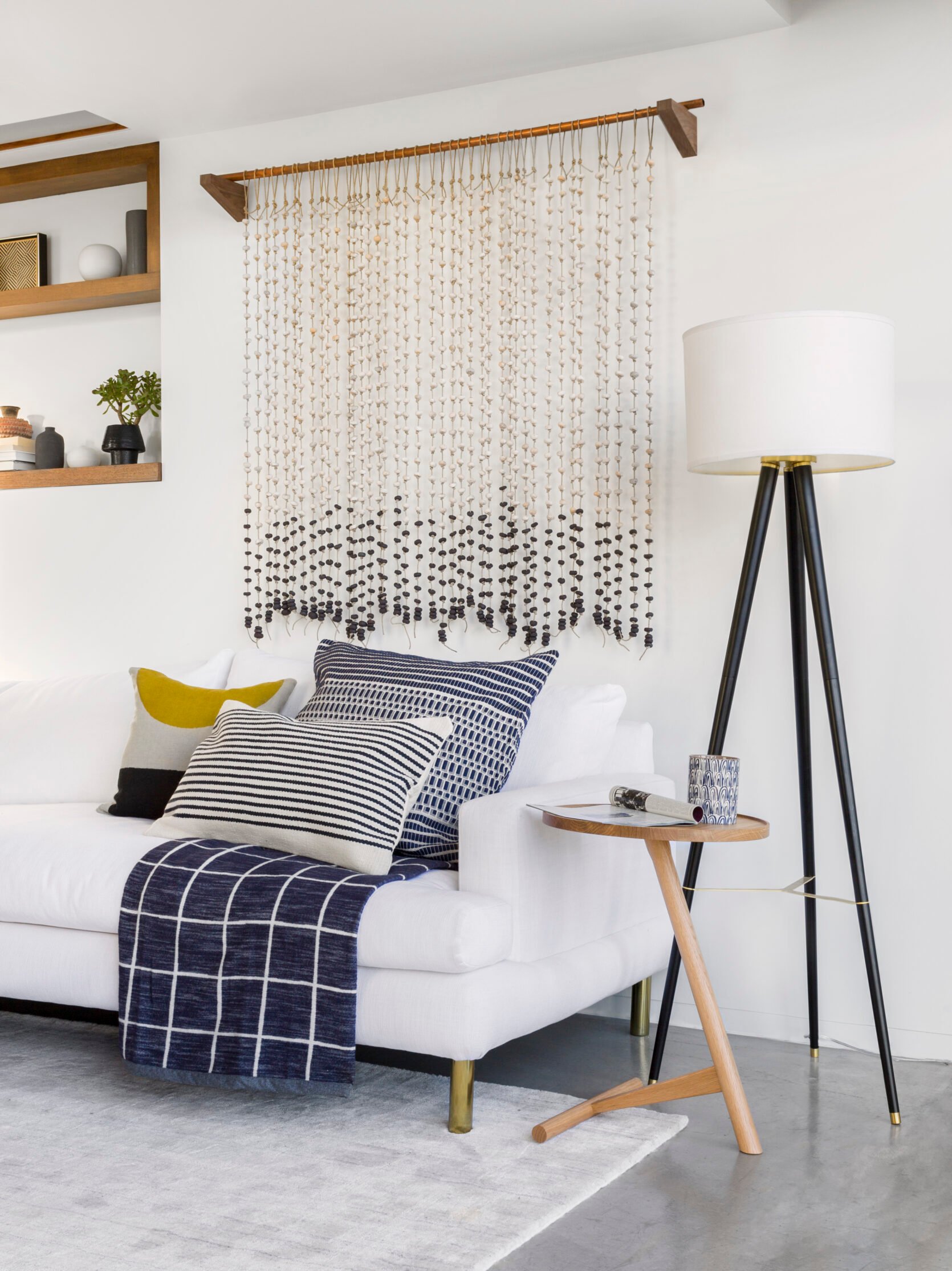
RULE: For a lamp sitting on a side table the bottom of lamp shade should always be at about eye level.
It’s the same concept as the floor lamp rule. You want to have the light enhance your living room time not make it uncomfortable with harsh light in your eyes. Take the seat height of your cushion, side table height and lamp height to figure out what is going to be the best option for you and your home.
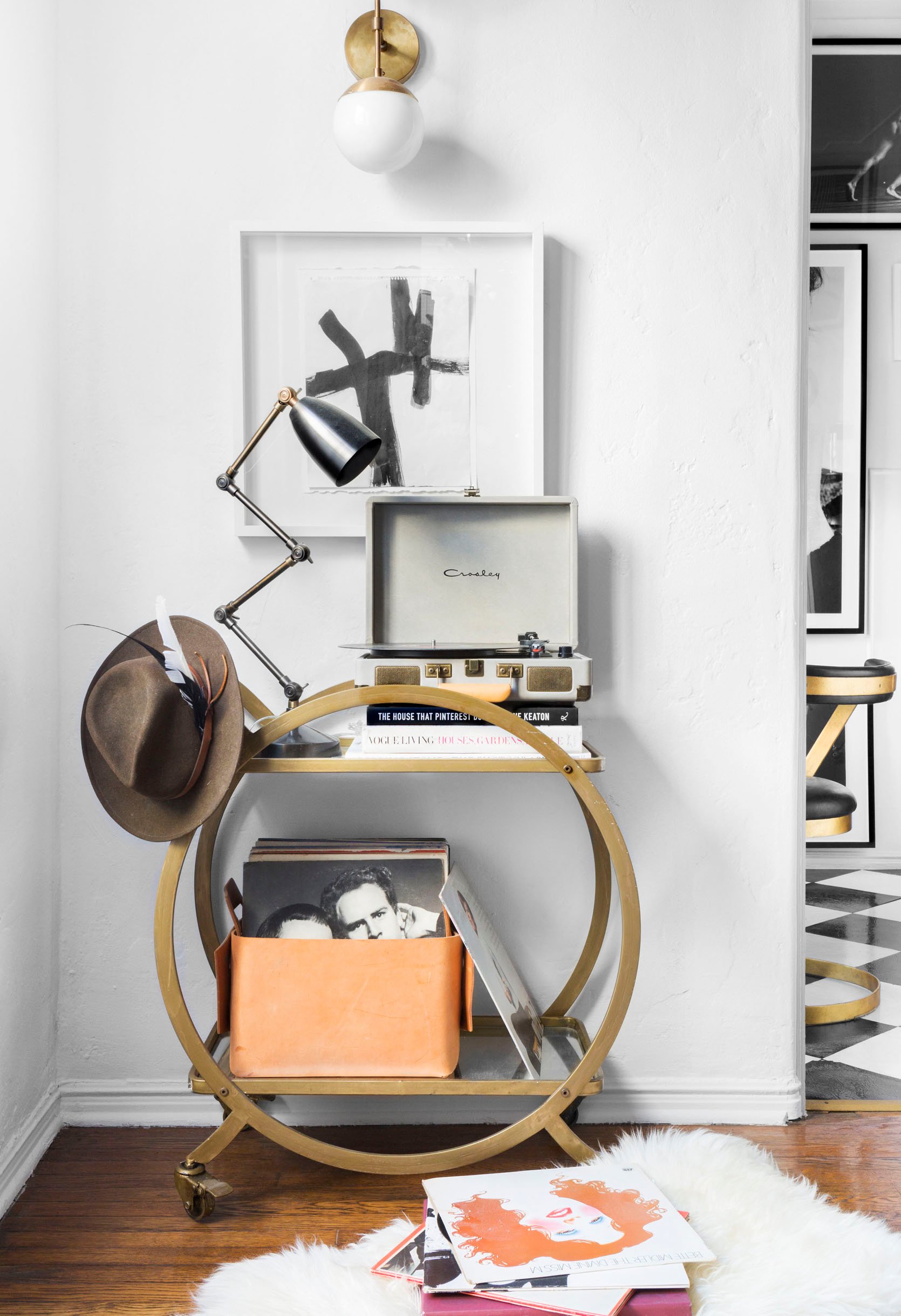
RULE: Place wall sconces between 5′ to 6′ up from the floor.
A sconce hung too low or high not only looks strange and won’t give you the right kind of ambient light you are looking for. Putting them at least 60″ above the floor is a good rule of thumb so you can easily avoid this potential issue, and cast a nice glow into all corners and areas of the room.
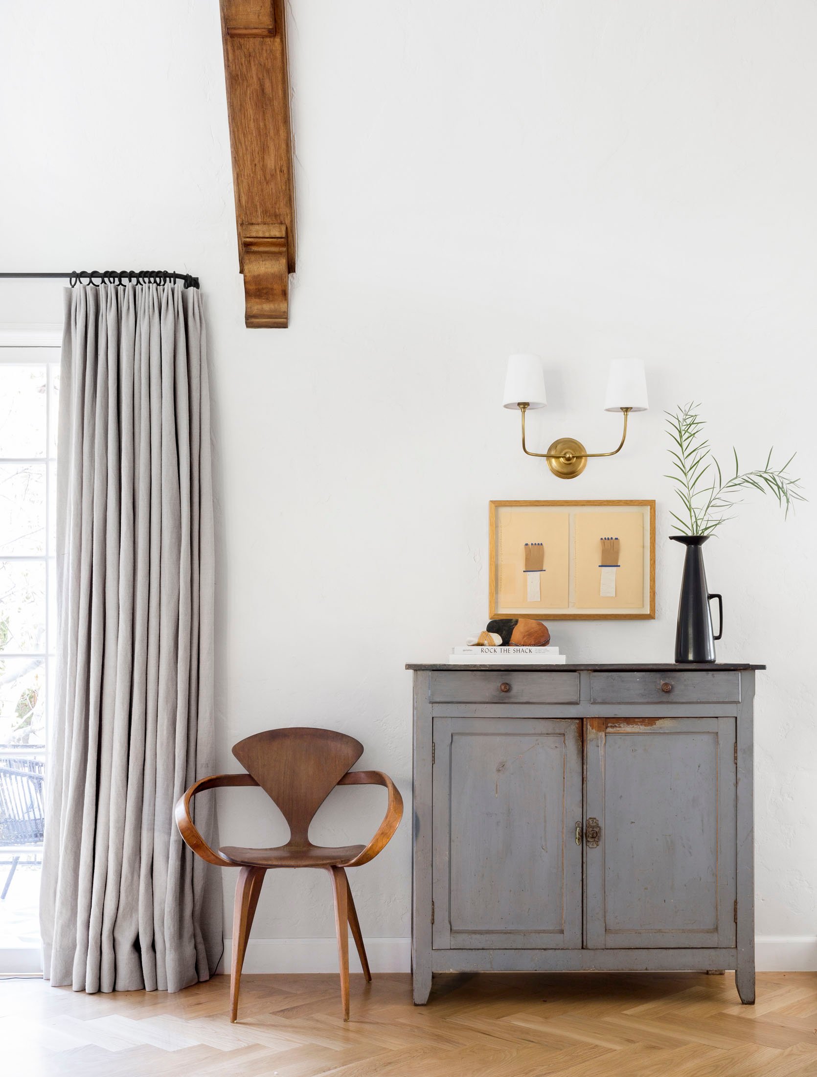
RULE: There should be 3 – 6″ between a wall sconce and the edge of a mirror or piece of art it’s next to.
Much like how your furniture needs space to breath and looks its best, so does your sconce. By keeping your hanging art and wall decor at least 3″ to 6″ away from the sconce it will give both pieces the space they need to shine…pun intended.
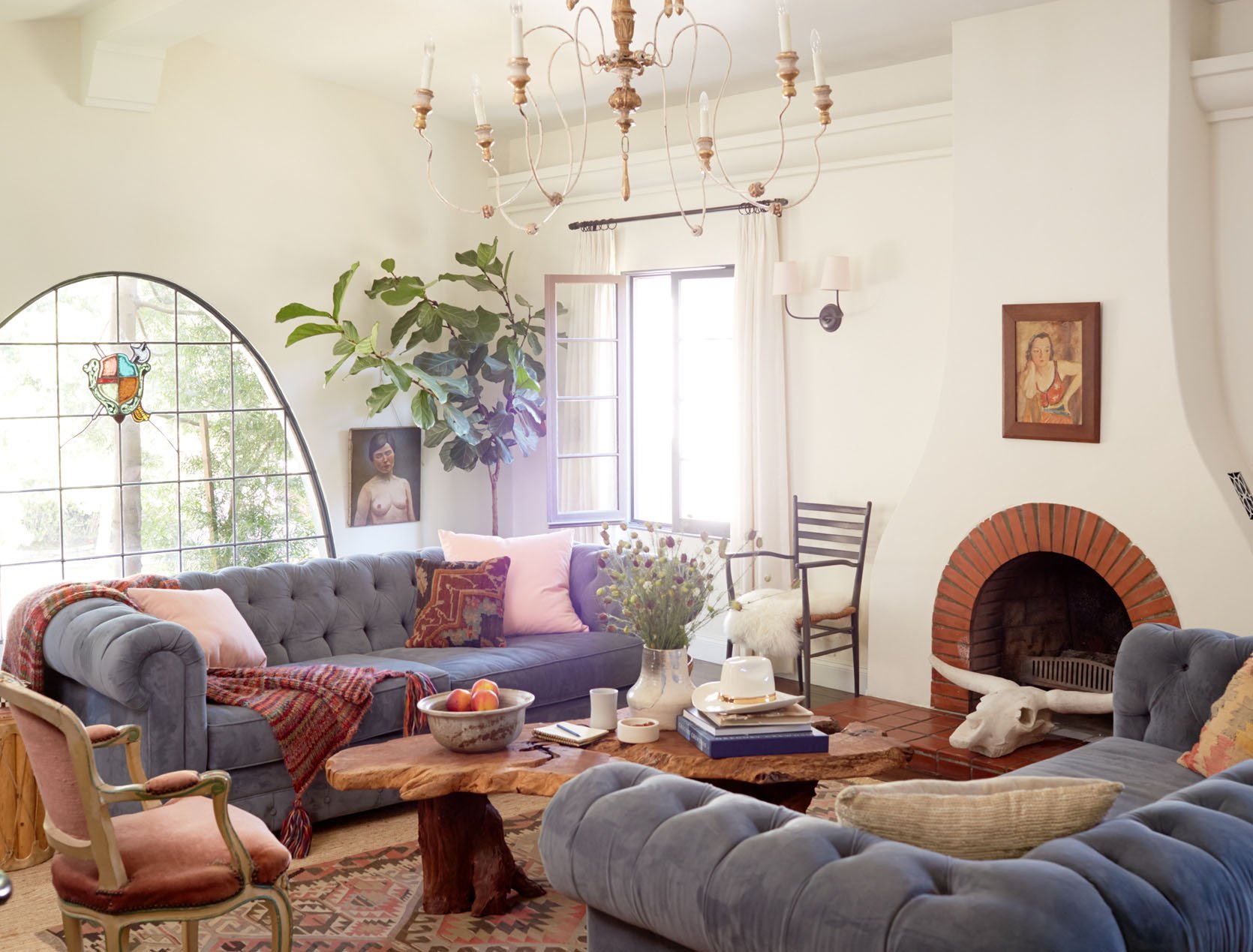
RULE: For determining ceiling light width: Multiply your ceiling height by 2.5 – 3 to get the recommended measurement in inches. So if you have a 10 ft ceiling you would multiply it by 2.5 giving you 25″. That should be your approximate hanging ceiling light width.
Another way you can calculate the right size light is by using the room size. Just measure the length and width of the room. Then add those two numbers together and convert the total into inches. For example if your room is 12 feet by 16 feet, your ceiling light should roughly be 28 inches wide.
These handy formulas will give you a starting place for the proper size you will need for your living room ceiling light. Ordering the wrong size is the worst and very annoying so hopefully this will take the guesswork out of light shopping and will help you in the process.
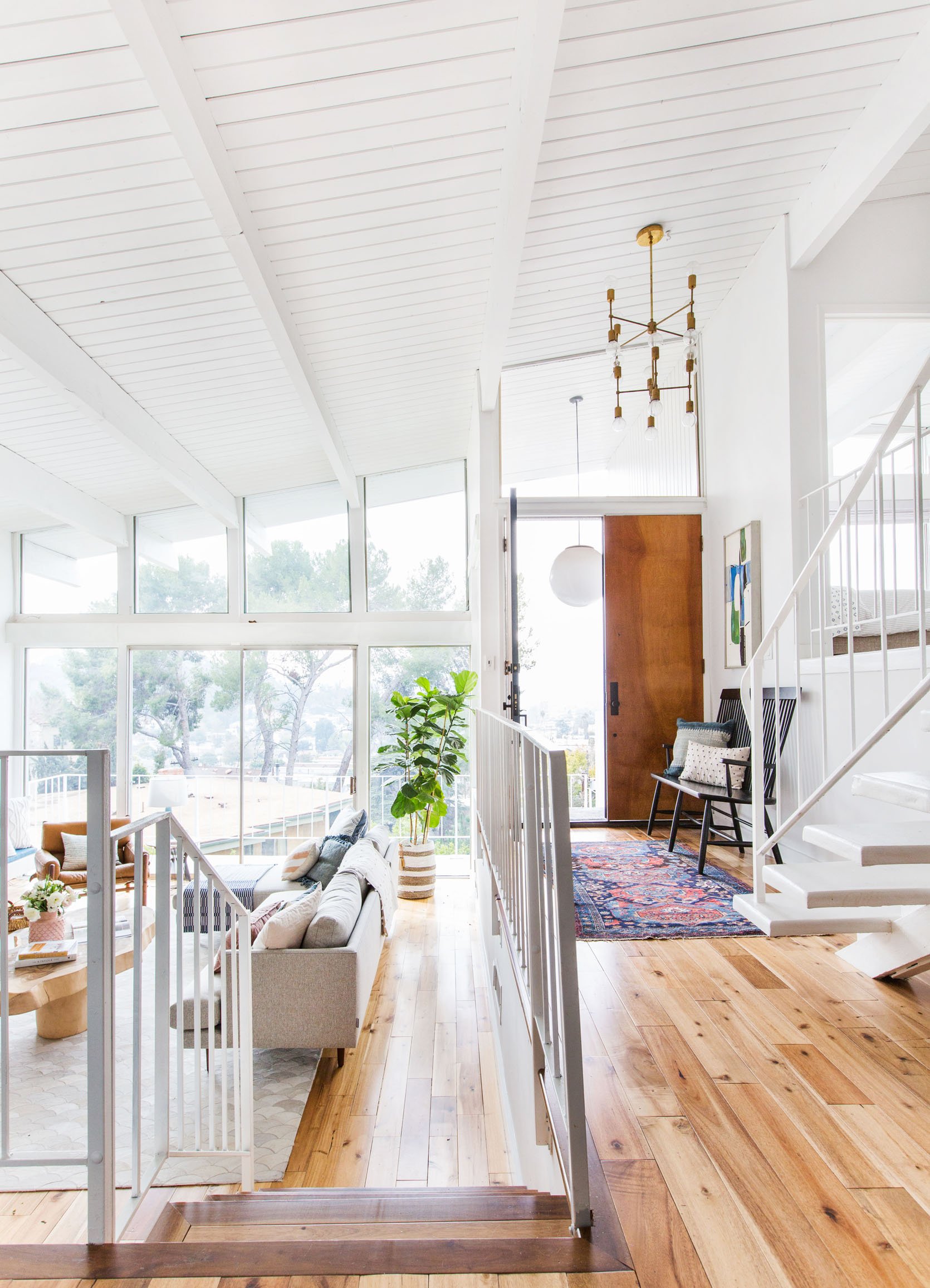
RULE: In an open space where people are walking, 7 feet is the minimum distance the bottom of a hanging light fixture should be from the floor. But for ceilings over 8 feet just add 3 inches of hanging height per foot. So if your ceilings are 10 feet tall, the light fixture should be about 8.5 feet from the floor.
As we stated before, bruised shins are a bummer but so are head injuries. This rule (unless you live with a VERY tall person) will keep you and your loved ones safe from hitting your heads on a ceiling light. It will also make your home look more spaciously aware and feel proportional.
Side Table
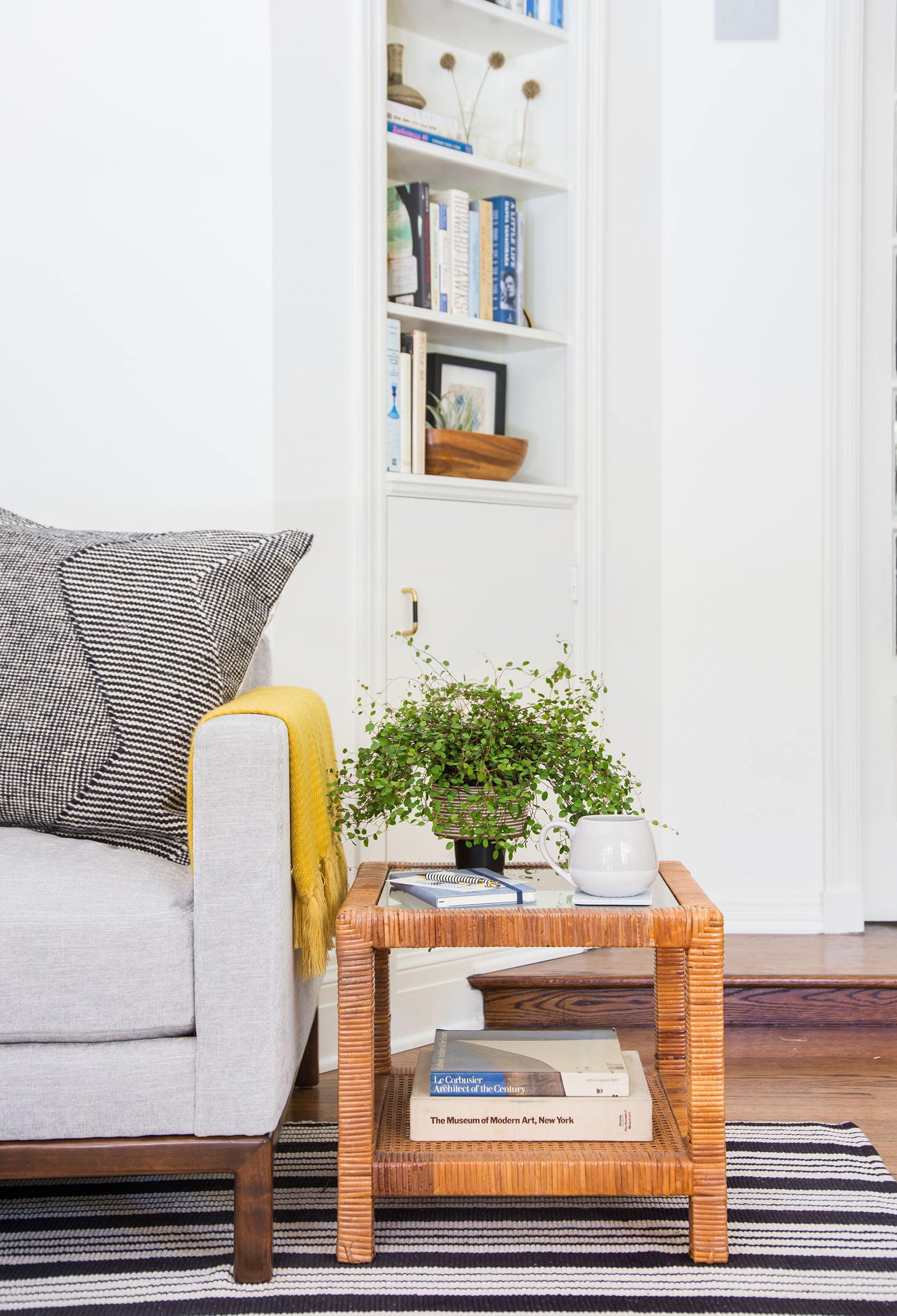
RULE: Side table shouldn’t be deeper than the depth of sofa they are next to.
This is kinda a no-brainer but just in case, make sure your side table is no deeper than your sofa. It’s an awkward look have a side table that looks too big for a sofa.
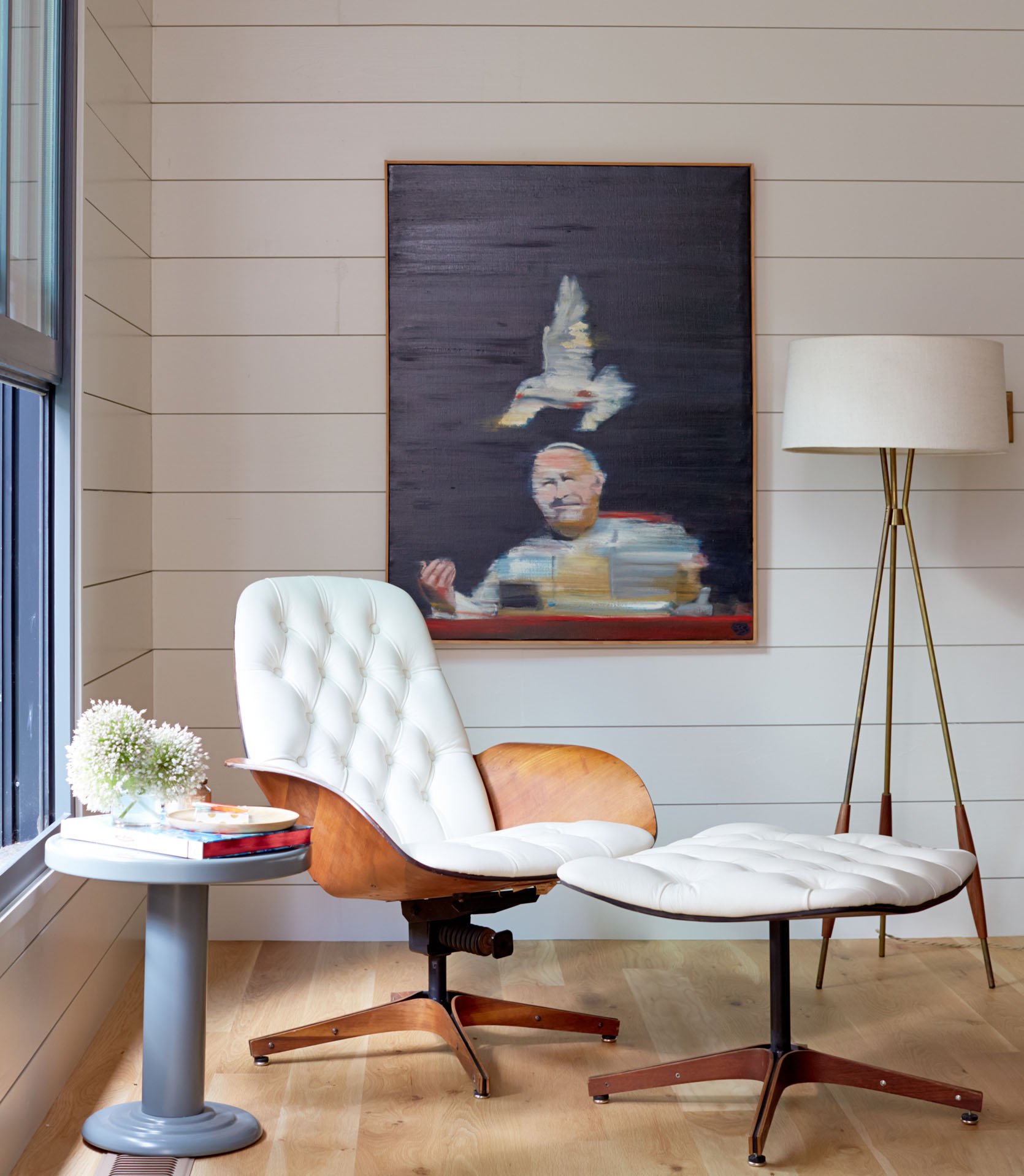
RULE: Keep your side table close enough to set down a drink with ease. Which is typically 2-3″ from the height of the arm.
Another no-brainer. A side table is meant to be used by the seat it’s next to. You want to be able to set that glass, book, or whatever else you are holding down with ease.
Bookcase
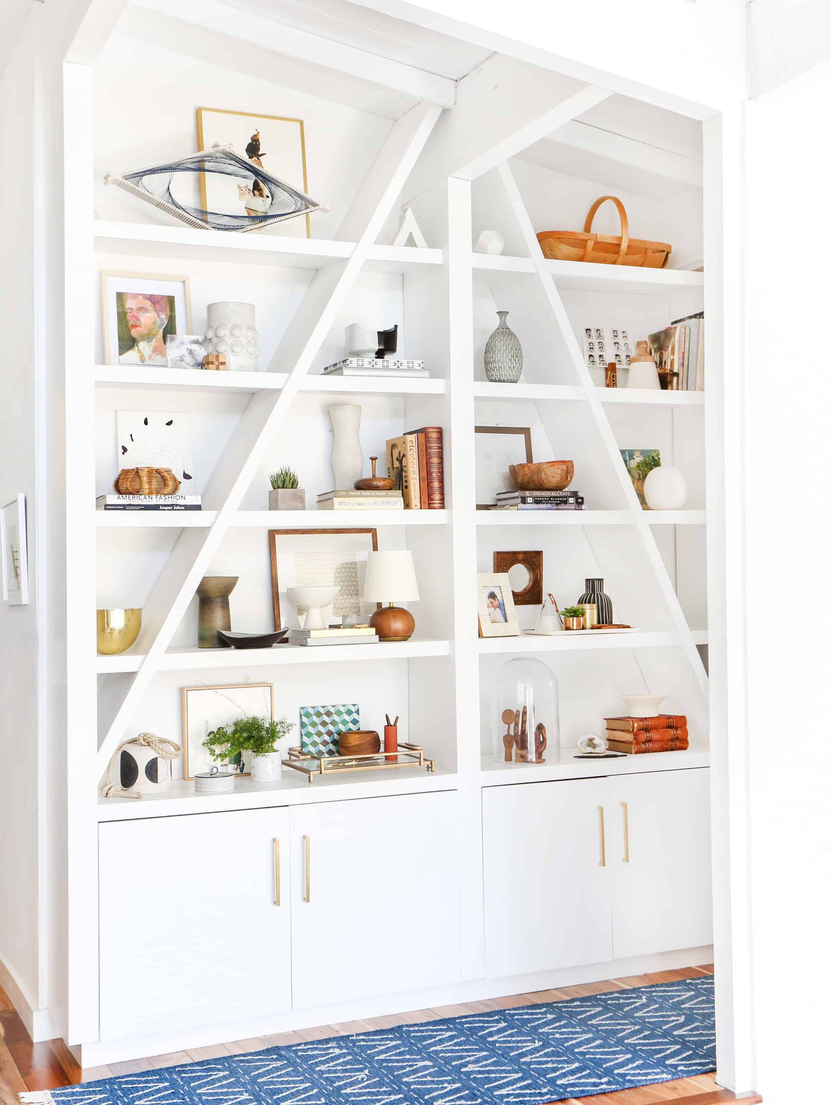
RULE: 12” is the ideal minimum depth of a bookshelf (or 15” to fit oversize art books).
To easily avoid a “book overhang” crisis make sure any bookshelves purchased or custom made are at least 12′ deep. Your books and “shelfies” will thank you. And if you don’t have a bookshelf that is that deep than try to steer clear of displaying any books or items that will hang out from the shelves.
Accent Chairs
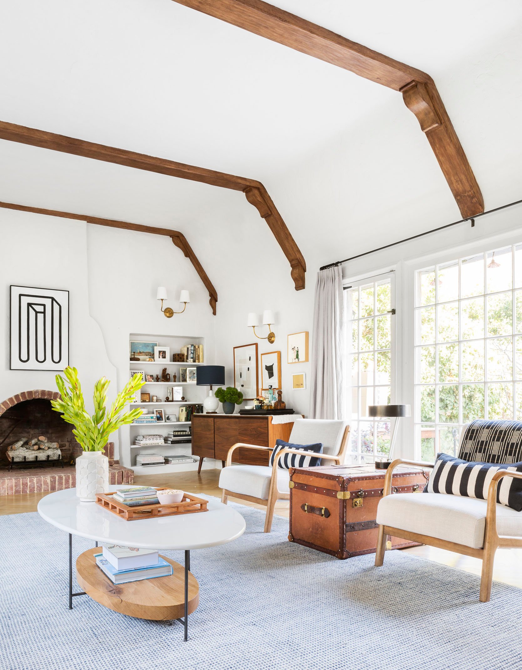
RULE: You want around 42” (size of your room willing) between a set of living room accent chairs to be able to fit a small table (or vintage trunk in this case) in the middle. For a smaller room just place chairs side by side.
Do you sense this theme of giving enough space in between pieces of furniture? 42″ is a great standard to give you the right amount of space between your side chairs.
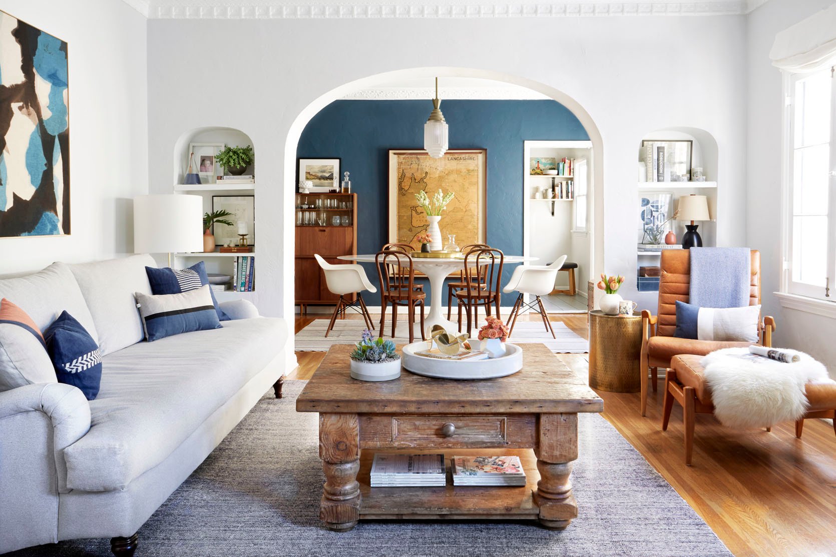
RULE: When pairing a sofa and accent chairs choose seat heights that are within 4″ of each other.
It helps to have similar seat heights in a living room so that when your family and friends are all sitting in the same space no one is awkwardly at a very different height. Plus it just visually looks better in the room.
Sofa Console Table
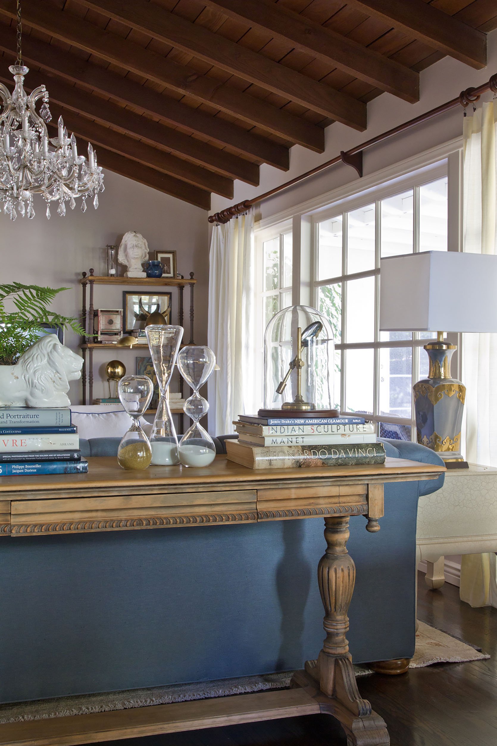
RULE: Make sure your console is the same height or a few inches shorter than the back of your sofa. It should also ideally have about 6″ of space on either end.
It just looks strange to have a sofa console table that’s taller or wider than your sofa. Keep it a few inches shorter and style away with your favorite keepsakes.
Television
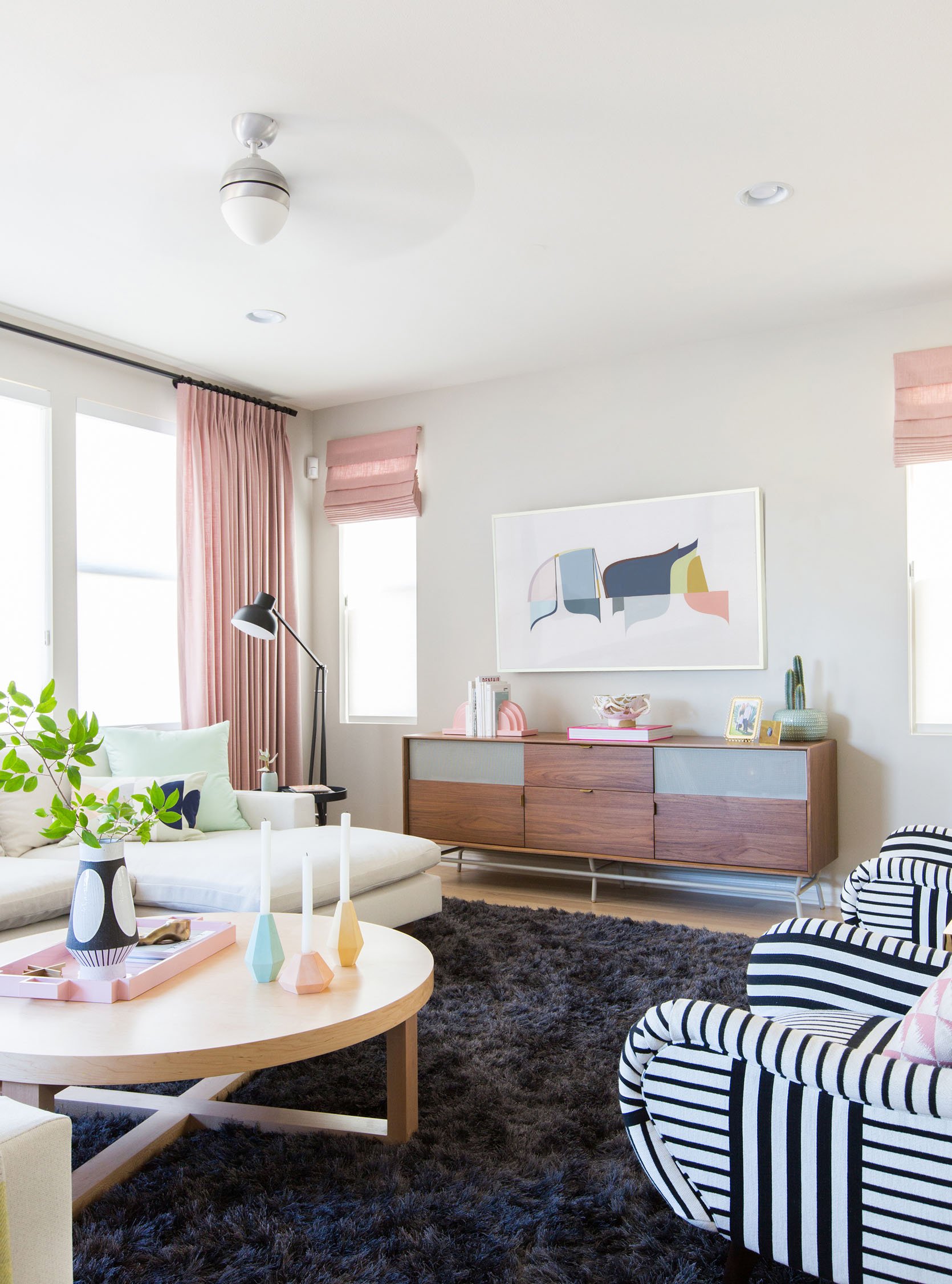
RULE: An optimal height for the center of the screen is 30 inches above the lowest seat height in the room.
Give your neck a break and use this rule to avoid hanging your tv being hung too high on the wall.
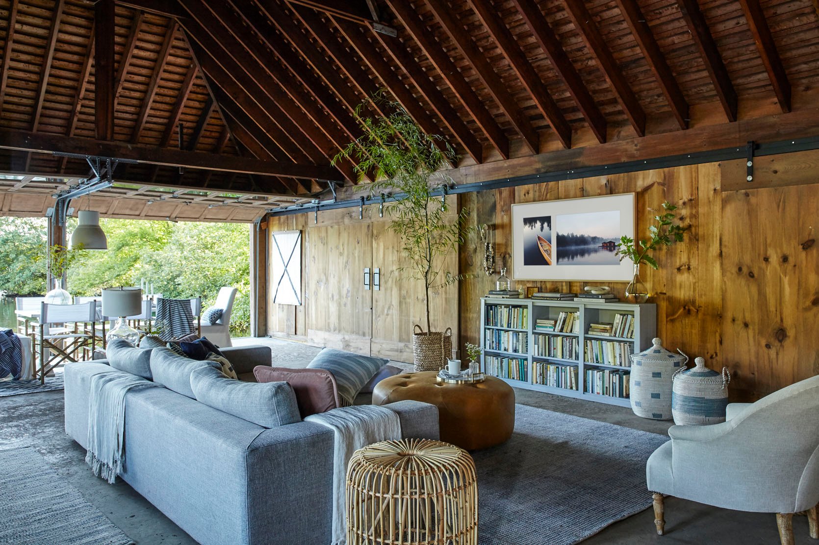
RULE: The distance between TV and sofa should be about 7′.
We all have different preferences when it comes to how close we like to be to our beloved televisions but a good rule of thumb is 7′. Your eyes will be very happy, and you won’t feel like you are either in the front or back row of the movie theater.
Phew… we made it out alive. As mentioned before these are all guidelines and some of these rules can be broken and the room can still work cohesively together, but hopefully these will give you a good foundation for your living room layout. Let us know if you have any questions below or if there are any rules that we left out that you want answered. Now what room should we tackle next? Let us know your burning questions below.
Check out the rest of our design rules: Bedroom Design Rules | Dining Room Rules
Opening Image Credits: Photo by Sara Tramp | From: My Living Room Update
THIS POST WAS ORIGINALLY PUBLISHED HERE.


