Close friends of ours rented a 14th-century castle in Spain seven years ago where we stayed for a couple of weeks. It was dark, weird, full of stone and narrow passageways, and creepy historical secrets. Then, as you rounded the corner, the kitchen was flat panel cabinetry and stainless steel countertops. As an American, who doesn’t have to work with truly “historic” properties, this was unsettling. But this happens all over Europe – old building shells with contemporary vessel sinks and stainless countertops, offering the latest non-historic amenities. I think there is something kinda badass about it – as if historic homes are so normal there that you don’t feel this preciousness to restrain yourself and “reference the era”. If you want fresh and contemporary ya just do it. When it’s done right it’s SO EXCITING, but when it’s done cheaply/generically it feels sad and soulless like something was taken without giving back. Like a pop-up generic sunglass kiosk in the middle of a thriving cultural farmers market. No! Not here!
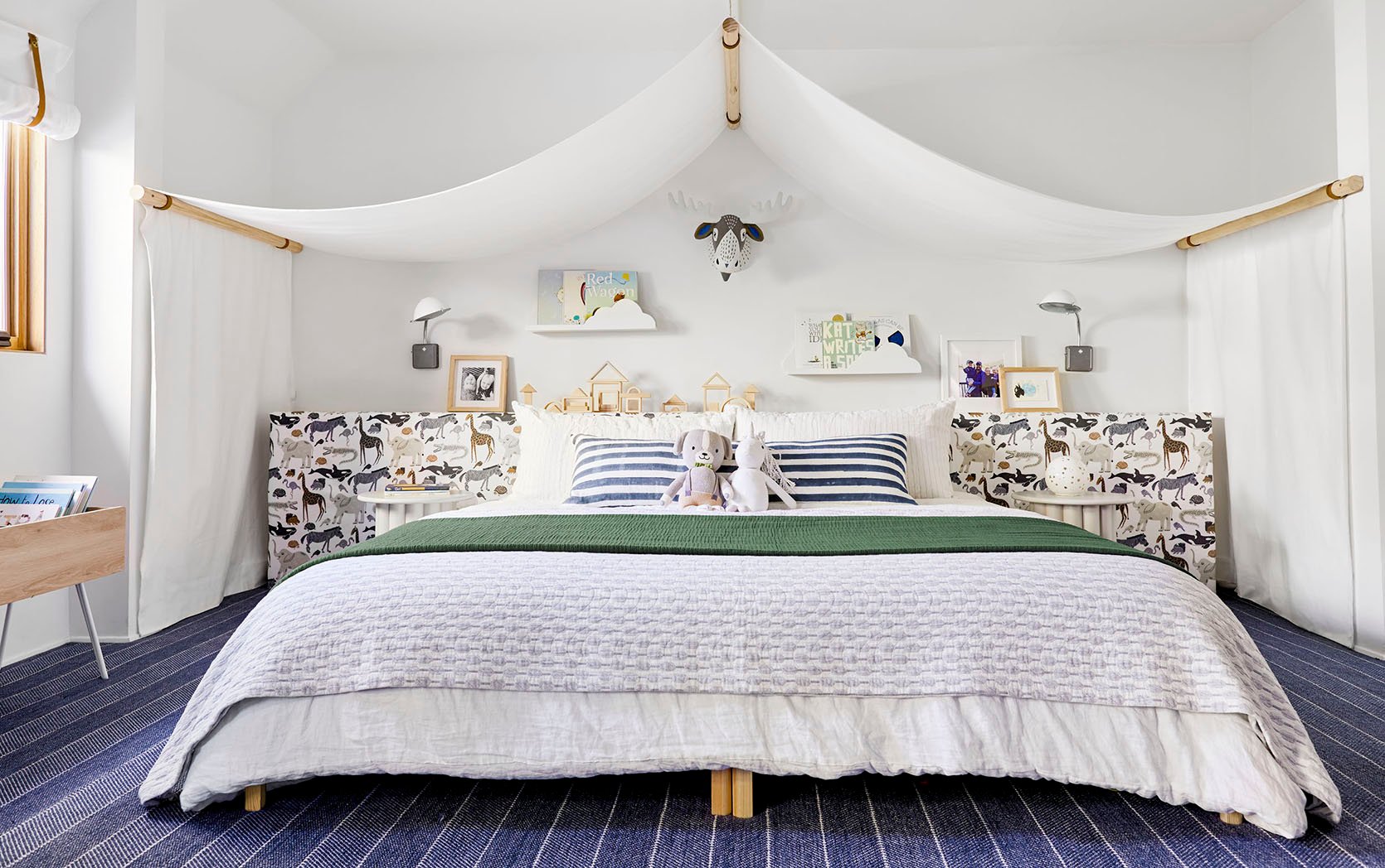
Another Example: When I revealed the kid’s fabric headboard wall at the mountain house (in a cute animal fabric) many readers commented that it was so not “mountain” and that it was more “safari”. It hadn’t occurred to me AT ALL until that moment and I remember thinking, “Are they right? Did I just do something weird and non-sensical? Does this fabric just not fit??” Ultimately it doesn’t really matter because life is a lot bigger than this, but at the same time when you walk into a space that has a clear, cohesive look, something about that clarity feels reassuring and calming. Is having a super cohesive themed vibe better for experiencing a space?
It just begs the question – how much do you have to reference the original architectural style of your home when doing an extensive remodel? Furthermore how much do you need to align the decorating and furnishing with the architectural style?
I LOVE A THEME… And Love A Mix Even More In My Home
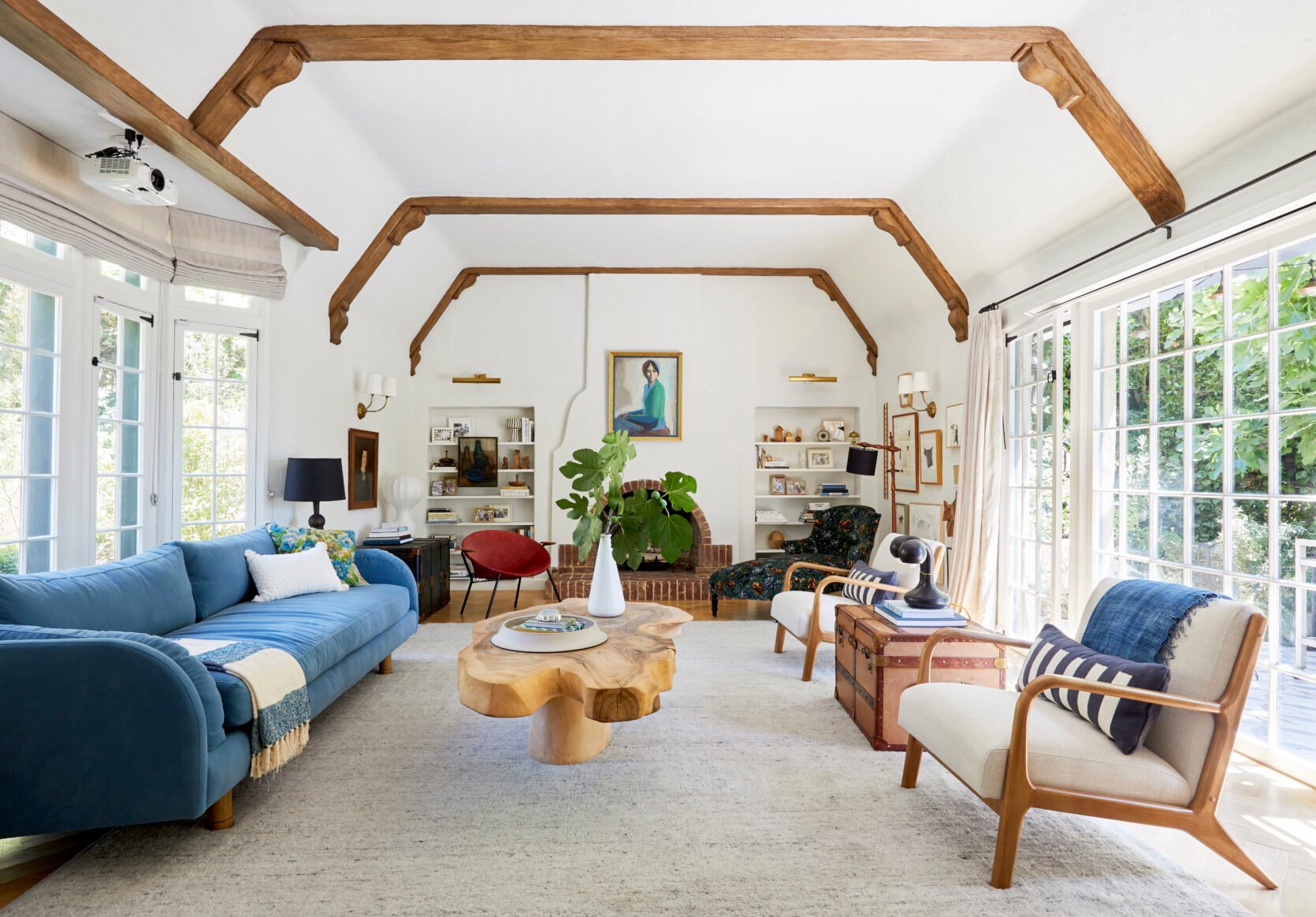
I find that experiencing a room with complete design cohesion feels just so clear and calming. Your brain and eyes don’t have to “figure it out,” they just experience the intent of the space and enjoy it in its clarity. That sounds pretty great and is like most great hotels (and now that I’m thinking about it, the mountain house has a very singular vibe). But due to my natural eclectic nature, and my now very sentimental attachments to so many pieces that I have collected and loved SO MUCH over the years, one style isn’t possible over here. It’s a mashup, that without a lot of attention can look like a thrift store, but also feels like capital H Home.
When we bought the farm I knew that I wanted it to feel casual and solid, with some classic country motifs (plaid, stripes, wood, quilt). The real question was how rustic do we go? I look at Claire Zinnecker’s farm, full of so much rusticness and charm, antiques, chippy paint, and quirk, and at times I wish I had gone in that direction (it’s so good). And then I look at Sara Sherman Samuel’s home, also a very clear style and I want that!! Both of their interior styles matched the architectural styles so perfectly (as intended). But what about those of us whose style doesn’t totally match our architecture? I love the country/nature A LOT, but I’m not hyper-traditional. Sure, I love plaids and ticking stripes, but it wasn’t until I found “shaker farmhouse” that I decided marrying my love of simplicity and the warmth of country might be the combination. But even that I haven’t stuck to it! I have recently brought in some more contemporary pieces and it’s making this place feel alive in such a good way!
Those following along for a long time (thank you) have seen me design/decorate many houses of different architectural styles. They all tend to have an “EHD vibe” – but have been very, very different. I personally love to lean into the architecture and let it lead the design (especially when remodeling) because I get to play with a new style, a new point of view, and learn more about that design style/era. It’s an excuse to flex that muscle, explore that genre, and dive into something totally different. I used to say that my style was “Footloose meets Marie Antoinette meets Wes Anderson”. I’m not sure how accurate that is – I think we all fancy ourselves more interesting than we are, which is OK and probably just part of existing on the internet. But the “Footloose part” of it has always been plaid, leather, and casual woods (maybe worn brass like Kevin Bacon’s belt buckle?)
So today I’ll talk through some things that I did right, and some I’m certainly still learning about.
Lean Into The Architectural Style/Era/Location, But Don’t Fall…
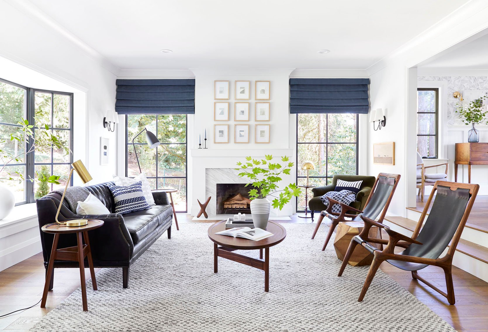
Look at the architectural style as an opportunity (not all houses have them), a built-in point of view. Sure, modern farmhouse is everywhere, but it is for a reason – in general they are just warm, inviting, and homey spaces. I tried to marry what I love about the farmhouse (homey, casual, comfort, with farm motifs) with what I love about the mountain house (simplicity, minimalism, so easy to live in), but with all our stuff from LA and lots of stuff from the OG Portland project that I’ve been holding onto. So hilariously it’s a total mix of all the projects you’ve seen here. So yes, “shaker farm” was a jumping-off point, but let’s just say it’s a real mix from there.
Permanent Finishes Are PERMANENT, Y’all
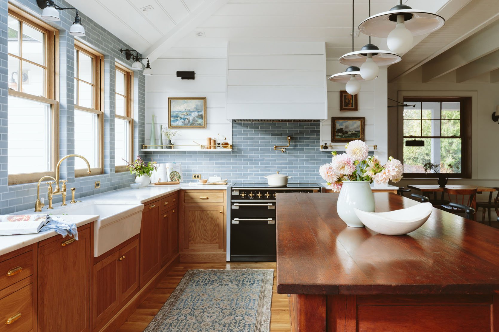
I’m going to go ahead and rebrand that to “forever finishes” just to remind us to intend to not replace them. Listen, you can do anything you want, it’s your home but if you are worried about renovation regret, the safest thing to do is go classic (if in an older home) or streamlined/simple in a postmodern or contemporary home. And I’m hesitant to say this – but if you can, avoid going too cheap on these fixtures because that is really what dates a house. Ideally, those scary forever finishes (tile, flooring, plumbing) would reference, or give a nod, to the original style so that they look like they “belong” there. It does NOT have to match or be literal, and if you don’t like this advice don’t follow it. Also if you buy a Spanish bungalow you do not need bold patterned terra cotta tile, just lean towards a Zellige in whatever color speaks to you. If you have an English Tudor you don’t need old-world cross-handled faucets, but yes leaning “classic” will always work. It’s my theory/hope that if you try hard enough you can find a “you” version of every architectural style. Is our bathroom tile “farm” like? Not necessarily, but it’s simple enough that they work within a shaker farm style. Do I wish I had gone for the delft tile? Or done a custom floral tile? Put in a salvaged hutch in our pantry? I mean that all sounds so beautiful and I want to stay in that Airbnb really badly, but no, I’m still pretty happy that it feels quiet, simple, and layered. To be fair this could also be confirmation bias, snobbery, and fear of not getting it right so I took a lesser risk with our materials 🙂
You Don’t Need To “Theme” Your Furniture To Your Architecture (But Some Sort Of Cohesion Is A Very Good Idea)
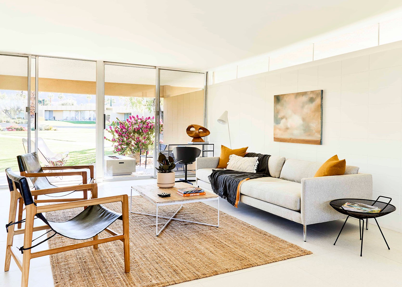
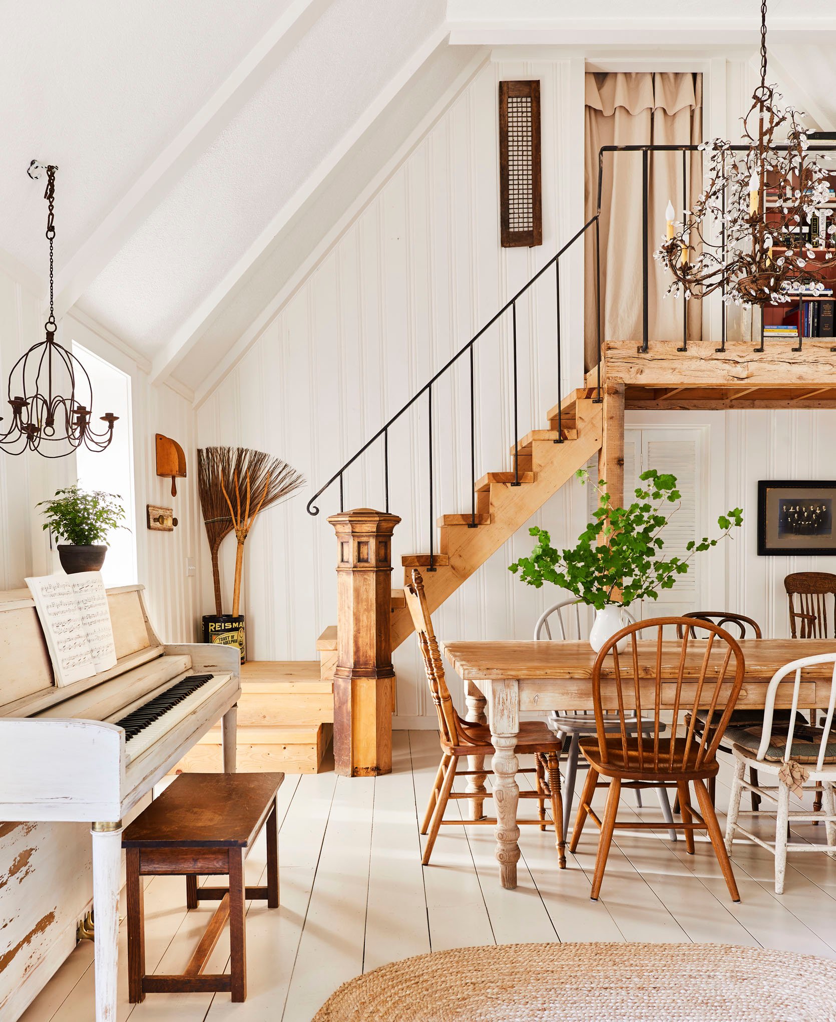
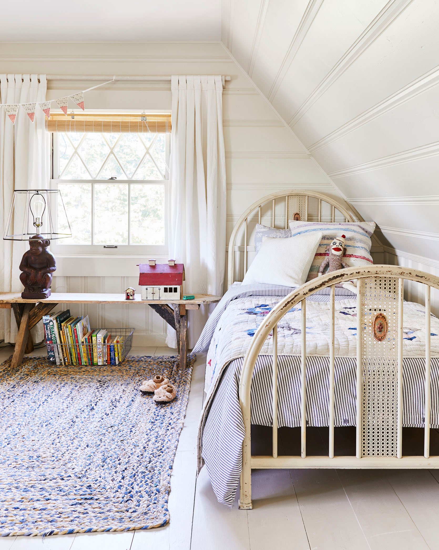
Your house doesn’t need to wear a costume unless you want it to (again, which I think can be so fun). I kept falling into this trap with the pieces that we really did need – they had to be “FARM,” but I wasn’t finding what I actually liked. Don’t buy a Spanish-style sofa that you don’t like just because you live in a Mediterranean bungalow. I tend to bring some of the theme into the decor because it helps with cohesion (which as discussed can be calming), but after years of collecting my favorite pieces I would never not buy something that I love because it might not look or feel like a “farm”. NO. But would I lean towards a style more based on the architecture? Yes. Definitely.
Interesting Is Better Than “Right”
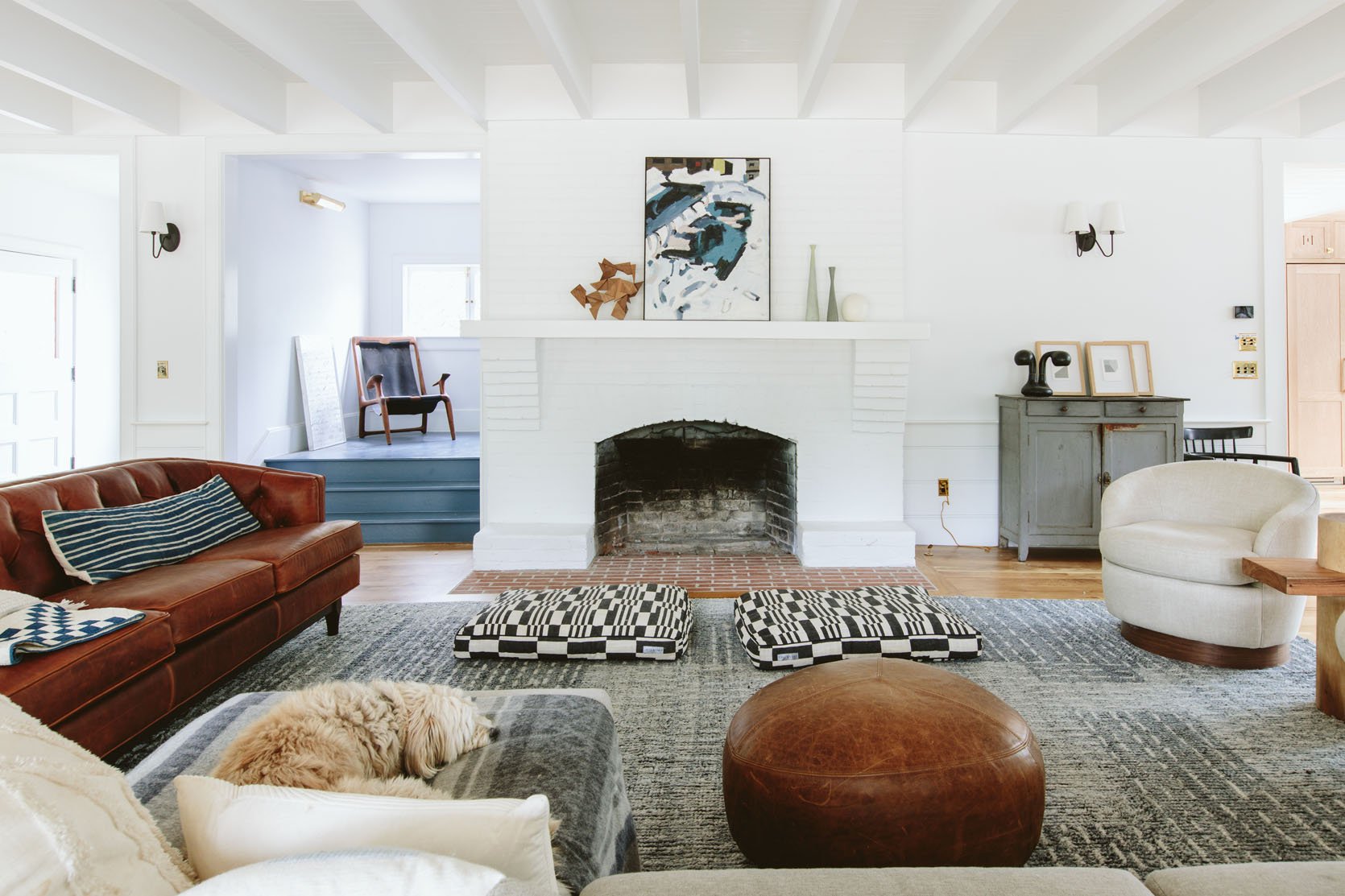
When buying something new that I actually need (i.e. a bookshelf behind our sofa for instance) I first try to make sure that it meets functional/practical needs (right height and depth, right amount of storage, complimentary finish, etc), then I look for a style that I think would be appropriate in the home. But if I’m shopping and fall in love with a piece that could go in a prominent place and it sings to me on a cellular level, I don’t let the fact that it would never have been in a farmhouse stop me. For instance, so many people are confused about the Fernweh chair on the landing of our stairs. And I get it! Who puts a large wood and leather chair on a stair landing? But the fact is that I LOVE that chair so much. It reminds me of the project I did with my brother (which was memorable because that house taught me how to renovate), and I just love looking at it so much. Would I have bought that chair just to live on the landing? NO. But I’m not going to let the fact that it’s not a chair that would be in a farmhouse deter me from staring at it all day.
Think About The Rooms Obituary….
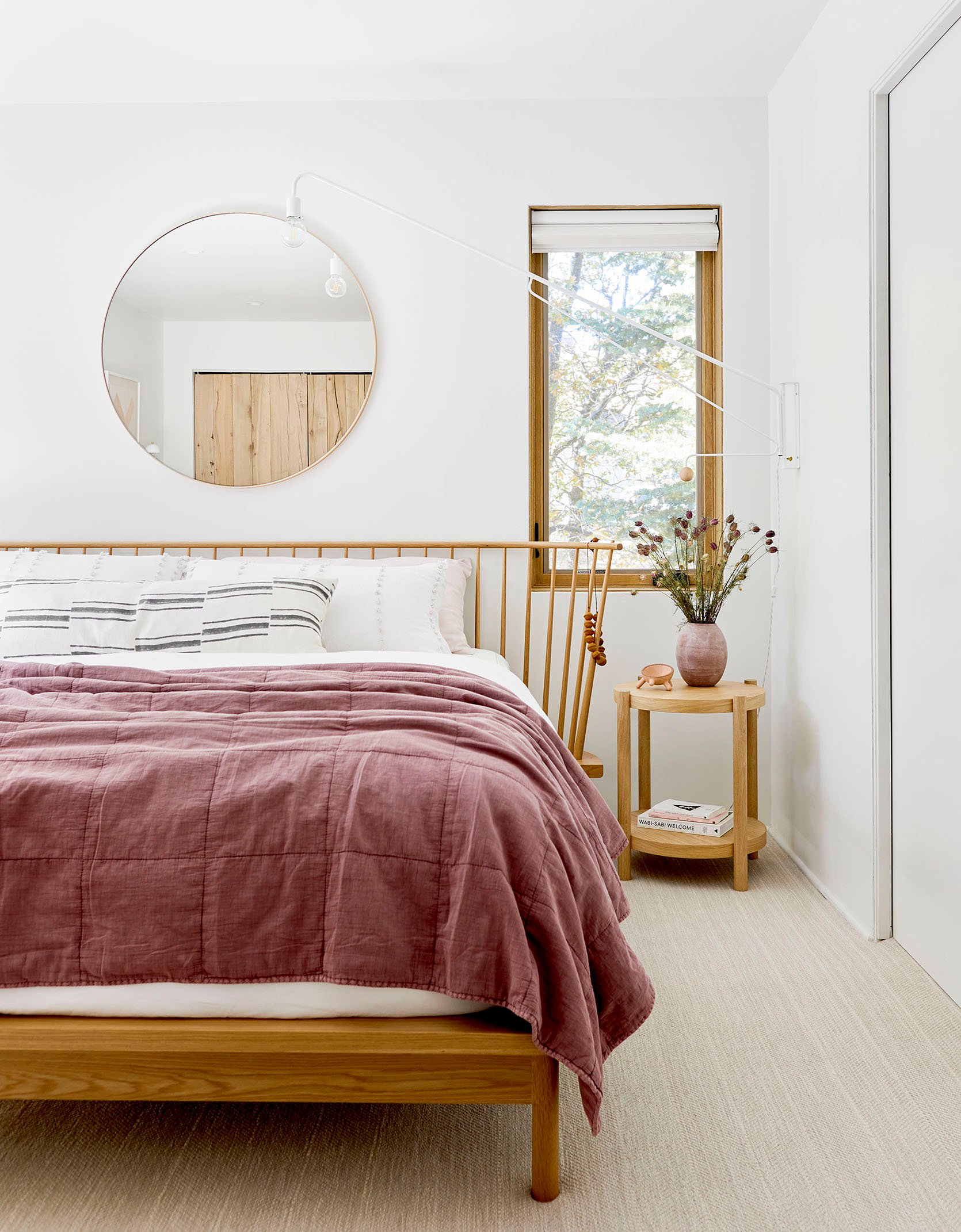
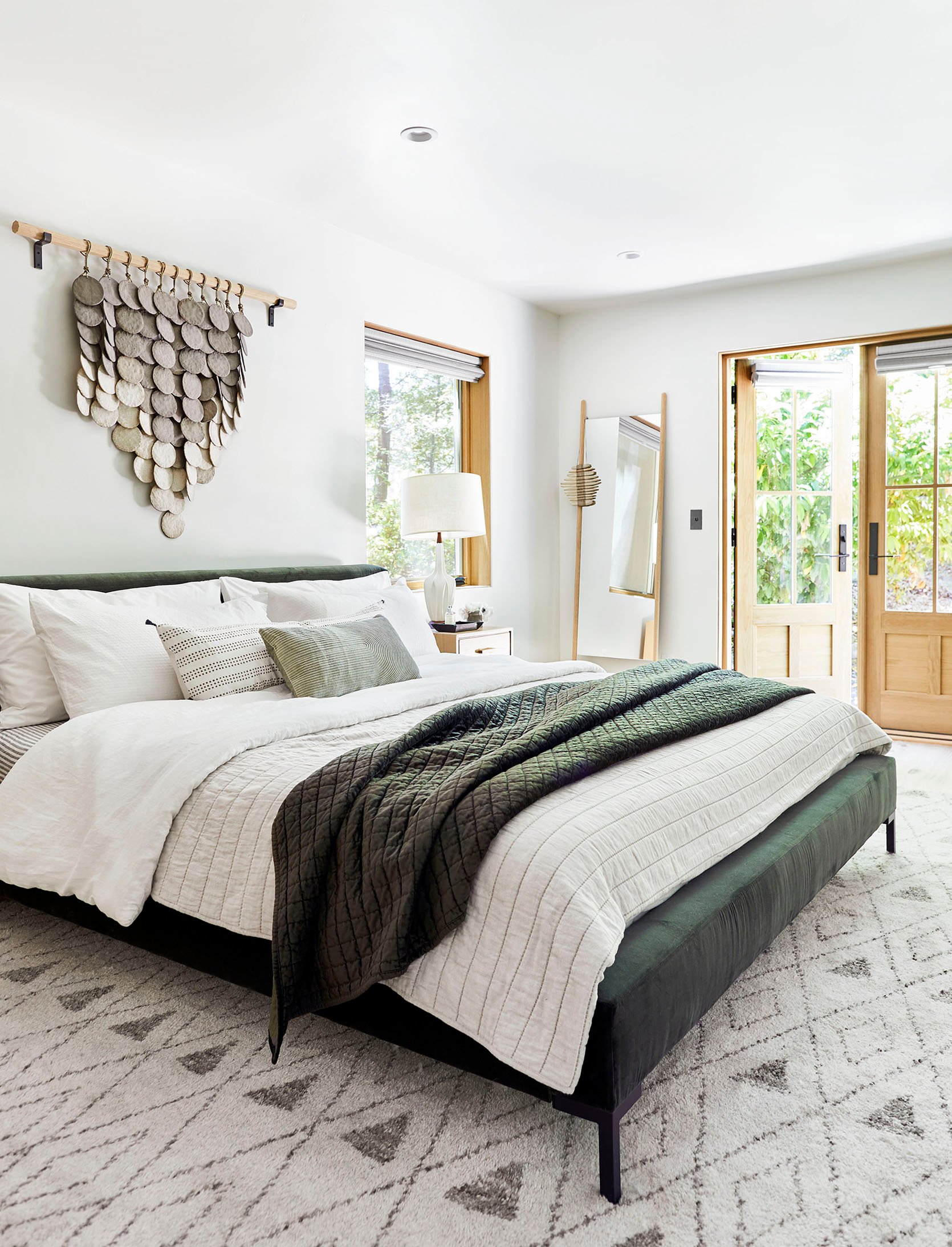
| right: mountain house reveal: our soft yet secretly sultry downstairs guest bed + bath
Here’s a fun if not odd exercise: When designing a room think about the impact that this room might have on those inside it. What would you say about this room after leaving it? What starts a conversation? Creates a vibe or mood? Not every room has to be memorable, but if you are spending the time and money designing it what do you want people to remember about it? It can be that it’s so inviting and warm, or so exciting and fun, or the perfect mix of calm but interesting (maybe that’s what I’m going after all??). The guest rooms at the mountain house admittedly look boring, but in person, everyone remembers them as being calm, warm, so comfortable, and well-appointed. Everyone sleeps well there and that’s what they’d say at that room’s funeral. Told you it was a fun if not totally esoteric exercise.
To Avoid It Looking Messy And Hodge Podgy I’ll Control The Color Palette
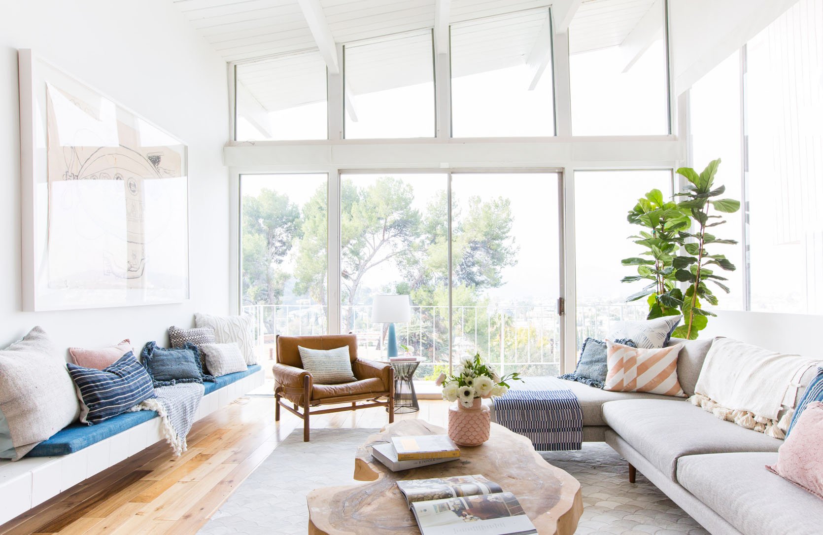
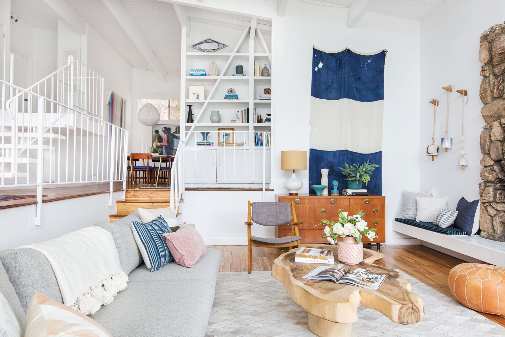
I still, to this day, implement this, and when I don’t I end up shifting back to a more controlled color palette. The other day I brought in a bunch of art from the prop storage room and really went for it. It was exciting for a couple hours and then as the normal Sunday cleaning went by I was already done with how busy I had made it. This is totally personal and many people can handle more color/pattern and busyness/clutter than I can. So if you are a maximalist that likes an all-color palette approach, I get that and we’ve all seen it done in such exciting ways. But yes, I have found consistently over the years, that you can mix all styles together as long as you have a paired back color palette. Our living room is finally coming together, with so many different styles happening but all in the blue/green/brown/white/black world…
Lean Into The Theme For Newer Pieces (Should You Need Them) Then Mix In New/Contemporary To Create Contrast
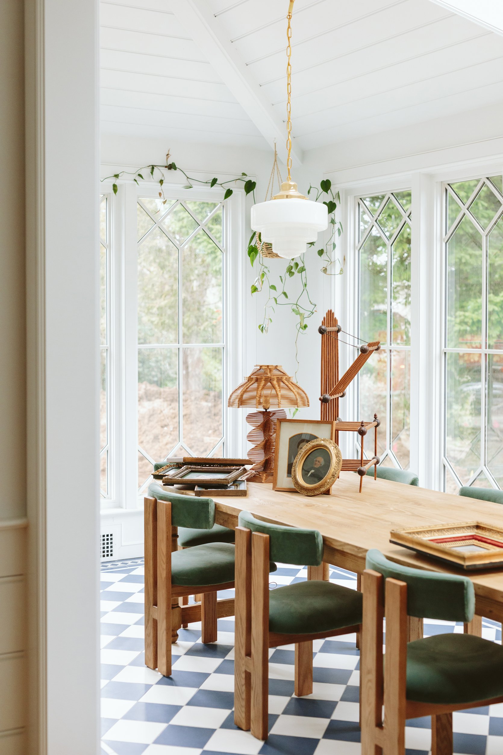
When we moved here we didn’t have a lot of major furniture. Our “theme” (which admittedly we have strayed from a bit) was shaker farmhouse, so less country and more simplicity. So for the major pieces that we needed to buy I tried to stay within that theme at first (i.e. our dining table, our rug, our stools). But the dining/sunroom is a great example – mixing in the contemporary dining chairs with the classic oval farm table, made that room SING. They were so incredibly perfect for the room and created a new vibe. Once I brought in those chairs I realized that’s what the rest of the house needed – new, simpler, more postmodern contemporary pieces to balance out the sweetness and simplicity of the more traditional farm elements. And now I’m getting SO EXCITED.
So that’s where I am right now, trying to convince myself that I don’t have to be 100% farm in the house to create the experience that I want here. Just like I’m not 100% anything, none of us are 100% anything. I wear athleisure, overalls, drop crotch, sequins, cowboy boots, and princess sleeves – I’m all over the place and always have been – matching my outfit very clearly to the task/occasion to varying degrees of success. Does that mean that some rooms are going to be more themed farm than others? Maybe! I think they are all going to be a mashup of casual farm, some old-world elements, and some contemporary pieces all within a color palette. LET’S HOPE THAT IT WORKS!!!!
Opening Image Credits (From Left to Right): Photo by Tessa Neustadt, From: How We Styled Our Living Room to Sell | Photo by Sara Ligorria-Tramp, From: Portland Project: The Living Room Reveal | Photo by Kaitlin Green, From: My Journey To FINALLY Choose A Wall Color For Our Living Room (And How I Feel Now That It’s Painted)
THIS POST WAS ORIGINALLY PUBLISHED HERE.


