I need you all to know that I am sitting down to write this post with the same manic-meets-panicked energy of Michael Scott during a fire drill. Like, OH MY GOD, IT’S HAPPENING. (In case you’re just tuning in – my name is Caitlin and I head up partnerships and revenue around these parts. You may know me from greatest hits like “Caitlin designs an insane bathroom” and “Caitlin tries and fails to buy a condemned house that’s falling off the side of a hill.”) Today, though, I’m FINALLY welcoming you into my actual living space (and it only took 3.5 years to build up the courage, so that’s something).
Some context into the process, before we deep dive into the very personal photos up ahead: I’d say that this room was “collected” more than “designed.” Sure, there are a few new investment pieces in here – my dream swivel chairs, a classic rug, a modern record cabinet – but the rest of the room is filled with vintage furniture, family heirlooms, flea market finds, gifts from friends, and hand-me-downs from the big boss’ garage. (I am very lucky!!!) Here’s a quick reminder of where we started…
The Before
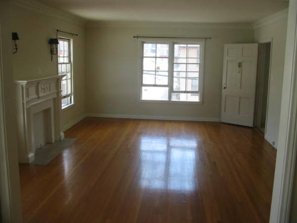
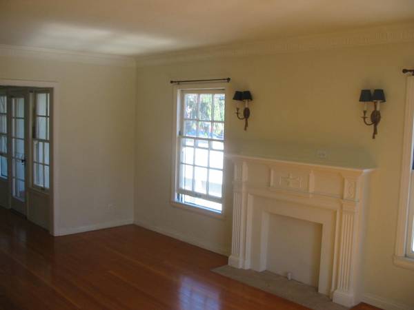
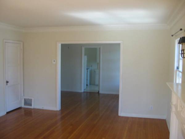
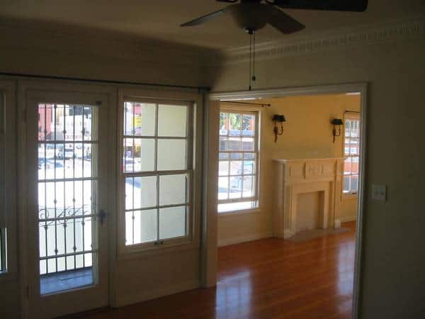
The good: a huuuuuge space (14’x20′!), original hardwood floors, plaster walls, beautiful moulding, a decorative fireplace, 1930s sconces, gorgeous windows, nearly 100-year-old hardware…SHEESH. The bad: well, it gets kind of hot? (I’m underselling – it regularly hits 90 degrees in here in the summer. It’s VERY HOT. But then I think about all of the people who buy sauna blankets and who love sweating, and about how my apartment – seemingly built of top-of-the-line insulating materials like “a piece of paper” and “a prayer” – is kind of like my own rent-controlled sauna blanket, and that helps.) All in all, it’s a beautiful place with incredible bones and I’m still so grateful that I get to live here, surrounded by so many special original details.
The Progress (Alternatively, “Trust The Process”)
This is where I last left you – most of the major pieces were in place, but I knew the layout, paint color, and styling still needed some SERIOUS tweaking. Earnest confession time: honestly, sharing this in-progress content left me feeling anxious and insecure. Like, my full-time job is to help the EHD team turn around beautiful, scroll-stopping makeovers in a matter of weeks…but this was as far as I’d gotten in my own home after years of collecting?
And while I could see the light at the end of the tunnel – I imagined new curtains, warm paint on the walls, two chairs flanking the fireplace, all kinds of stuff that made me feel excited and hopeful! – I also felt worried that my space wasn’t going to be “designed” enough to be internet-worthy, especially when I looked at all the beautiful, cohesive, seemingly uninhabited spaces on my Instagram feed. The absolute insanity of me – a journalism grad with 1. a business development background and 2. a tight budget – comparing my living room to the work of AD100 designers is not lost on me. But I couldn’t stop!!! I felt really disappointed in myself, honestly. The negative self-talk and self-flagellation were at an ALL-TIME HIGH, friends!!!
The After
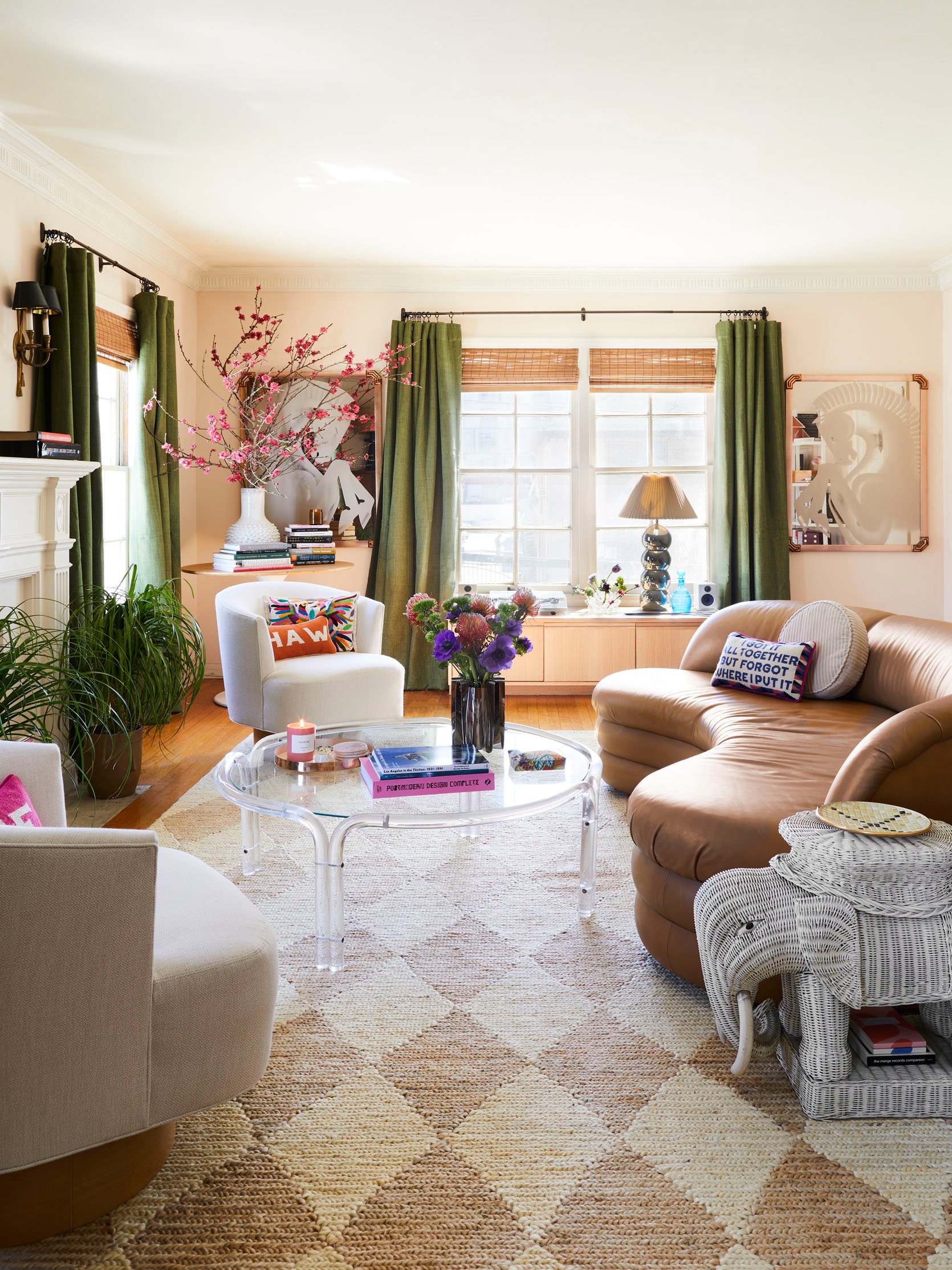
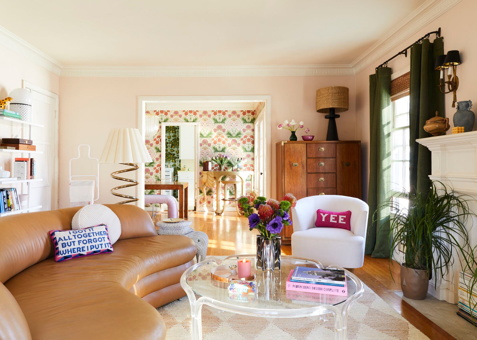
…buuuuuut then I saw this image pop up on Sara’s laptop screen. (HI, WELCOME TO THE REVEAL PORTION!) It was the first photo we took, and, well, it took me WAY back in time. I thought about the 13-year-old version of myself who had designed a striped pink, orange, and green bedroom and who had filled that space with wicker furniture and chrome accents and geometric lamps. (I’ll link a photo on my IG as not to fry your retinas; proceed with caution.)
So when I stood behind Sara and really looked at this picture, I just saw me. Like, that colorful (borderline abrasive?) style I had developed as a loud, strange kid? Turns out that I still have that same taste now, nearly 20 years later, as a loud, strange adult. It was a real “wherever you go, there you are” moment, you know?
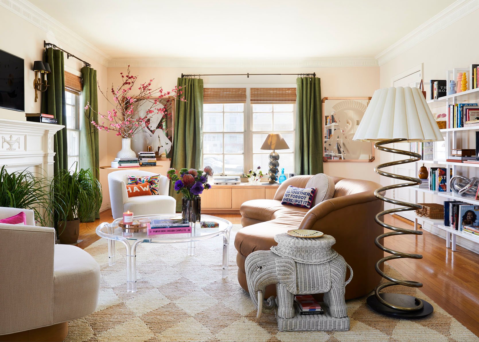
Since the shoot, I’ve been thinking a lot about going back in time and meeting up with that weird kid in her nearly-neon bedroom – sitting her down, showing her these photos, and letting her know that it all does work out in the end (mostly, at least). Because friends, let me tell you: that lil’ freak who just wanted to get out of Delaware and who loved color and chrome and quirk would have FLIPPED OUT. She’d be overjoyed to live here, in Los Angeles (a lifelong dream!), in an apartment decked in her signature pink, orange, and green color scheme.
So after spending so much time worrying about how I’m stacking up to my “peers” (read: full-time famous designers who are by NO MEANS my actual peers in any way, shape, or form), realizing that little me would be SO proud to live in this apartment feels really fulfilling in a new way. It’s a welcome, WAY overdue change in my perspective. It may never be Elle Decor cover-worthy or Pinterest perfect, but it’s filled with things I love and it feels like a Lizzie McGuire set from the early aughts that’s enough for me. (FINALLY. Only took a photo shoot to get there, NBD.)
The Paint + Coffee Table
OKAY, ENOUGH BLUBBERING. Let’s talk about paint (because that’s a good transition, right?)! After a little bit of trial and error with my color selection (mainly “error,” TBH, as detailed previously here), I covered the walls with two coats of Pueblo from Sherwin-Williams and I couldn’t be more thrilled about how warm it makes this room look and feel. It’s technically a light orange (!!!), but it’s the perfectly barely-there, almost-pink shade – a little neutral, a little peachy, and SO GLOW-Y. We shot these photos in the late afternoon, and you’ll be able to see how the light and color change throughout the day as the sun goes down – it’s one of my favorite parts of living in this place.
I wanted to take a second to call out the vintage coffee table, too. It was a 2019 steal from AES of LA and it’s lived through every iteration of this room – I love that it’s statement-y, but not loud. The copper tray and stainless Georg Jensen vase were hand-me-downs from Em’s garage (zero qualms about mixing metals over here, can you tell?) and you can also spot my much-loved Horchow card box (copped for $25 on Chairish!) on top of a few recent book purchases from Hennessey + Ingalls. We kept the styling really true to life and only added some fresh flowers – I know I write a lot about maximalism, but it turns out that I like to keep surfaces pretty open in my own home. 🙂
The Closed Storage

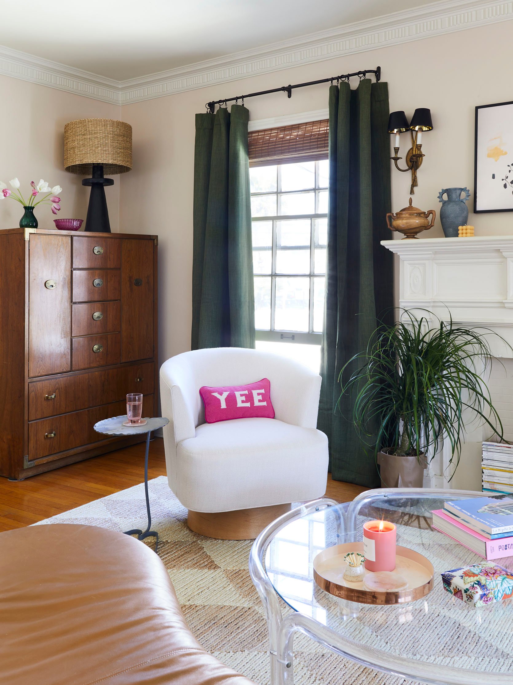
Chairs | Ceramic Lamp | Rug
Let me set the scene real quick: I’m currently writing from this exact spot (it’s my favorite place in the apartment!). My go-to playlist is on shuffle, the sky is blue, it’s 76 and sunny (after three months of nearly non-stop gloom – what gives, LA?), there’s such a nice breeze coming in from the open window, and I’m getting occasional whiffs of clean laundry from the laundromat next door. IT’S SO DREAMY.
Speaking of dreamy…can we talk about that vintage campaign dresser? It’s a workhorse that stores everything from board games and puzzles to wallpaper swatches and tile samples. The ceramic lamp is new from Crate & Barrel, and I love how it’s a modern cousin to the original sconces flanking the fireplace. The green glass vase and pink glass bowl are both family heirlooms that Brenda shipped to me before we shot (thanks, mom!!!), and it’s fun to think that my love of color is at least a little genetic. 🙂
The Dream Swivel Chairs
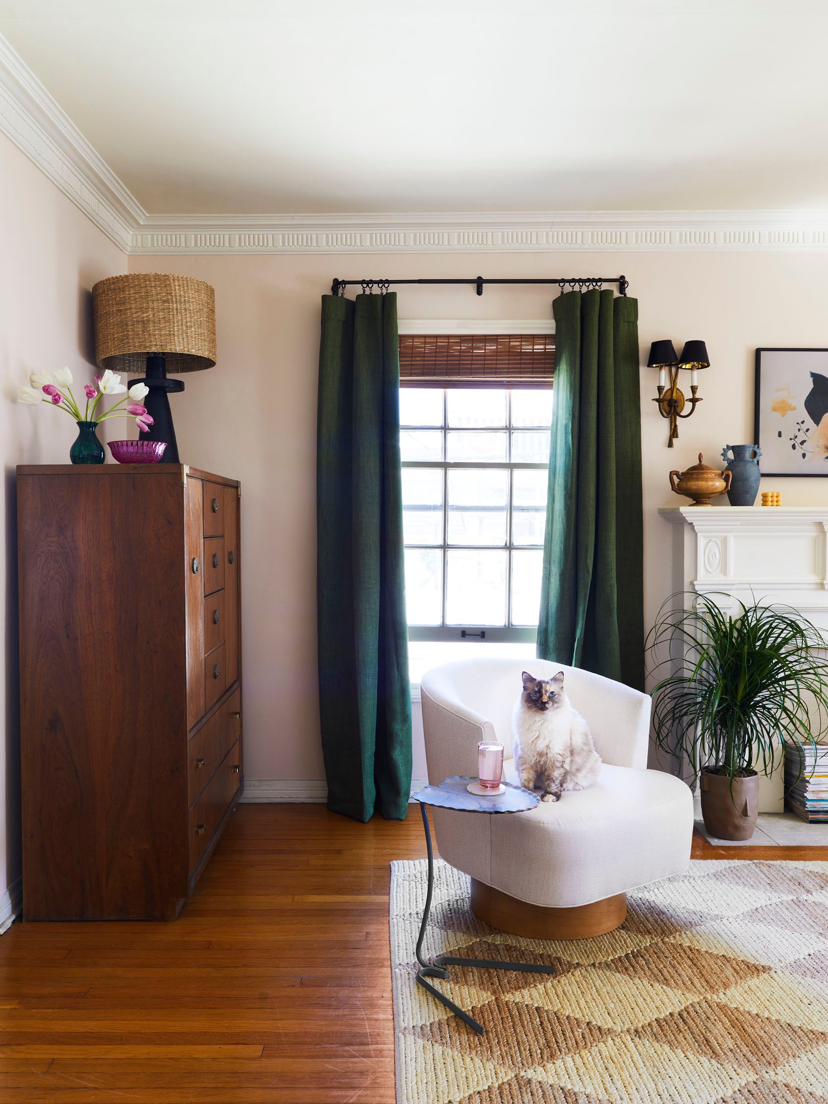
Chairs | Ceramic Lamp | Rug | Cat (Similar)
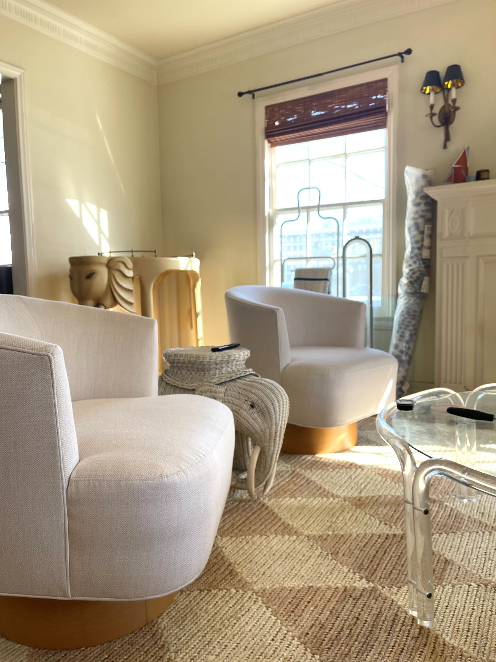
You may recognize that Salterini end table from the last update – it was a Rose Bowl flea find that I’m still pinching myself over. I also can’t speak more highly of the swivel chairs. I knew I wanted upholstery here to balance out the leather sofa, but I didn’t want to invest in something that couldn’t stand up to pretty intense daily wear-and-tear (I spill everything – no joke, I literally spilled Hawaiian Punch all over the sofa while we were shooting – and Buffalo spends at least half the day scaling chairs like a feline Alex Honnold, so performance fabric was essential.)
To that end, Sunbrella was the only upholstery option that made sense for my life, and I was THRILLED to find the offerings at Mitchell Gold + Bob Williams. I was immediately taken by the Costello Swivel Chair – customizable! Clean lines! No bulky cushions! The perfect arm shape for those of us who love to pull our legs up into our chairs! – and after ordering a few fabric swatches, I customized my pair with Sunbrella’s Performance Basket Weave in Almond fabric and Natural Wood bases. I’ve been living with these for 7 months and I genuinely couldn’t be more pleased – I love how they look (clean, modern), but I also love how they feel (comfortable, supportive) and how easy they are to maintain (seriously – if you’re only using Sunbrella fabric outdoors, you’re missing out).
A Lazy Gal’s Frame TV Hack
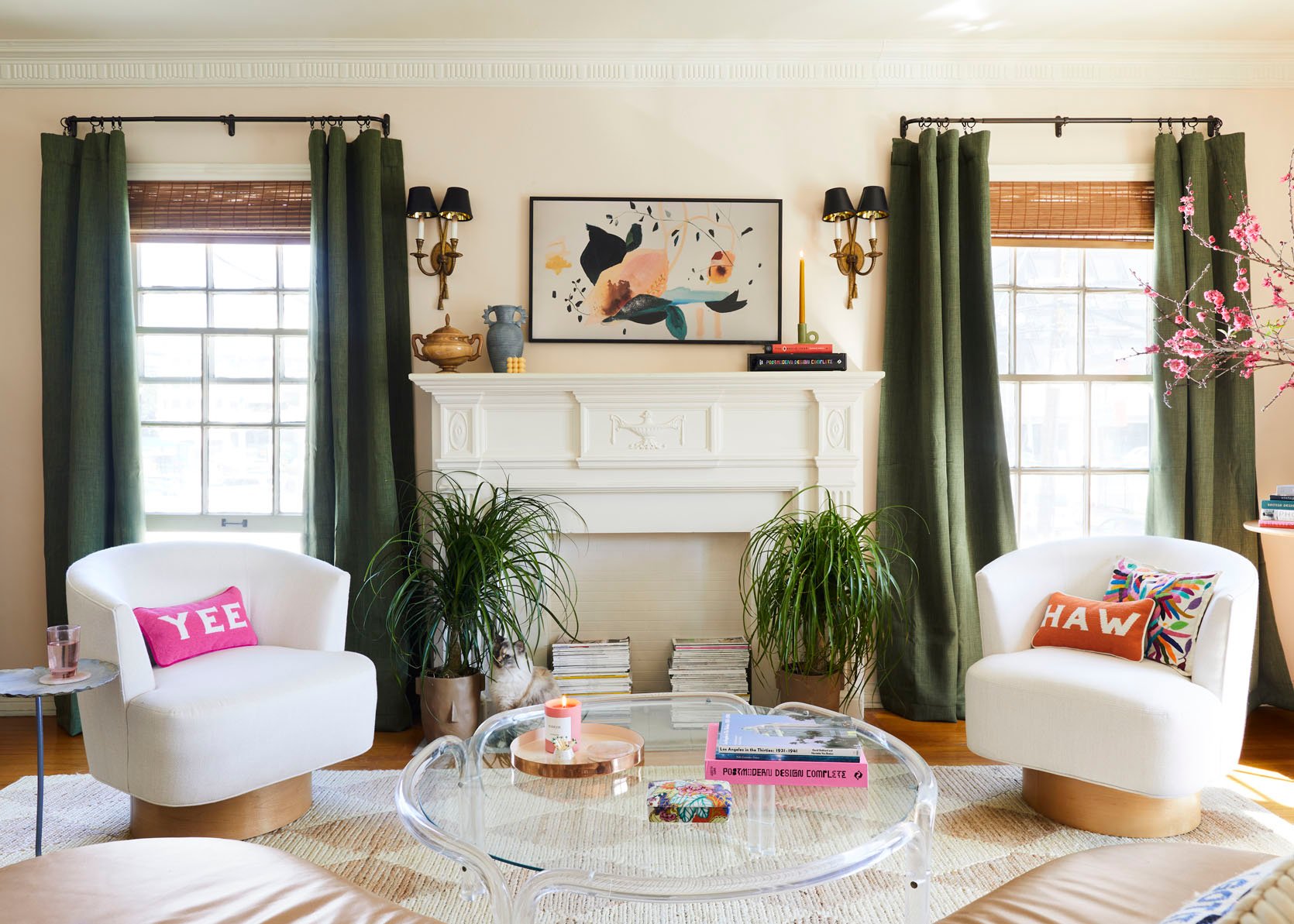
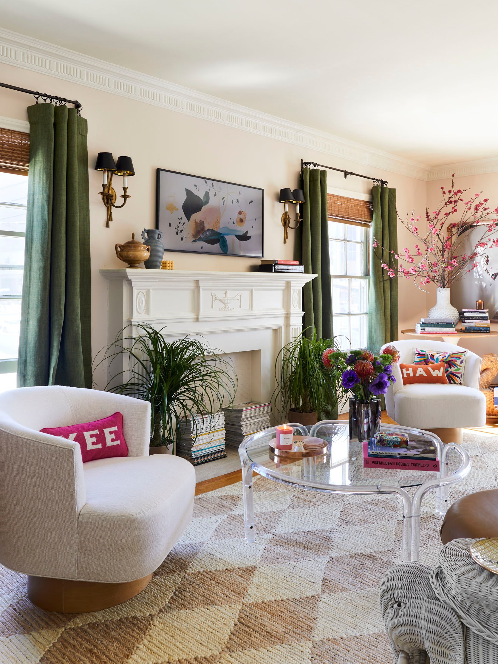
Chairs | ‘Yee Haw’ Pillows | Rug | Planters | TV
Um, hi, TEXTBOOK LIBRA REPORTING FOR DUTY. It’s not groundbreaking, but I love symmetry. A few other things I love: the vintage wooden sugar bowl on the left of the mantel (purchased from this Ukranian Etsy shop in 2020 – they’re still shipping and it’s a great business to support!); the old blue Anthropologie vase; and the little geometric candle, which was a gift from Em on our most recent team trip to Portland. And y’all, don’t even get me started on those Yee Haw needlepoint pillows – they’re so fun AND they’re from a small business in Texas, which rocks. (Who else grabbed one?!) I’ve had the embroidered Mexican Otomi pillow on the right for years – it was a Rose Bowl find and I never get tired of looking at the embroidery.
BUT WAIT, LOOK UP. You see that stack of books on the right side of the mantel? That’s actually the receiver for my Frame TV – I just wrapped it in a black book jacket right before we shot. There’s a famous Bill Gates quote that goes, “I choose a lazy person to do a hard job. Because a lazy person will find an easy way to do it,” and baby, IT’S TRUE. No need to make a fancy electronics cover or run wiring through the wall – just strip down a book, wrap it around your technical eyesore, and call it a day. www.lazygirldesignhacks.com
A Fun Planter
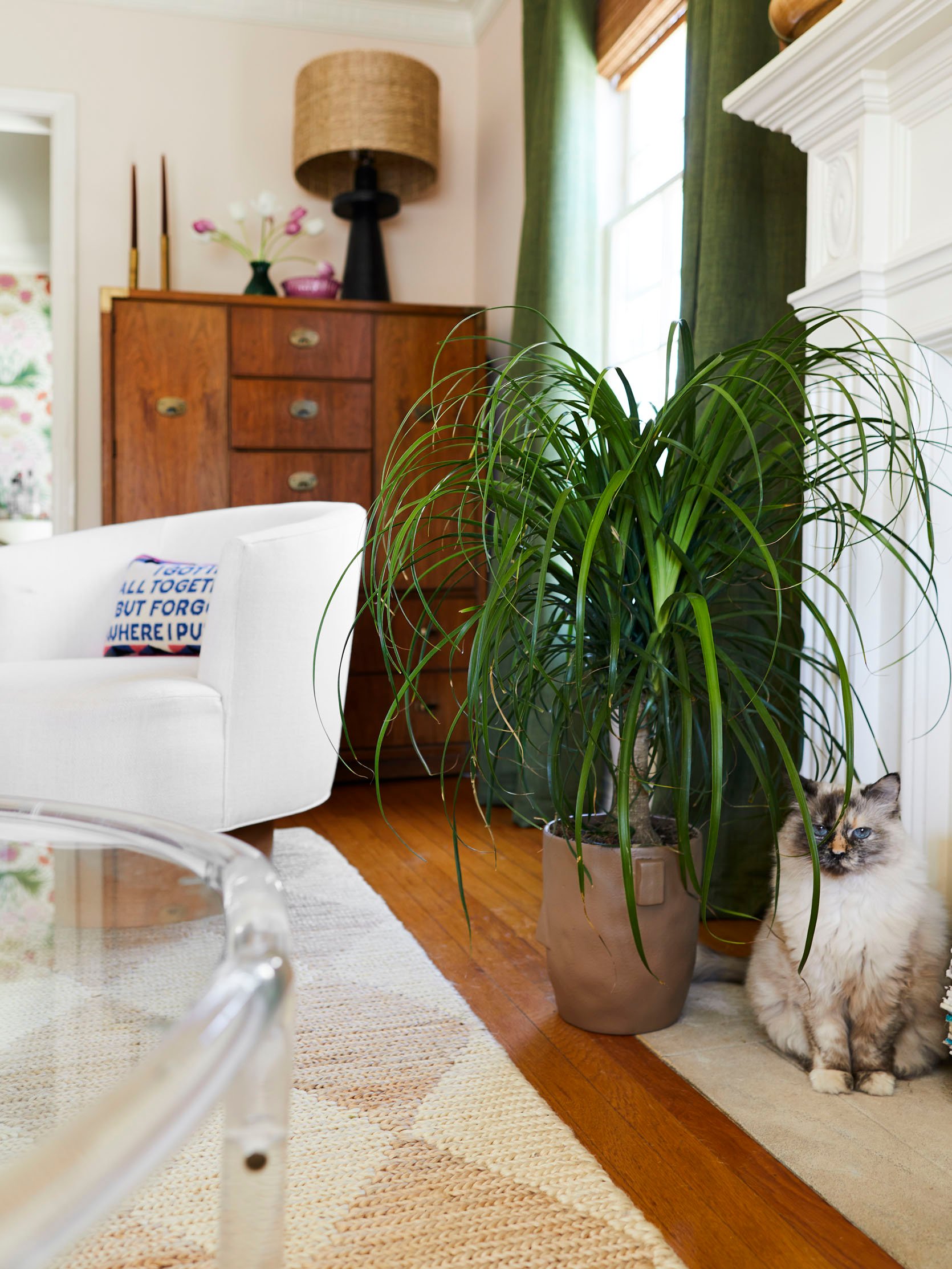
Planters | Cat (Similar) | Rug
I found these face-shaped planters at a Target in Glendale the night before we shot. I sent Bowser about a trillion texts about them (“Do you like these?” “Do you think they’ll look okay in the photos?” “Is this too weird?” “Am I overthinking?”)…and then I bought them anyway before she responded because the heart wants what it wants. (Nothing like repotting plants in the dark, amiright?) I think they’re kind of quietly kitschy – especially when paired with ponytail palms!!! Guys, it’s like they have little ponytails!!! – but most of my visitors haven’t really clocked the faces, so it’s like a fun inside joke with myself (and now with you, too).
An Updated Neutral Rug
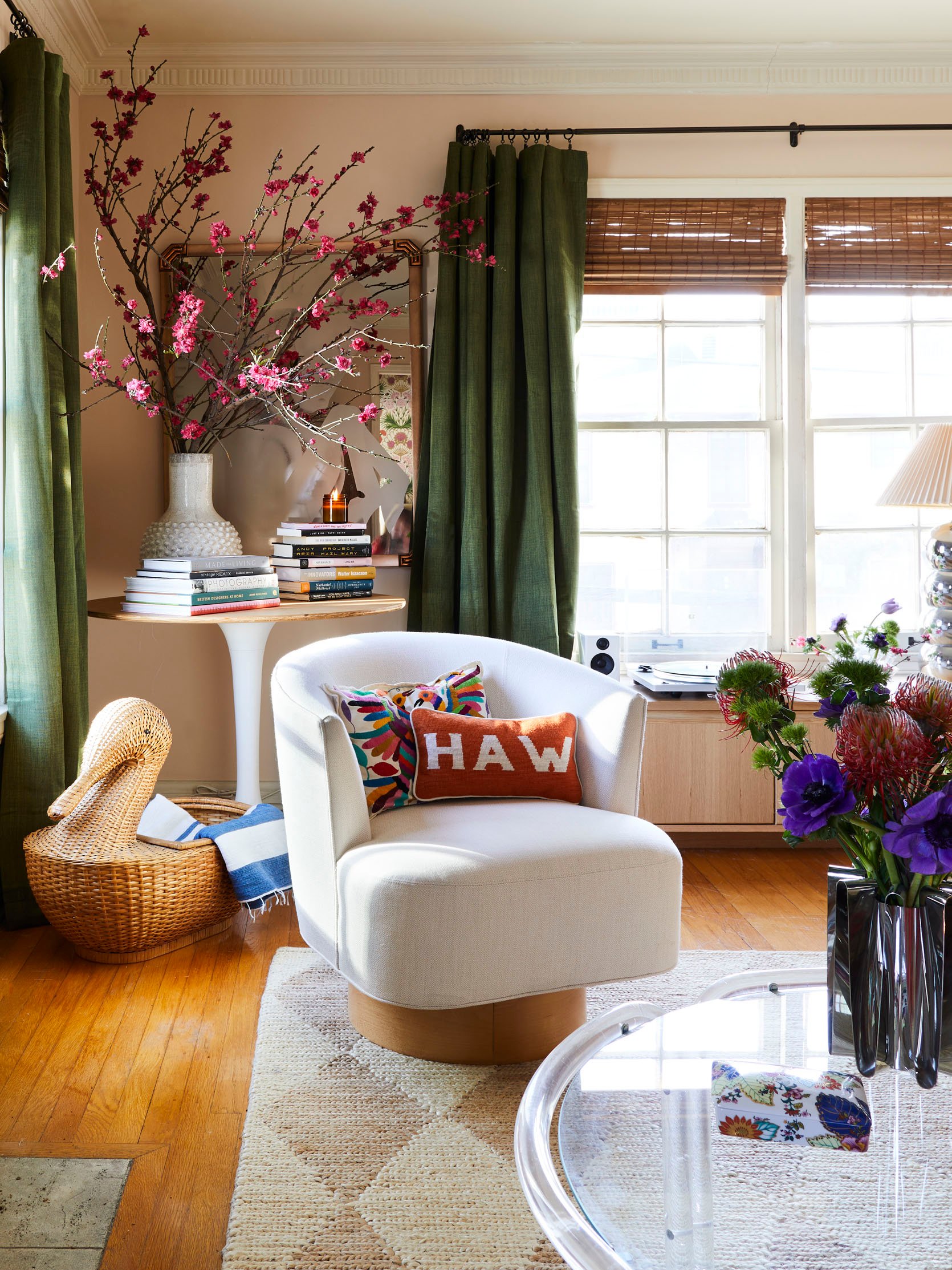
Rug | Chairs | Media Cabinet
After years of writing “my apartment has the best bones and the best light,” it’s SO EXCITING to show you said “best bones” and “best light.” It’s so warm and bright, even at sunset – my favorite. 🙂 I wanted to honor the light and airy feeling in here, so I chose the Harwich Rug from Annie Selke to anchor the room. I love the timeless harlequin pattern – I think it speaks to some of the more classic architectural elements of my apartment (the moulding, the hardware, all that jazz). Beyond that, it can take a BEATING (read: daily maulings and clawings from a certain feline companion). It’s surprisingly comfortable underfoot and it’s held up beautifully over the past 7 months. If you’re on the hunt for a neutral rug with a little extra ~spice~, I’d wholeheartedly recommend this one.
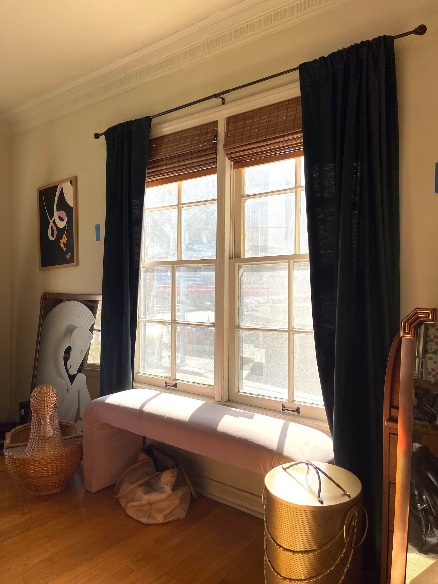
Oh, and that vintage wicker duck basket is an all-time favorite of mine. I grabbed it 7 or 8 years ago from Pepe’s Thrifty Shop (there are two in LA – the one on Centinela is the good one!!!). Pepe’s genuinely has the best inventory, the greatest prices, and it’s owned by the sweetest family team. If you’re in the area, you’ve gotta follow them on IG and stop in sometime!
The Best Cheap Curtains, Shades, and Rods
Curtain Rods | Drapery Rings | Roman Shades | Curtain Panels
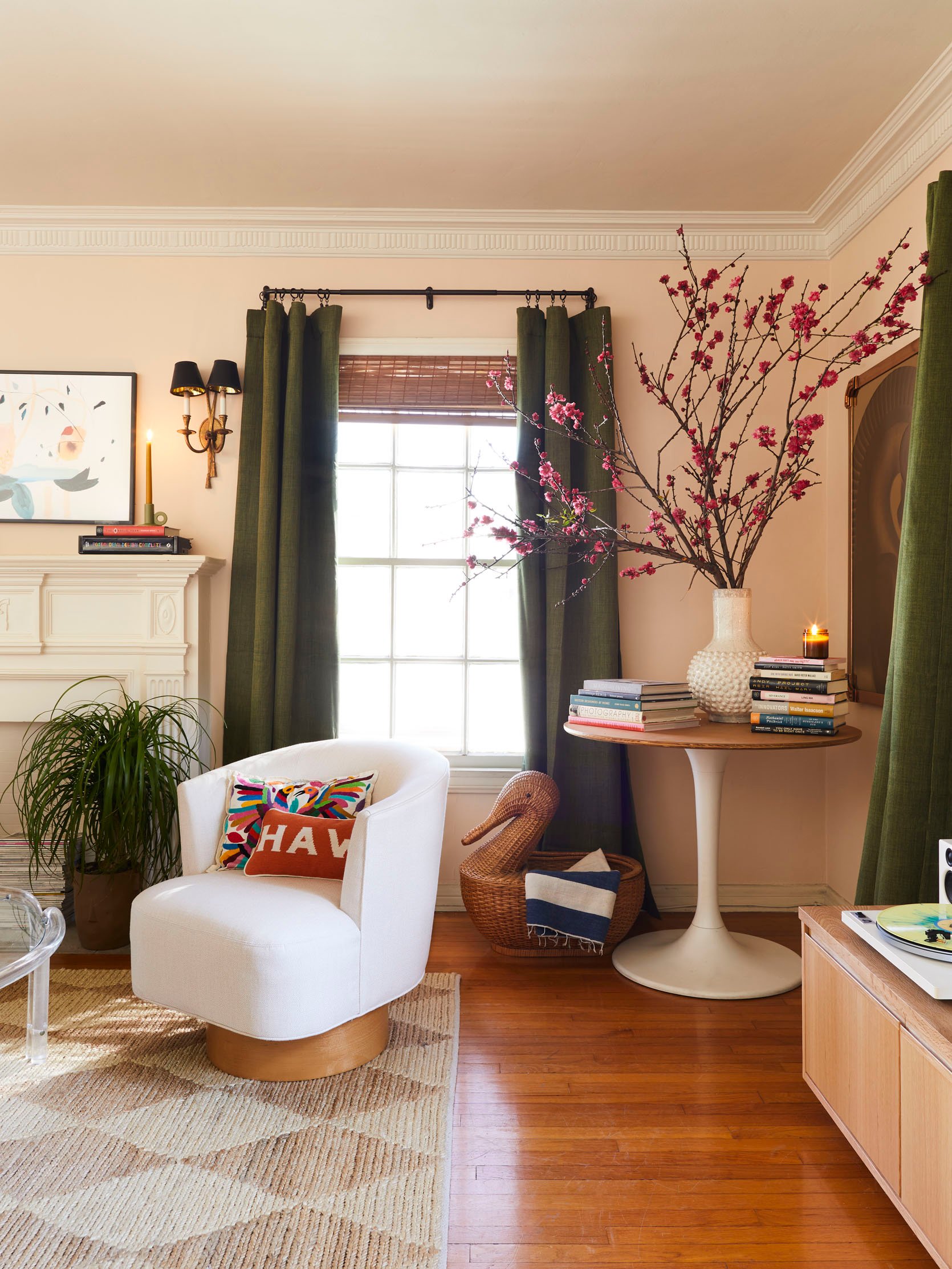
Well. Since I’m clearly not good at gatekeeping my favorite resources: LET’S TALK ABOUT MY CHEAP, FAST, AND GOOD WINDOW TREATMENTS. Y’all, these fooled Bowser and Sara – both gals thought they were gifted and custom, which is THE BIGGEST COMPLIMENT I COULD EVER RECEIVE.
From the top (make it drop?): I bought the French Rods and Drapery Rings, both in Bronze, during one of Ballard Designs’ 30% off sales (they happen frequently and they’re worth the wait). The cordless woven shades were from Amazon (about $40 each, and they come in a ton of sizes and colors – this one is “Squirrel”) and the curtain panels (in “Tuscany Green”) are currently on sale for $34 each. I used 7 rings per panel and I LOVE how they turned out (you know, in case you’re also the type of person who Googles questions like “where do I place my drapery rings” and “how many rings do I need” and “what’s the correct drapery ring spacing”). I’m really proud that I was able to outfit all the windows in here for the price I’d been quoted for ONE custom window treatment. Feel free to steal the formula for your own home!
A Vintage Tulip Table
Curtain Rods | Drapery Rings | Roman Shades | Curtain Panels
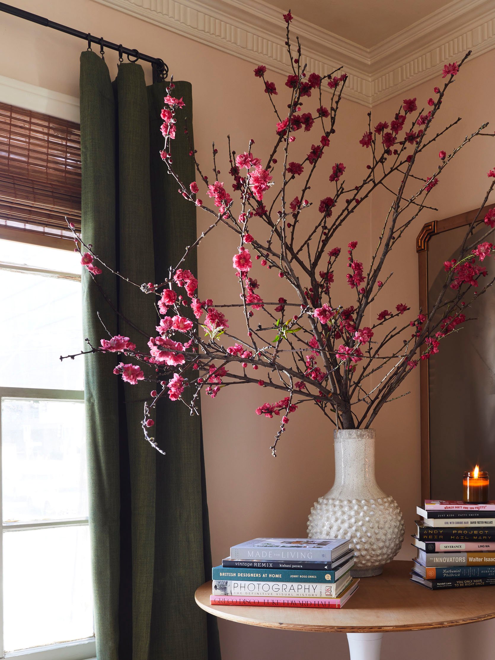
If you’ve been following along for a while, you may remember that this corner was my problem area…NOT ANYMORE! I considered a lot of different things for this space – game table? More storage? Sculpture? Large light fixture? – but then I saw this $120 vintage oak tulip table on FB Marketplace and was like, “oh, that’s what’s supposed to go there.” I love how this piece feels like it’s “friends” with the rest of the room – the white base speaks to the bookshelves and trim, and the wood speaks to, uh, the other ~15ish wood tones I have going on in here.
I’ve loved having a table in this corner, though – it’s fun for puzzles, practical as a bonus workstation, and it looks pretty freakin’ nice with a big bunch of branches, too. 🙂 Bowser grabbed this bundle of blossoms at the flower market in DTLA for only $20 (!!!) and a ton of blooms continued to open up in the weeks after we shot, which was such a genuine delight. (PS. Guess who gave me the big ceramic vessel – her name starts with “E” and ends with “mily Henderson.”)
A Little Decor Break
Media Cabinet | Circle Pillow | Rug
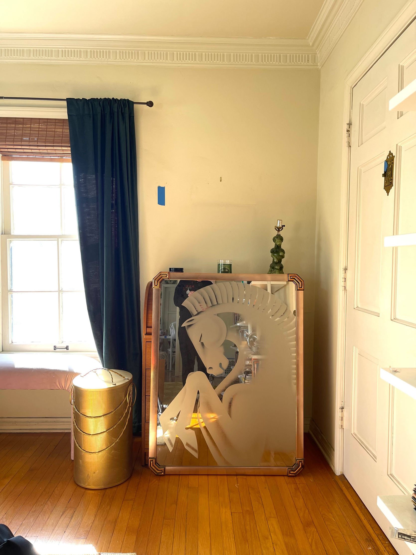
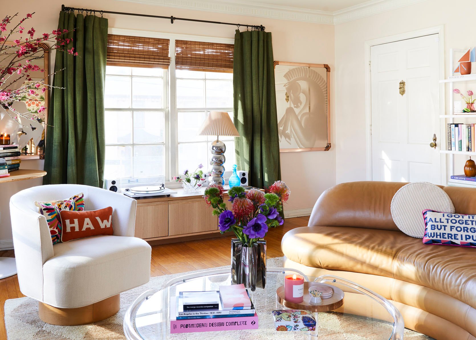
Welcome to the entry! The open space to the side of the door is typically reserved for my ice skating duffle bag (huge and ugly, so it did not make the cut for this shoot, but just know…it’s usually there). And man, I finally found the spot for my vintage horse mirrors!!! I bought them from Old Green Garage on a Rose Bowl trip with Jess in 2021 – our first excursion post-lockdown! – and I really, really, really love them. Speaking of vintage, you can spot the 1800s pear “box” that I grabbed in a Hungarian antique shop last November on the shelf right above the sofa! Thanks to a few brilliant commenters, I learned that what I thought was a ~fun souvenir~ is actually an $$$antique tea caddy$$$.
And while it’s not thrifted (finally, something from this decade to talk about!), I also wanted to call out the ceramic vessel on the top of the bookshelf, which was made by an artist I love named Scott Cooper. He’s based in Philadelphia (just a hop from my hometown in Wilmington, DE!) and I’ve purchased a few of his pieces over the years. All of his work is unexpected and irreverent and fresh – grab it while you still can!
The Best Vinyl Record Storage
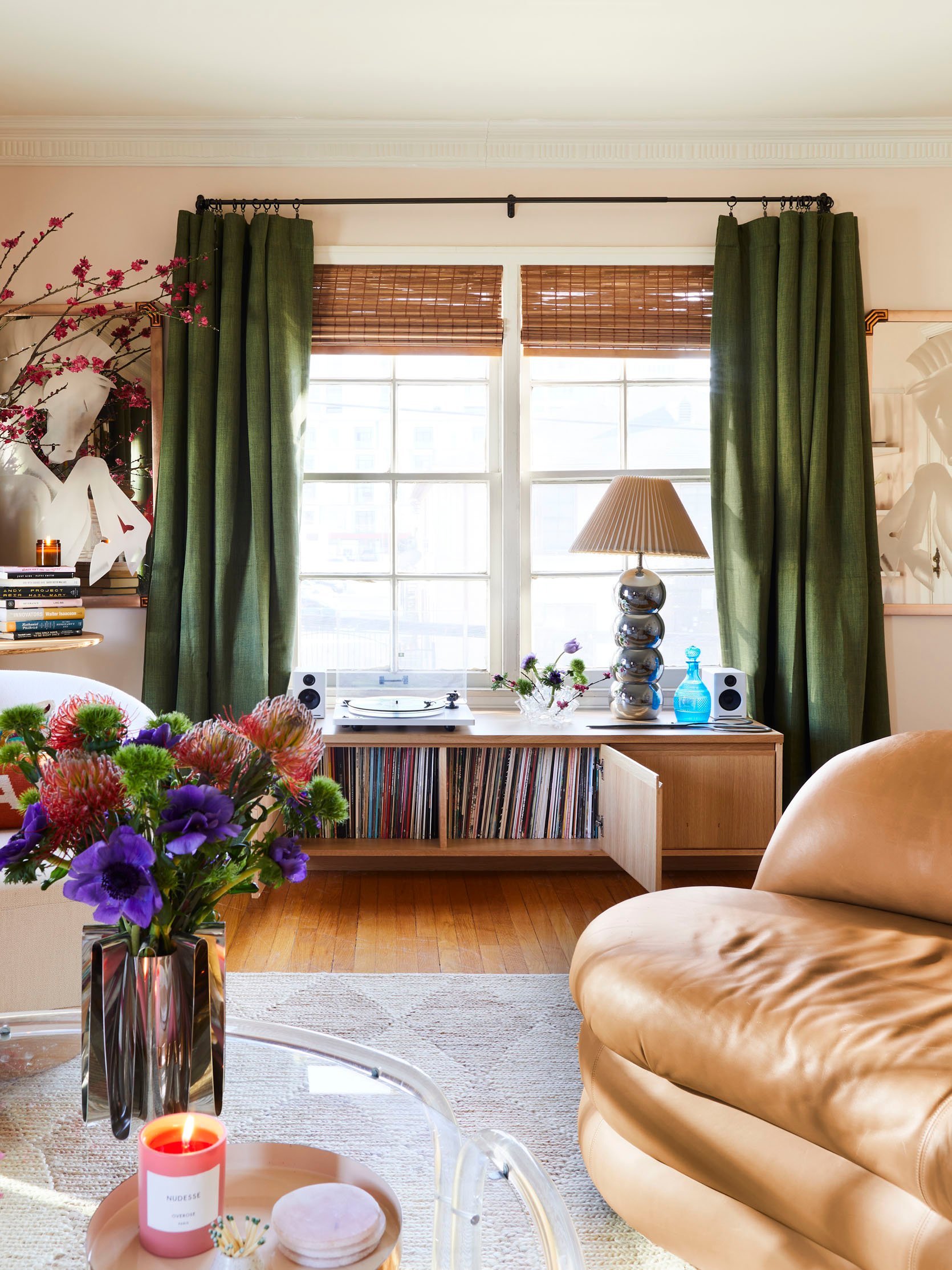
Media Console | Record Player | Speakers
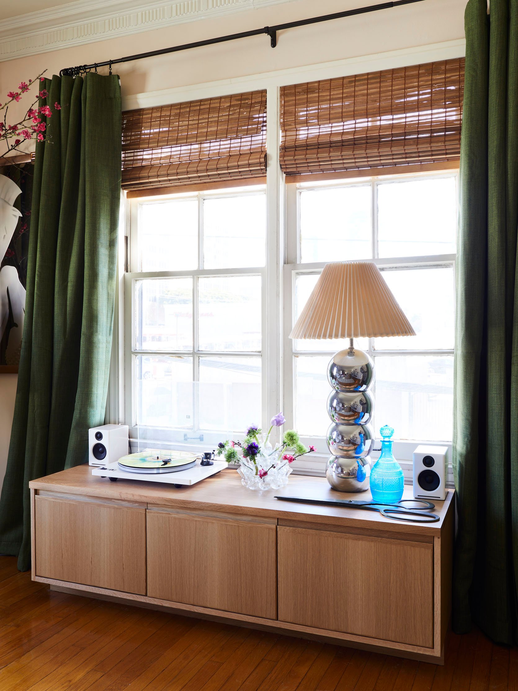
Pivoting around for a minute to show off my final new acquisition: the Keaton Media Cabinet from Room & Board. Y’all, I spent YEARS looking for this piece. My wishlist was incredibly specific: I needed something long (at least 60″ to fit a good chunk of my records), low (under 19″, to keep the windows functional), with closed storage (for blocking sun AND for blocking nosy cats), and with a simple shape (something that can work with any future styles or trends I decide to try). CHECK, CHECK, CHECK, CHECK. I grabbed the Keaton in white oak, pulled out the removable shelves, loaded it up with LPs, and it’s been the PERFECT base station for my little record zone.
All the decor on top is from the flea market with the exception of the blue glass decanter, which is another family piece that Brenda shipped to me before we shot. I’m so glad I got to document it like this! 🙂 And if you’re in the market for a high-quality audio setup that will not (majorly) bankrupt you, you cannot go wrong with a U-Turn Audio Record Player and these powered AudioEngine speakers. It’s easy to set up, aesthetically appealing, comparatively affordable, and it sounds WAY better than the all-in-one turntables out there. (PS. All the wifi/router/cord/mess situation in this room is just shoved behind the curtain on the left. www.evenmorelazygirldesignhacks.com)
A 1980s Sofa Moment
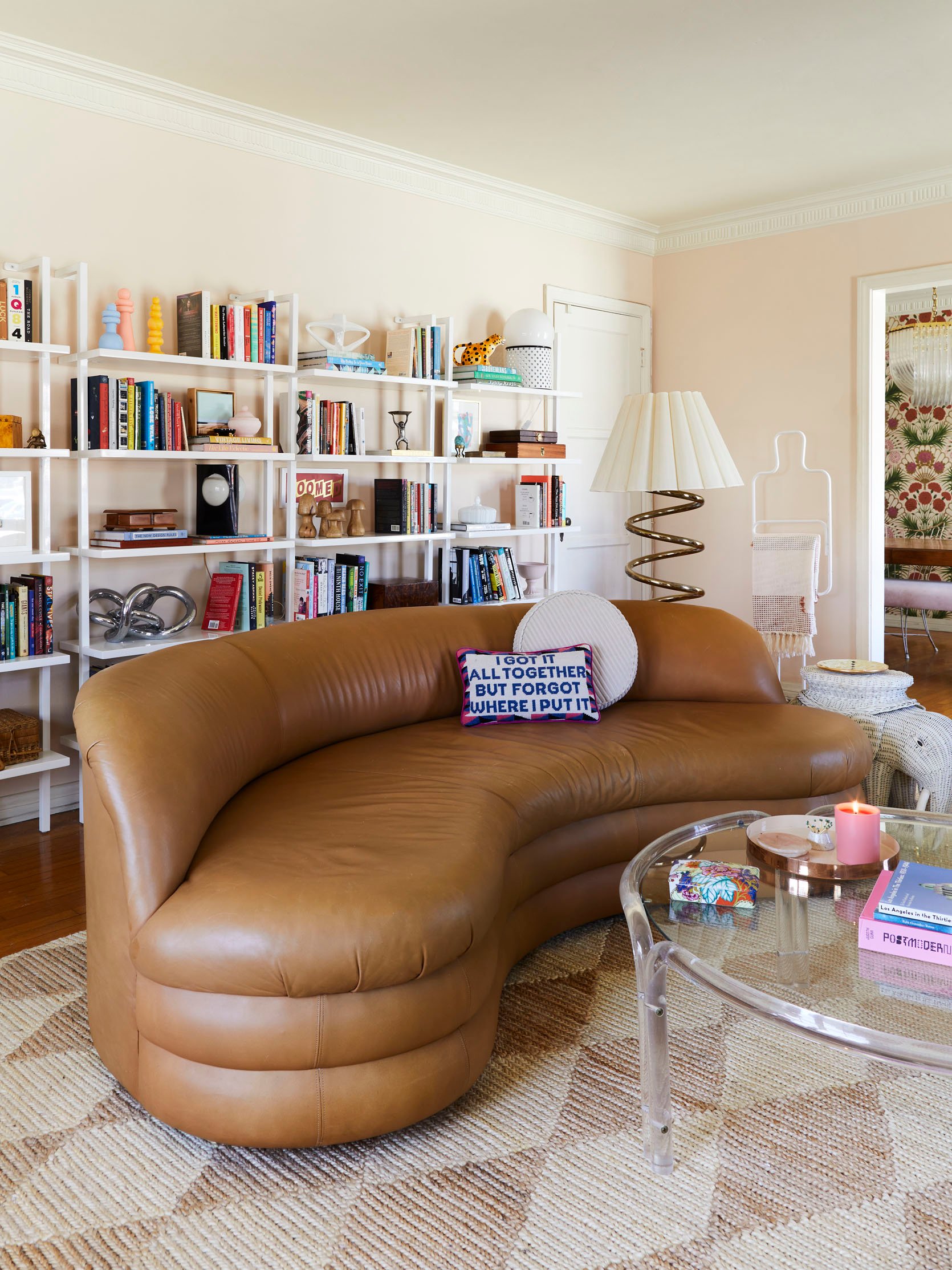
Shelving | Rug | Circle Pillow
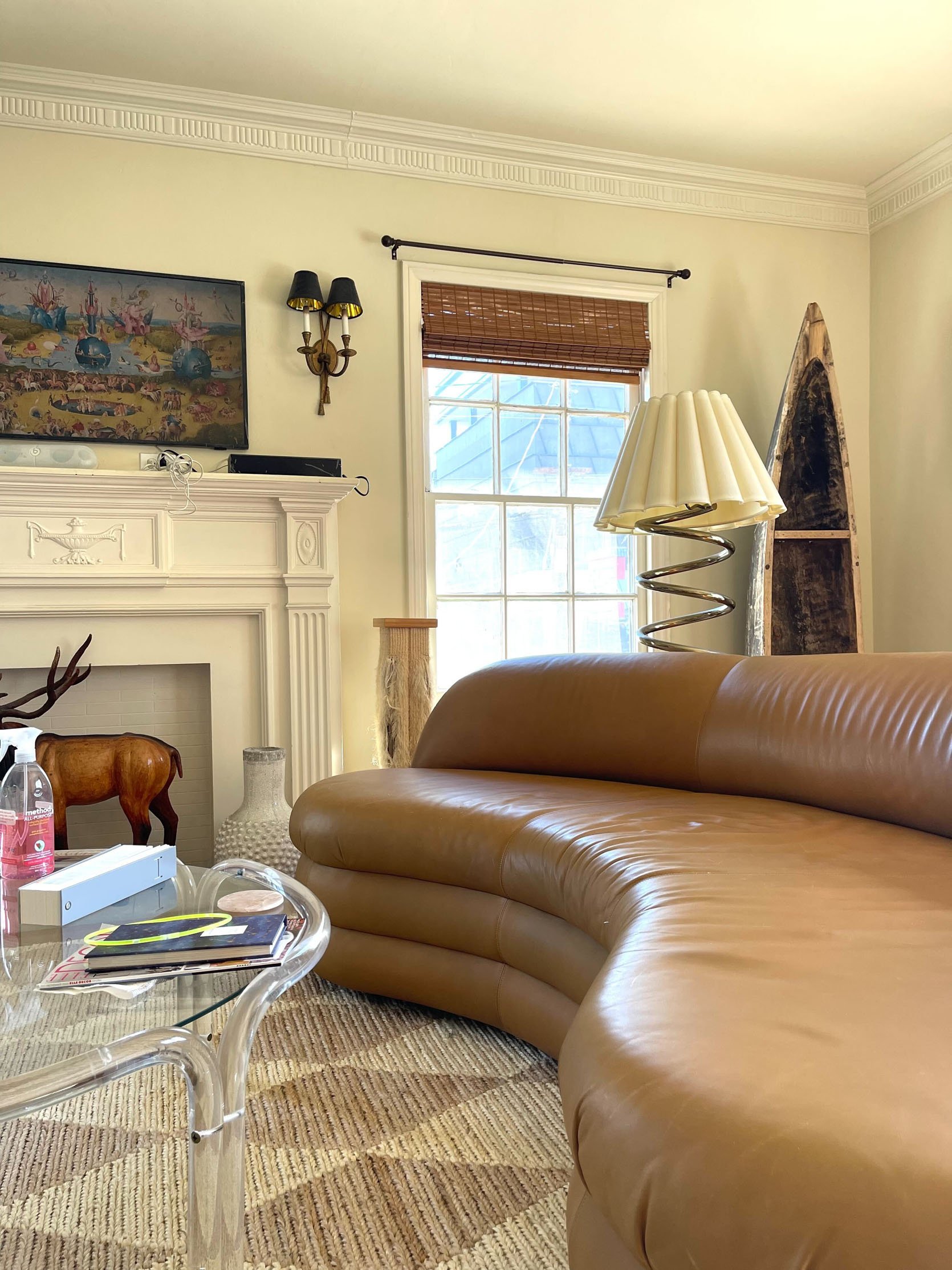
It’s THE DREAM SOFA. I loved it, I loathed it, and then I learned to love it again. I bought this 1980s caramel leather baby sight unseen from Modtiques, an incredible vintage retailer in New Jersey…but when it arrived, I realized that I hadn’t considered that the shape (curved), material (leather), and construction (armless) makes it more of a “talking” sofa and less of a “lay down here and don’t move for the whole day” sofa.
Enter: the shaped, textured pillow. Instead of throwing the baby out with the bathwater, I realized I just needed to change the types of pillows I was trying to use here – this one from Crate & Barrel doesn’t slide off the leather, which makes the whole setup infinitely more comfortable and usable. PROBLEM SOLVED. And as it turns out, having a sofa that doesn’t make me want to waste the day lying prone and staring at the ceiling is kind of a win too, you know? It all works out! I love this sofa and I’m glad I learned to work with her. 🙂
A Little History
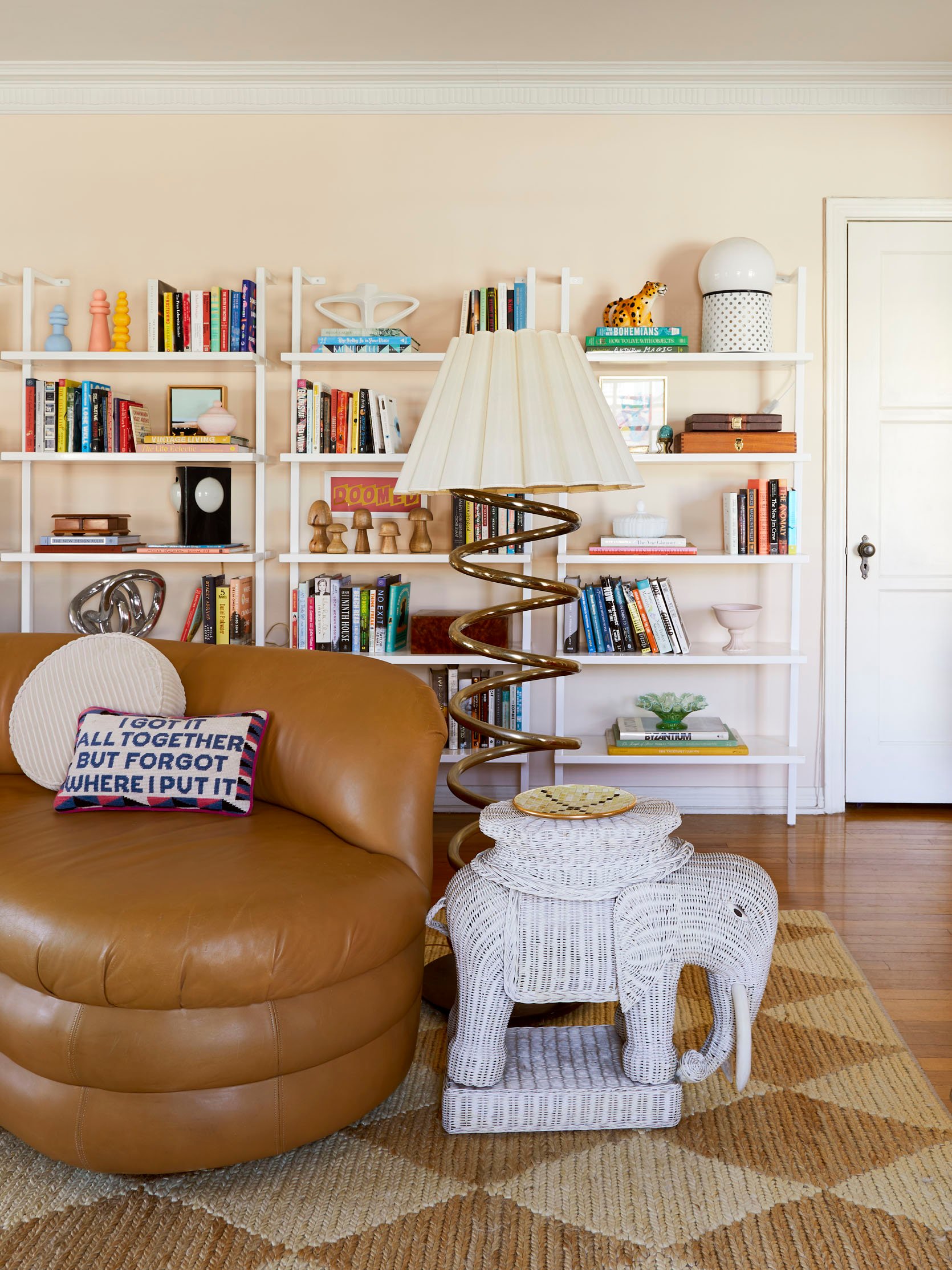
Well, well, well…if it isn’t more vintage 🙂 The gold chrome lamp was a pandemic purchase from Lackluster.co that I topped with a cheap lampshade from the Rose Bowl; the wicker elephant was a 2017 Long Beach Flea find that I bought for a single $2 bill! (Can you believe it?!) Bowser and Sara pivoted him out so you could get a nice look – the table’s in awesome condition and I love him SO much.
One of my favorite pieces, though, is the little tiled tray on top of the elephant. It was made by my great-grandpa Frank! He passed away when I was pretty young (6 or 7, I think), but he worked with tile as a hobby. I have a few pieces he made (smaller ashtrays, larger trivets) and they’re all so cheerful and geometric and colorful. It’s so exciting that the pieces he made decades ago blend in so seamlessly here, you know?
My other favorite piece in this shot is the leather box on the bookshelf farthest to the right – it was my dad’s backgammon set. He passed when I was very young (18 months – I know that one for sure!) and while I don’t have any memories of him, I love that his things also fit in perfectly here. It feels nice to have a connection to my family, even though they’re no longer around. 🙂
Bookshelves (with Books!)
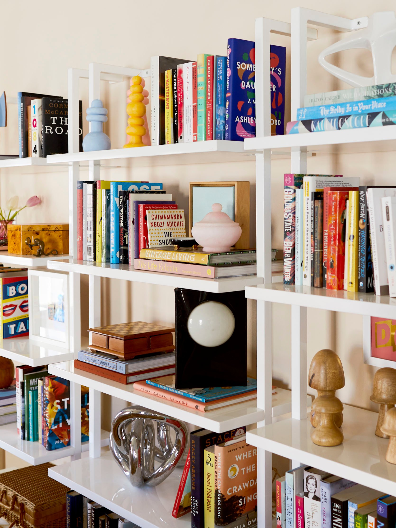
And here’s some real up-close intel on SO MANY of my little treasures! The framed dog matchbooks on the left were a 2019 Christmas gift from Sara; the Carl Durkow candles up top were a 2022 Christmas gift from my boyfriend’s parents (literally was blown away when I opened the package – the Keenans knocked this one outta the park!!! I’m very lucky :)); I bought the pink vessel after writing about it here in a post about affordable accessories (purchased it minutes before the post went live, naturally); the chess board, lamp, and original chrome tangle are all flea finds; the “Doomed” art was a limited run piece in 2020 by my all-time favorite band, Los Campesinos.
I’ve always admired bookshelves that are styled a little more sparsely – you know, all curated vessels and objects in a cohesive palette – but I like to read, so I needed space for actual books, and I love to see all my little favorite sentimental pieces of decor displayed (even when they don’t technically “go together” – like, yes, of COURSE, I needed to display my tiny wooden mushroom forest next to a 1970s space age lamp). Overall, I love that the shelving units back here are a blank canvas with a ton of room to grow – I can’t wait to show you the next iteration someday in the future 🙂
That’s Just the Beginning…
Dining Room Wallpaper | Kitchen Wallpaper
On that note, HERE’S A SNEAK PEEK INTO WHAT’S NEXT. Lots of color, lots of wallpaper, and lots of fun. One day I’d like to get a big piece of art for the wall on the left to balance out the campaign dresser, but I’m still saving up for something special. (Dreaming of a Monica Ajenjo piece, TBH.) The dining room to the back is still a work in progress, but I CAN’T WAIT to show you the awesome $75 vintage china cabinet I just had delivered – it looks SO GOOD in there. (Did anyone catch it on my stories last week?!) I also finally hung my lucite ribbon chandelier! Just need some comfy dining chairs and some art and we’ll be cruising towards a shoot date. 🙂
The galley kitchen in the rear is almost ready to share, though…just finishing up a few hardware and lighting swaps. Are you ready for it?
But That’s All for Today 🙂
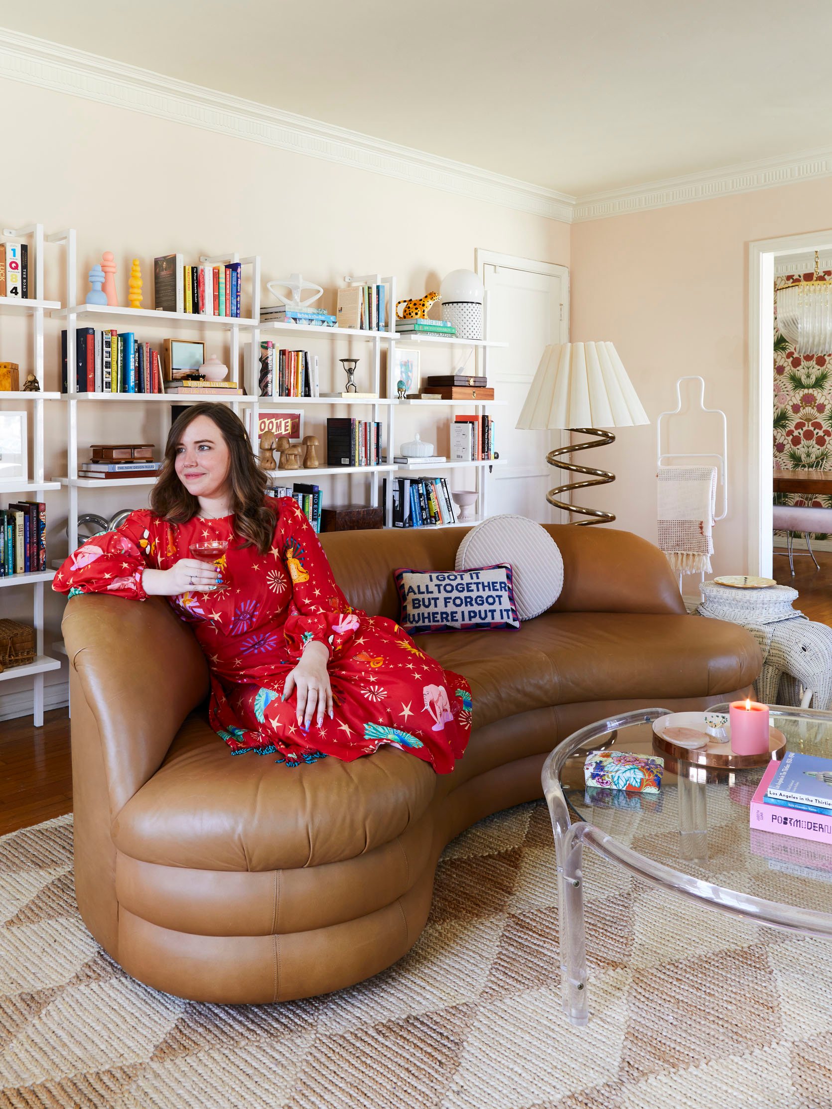
Here’s where I leave you – sitting in my favorite party dress with a champagne coupe filled with Hawaiian Punch. You know, JUST A TYPICAL TUESDAY. (Not pictured: me spilling all over myself and the sofa. You’ll have to imagine that one for yourself.) ANYWAY. If you’re also struggling with self-doubt and insecurity when it comes to the design of your home, I hope this helped a bit – we’re all our own toughest critics. I mean…did you notice that my TV is seriously off-center?! No one else ever does – and I didn’t have it fixed in the photos, because I wanted to keep it real! – but the idea of sharing all these small imperfections originally left me feeling scared. Now, though, it makes me feel kind of powerful – like, HERE’S MY HOME, MISTAKES AND ALL! It’s not perfect, but it’s perfect for me. 🙂
Signing off from my strange lil’ “1999 Limited Too Exec Time Travels to 2023″-style apartment. Thank you for being here. Any thoughts, questions, concerns? I’m ready to hear it all. WHAT SAY YOU? Let’s chat. See you in the comments. xx
*Design by Caitlin Higgins (me!)
**Styled by Emily Bowser
***Photos by Sara Ligorria-Tramp
THIS POST WAS ORIGINALLY PUBLISHED HERE.


