Hi everyone! It’s been a little while since I was last here with the EH community and I’m SO EXCITED to share this project with you all. I was honored to take over the reins as VELUX Brand Ambassador and host of the Brighten Up Any Room Giveaway and I’m thrilled with how the space came together. So let’s meet our winner and take a look at the space they nominated for the makeover.
BUT FIRST! Holy wow! We had SO MANY amazing entries and it was really, really difficult to decide on just one. In the end, we chose Viet as the winner! Viet lives in Los Angeles with her husband, David, and baby, Ocean. How cool is Ocean’s name, right!? He’s also the coolest little toddler, but I digress. Viet and David purchased their first home and gave birth to their first child around the same time during the pandemic and quickly realized the room Viet was using as a work-from-home space also needed to function as a guest space as well. Shortly after moving in they discovered the room was likely the original primary bedroom and they also unearthed some pretty amazing original hardwood floors hidden under the carpet. We love an old house original detail discovery! While the floors were an amazing find, the room itself is pretty tiny coming in at right around 100 sq ft. After returning to work from maternity leave, Viet had to rely on the space a bit sooner than she thought and was at a loss for what to do with it. They painted it a sunny marigold yellow color and she envisioned a “feminine cozy library vibe” but it fell just short of her vision. My job was to get her closer to that goal, but also make it a workspace AND a guest sleeping space. Challenge Accepted.
A VELUX skylight installer did a site visit to determine if the space was structurally a good candidate for skylights and with their green light, myself and the VELUX team headed to L.A. As someone who is passionate about small-space living and designing bold color-filled small spaces, I was so excited to see this room nominated. I LOVED that they embraced its small size and wanted to maximize its potential to be a workhorse for their family. I also LOVED that Viet and David love colorful and bold spaces! So often I’m trying to convince folks to be daring and lean into color, but Viet’s home is full of color and playful patterns from the moment you step in the front door. This was already shaping up to be a bit of a dream project for me! Ok so now that we have a bit of the back story let’s have a look at the space we are working with.
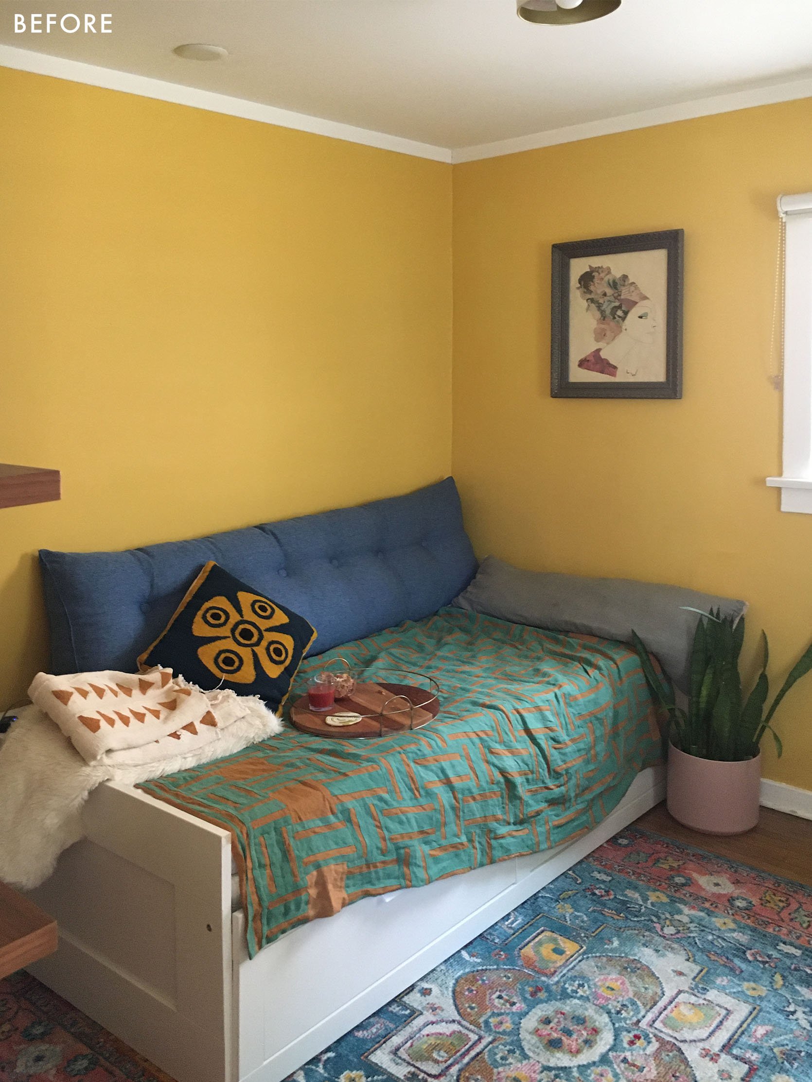
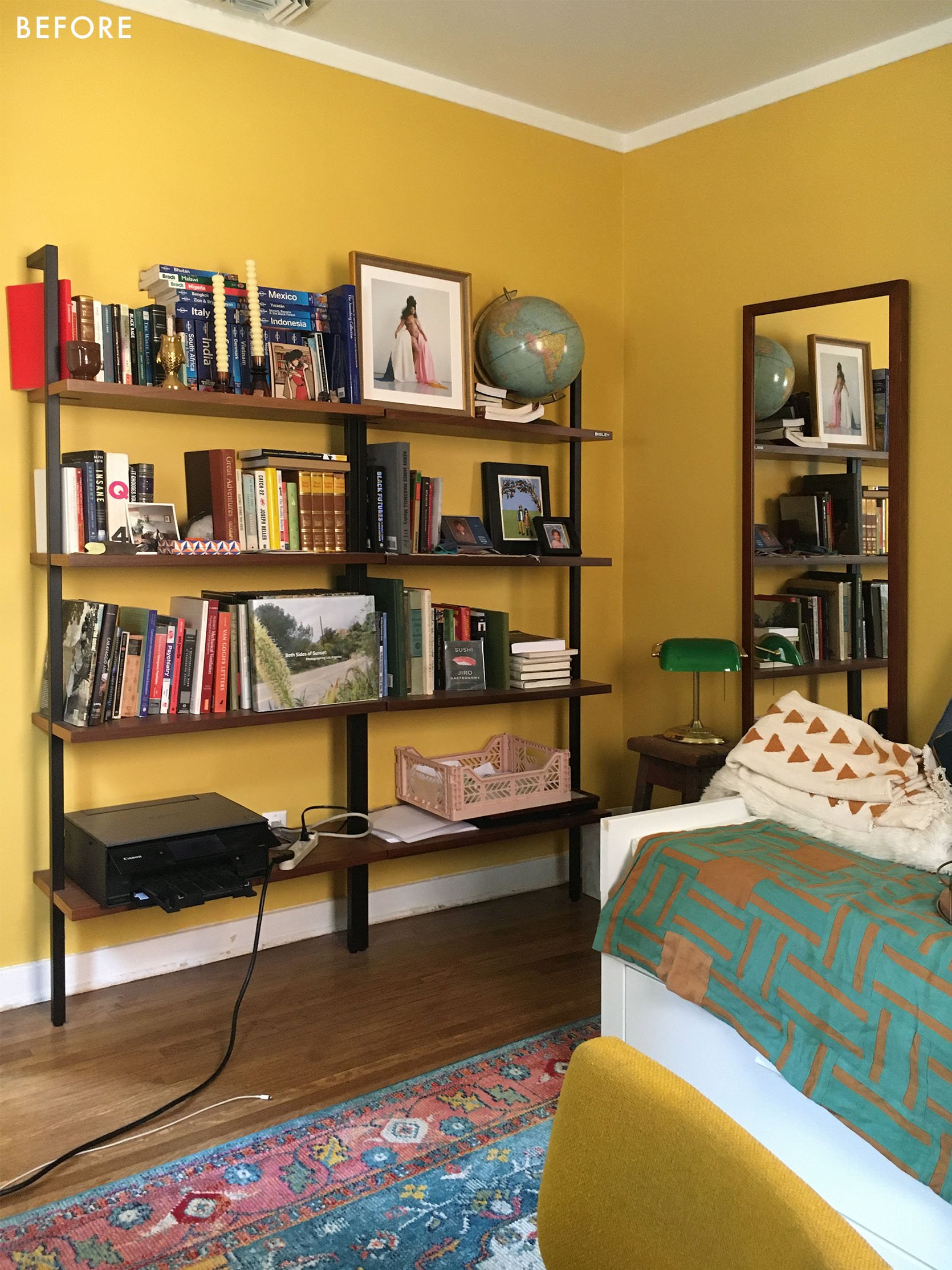
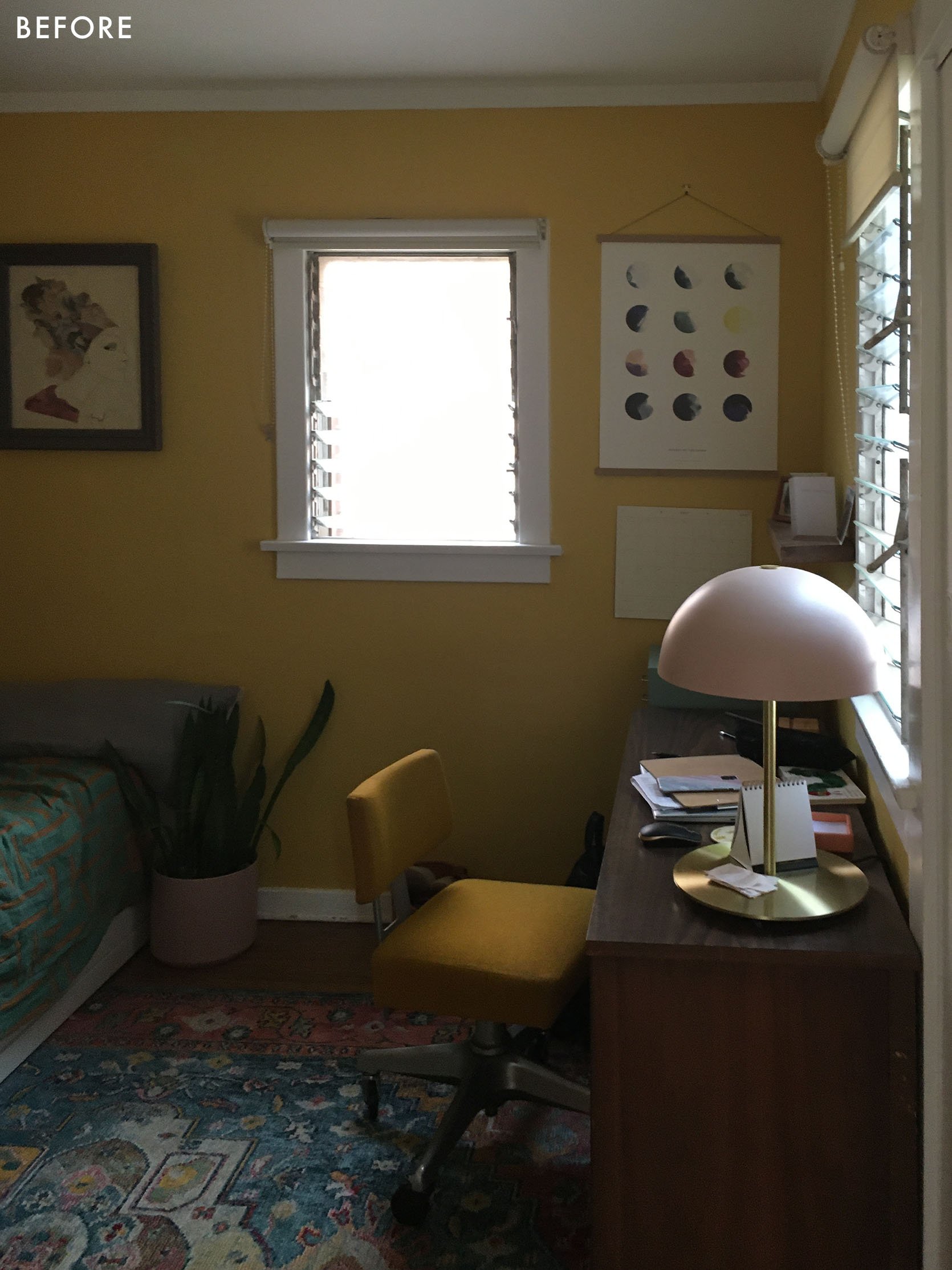
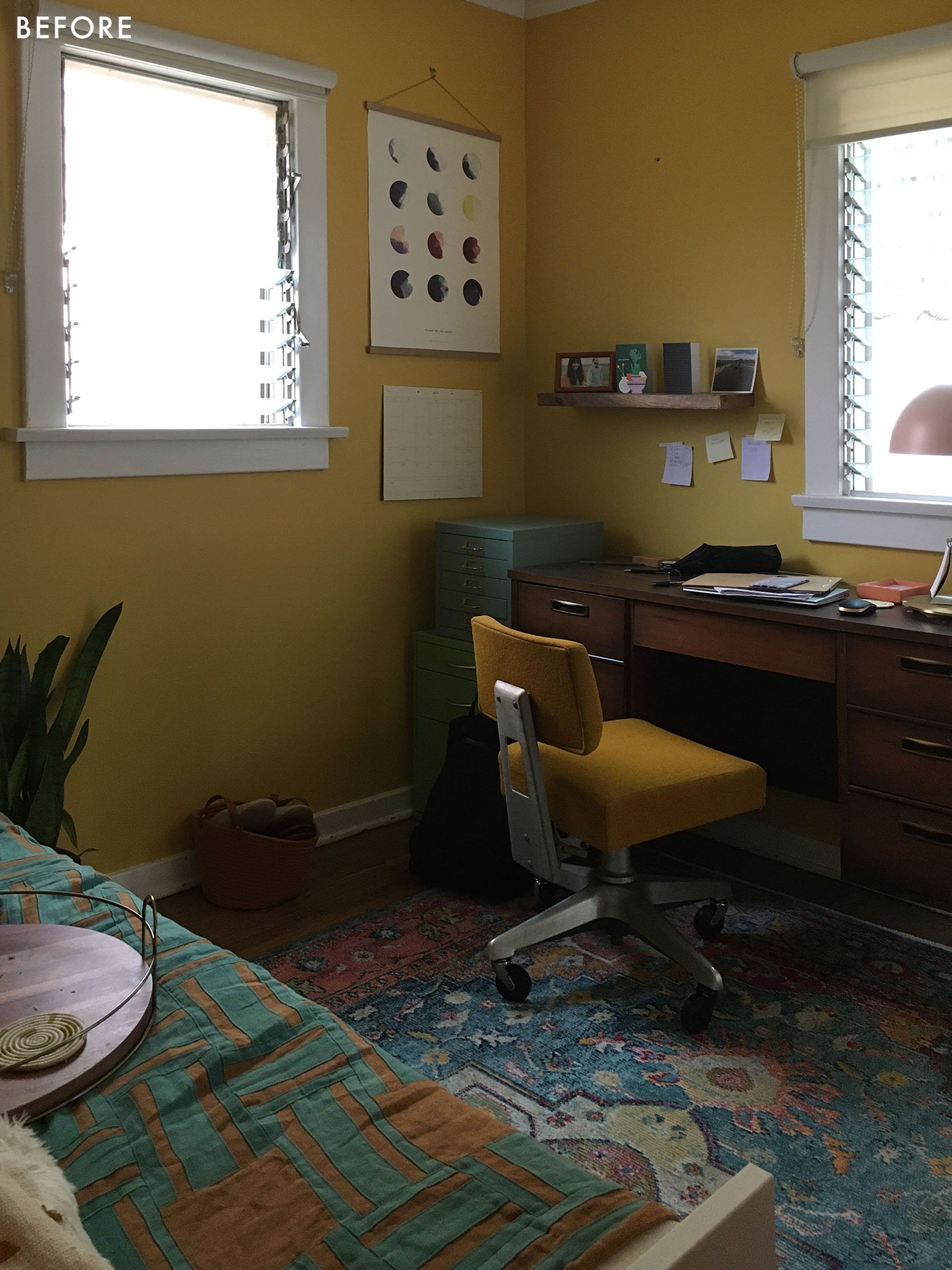
The room wasn’t bad, but it could be better. 1. It relied heavily on artificial light as the two windows in the space are on the smaller side and one them faced a fence so it didn’t get the most ideal light streaming in. 2. Viet’s book storage wasn’t quite giving off those cozy library vibes. 3. The trundle bed didn’t exactly scream “hi guests, I hope you have a good night’s sleep”. 4. Her work area (hello amazing mid-century desk!) could use a bit better storage and streamlined organization.
The one thing we all loved about the space was the wall color! Viet was open to anything we wanted to do with the room and said we could either keep the color or go with something different, but there was no way I was getting rid of this color! I actually had a plan to really lean into it, and if you know me you already know that meant taking it all the way to the ceiling and on the trim too!
After visiting with Viet and getting a sense of the space and her overall needs I came up with a plan to help transform its small footprint into something dual-use, functional, and beautiful. Here’s how it turned out.
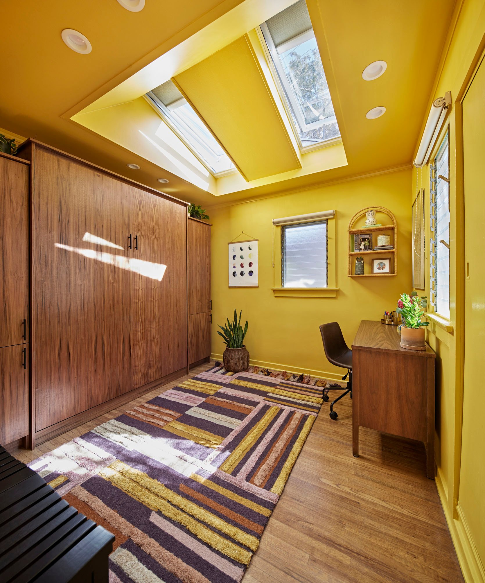
Skylights | Room Darkening Shades | Paint Color
So much to break down here, but let’s start with the skylights, of course! The VELUX Solar Powered Fresh Air Skylights are the real hero in this space! When the installer realized we could basically replace most of the ceiling with them we said, “Let’s do it”! And boy are we happy they did!
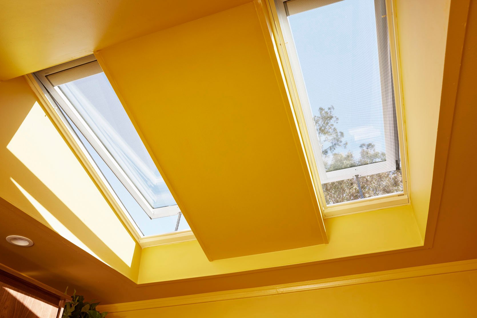
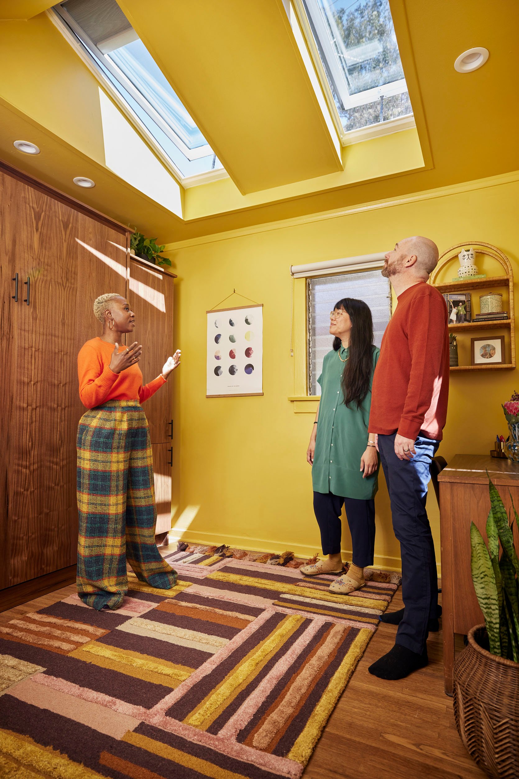
They flood this room with much-needed natural light and fresh air, and provide such amazing visual impact in the space. The room-darkening shades give Viet total control over the light concentration and allows her to adjust them according to how much (or little) natural light she wants to experience in the space, which is ideal for an office area with multiple screens. Viet really enjoyed having her desk placed nearby the window so we kept it in its existing spot and with the limited footprint it was the best choice overall.
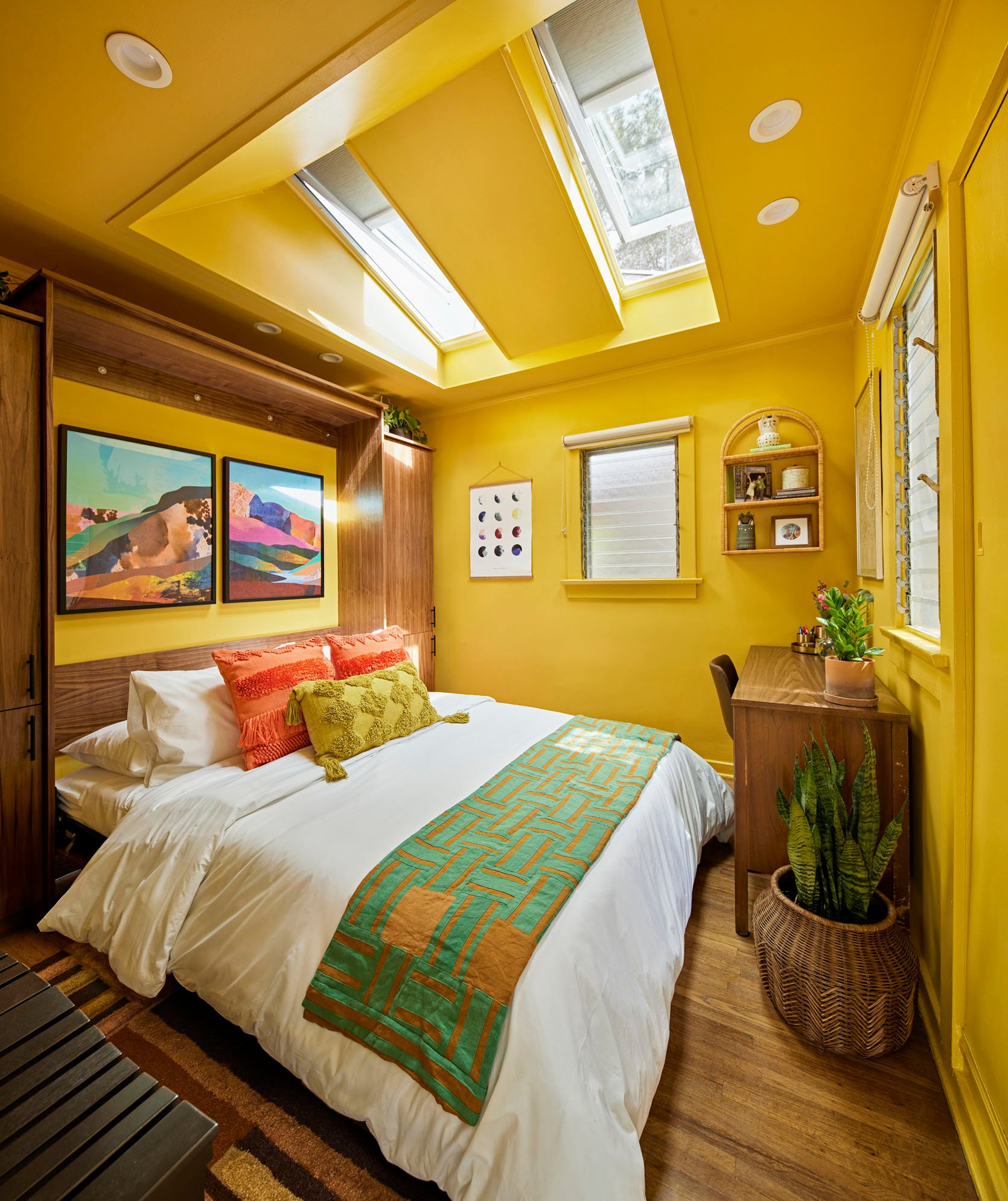
Murphy Bed | Art (left) | Art (right) | Bedding | Orange Pillow (similar) | Lumbar Pillow (similar) | Rattan Wall Shelf
The key to really maximizing this small space was bringing in a Murphy bed with side cabinet storage that spanned the entire length of the back wall from pretty much floor to ceiling. It allowed us to bring in a queen size bed for guests, storage for all of her books, and a new place for her work files to tuck away. Murphy beds really are the secret weapon in a tiny space that also needs to function as a sleep area. I wanted this piece to feel like a beautiful piece of built-in furniture so we selected a pretty walnut finish that complements her vintage desk and other midcentury pieces they have throughout their home.
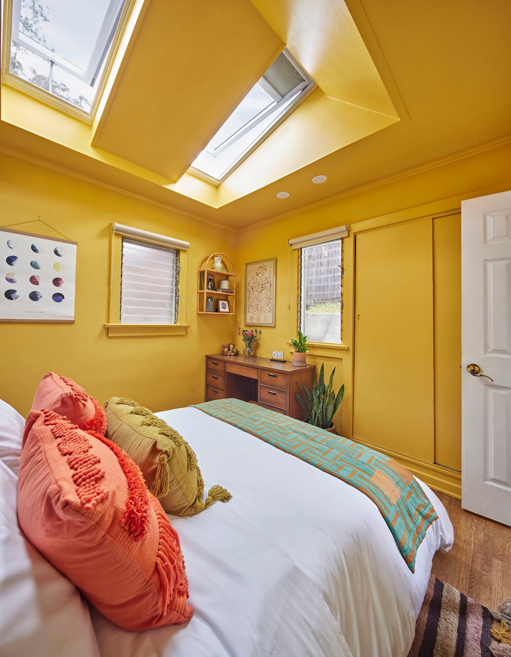
Gold Desk Accessories | Desk Calendar | Desk (vintage)
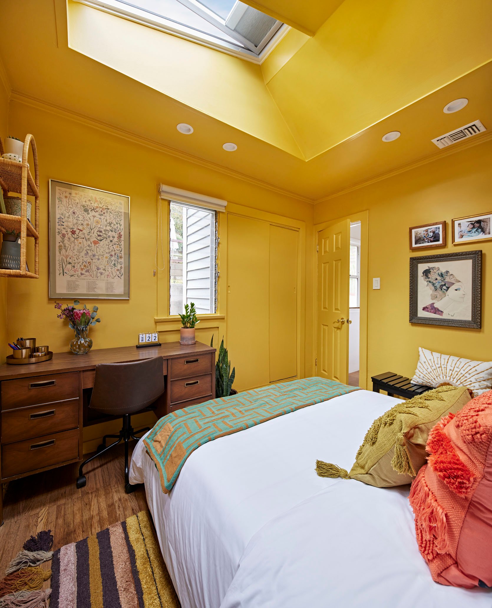
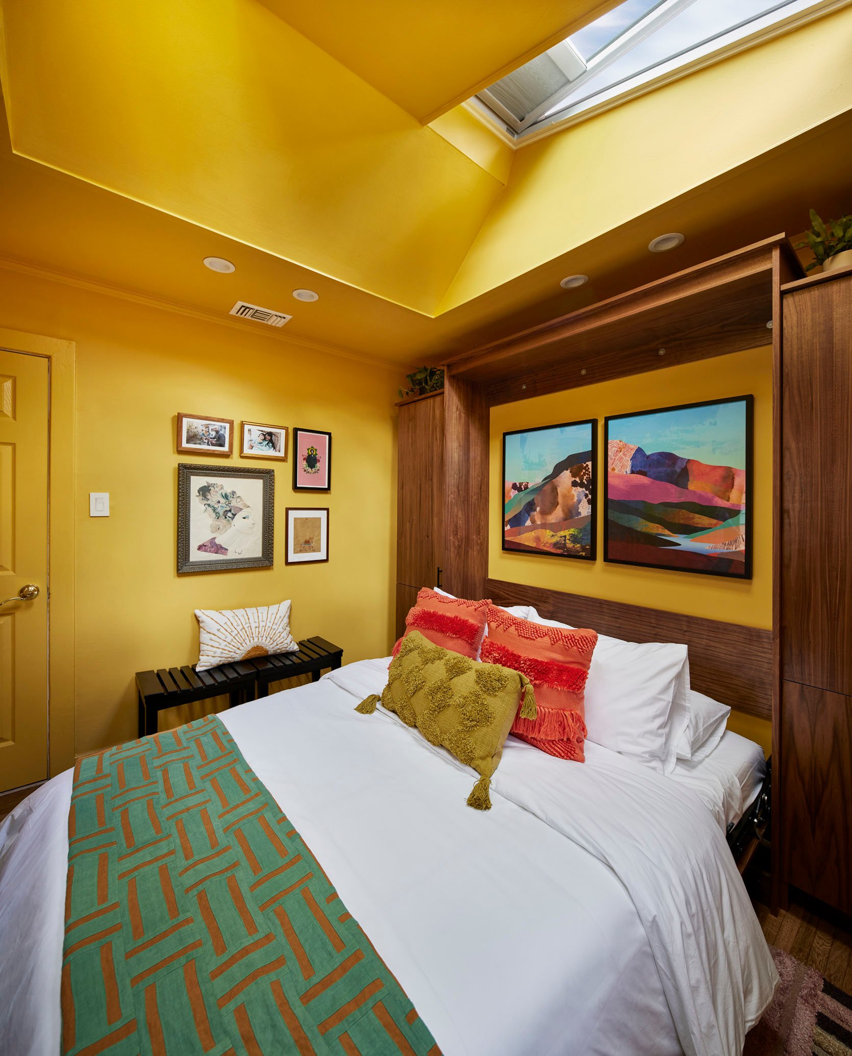
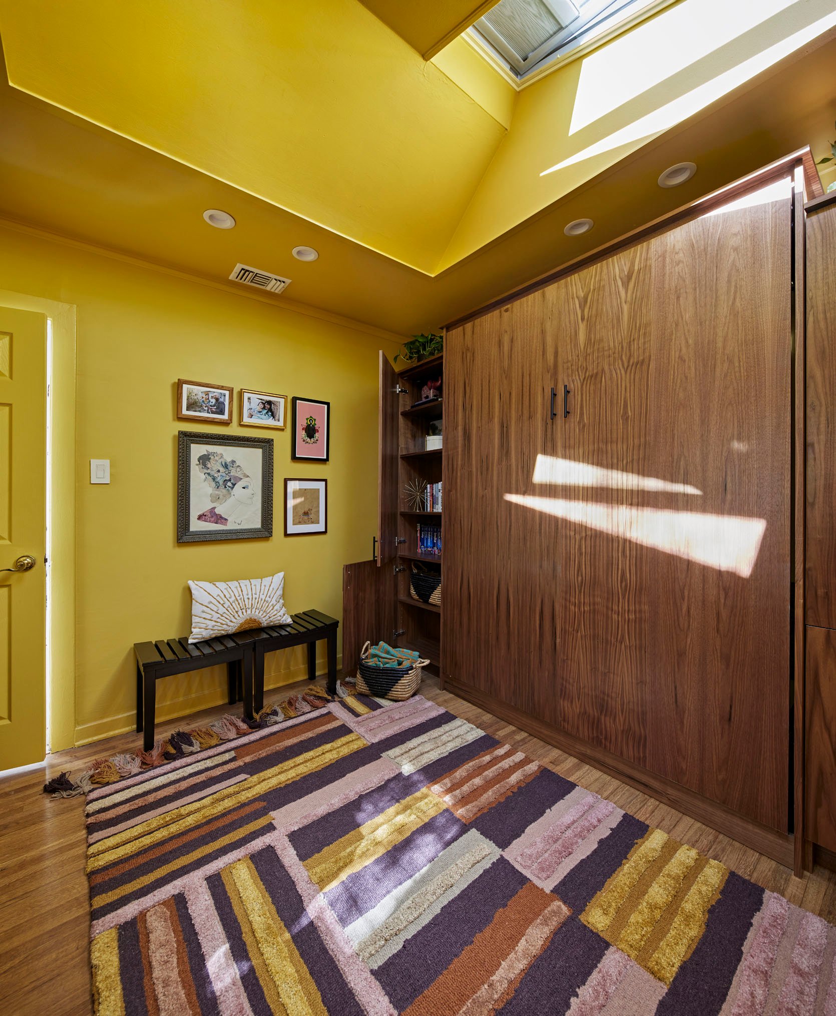
On the wall that used to have the bookcases, we created a mini gallery wall of some of their family photos and beloved art pieces, and brought in a couple of small benches that serve as both a place to sit when the space is being used as the office and a place to for a bag or personals when it’s being used as the guest room.
To complete the room we brought in some art from Minted to complement her existing pieces, beautiful bedding from Brooklinen, the gorgeous rug from Jungalow, the benches, pillows, and accessories are from Home Goods, baskets and planters from West Elm, the arched rattan wall shelf is from World Market, and of course, several plants. I always try to infuse as much of a client’s own things into a newly designed space and Viet’s gorgeous textile, which I used as a bed scarf, was a big inspiration for other overall design and color story of the space.
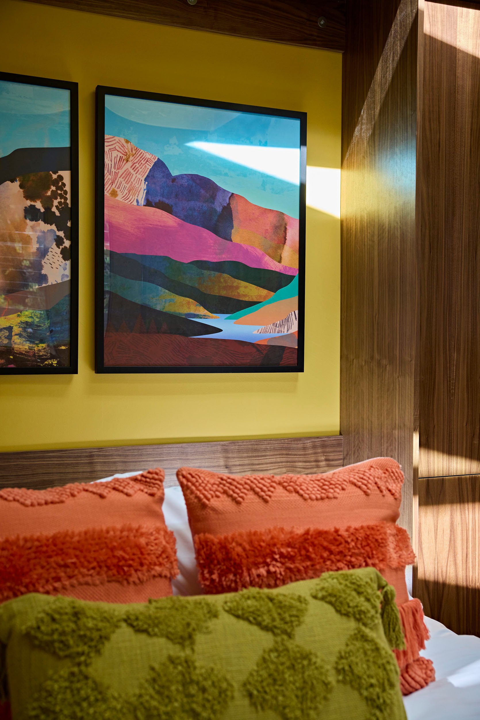
The key to getting a really small space right is having a very clear understanding of how it needs to serve you. By fine-tuning all of her needs we were able to create a space for Viet that delivers on both function and beauty. This room feels as chic as a boutique hotel room, and it also feels like a good place to be productive for work. The best part about is Viet and David LOVE it and that’s really all that matters in the end!
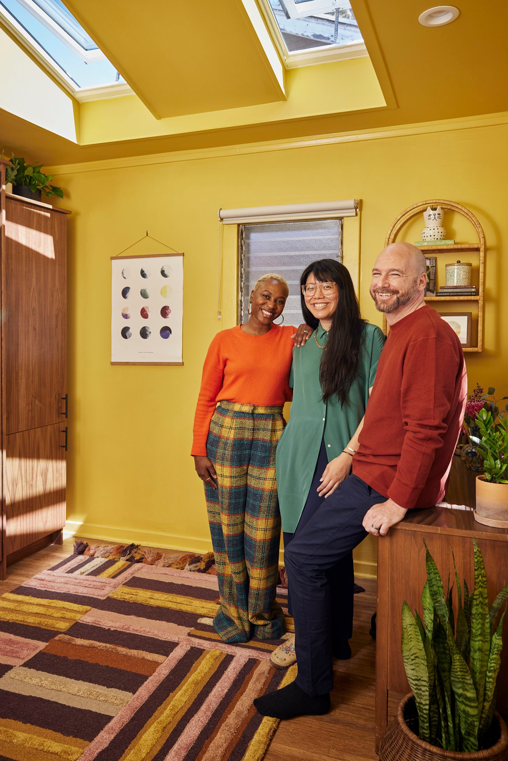
*Design by Shavonda Gardner
**After Photos by Rusty Williams Photo
***Sponsored by VELUX
THIS POST WAS ORIGINALLY PUBLISHED HERE.


