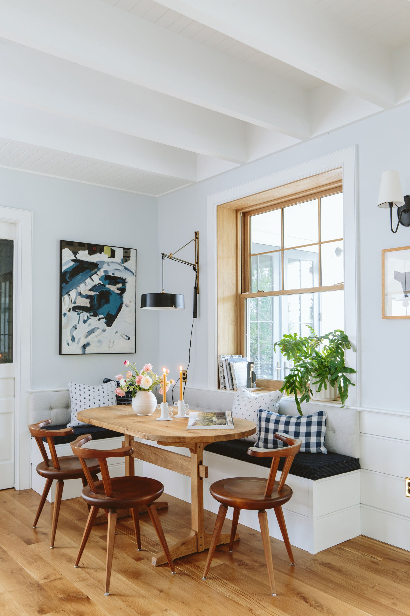
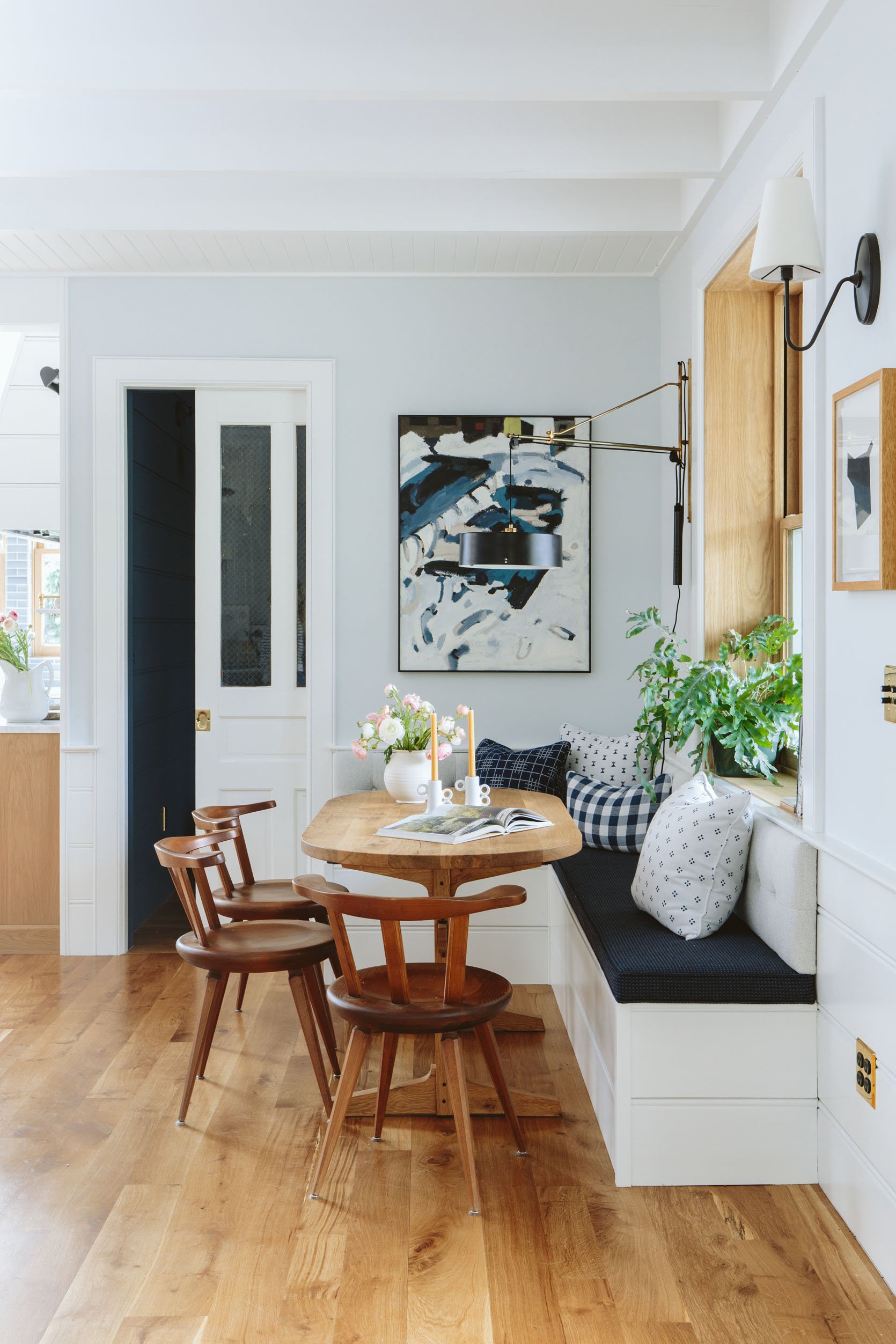
If every seat in our house competed in daily musical chairs, all of us would fight to land in our new dining/homework nook. I am so pleased with how it turned out and it’s making me love this room and home even more (like exponentially so). It’s so inviting, comfortable, and almost totally worry-free because all of those beautiful woven and highly durable cushions are Sunbrella, (more on that below). This corner really anchored this almost too big living room and created some much-needed function (sitting as a small family) AND beauty in here (the fabric, texture, pattern, mix materials – all of it). I love it so very, very, very much and on rainy writing days I often end up here because it’s so comfortable and cozy, (especially on the grayer days when I don’t want to necessarily see the rain all day in the “sunroom”).
But before we get into all the details and pretty photos here’s a fun video! (As always just wait for the ad to play before the video starts:))
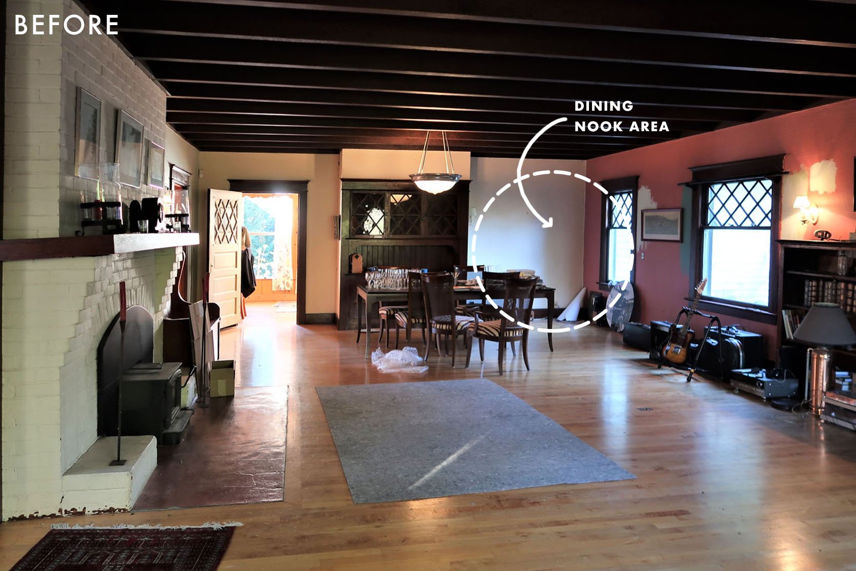
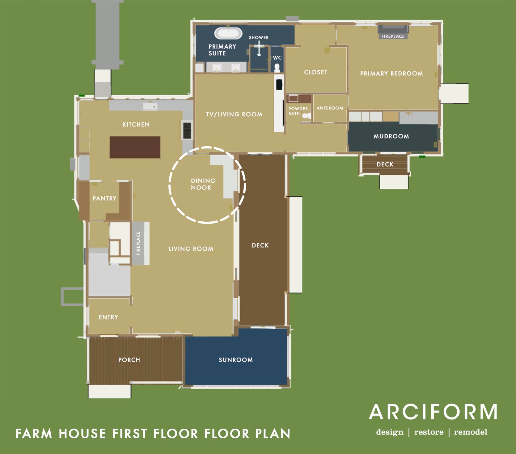
But first, where are we in the house? This was a last-minute add to the floor plan (over a year ago, but after the layout was finalized). We had planned to float a kitchen table somewhere in the room (we’d just “figure it out” once the island came in). But after spending more time in the room (during construction) I thought, “Surely we can fit a more intentional, small dining situation in here for our family“. Everyone loves a cozy booth – both visually and while sitting, and I was going to try my hardest to get one in here. We have the island of course (for breakfasts), but we like to face each other for dinner and the sunroom was too far away for every night causal dinners (which we had predicted, the sunroom is more for work/dinner parties/gatherings). So we moved the door opening to the family room towards the kitchen and attempted to shove a little booth/nook into that corner. It was tight. There were naysayers. But BY GOLLY IT WORKED.
Instead of it feeling forced, it actually solved a lot of problems in the room.
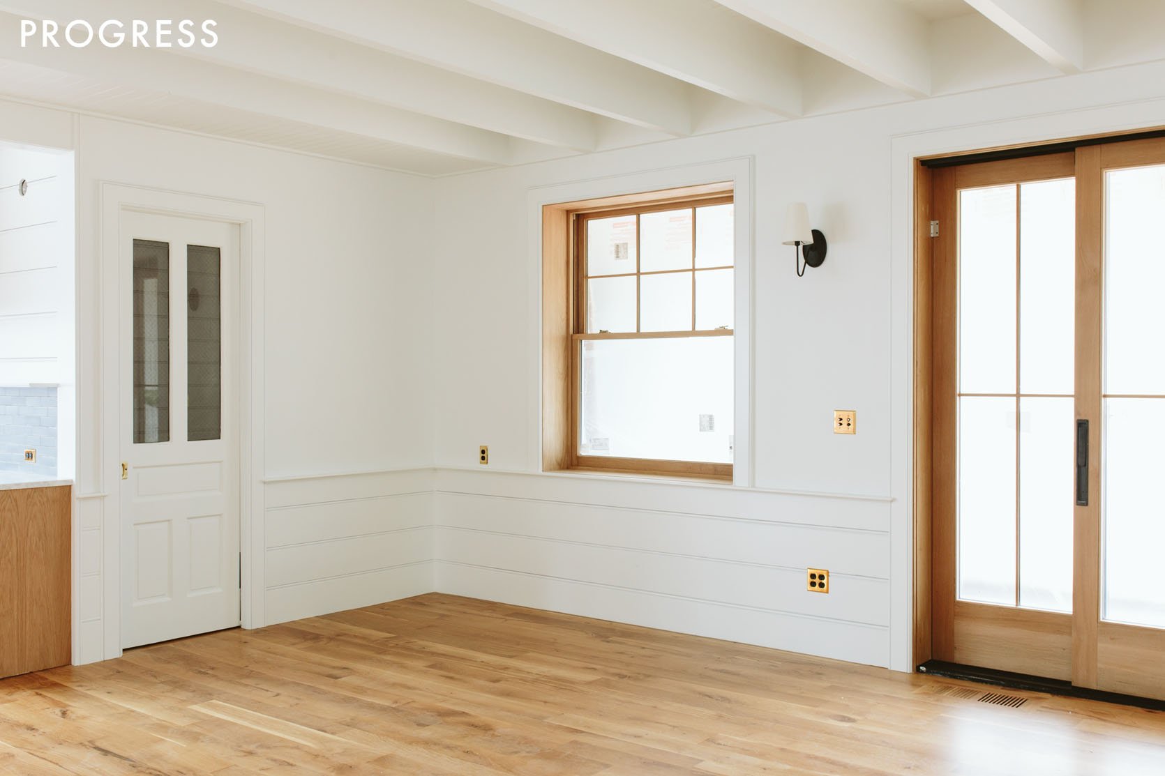
We decided to wait to design the nook until we knew for sure that it would work – flow, color, etc. We lived with a round and then rectangular table there for months while I figured out how to make it work. What I hadn’t remembered is that ARCIFORM had designed the trim work so that at the bottom of the window, the sill sticks out and tops off the paneling (by over an inch). This actually gave us a great place for us to end the height of the booth – it would butt right up to the sill that wrapped around.
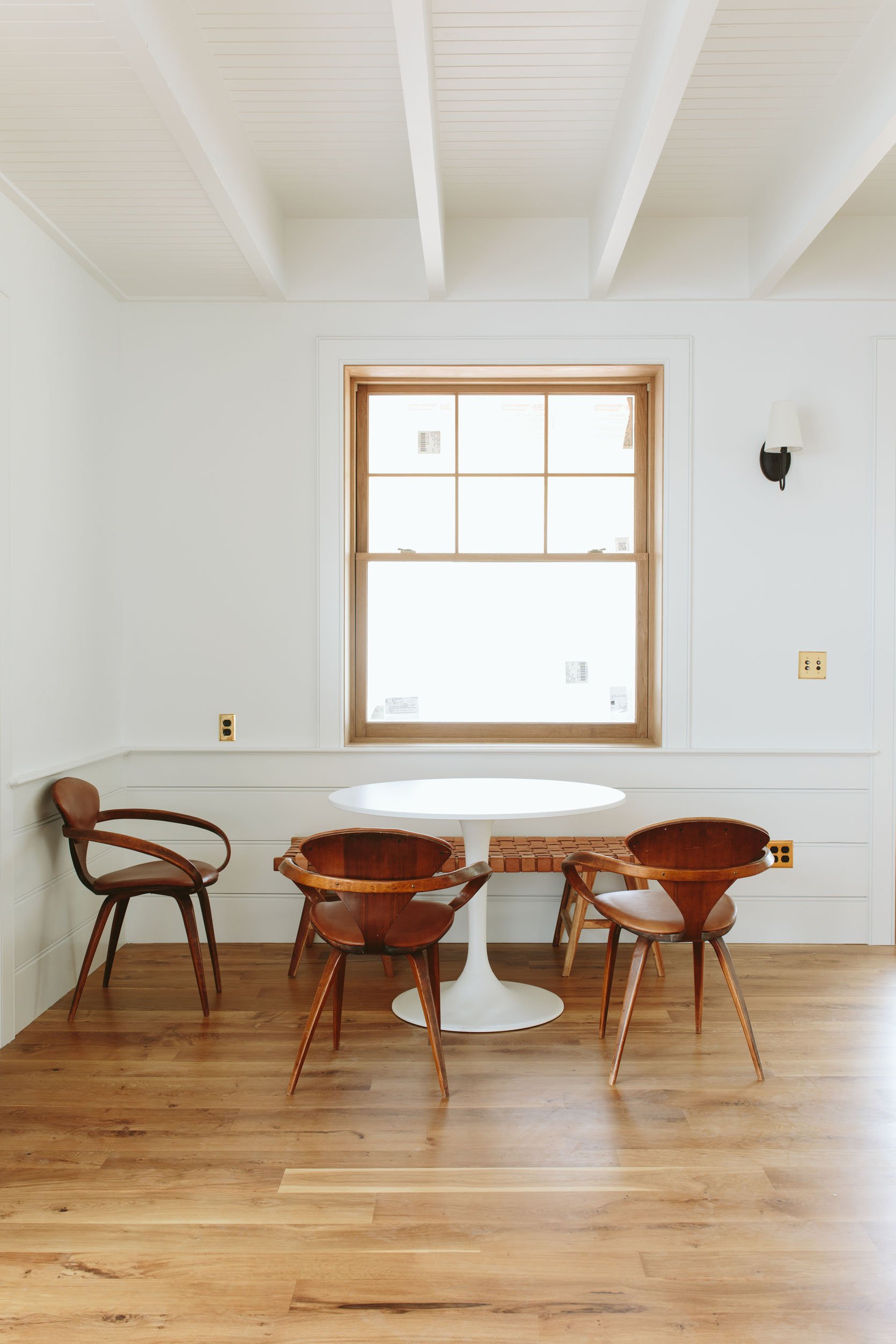
It was nice to A. see how often we used it (daily) and B. be able to visualize what colors/finishes we would want as well as C. to maximize the space and figure out the exact depth, length, etc.
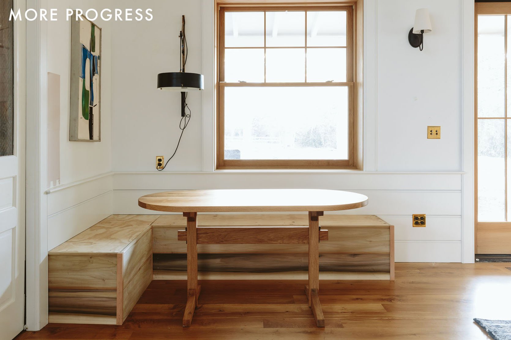
I spent hours designing a seat and back that would be so simple, but really special – with cool lines, pretty wood grain, floating with the base angled back toward the wall, blah blah. But once we got it priced out it was far more than we wanted to pay (over 8k for materials + labor/install, pre-upholstery). I’m sure I could have gotten other quotes or reduced the amount of wood/skipped the back. But one morning I thought, “why not just build a frame/base, clad it with leftover paneling, paint it, and make the upholstery, table, chairs, and accessories the star?” It could look like it was always there, built-in to the paneling/window sill and so sweet. Jamie, from ARCIFORM, is a master carpenter and they thought it could take two days on-site, with no drawings necessary (and “no drawings” is really my specialty). I had already commissioned Nate Dinihinian to make the table because it needed to be very specific (narrow, long, racetrack shape top, trestle base). I probably should have waited to commission that til the bench was in because it could have been 6″ longer, but it actually works really great with the sofa placement, putting one chair at the end.
Sunbrella Fabric For The Win
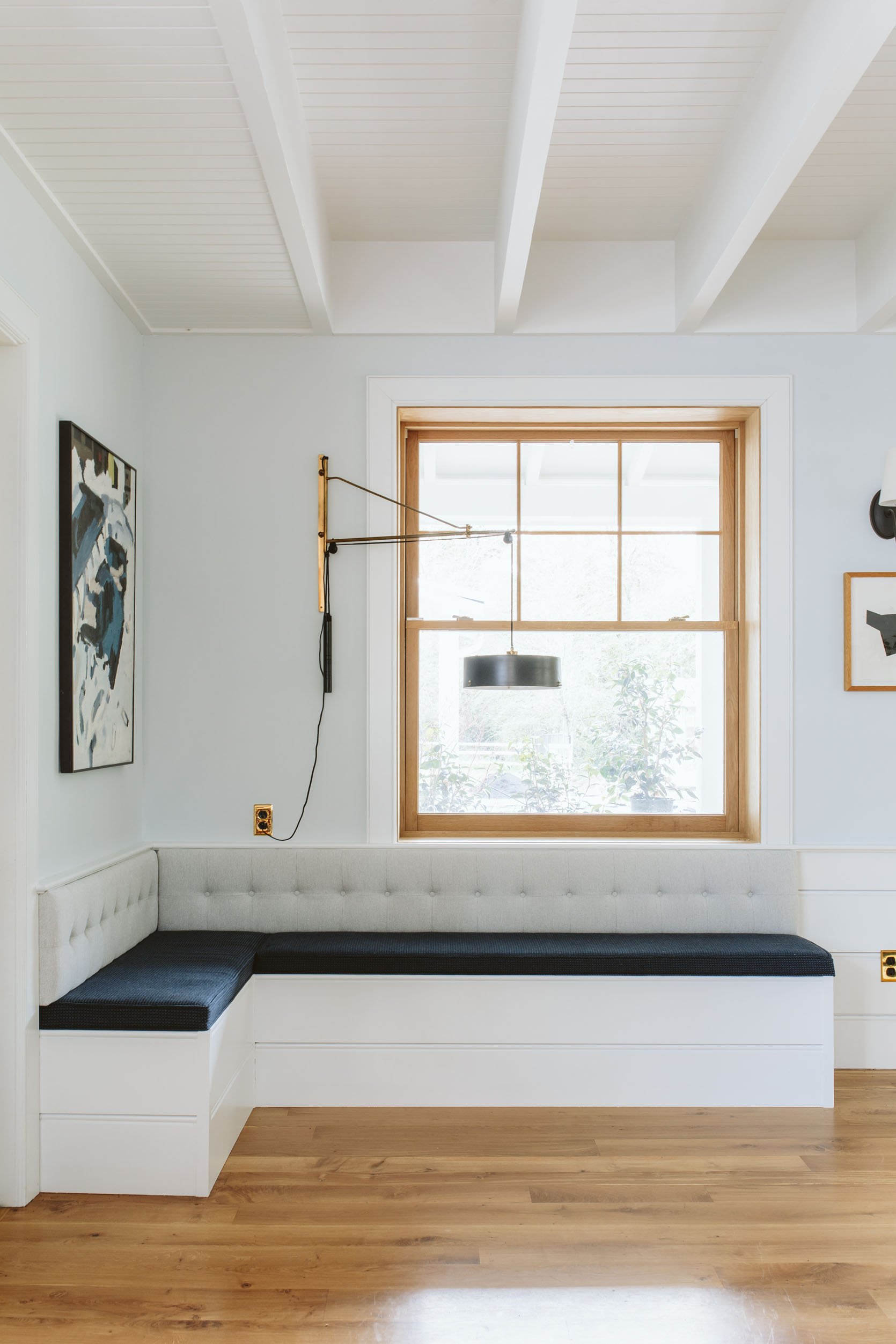
Back Cushion | Seat Cushion (similar)
I chose two different Sunbrella woven fabrics, highly contrasting but in the same color family. The navy blue is actually a blue/black small check pattern and the light gray/blue is such a pretty weave. Sunbrella is no joke – literally made to withstand hurricanes, so the durability and stain resistance is HIGH. And the woven fabric I chose looks like beautiful interior fabric, not a canvas or something that you might associate more with patio furniture.
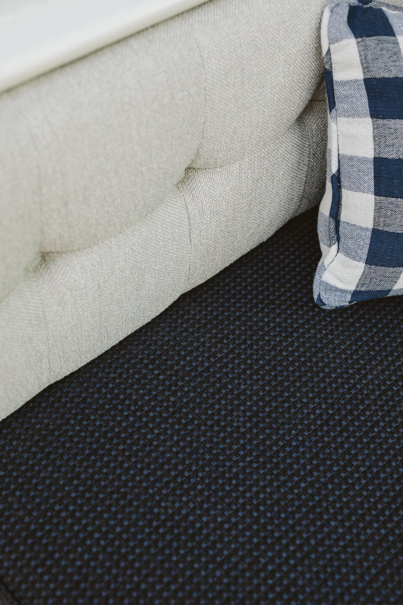
I hired Raleigh Hills Upholstery to customize the cushions. They came and templated, we talked through the tufting cadence, piping, etc., and installed it two weeks later (they did an incredible job, totaling $1800 not including fabric just to give you a cost reference).
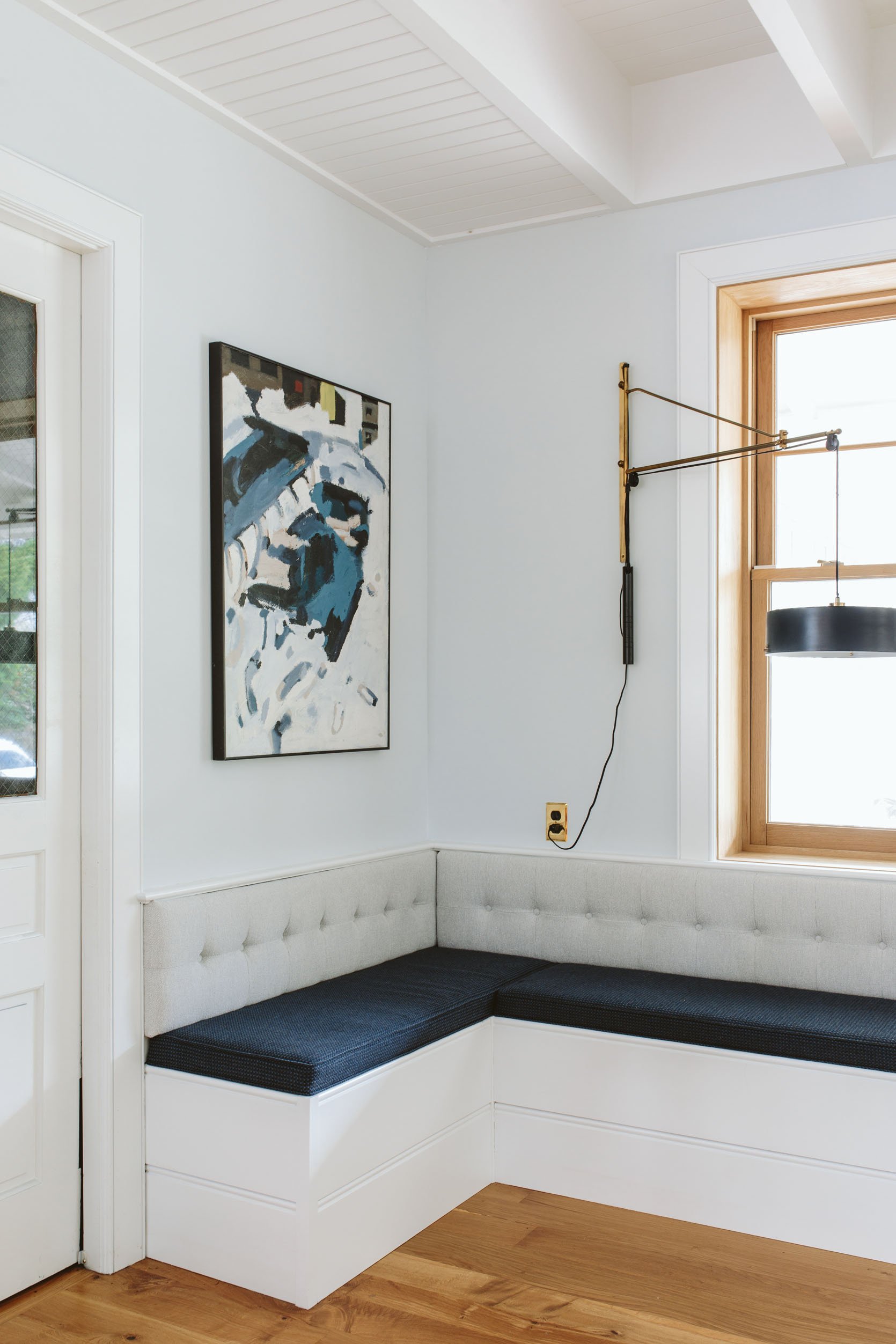
The cushions and back had to fit perfectly into the corner and the tufts had to be spaced appropriately. I hadn’t even thought of tuft placement so I was very grateful that they made it look PERFECT. The cushions were upholstered onto plywood to weigh them down and secure them more (or they might have moved around too much since they aren’t huge nor thick). To finish them off they secured them to the seat and wall with heavy-duty velcro. They aren’t going anywhere.
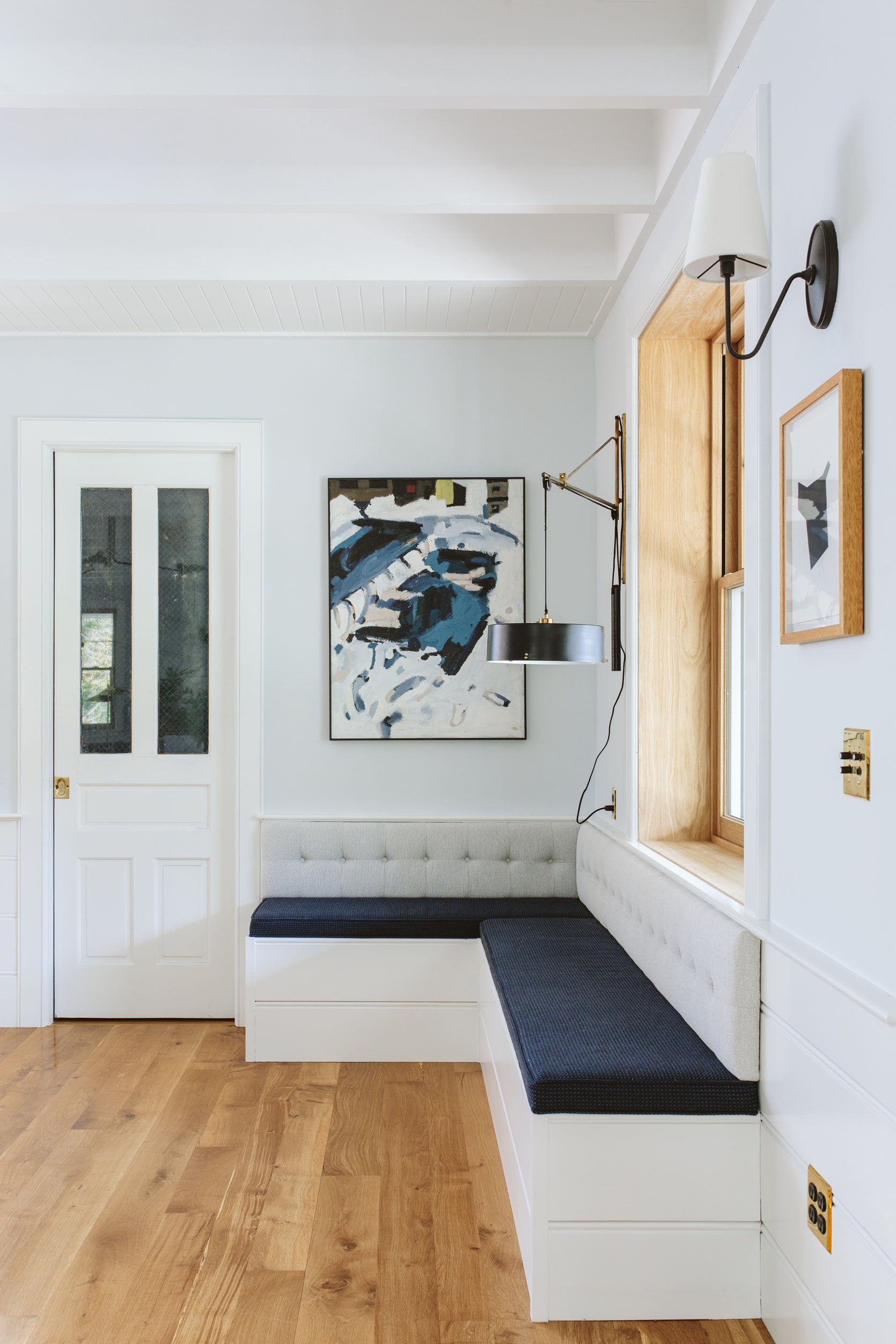
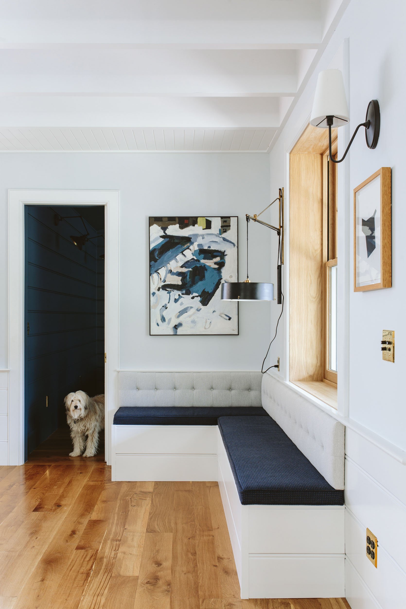
I love that the darker base color pulls your eye over to that side of the room, while the back is lighter and quiet. In the context of the whole room, it works really nicely and I wouldn’t have done it any other way. Doing them both the dark color could look good but less interesting and doing them the light color I think wouldn’t be as powerful. Oscar agrees (as you can see up there).
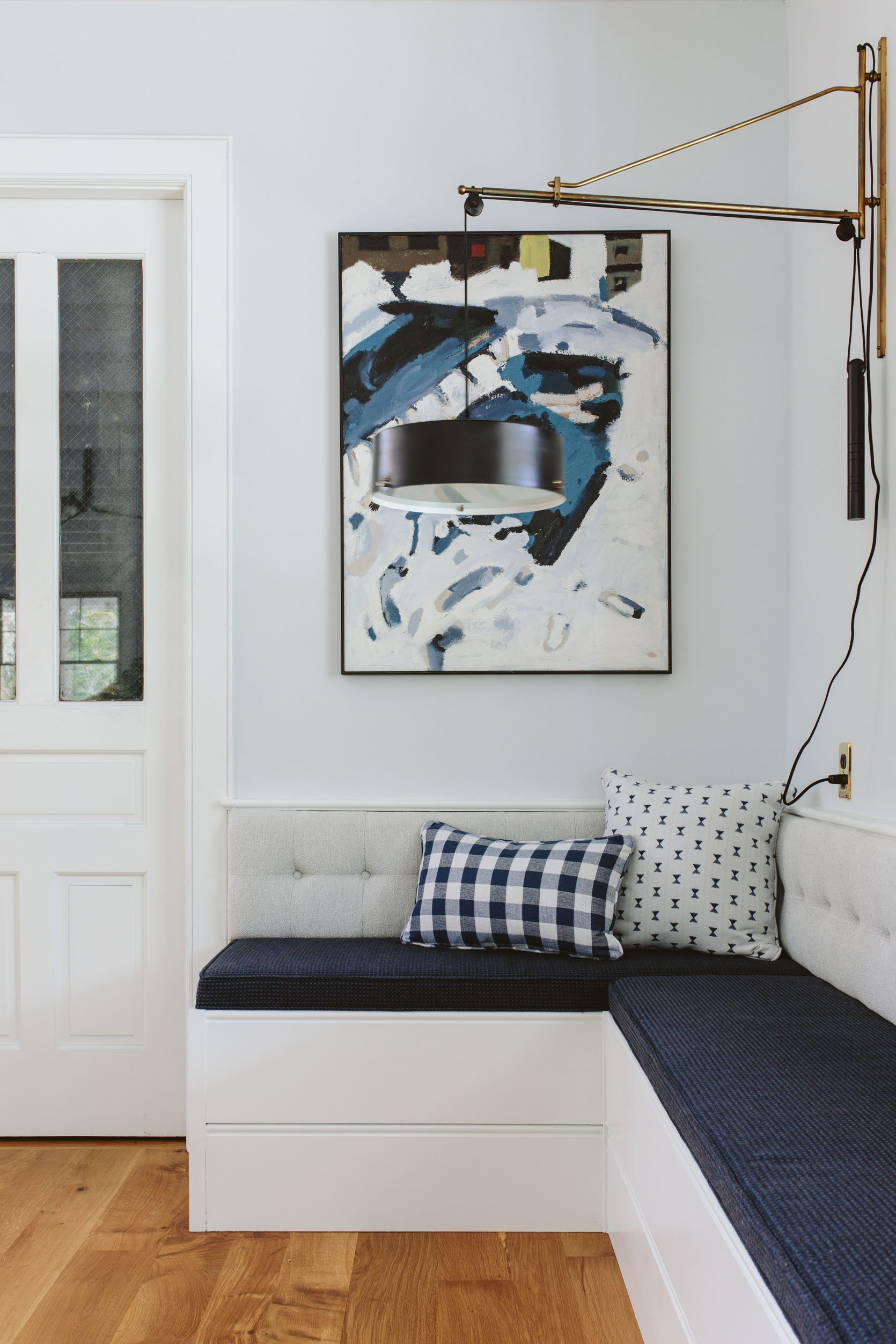
It is pretty darn comfortable and easy over there. We always knew that this booth wasn’t going to be for long lounging dinners, but y’all I spend hours a day here writing, and the 18″ seat depth (not accounting for the cushion) works!
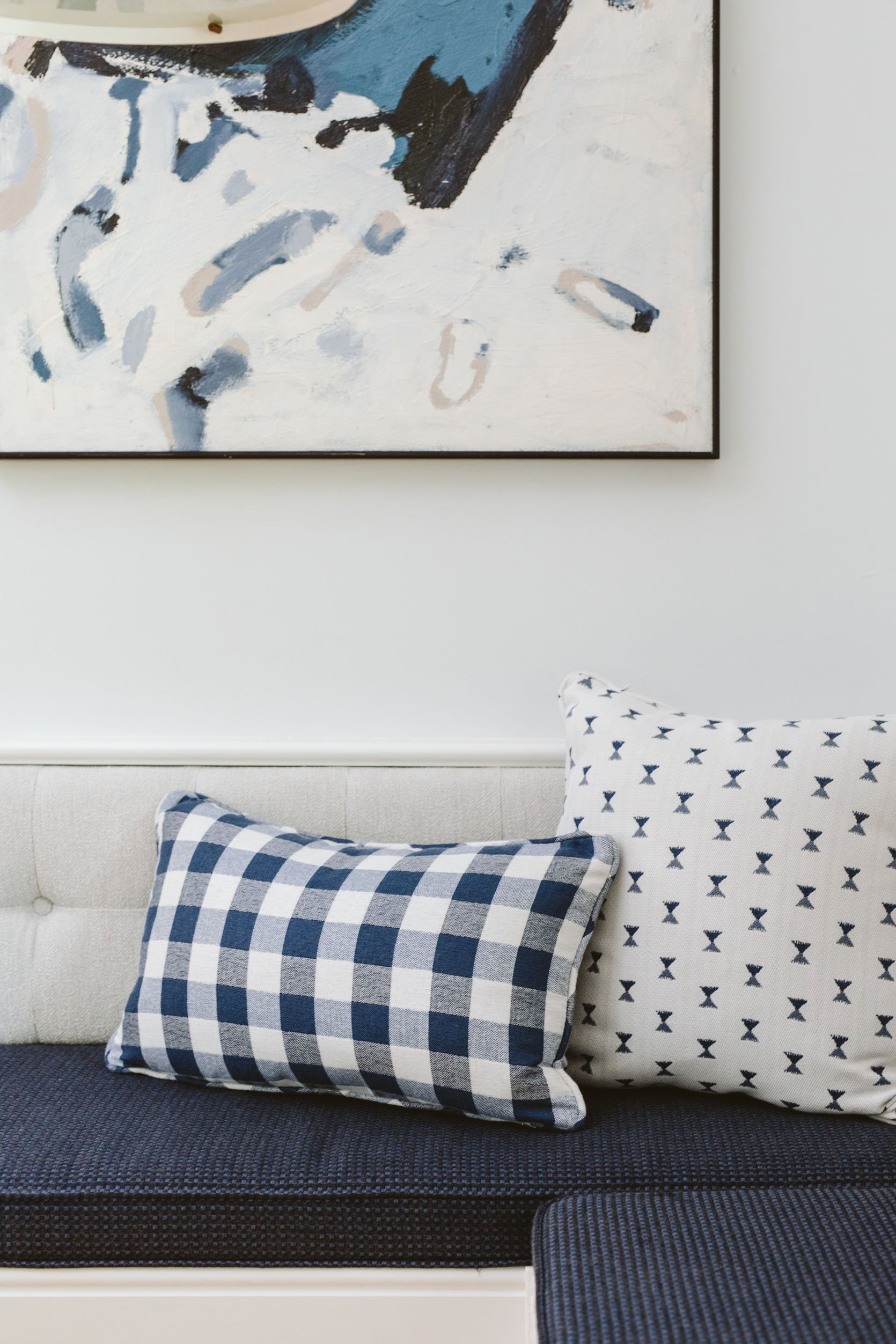
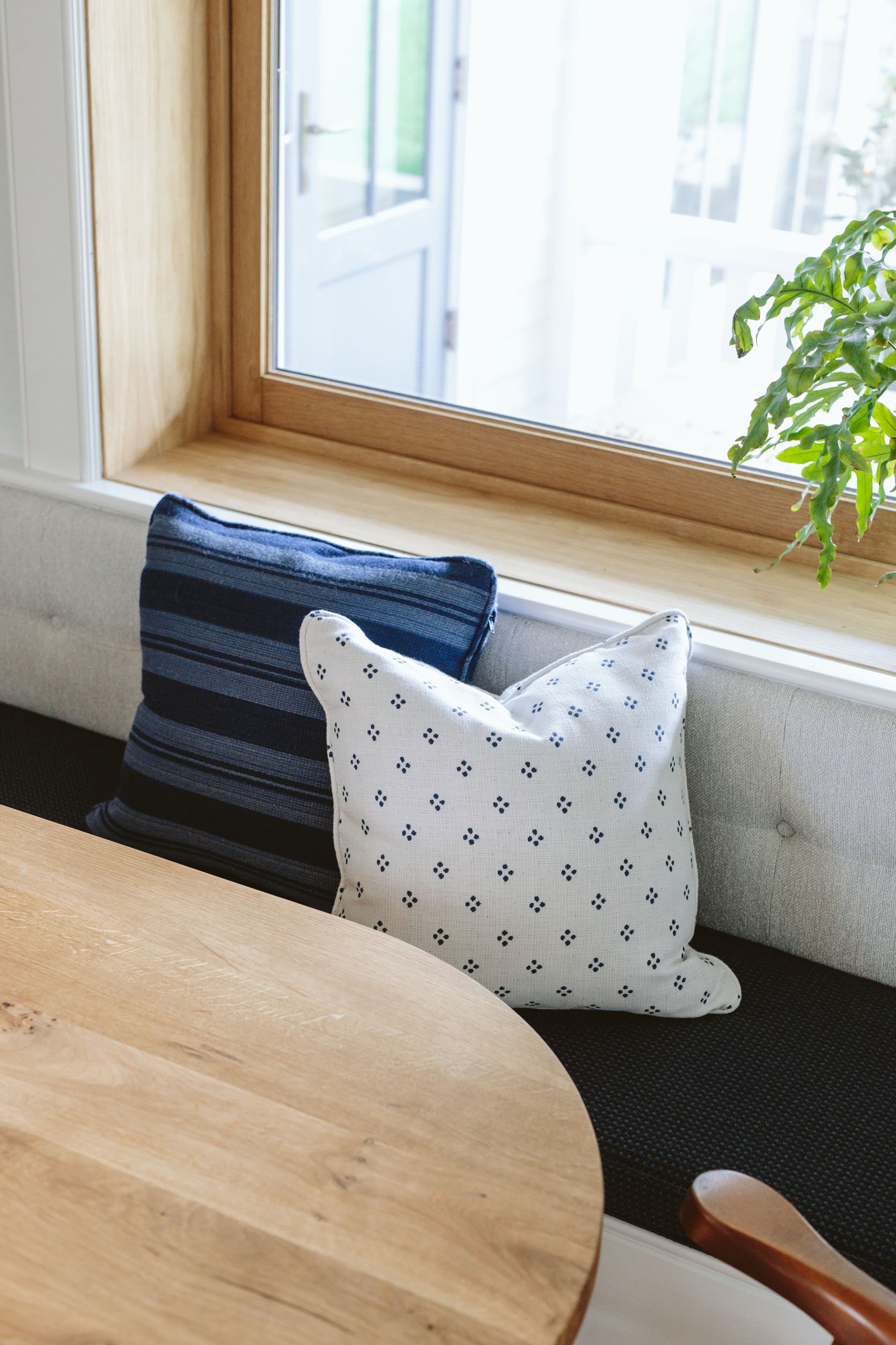
I added some of Max Humphrey’s pillows (a collection with Pindler and Sunbrella) which have such a sweet farmhouse vibe. He stole these back to take to Highpoint last week and I have missed them a lot. So you might see it styled differently soon, but only with Sunbrella as I want ZERO worries over here.
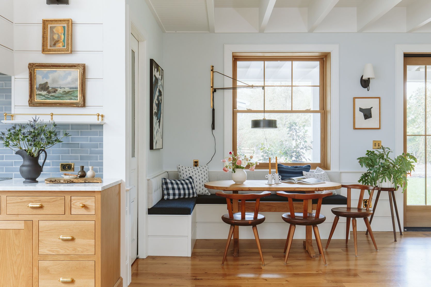
Left Art (vintage) | Right Art | Pillow Fabrics | Cushion Fabric | Large Sconce (vintage) | Small Sconce | Swithplates | Table (custom) | Chairs (vintage) | Candlestick Holders | Vase (similar) | Plantstand (vintage)
The whole nook works so well, honestly. It’s close to the kitchen making it so easy for meals/cleanup. It can seat up to eight (kids) but is more comfortable for six. But since it’s just for the four of us we are super pleased. The chairs are vintage Swedish from Etsy that has a really heavy round seat and has proven to be far more popular to sit in than my vintage Cherner chairs that everyone is scared to sit on.
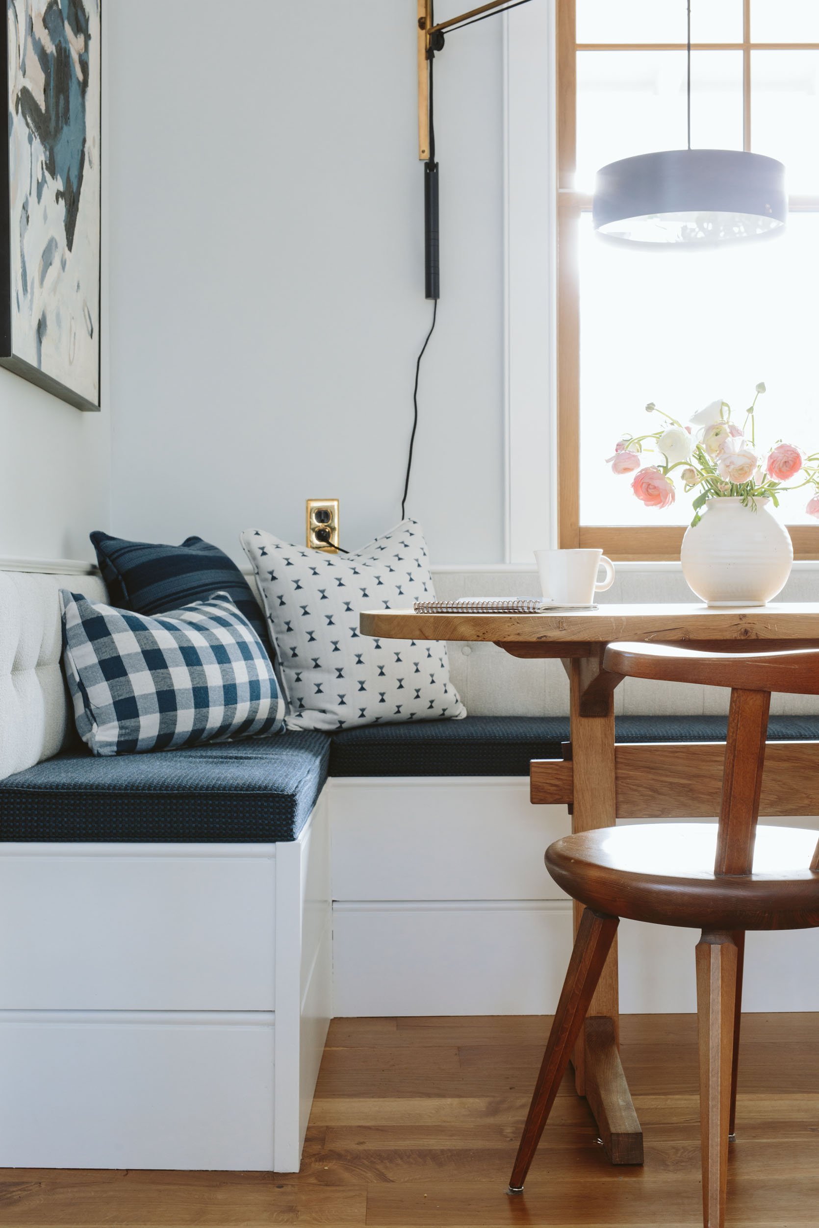
The vintage light fixture is from Rejuvenation (their antiques and vintage department) and one that I spotted and have hoarded for two years. It marries the two finishes in the house (black and brass) so perfectly.
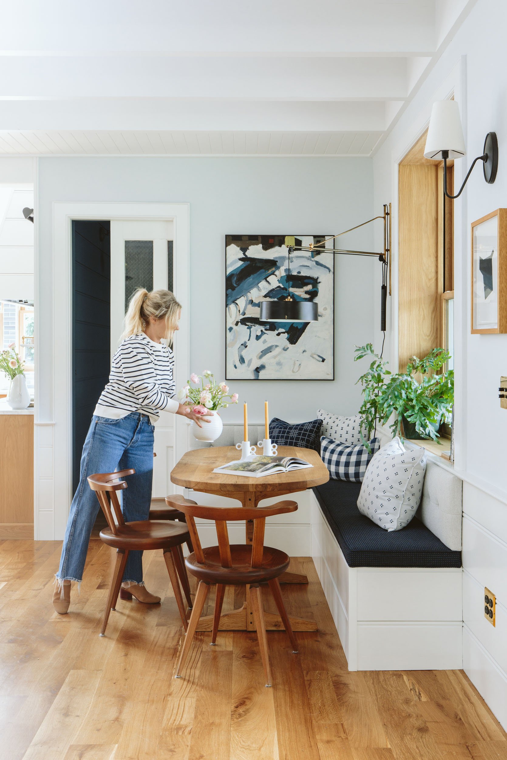
If you watch the video at the beginning of the post (or some social) you’ll see different paintings up there, but as we shot the photography they were bugging me a little (tonally and with the sconce intersecting them). So I moved this painting that I had over the mantel here and it was an obvious “YES”. It’s just perfect (vintage, sorry!). The art on the right is by Kirill Bergart, an artist in LA that I love.
The table that Nate built is so pretty and well made, from reclaimed Oregon white oak and we were able to customize the dimensions to make sure it was narrow enough for the space (30″) and with a trestle table to avoid legs in the corners that would block flow. He is now selling this table and you can customize it as well. He’s a lovely, talented Portland maker 🙂
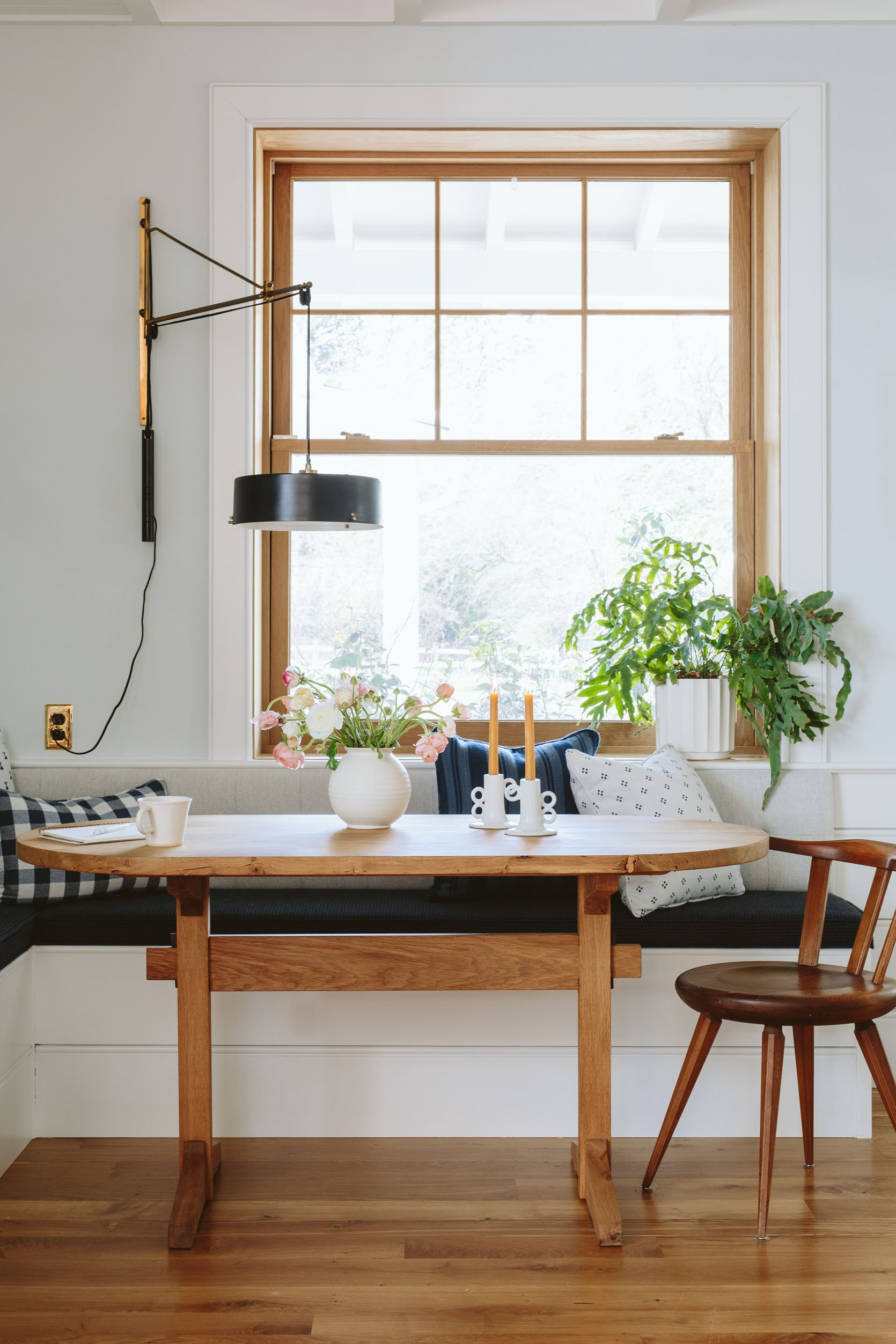
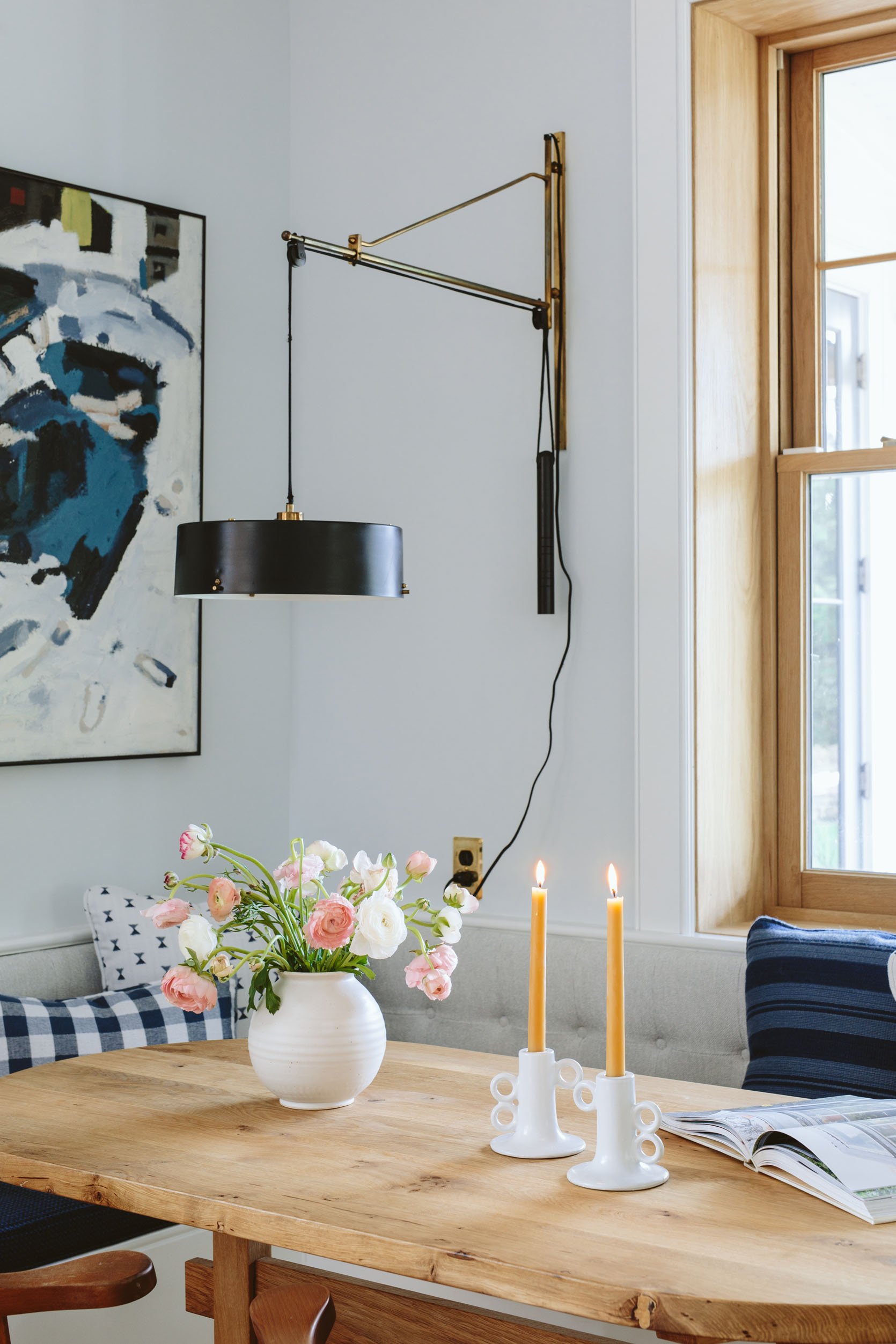
I’m just so happy with how the whole thing turned out – with literally zero changes I would make. We are going to add a cafe curtain so stay tuned for that.
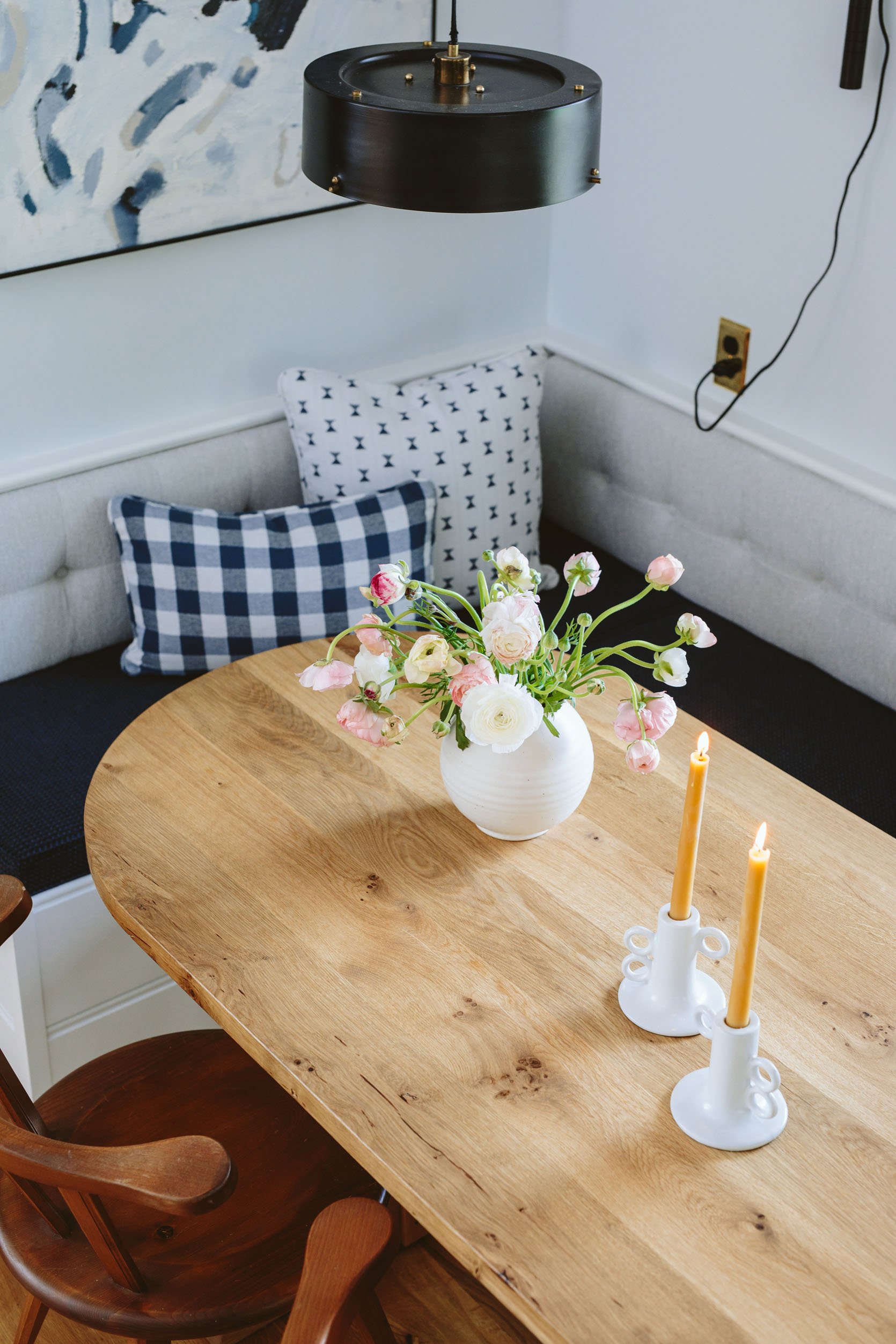
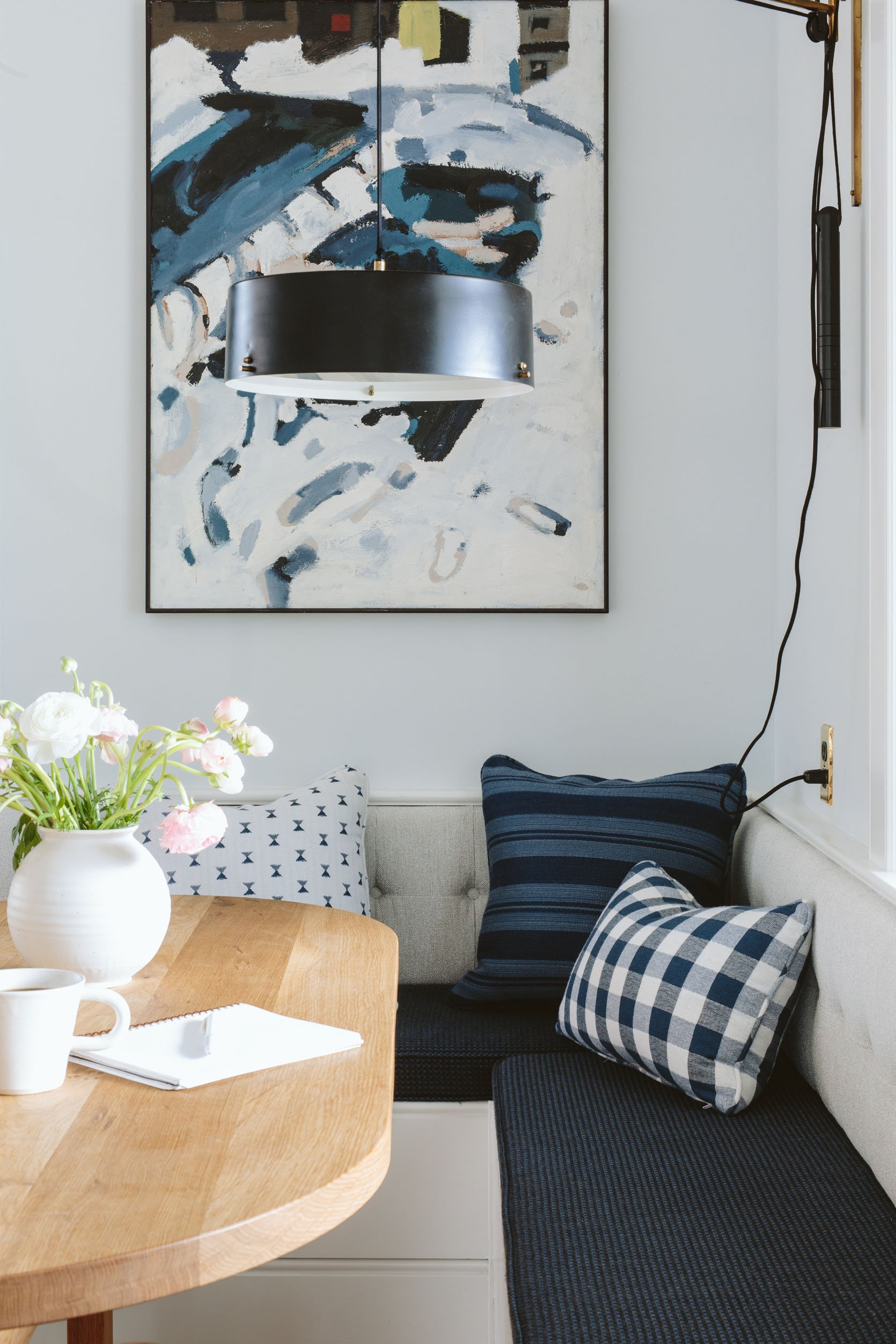
I can’t stress enough how un-stressful this corner is due to the fact that we used Sunbrella. When I was talking to my upholstery team they asked me if I wanted a stain treatment and I said I was using Sunbrella and they quickly responded, “Oh no you don’t need anything then, that stuff is impossible to stain”. Now that is NOT a direct quote from Sunbrella, but it is a pretty big endorsement from some experts.
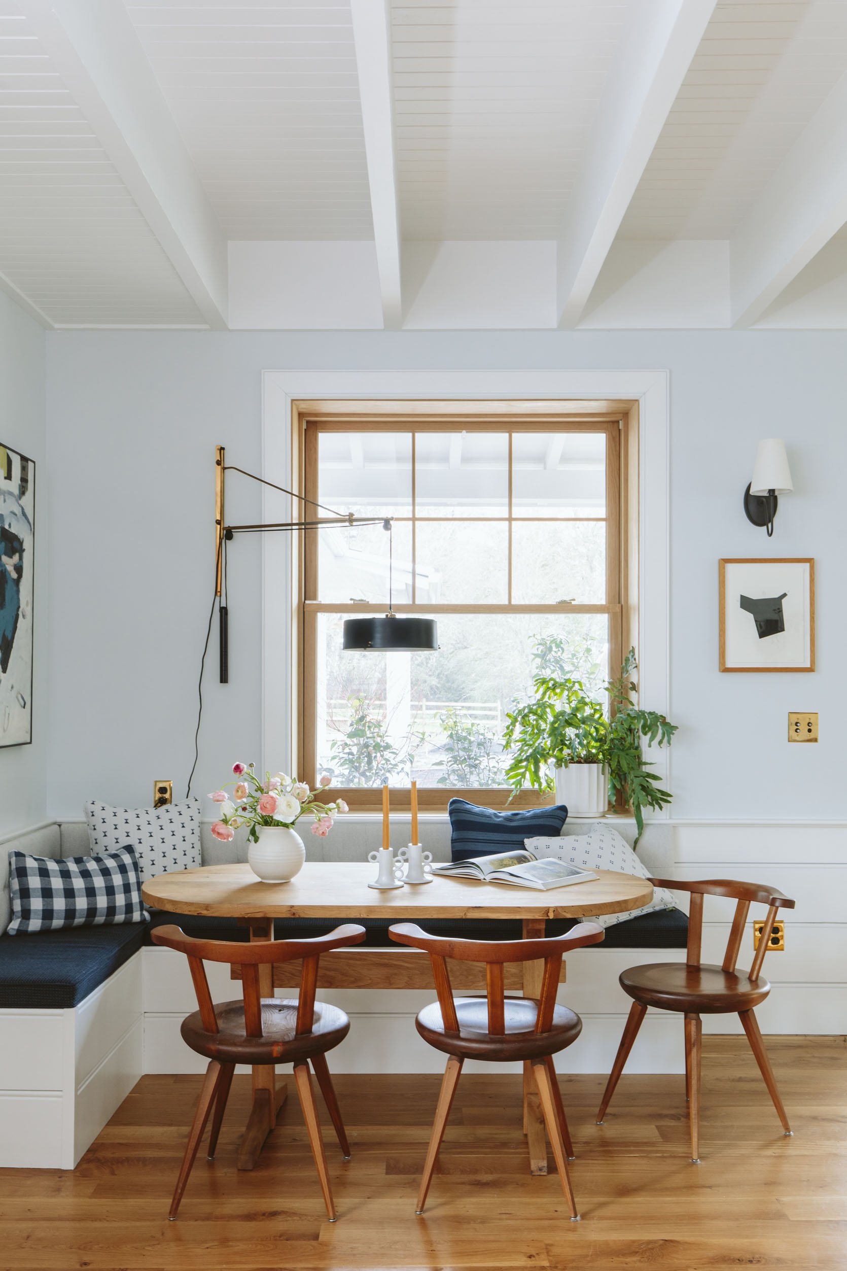
We painted the drywall in the whole room this extremely pale blue called Mantra SW 9631 by Sherwin-Williams and it’s so calm and soothing – in a barely there vibe.
Sunbrella in Action…
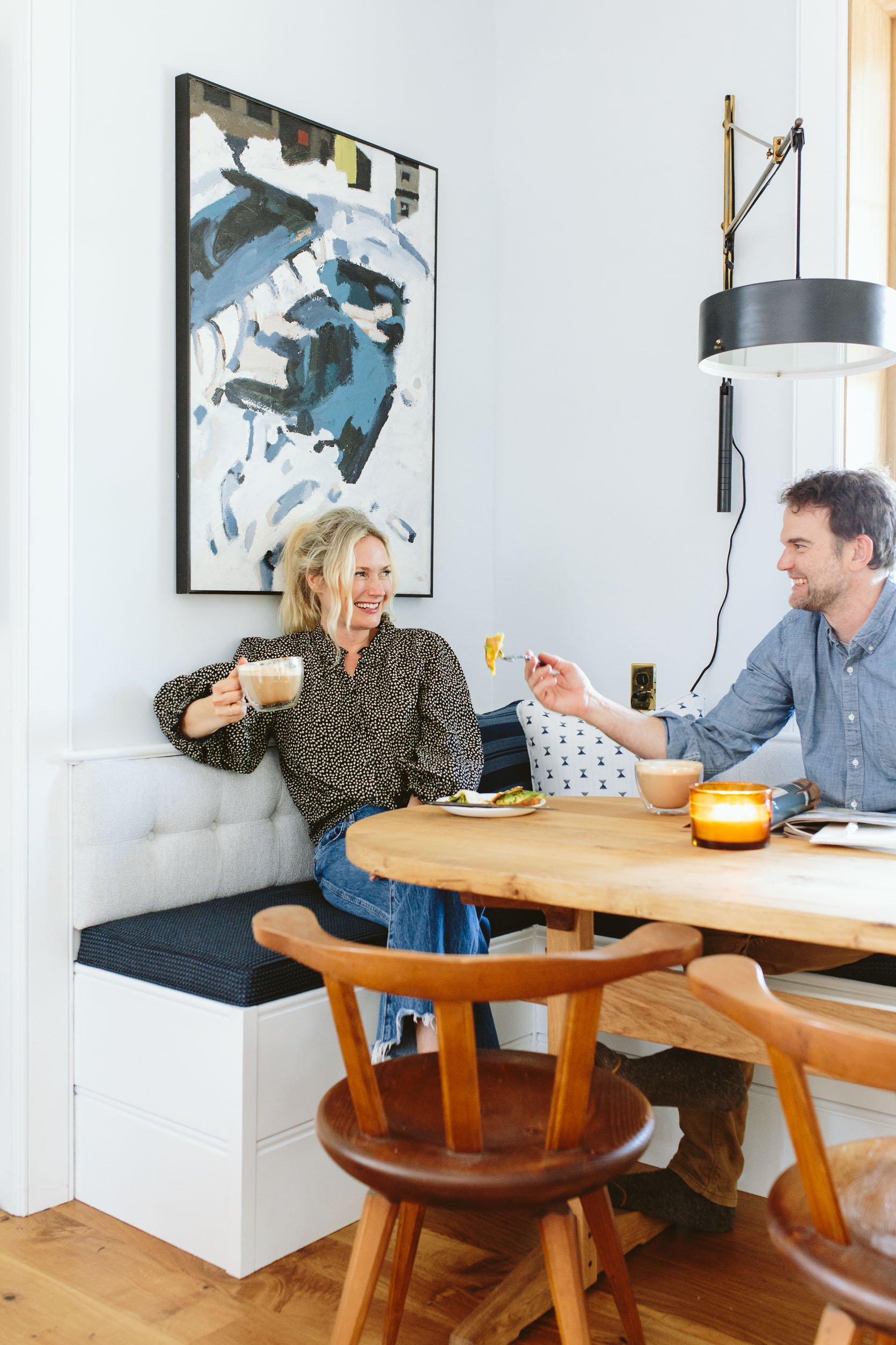
We thought it would be fun to show you how we use the space and really highlight the ease in which life can be with Sunbrella fabric. I joke that I should turn it into clothes so I never have to worry about literally any fabric in my life (I’m joking but is that actually possible?).
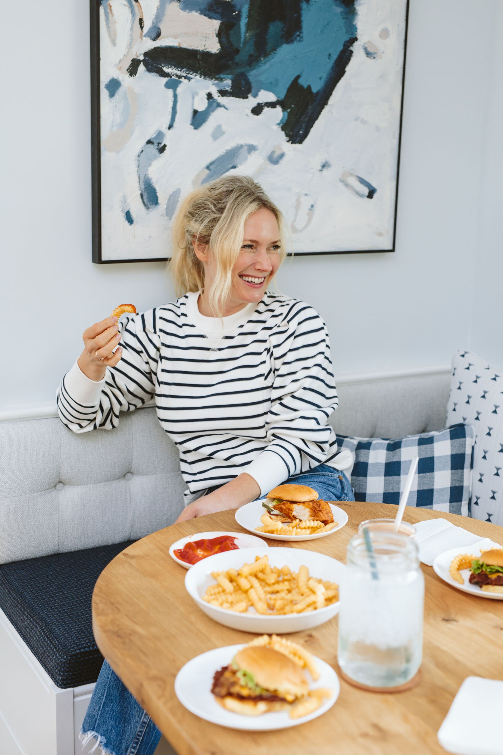
Team lunches happen here (with Shake Shack or soup) on shoot days, in addition to our family dinners most nights.
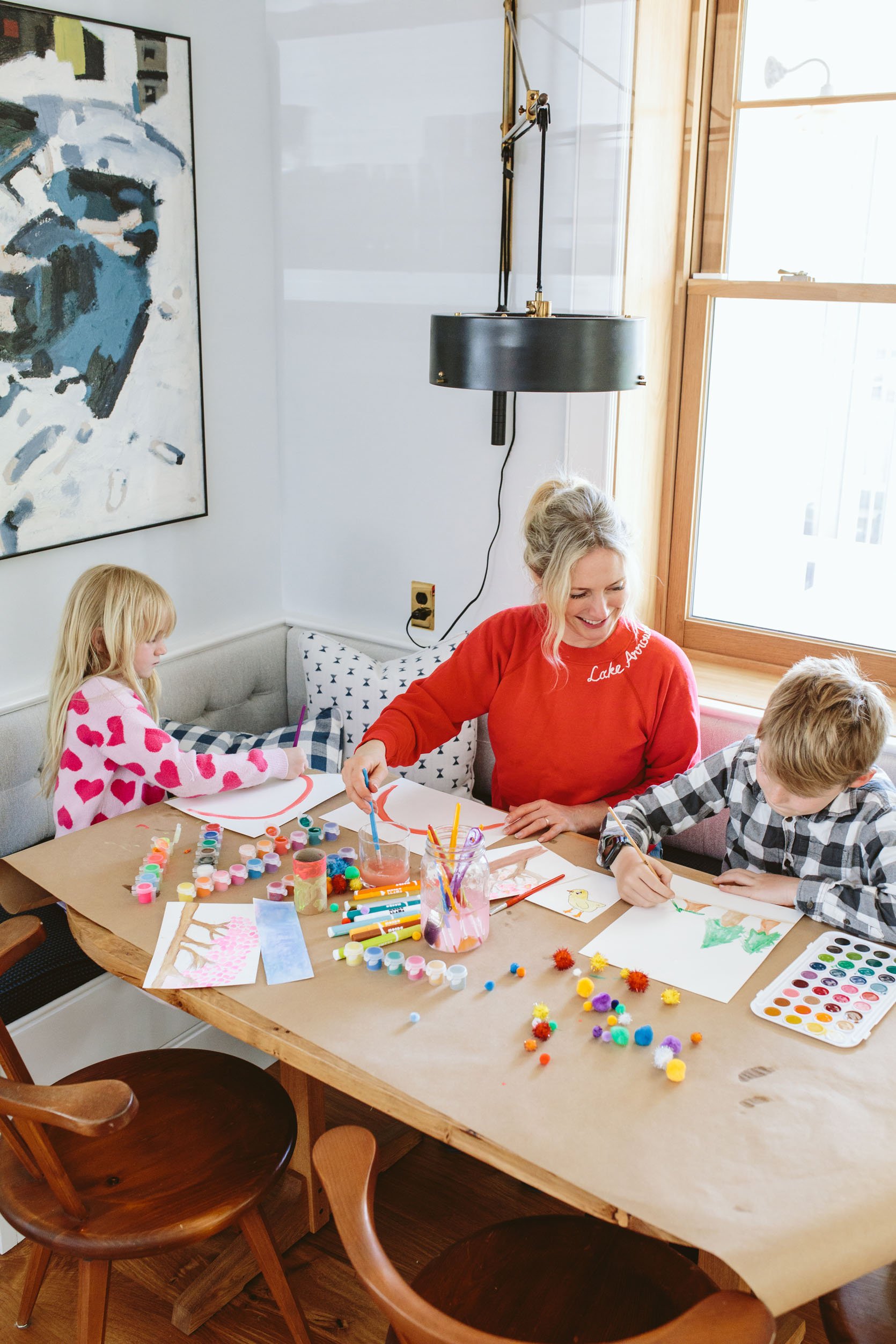
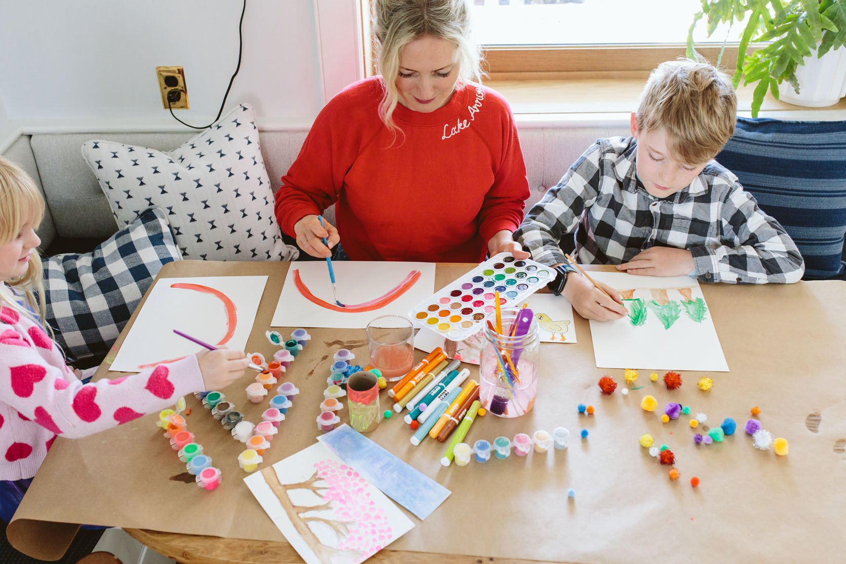
The kids use it for arts and crafting. And I even let them paint in here on rainy days instead of in the sunroom (uh, no). Of course, we use paint that is ideally washable, but even if not we are fine because it’s Sunbrella, and everything just literally wipes off.
Sunbrella Is Pet-Friendly (Of Course)
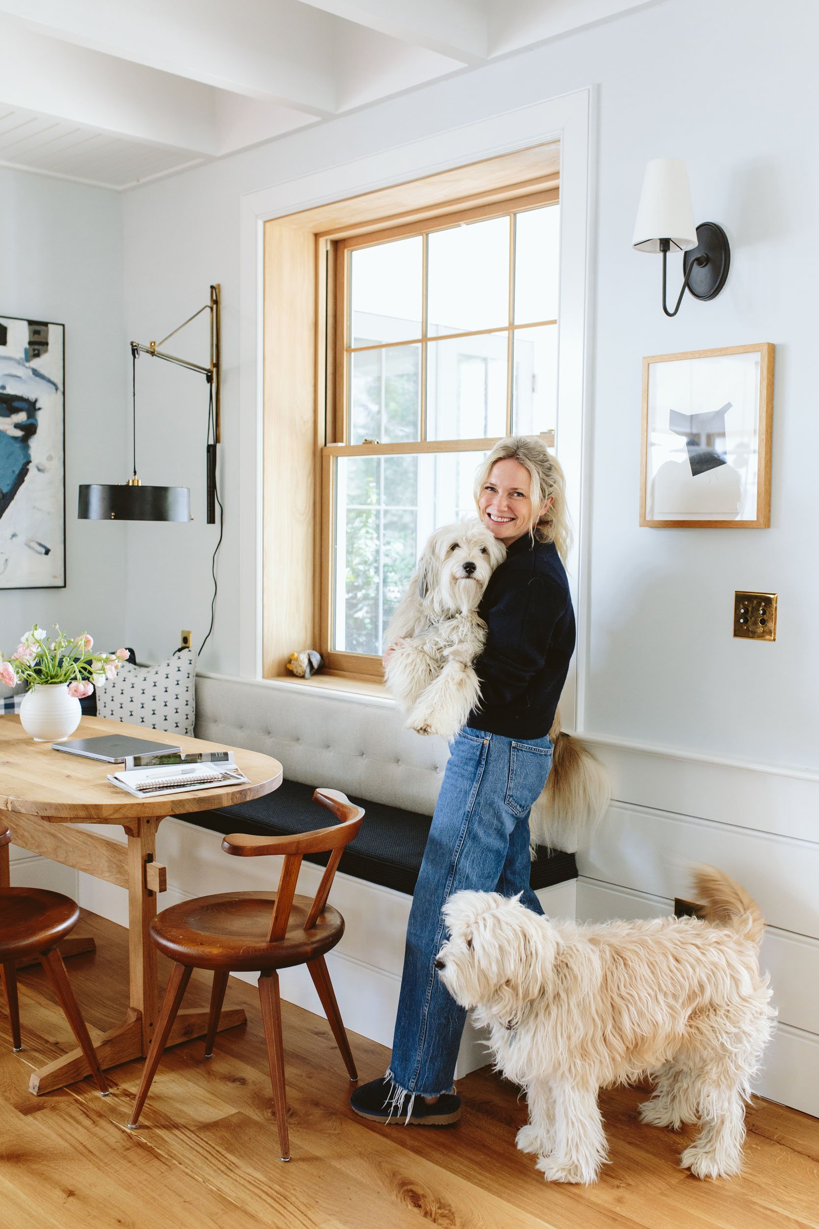
We try to eat dinner with our pups at the table (this is a growing trend?). I’m joking, but we certainly did encourage them up on the dining bench for these photos and they happily obliged (because they are the sweetest pups on the planet). The point is, you do NOT need to worry about this fabric with animals – it’s extremely pet-friendly and durable. If I didn’t want velvet so badly on our sofa I would absolutely have used one of these Sunbrella woven fabrics. I hope more major retailers design more interior sofas with this fabric because it’s really beautiful, soft, and appropriate for all pieces of furniture.
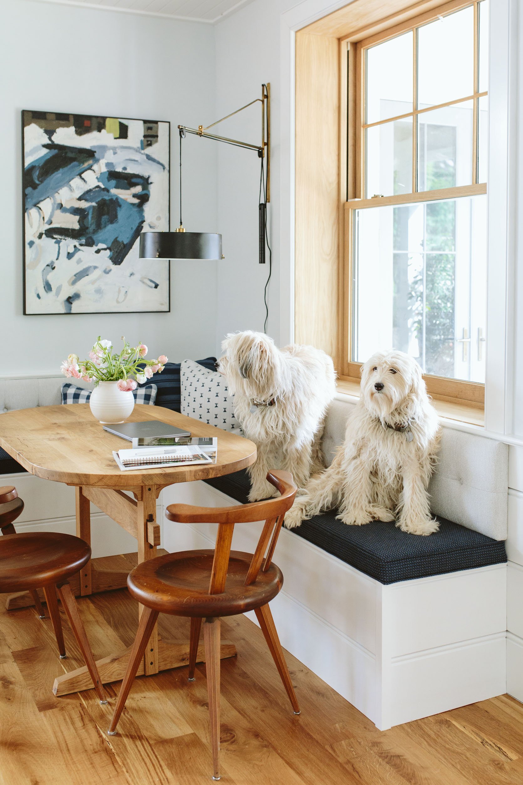
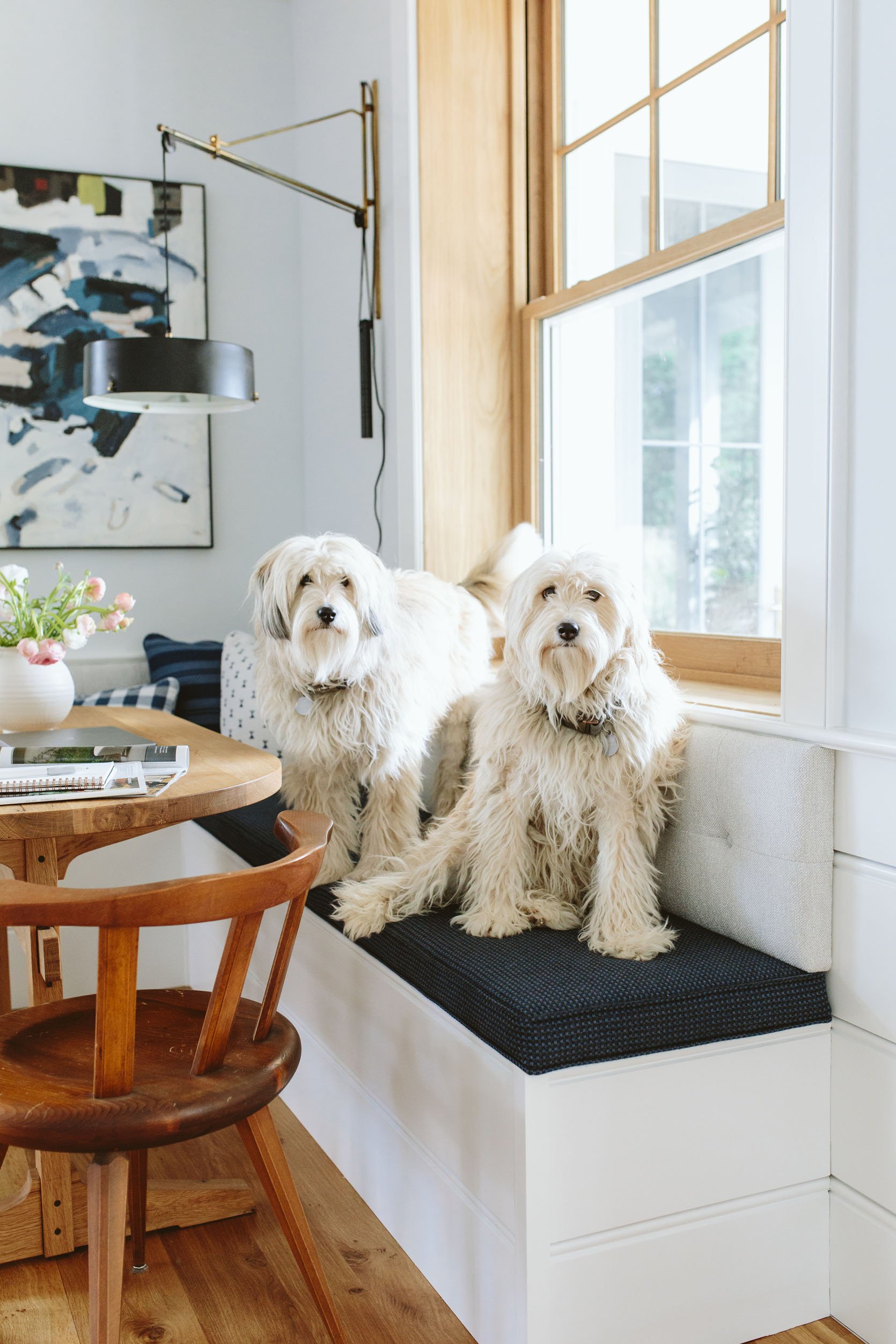
Too bad we don’t live in LA anymore – these pups could absolutely have a career in Hollywood. (make sure to watch the reel of them up there – the reason we put them up there in the first place)
A huge thanks to Sunbrella for making a product that makes our life less stressful, more manageable, and worry-free. And of course, thank you for partnering on this project. We have a few more coming up that I can’t wait to show you as well (the kitchen patio coming at you soon!). It’s my favorite corner in the house, I love every element in there, and it’s really informed the design of the rest of the room. Cheers to checking a big box. 🙂
All dining nook resources are below and ask any questions in the comments. xx E
Resources:
Seat Cushion Fabric: Sunbrella (Back Cushion + Seat Cushion – similar)
Pillow Fabric: Max Humphrey for Pindler and Sunbrella
Bench Seat: ARCIFORM
Upholstery: Raleigh Hills Upholstery
Table: Dinihanian Design Build
Lighting and Outlets: Rejuvenation
Wood Flooring: Oregon White Oak by Zena Flooring
Windows and Doors: White oak, Aspen Casement by Sierra Pacific Windows
Wall Color: Mantra by Sherwin-Williams
Paneling Color: Extra White by Sherwin-Williams
This post was sponsored by Sunbrella but all words and opinions are all mine🙂
*Design by Emily Henderson and ARCIFORM
*Photos by Kaitlin Green
THIS POST WAS ORIGINALLY PUBLISHED HERE.


