We are getting close to three years into this project (four years since we found the property) and seeing the progress documented in this post actually makes me tear up. It’s taken me a while to get our footing up here, build a team to help create the content, deal with endless mud through the remodel, and now with a deadline looming I’m using it as an excuse to be as “done” as possible. Not sure what “done” means in our world, but I think at least where every room functions for its own purpose, and no room feels like a storage room (like our bedroom does right now). I really, really wanted to be able to take our time and enjoy the decorating process which is why I pushed shooting it til late May, and truly we had a lot of time, but there are still a lot of things that have to happen. I wouldn’t say I’m scrambling, but I wouldn’t say that I’m NOT scrambling either 🙂 It’s honestly SO FUN. We secured the Real Simple magazine feature a couple of years ago because I love Real Simple so much. Part of working with a magazine is keeping some rooms exclusive to the feature – i.e. not showing the whole world everything so that no one buys the magazine. Now social media has changed this process SO MUCH, especially for those of us whose livelihood depends on our own traffic/numbers and daily documentation of our homes. So I’ve been able to show you a lot, but yes, will hold onto some room reveals till after we shoot.
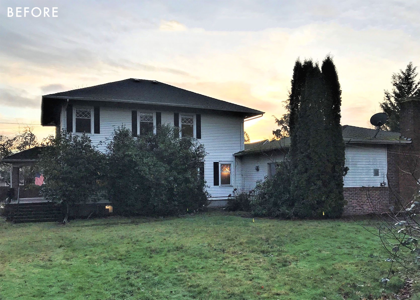
Today I’m going to walk you through where we are with every room, what rooms have been done and shot (and how we’ll style them differently) as well what we have left to do. It’s a lot of moving parts, with so many domino effects but y’all it is absolutely coming along and I feel beyond grateful for this home, this job, and that I get to share it all with you here. I’m trying to figure out some sort of reader event like we did for the mountain house that doesn’t give me strange anxiety about people knowing where my kids live. I’d love to open it up to those of you who have followed so closely (thank you) and share it in person but this is our full-time home (not a vacation home like the mountain house) so it makes me more nervous. I even jokingly thought that we could blindfold people, put them on a bus, take their phones so they can’t ping where we are, and bring them here for a day-long party. Most of that is highly unadvisable so I’m hoping instead that our new videographer and my team can figure out the best way to show you every nook and cranny through video content so that you feel here. So here is where we are at – room by room.
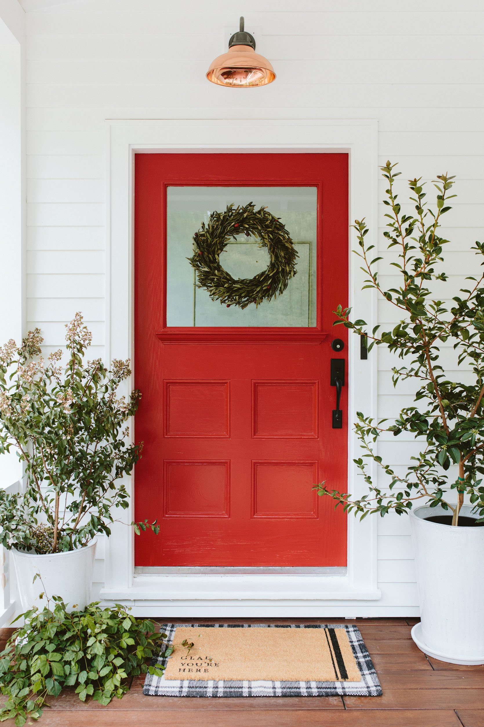
Well, the front door color (an extremely good red called Poinsettia SW 6594) has been changed (as of last week). The house is so white and big and this bright red door just popped too much. It was strangely in your face and aggressive (as red most certainly is). So last week we changed it to a – shocker – blue, and as I round the broken driveway and the house comes into view, it feels so much better I can’t even tell you. It was a three-hour change that makes a world of difference to me loving my own curb appeal. I was trying to figure out why the red wasn’t working for me and I think it was that against the white and green it read holiday but more than that I think that when we had a red door before it was against a warmer/darker color so it was more subtle. The only word that I can think of to describe why I didn’t like the combination is that it felt too “flashy” and just not very “us”. But I love a red door in certain situations, for sure.
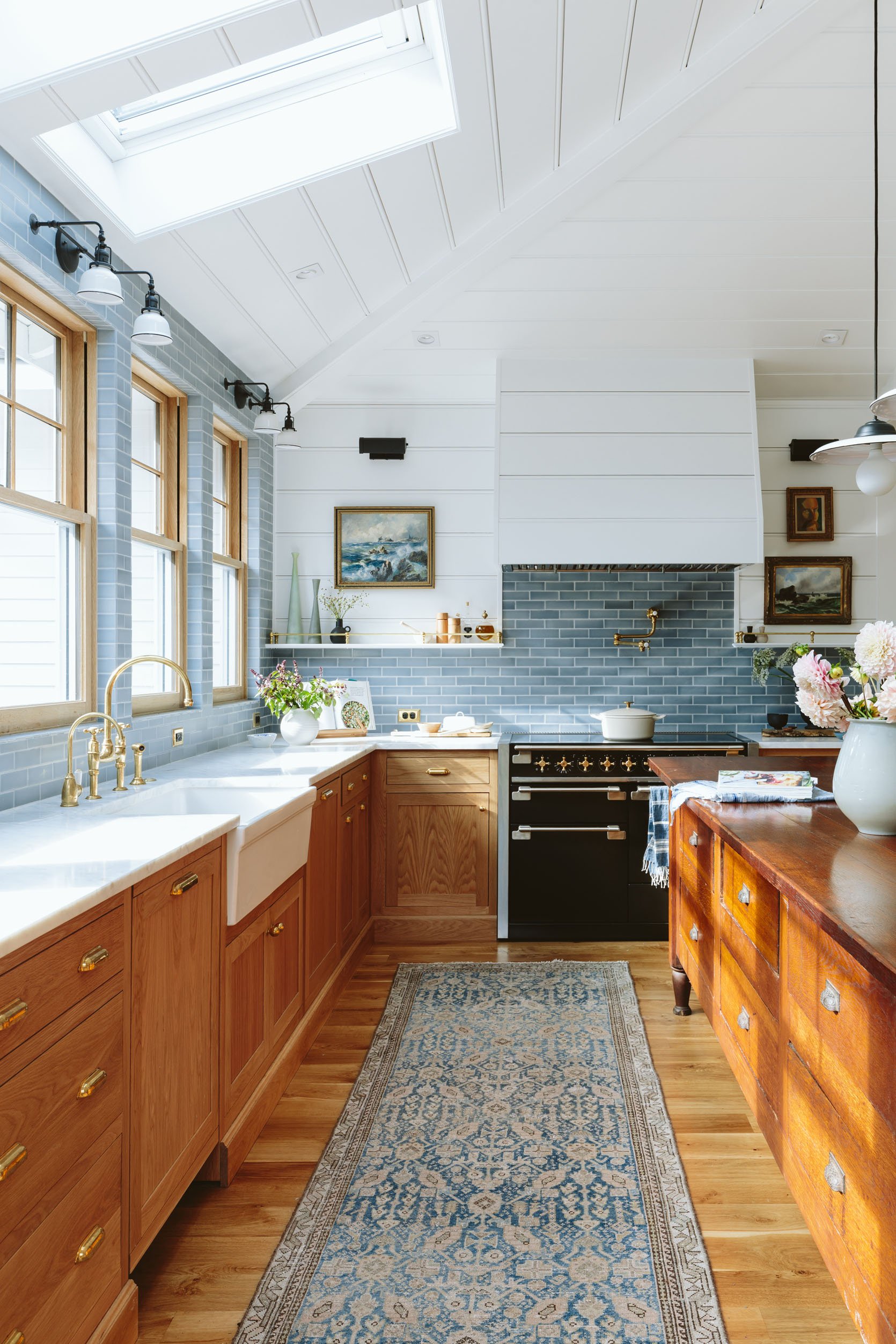
The kitchen has been done since October when we shot it and revealed it here. For the magazine shoot, we’ll likely style it differently making it more seasonal (shooting in May, September issue) and get more family shots in here. The magazine editors/art directors will have a huge say in this to make sure that these shots speak to their audience and feel right for the issue and time of year. I’m SO GRATEFUL for this advice because honestly, I can’t be objective about my own home anymore. I know this for a fact because I totally understyled the mountain house kitchen, not wanting a lot of “stuff,” because I was in such a minimalist stage. My aversion to clutter clouded my judgment. I think having their input/expertise on how many lifestyle moments we want, without making it feel cluttered will be so valuable.
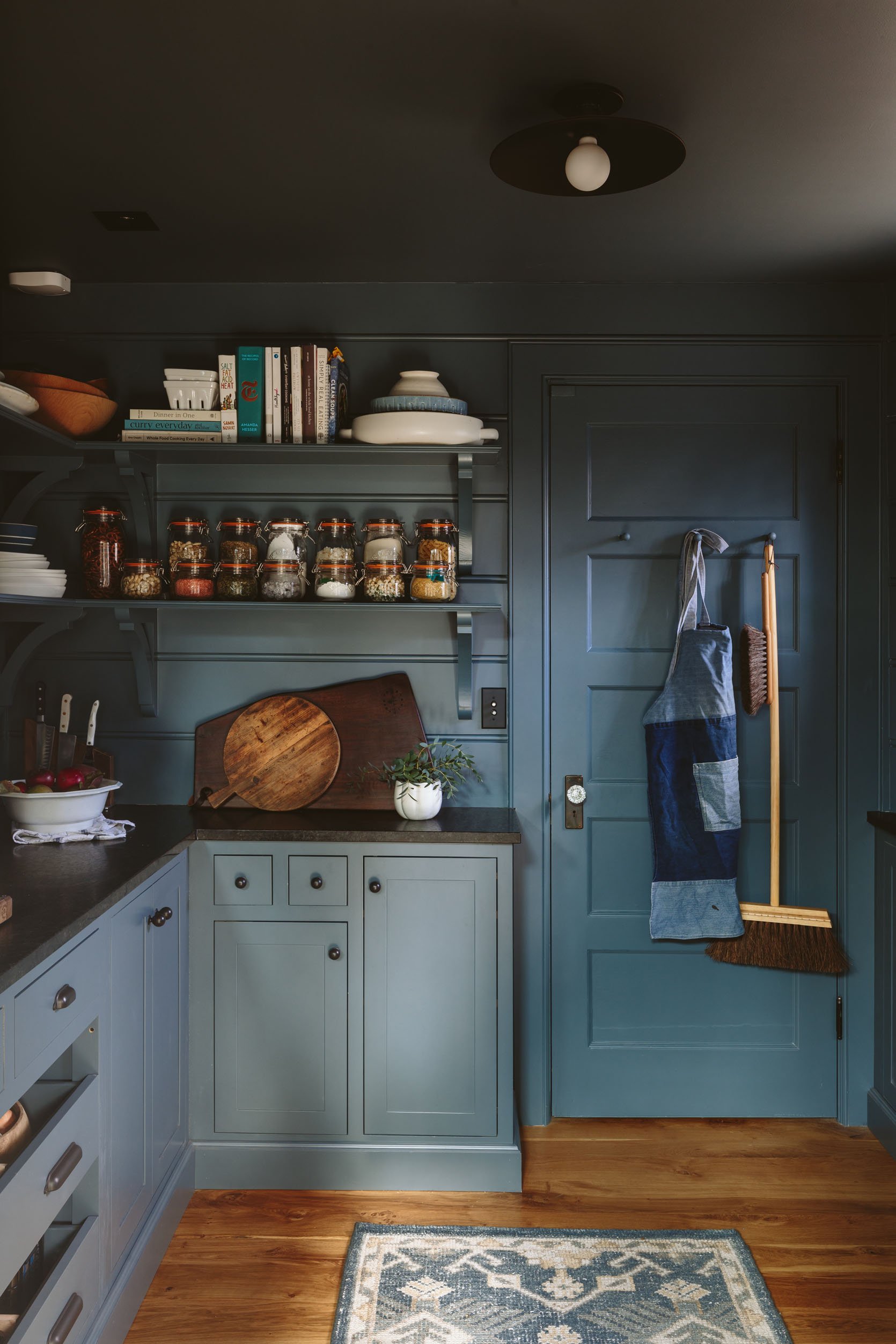
The pantry is also shot and done. If they shoot this space nothing is changing except maybe the rug and styling. See the full reveal here.
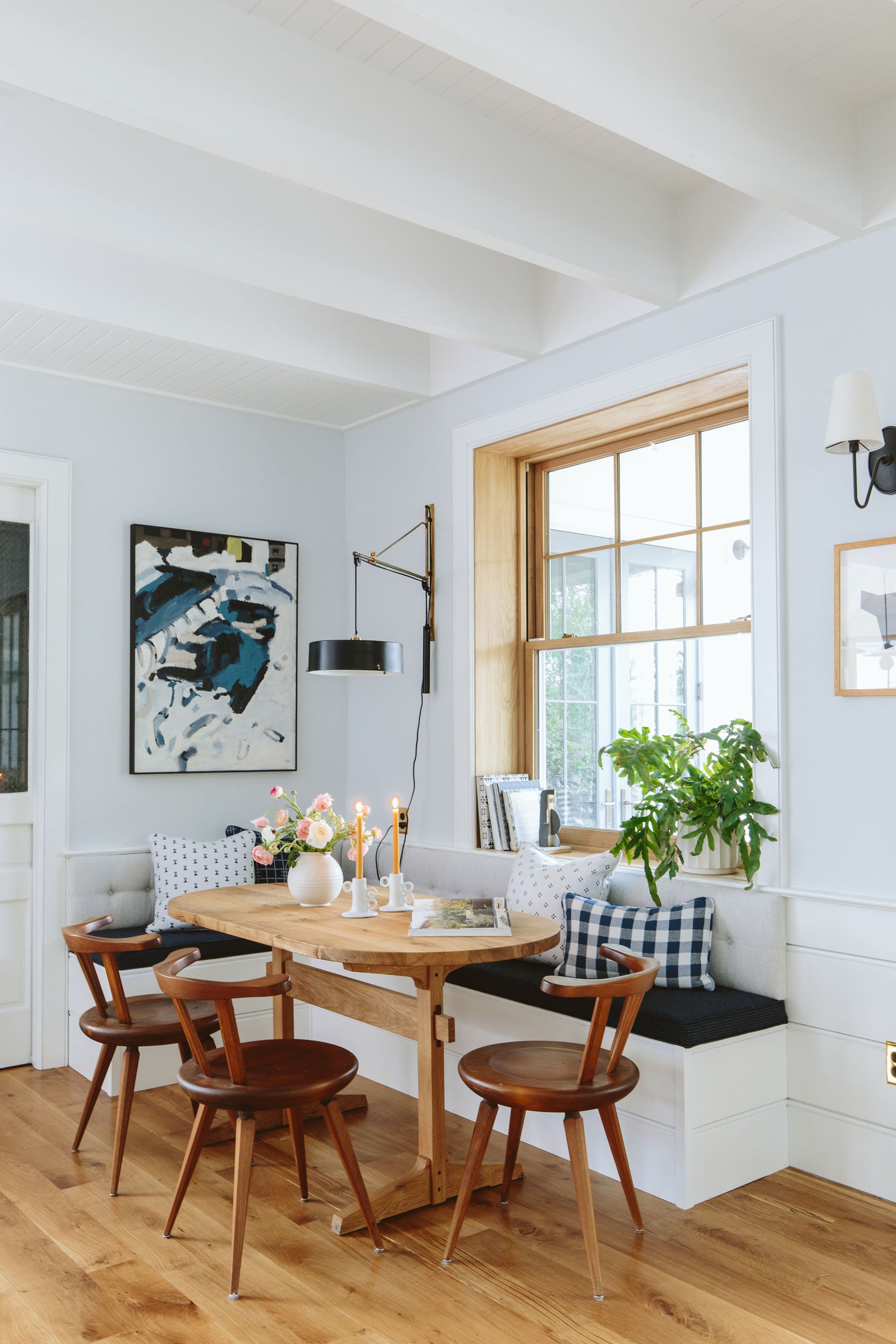
We JUST shot and revealed this (which I LOVE). We do have some more to add, all in the works. When we shot this nook it was with our fabric partner, Sunbrella, and we didn’t want to put any other non-Sunbrella fabrics so that they could really own the photos without fabric confusion. So for the magazine shoot, we are going to add more but not too much.
- We might shoot my vintage Cherner chairs instead (even though our kids love sitting on these chairs more) because I love the shape of them so much. Might be a game-day decision. They are caramel leather which we love, too.
- We are adding a cafe curtain on a brass rod. I’m slightly nervous about this because the fabric that I originally wanted became out of stock and my #2 choice is a bit thicker. They come in this week and hope that they are perfect.
- We’ll mix up the pillows. Max already took back his Sunbrella for Pindler pillows (he needed them for High Point) so I’ve ordered yardage of his fabrics to make more, and then yes might mix in others should we feel like it.
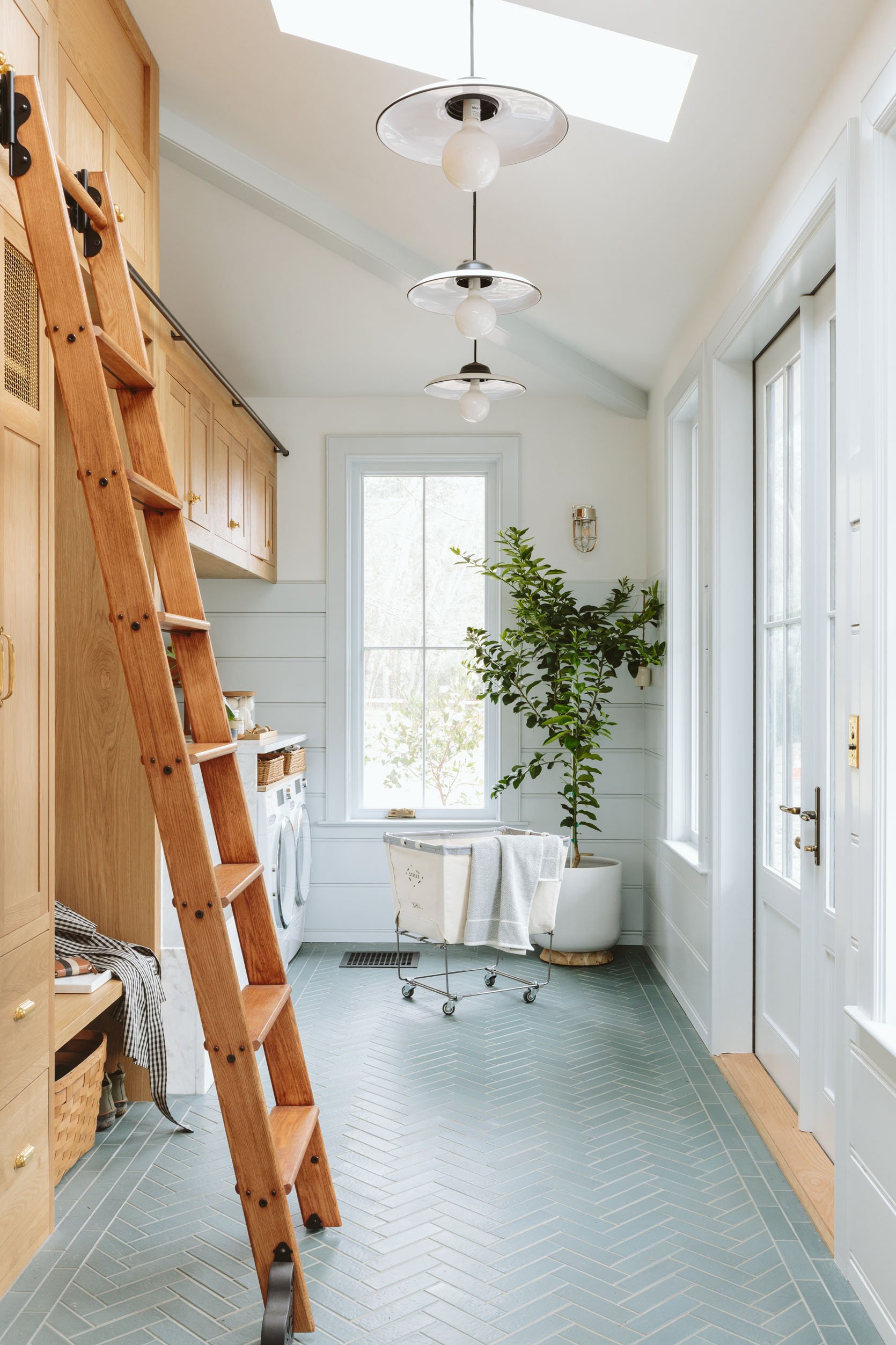
I love our mudroom SO MUCH, and if you missed the full tour head to the reveal here. Yes, this room could have been styled with more “life,” for sure. I feel like I do this thing where for the first reveal I want everyone to see “the design” – to really see the tile choice, the trim, the cabinets – all the big moments that are more about the remodel and design. Then it’s fun to muck it up and style it more how a family lives in it. So I’m assuming that’s what we’ll do for the shoot (i.e. muddy boots by the door, a pretty rug/mat, dogs, the perfect dog leash hanging on a hook, etc). We shot it with the dogs and broke down the dog bathtub here.
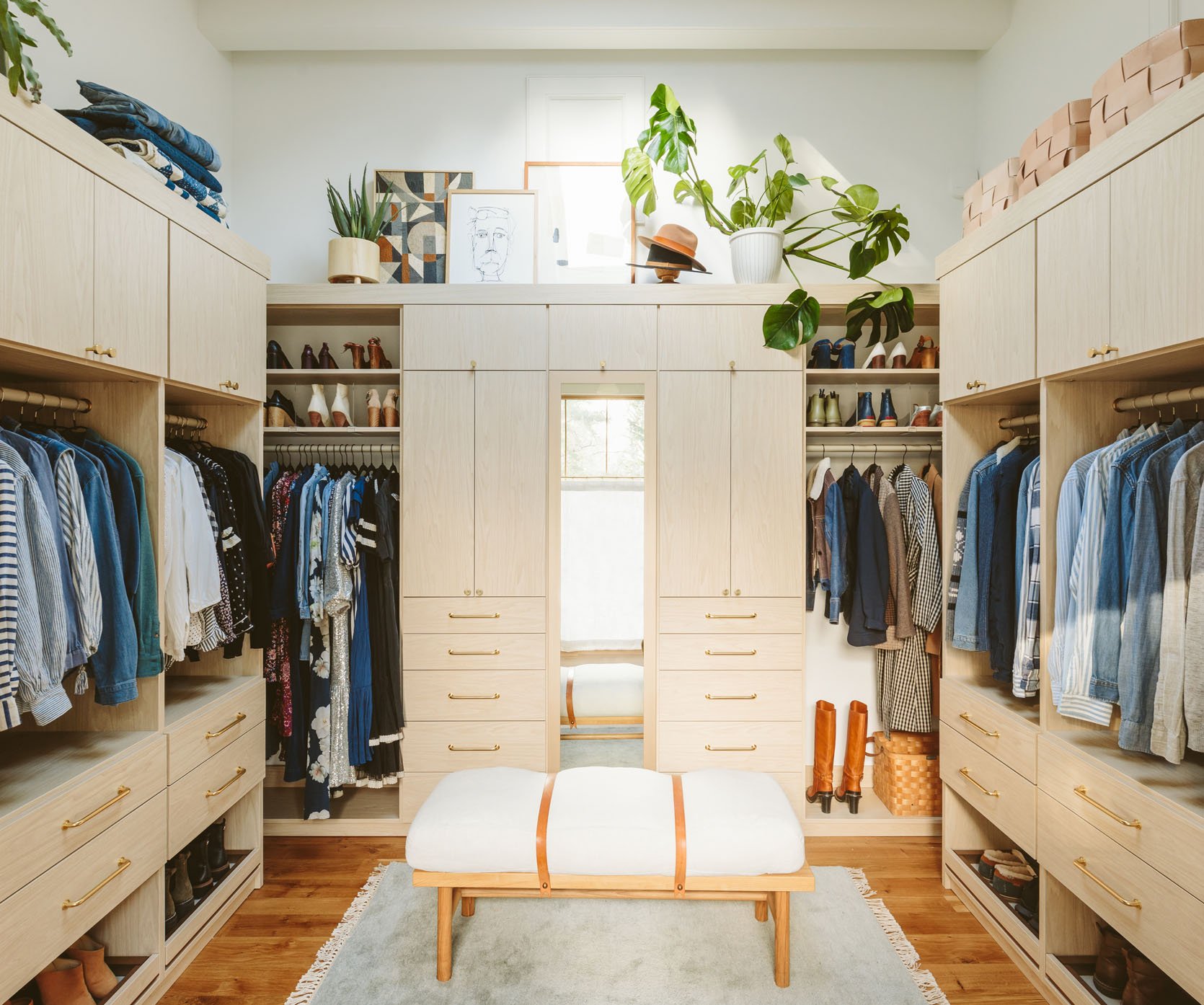
Not sure if they are going to even shoot this but if they do we’ll likely style it differently. Also, that bench is back at the foot of my bed and this Target bench is back in here (this bench was a bit too big when we were actually moving around the space).
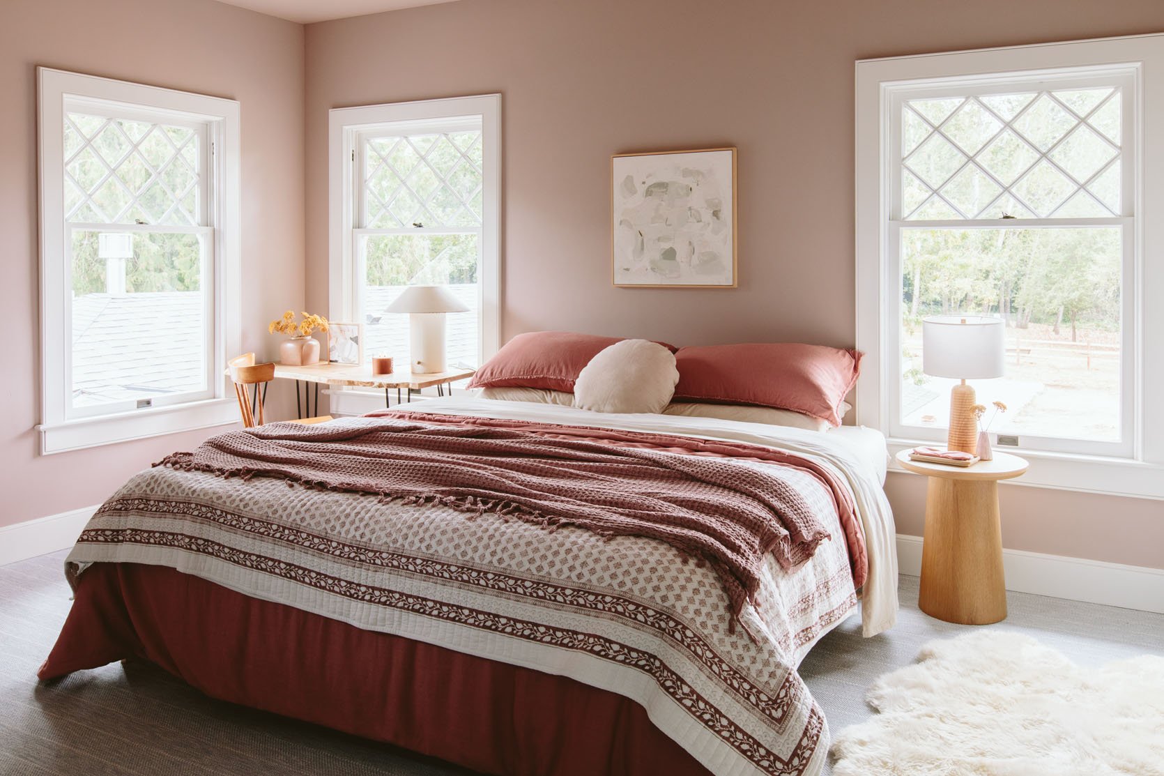
We did a “first reveal” of this with Target in September before my in-laws came to stay. And the room is basically a time capsule (nothing has changed, because it is so warm/calm). We are doing a custom bed with this Rebecca Atwood fabric (which I’m so excited about), we have since added beautiful white shades (from Decorview). But that’s kinda it – I love this room so much – the color on the walls (SW 6030 Artistic Taupe) is absolute perfection.
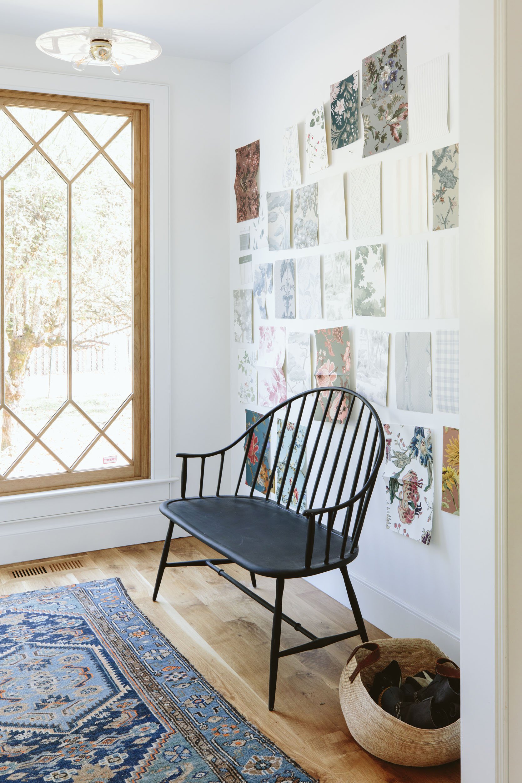
The entry has officially been wallpapered – and it’s one that might underwhelm a lot of you but I LOVE IT. I can’t wait to show you. We also just got our Thos Moser bench which is exquisite (the one above is from Rejuvenation which now lives outside). I’m waiting to find the right piece of art (something graphic, simple, powerful, large scale, but not busy or too in your face).
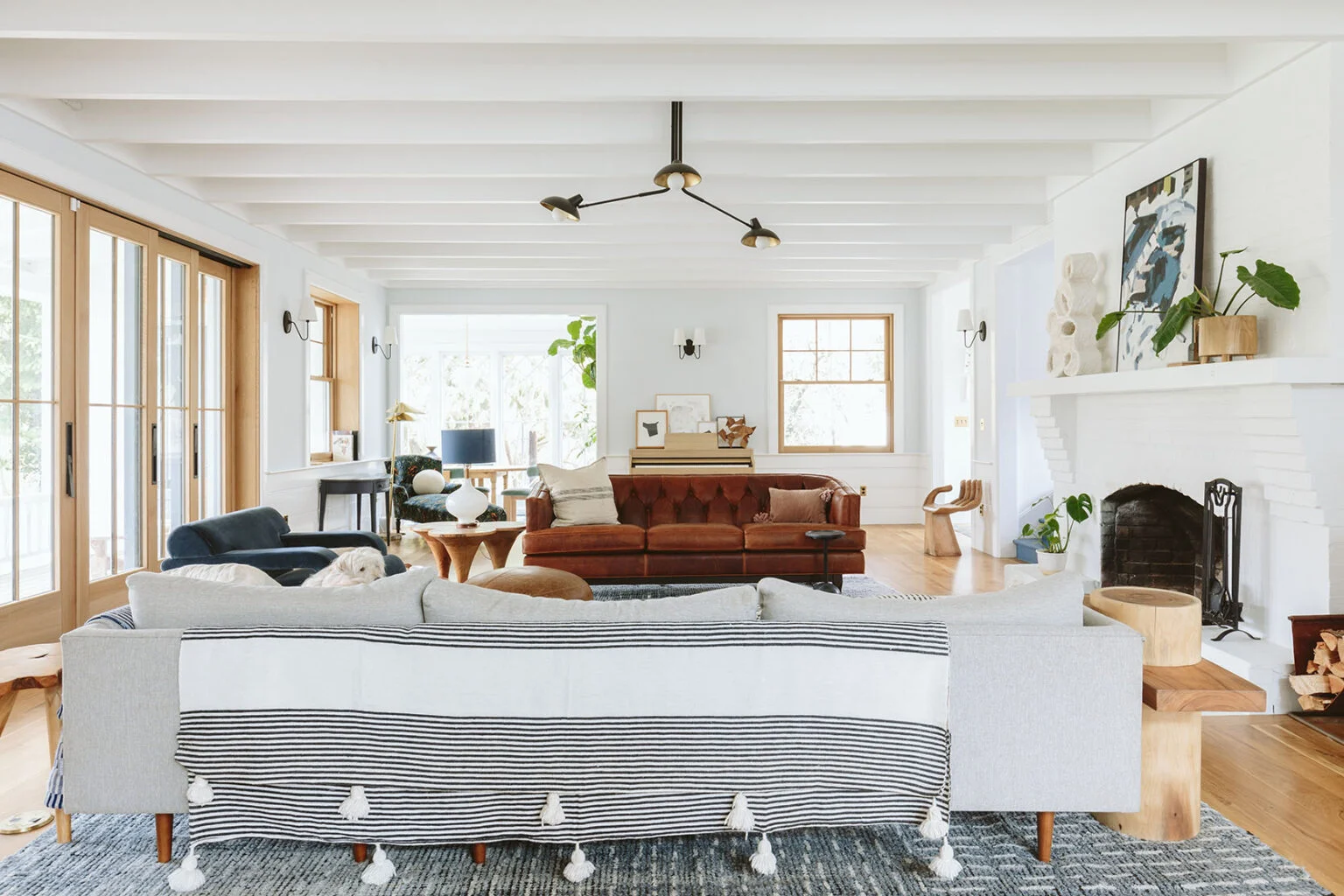
The living room is the furthest from being done, but we are getting there. Here are the updates that are in the works:
- Furniture choices and layout – we have a lot in the works. I have a sofa and another club chair arriving next week. We might reupholster a different chair. But essentially until we get the major pieces we can’t really rearrange anything. It’s a game of musical chairs that I’m very, very excited to play.
- Our coffee table is being made. You may have seen it on stories, but we are customizing a vintage wood slab coffee table with two makers here – Purl (@total_nonsequitur) and his blacksmith friend, Billy. I’m SO EXCITED. They are currently staining it and welding the legs.
- We are adding curtains on the big windows, cafe curtains on the double-hungs AND a roman shade on the other double-hung that doesn’t have such a deep sill. They are super simple curtains that hopefully just add some softness and texture but don’t make it too busy. There are times when I’m feeling back to my eclectic self and other times when there is too much going on, so I’m slightly nervous about these curtains. But my hope is that it just softens the room (and will be great for light control during peak summer western light in the afternoon).
- We aren’t happy with the fireplace and I still feel unsure of what to do. If I could snap my fingers it would be a pretty aged natural brick. We’ve thought about painting it dark or medium, considered lime washing it (still might), and recladding the mantel with a pretty wood. We are still totally unsure of what to do – none of those feel right YET. Hoping that the right inspiration and I can get to my “80% sure” level in order to execute.
- Literally, all the art and accessories are up for grabs. I’ve only put like 5 nails in the wall in this house because I want all the art and walls ready for us to do a full holistic art placement (mostly to avoid unnecessary holes). In the few that I have put in, I feel pretty good about, but we’ll see. It’s such a balance and I’m so picky about making sure that we don’t put abstract next to abstract, etc. Individual vignettes might look sooo good with a certain piece of art but when you pull back to see all the walls it gets trickier.
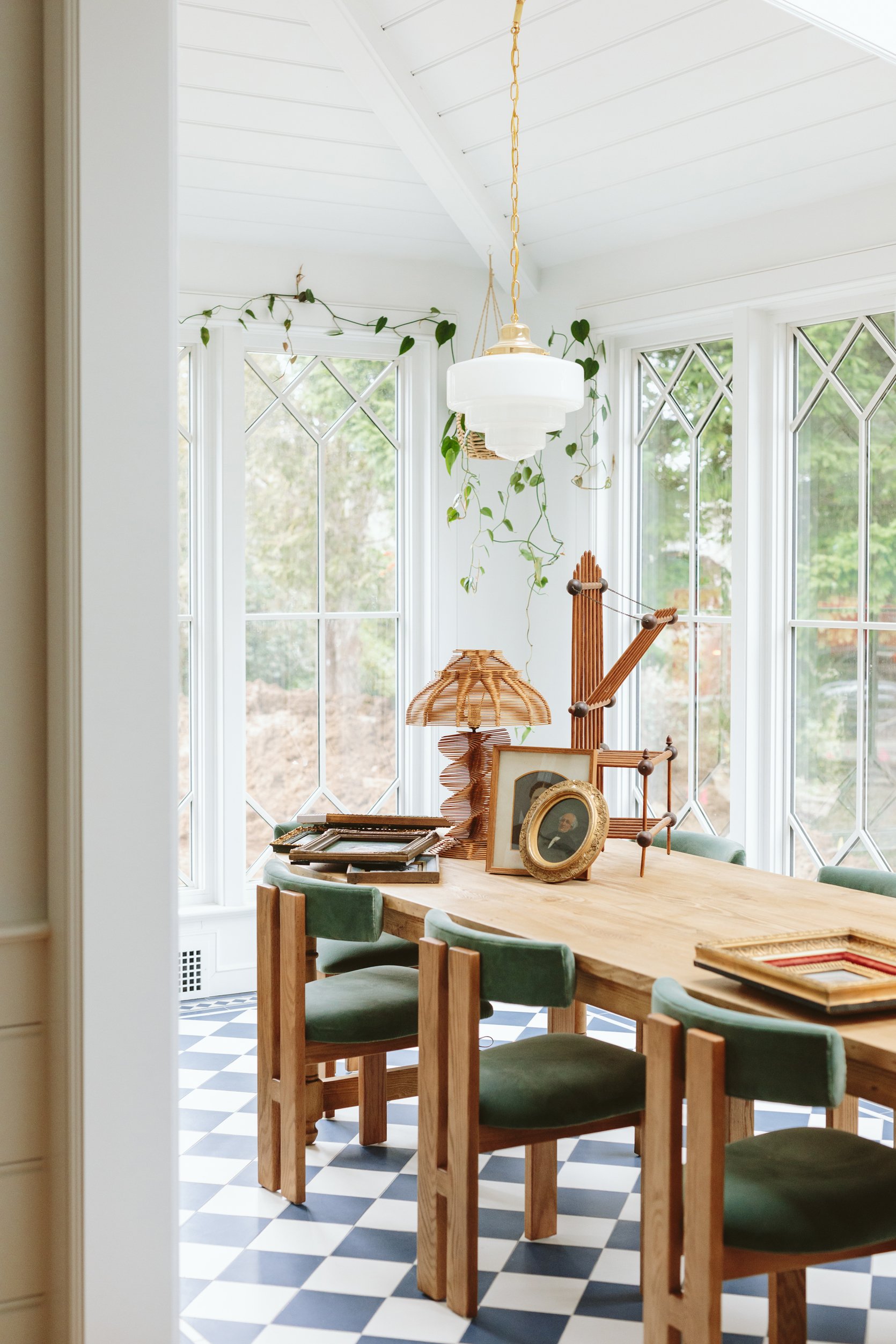
Oh this room…my heart. It’s feeling SO GOOD, y’all. I bought this credenza from Crump & Kwash (finally found the right dimensions/finish/function and size), and then I hung the blimp up, added a huge fiddle leaf fig tree, and it’s 95% there. I secretly miss the portraits of strangers (I was going to do a full gallery wall) but once the blimp didn’t work in the family room (below) this wall was the only wall possible in the whole house. I still need to style it all out, buy more plants (or figure out how many plants I even want in here), accessorize, etc. But I absolutely nailed the dining table, perfect dining chairs, the beautiful light fixtures, our custom windows, and the new credenza – literally every single major element in here works so well together. If only I felt as sure about every other room as I do about this one…
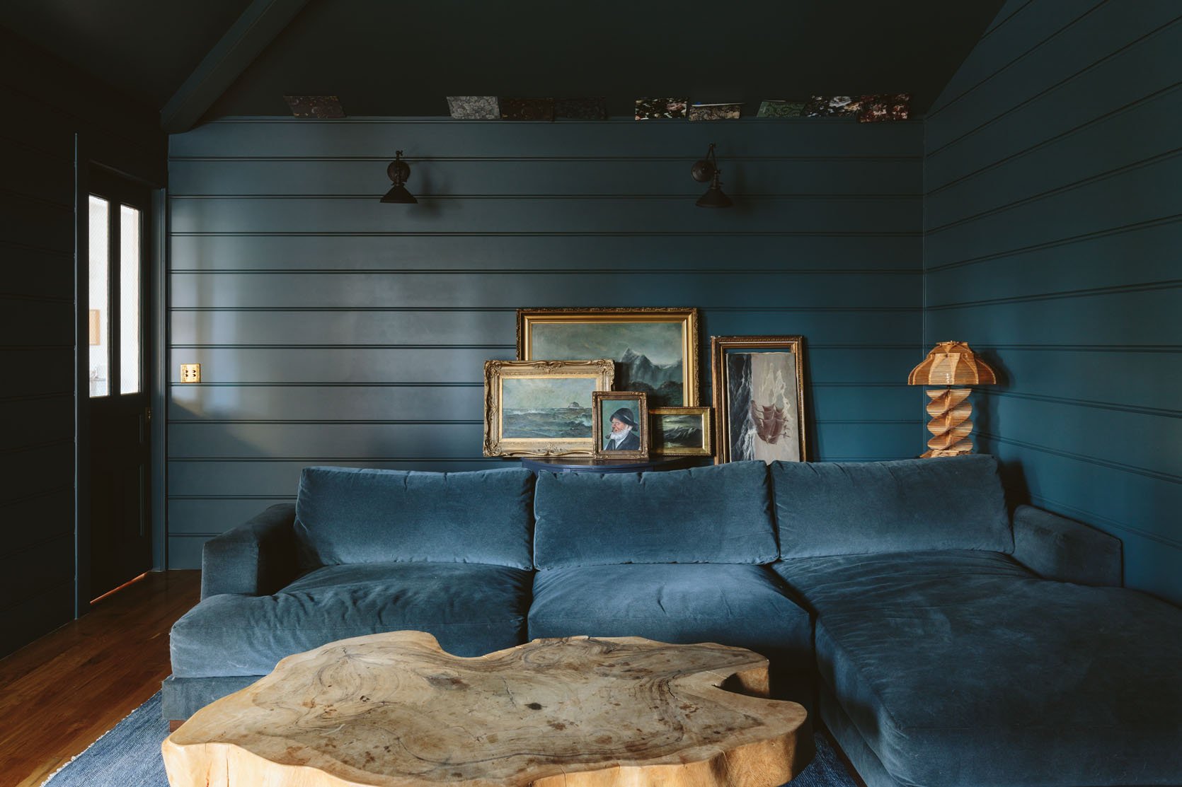
This room changed from being the room that I wanted to be in the least to the room that I almost love being in the most (at night) the second that we painted it dark. Shame on me for not going with my initial gut on this one and trying to play it safe with a lighter color. What’s left?
- Hang the seascape gallery wall. I’m waiting on one last one that is at our framers, then we can go for it.
- Pillows and throws – I’ve avoided buying any because I want them to be in great shape for the shoot.
- I might change the shades of the sconces to gold instead of black (they are gold inside but I might switch them).
- I might make a large cushion for the bench. Technically we don’t need it so I’ve been hesitant to do it, but I have leftover fabric and I think it would be a pretty layer.
- Window treatments for the door windows – the sun blasts in here in the afternoon (and afternoons are long in Portland with the sun not going down til 9:30-10 pm). I might just get some readymade woven shades.
- Custom plaid being framed – excited about this one.
- We added a door to the hallways (so we could close it off to the afternoon light) and that needs to get painted.
- We added two of these bookshelves to the back of the sofa that has provided much-needed function and storage.
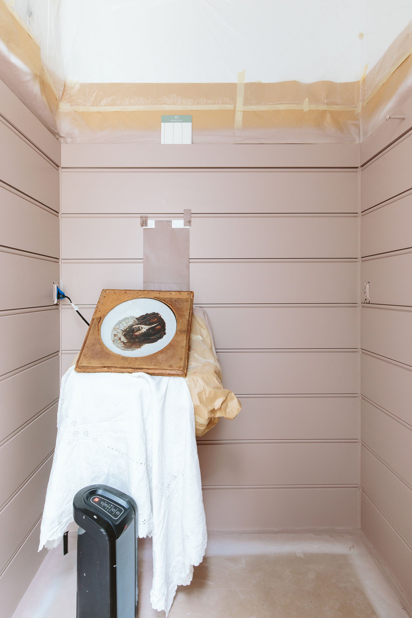
Now we haven’t put this on the blog yet, but basically this bathroom was painted a blue that I didn’t love as much. I decided to paint it SW 6031 Glamour, the color you see above. HOWEVER, this was the first coat and as my painter was painting I decided to go one shade darker and paint it SW 9078 Cocoa Berry. It’s on the same paint strip (and it’s the color that is on the large sticker that you see). I LOVE this color (SW Glamour) though and have thought about putting it in many other places (including the front door). I guess I just wanted it to be deeper in here since there isn’t any natural light. And I love the color (SW Cocoa Berry) so much. What’s left?
- Wallpaper. I’ve thought about, no joke, 25 different patterns and keep landing on that one above as my favorite. My only issue with it is that we have horizontal “stripes” as the wood paneling so is it weird to put a vertical stripe on the wall space above it? I know that this paper might bore you guys but it’s so simple and pretty and really warm in person (it looks more like a fabric). It’s the vibe that I want.
- Vanity. Welp, the blanket box that we bought and wanted to use was determined to not work (the dimensions were off enough that trying to make it work could be a huge expensive mistake). I’m still looking for the right piece, or might retrofit something else, or not do a vanity at all and just have the wall-hung sink and style out the blank space on the right better.
Staircase Progress
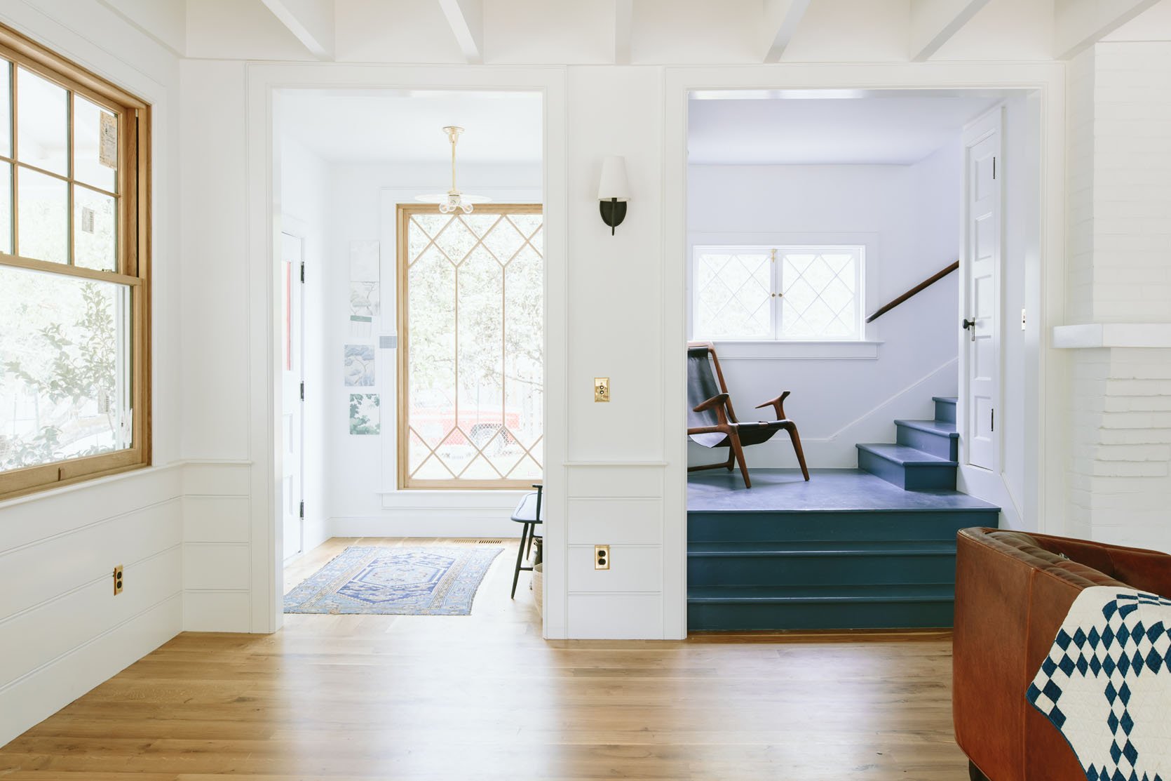
I’m very excited about this pass-through space. Here is what is happening:
- Wallpaper is going up. It’s subtle but I personally think perfect for what I want to do next.
- Add a fun family gallery wall – photos, kid art, and all the stuff that makes us just so happy.
- Add a stair runner. After many attempts to hire a professional installer and find a commercial carpet we like, we are going to do it ourselves. It’s a whole thing that I’ll fill you in on. It’s on the calendar to do it next week and we’ll be documenting it of course. We chose this rug runner and we are very excited to make sure its going to work.
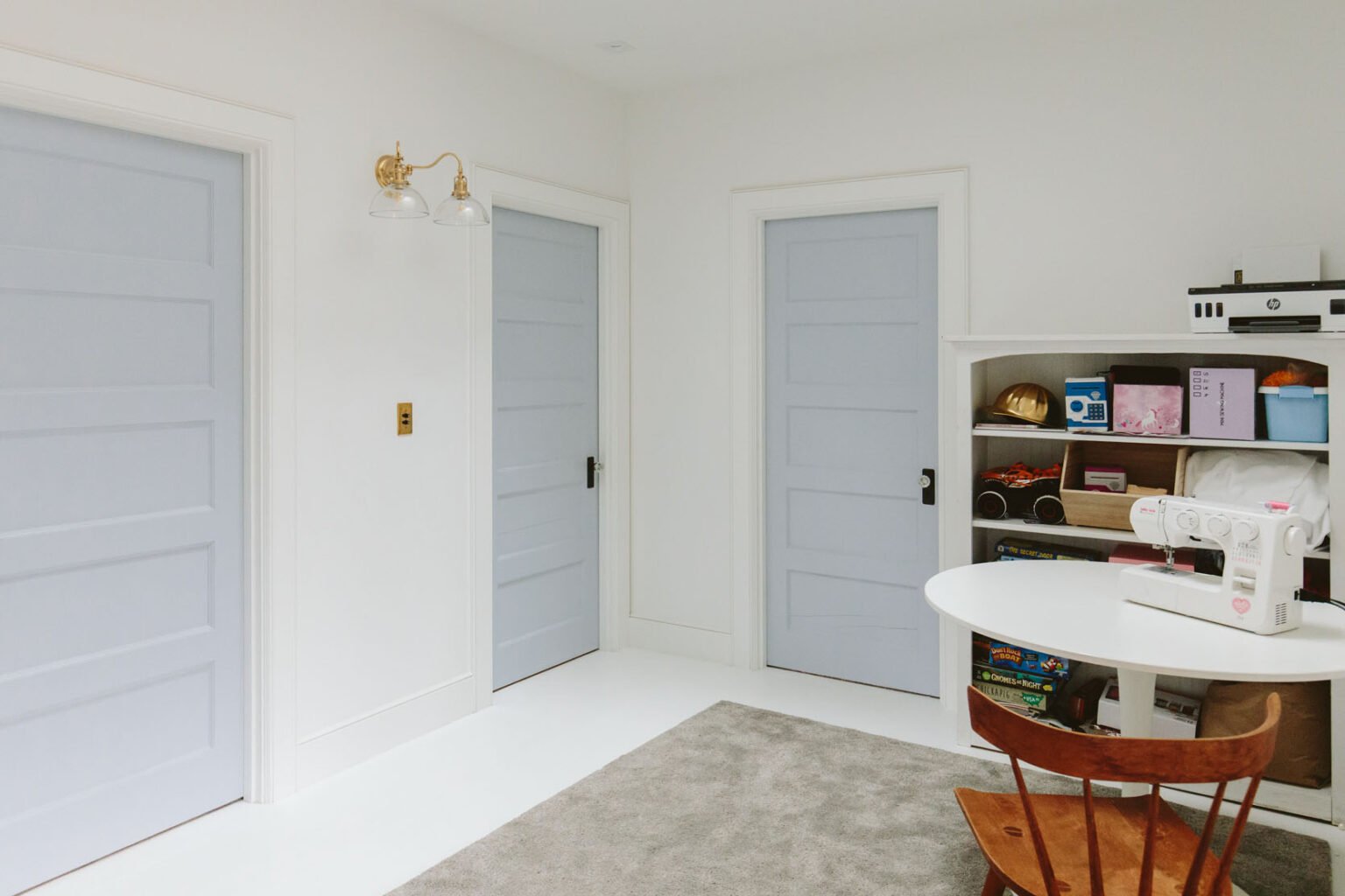
This is the only space that I don’t think I’m going to have ready. Since this shot, I have added an oval jute rug, this hutch with glass fronts, and this pedestal table (both from Urban, strangely). The bookcase might end up living in Charlie’s room, which means I’ll kinda start over here. The walls will be wallpapered the same as the stairway (a subtle stripe) and I have grand plans of doing a stencil pattern on the floor. But again since there is so much to capture during our two-day feature shoot I can’t imagine we’ll get to this space so I’m not stressed about finishing it. I have a call with them to see if they want video content and if so then we’ll want it to look nice in case we do a walk-through of the whole house (which is very possible).
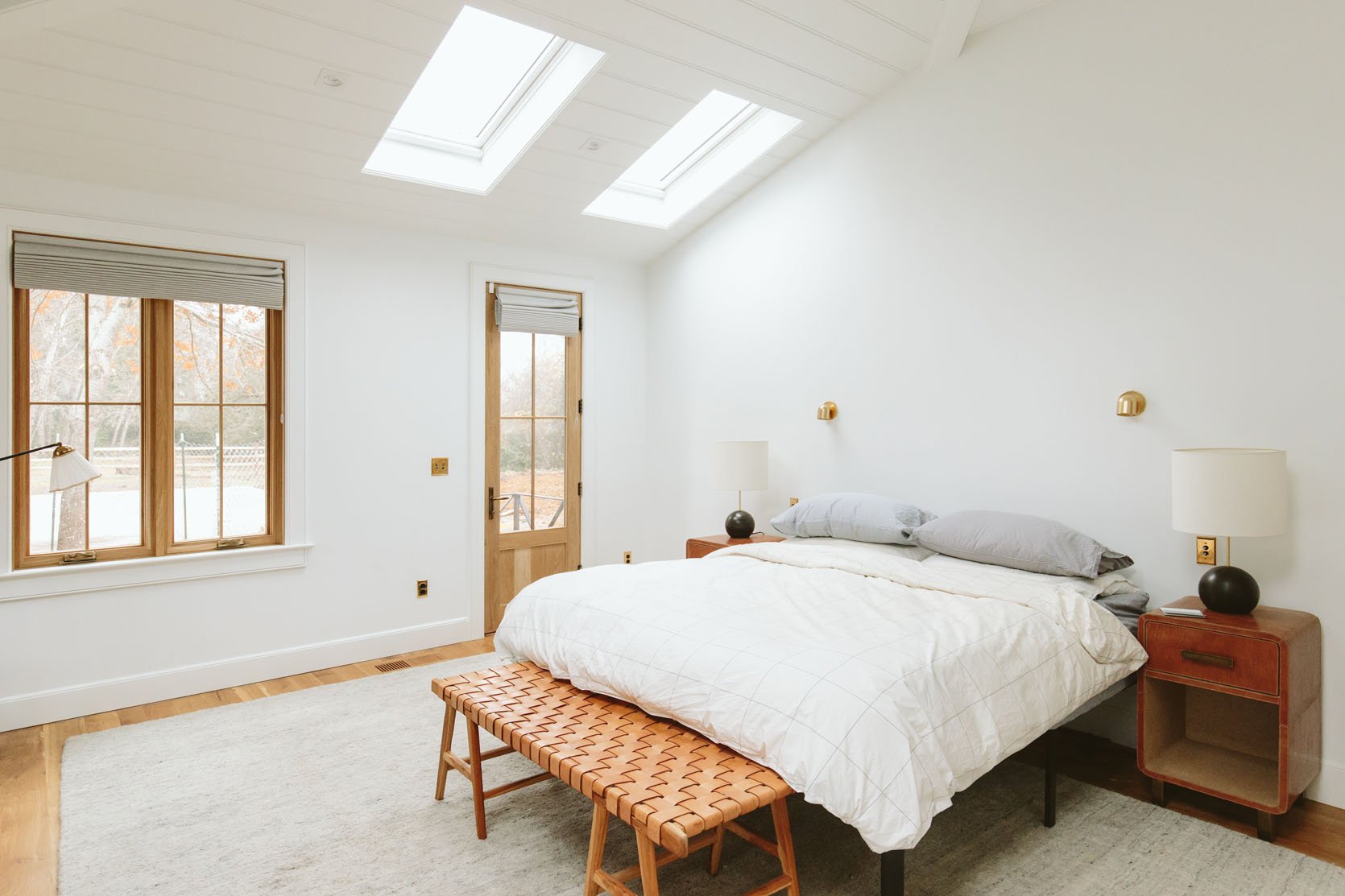
A LOT TO DO HERE, FOLKS. I’m writing this post on Monday and this room is getting painted literally today and tomorrow. It’s all taped off and I’m TERRIFIED that I won’t love the color, so there are a lot of fingers and toes crossed right now. We also got our bed from Maiden Home that is so pretty but is too wide and covers up the sconce light switches (that we don’t use TBH). I know this rug looks really boring, but it’s so soft and cozy, and while it does have a decent amount of stains I’m trying to keep it. The nightstands, lamps, and bench are all great but might get shuffled around the house. In short, this room is nowhere near done but it’s going to be awesome (I think/hope). I might take some new shots when the room is painted and walk you through it all.
The Main Bath
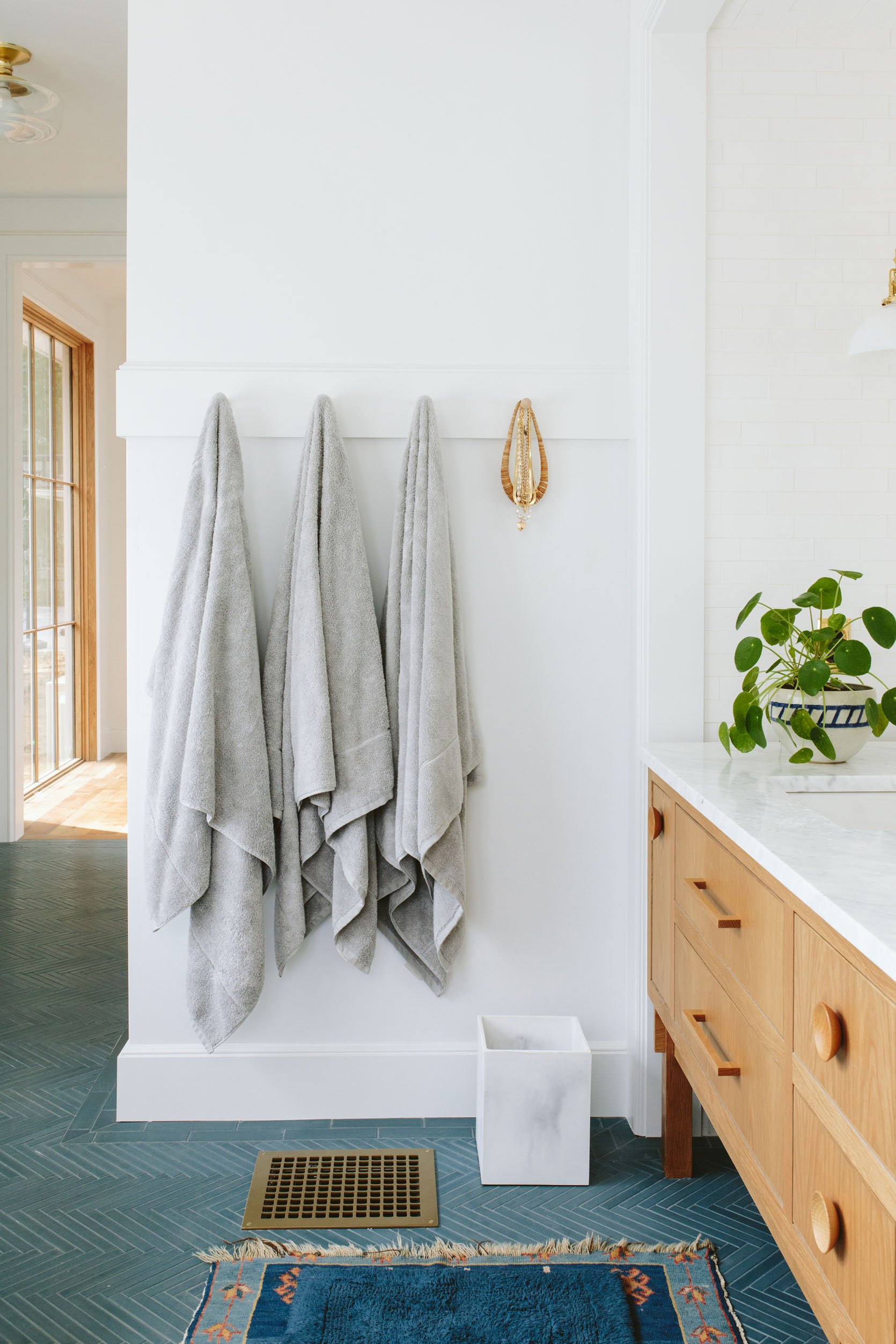
Our bathroom is done, shot, and awaiting its debut to you all. It’s visually so simple, and exactly what I want to spend time in every day. That’s just a peek, more to come very soon I promise 🙂
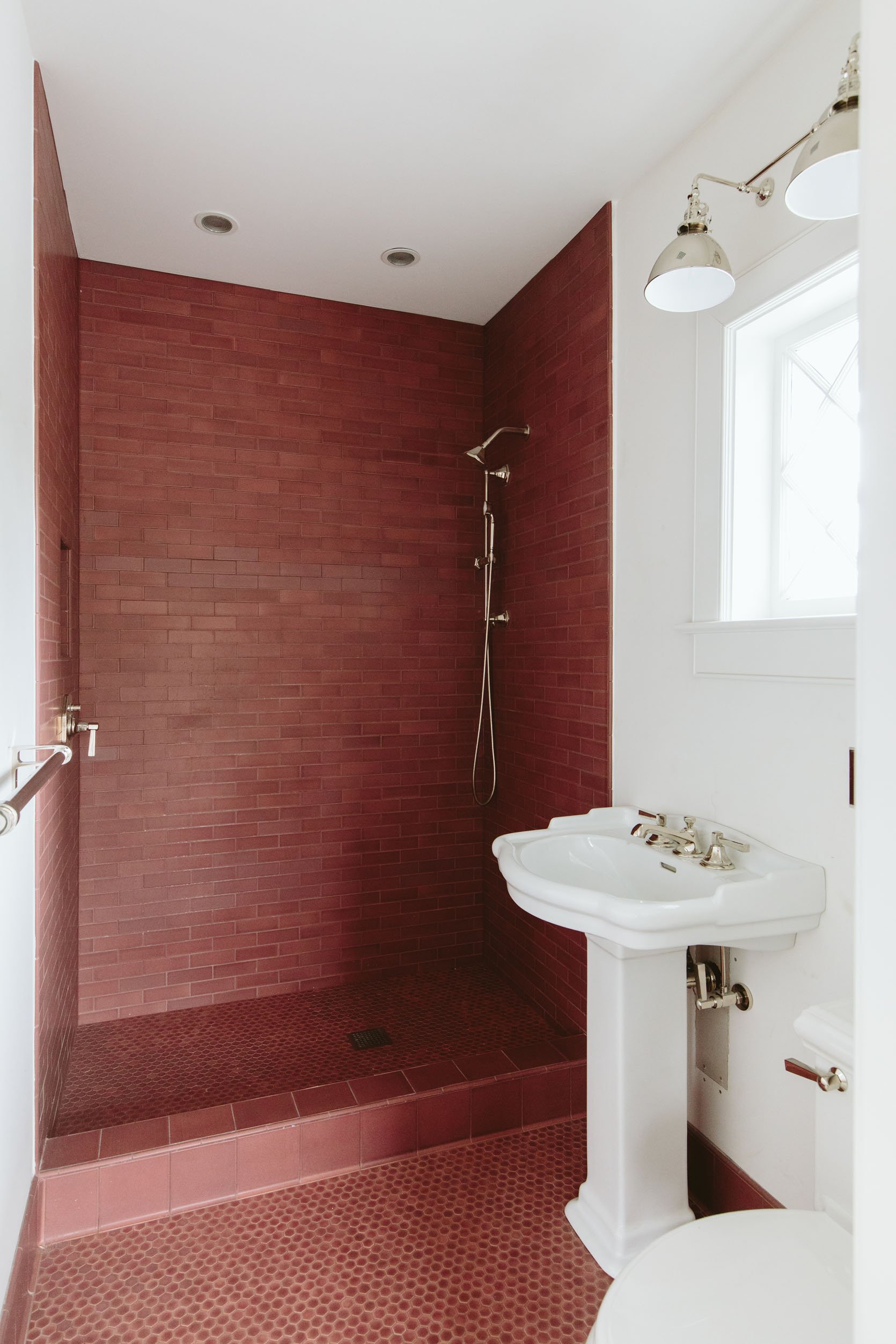
This room is getting wallpapered next week and the glass door enclosure is in. I still want to try to lighten the grout color (I saw a few hacks online) because the tile doesn’t pop as much as I wish it did. But my hope is that the busy-ish wallpaper will make a huge difference and make the non-busyness of the tile actually make sense. I don’t know. It feels a bit like a disappointment right now, but other rooms in the past did as well and often it just takes a few tweaks to make them sing.
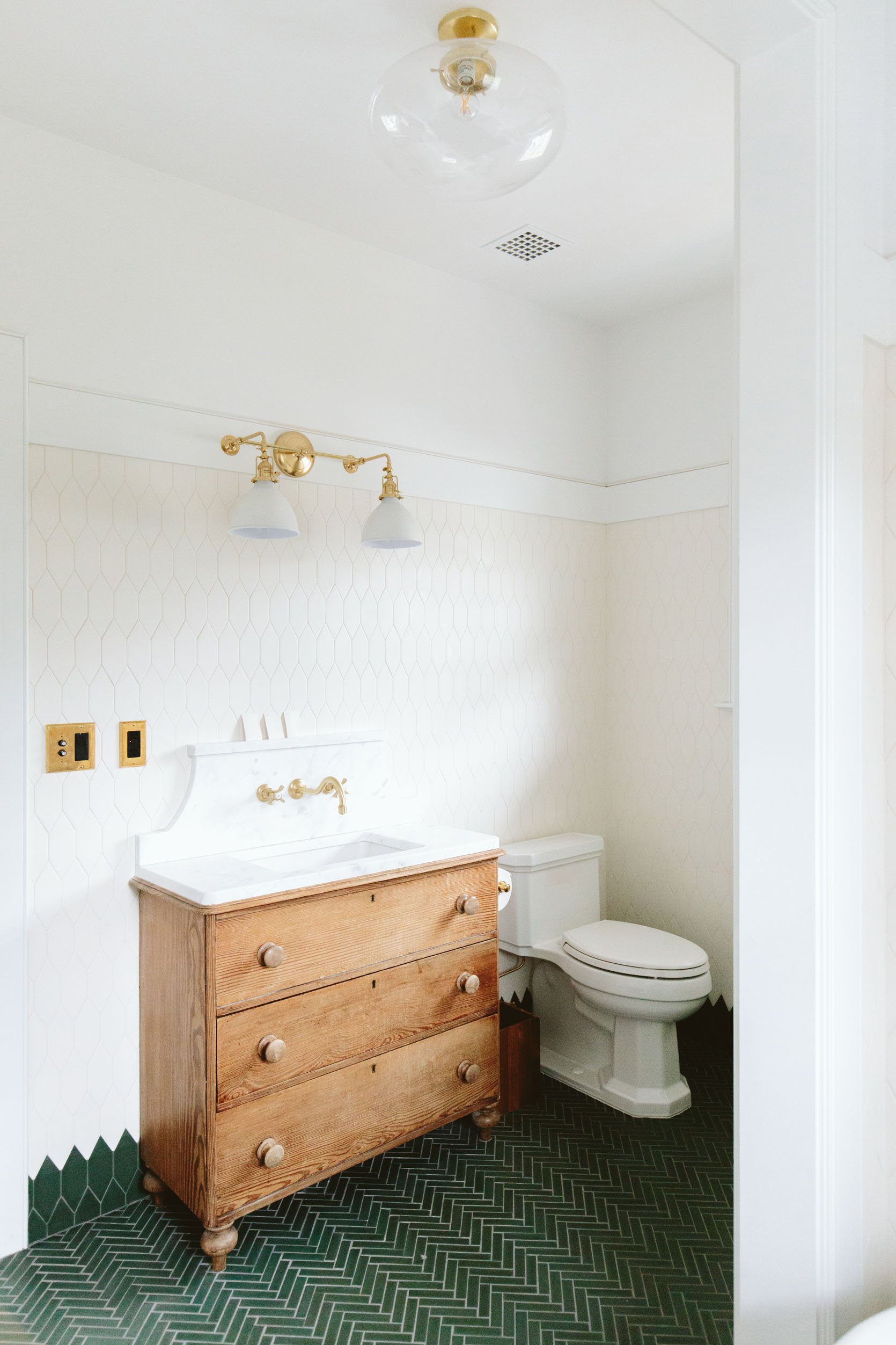
When we last checked in on this room I was lamenting the two main white colors looked pretty terrible together (the wall color and the tile color). Since that post, we repainted all the drywall and trim a warmer white that matches the tile and it was an instant, immediate, sigh of relief. I don’t think a lot of people would notice it, but it drove me NUTS and since it was my fault it was extra annoying to look at every day. Once repainted to match the tile you could actually focus on what is so great about this bathroom – the green tilework, the cute vintage vanity, the bathtub niche, etc. Since that photo, we’ve added the mirror, more pegs to hang stuff from, and I’ve started to style it out. We love, love, love it.
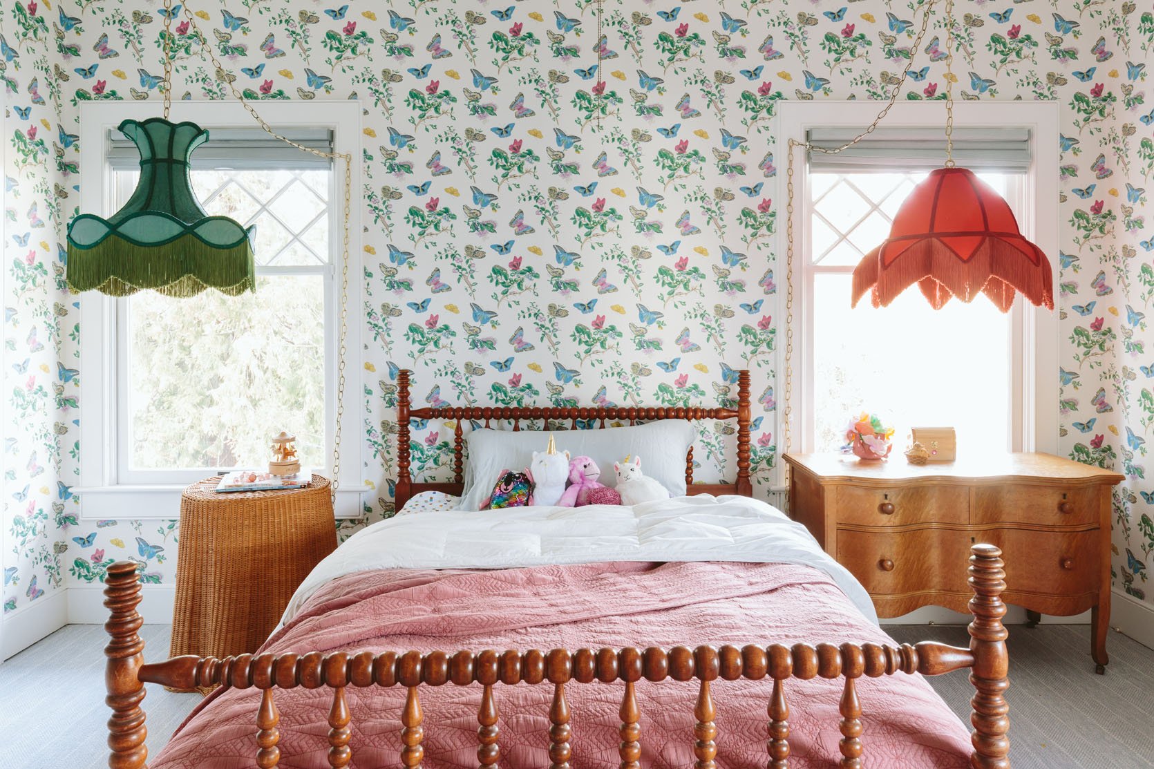
It’s hard not to be too excited about this room because it’s so wildly fun to hang out in, so we don’t have too much left, honestly. Art, accessories, maybe a rug, a big bulletin board – mostly styling. The only thing I’m debating/considering is either crown moulding or painting the ceiling. It feels pretty unfinished at the ceiling and I’m not sure why?! It might be a matter of just time (both brain time for creativity and time to execute). Crown moulding would be the easiest thing to execute. I also don’t want to over-design this room since it’s for a 7-year-old and her tastes might change, so we could just call it.
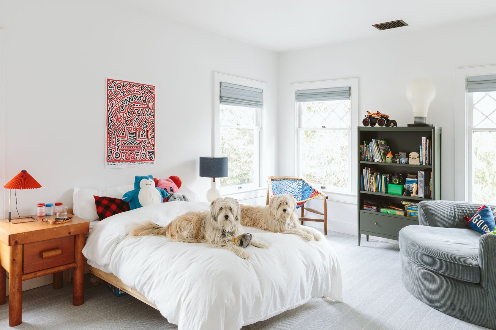
And last but not least is Charlie’s bedroom. I love all the vintage stuff, but it’s not there yet design-wise so I need to spend some time sitting in here and staring. We are making a DIY vintage plaid headboard this week so that will help. I might bring the arched wood urban outfitters cabinet in here and put this bookshelf on the landing instead. I also want to execute a cool mural in here – think a Banyon Bridges-style swirl line…Clearly, a lot to do in here but all fun stuff that I think can be pulled together quickly.
That was A LOT…
And also wow, we’ve done a lot. I’ve made so many decisions – both kinda wrong and so right. I’m so glad you are here with me 🙂 Building a life is long, hard, and wonderful. Remodeling a home is the same. We are so close, y’all. SO CLOSE. So thank you so much for being here with me. As Birdie likes to say to me when she knows I need it, “I love you more than all the molecules in the world” 🙂 (but seriously, I really appreciate you here reading, following, and supporting this farmhouse journey). xx
Opening Image Credits: Photo by Kaitlin Green | From: Our Front Door Reveal – On Choosing The Right Color + What It Did To My Psyche AND Our Curb Appeal
THIS POST WAS ORIGINALLY PUBLISHED HERE.


