This room is not designed yet. I put it on the back burner because honestly it was good enough and I like really simple bedrooms. We had a bed, our old nightstands, lamps that we’ve had forever, and a huge new mirror. But no, it didn’t feel finished and not a room that a designer had touched. So we needed to move forward with it. After staring at the paint swatches for literally months, I finally made the decision on what I felt was the perfect warm, moody, happy, mid-tone powder blue.
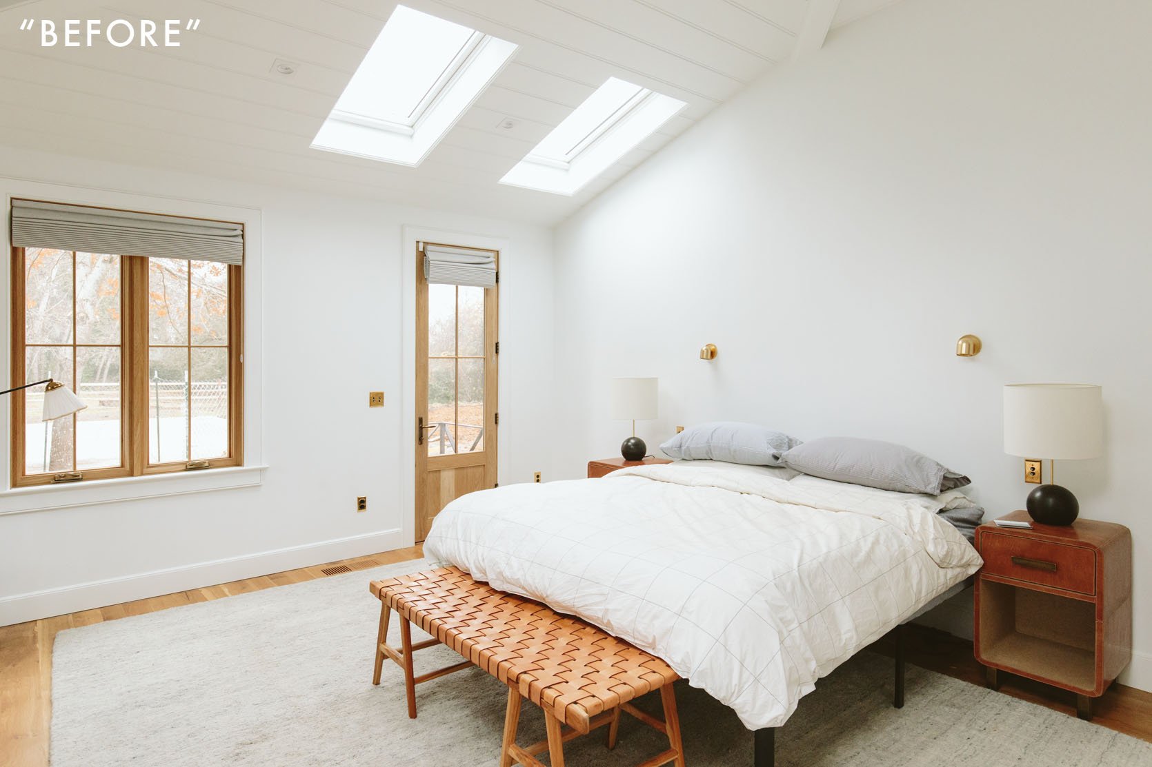
I had two main conflicting fears – 1. That it would feel too gray (a big no no up here) and 2. that it would be overwhelming and be a color that was too blue. And y’all you truly don’t know how anything is going to “feel” until it’s on all four walls – you just don’t. You can do all you want in Photoshop and put paint stickers on all four walls and stare at them at different times of the day, and you can have a lot of experience painting colors – but you simply don’t know how it’s going to “feel” when you walk in until it’s on those four (in this case 5) walls!
So when I made the decision I was at 80% sure (my new metric I try to get to before making a big design decision). But that is still 20% unsure. I gathered so many opinions – my team, Brian, friends, everyone. I felt about as confident as I think I could have. We all agreed that SW 9139 Debonair was the right color. We would do all the walls and trim (flat on the walls/ceiling, satin on the trim). It took a day and a half. We slept in the guest room. Easy Peezy.
After the first coat, I walked in and was SO EXCITED. I LOVED the color, vibe – the whole thing gave me so much hope.
So How Do I Feel Now?
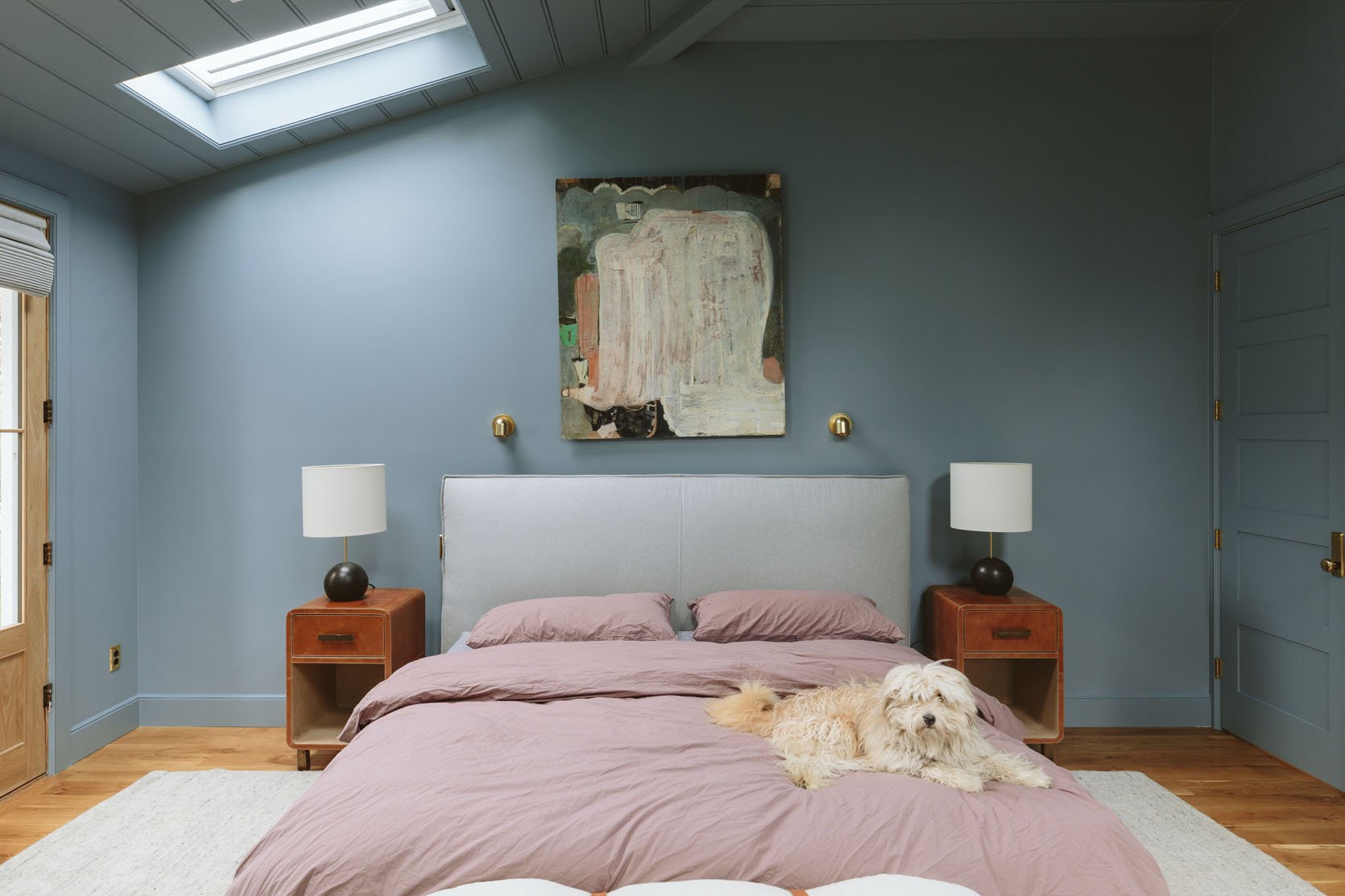
Chair | Ottoman | Rug (unavailable) | Art | Bed | Duvet Cover | Nightstand | Lamp | Bench | Wall Color | Sconce | Switch Plates
I don’t know!!! Brian loves it. Kaitlin loves it. At times of the day, I love it. But other times and in certain areas it feels too blue, too much. So we did this update shoot (which is genuinely so helpful) to show you and honestly to help me see it more objectively. The color itself is very beautiful, but is it right? Should I have left the ceiling white? Is it the wrong vibe/too dark for a spacious room full of so much natural light?
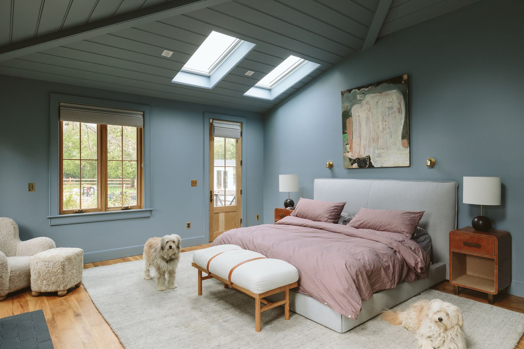
Mirror | Sconce (unavailable)
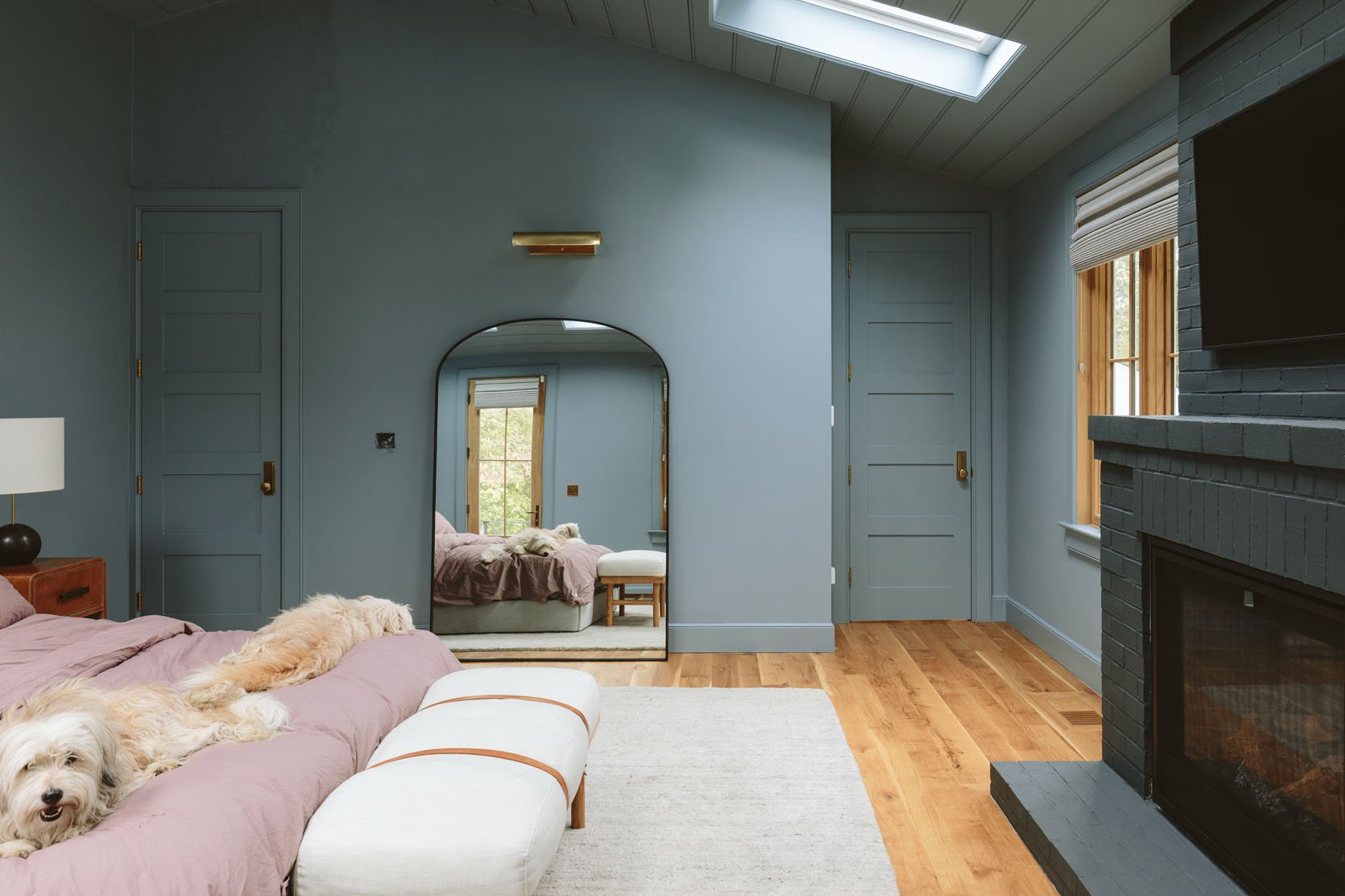
When we painted the family/TV room the dark SW 6223 Still Water, it felt an instant “so much better” but I was nervous for a few hours. It took bringing back in the sectional and the rug to be like, “Oh yes, this is it” and now I’m 100% in love with it. But when the recessed lights are on I don’t like it as much because the pigment of the paint pops and it reads as a really bright dark teal – which is fine because this room is meant to be enjoyed with lamp light. So if I were to recommend it to someone I would say it’s so great for a room like ours, with very little natural light and meant to be very dark and moody.
So I guess what I’m saying is that A. Not all color choices are an immediate “yes,” some colors need the context of the other design elements to make the color make sense. And B. Even if this is the perfect color, perhaps it’s not the perfect color for this scale/size of the room.
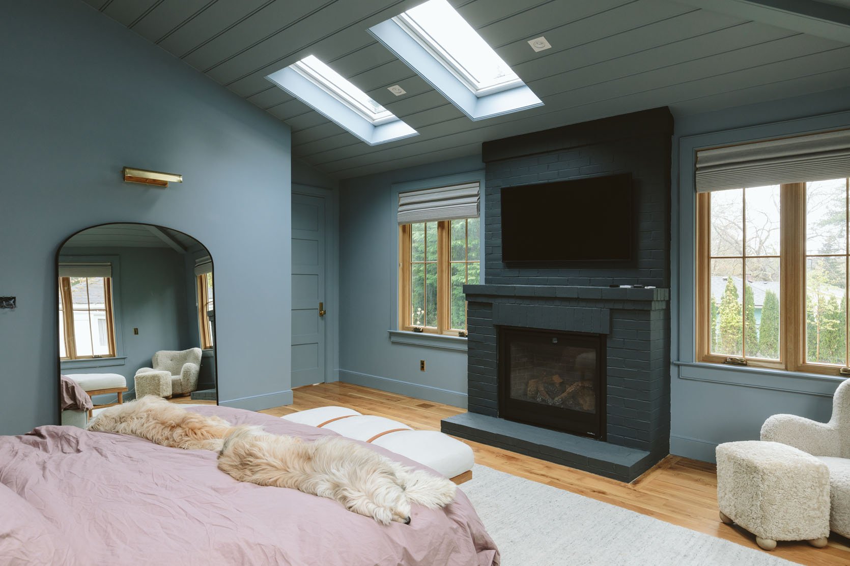
My biggest pet peeve of it all is how prominent the recessed lights are. No thank you. I’m not sure what to do about it but they can’t stay like that. It’s all I can see.
So my options are:
- Shop for brass or black canned lights and switch them out.
- Paint the ceiling light or white.
- We’ve joked that we are going to put the paint stickers over them and just pretend that they aren’t there – this is obviously a very bad idea, but it sure is easy!
- Paint the square part but leave the round light inside white. This is not advisable in any way, but it is a not ideal option we’ve thrown out there.
I’m wondering if I should change the trim color – make it lighter or darker? Should I paint back the ceiling?
What Am I Going To Do?
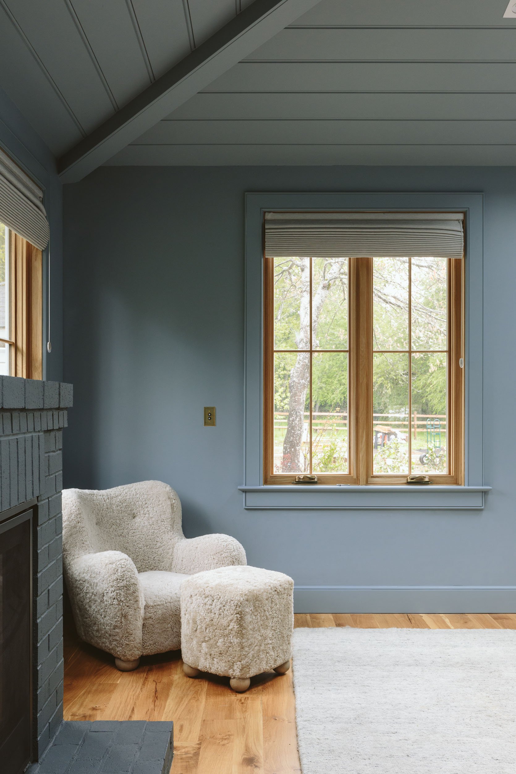
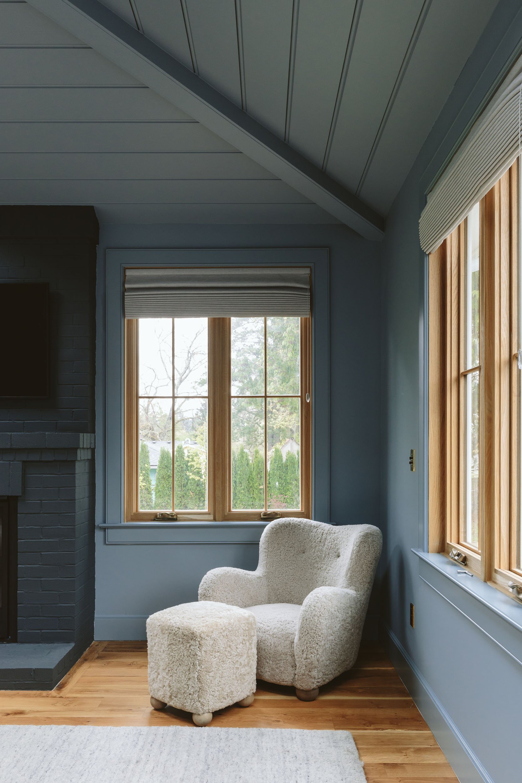
For now, I’m definitely going to keep working with it and see if we can get to a point of it being right. It’s not overwhelming but if I had a clear idea of how I would change it, I would do it. But it might be that I just need to get used to it and that it needs more powerful furniture to contrast against it. I went from a boring white box to this. Maybe I went too far too fast? I don’t know. I have ordered a new bed, in camel velvet (this one) and I’m excited to see how it is. The bed we have here is from Maiden Home and is so simple and pretty, but it’s too wide and covers the light switches, and is too low for the room (the mattress, not the back). I also wish I had chosen more of a statement bed (I was in Scandi mountain house mode when I ordered it) So I regret to say that this will be heading to another great home soon (maybe the river house guest room!). The piece of art is from the OG Portland project, by MaryAnn Puls, the nightstands are from Made Goods, the table lamps are from Rejuvenation (that I’m likely keeping but with a different shade), and that incredibly cozy chair and ottoman are from Crate and Barrel. I LOVE how the chair contrasts with the wall – so I’m leaning into those tones. Re the bedding – I just bought this duvet cover from Parachute and I love the color, but I’m open to exploring other tones, too. It’s all up in the air and I’m really really happy we painted and can move with a design direction. I would genuinely love your thoughts, though. Not a “do you love it or hate it” but more, what would you do in here? Do you see a clear answer? Or do you, like most people around me, think that it’s so awesome and think that I’m not used to having such a saturated color in my bedroom??
Let’s chat! xx
Resources:
Wood Flooring: Oregon White Oak by Zena Flooring
Windows: White Oak, Aspen Casement by Sierra Pacific Windows
Roman Shades: Decorview
Fireplace: Slimline 7X with Tranquil Greige Refractory Brick by Heat & Glo
Blue Wall Color: Debonair by Sherwin-Williams
Current Fireplace Color: Smoky Blue by Sherwin-Williams
Skylights: Skylights with Room Darkening Shades by Velux Skylight
Lights and Switch Plates: Rejuvenation
*Photos by Kaitlin Green
THIS POST WAS ORIGINALLY PUBLISHED HERE.
